










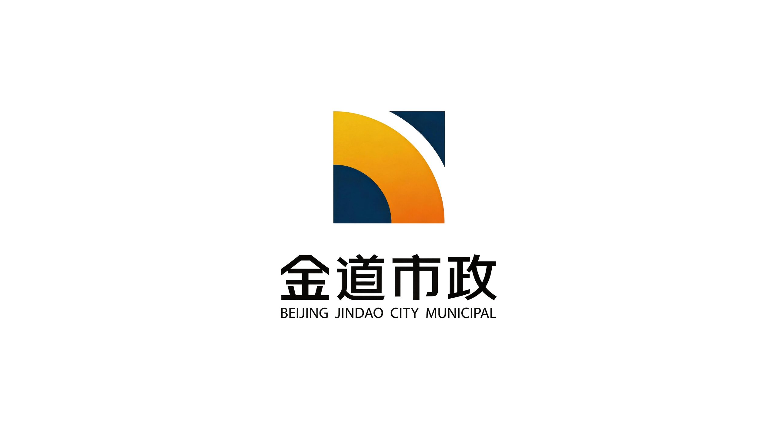
Jindao Municipal is a professional engineering enterprise with municipal engineering construction and urban infrastructure services as its core. Its business covers road and bridge construction, water supply and drainage pipe network engineering, urban lighting, landscaping and underground pipe gallery construction. It is committed to creating the basic lifeblood of urban operation with superb engineering technology and strict construction standards.
The brand name "Jindao" has two striking words - "jin" means real gold and gold quality, symbolizing that the quality of the project is as durable and unshakable as gold; "dao" means road and avenue, which not only directly refers to the core road construction business in municipal engineering, but also conveys the company's business creed of "operating with the right way and reaching great distances with the avenue". Qingmei Future was commissioned to lead the brand identity design.
The design goal of the brand logo is to convey the brand image of "quality is made of gold, and the road connects thousands of miles" through the visual language of engineering strength, solid quality and urban responsibility.
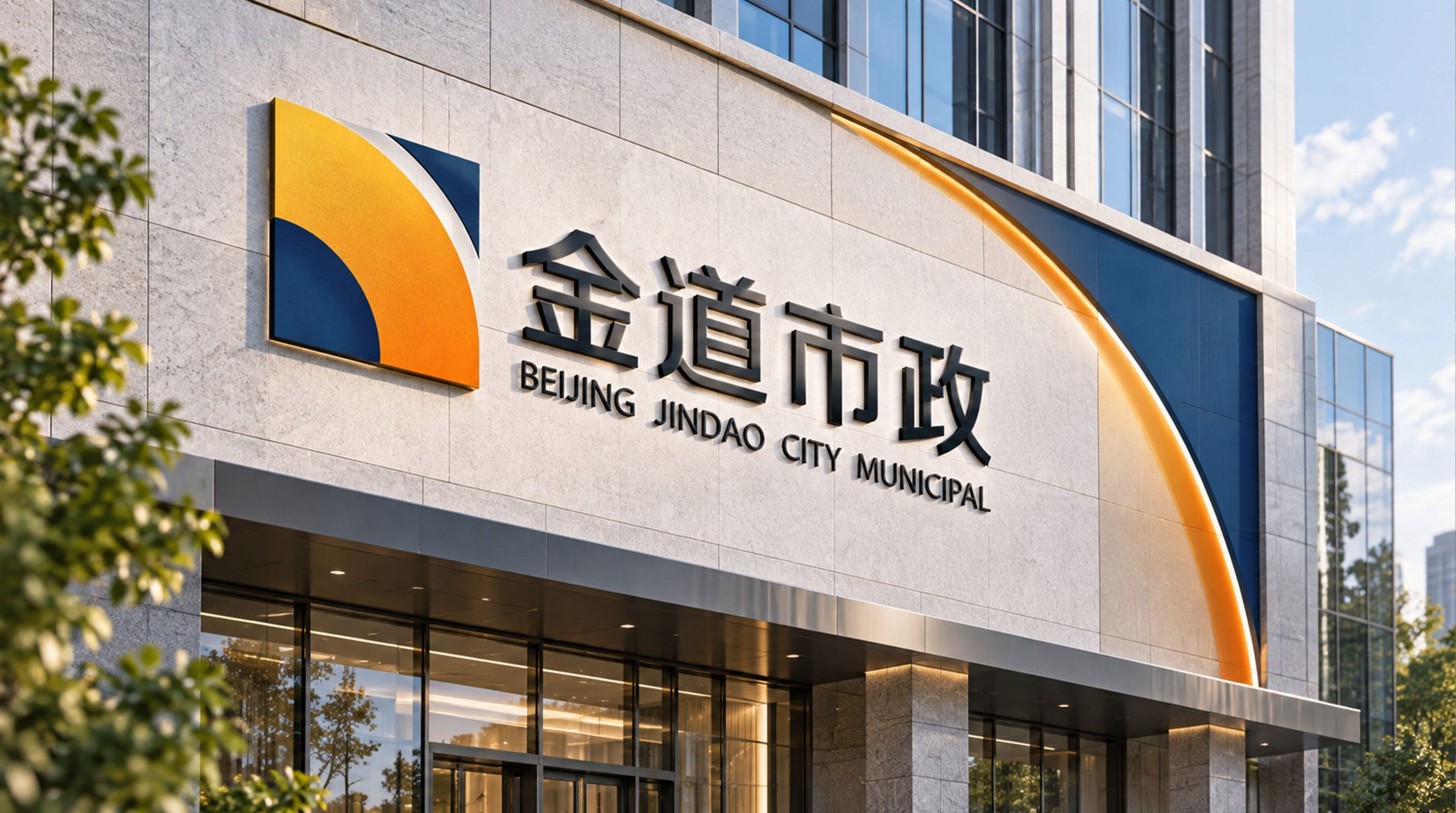
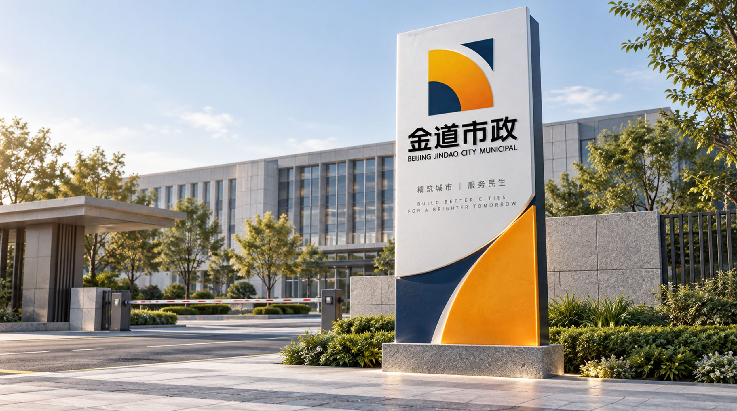
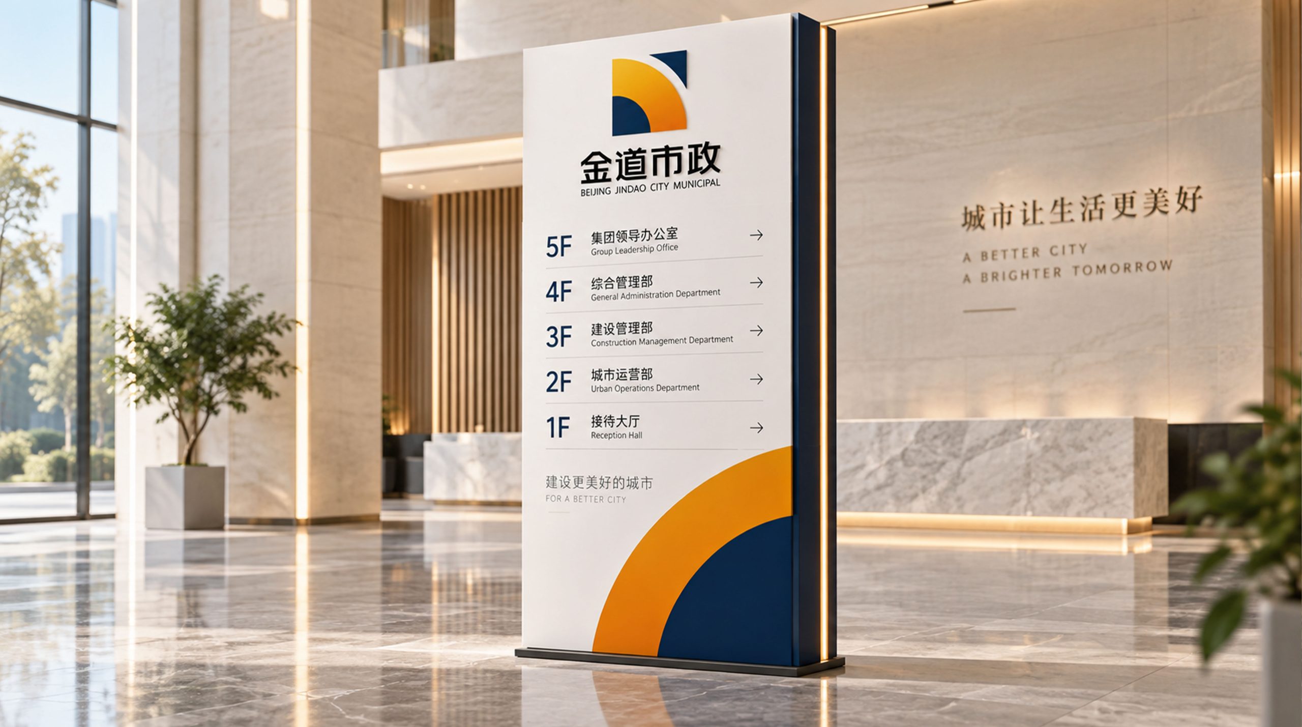
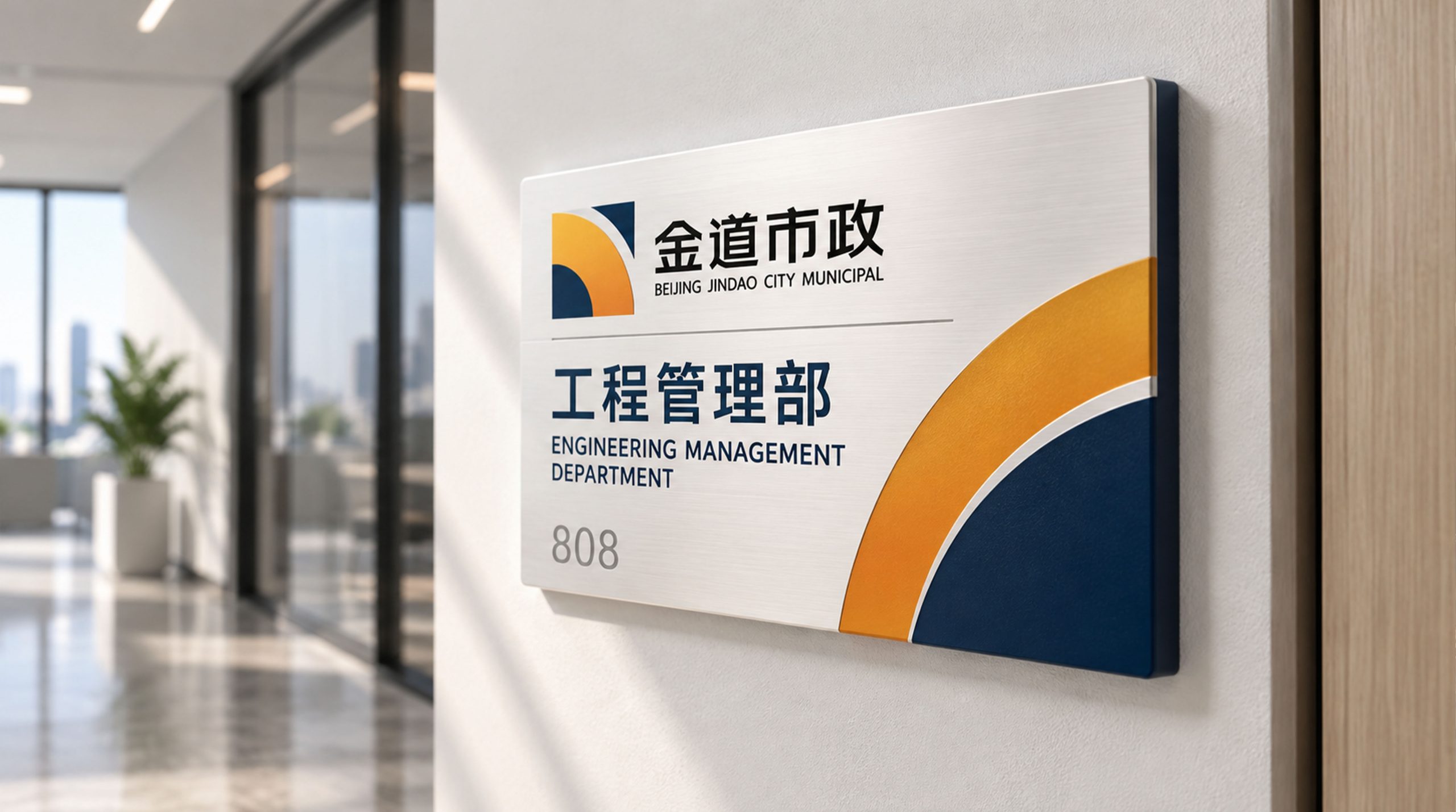
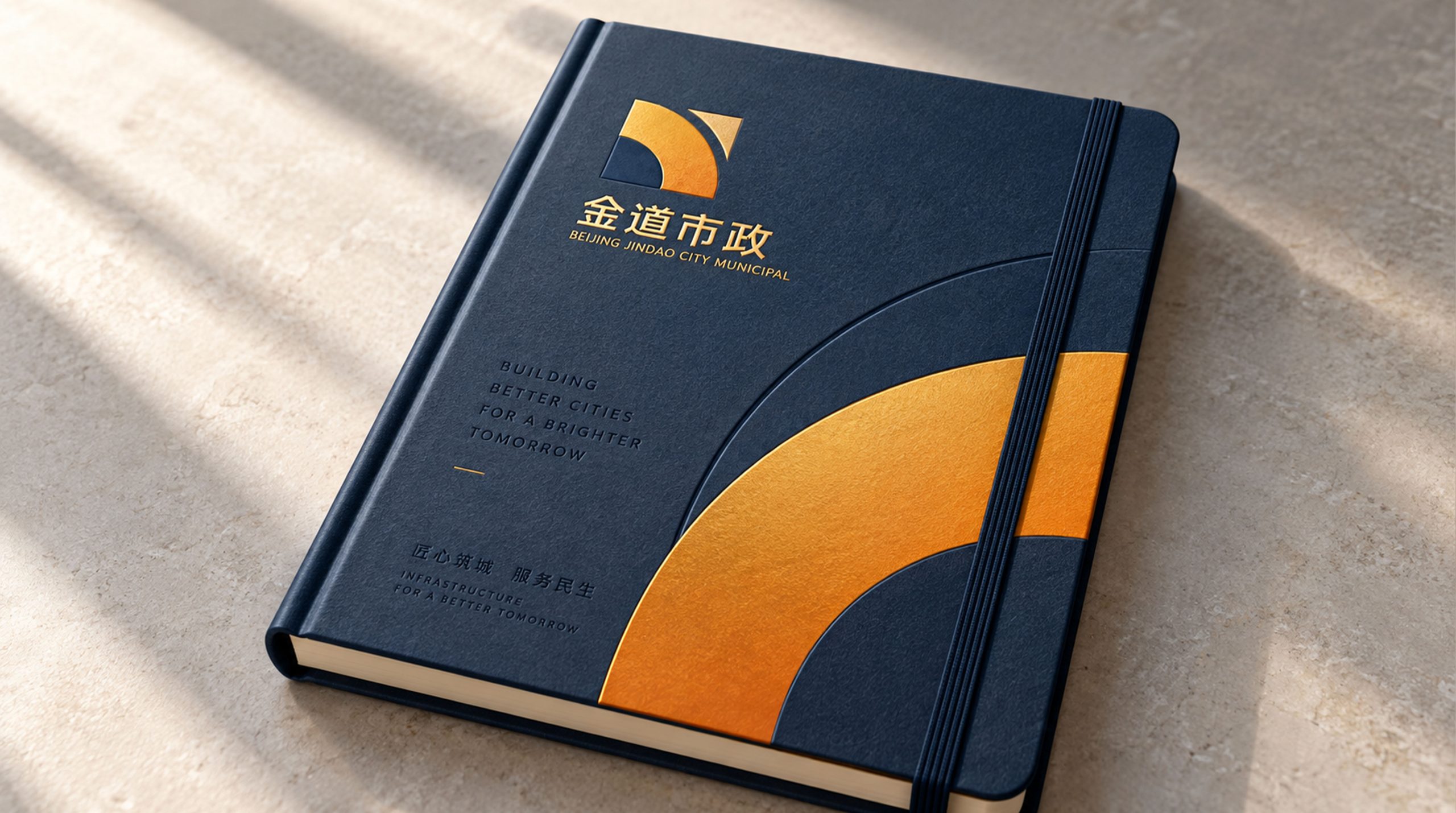

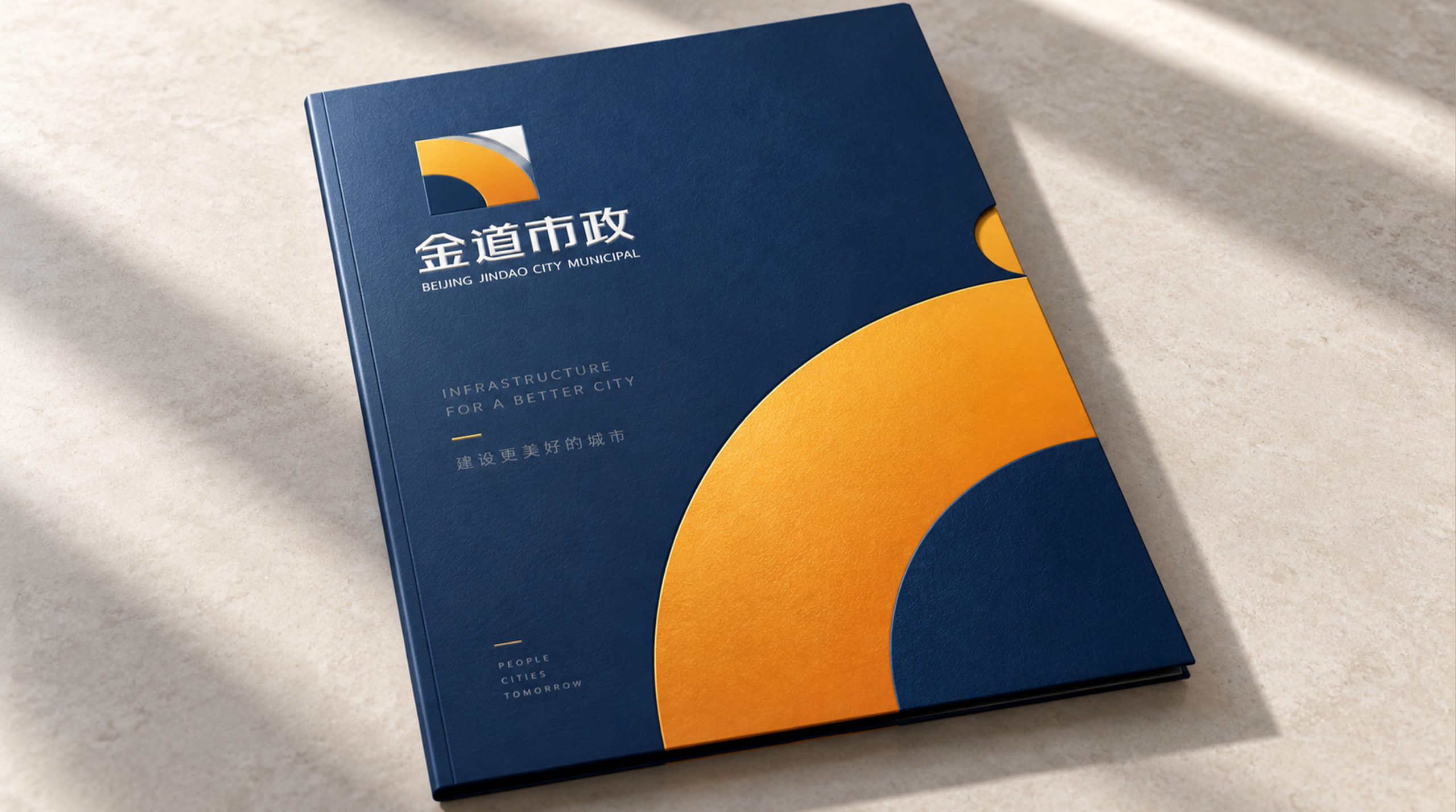
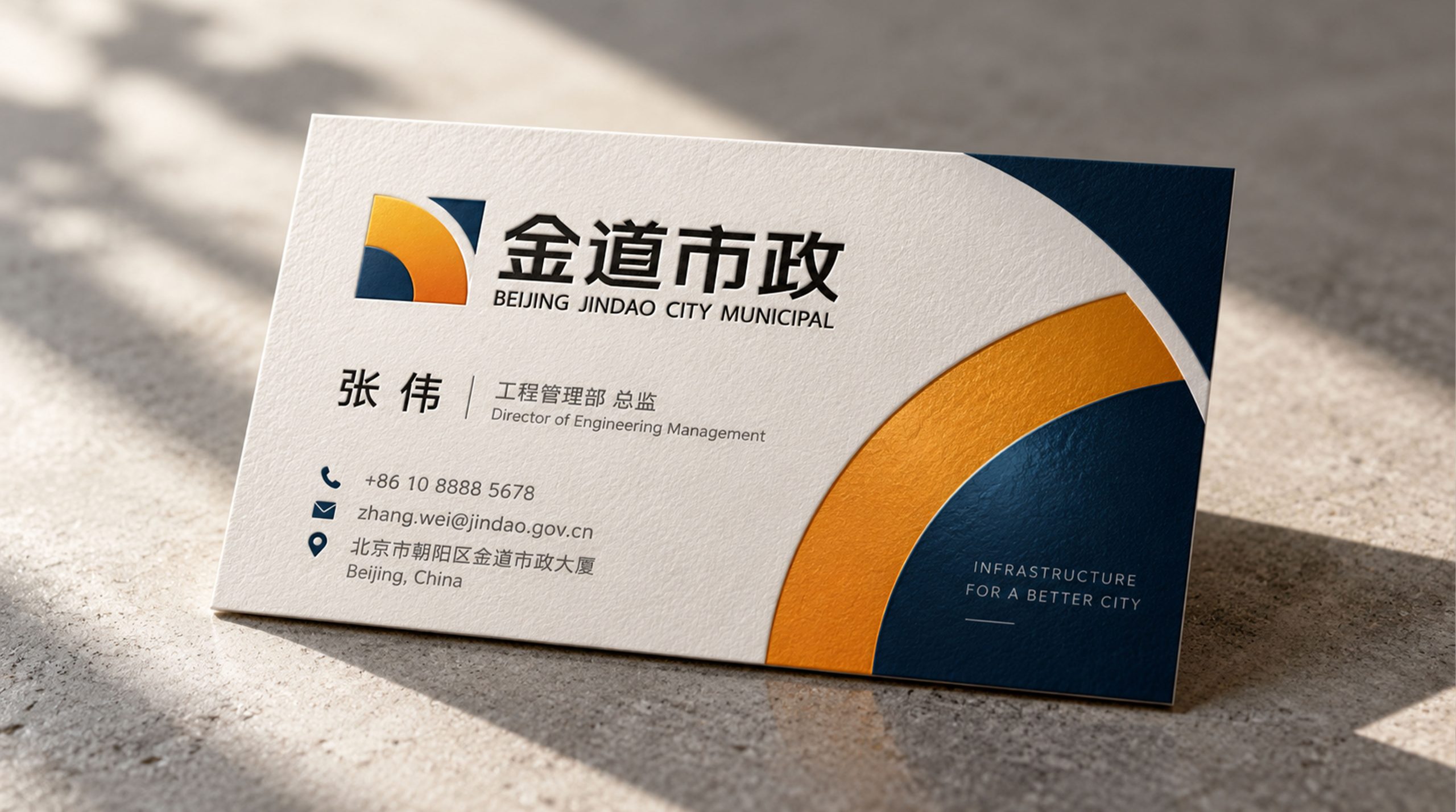
design results
The logo takes "Golden Road" as its core concept, integrating a straight road with a solid engineering structure. Roads are the core achievements of municipal projects - behind the smooth flow of every avenue is the sweat and expertise of municipal builders; the golden structure conveys the highest standards of project quality. A golden avenue is the solemn commitment of Jindao Municipal Government to every project.
graphic language
The main body of the figure uses the rules of perspective to present a road extending into the distance. The two curb lines start from the wide area at the bottom of the picture, converge upward at symmetrical angles, and meet at a vanishing point in the distance - just like the classic perspective picture seen when standing on a straight city main road and looking into the distance. The two curb lines are straight and strong with no bends, conveying the technical standards of "straight markings and precise construction" of municipal engineering.
The vanishing point where the two road edge lines converge is marked with a golden rhombus. The rhombus is like a landmark or lighthouse at the end of the road - the goal is clear and the direction is clear, conveying the company's engineering mission of "every road leads to a certain goal". The four sharp corners of the rhombus point up, down, left, and right, implying that the municipal road network extends to all directions of the city.
A thick central line runs through the center of the road, from the bottom of the screen to the vanishing point, just like the clearly marked lane dividers on the road. This central line is the visual backbone of the entire graphic, conveying the execution and engineering discipline of Jindao Municipal Government to "go in a straight line to the end".
Several minimalist vertical short lines can be placed on both sides of the road to imply the rhythmic arrangement of street lights or guardrails, conveying the comprehensive service capabilities of "road + lighting + ancillary facilities" of municipal engineering. The overall composition uses a deep perspective structure of "two lines converging and one leading to the distance" to construct a "golden building of the avenue".
Font composition
The Chinese "Jindao Municipal Government" uses strong modern boldface, with thick and square strokes and full structural strength. The word "gold" is as steady as cast iron, the word "dao" stretches out like an extension of the road, and the word "municipal" calmly converges to clarify the industry attributes. The English "JINDAO MUNICIPAL" is arranged in a standard uppercase sans-serif font with a broad and stable font to ensure professional recognition in project bidding and government cooperation scenarios.
color system
The main color is gold #B8860B, which represents gold quality, engineering value and durability. The golden color is like the luster of compacted gravel in the road base that shines in the sun - solid, thick, and able to withstand rolling, conveying the quality promise of "gold standard, unbreakable for a hundred years" in municipal engineering. Auxiliary road gray #3D3D3D is used for the basic elements of the brand system and engineering documents. Dark gray is like the calm color of asphalt pavement - asphalt is the paving material of municipal roads, and gray is directly related to the material body of "road". The combination of gold and gray conveys "gold standard + true color of the road". Auxiliary Safety Orange #E8700A is used for construction safety and site identification elements in brand systems. Orange is the most common safety warning color in the global engineering and construction industry. Pure white #FFFFFF as standard base color. The overall color uses golden gray as the dual core, reflecting the brand temperament of "sturdy quality and sound engineering".
Application extension
The logo can be widely used in corporate headquarters and project department logos, construction site fencing and safety signs; project bidding documents, construction organization design and completion report covers; official websites, corporate management platforms and social media images; municipal engineering industry summits, construction expos and government cooperation project images; engineering vehicle painting, safety helmet logos and workwear chest tags. At the completion and opening ceremony of a large-scale municipal road, the Golden Road logo was presented as a large metal sign at the starting point of the road. The perspective extending road graphics merged with the real new road behind it - the brand symbol and the engineering results were unified in the same line of sight. In the dynamic vision, the two edge lines quickly extend and converge from the bottom of the screen to the distance. The center line runs through the entire process with golden light, and the vanishing point diamond lights up in the distance, symbolizing that every avenue created by Jindao Municipal Government leads to a better future for the city.
brand meaning
The logo contains three core images: Golden Standard - the golden tone conveys the highest standard of municipal engineering quality and durability; Road to the Future - the perspective extension of the road conveys the core function of municipal engineering connecting the city and the future; Solid Execution - the straight lines and square structure convey the engineering company's professional capabilities of precise construction and strict discipline. The overall design conveys the brand vision of "Gold Casting Quality, Traveling Thousands of Miles".
Improper Usage (Protection Specification)
Do not change the perspective convergence angle of two road edge lines or change a straight line into a curve; do not delete the center line or vanishing point rhombus; do not change the hue of the main color of Jindao Jin; do not add gradients, strokes or soft decorations inconsistent with the engineering style; do not separate any component of the road structure for separate use; keep white space ≥ 25% of the graphic height; the minimum display width shall not be less than 25mm.
design results
After the release of the logo, Jindao Municipal's brand recognition and industry influence in the field of municipal engineering construction have been significantly improved. With its visual language that conveys the power of engineering and the quality of gold, "Dao Jinzhu" has become the core identification symbol of the brand system, showing the brand vision of "quality of gold casting, the road to thousands of miles".