










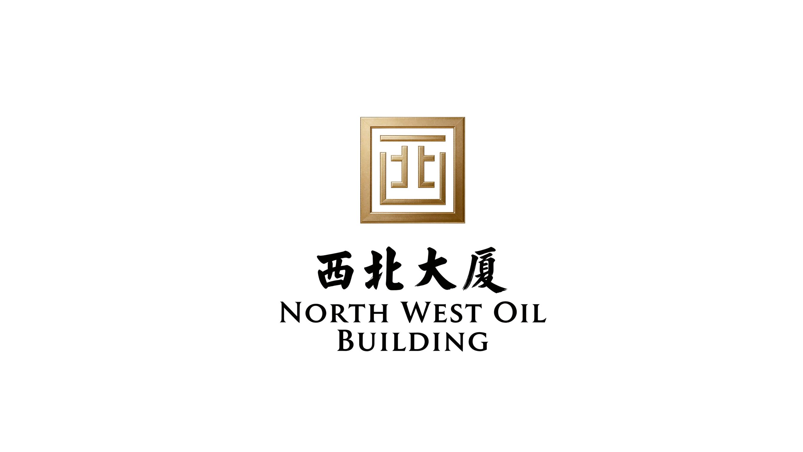
Northwest Tower is a comprehensive hotel rooted in northwest China with profound historical and cultural heritage. It provides business reception, conference banquets, and cultural tourism accommodation as its core services. It has been the flagship of the local high-end hotel industry for decades, carrying the collective memory of generations of northwest hospitality.
The four characters of the brand name "Northwest Building" carry distinct regional identity and industry weight - "Northwest" is a geographical coordinate, a cultural label, and a resounding gold-lettered signboard; "Building" not only defines the grand size of the hotel building, but also conveys the brand's weight and status in the industry. Qingmei Future was commissioned to lead the brand identity design.
Based on the hotel characteristics and profound historical culture of Northwest Tower, Qingmei Future focused the design on how to skillfully integrate the golden signboard "Northwest" into the corporate image. The plan uses the word "Xi" as the basic graphic, and integrates the word "Bei" into its internal structure, so that the two characters "Northwest" merge into one. The golden frame symbolizes the hotel windows, which is closely connected with the industry attributes. The font is set in a thick and round calligraphy, reflecting the profound history and culture of the Northwest Building.
design concept
The logo takes "Northwest in One Frame" as the core concept and creatively integrates the Chinese characters "Xi" and "Bei" in a structural manner, so that the two independent Chinese characters share strokes and merge into one, forming a clever logo that "looks like one character at first glance, but two characters are hidden upon closer inspection". The golden square border is like a hotel window - open a window and see the entire northwest.
graphic language
The graphic uses the outer frame of the Chinese character "Xi" as the basic graphic. The Chinese character "Xi" naturally has an approximately square outer outline in the structure of the Chinese character - a horizontal capping at the top, two vertical walls on the left and right, and an arc closing at the bottom, forming a nearly rectangular "mouth"-shaped frame. This frame is like the frame of a window, which naturally has the visual association of "window" in the hotel industry.
The key creative treatment lies in the internal structure of the word "Xi". The interior of the original character "Xi" is a combination of two vertical strokes and a horizontal fold - Qingmei Future has exquisitely reconstructed this internal structure and embedded the core strokes of the character "Bei" into the inner space of the character "Xi". The character "Bei" is composed of a vertical stroke on the left half plus a horizontal fold and a vertical stroke on the right half plus a stroke - these strokes, after subtle angle adjustment and positional adaptation, can just replace the original internal strokes of the character "Xi", so that the inside of the character "Xi" simultaneously presents the structure of the character "Bei".
The subtlety of the fusion lies in sharing and double reading - the outer frame reads "West", the inner pen reads "North", or the whole reads "Northwest" at the same time. The first thing the viewer sees is a square Chinese character graphic. Upon closer inspection, they find that the complete information of the word "Northwest" is hidden in it. This design method of "hiding words in words" has a long history in traditional Chinese patterns and seal art, conveying the profound historical and cultural heritage of the Northwest Building.
Font composition
The "Northwest" fusion font itself is the core logo of the brand, and the thick and round calligraphy strokes are its irreplaceable style features. "Building" is presented in matching calligraphy. The English "NORTHWEST HOTEL" is arranged in a stable uppercase serif font. The classic shape of the serif and the historical sense of the calligraphy form a cultural dialog that combines China and the West to ensure the brand's recognition in international business reception and tourism promotion.
color system
The main color of the signature gold #B8943E represents the gold signature, nobility and historical heritage. Gold directly represents the brand semantics of "golden signboard" - the word-of-mouth and reputation that Northwest Building has accumulated in the local area for decades can stand the test of time like real gold. Gold conveys the distinguished quality and VIP treatment of high-end hotels at the same time. Auxiliary building red #8B1A1A is used for festivals, banquets and cultural event elements in the brand system. The dark red is like the calm color of the vermilion doors in traditional northwest architecture, conveying the hotel's Chinese elegance and hospitality. Auxiliary calm ink #2C2C2C is used for the basic text of the brand system and formal business scenes. The dark ink color is like the rich texture of calligraphy ink. Auxiliary ivory white #FAF5EE is used as the standard base color, just like the warm wall under the warm light in the hotel lobby. The overall color uses gold and ink as the dual core, reflecting the brand temperament of "golden signboard and rich culture".
Application extension
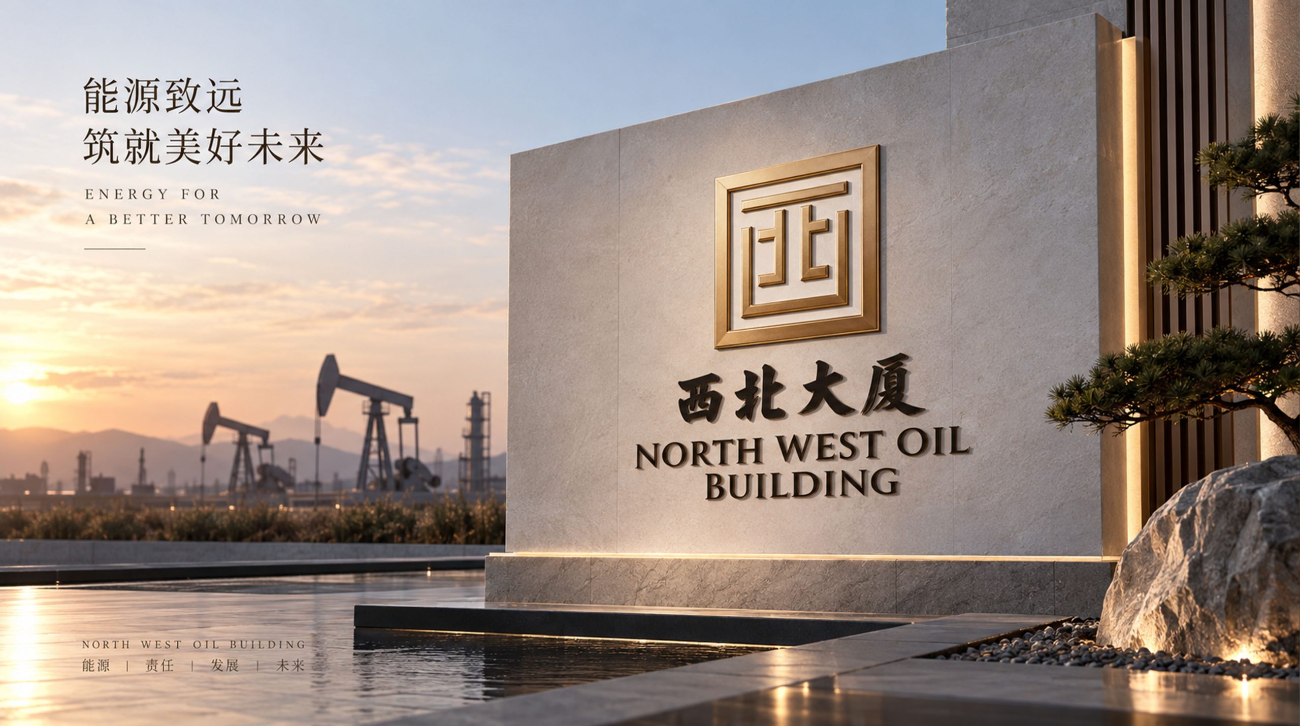
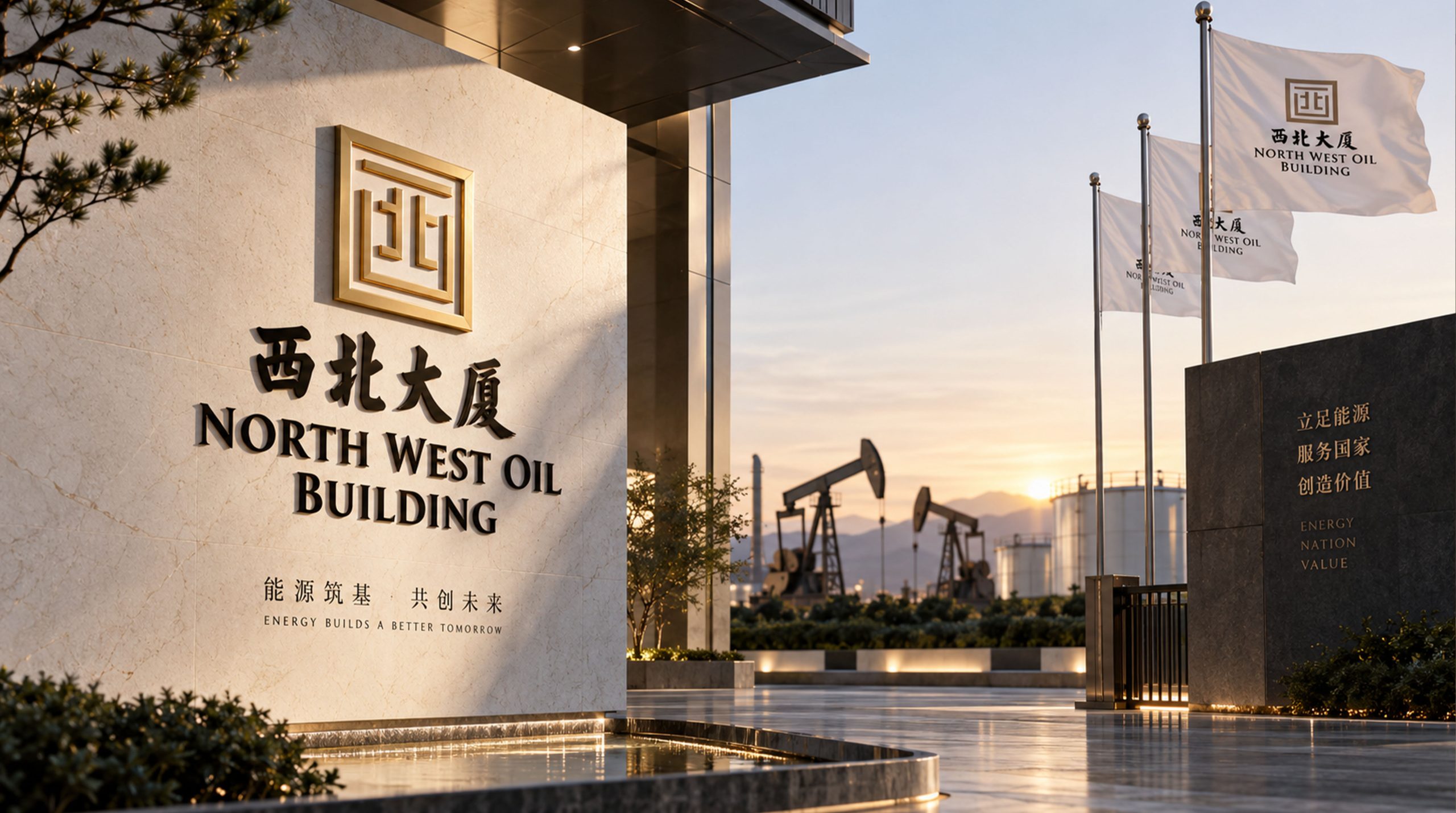
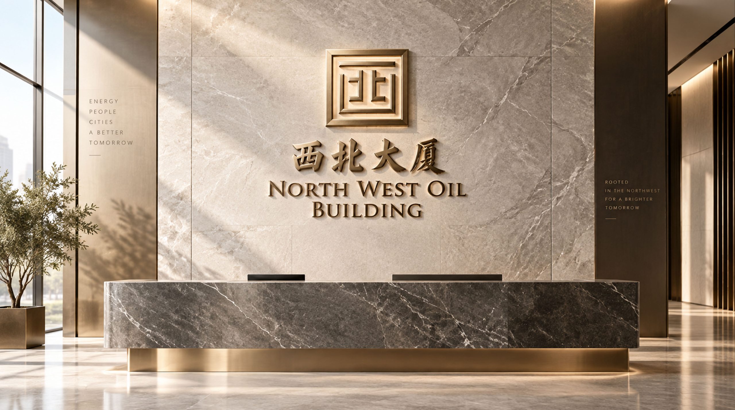
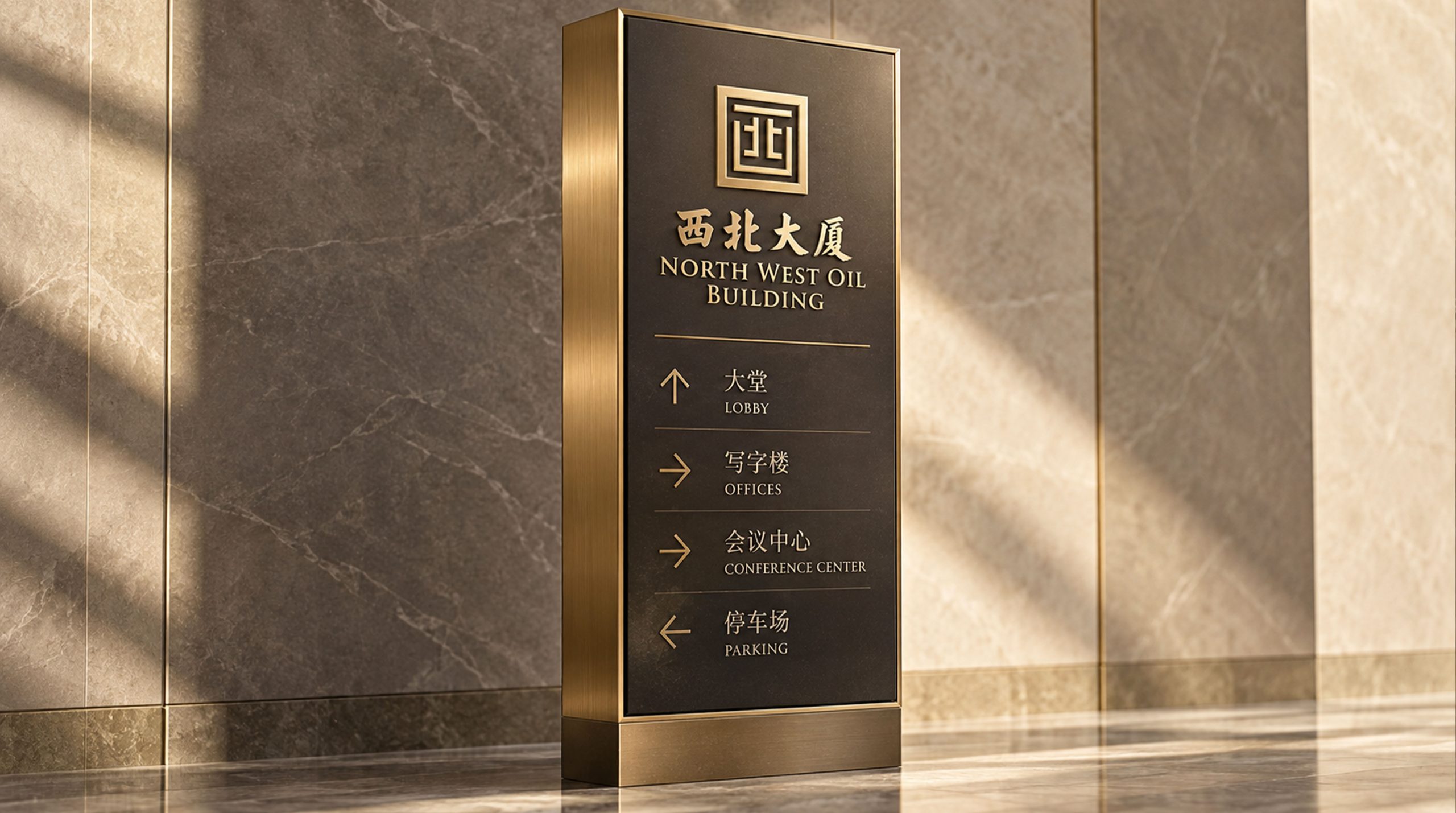
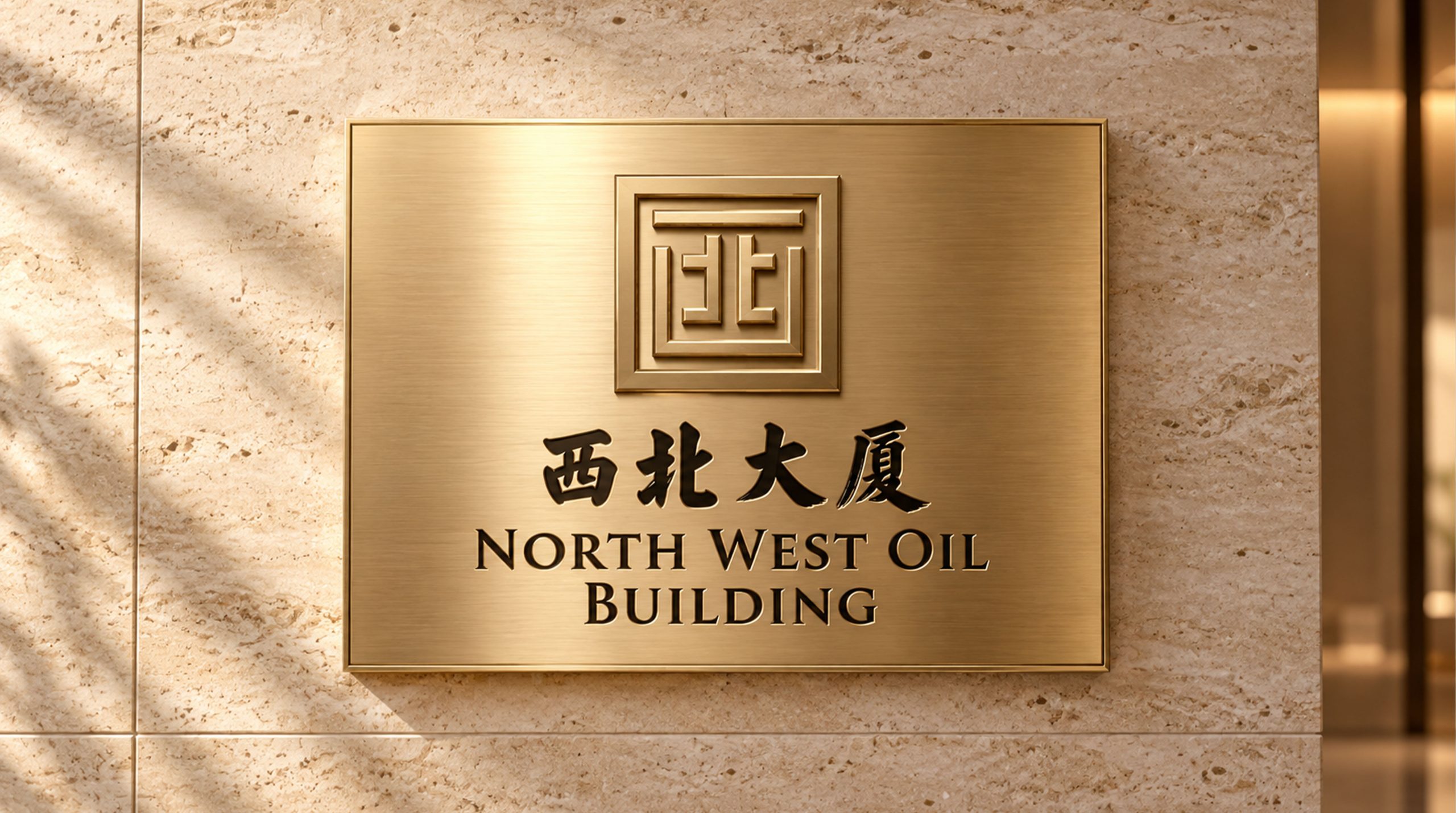
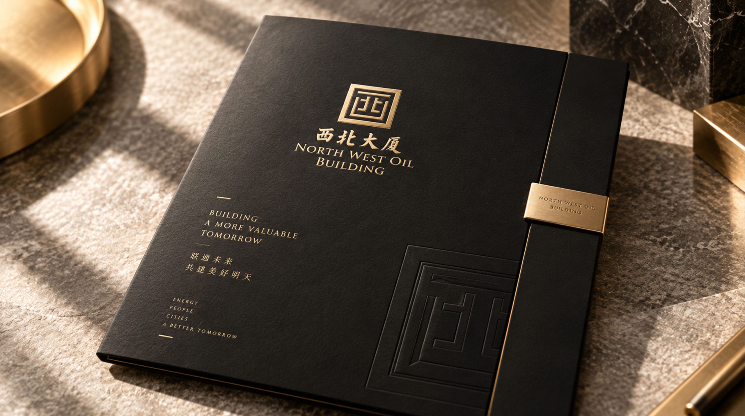
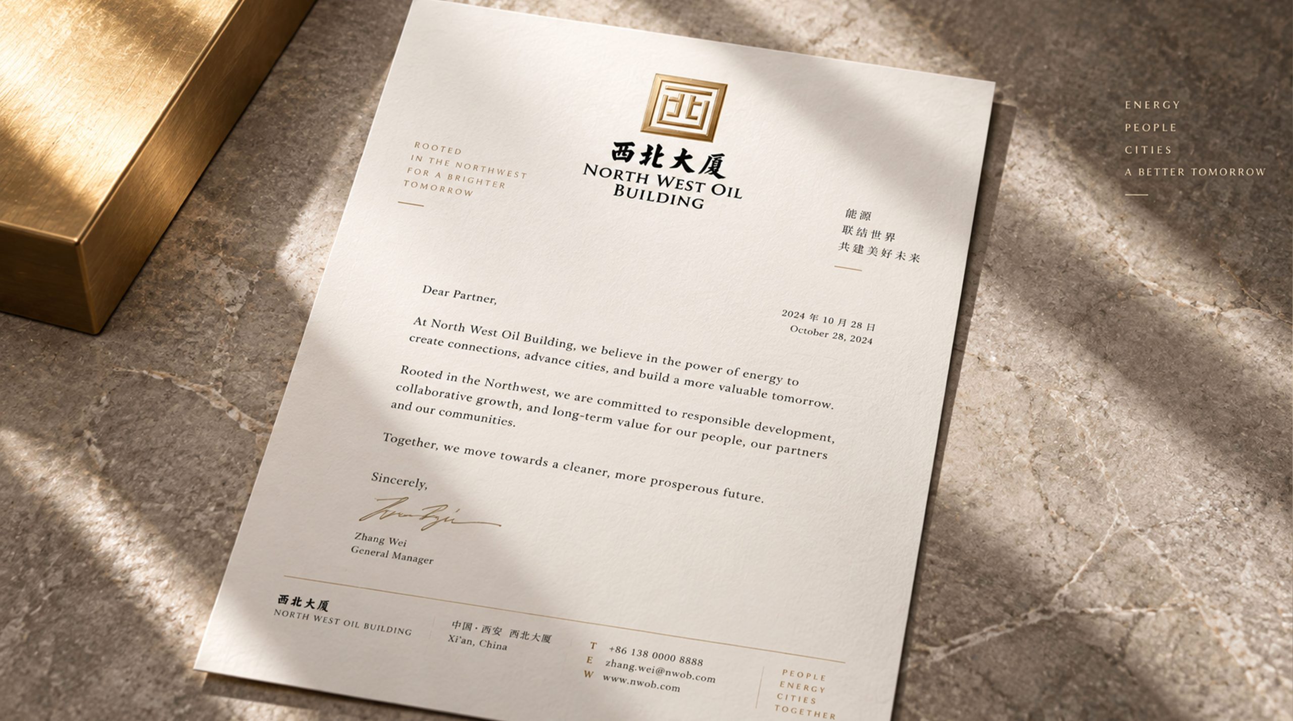
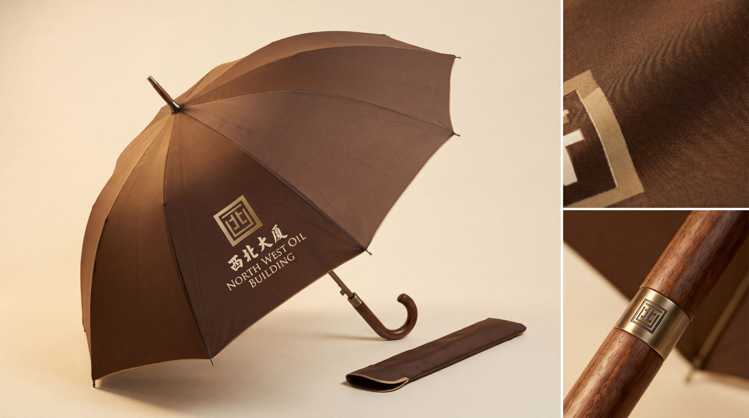
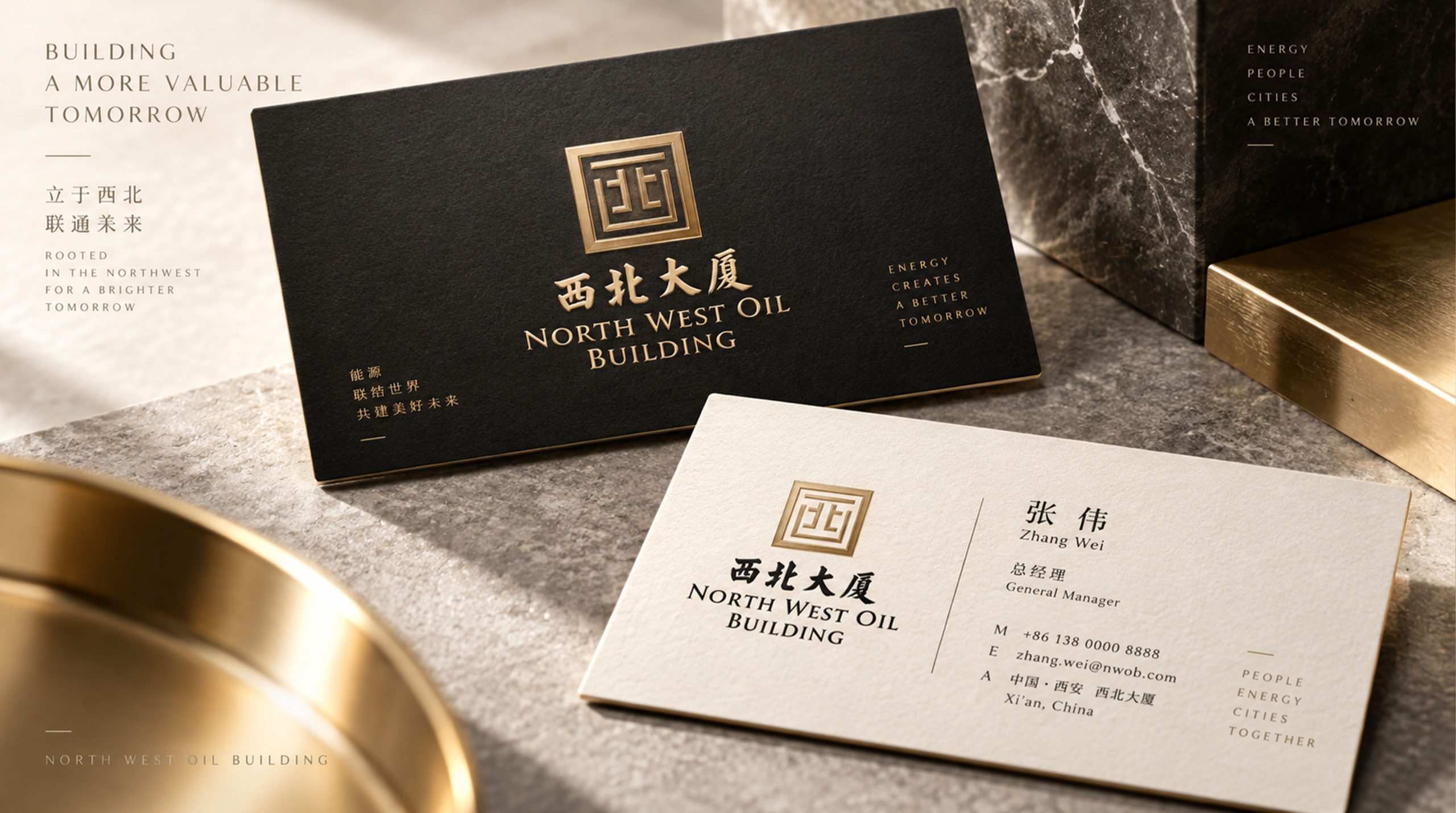
The logo can be widely used on hotel building facades, lobby entrances and front desk image walls; guest room door cards, welcome envelopes, catering menus and banquet invitations; official websites, online booking platforms and social media images; hotel industry selections, cultural tourism promotion and government reception event images. Above the main entrance of the hotel lobby, the golden "Northwest" fusion logo is presented in copper relief on the dark stone background wall. The thick and round calligraphy strokes exude a steady metallic luster under the warm light. Guests can feel the weight and warmth of this golden sign accumulated over decades at the first sight when they enter the lobby. On the window sill of the guest room, a delicate welcome card is printed with a golden "Northwest" window frame logo - guests look out at the city scenery through the real window, look down and see the window frame logo on the card, and feel the brand's artistic conception of "open a window and see the entire Northwest" between reality and reality.
brand meaning
The logo contains three core images: Golden Legacy - the golden frame and the fusion of "Northwest" directly represent the brand's golden legacy accumulated over decades, conveying the weight of word-of-mouth and credibility; Hotel Window - the window frame shape is closely linked to the attributes of the hotel industry, conveying the service promise of "behind every window is a warm hospitality"; Cultural (Cultural) Heritage) - The thick and round calligraphy conveys the profound historical and cultural heritage of the Northwest Building and the simple and profound humanistic temperament of the Northwest region. The overall design conveys the brand vision of "Northwest Gold Medal, Honesty and Welcome".
Improper Usage (Protection Specification)
Do not split the fusion structure of the words "Xi" and "Bei" to make it appear independently; do not change the square proportion of the golden frame or replace right angles with rounded corners; do not replace calligraphy strokes with geometric equal-thick lines; do not change the hue of the main gold color of the signature; do not add gradients, strokes or decorative effects inconsistent with the hotel style; keep white space ≥ 25% of the graphic height; the minimum display width must not be less than 25mm.
design results
After the logo was released, Northwest Tower's brand recognition and guest awareness in the fields of hotel services and cultural tourism have significantly improved. "One Window Hidden Northwest" uses the creative technique of cleverly integrating the words "West" and "North" into a window frame, which not only maintains the complete identification of the golden signboard "Northwest", but also closely links the attributes of the hotel industry with the golden window frame. The thick and round calligraphy injects profound historical and cultural warmth into the brand, becoming the core identification symbol of the brand system, showing the brand vision of "Northwest Gold Medal, Kindness and Welcome".