










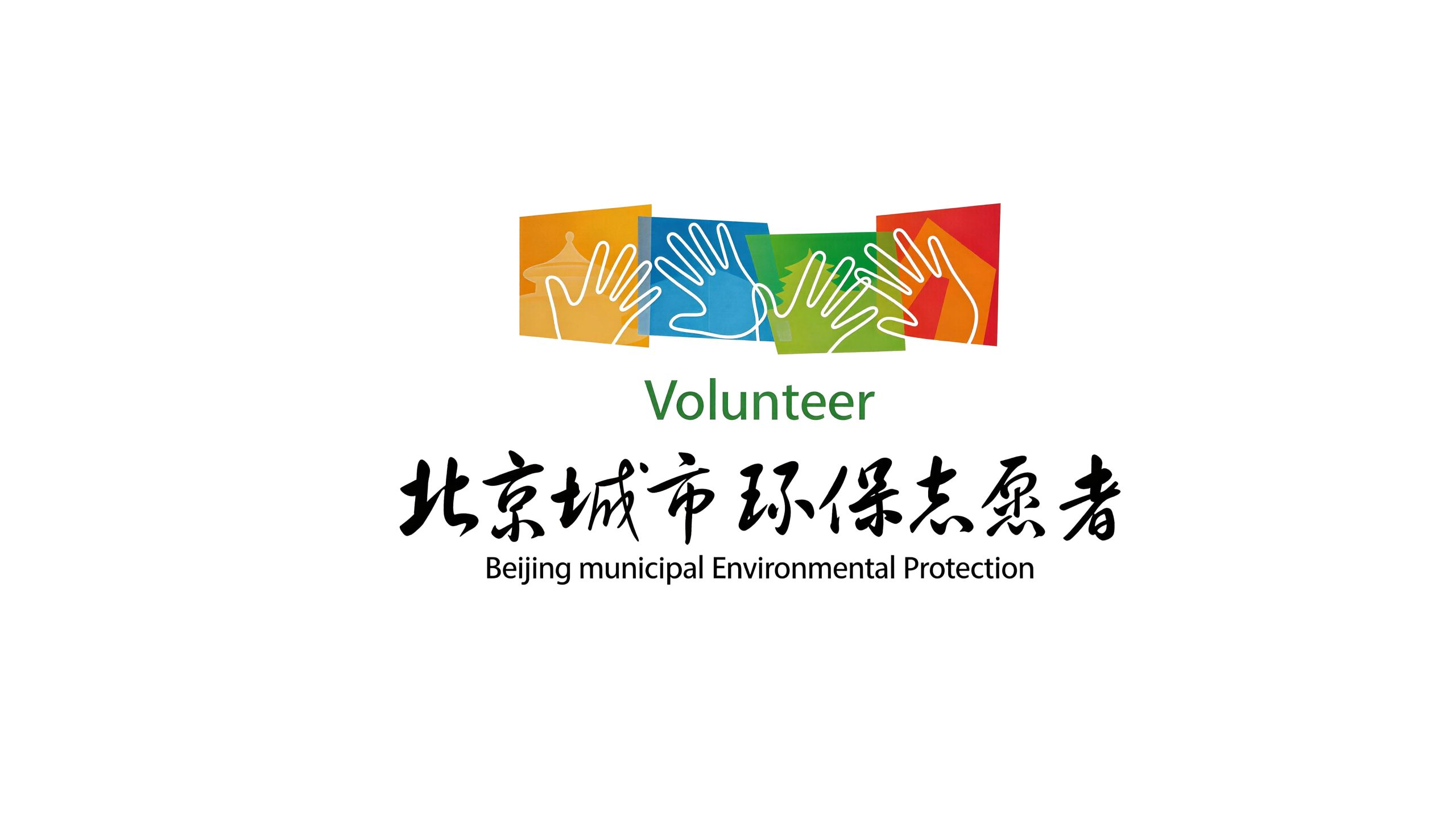
Beijing Environmental Protection Organization is a public welfare environmental protection organization rooted in the capital and facing the whole country. It is committed to promoting air management, water source protection, garbage classification, ecological restoration and public environmental awareness education, and using practical actions to protect the blue sky, green water and green mountains of the capital.
The brand name directly carries the dual identity of the organization - "Beijing" anchors the geographical coordinates of the capital and its responsibility for demonstration and leadership, while "Environmental Protection Organization" clarifies the core mission of public welfare and environmental protection. Qingmei Future was commissioned to lead the brand identity design.
The design goal of the brand logo is to convey the brand image of "protecting the capital and moving the future green" through the visual language of ecological protection, green action and the capital's responsibility.
design concept
The logo takes "Green Leaf of Beijing" as its core concept, integrating a natural leaf shape with the urban outline of the Beijing skyline. Leaf is the most intuitive visual symbol of environmental protection. The city outline anchors Beijing's regional identity - a city is hidden in a green leaf, conveying the environmental protection vision of "turning Beijing green".
graphic language
The graphic uses a full leaf shape as the overall outline, with the leaf tip slightly tilted upward, conveying the vitality of natural growth. The leaf edge has a rounded and smooth arc, and the leaf veins extend from the root to the tip of the leaf in a central axis curve.
The interior space of the lower half of the leaf shape is presented in minimalist skyline silhouettes of Beijing’s iconic buildings – the dome of the Temple of Heaven, the dome of the National Center for Good Harvest or the outline of the city tower are outlined with the most refined lines, as if the city is growing out of the green leaves. The silhouette of the building blends naturally with the veins of the leaf, and the city is part of the leaf.
The upper part of the leaf shape remains pure white space or green filling, just like the clean blue sky above the city - the ultimate goal of environmental protection is to restore purity above the city. The overall composition constructs a "green leafy capital" with the internal and external structure of "leaves hide the capital and green covers everything".
Font composition
The Chinese "Beijing Environmental Protection Organization" uses a simple modern sans-serif font with clear and neat strokes. "Beijing" conveys regional identity, and "environmental protection organization" clarifies its public welfare attributes. The English "BEIJING ENVIRONMENTAL PROTECTION ORGANIZATION" is arranged in standard uppercase sans serif font to ensure clear identification in international environmental protection cooperation.
color system
The main color ecological green #2E7D32 represents nature, life and environmental protection. Green is the most consensus core color in the global environmental protection field, directly conveying the public welfare signal of "green, ecological and sustainable". Auxiliary sky blue #42A5F5 is used for elements related to air management and blue sky protection in the brand system. The blue color conveys the environmental protection goal of "returning Beijing to a blue sky". Auxiliary Earth Brown #795548 for soil protection and ecological restoration elements. Pure white #FFFFFF as standard base color. The overall color uses green and blue as the dual core, reflecting the brand temperament of "green water, green mountains, blue sky and white clouds".
Application extension
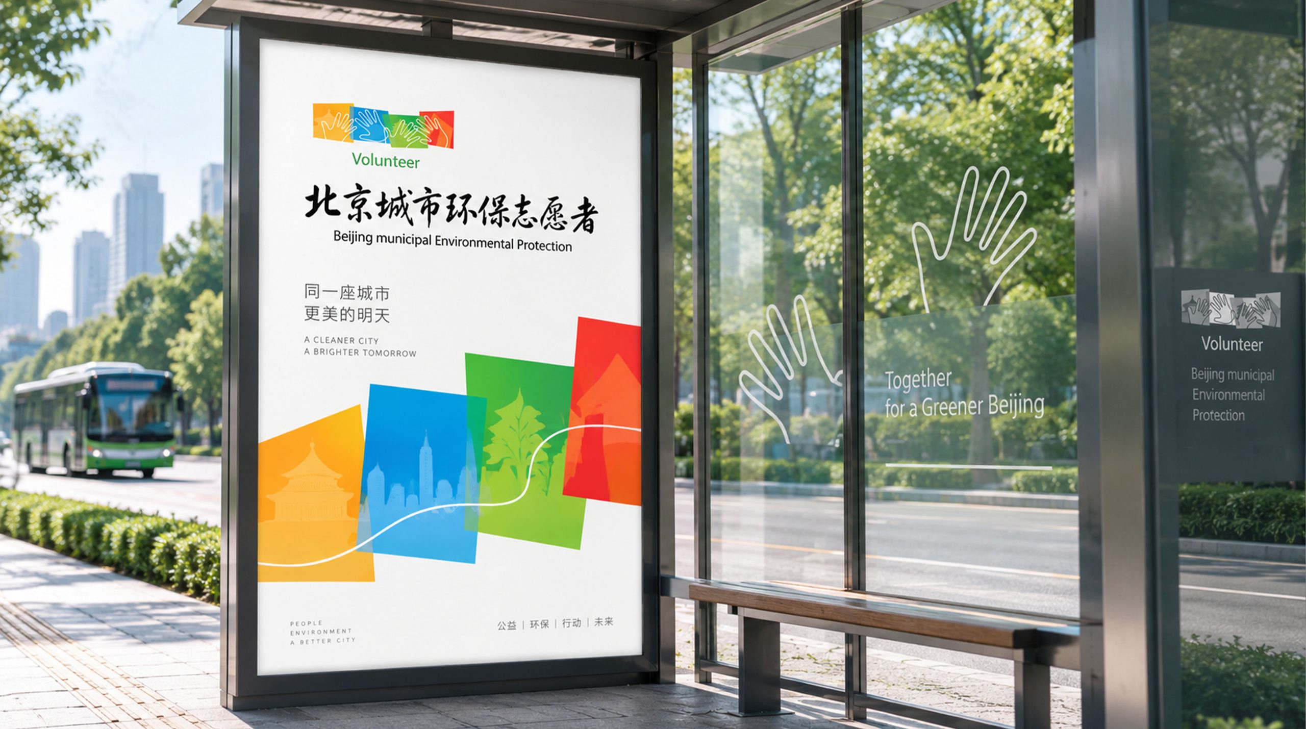
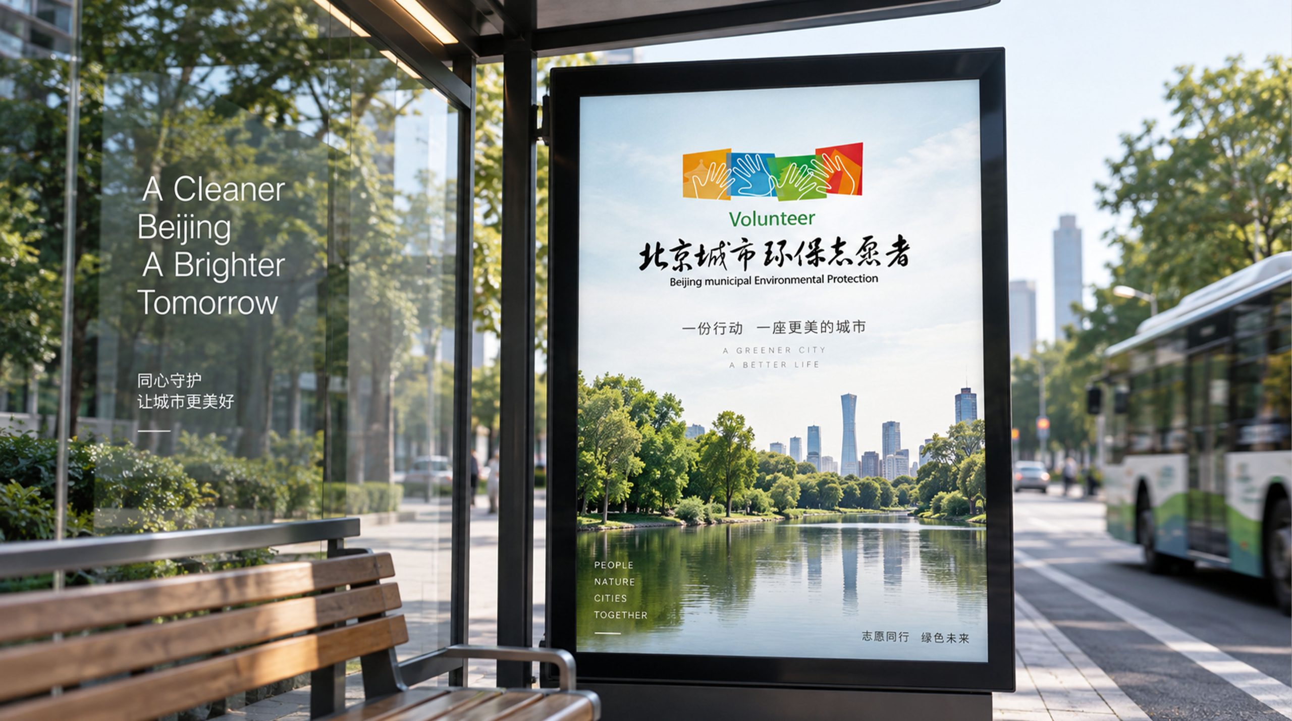
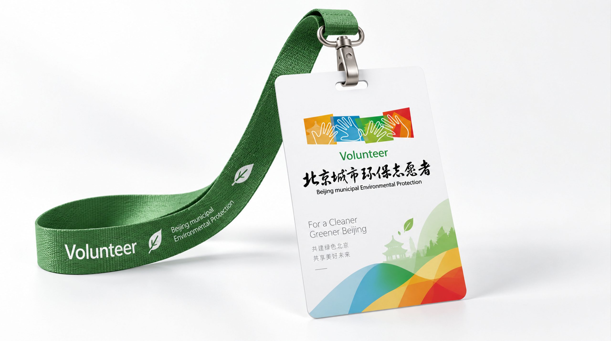
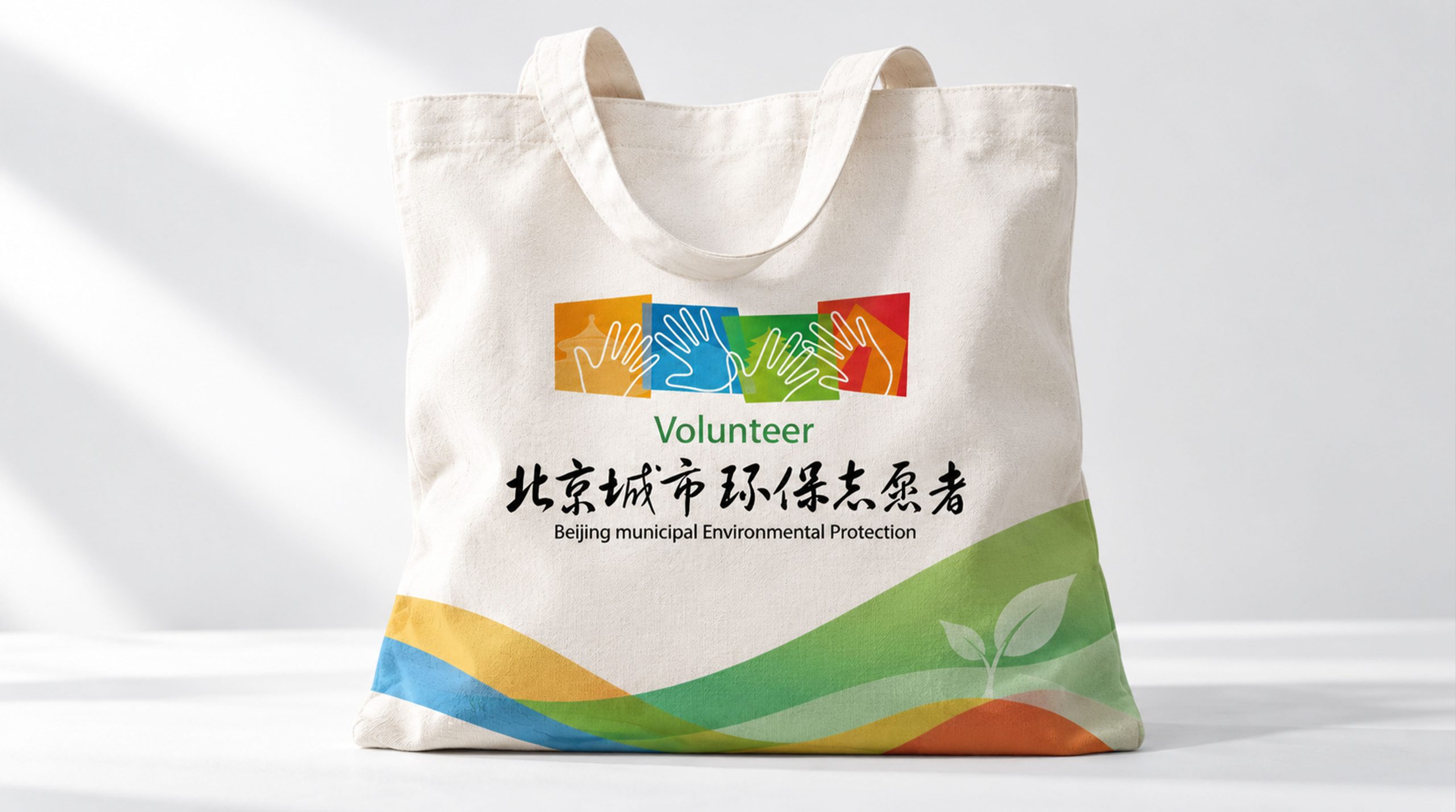
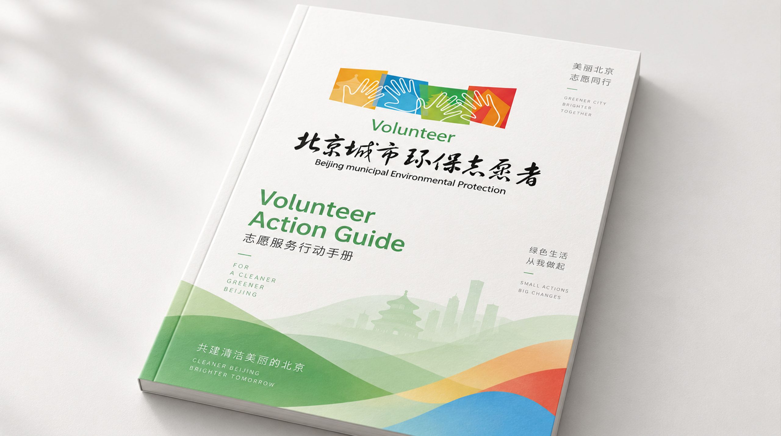
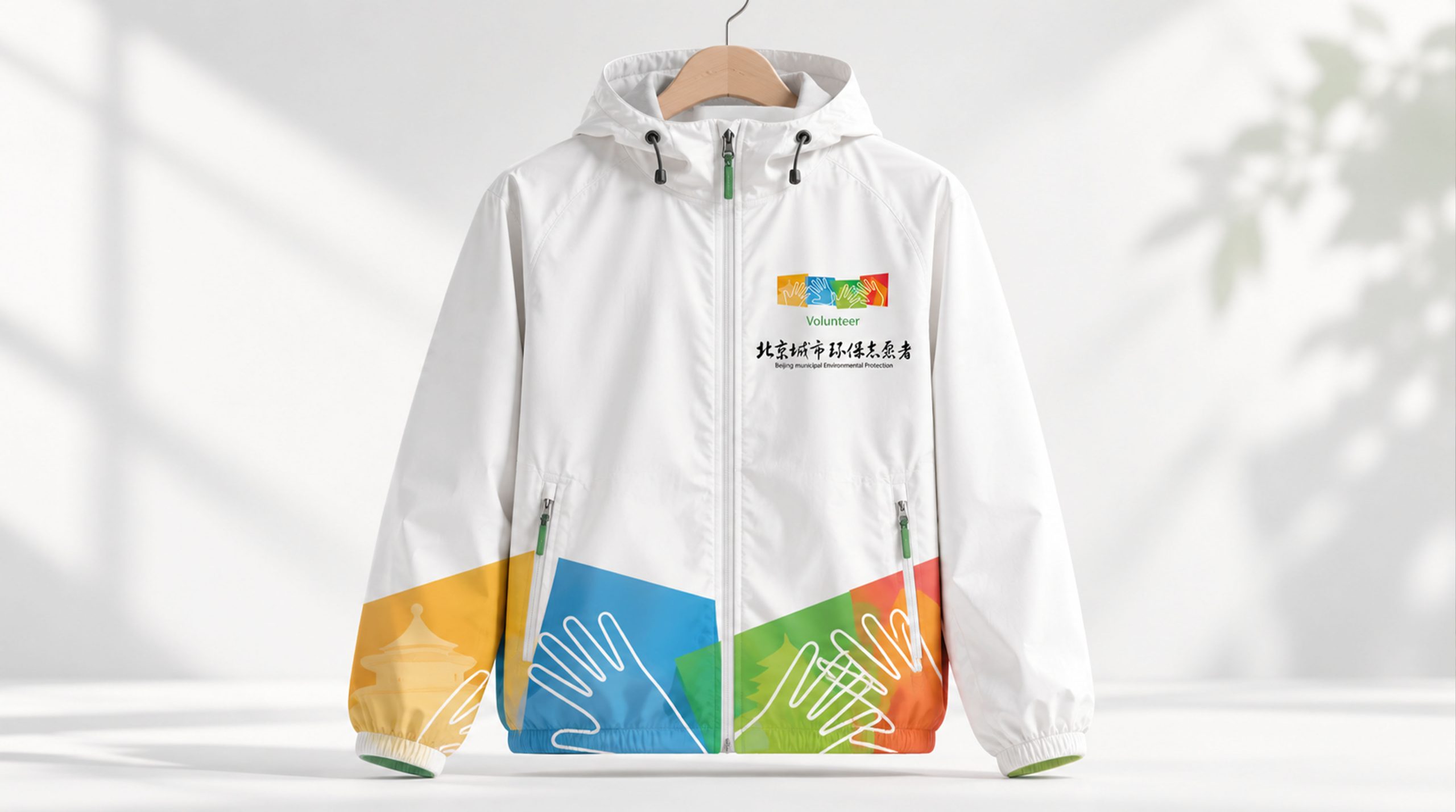
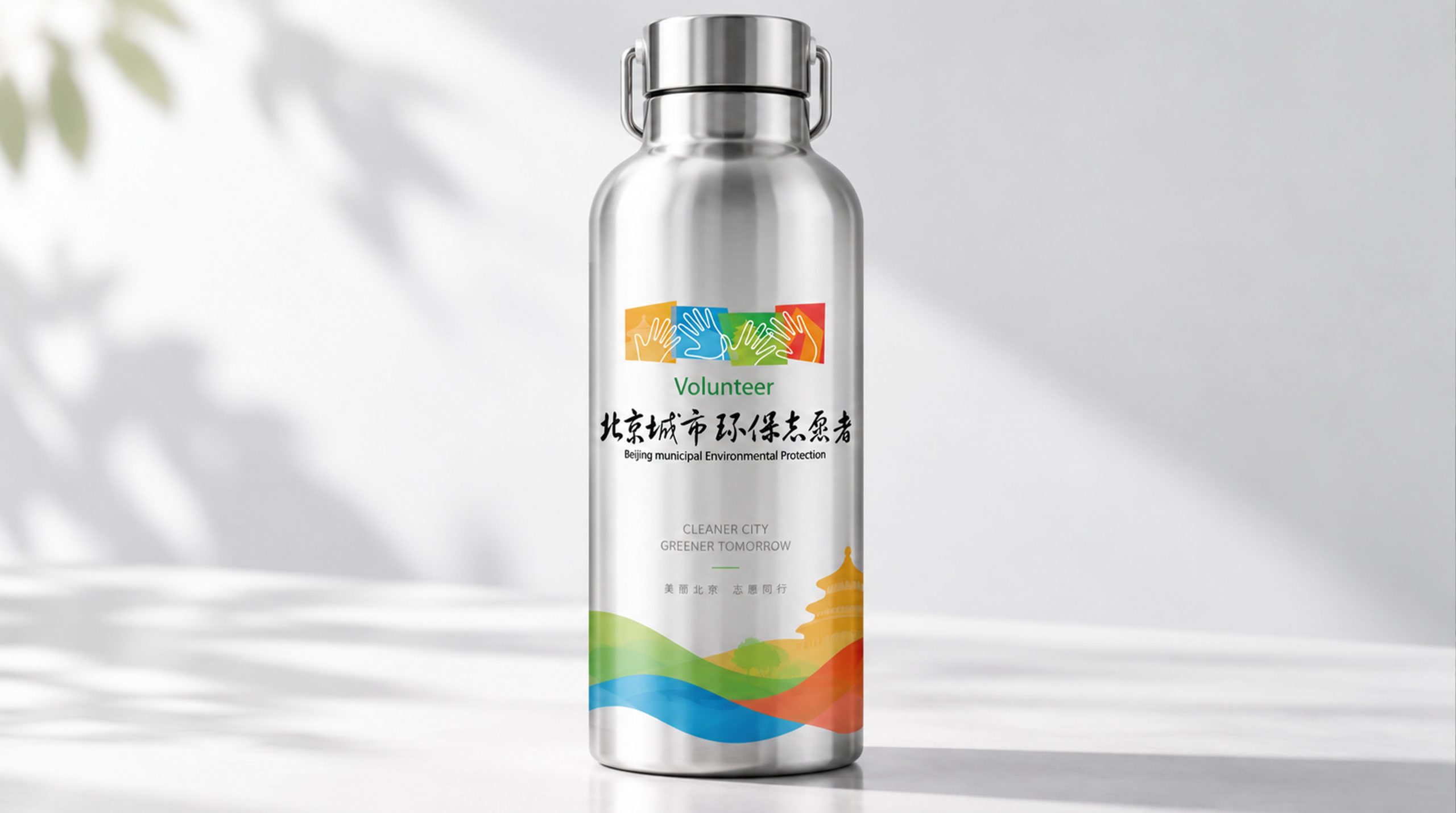
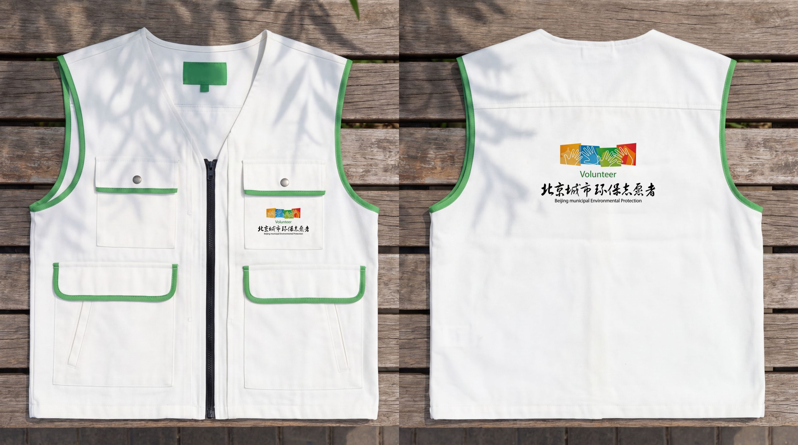
The logo can be widely used in the organization’s headquarters and district site logos; environmental brochures, public education posters and volunteer materials; official website, social media and public welfare communication platforms; World Environment Day activities, environmental protection public welfare forums and community promotion activities. In community environmental protection promotion activities, the Greenleaf Capital logo was presented on a large display board at the entrance of the event. When citizens saw the picture of Ye Zhongzang City, they immediately understood that "protecting the environment is protecting the city we live in." In the dynamic visual, a green leaf slowly unfolds, and the outline of the Beijing skyline gradually emerges clearly inside the leaf, symbolizing the Beijing environmental protection organization's green actions to protect every inch of the sky and land in the capital.
brand meaning
The logo contains three core images: Green Protection - the leaf shape conveys the core mission of environmental protection and the precious value of natural ecology; Capital Responsibility - the skyline of Beijing in the leaf conveys the regional responsibility of taking root in Beijing and demonstrating leadership; Symbiotic Future - the integration of city and green leaves conveys the ultimate environmental protection ideal of harmonious coexistence between man and nature. The overall design conveys the brand vision of "protecting the capital and greening the future".
Improper Usage (Protection Specification)
Do not change the overall outline of the leaf shape or the central axis curve of the leaf vein; do not delete the city skyline within the leaf or replace it with other city outlines; do not change the hue of the main ecological green color; do not add commercial decoration that is inconsistent with the environmental protection style; do not separate the leaf shape and the city silhouette for separate use; keep the white space ≥ 25% of the graphic height; the minimum display width shall not be less than 25mm.
design results
After the release of the logo, the brand recognition and social influence of Beijing environmental protection organizations in the capital's environmental protection and public ecological education fields have been significantly improved. "Green Leaf Capital", with its visual language that integrates natural ecology and urban identity, has become the core identification symbol of the organization, showing the brand vision of "protecting the capital and greening the future".