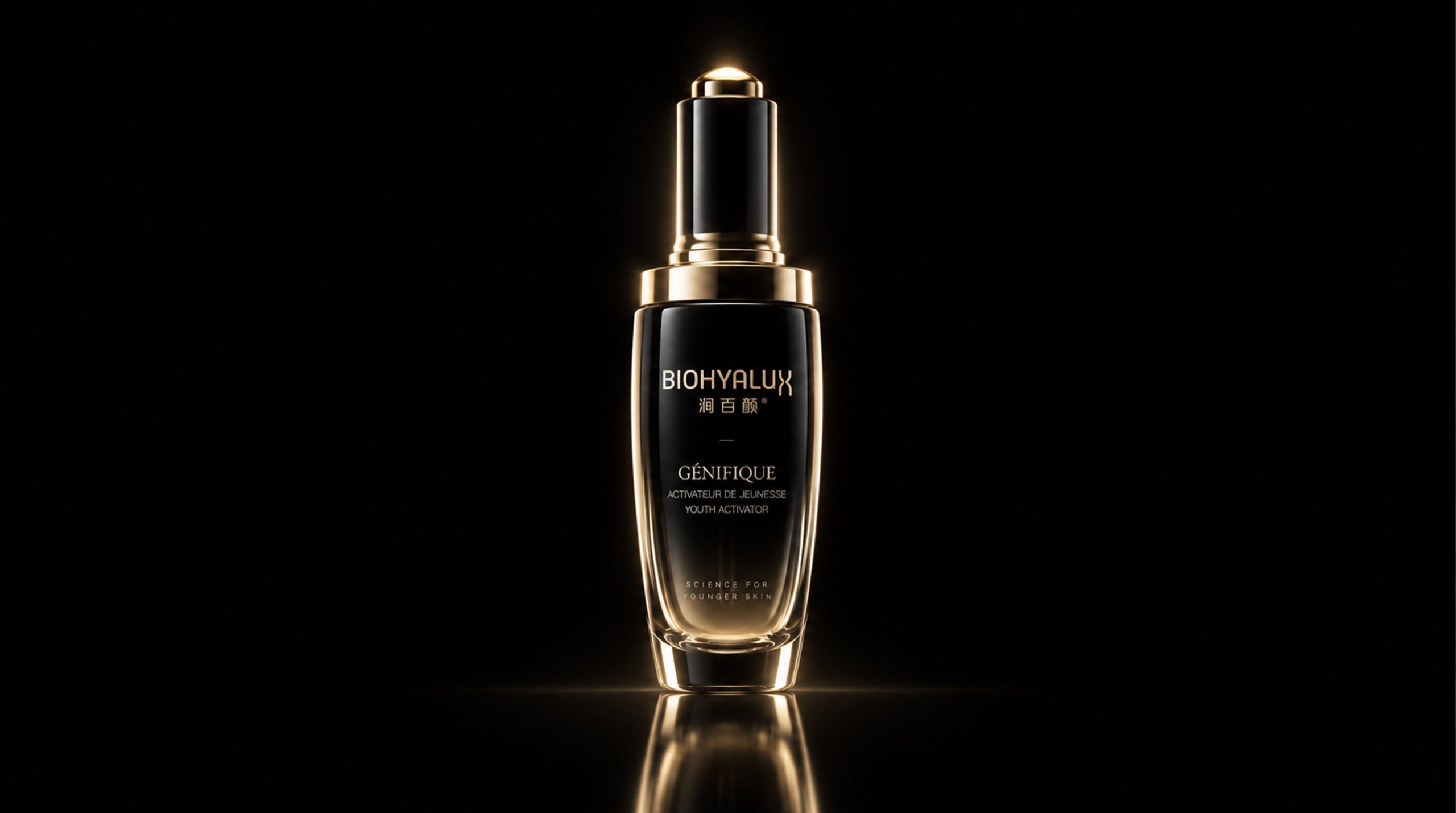









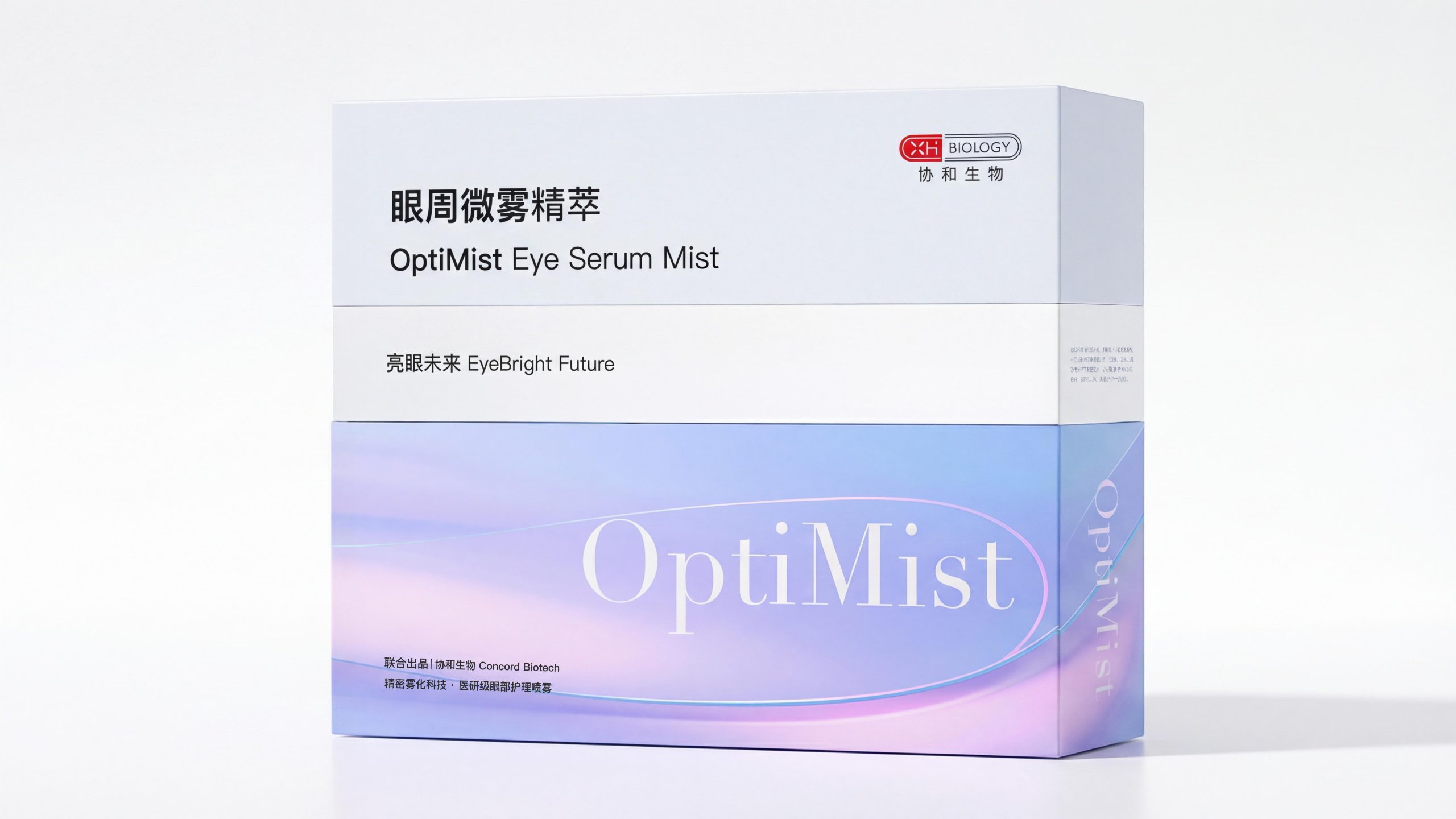
OptiMist Eye Micro Mist Essence, as a medical-grade eye care product under Concord Biotech, carries the brand's profound accumulation in the fields of biotechnology and precision skin care. Concord Biotechnology uses "precision atomization technology" as its core technical barrier to transform medical research results into daily care experiences that consumers can perceive.
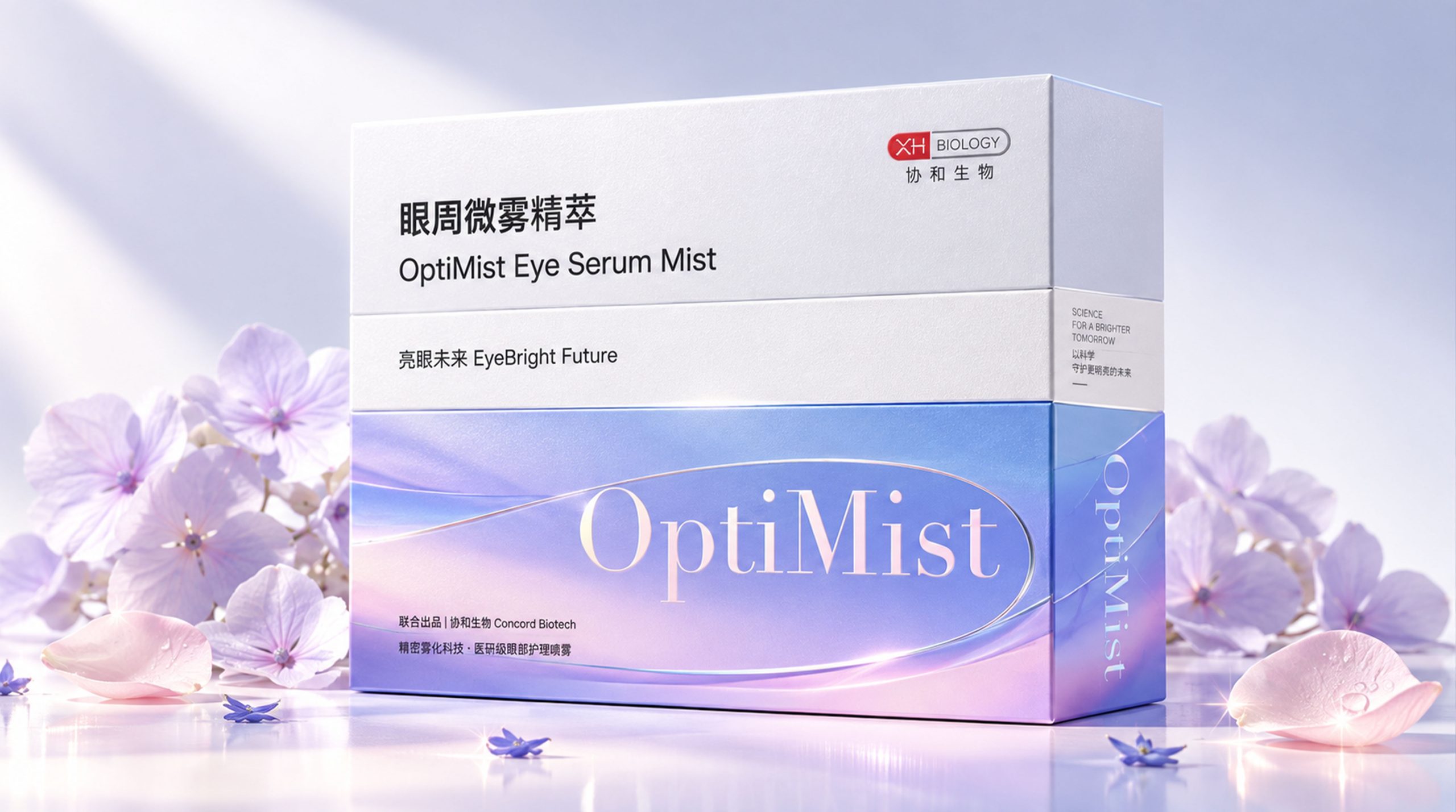
OptiMist's packaging design closely revolves around the brand's concept of "EyeBright Future" and strives to convey a sense of technology, purity and professional trust on a visual level. This packaging design fully integrates modern medical research aesthetics and soft natural color language. Through restrained and exquisite visual expression, consumers can feel the professional quality and gentle care of the product at the first glance.
Brand Essence
The core spirit of the packaging design of OptiMist Eye Mist Essence can be summarized as the following points:
Technology × Purity × Trust
Soft × Precision × Futuristic
These keywords form the spiritual core of the brand. The sense of technology comes from Xiehe Biotech's deep exploration in the field of precision atomization technology - every spray is micron-level precision care; the sense of purity conveys the mildness and safety of the product formula through the color and material of the packaging; trust comes from the "medical research grade" quality endorsement, allowing consumers to have a full sense of security when making choices. The combination of gentleness and precision reflects the brand's utmost respect for the delicate skin area around the eyes - it must be gentle enough but precise enough. The sense of the future echoes the brand's proposition of "bright future" and conveys a firm belief in exploring the frontiers of scientific and technological skin care.
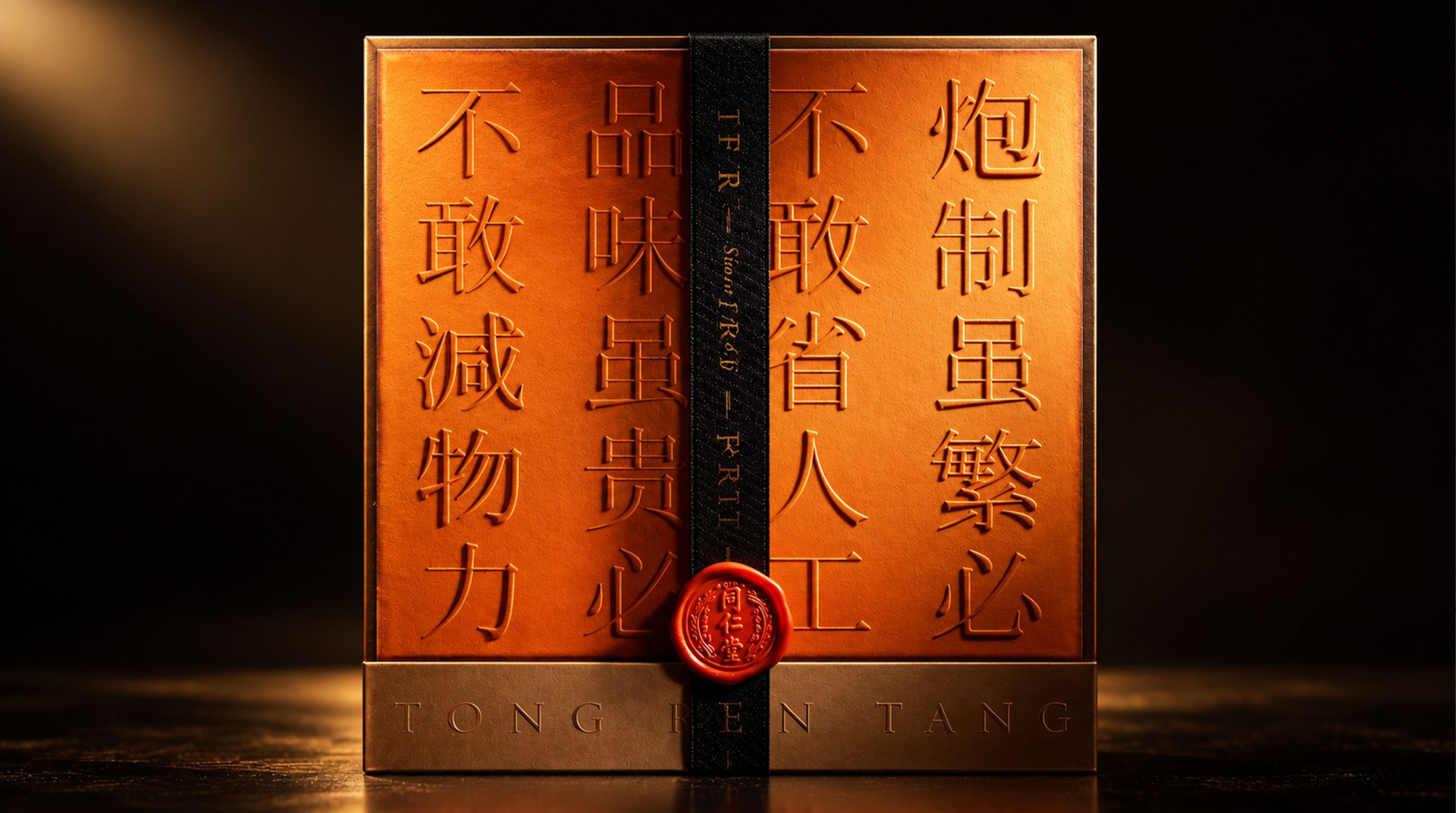
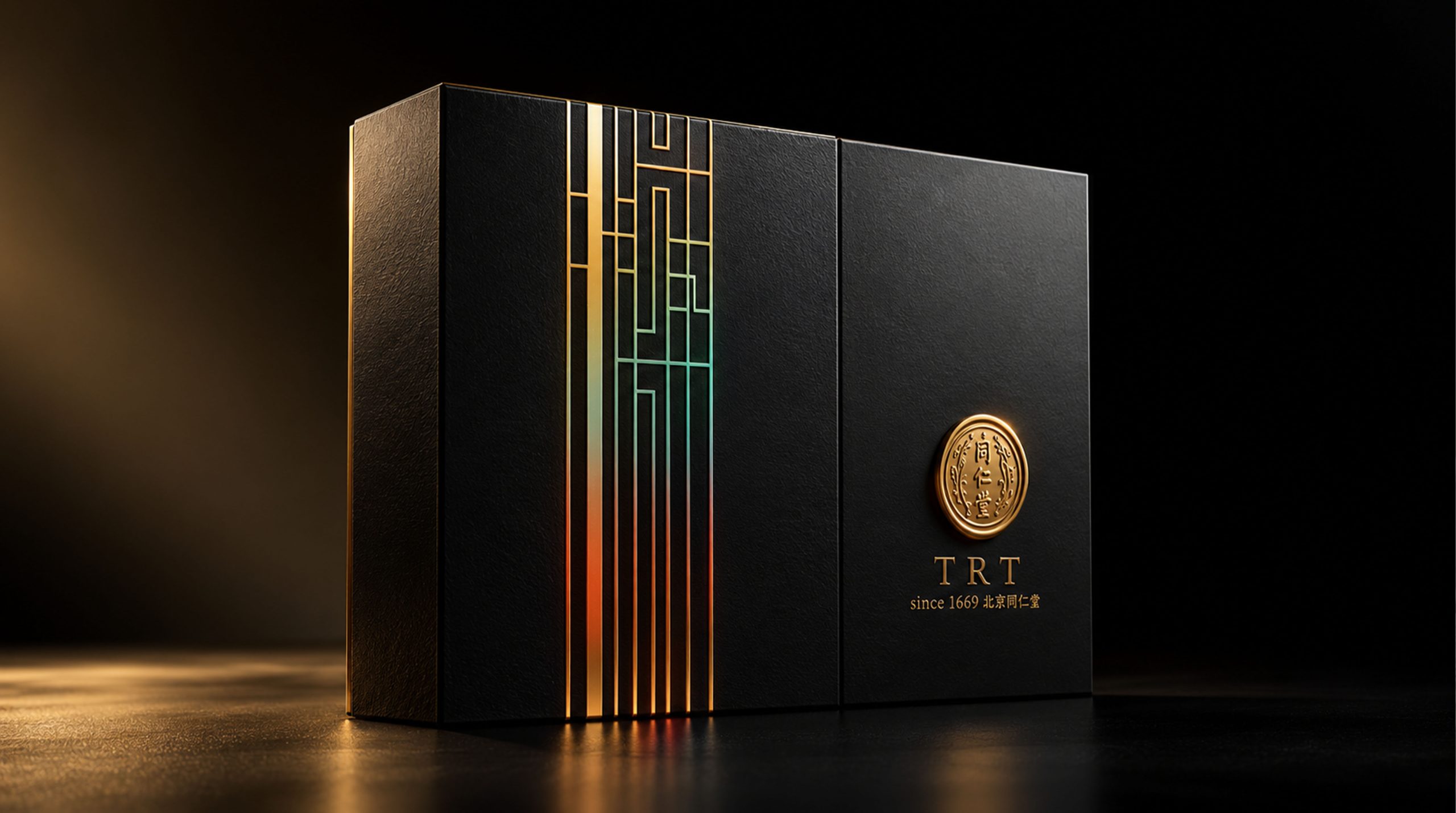
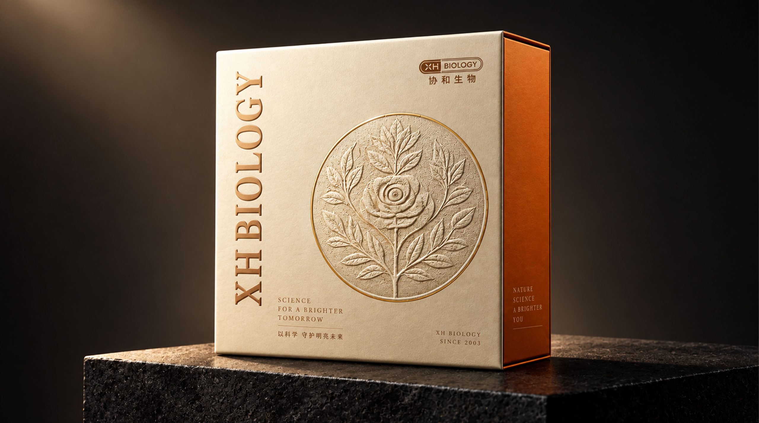
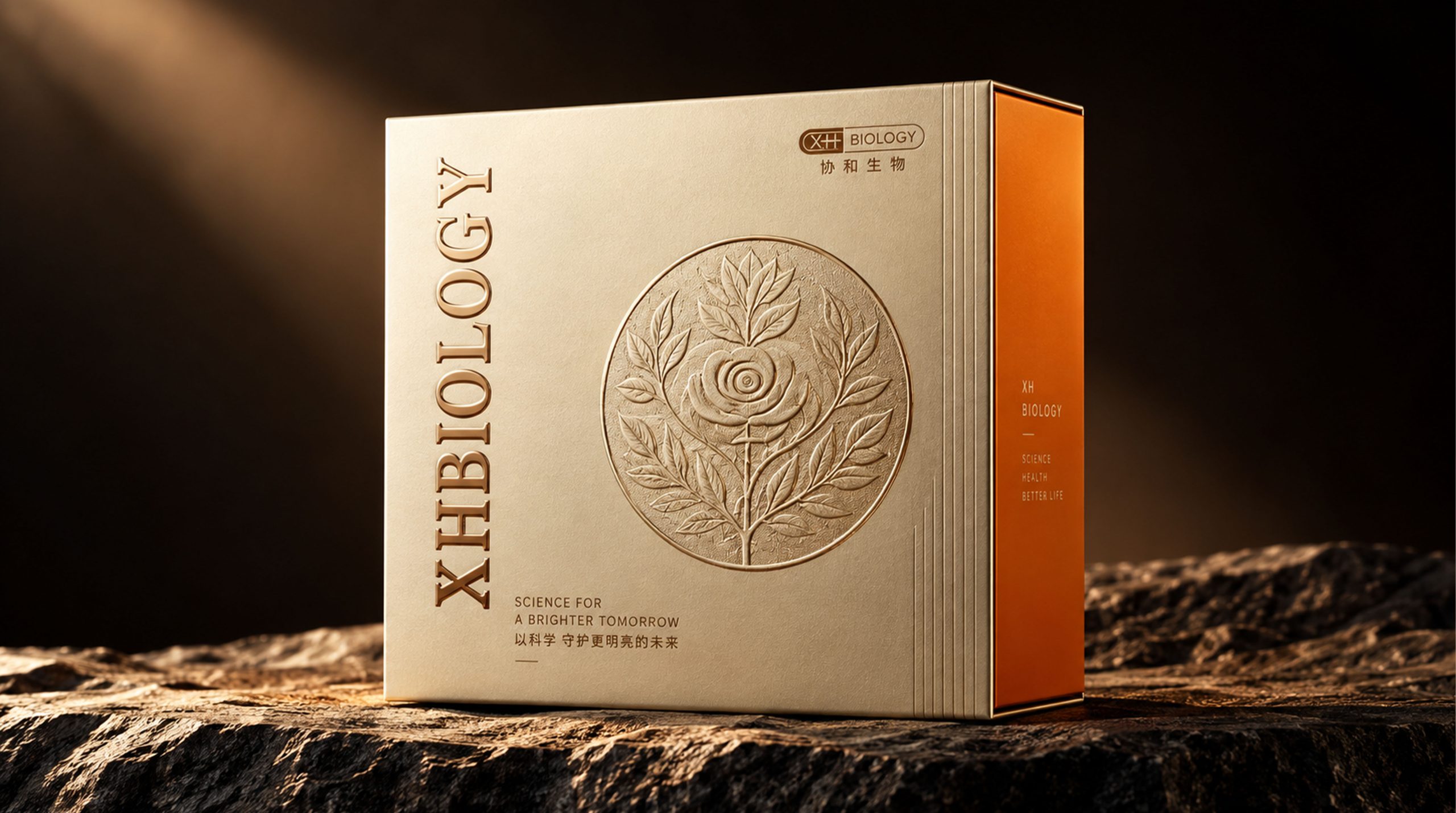
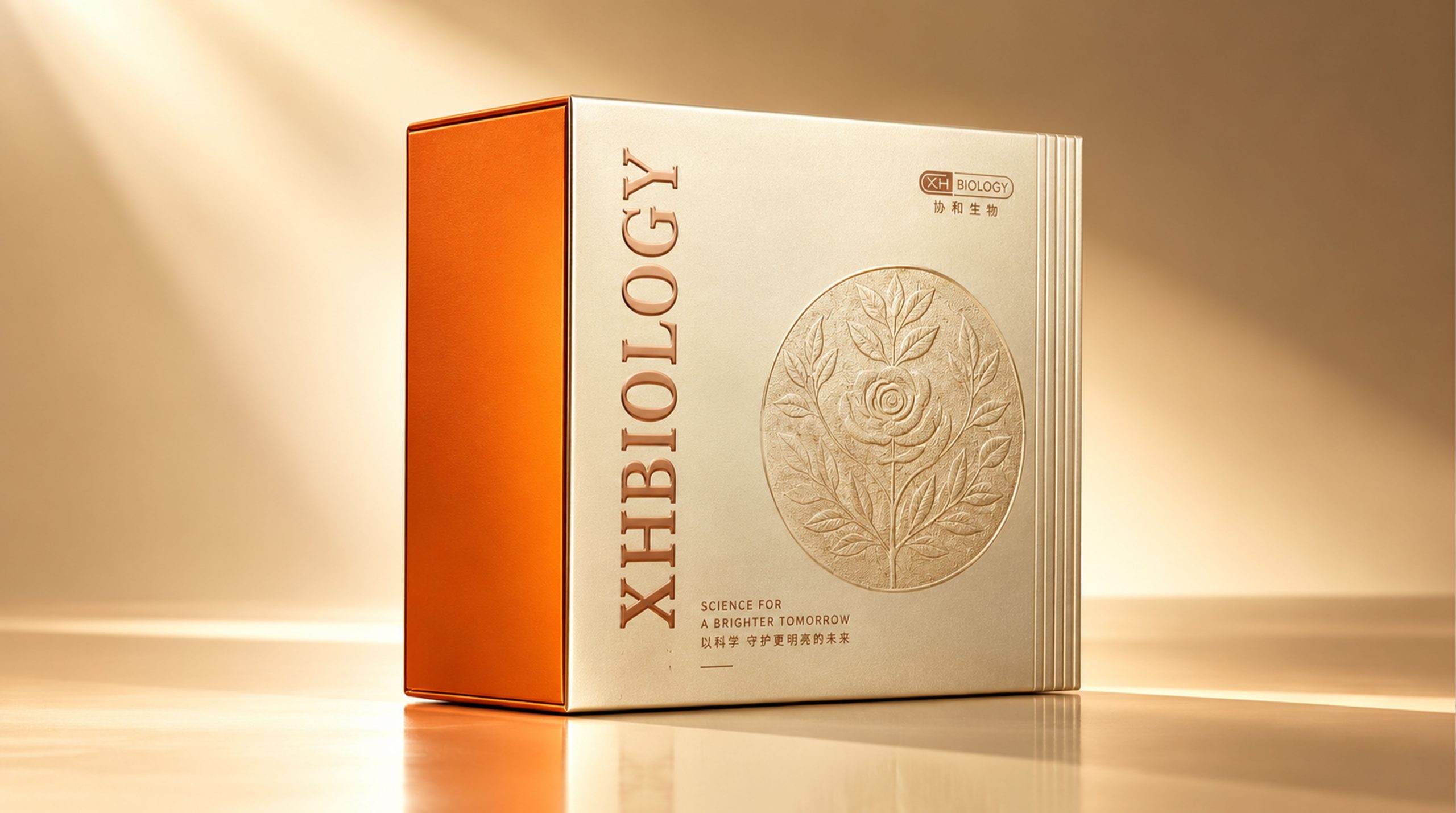
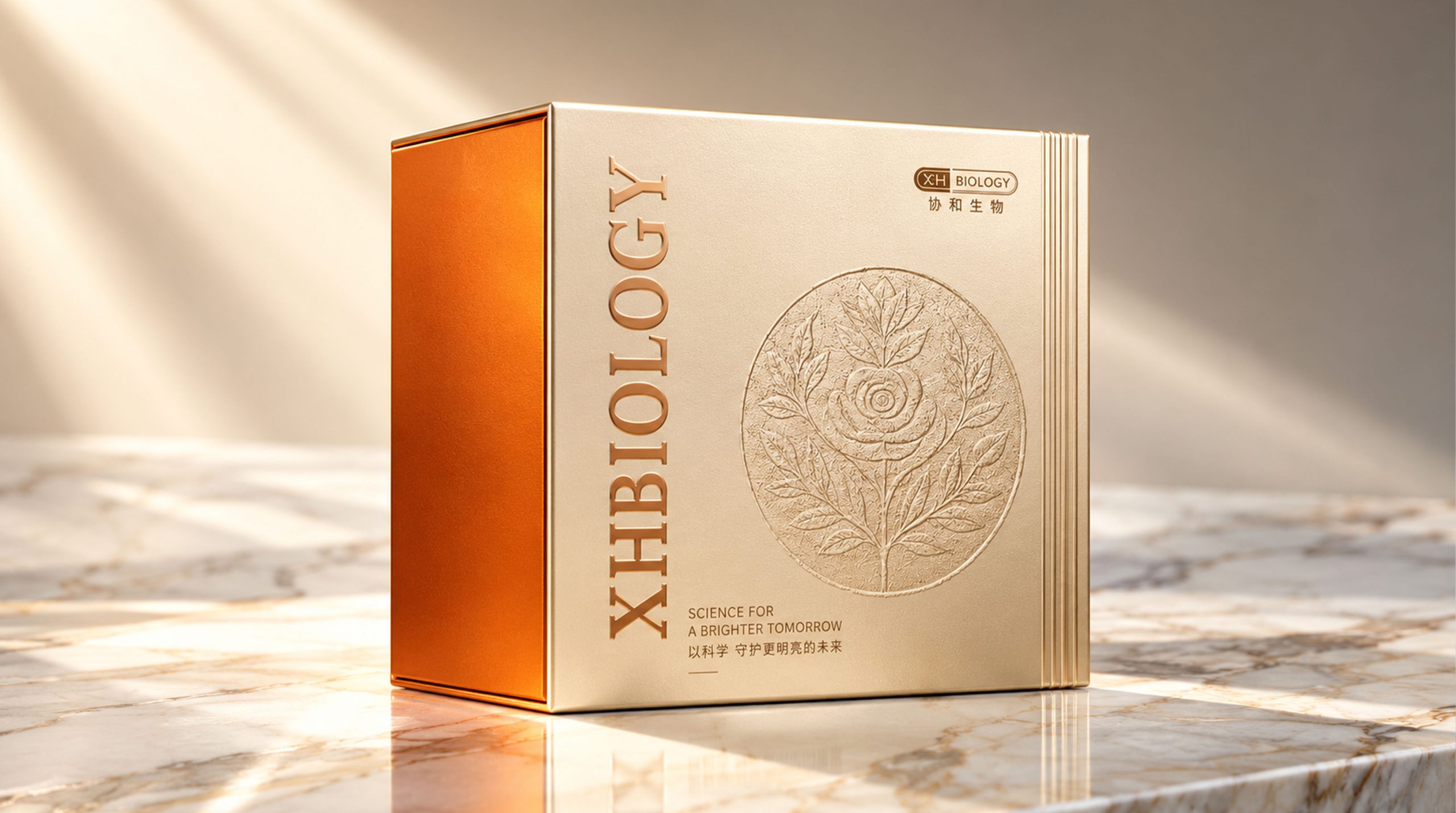
The core spirit of XHBIOLOGY XHBIOLOGY gift box packaging design can be summarized as the following points: Nature × Technology × Nobility, Ingenuity × Inheritance × Sense of Ceremony
These keywords highlight the deep connotation of the brand. The sense of nature comes from Xiehe Biotechnology's in-depth research on plant active ingredients - rose, as the soul element of the brand, symbolizes the blooming of life and the eternity of beauty; the sense of technology is reflected in the brand's core ability to integrate biotechnology into skin care products; and the sense of dignity conveys the brand's high-end positioning through the material, craftsmanship and color of the packaging. The combination of craftsmanship and inheritance reflects the brand's respect and continuation of the oriental aesthetic tradition - every relief texture embodies the temperature of craftsmanship and the thickness of time. The sense of ritual gives the product an emotional value beyond the function itself, making every time you open the gift box a tribute to beauty.
Design Philosophy
OptiMist's packaging design concept is based on "the light of technology, gentle touch" as the starting point. Inspired by the physical image of optics and atomization, the design team visually presents the core technology of "precision spray" on the packaging through flowing gradient colors and soft curve language. The overall design abandons the cold feeling of traditional pharmaceutical products and instead communicates with consumers in a way that combines technological aesthetics with emotional warmth. The design of the packaging is not only an intuitive expression of the efficacy of the product, but also a visual narrative about "future skin care". When consumers pick up this box of products, they feel that it is not only an eye care spray, but also a beautiful promise made in the name of technology - to give every pair of eyes a brighter and younger future.
The packaging design concept of XHBIOLOGY gift boxes is based on "natural beauty, craftsmanship" as the starting point. The design team took the brand's iconic rose flower as the creative starting point and solidified the vitality of the flower on the box surface through relief technology, forming a quiet and majestic beauty. The design language abandons the accumulation of flashy decorations and instead interprets luxury in a restrained and profound way - letting the materials speak, the craftsmanship expressed, and the white space breathing.
The design of the packaging is not only a visual communication of the brand concept, but also an in-depth exploration of the aesthetics of "oriental luxury". When consumers receive this gift box, they feel that it is not only a skin care product, but also a precious gift that carries the warmth of natural respect and craftsmanship - making every gift a ritual that conveys beauty and heart.
Visual Language
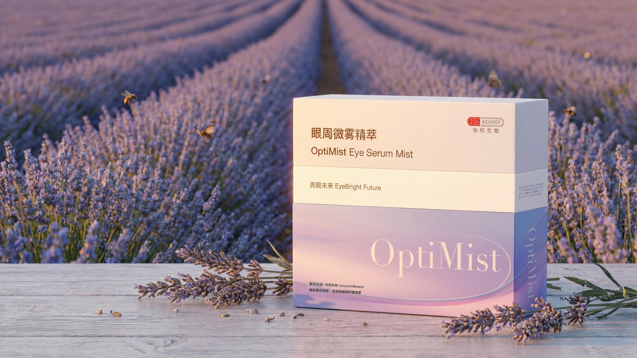
OptiMist's packaging visually creates a clear, soft and futuristic atmosphere. The combination of colors and graphics makes the product highly recognizable on the shelf:
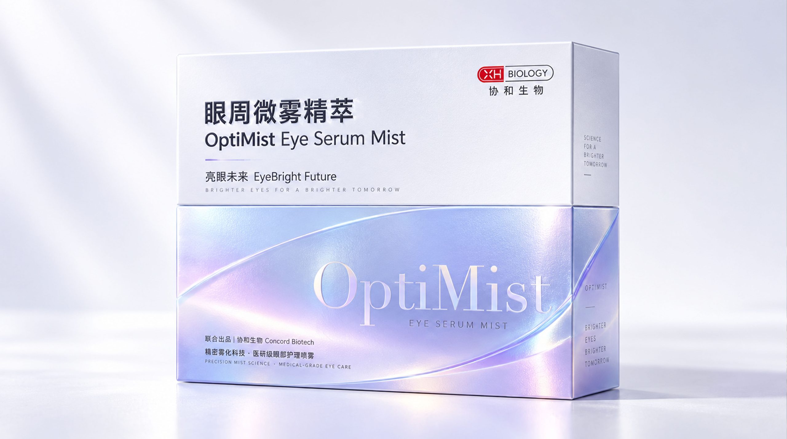
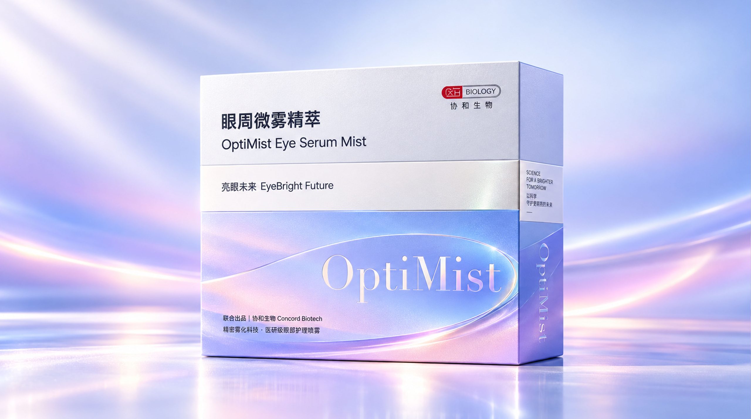
Color: The packaging uses soft gradients of ice blue and lavender as the main colors. Blue symbolizes technology, purity and calmness, while purple gives the product an elegance and mystery. The bottom transitions to light pink, hinting at the softness and moistness of the skin around the eyes. The overall color is like the first ray of morning light passing through the mist, creating a visual artistic conception of "light and fog" intertwined, echoing the core selling point of the product "Micro Mist Essence".
Pattern: The packaging surface adopts a flowing gradient glossy texture, simulating the effect of atomized water droplets refracting under light, which is both abstract and full of technological beauty. There are no complicated decorative patterns, but "white space" and "gradient" itself are used as the design language, conveying a pure and precise brand tone.
Font: The brand name "OptiMist" adopts an elegant serif design with stretched letter spacing, conveying a sense of calmness, confidence and high-end. The Chinese name "Micro Mist Essence around the Eyes" uses simple boldface to ensure the clarity and professionalism of information transmission. The combination of Chinese and English fonts balances international vision and local affinity.
XHBIOLOGY gift box packaging visually presents a calm, elegant and weighty oriental luxury temperament. The exquisite combination of color and craftsmanship makes each gift box like a work of art:
Color: The main body of the gift box adopts a warm champagne gold tone. Gold symbolizes nobility, richness and eternity. It is neither ostentatious nor dull, and appropriately conveys the magnanimity of a high-end skin care brand. The bright orange color is used on the inside of the box, which is in sharp contrast with the calm golden tone on the outside. It brings visual surprise and pleasure at the moment of opening the box, implying the inner vitality and vitality of the product. The combination of gold and orange is like the warm autumn sun shining on the earth, creating a warm and noble brand atmosphere.
Pattern: In the center of the box is a delicate circular relief, with blooming roses and branches and leaves as the main body. The petals are stacked and stretched, and the veins of the leaves are clearly visible. The circular composition symbolizes perfection and harmony, while the rose pattern is an intuitive expression of the brand's botanical aesthetic concept. The relief is surrounded by fine dot-like textures that fill the background, forming a texture similar to a classical bronze medal or badge, giving the packaging a classic feel that transcends time.
Font: The brand name "XHBIOLOGY" is arranged vertically on the left side of the box. The letters are presented in relief and the strokes are straight and powerful, conveying the brand's sense of professionalism and strength. The brand logo (XH BIOLOGY) in the upper right corner is presented in red and white, small and eye-catching, forming a delicate finishing touch on the golden background, taking into account the balance between brand recognition and overall beauty.
Packaging Structure and Details
The packaging adopts a classic clamshell box structure. The overall shape is square and concise with clean lines, which reflects the professionalism and standardization of medical research products. The proportions of the box have been carefully considered, making it comfortable to hold and smooth to open and close, achieving an elegant balance between functionality and aesthetics. The top of the box is a white area, which carries core brand and product information; the bottom is a gradient color area, forming a visual rhythm of upper and lower divisions, which is both clear-cut and integrated. In terms of detail processing, the surface of the box adopts matte coating process, which is delicate and smooth to the touch, just like the gentle texture of atomized spray touching the skin. The "OptiMist" brand words are partially made of hot silver or UV technology, showing subtle gloss changes under light, which enhances the product's sense of sophistication and technological attributes. XH BIOLOGY's brand logo (XH BIOLOGY) is placed in the upper right corner, and the red logo embellishes the overall cold-toned packaging, which not only serves as brand endorsement, but also adds a touch of visual focus.
The gift box adopts a top-and-floor cover structure. The box shape is thick and stable, and has a moderate sense of damping when opening and closing, which enhances the ritual and high-end feel of the unpacking process. The proportions of the box are carefully designed, the box is square and grand, and the weight when held allows consumers to perceive the value and sincerity of the product the first moment they touch it. The four corners of the box are rounded and finely processed, with clean lines. The overall shape has both classical charm and modern simplicity.
In terms of details, the rose relief on the box uses deep embossing technology. The layers of petals and branches show rich changes in light and shade under the light and shadow, which is full of three-dimensionality and artistry. The letters "XHBIOLOGY" are also presented in deep relief, with clear and sharp edges and a distinct touch. The entire surface of the box is covered with a delicate skin-sensitive film, and the tentacles are as warm as jade, forming a rich tactile layer with the concave and convex texture of the relief. The orange lining of the inner box uses a highly saturated color, which forms a dramatic contrast with the subtle gold tone of the outer box, releasing strong brand vitality and visual tension the moment the box is opened.
Tone of Voice
OptiMist's packaging text is concise, professional and full of warmth. The product name "Micro Mist Essence around the Eyes" directly points out the core functions and usage of the product, which is simple and efficient. The brand's proposition of "EyeBright Future" conveys the brand's best wishes to consumers in a hopeful tone. The product description at the bottom "Precision Atomization Technology·Medical Grade Eye Care Spray" completes the technical endorsement and category definition in the most concise language.
The overall tone is confident but not ostentatious, professional but not cold, gentle but not weak. Every line of text on the packaging has been carefully considered without unnecessary modifications. Each word has a clear mission of conveying information - allowing consumers to build awareness and trust of the product in the shortest possible time.
The text language of XHBIOLOGY gift box packaging is extremely concise, and the principle of "less is more" runs throughout. The box surface only shows the brand name "XHBIOLOGY" and the brand logo in the upper right corner. There is no redundant product description or marketing rhetoric, and all expressions are transferred to the craftsmanship and material itself. This restrained text strategy conveys a kind of brand confidence that needs no words - quality needs no elaboration, and ingenuity has its own expression.
The overall tone is calm and restrained, noble but not arrogant, restrained but not cold. The brand chooses to use visual and tactile communication instead of words, allowing consumers to feel the temperature and thickness of the brand while interacting with the packaging. This power of silence is precisely the most persuasive language of high-end brands.
Brand Experience
The packaging design of OptiMist Eye Mist Essence creates a complete closed loop of brand experience for consumers from three dimensions: visual, tactile and emotional:
Visual experience: The gradient colors of ice blue and lavender form a strong visual appeal on the shelves, which is different from the common white or gold packaging of traditional eye care products, creating a unique category memory point. The soft color transition is reminiscent of morning, mist and light, and visually conveys the product association of "clear" and "bright".
Tactile experience: The matte-coated box surface has a delicate and silky texture, conveying "precision" and "gentleness" everywhere your fingertips touch. The subtle concave and convex feeling caused by local UV or hot silver processing allows consumers to feel the brand's persistent pursuit of details during the unpacking process.
Emotional experience: The packaging conveys to consumers a sense of security and happiness of "being professionally cared for" through the integration of technological aesthetics and soft colors. The brand proposition of "Bright Future" sublimates the product use experience into an expectation for a better future, touching consumers' deep desire for youth, brightness, and confidence.
XHBIOLOGY XHBIOLOGY gift box packaging builds an immersive brand experience for consumers from three dimensions: visual, tactile and emotional:
Visual experience: The champagne gold box surface and the exquisite rose relief show rich light and shadow changes under the light, and are calm and elegant with delicate beauty. After opening the box, the bright orange on the inside creates a strong color contrast, bringing a visual surprise like an "unveiling" and making the unpacking process itself a ritual.
Tactile experience: The warm touch of the skin-sensitive film is like touching fine silk, and the uneven changes in the relief texture bring rich exploration fun to the fingertips. The thick weight of the box and the damping opening and closing of the top and bottom lid allow consumers to feel the brand's uncompromising quality in every movement.
Emotional experience: The gift box conveys a sense of "cherished" dignity to consumers through the perfect integration of classical relief craftsmanship and modern luxury aesthetics. The image of rose flowers evokes the yearning for natural beauty, while the details of craftsmanship touch the inner resonance of "real good things". Whether for personal use or as a gift, this gift box carries emotional weight and beautiful meaning beyond the product itself.
Brand Statement
"Precision technology brightens the future." The packaging design of OptiMist Eye Mist Essence is centered on the integration of precision mist technology and soft aesthetics, highlighting Concord Biotech's dual commitment to technological innovation and consumer care. The packaging of each box of products is not only a container for skin care products, but also a bright future promised by the brand to every pair of eyes in the name of technology.
"Natural beauty, eternal craftsmanship." The XHBIOLOGY XHBIOLOGY gift box packaging design is based on the integration of oriental plant aesthetics and classical craftsmanship, highlighting the brand's awe of natural vitality and persistent pursuit of ultimate quality. Each gift box is not only a container for skin care products, but also a promise of beauty and preciousness presented by the brand to every consumer in the name of ingenuity.