










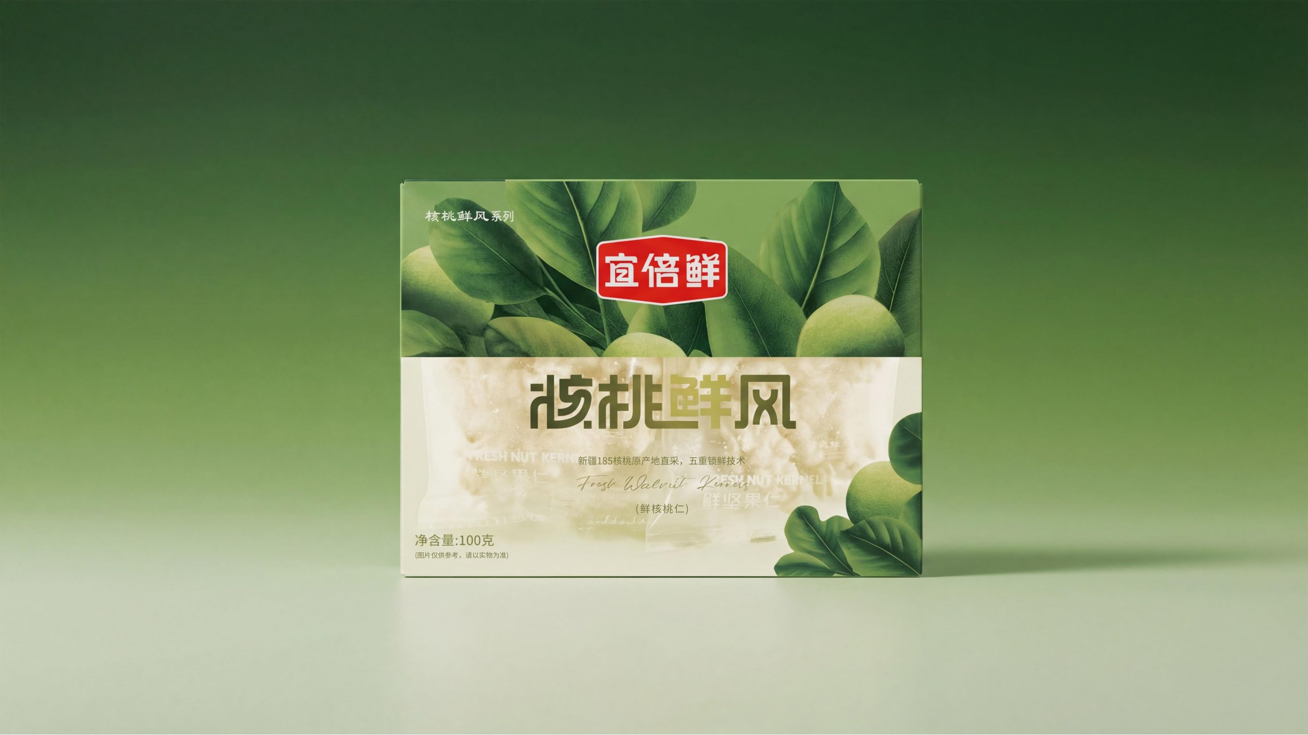
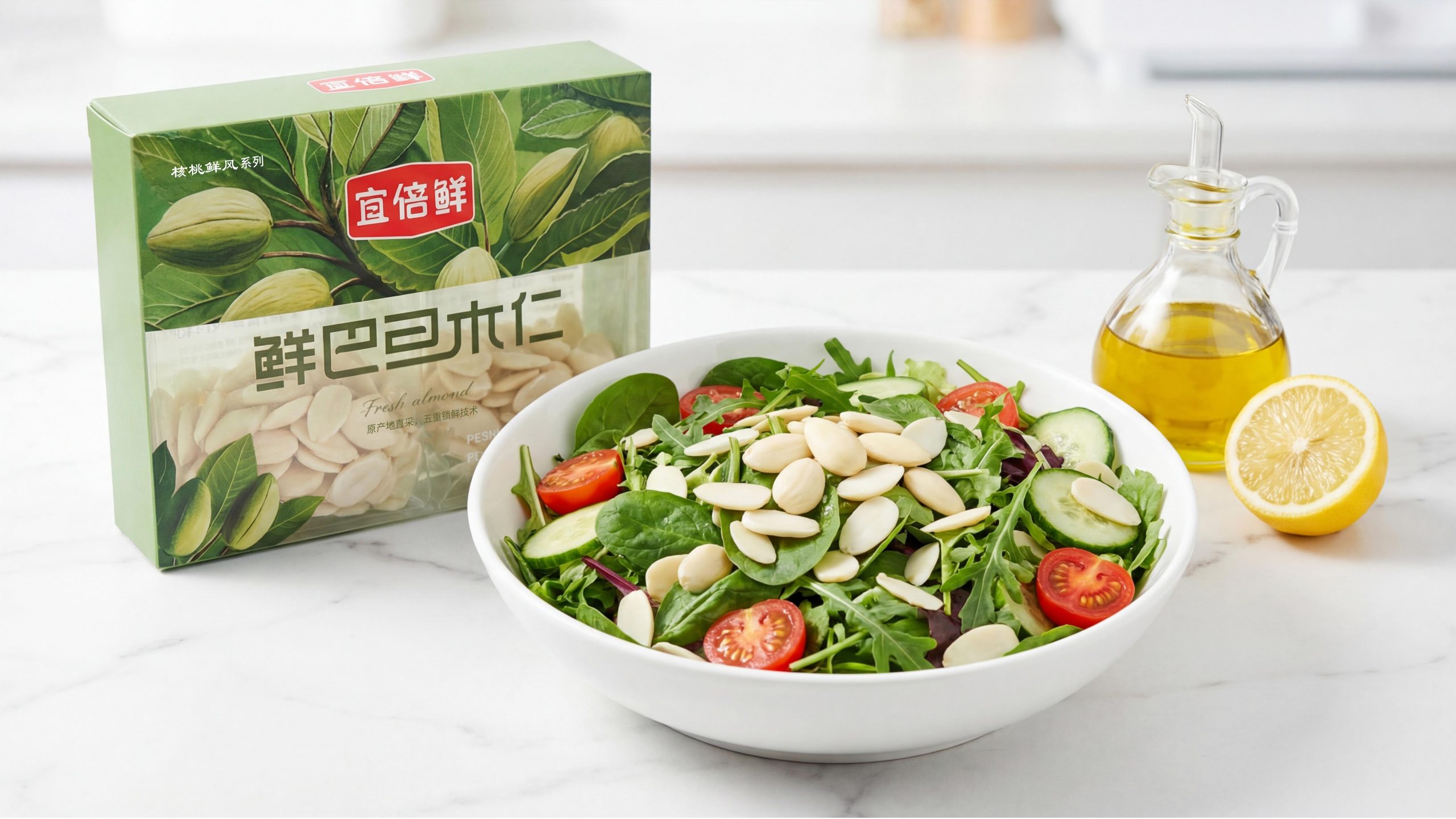
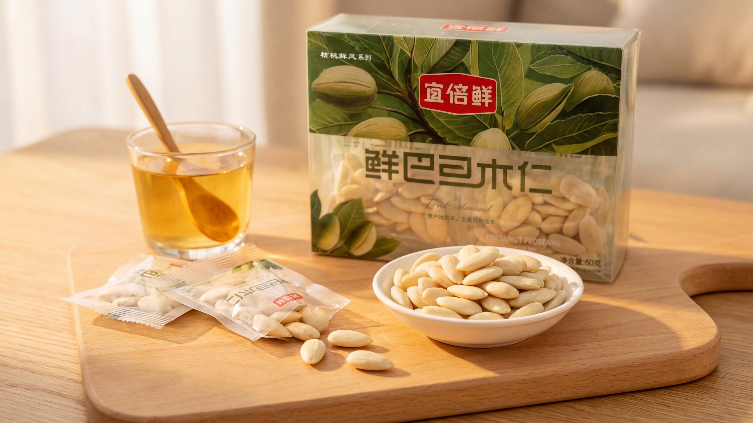
Yibeixian is a nut category brand with "fresh" as its core brand proposition. Its "Walnut Fresh" series covers three major items: fresh almond kernels, fresh macadamia nuts and fresh walnut kernels. In terms of packaging design, Yibeixian has built a complete visual system with "upper half of plant illustration × lower half of transparent window" as a dual language: the upper half uses full and delicate plant illustrations of origin to convey a sense of traceability, and the lower half uses transparent or frosted materials to directly present real nuts. The two layers of language, one virtual and one real, one far and one near, jointly explain Yibeixian's unique understanding of "fresh" - the place of origin is endorsement, and seeing is trust.
Brand Essence
The core spirit of Yibeixian packaging design can be summarized as:
fresh × true × close
Traceability × Transparency × Nature
"Freshness" is the brand's most fundamental product proposition. "Five-fold freshness locking technology" and "direct procurement from origin" form two parallel narrative axes of trust between brand technology and origin, allowing each nut to complete the shortest path from the field to the hand in consumers' perception; "truth" is reflected in the design philosophy of the transparent window - Nuts do not need any filters and appear on the front of the package as they are, with the fullness and whiteness of the product itself as the most powerful sales language; "near" is the emotional background of the entire design. The branches, leaves and fruits with water drops in the illustrations seem to have just been picked from the place of production, and have not lost the warmth and humidity of the field. "Traceability" is realized with botanical illustration-style high-precision illustrations. Each product corresponds to the real plant form of its place of origin, which is scientifically rigorous and full of vitality; "transparency" is not only the physical characteristic of the packaging material, but also the most direct communication gesture between the brand and consumers; "nature" runs through the green color system, handwritten English subtitles and layout design without excessive decoration, making the packaging itself like an uncarved oasis.
Design Philosophy
Yibeixian adopts the overall design concept of "let the origin and the product be in the same frame". The packaging of most nut brands makes an either/or choice between origin narrative and product presentation. The structured layout of the upper and lower partitions of Yibeixian integrates both into the same front of the package, forming a complete visual narrative "from the tree to the palm":
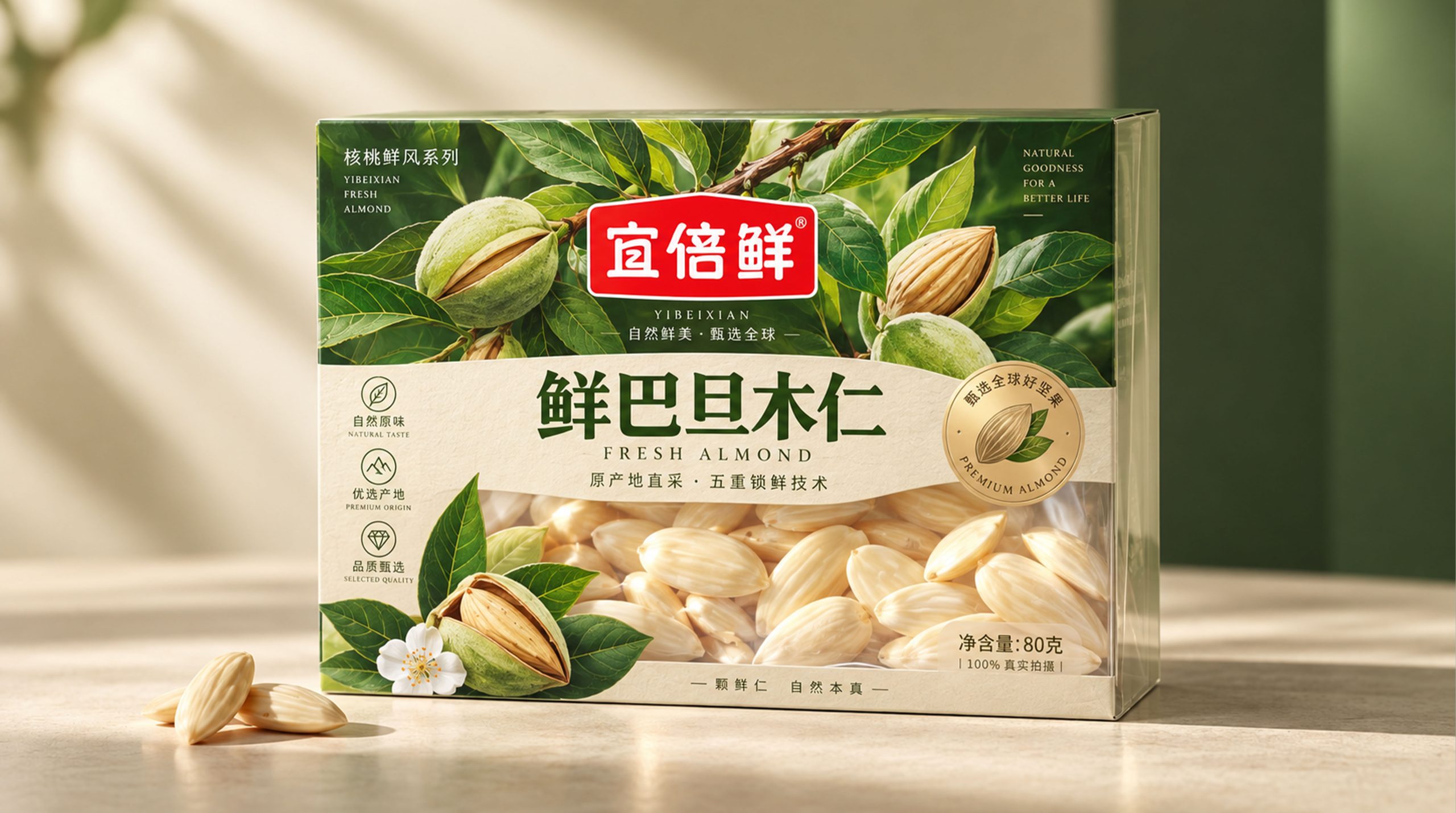
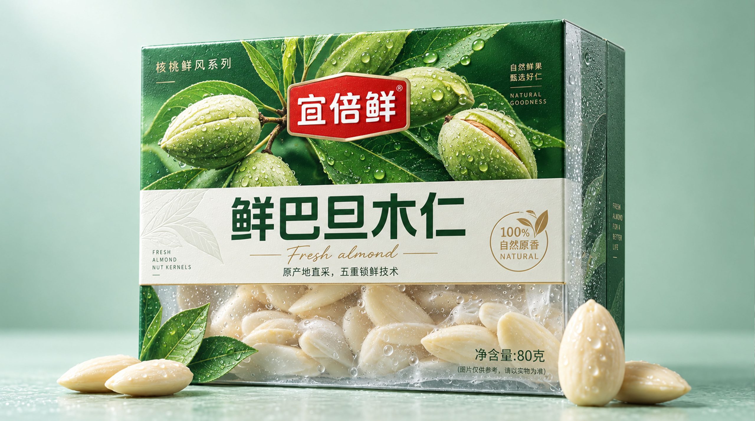
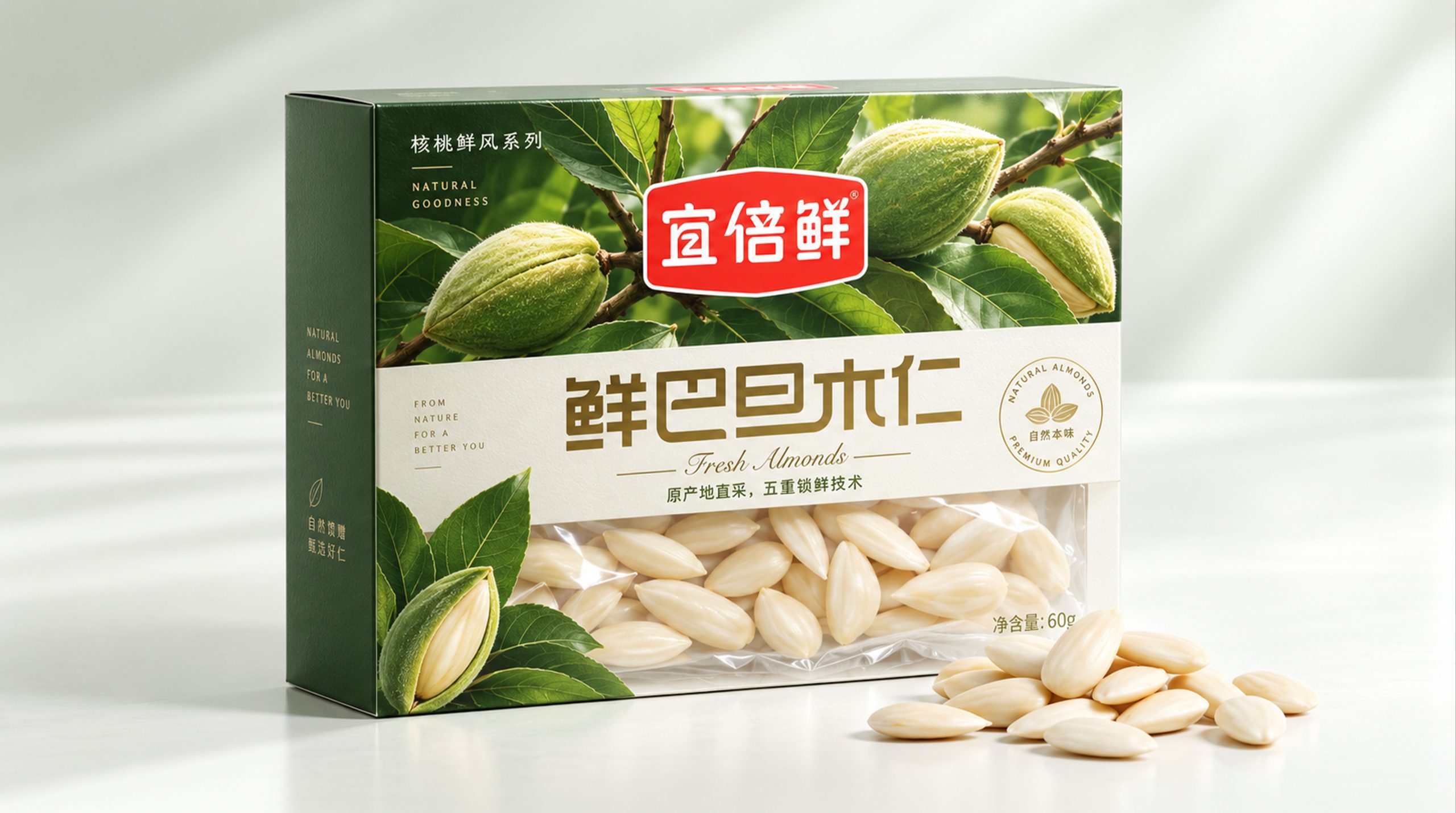
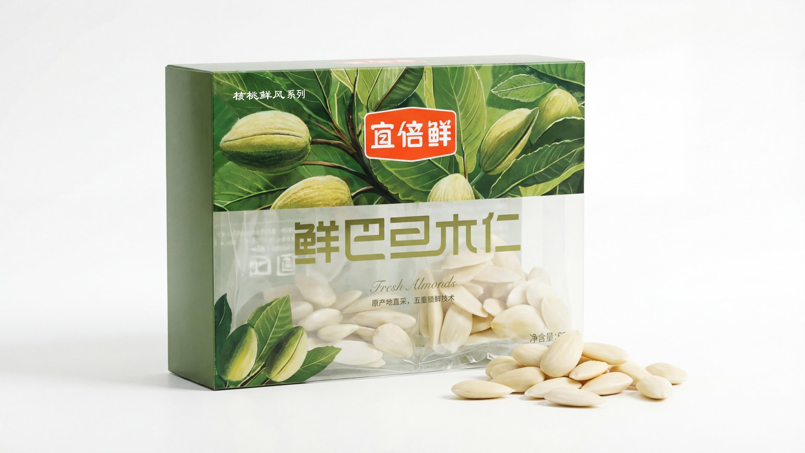
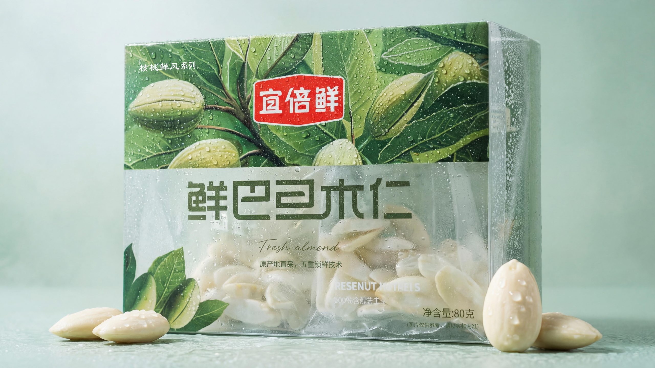
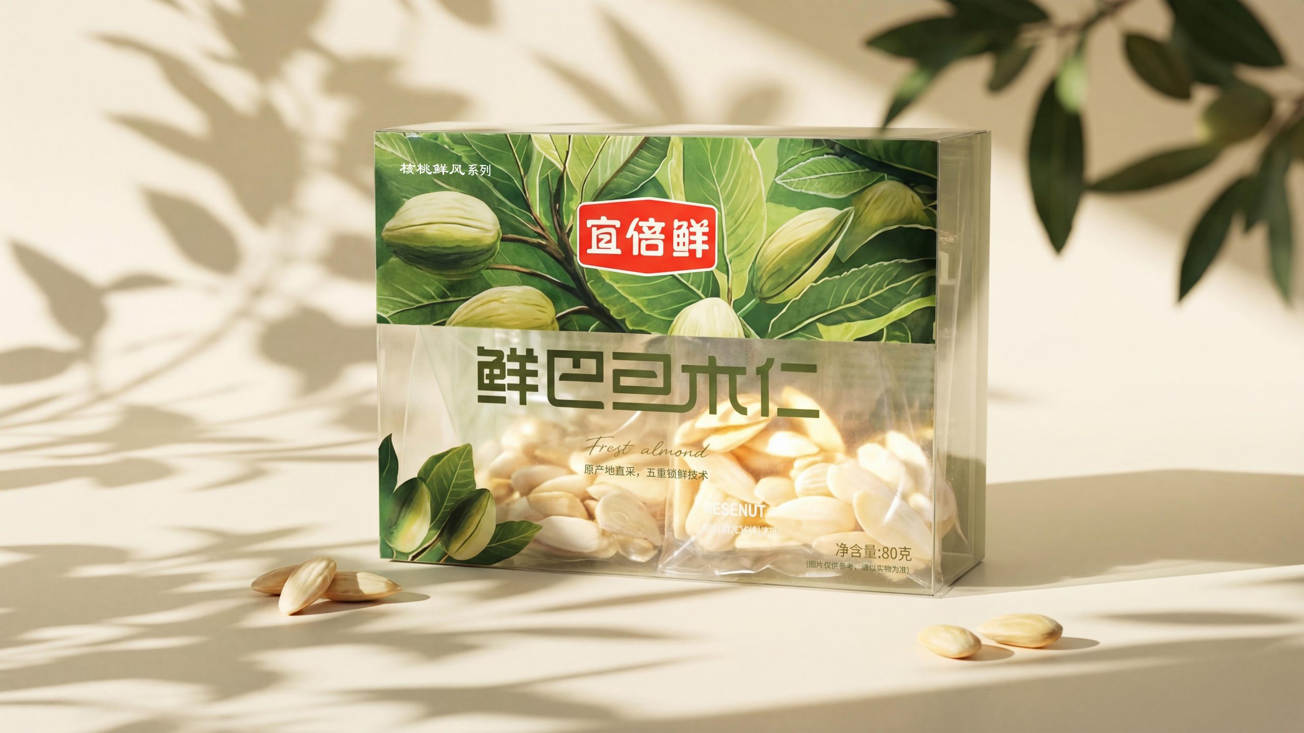
Fresh almonds (transparent self-standing bag × color-printed card head): The packaging adopts a transparent self-standing zipper bag structure. The bag body can directly display the original appearance of the white, moist and plump almonds, and the quality can be convinced without any text description. The top of the bag is sealed with a green color-printed card. High-precision illustrations of almond branches, leaves and green fruits are used in the upper half of the card. The leaves are covered with crystal water droplets, simulating the feeling of morning dew during picking. The brand name "Yi Beixian" is printed in white on the red rounded rectangular badge and placed in the center of the illustration area. The product name "Fresh Almond Kernel" is written in large green calligraphy letters across the lower part of the card. The font is vigorous yet friendly, "Fresh" "almond" is appended below it in slender handwriting, providing an elegant international footnote to the main title in Chinese characters.
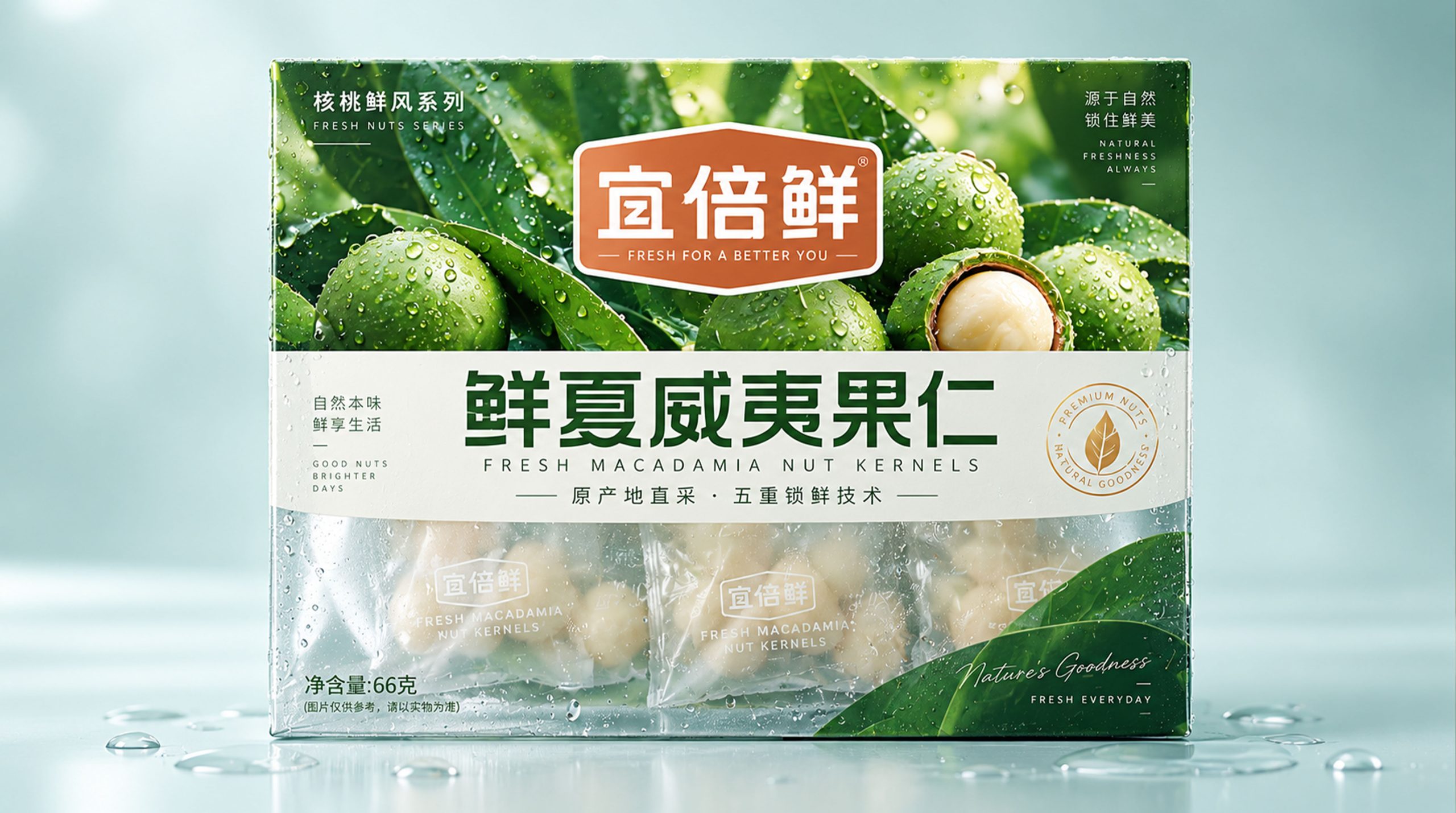
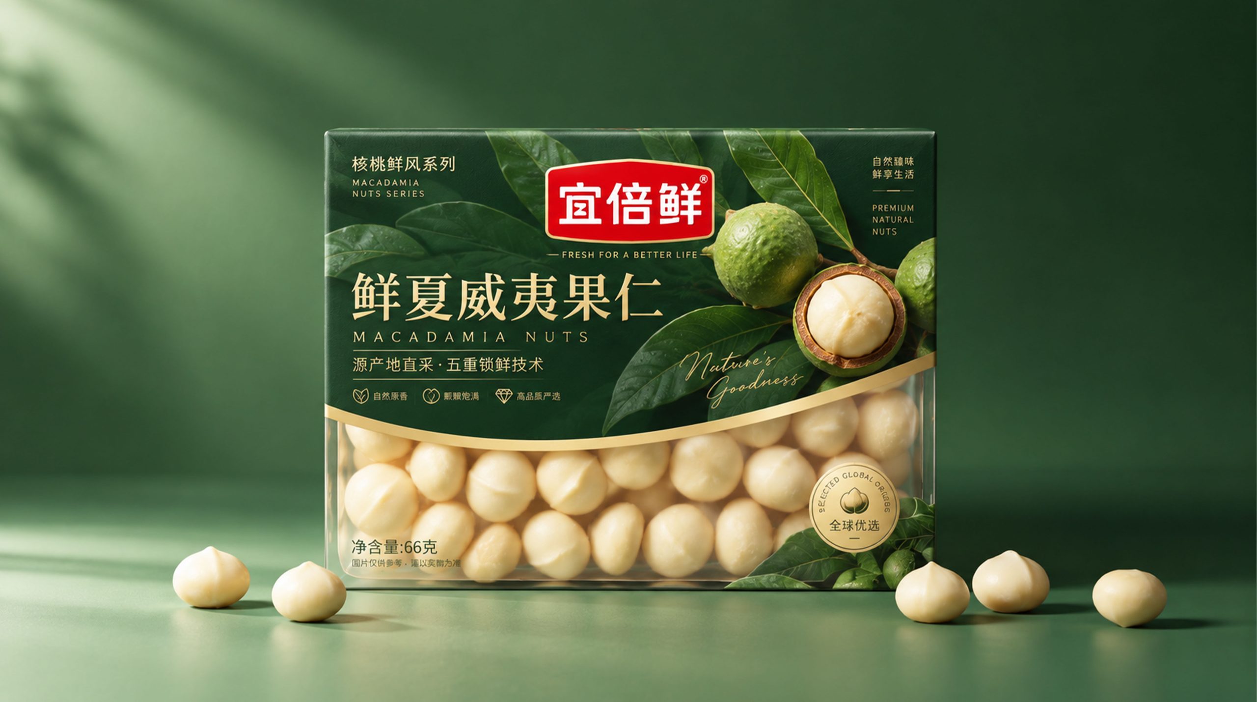
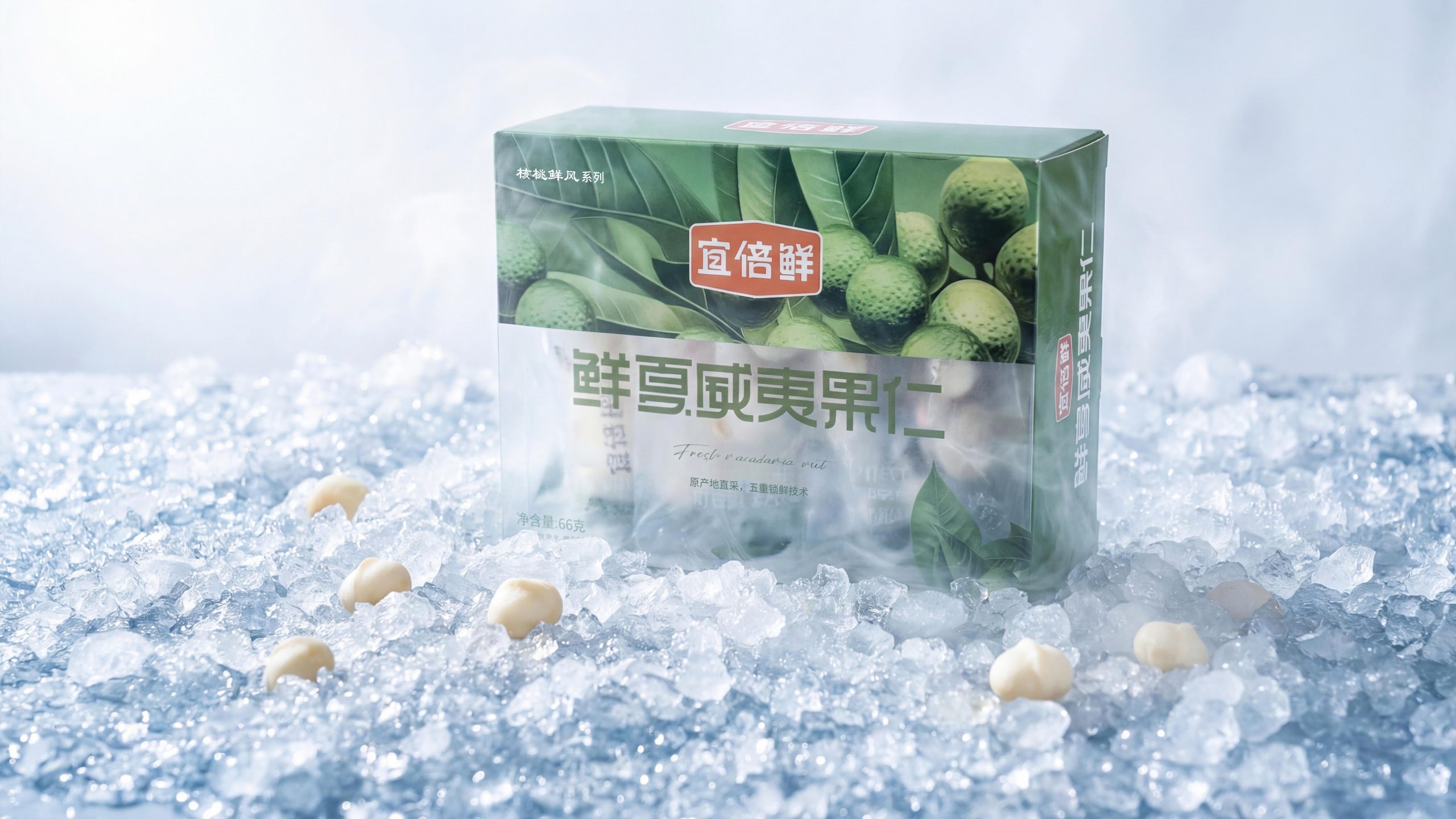
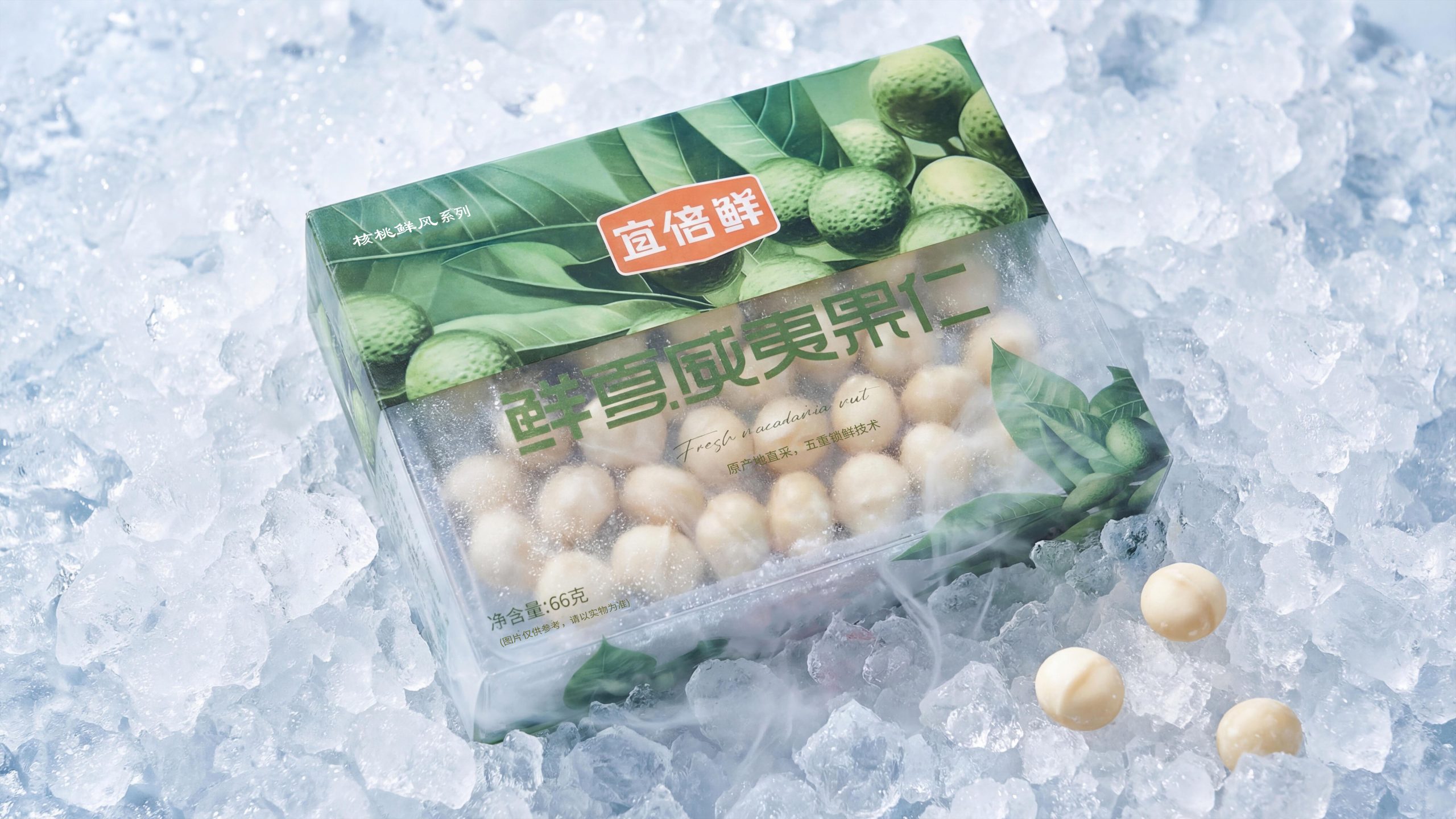
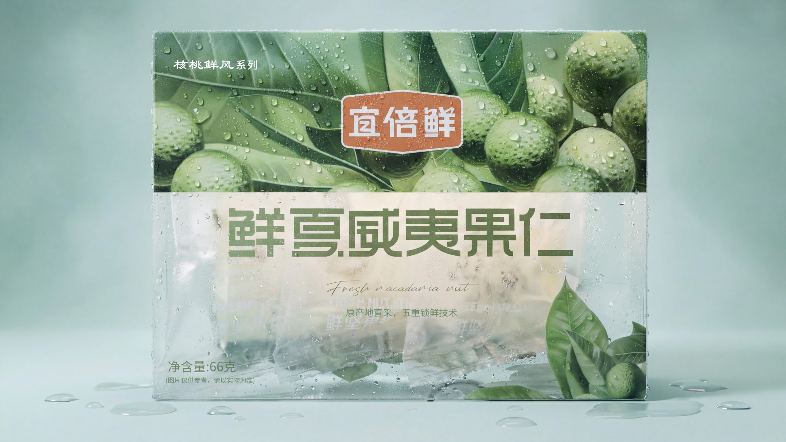
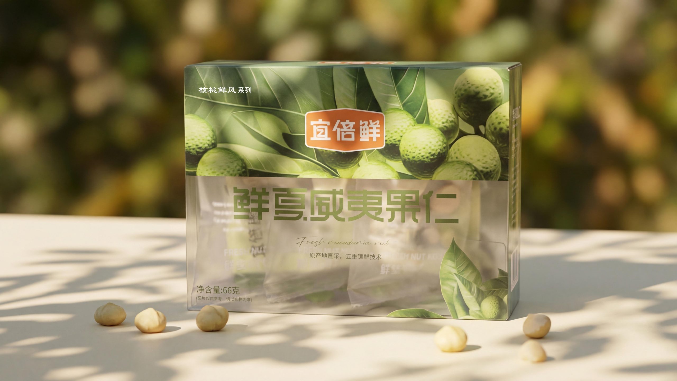
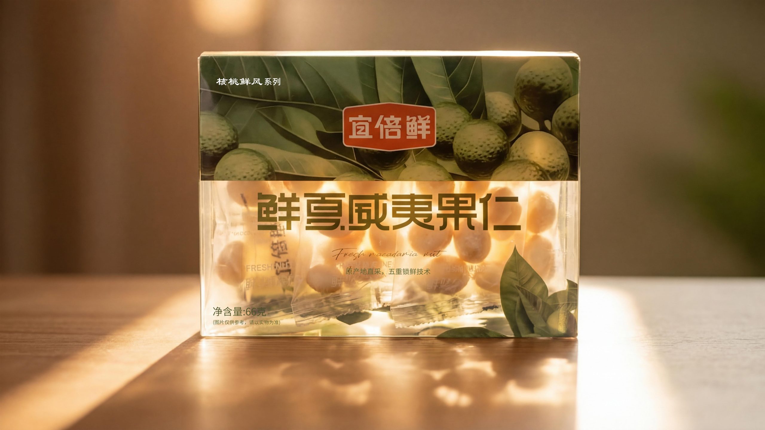
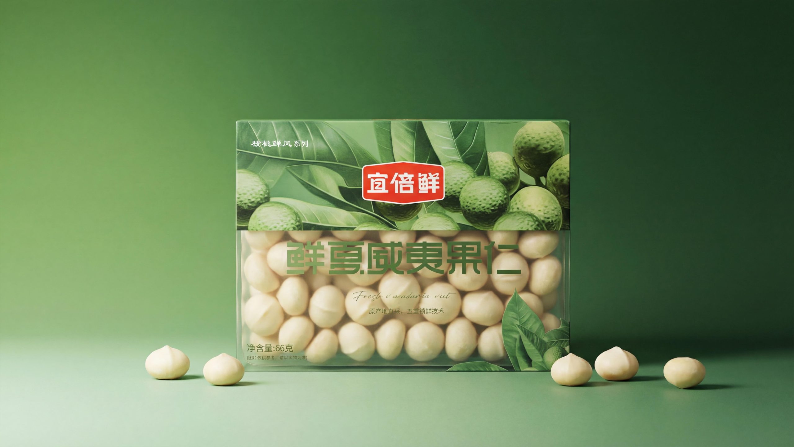
Fresh macadamia nuts (transparent stand-up bag × color-printed card head): Continuing the same structure, the illustration switches to macadamia branches and leaves and green spherical fruits. The grainy texture of the fruit surface and the gloss of the leaves are meticulously restored in the illustration, making people feel the vigorous vitality of tropical production areas at a glance. The brand emblem is adjusted to an ocher color, which forms a warmer color contrast with the green illustrations, making the overall temperament slightly calmer than the almond version, which is reminiscent of the creamy texture of the macadamia nut itself. "Fresh macadamia nut" is presented in the same green italic letters, and "Fresh macadamia nut" is accompanied by a handwritten English subtitle.
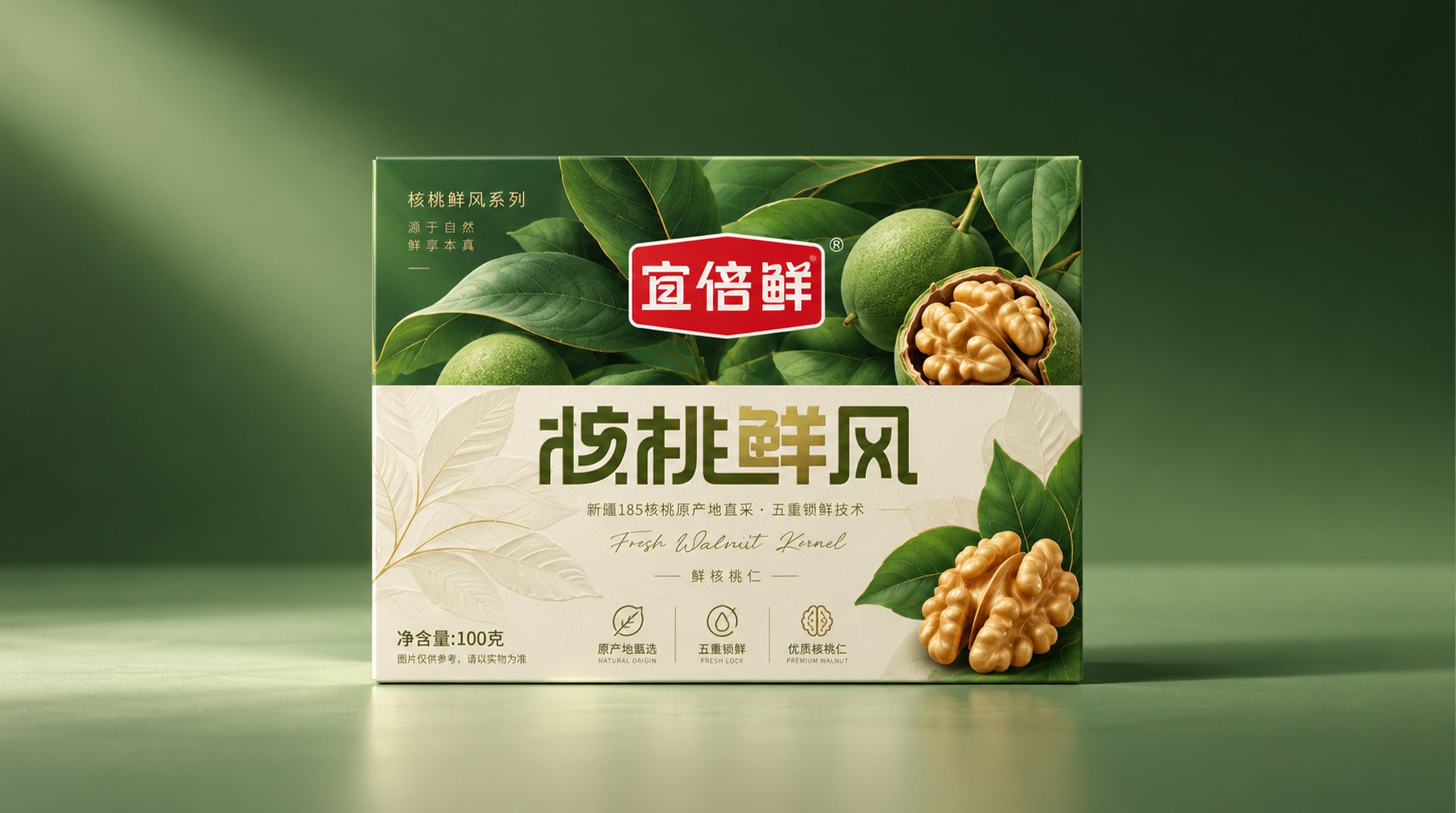
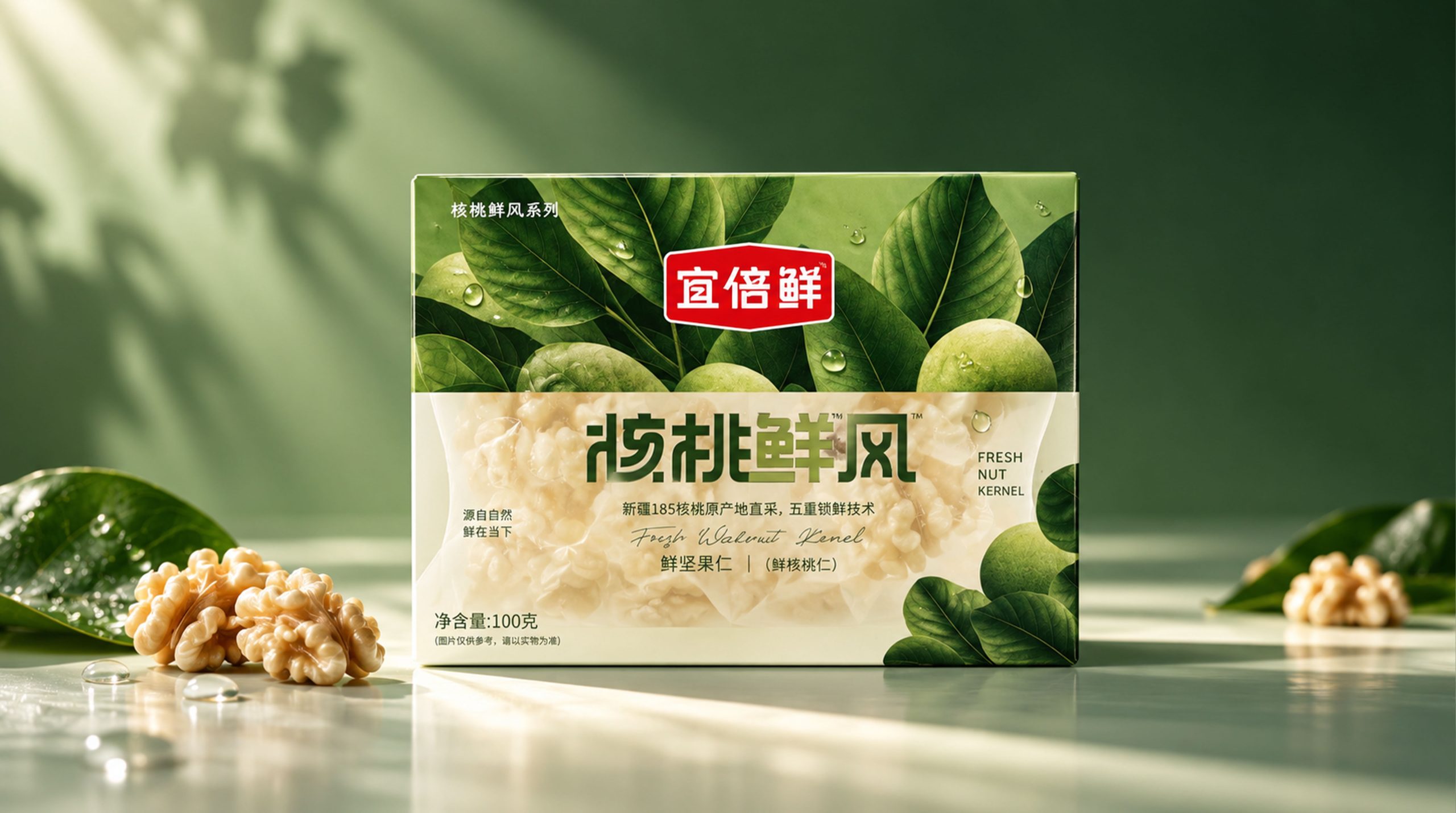
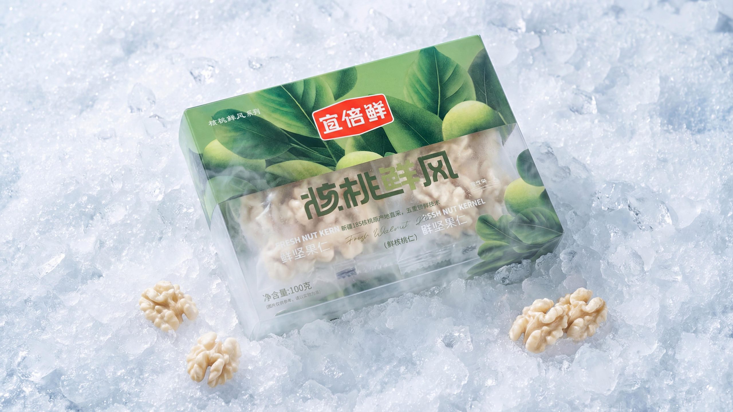
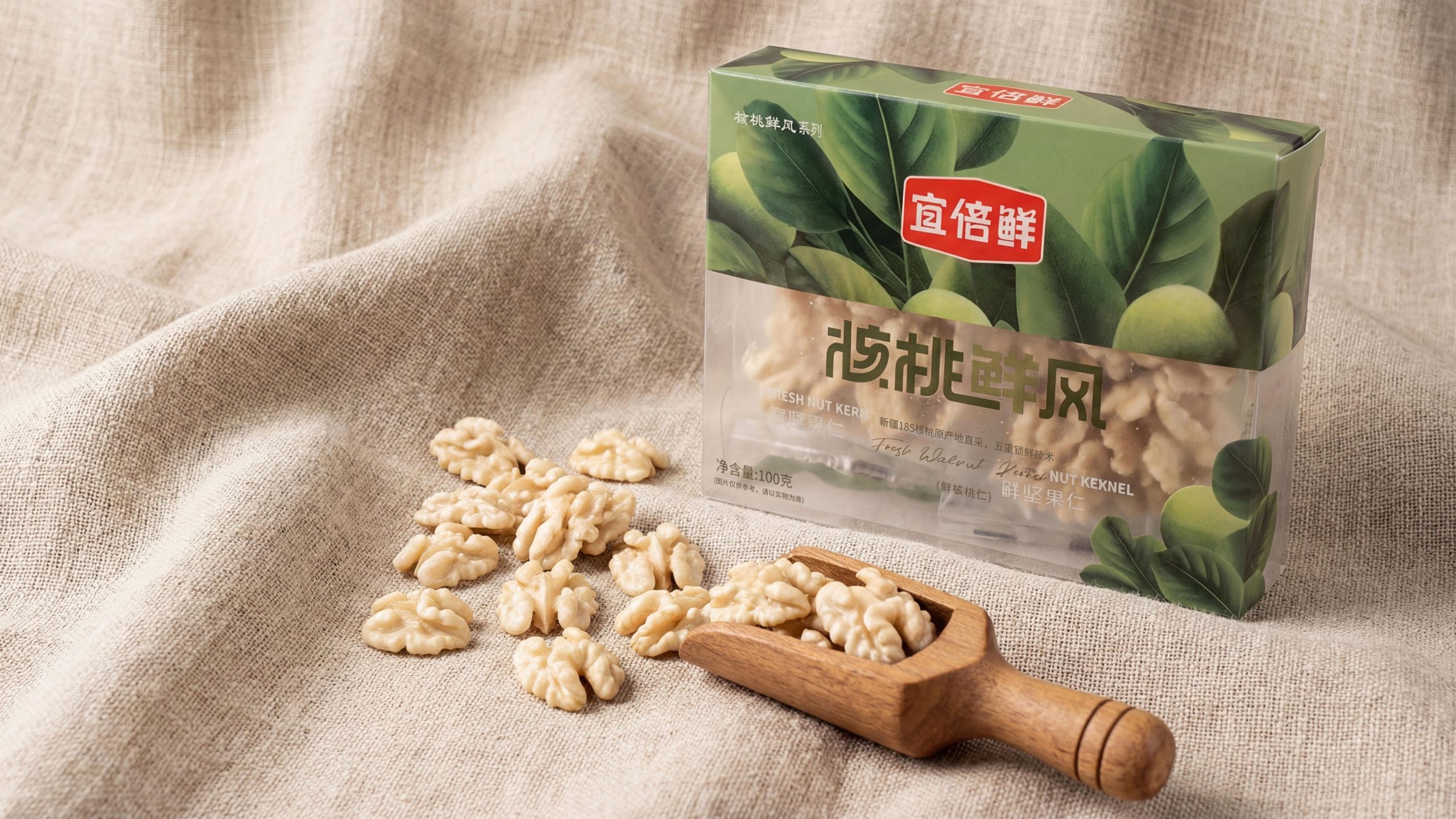
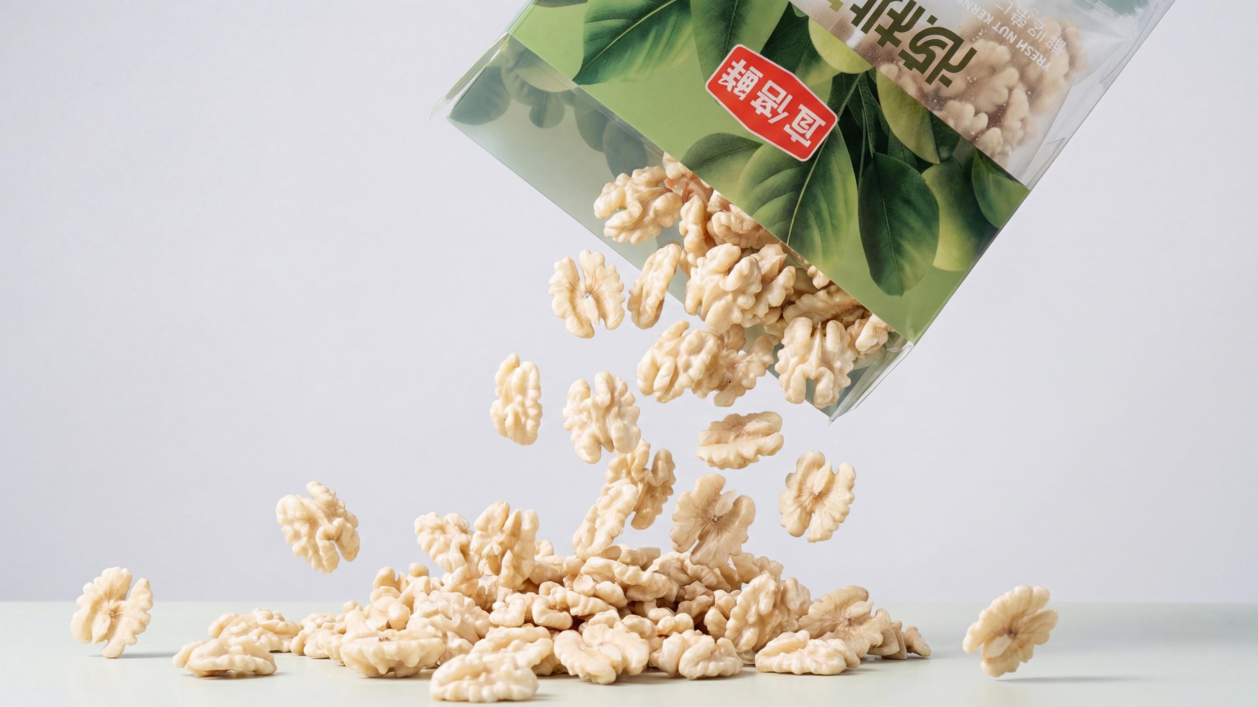
Walnut Fresh Wind (hard folding carton × frosted transparent window): As the flagship product of the series, Walnut Fresh Wind adopts a stiff hard folding carton structure, with larger specifications and richer layers. The upper half of the box has a dark green gradient as the base, and illustrations of plump walnut branches and leaves cover the entire screen. It is lush and green, as if you are under the canopy of a walnut orchard in Xinjiang. The lower half of the box is made of frosted transparent material, and the outline of the walnut kernels inside is vaguely visible. The hazy feeling adds a layer of anticipation and tension to the product before it is opened. The four characters "Fresh Walnut Kernel" are printed in large calligraphy on the frosted window area. The color of the characters is dark olive gold, which creates a low-key luxury feeling just right with the frosted texture; "Fresh Walnut Kernel" is handwritten in English under the Chinese characters, and "Xinjiang 185 walnuts are directly harvested from the origin, five-layer freshness locking technology" is followed by small characters, and the information level is clear.
Visual Language
Yibeixian has constructed a visual system of "plant green × transparent texture" to achieve a high degree of unity between natural feeling and food safety:
Color: The overall color scheme uses multi-layered green as the main color spectrum, from the yellow-green of young leaves, the emerald green of leaves, to the dark green of fruits and then to the dark green of the background, forming a complete and restrained natural green color palette. It does not use any highly artificial and highly saturated colors, so that the first visual impression stays in the emotional range of "healthy", "natural" and "trustworthy". The brand badge appears in red or ocher, which is the only contrasting color in the whole set of greens. It has a strong visual focus function and makes the brand name stand out clearly from the complicated illustration background. Transparent or frosted colorless packaging materials and green printing areas form a visual rhythm of "colored narrative × colorless presentation", making the overall packaging both recognizable and refreshing in dense shelves.
Pattern: Illustration is the most important design element in Yibixian’s visual system. The illustrations of each product are carefully drawn based on the true forms of the plants in their origin. The branches, leaf veins, peel texture, and water droplet refraction all reach the level of illustrations. They have the rigor of scientific specimens and the poetry of oriental gongbi paintings. The water drop element appears repeatedly in the illustrations of the three products, using visual language to strengthen the sensory association of "fresh", "moisturizing" and "just picked". It is a unified visual symbol throughout the series. There is no geometric decorative border on the box surface, and the illustration covers the printed area with full-width bleed, maximizing the natural perception.
Font: The product name is presented in customized Chinese brush calligraphy. The strokes are full and powerful, and the ink color is even. The font has both a traditional handmade feel and modern recognition, and is highly coordinated with the natural temperament of the illustration. The English subtitle is presented in slim handwritten italic cursive script, with a font size of Deliberately compressed, it serves as a light footnote to the main title in Chinese characters rather than competitive information; the functional explanatory text (origin information, net content, technical claims) is completed in regular sans-serif small fonts, with clear information levels and does not interfere with the breathing of the main visual area.
Packaging Structure and Details
The structure of the three products shows a hierarchical evolution from "daily snacks" to "quality gifts", sharing the same freshness expression logic:
Fresh almond kernels/fresh macadamia nuts (transparent stand-up bag × card head structure): The packaging material is made of highly transparent OPP/PE composite material, which has high light transmittance, good nut color restoration, and water vapor barrier performance to meet the freshness locking requirements. The bottom of the bag body is a boat-shaped unfolded self-standing structure, which can stand upright stably when displayed, eliminating the need for shelf supports. The top chuck is heat-sealed to the bag mouth with coated coated paper. The thickness of the chuck is specially designed to ensure that it is in proportion to the bag body and prevents the package from tilting forward due to excessive weight of the chuck. The color-printed card head adopts a matte coating process and feels as delicate as velvet paper, forming a distinct tactile layer with the transparent material of the bag body. The net contents of the products are 80g and 66g respectively, and the packaging is lightweight and suitable for daily consumption scenarios.
Walnut Fresh Style (hard carton × frosted window structure): The outer box uses a 350g white card-mounted gray board four-color printing structure. The entire surface is matte-coated to present a low-key texture. The green saturation in the printing area has been specially adjusted to ensure that it is consistent with the green color of the actual plant instead of being yellowish or bluish. The frosted transparent window is framed with PETG frosted film at the opening, and the haze value is precisely controlled, making the contents vaguely visible but not completely exposed, creating a moderate sense of visual mystery and anticipation of opening the box. There is no extra decorative line on the edge of the window, which is directly integrated with the printing area on the box surface, neat and without traces of connection. The box structure is a tongue-type sky-and-ground box, and the four corners of the bottom are reinforced with double-layer insertion to ensure that 100g nuts have no risk of deformation during the logistics process. The series logo "Walnut Fresh Series" is printed in a very small font size on the upper left corner of the box, retaining a visual interface for series expansion.
Tone of Voice
The written language of Yibeixian is consistent with the direct tone of "statement of origin". It does not use adjectives or make exaggerated promises. It builds consumer trust with the concise juxtaposition of origin facts and technical facts.
The eight words "Direct sourcing from the origin, five-fold freshness-locking technology" are the copywriting with the highest information density in the entire package - it simultaneously completes the two persuasive links of origin traceability (direct sourcing from the origin) and technical endorsement (five-fold freshness-locking technology) in the most economical number of words, without over-explanation or lack of information. "Xinjiang 185 Walnuts" uses product varieties and models instead of general origin descriptions, significantly improving its professionalism and allowing knowledgeable consumers to instantly establish cognitive connections. The handwritten English subtitles "Fresh almond", "Fresh macadamia nut" and "Fresh Walnut Kernel" appear in the same sentence structure. "Fresh" serves as the unified prefix of the series and solidifies into a brand freshness label. Repeat it and remember it. The entire package does not contain overused and unconvincing clichés such as "natural and additive-free", "selected top quality" and "selected good fruits". The brand leaves all trust building to the transparent bag and the origin illustration itself - seeing is believing, which is the strongest copywriting.
Brand Experience
Yibeixian has built a complete "freshness" experience for consumers from three dimensions: visual, tactile and scene sense: Visual experience: When the three products are displayed side by side, they are like a small plant illustration exhibition - the slender leaf shape of the almond, the spherical outline of the macadamia nut, and the deep green shade of the walnut each have their own shapes, which together form a miniature botanical garden of origin. The color difference, morphological difference and natural irregularity of the real nuts in the transparent bag, when set against the carefully drawn botanical illustrations, not only do not appear rough, but become the most powerful visual evidence of "direct sourcing from the real place of origin". The series as a whole has a strong sense of cleanliness and recognition on the shelves, and the green plants form a natural shelf differentiation in the nut category with red and rhubarb as the mainstream visual language.
Tactile experience: The transparent bag body of the stand-up bag feels smooth and refreshing, and you can feel the real graininess of the nuts inside when you pinch it lightly, making it possible to conduct tactile inspection before purchasing; the velvety touch of the matte-coated chuck and the smooth plastic feel of the bag body form a layered contrast, and the texture in your hand exceeds the expectations of products of the same level. The matte coating surface of the walnut fresh air carton is fine and even, and the tactile switching between the matte window area and the printing area is subtle and precise, making the overall feel like flipping through a hardcover plant album.
Scenery experience: The ubiquitous water drop details in the illustrations are the most accurate scene placement of Yibeixian - it does not directly describe "freshness", but reconstructs the production site using the still-dry dew on the leaves when picking in the early morning, allowing consumers to complete a short "travel to the production area" in front of the shelves. This design strategy of awakening olfactory and tactile associations through visual details transforms "fresh" from an abstract brand proposition into a concrete experience that can be remembered by the senses, allowing the brand to leave an emotional depth in consumers' memories that far exceeds that of similar products.
Brand Statement
Based on origin traceability, five-layer freshness locking technology as a guarantee, and the double-layer packaging language of "Plant Illustrated × Transparent Window" as a carrier, Yibeixian translates "fresh", the core value proposition of the nut category but the most difficult to present in packaging, into a complete consumption experience that is visible, tactile and sensible. The sophistication of the illustrations shows respect for the place of origin, the transparent bag body shows honesty to consumers, and the details of the water beads show the cherishment of time - the three superimposed together form the most authentic and powerful brand statement of Yibeixian: good nuts, no need to hide them.