










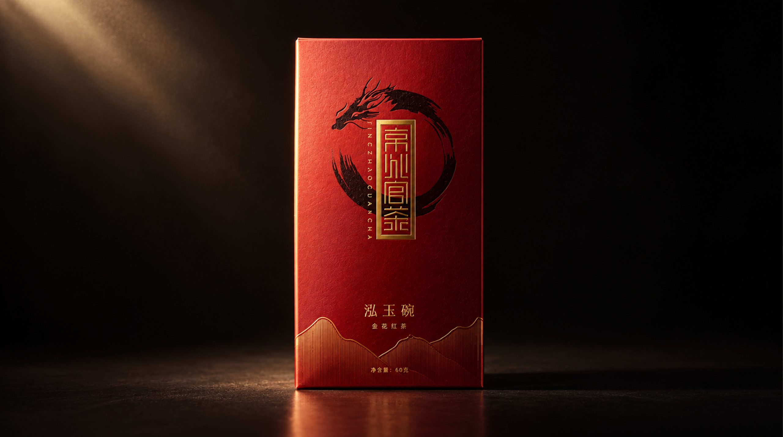
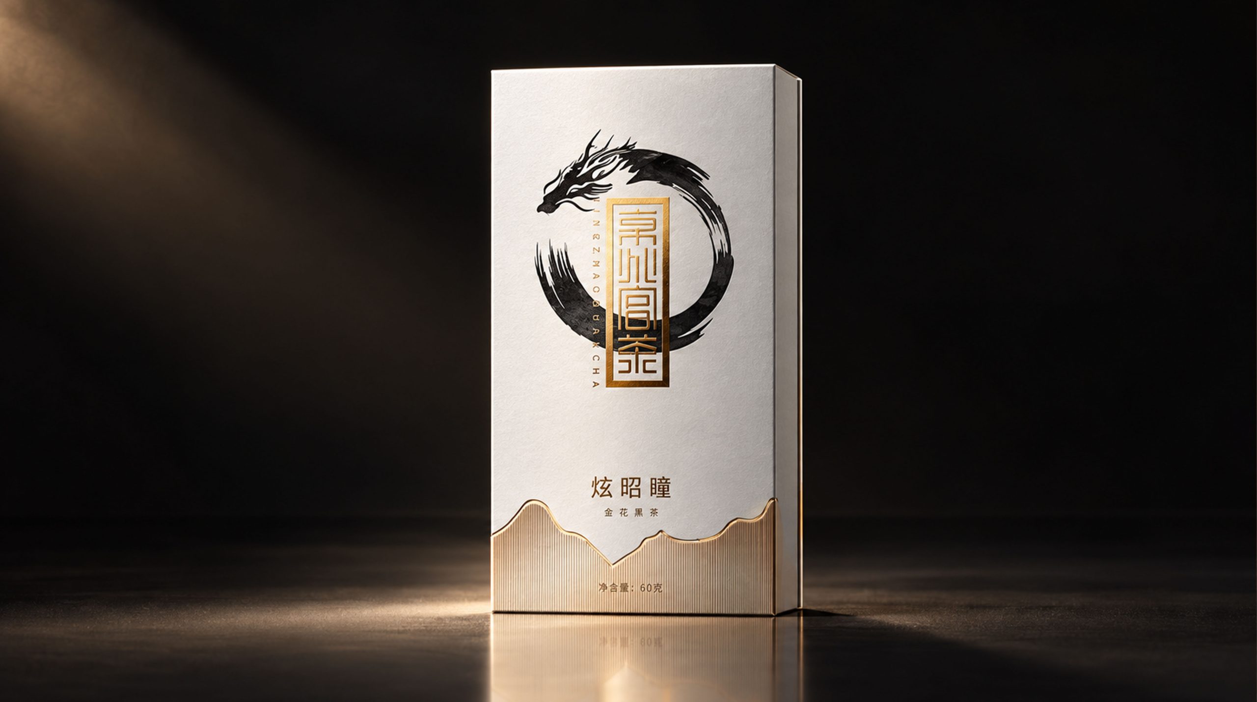
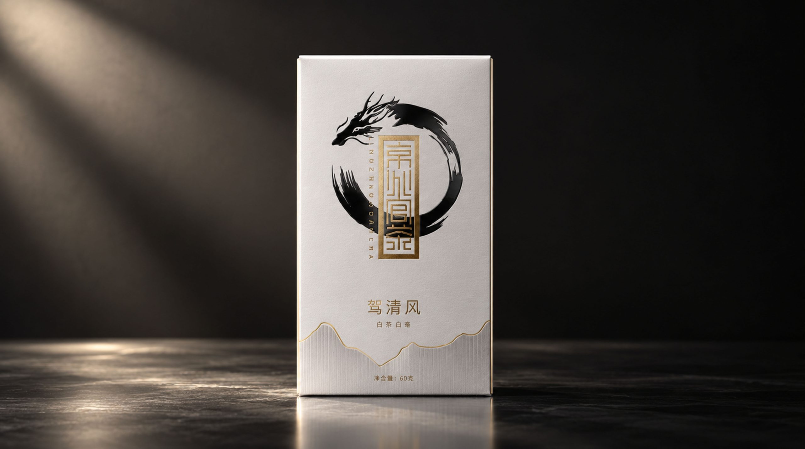
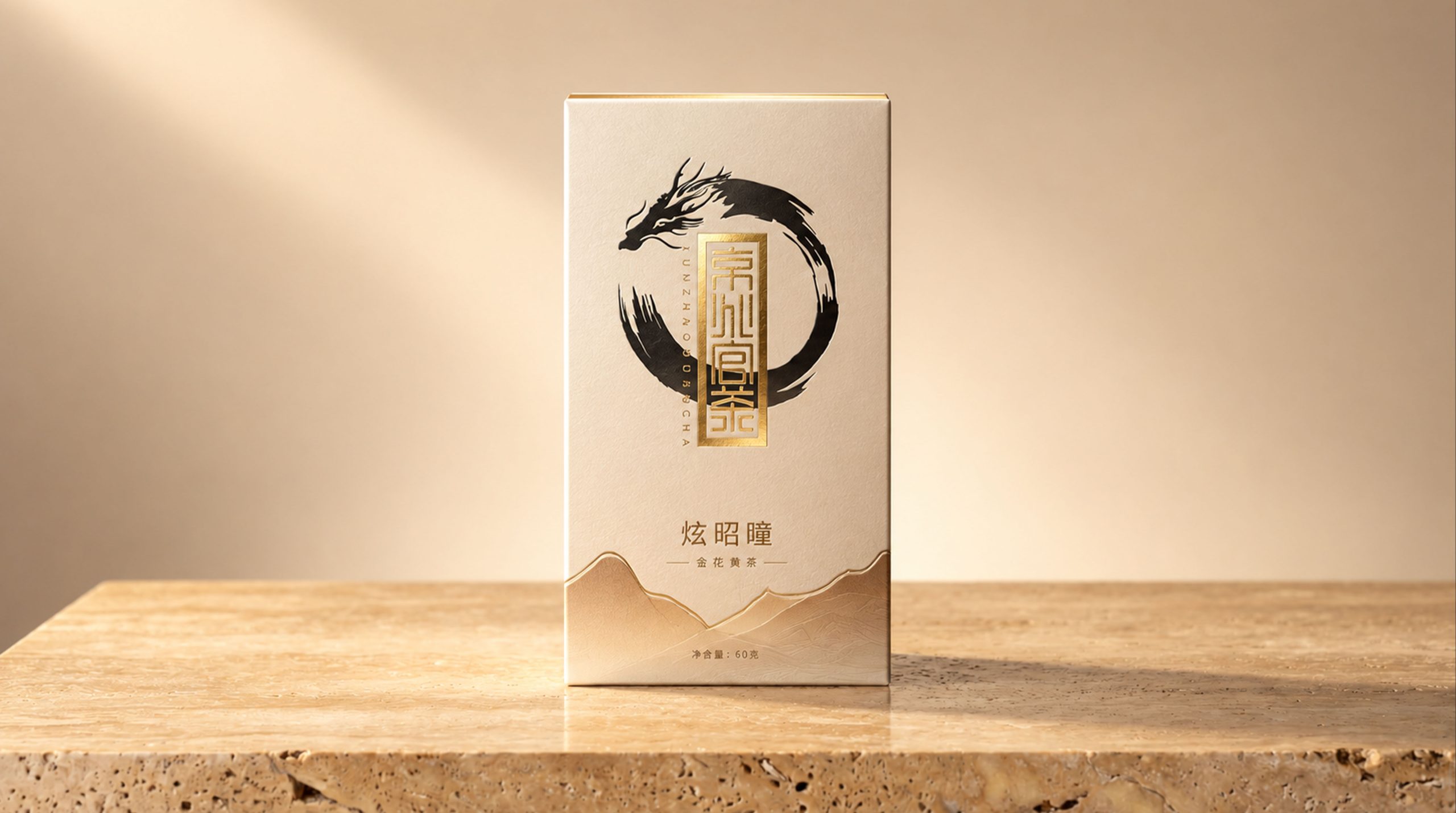
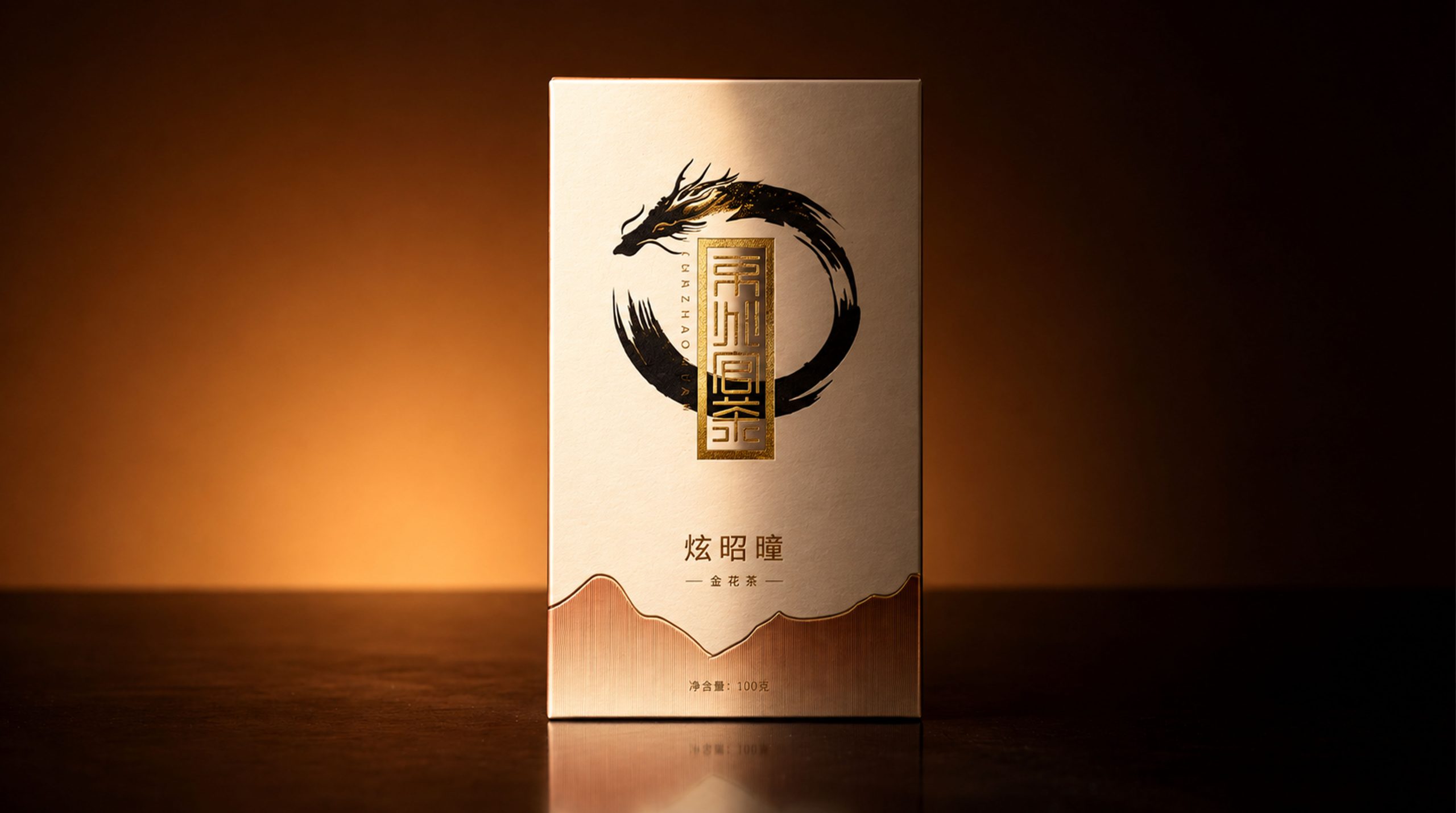
Jingzhaoguan Tea is rooted in China's profound tea culture tradition, with Jinhua fermentation technology as its core, covering four categories: yellow tea, black tea, dark tea and white tea. The brand integrates oriental ink aesthetics with modern packaging language, using the dragon pattern as the core visual symbol to convey its profound cultural heritage and elegant brand temperament.
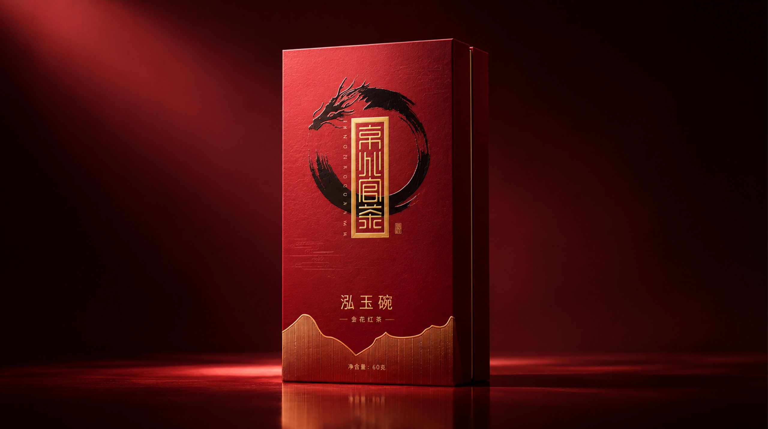
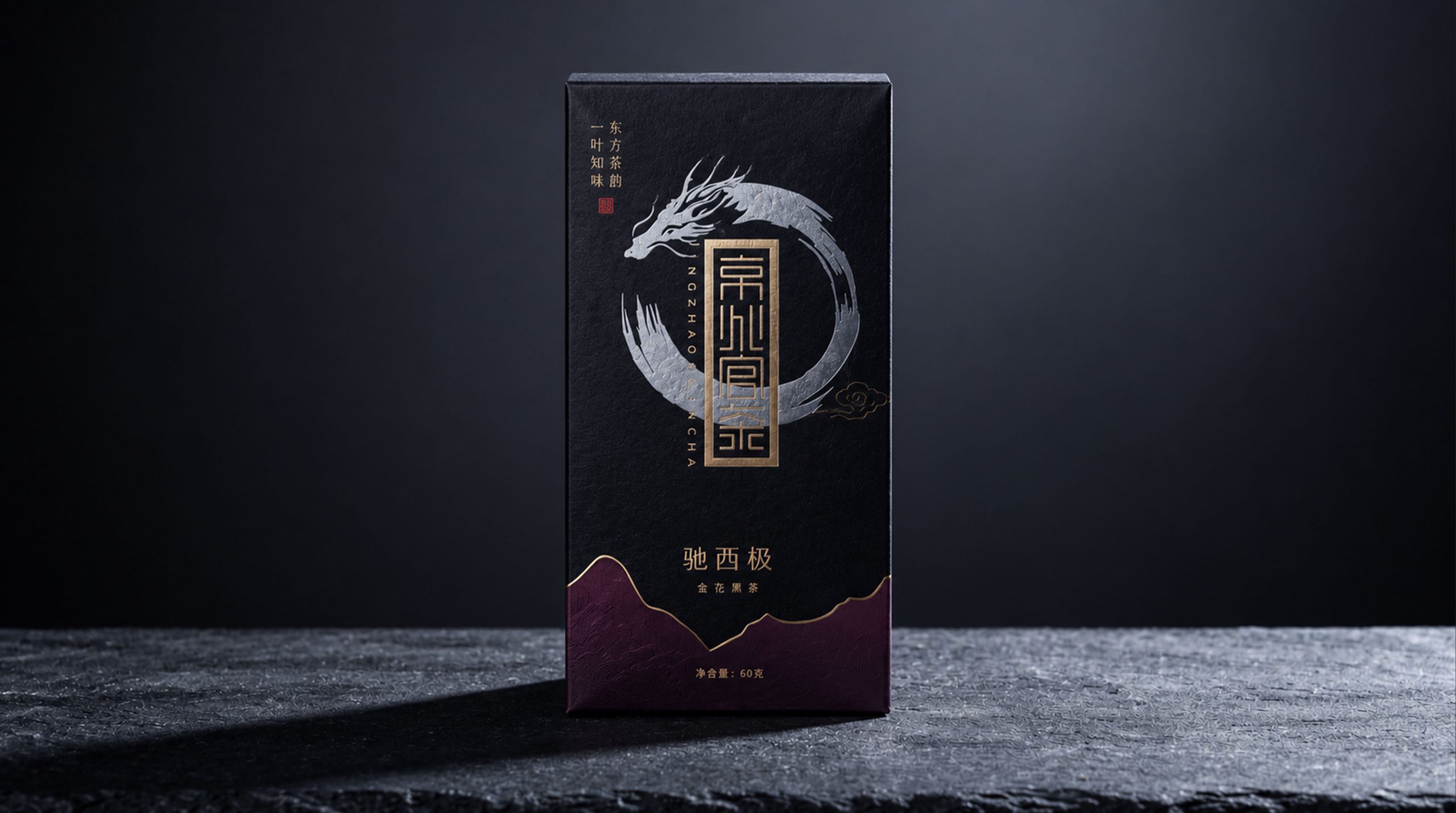
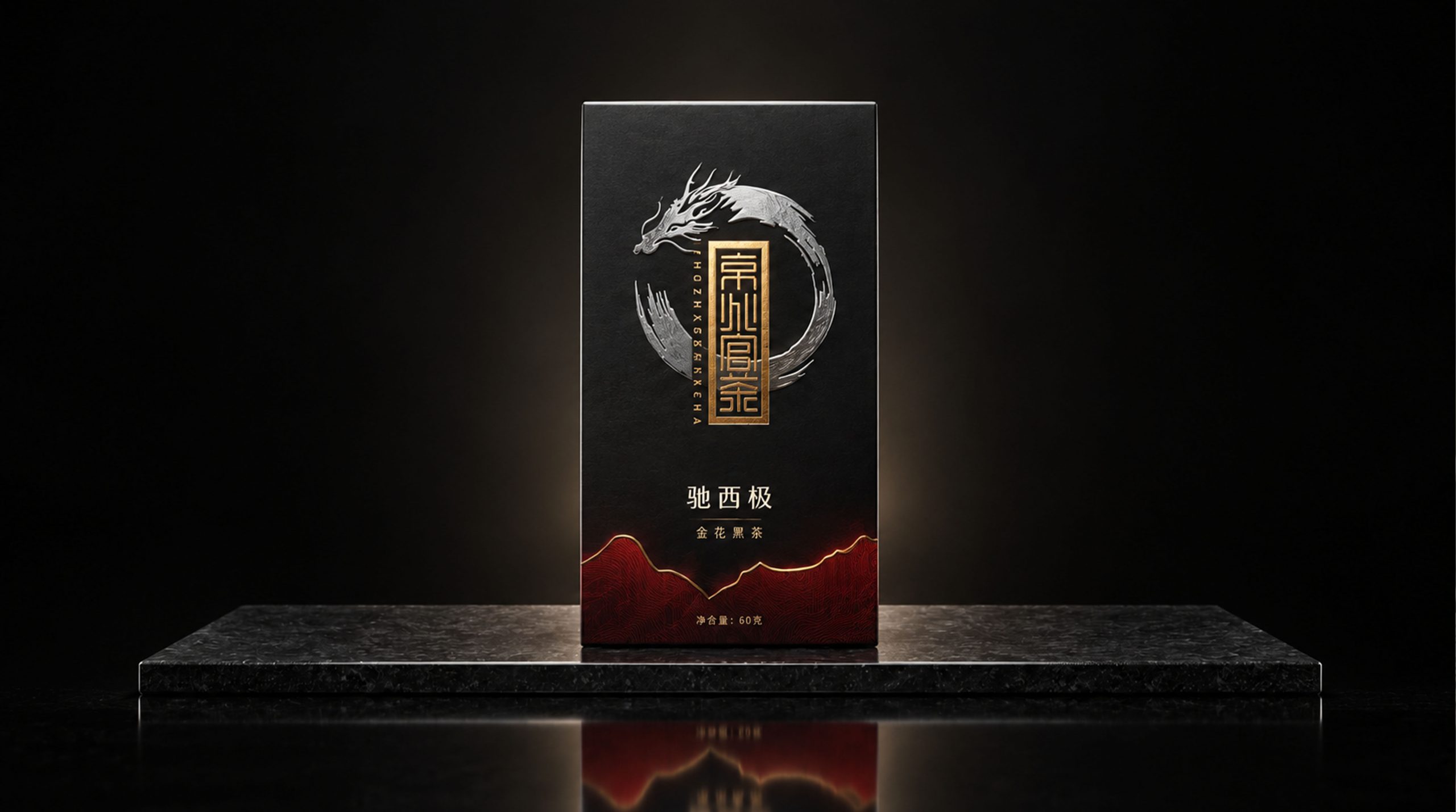
The four tea products—Xuanzhao (golden flower yellow tea), Hongyuwan (golden flower black tea), Chixiji (golden flower black tea), and Jiaqingfeng (golden flower white tea)—are presented in different colors, forming a unified and layered brand visual system.
Brand Essence
The core spirit of Jingzhaoguan Tea’s packaging design can be summarized as: Oriental × ink × etiquette, ancient charm × ingenuity × magnanimity
"Oriental" represents the brand's roots in China's thousand-year tea ceremony tradition; "Ink" is the visual language throughout, using a dragon pattern circle to present the vivid spirit of pen and ink; "Ritual Preface" emphasizes the identity of tea as the carrier of Chinese etiquette culture. "Ancient rhyme" pays homage to traditional tea-making techniques, "craftsmanship" highlights the unique skills of Jinhua fermentation, and "temporality" conveys the brand's high-end positioning through a calm and atmospheric packaging style.
Brand Philosophy
The packaging design of Jingzhaoguan Tea takes "the charm of ink and mountains and rivers" as the starting point. The freehand dragon pattern surrounds the brand seal and forms the core graphic, symbolizing the power of Eastern culture and the endless cycle of natural philosophy. The mountain lines at the bottom of the packaging are presented in a fine contour style, metaphorizing the mountains and rivers where the tea is produced, giving each tea product a unique geographical narrative.
The four packages use the same design language and differentiate tea categories through color differences, which not only ensures the brand's systematicness and recognition, but also allows each tea to have an independent personality expression. When consumers choose Jingzhaoguan Tea, they are not only drinking a cup of good tea, but also experiencing a life experience of oriental aesthetics.
Visual Language
The packaging of Jingzhaoguan Tea visually combines traditional charm with modern tension:
Color: The four tea products correspond to four main colors - apricot color (yellow tea), Chinese red (black tea), jet black (black tea), and plain white (white tea). Each color not only echoes the properties of the tea soup, but also conveys different drinking moods emotionally: warm, warm, deep, and elegant. The mountain lines at the bottom are treated with gradients of the same color, which enhances the layering and breathing of colors.
Pattern: The core vision is a circle with an ink dragon pattern. The brushstrokes are vigorous and free, and are completed in one go. It combines the freehand spirit of calligraphy and the solemn power of totem. The dragon pattern is not only a classic symbol of Chinese culture, but also coincides with the imperial charm of "Jingzhao Official Tea".
Font: The brand name adopts a seal-engraved seal style, placed vertically in the center of the dragon pattern, and is gold hot stamped, solemn and elegant. The names of each tea product, such as "Xuanzhao" and "Hongyuwan", are presented in regular script, which is upright yet literate, and is highly consistent with the overall oriental aesthetics.
Tone of Voice
The writing language of Jingzhao Guancha is concise and rich in cultural depth. The names of the teas - Xuan Zhaozong, Hong Yuwan, Chi Xiji, Jia Qingfeng - are taken from classical literary images. The four characters not only have the beauty of phonology, but also illuminate the temperament and artistic conception of the tea.
The brand's tone is calm, restrained, and confident. It does not pursue excessive modifications, but conveys deep cultural confidence with restrained expressions. The text is arranged in a clear and orderly manner, the information level is clear, and the focus is on conveying the richest brand connotation in the least text.
Brand Experience
The packaging of Jingzhao Guan Tea creates an immersive brand experience for consumers from three dimensions: visual, tactile and emotional: - **Visual experience:** The strong contrast between the ink dragon pattern and the solid color background makes the packaging highly recognizable on the shelf. When the four colors are juxtaposed, they form a majestic brand matrix, and when displayed individually, each becomes an independent painting.
Tactile experience: The packaging paper is made of special paper with texture, which is warm and delicate to the touch. The golden hot stamping part is slightly raised, adding a sense of ritual and sophistication when touched by fingers.
Emotional experience: Dragon patterns, mountains and rivers, and seal seals jointly create a field full of oriental cultural imagination, allowing consumers to be immersed in respect and yearning for traditional beauty before tasting tea.
Brand Statement
"Inheriting the ancient method of golden flowers, continuing the charm of oriental tea." The packaging design of Jingzhaoguan Tea takes oriental ink aesthetics and traditional cultural symbols as the core, integrating dragon patterns, mountains and rivers, and seal seals, conveying the brand's respect for the traditional tea ceremony and its ultimate pursuit of quality. The packaging of each box of tea is not only a container for tea, but also a condensed expression of oriental life aesthetics.