










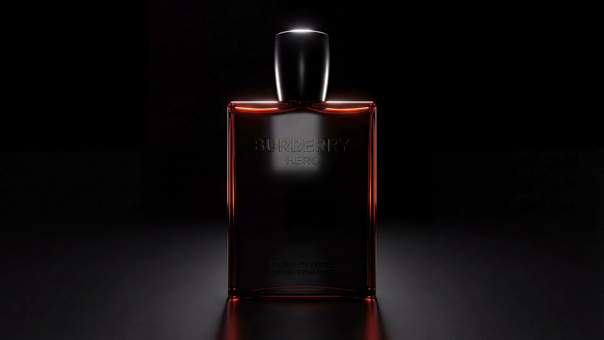
BURBERRY, a classic fashion brand originated from the UK, is famous for its highly recognizable plaid pattern and rational and elegant British temperament. In recent years, the brand has reshaped its visual language under the theme of "Modern Gentleman", shifting from traditional classic luxury to a more contemporary, restrained and powerful visual expression.
The HERO series is the representative of this new visual system. It is not only a fragrance, but also a spiritual expression that symbolizes male self-strength, independence and inner balance. The brand hopes to convey "quiet power" through minimalist appearance and deep materials, so that the fragrance and shape can jointly build a symbol of "modern courage".
This packaging design is therefore defined as a "minimalist power exercise" - it abandons flashy decoration and expresses a restrained sense of power through materials, light, shadow and proportion.
Brand Essence
The design language of BURBERRY HERO is condensed into three sets of keywords:
Restraint × Power × Eternity
Reason × Emotion × Balance
Classic × Reconstruction × Modern
These words form the spiritual basis of this fragrance packaging. Restraint represents the calm rationality of the design, strength is reflected in the thick geometric proportions of the bottle, and eternity implies its aesthetic purity that is not eroded by trends. The designer hopes to use very few visual elements to let material, touch and volume become the main narrative tools, conveying BURBERRY's unique "Silent Luxury" aesthetics.
Brand Philosophy
The core of the design concept is - "Restraint contains strength, and calmness breeds tension." The design team sought to create a piece that conveyed the masculine spirit without the need for words. This trait is not outward aggression, but a sense of restrained, calm, and self-controlled power.
At the conceptual level, packaging pursues "simplification to the essence". All decorative symbols have been removed, leaving only the relationship between form, texture, proportion and light and shadow.
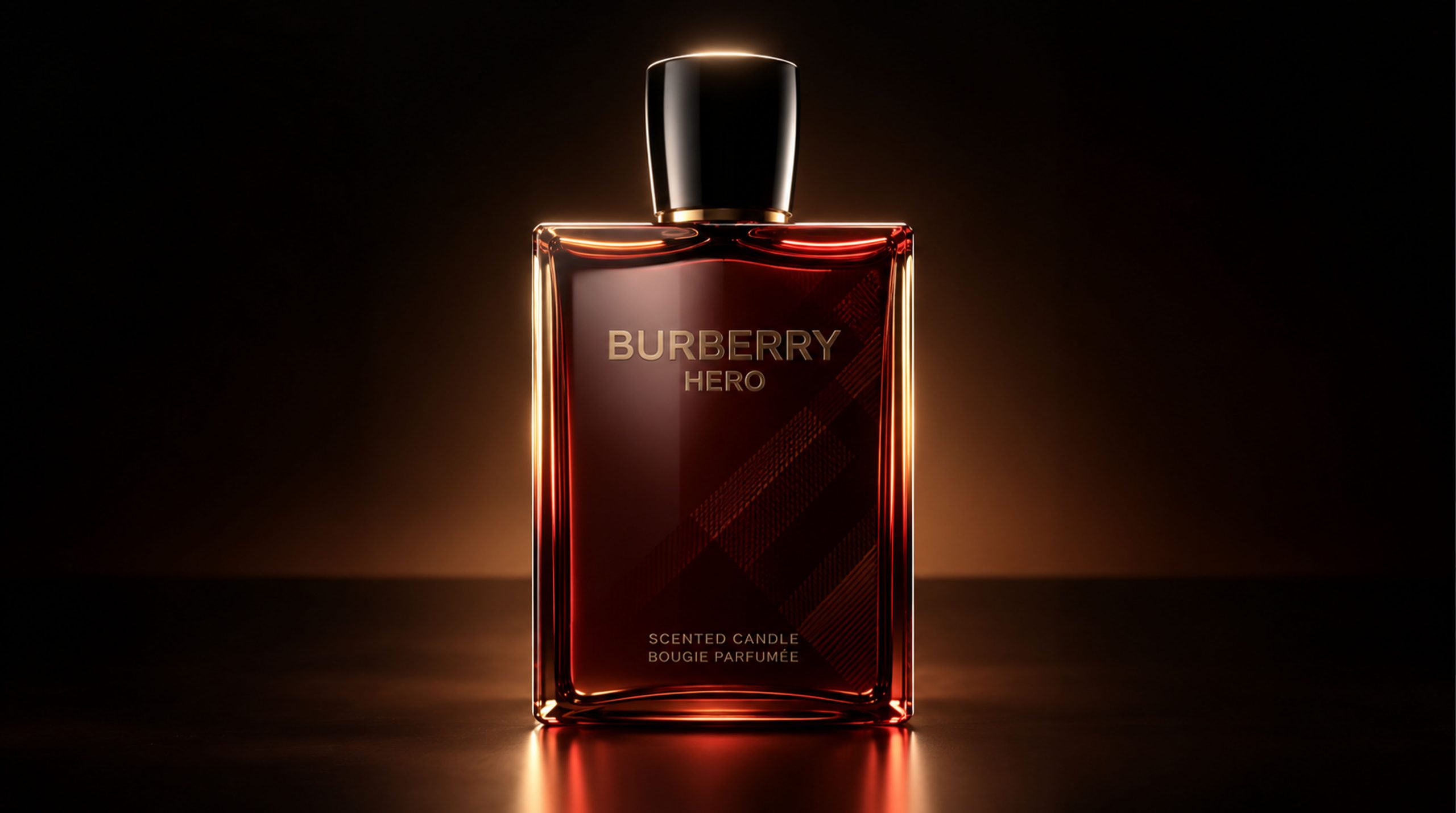
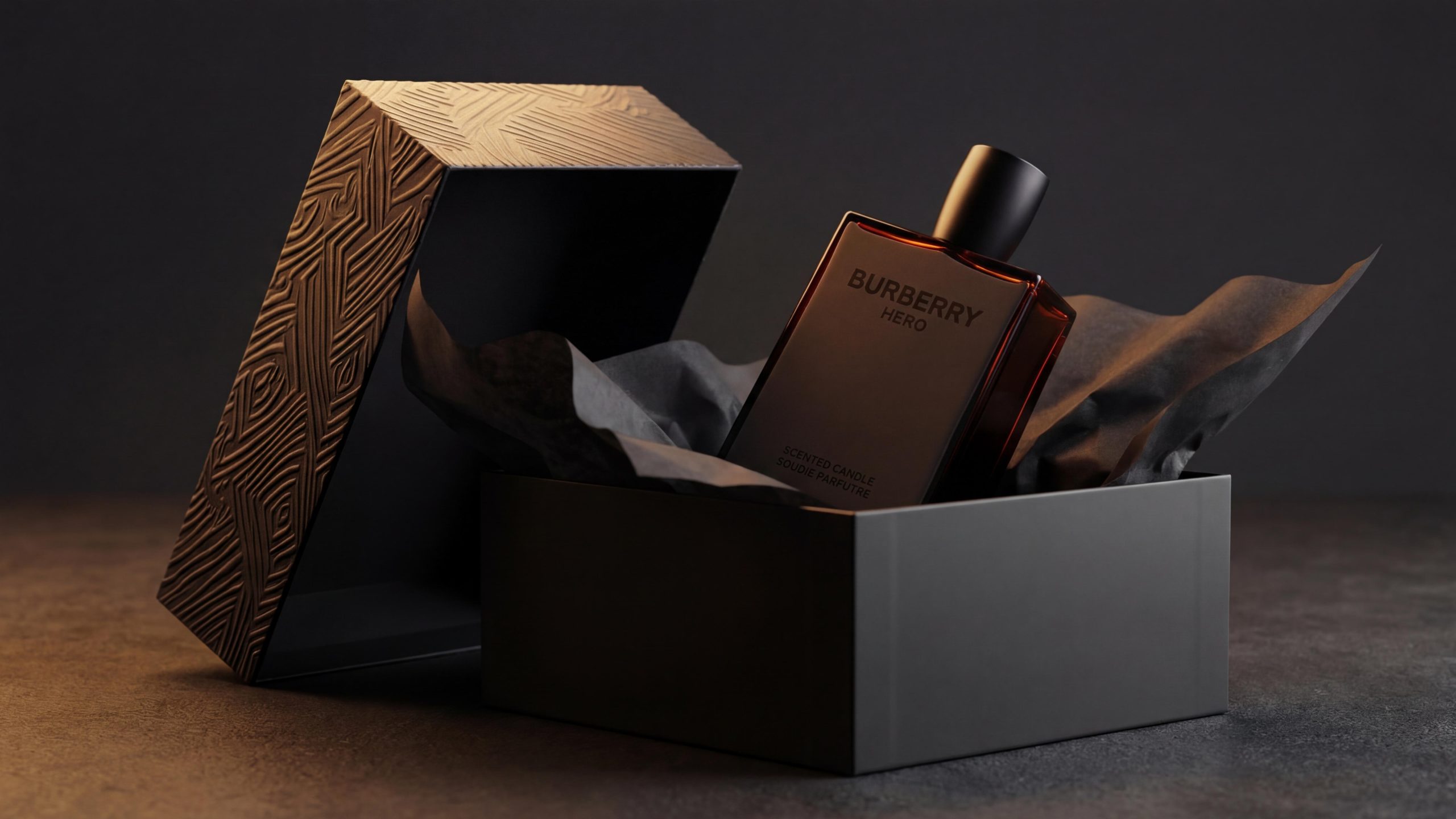
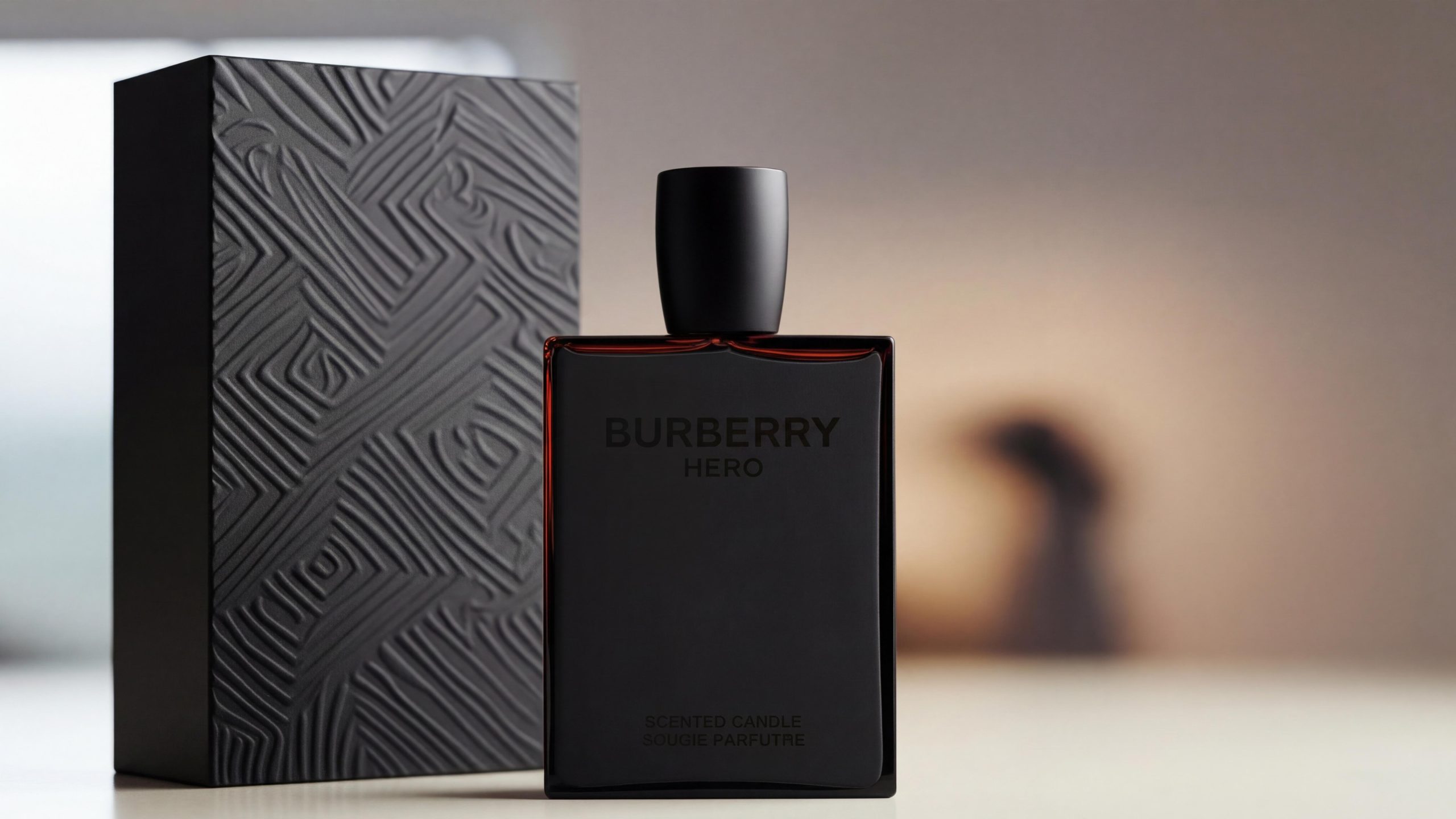
Bottle body: The square and upright shape symbolizes reason and strength, while the rounded bottle cap on the top introduces warmth and humanity.
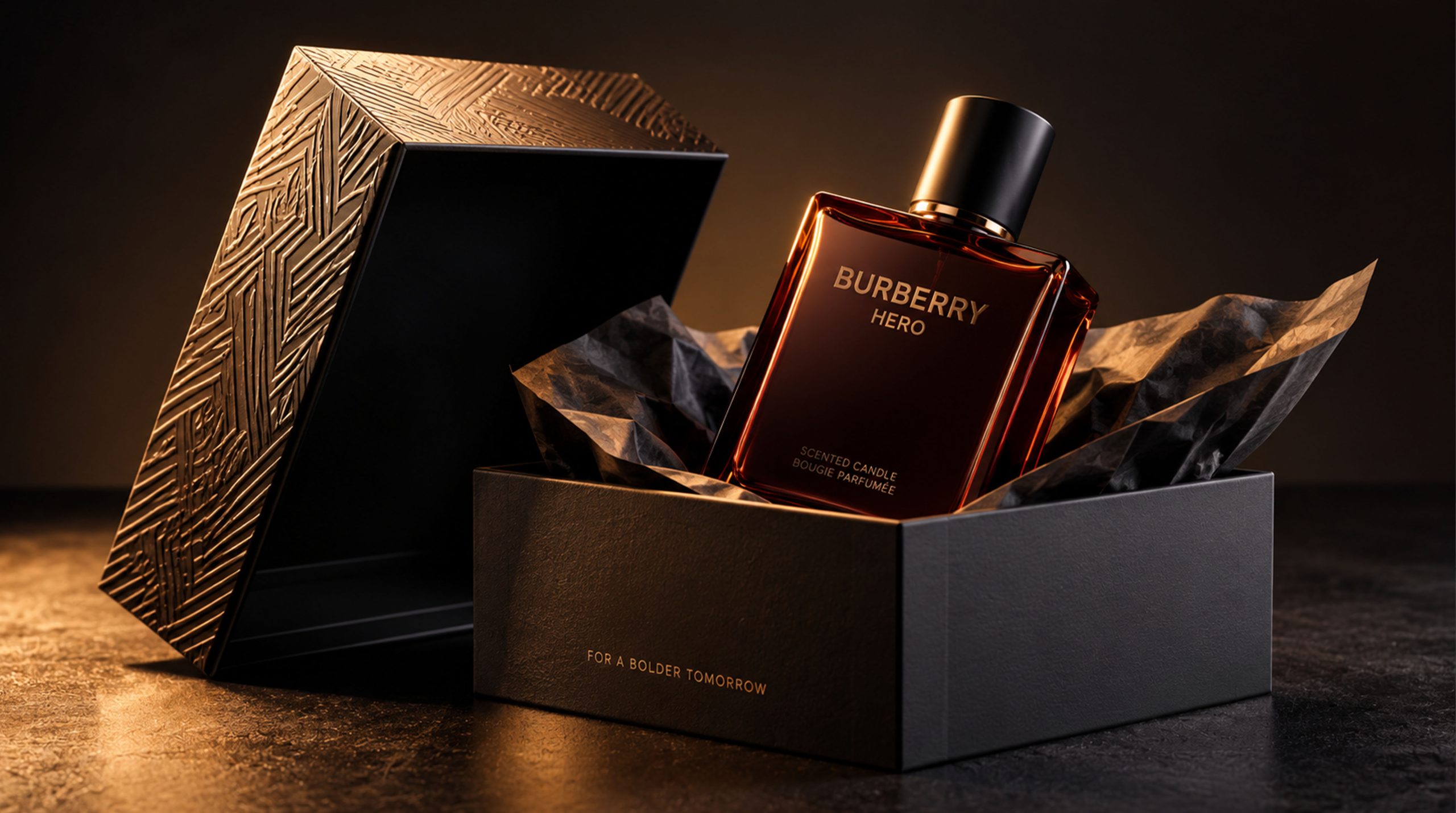
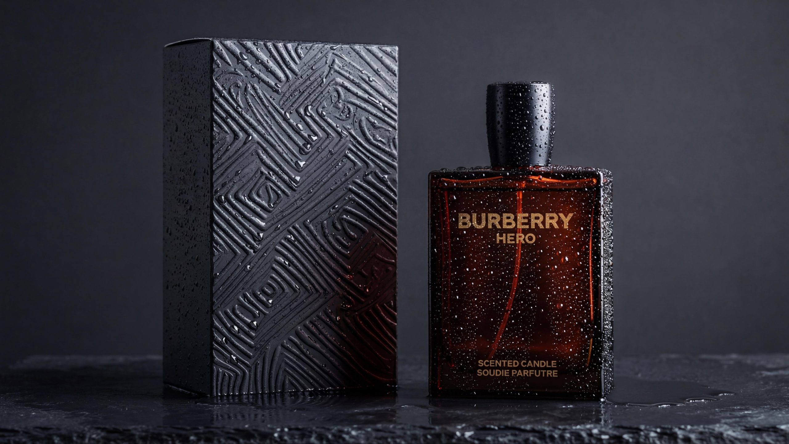
Box body: The geometric relief pattern extends the lineage of the brand's classic plaid pattern, recreating tradition in an abstract way and transforming cultural memory into modern textures.
Color tone: The all-black color scheme symbolizes depth, strength and self-control, while the slightly translucent brown tone injects warm balance into cold rationality.
All this makes packaging a "dual sculpture of vision and spirit" - both perceptible and resonant.
Visual Language
BURBERRY HERO's visual system takes "light and shadow sculpture" as its core logic:
Color system: The overall use of low-saturation matte black and dark brown glass tones. Black is a symbol of control and power, representing self-assertion; the brown background symbolizes temperature and humanity. The two form a visual "sense of internal and external breathing", which is both cold and gentle.
Materials and craftsmanship: The perfume bottle is made of high-density thick-walled glass, and the edges are precision cut, showing soft reflection in the light. The outer box uses high-pressure embossing technology to achieve a geometric texture, which is rich in touch but not complicated, showing a strong texture contrast.
Geometry and Proportion: The bottle is constructed with a ratio of 1:2.3, which is steady and slender, giving people a sense of stability and strength. Straight lines form a rational order, while the curved bottle cap introduces soft balance. The overall proportions are very architectural and conform to the aesthetic trend of "sculptural modeling" in modern design.
Visual order: Only two lines of "BURBERRY HERO" are left on the front. The brand logo uses a sans-serif font with tight spacing to enhance modernity. The layout position is lower than the center, making the visual center of gravity more stable and emphasizing the power of "quietness".
Tone of Voice
The brand language of BURBERRY HERO is just like its appearance - minimalist, calm, but not lacking in emotional tension. The overall tone is "confident but not ostentatious, rational and warm".
Product information and copywriting layout are restrained to the extreme, rejecting all excessive advertising language, making every word like a load-bearing line in a building - necessary, precise and meaningful. The language level continues BURBERRY's consistent narrative method: stimulating resonance through "blank space". Packaging does not try to tell consumers how to feel, but allows consumers to self-define its meaning through touch and use. This design attitude echoes the core philosophy of the brand - elegance is not about display, but about restraint.
Brand Experience
The experience of BURBERRY HERO runs through three levels: visual, tactile and psychological.
Visual experience: From the moment the box is opened, the reflection of the black gloss and the shadow of the geometric relief form an "architectural sense of light and shadow ritual." Whether on shelf or in a private space, the bottle can become a focal point.
Tactile experience: The three-dimensional texture of the embossed outer box brings a strong tactile memory, while the smooth texture of the bottle glass enhances the "temperature in power". The contact between the fingers and the bottle seems to complete an action of "mastery and balance".
Psychological experience: What the entire package conveys is not a luxurious display, but a kind of "self-controlled elegance." The man it symbolizes is not a flamboyant conqueror, but a restrained controller - one who knows when to attack and when to remain silent.
This experience perfectly interprets the core image of the modern Burberry man: rational, independent, calm and powerful.
Brand Statement
Restraint is another form of strength. BURBERRY HERO tells the most complex story of male spirituality in the simplest design language. It is visually minimalist and psychologically deeply symbolic. Burberry no longer pursues external ostentation, but takes a more calm stance to redefine the meaning of "modern elegance" - an elegance that can burst out with power in silence.