










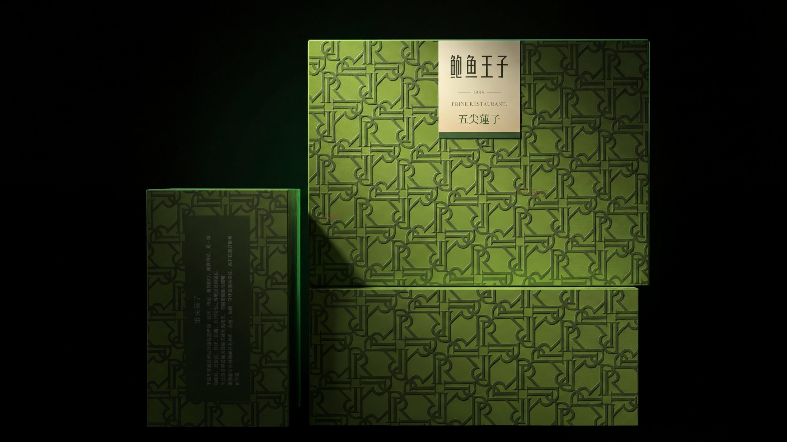
PRINE RESTAURANT (founded in 1999), in addition to the high-end food gift box series built with flake embossed patterns, it also has a set of "Exclusive Series" gift box product lines with "geometric all-over pattern × golden square seal × multi-color multi-season" as the visual pillar, covering festival gift scenarios such as mooncake gift boxes and chain gift boxes. Different from the "same color pattern base and pure texture" strategy of the flake pattern series, the exclusive series uses "multi-color geometric patterns" and "letter continuous patterns" as the core with more visual impact, raising the visual tension of the festival gift box to a higher energy.
Brand Essence
Pattern × Seal × Color
Tension × Authority × Season
"Pattern" is the visual foundation of the exclusive series. Different from the "same color texture" of the flake pattern, the exclusive series uses two completely different geometric patterns:
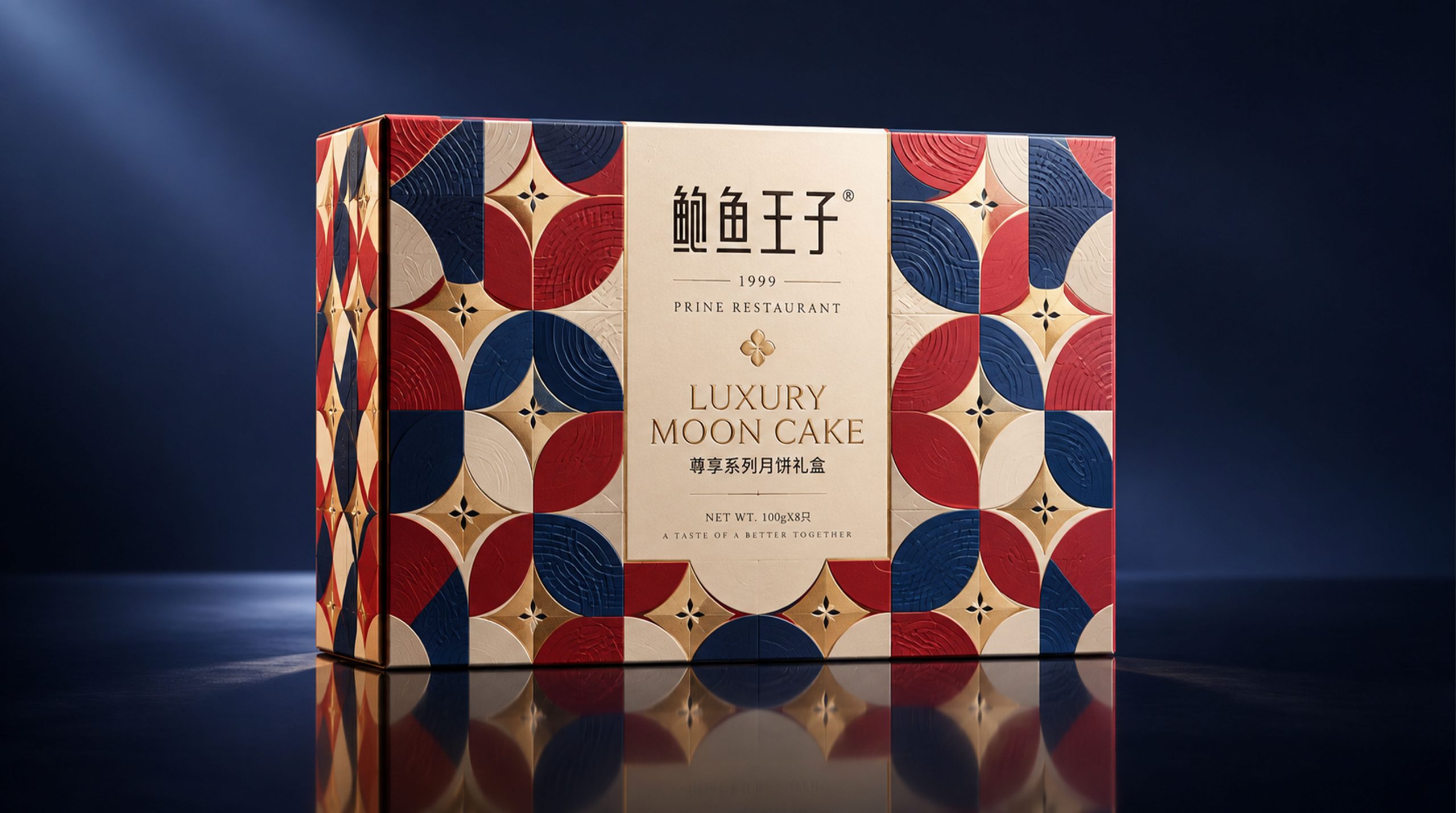
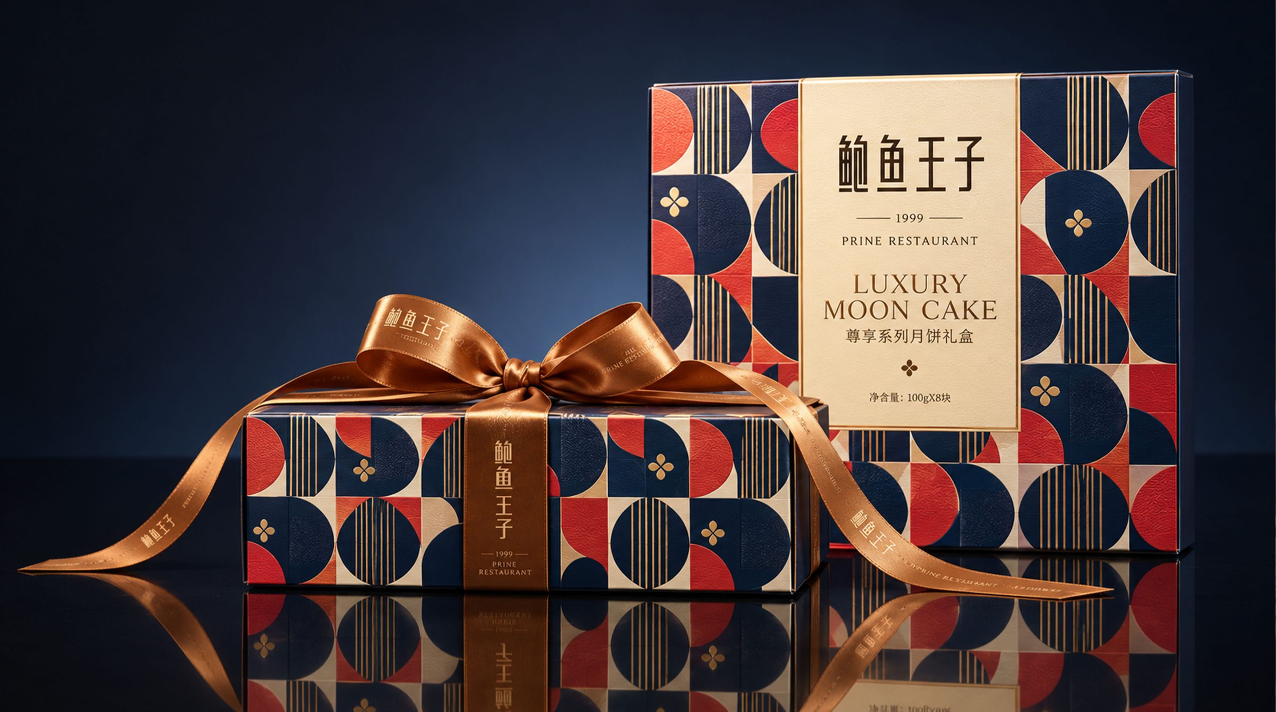
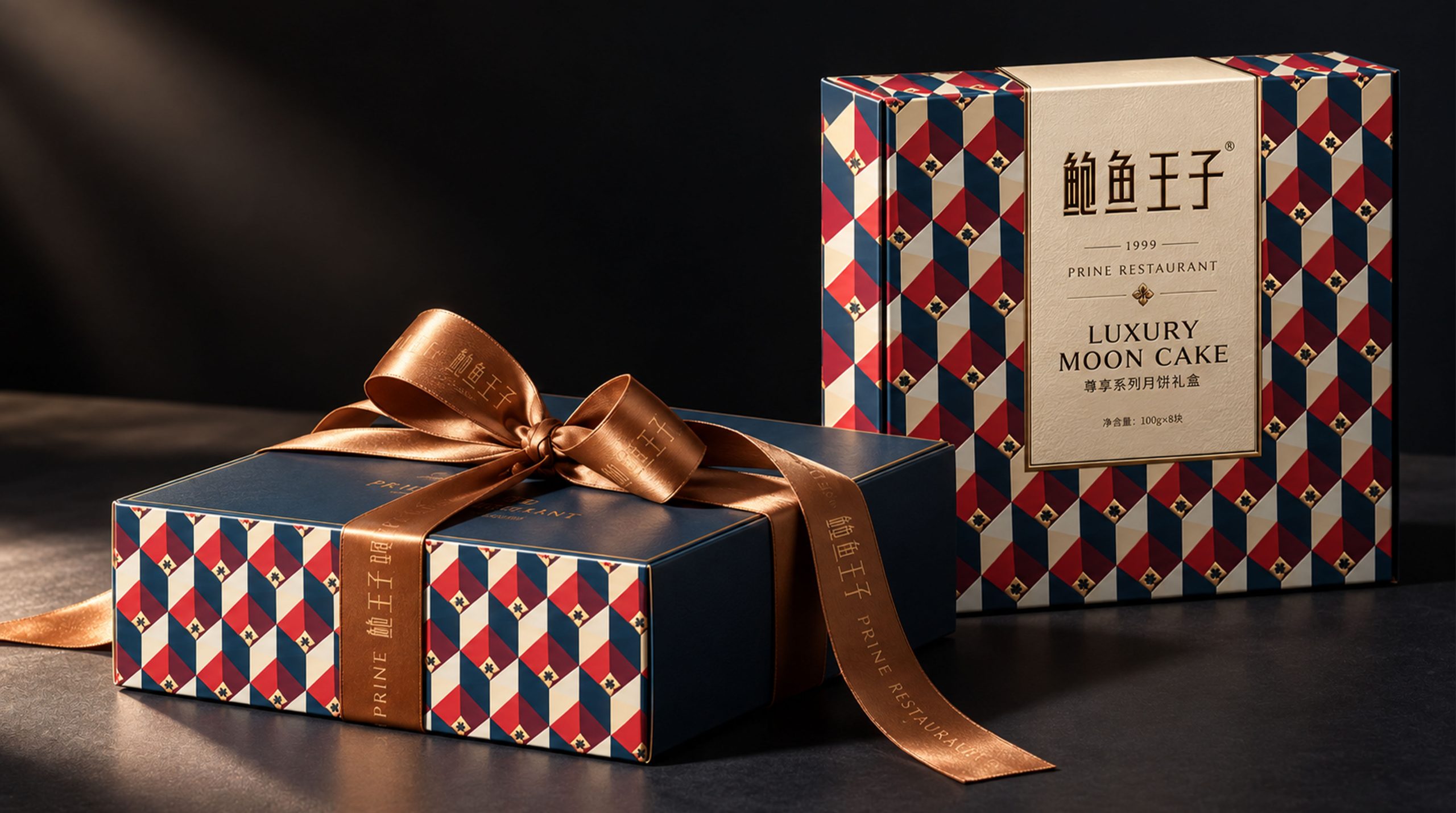
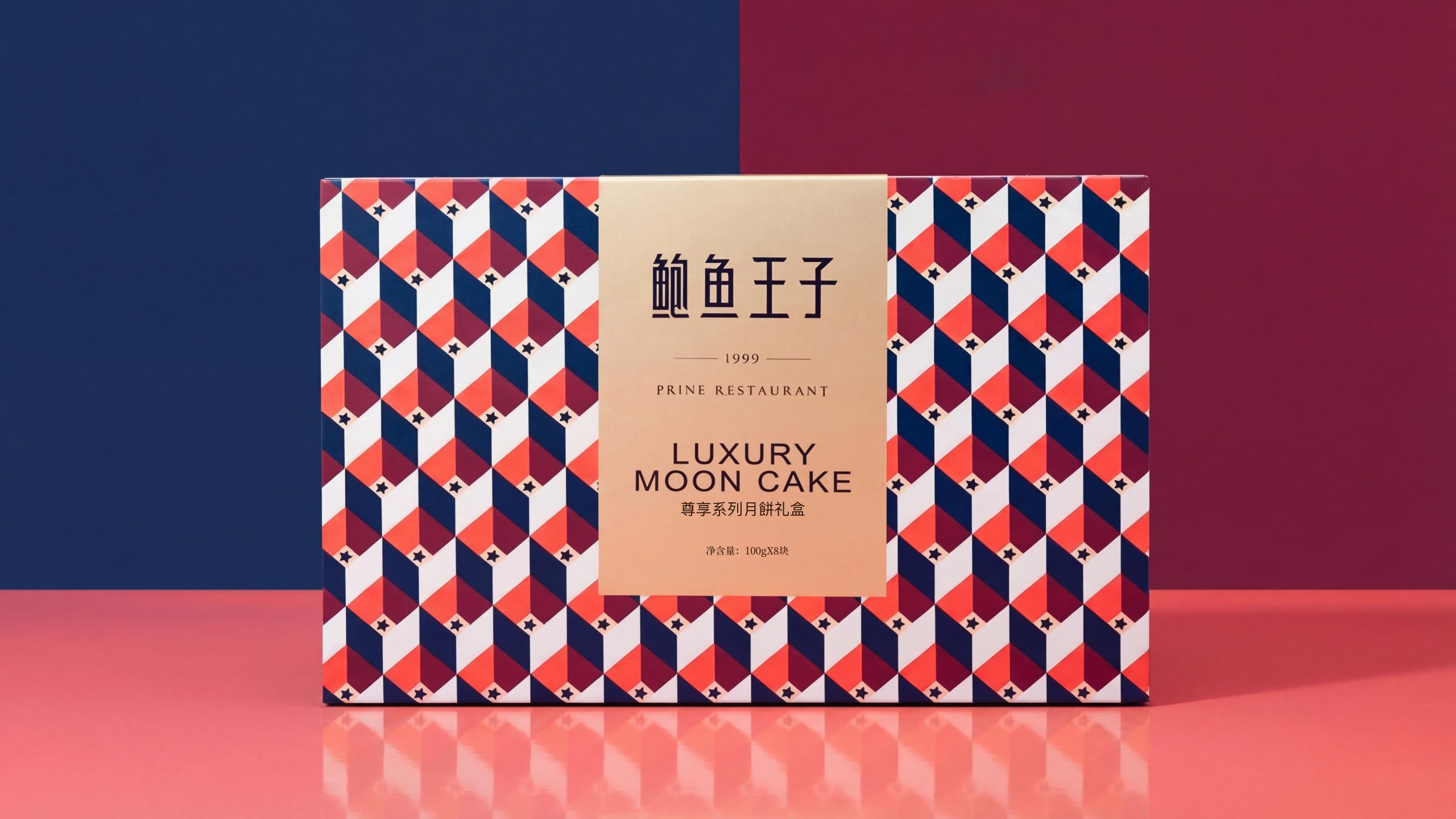
The mooncake gift box adopts a three-dimensional geometric pattern composed of dark blue, pure red, and white. Multiple diamond-shaped/arrow-shaped units are arranged overlapping in a precise perspective relationship. The alternating colors create a strong visual rhythm, and the whole is like an Op Art-style wallpaper. This "strong pattern" strategy forms a clear product line difference with the "weak texture" strategy of the flake pattern.
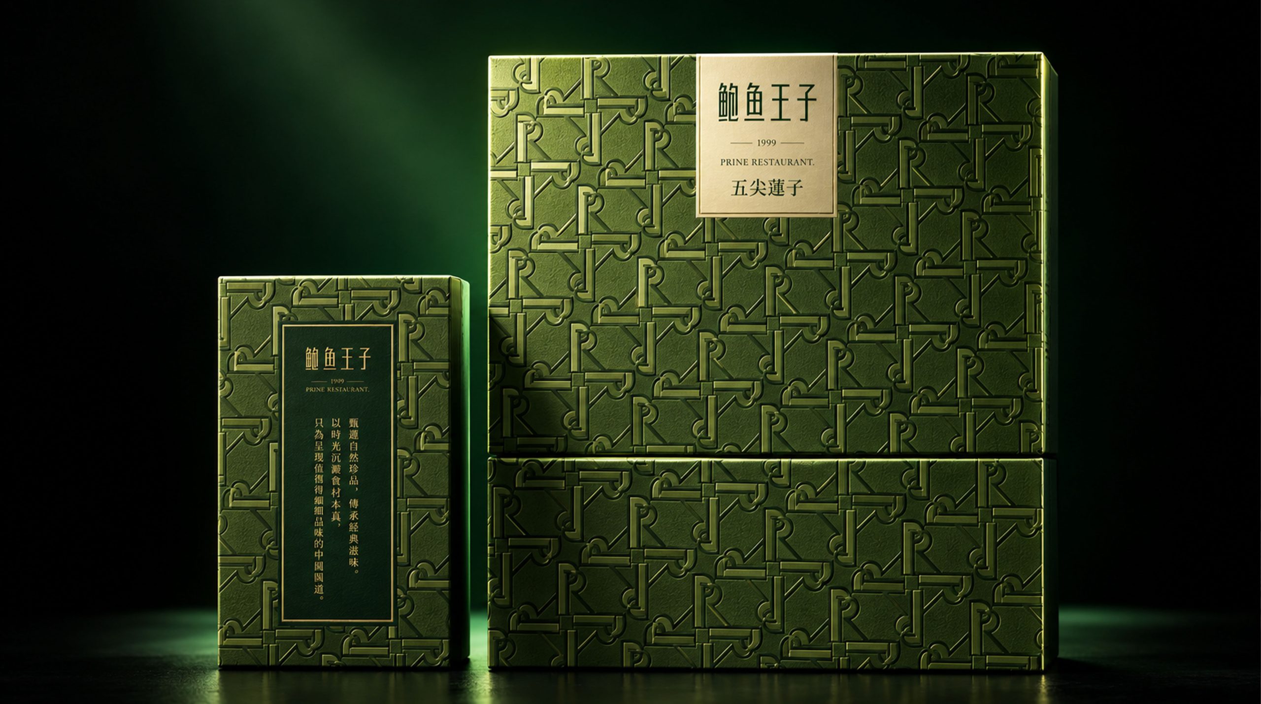
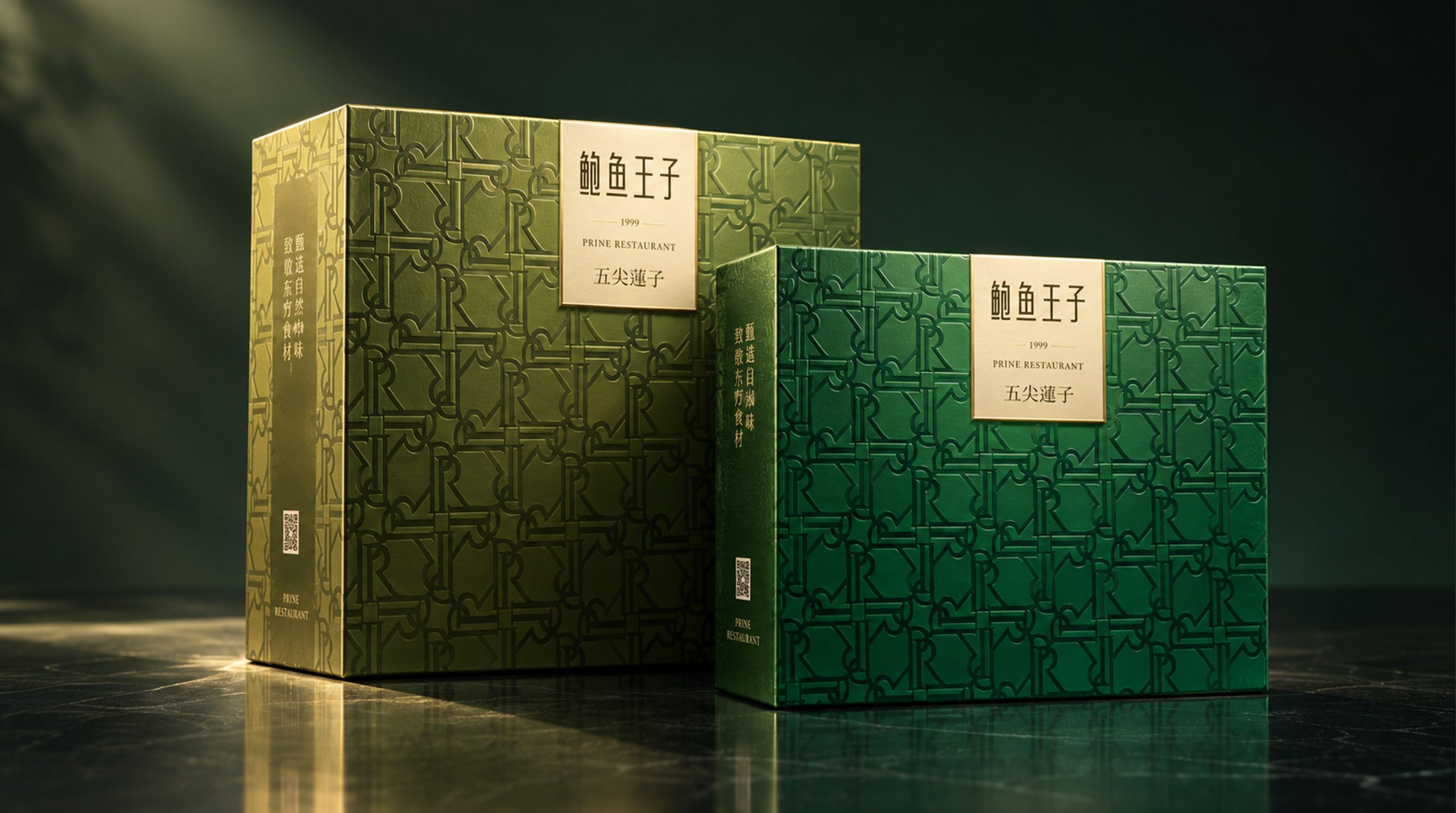
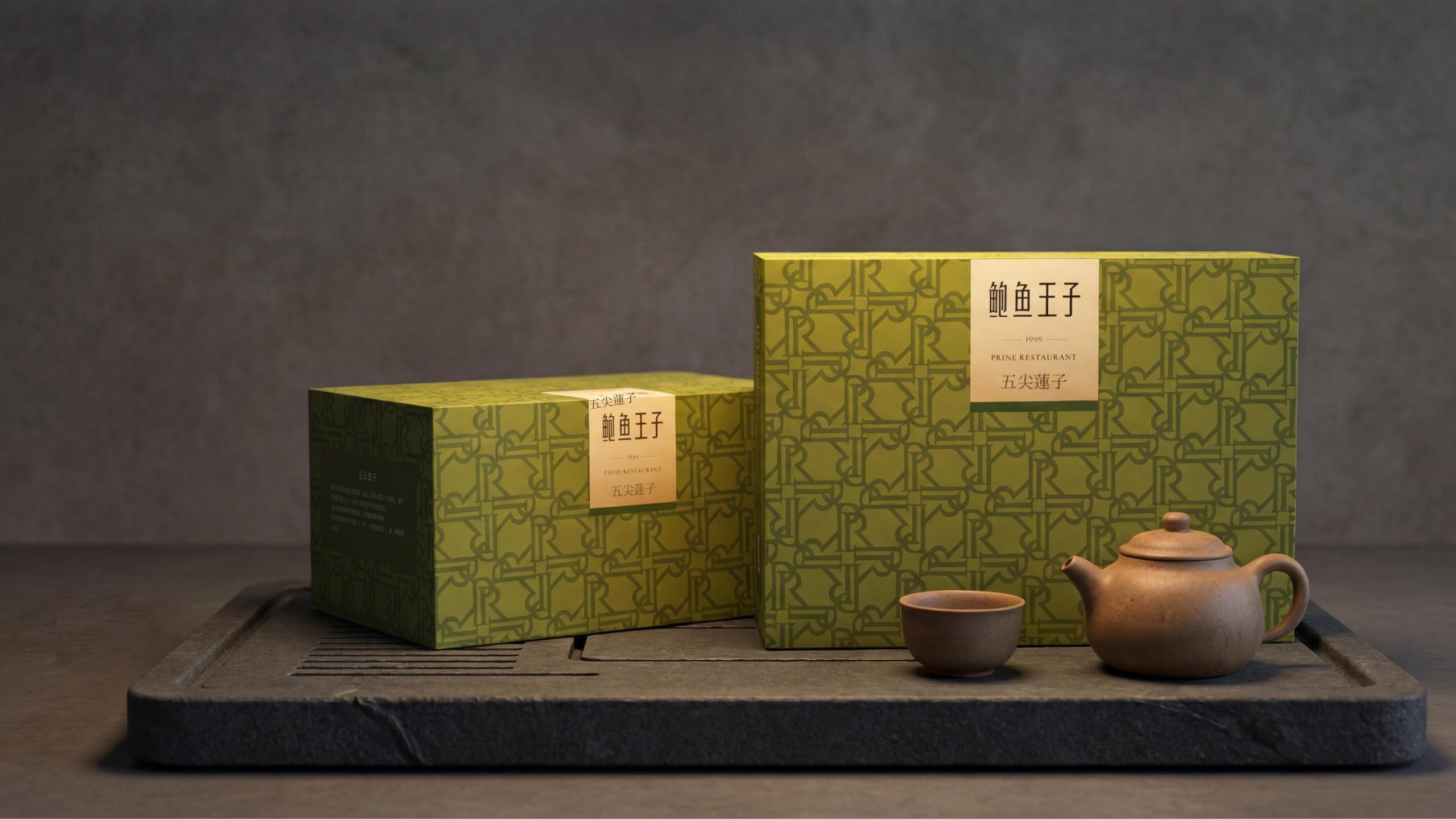
The Lianzi gift box adopts a letter pattern formed by the continuous interweaving of the brand's English initials "P" and "R" - the two letters are nested and repeated in geometric thick lines, like a modernist letter wallpaper. This "PR" letter pattern covers the entire box surface with embossed/embossed chains of varying shades of the same color. It is in line with the "pure texture" logic of the flake pattern series, but the graphic language is more modern - it turns the brand name itself into a decorative pattern, which is an extremely clever "brand logo is a pattern" strategy.
The logic of "Zhang" is completely consistent with the flake pattern series - the golden square brand label is placed in the center on the pattern, and the three-layer information of "Abalone Prince / 1999 / PRINE RESTAURANT" completes the brand recognition. However, the square seals of the exclusive series are uniformly presented on a gold background (rather than the black background of the flake pattern series). The warm luster of gold is more in line with the mood of the festival gift-giving scene.
"Color" is still the code of the product line: the mooncake gift box uses a three-color contrasting scheme of navy blue + red + white to convey the warmth and solemnity of the Mid-Autumn Festival; the Lianzi gift box uses an elegant green monochrome to convey freshness and nature.
Design Philosophy
The overall design concept is "one medal, two patterns - geometric patterns define festivals, and letter patterns define ingredients".
Mooncake gift box - "Exclusive Series Mooncake Gift Box" LUXURY MOON CAKE: A large horizontal gift box, with a full-page three-dimensional geometric pattern chain covering the entire box. The pattern consists of three colors: deep navy blue, pure red and white, forming rhombus/arrow-shaped units, which are alternately arranged in a precise perspective relationship, creating a strong three-dimensional illusion. Minimal star/cross decorations are also embedded into each unit, adding to the richness of detail. On the left side of the box, a vertical golden square brand label is placed in the center above the pattern - the label is made of matte gold, with "Abalone Prince", "- 1999 -" and "PRINE RESTAURANT" three-layered information on the upper part, and "LUXURY MOON CAKE" and "Exclusive Series Mooncake Gift Box" in Chinese in larger fonts on the lower part. "Net content: 100g × 8 pieces" is marked in small characters on the bottom. The golden square seal and the three-color geometric pattern form a visual relationship of "cum-color warm island + three-color energy field".
Lianzi gift box - "Wufu Lotus": a set combination of a large vertical gift box + a small square box. The surface of the box has an elegant turquoise color as the base, and the entire chain is covered with a continuous pattern of the letters "PR" - "P" and "R" are nested and repeated in geometric thick lines. The pattern is presented as embossing/embossing with varying shades of the same color, showing a subtle three-dimensional effect under different light angles. The same golden square brand label is placed in the center on the upper right side of the box, and "Wufu Lotus Seeds" is marked in small gold letters below the label. The small box is filled with the same turquoise background color and PR letter pattern, and a black square on the back carries product information text. The visual language of the large and small boxes is exactly the same, only the size differs.
Visual Language
Color: The exclusive series uses two completely different color strategies to correspond to two products. The mooncake gift box uses a "three-color strong contrast" strategy: deep navy blue (approximately Pantone 289C), pure red (approximately Pantone 186C) and pure white alternate in equal amounts to create a strong visual energy. The combination of these three colors coincides with the triple emotions of "solemnity" (navy blue), "festival" (red) and "purity" (white) in Chinese culture. The Lianzi gift box adopts the strategy of "monochromatic shades": elegant turquoise (approximately Pantone 577C–576C) forms the pattern and background with varying shades of the same color, just like the elegant tones of a lotus pond. Gold is the unifying factor across the two models – the square brand label is always grounded in matte gold and is the only constant color constant in the entire set of visuals.
Graphics: Two graphic languages constitute the "graphic bilingual" of the exclusive series. The three-dimensional geometric pattern uses a precise perspective arrangement of rhombus/arrow-shaped units to form a three-dimensional illusion, which is the visual subject of the mooncake gift box - this pattern is between Op Art and modern geometric design, with a strong sense of visual rhythm and decoration. The continuous pattern of PR letters, with the bold geometric lines of the brand's initials "P" and "R" nested into each other to form a cyclic pattern, is the visual main body of the Lianzi gift box - it turns the brand logo itself into a decorative pattern, a "monogram" strategy similar to luxury goods, like LV's Monogram or Goyard's herringbone pattern. The golden square brand label is the common "anchor" of the two patterns - no matter how the pattern changes, the golden square seal is always centered, ensuring the absolute priority of brand recognition.
Font: "Abalone Prince" is presented in the same customized modern Song font. The text color is dark brown or black, forming a warm contrast with the golden base. "1999" is separated by thin serifs and decorative lines. "PRINE RESTAURANT" is presented in small serif capitals. "LUXURY MOON CAKE" is presented in the lower half of the square seal in a larger capital serif font, with loose letter spacing and a solemn temperament. "Exclusive Series Mooncake Gift Box" is marked in small Chinese characters below the English name. The product name ("Wufu Lotus Seed") is presented in small gold letters below the square seal.
Packaging Structure and Details
It continues Abalone Prince's consistent "business card" restrained tone, but the exclusive series has a slightly more "scene definition" in product language than the flaky pattern series.
"LUXURY MOON CAKE" is presented in all capital letters in English. The word "LUXURY" is the only emotional modifier in the entire set of words - it does not say "noble", "premium selection" or "ancient method", but directly uses the international "LUXURY" to complete the positioning - this is a kind of confidence that disdains explanation. The "Exclusive Series Mooncake Gift Box" is marked with small Chinese characters, and "Exclusive" and "LUXURY" form a bilingual correspondence in Chinese and English.
The name of "Wufu Lotus" has two more characters "Wufu" than "Lianzi" in the "Lianzi" series - this is the origin label (Wufu is the famous origin of Lianzi), which completes the trust of the origin in the simplest way.
"Net content: 100g × 8 pieces" is the only functional information on the mooncake gift box, placed at the bottom of the square seal in a very small font size - the brand's attitude is: there is a lot of information required by regulations, but never let them occupy the visual attention.
Brand Experience
Visual: The three-color geometric pattern of the mooncake gift box is a very significant "modern anomaly" in the Mid-Autumn Festival mooncake gift box market. In the mooncake packaging, which mainly features the full moon, jade rabbit, palace spirit, and golden cloud patterns, a gift box with a chain of opal geometric patterns in navy blue, red, and white colors suddenly appears in a row of traditional landscape paintings like a contemporary art installation. The PR letter pattern of the Lianzi gift box presents the brand's modern feel in a more elegant way - it is not eye-catching, but if you look closely, you will find that each pattern unit is part of the brand name. The golden square seal maintains a completely consistent form in the two completely different patterns, ensuring that consumers immediately recognize that "this is the Abalone Prince".
Tactile touch: The glossy coated surface of the mooncake gift box provides a smooth, clean and modern touch. There is no tactile difference at the fingertips at the intersection of the three colors (all are flat printing). The hot stamping area of the golden square seal and the surrounding printed surface form a tactile transition of "smooth → lukewarm metal". The tactile experience of the Lianzi gift box is similar to that of the flake pattern series - the embossed relief of the PR letter pattern forms a precise rhythmic touch on the fingertips, and the undulating lines of each "P" and "R" are clearly distinguishable on the fingertips.
Scene: The three-color geometric pattern of the mooncake gift box has a strong "topic" in the Mid-Autumn Festival gift-giving scene - the first reaction of the gift recipient is often not "this is a mooncake" but "this box is so special". This kind of visual surprise that "exceeds expectations" adds extra emotional value to the gift-giving behavior. The elegant green color of the Lianzi gift box conveys freshness and nature in the summer and autumn gift-giving scenes. The combination of large and small box sets provides flexible price options for gifts.
Brand Statement
Abalone Prince·Exclusive Series - the same medal, two patterns. Seasons change, but quality remains the same. Abalone Prince's "Exclusive Series" uses two graphic languages: three-color three-dimensional geometric patterns and PR letter continuous patterns to build a modern geometric aesthetic system that is unique in the festival gift box market. The mooncake gift box replaces the full moon and jade rabbit of traditional mooncake packaging with three-color explosions of navy, red, and white; the Lianzi gift box uses the brand name itself as a decorative pattern, completing a visual strategy like a luxury monogram. The golden square seal is always in the center. No matter how the pattern and color change, the three-layer message of "Abalone Prince / 1999 / PRINE RESTAURANT" always calmly defines the same thing - the seasons are changing, the ingredients are changing, but the quality remains the same.