










WANDASHAN is a Chinese liquor brand with the Wanda Mountains in Heilongjiang as its spiritual homeland. Its product lines cover three packaging series: "Ice Fine Wine" blue series, "Precious Wine" wood and stone series and classic red gold series, corresponding to the complete price range from daily banquets to high-end collections. In terms of packaging design, Wandashan constructed a set of multi-material and multi-color visual matrix with the "mountain-shaped motif" as the running clue: the blue color conveys the pure brewing environment of the arctic cold in the north with glacier-like transparency, the red gold color carries the grand ceremony of Chinese gift culture with the thickness of the earth, and the wood and stone color tells the value of time and storage with a silence like rock formations. Each of the three languages has its own temperature, but they share the spirit of the same mountain - Wanda Mountain, which is not only the place of origin, but also the starting point and destination of the brand's entire narrative.
Brand spiritBrand Essence
The core spirit of Wandashan liquor packaging design can be summarized as:
Mountain × Ice × Hidden
Thickness × Purity × Time
"Mountain" is the source and anchor of the brand's entire narrative. The outline of the Wanda Mountain Range appears repeatedly on each package using different techniques such as relief, bronzing, and line drawing. It is not only a direct expression of geographical coordinates, but also a spiritual metaphor for the brand's temperament - calm, powerful, and unshakable. "Ice" is the unique aesthetic language of the blue product line, conveying the 45° north latitude with ice-blue glass bottles and silver-blue gradient boxes. The pure water source and low-temperature slow-brewing process of the extremely cold production area are convincing in the narrative logic of transforming geographical disadvantage into quality advantage; the "Tibetan" is condensed in the wood and stone materials and dark tones of the rare wine series. The time value of the cellar is conveyed through the visual cues of natural oak texture and rock texture. It does not mention the year, but it alludes to the years. "Thickness" is the core texture of the red gold gift box - the rough fiber texture of the golden earth paper, the visual impact of the large red calligraphy characters and the vigorous brushstrokes of the mountain-shaped line drawing together form a reassuring sense of weight; "Purity" is the soul of the blue series - from the bottle to the box, the ice blue gradient is like staring at a piece On the ice surface of the North, all decorative elements are compressed to a minimum, leaving only the mountain shape, calligraphy and brand name; "time" is the silent assertion of the rare wine series wood and stone box - the texture of the real oak panel, the low-key texture of the dark gray fabric and the display method like a stone seat, together imply a kind of calmness after a long wait.
Brand conceptBrand Philosophy
Wanda Mountain takes "three expressions of a mountain" as its overall design concept. The same Wanda mountain range shows completely different looks in different seasons, different lights, and different times. The brand's three major product lines are the design translation of these three mountain expressions:
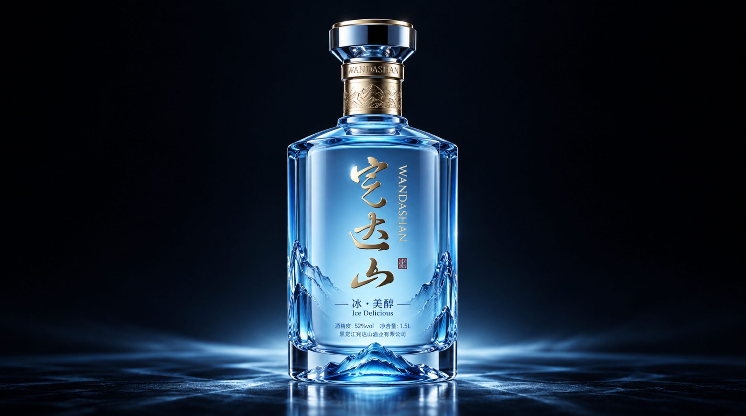
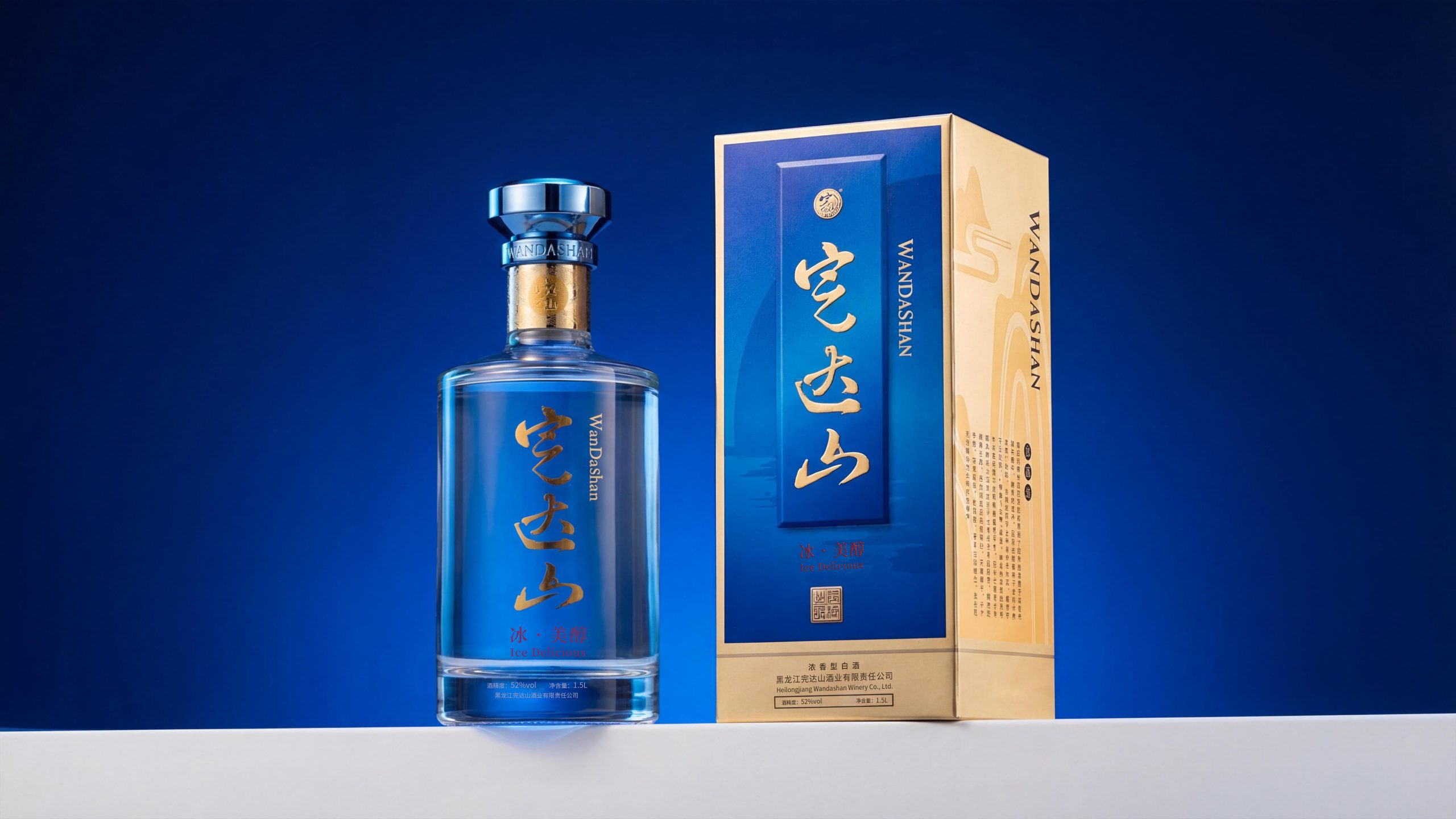
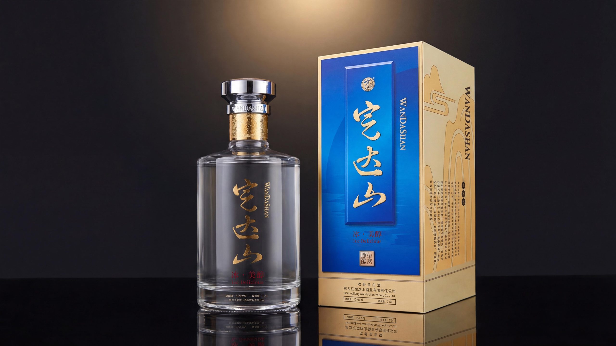
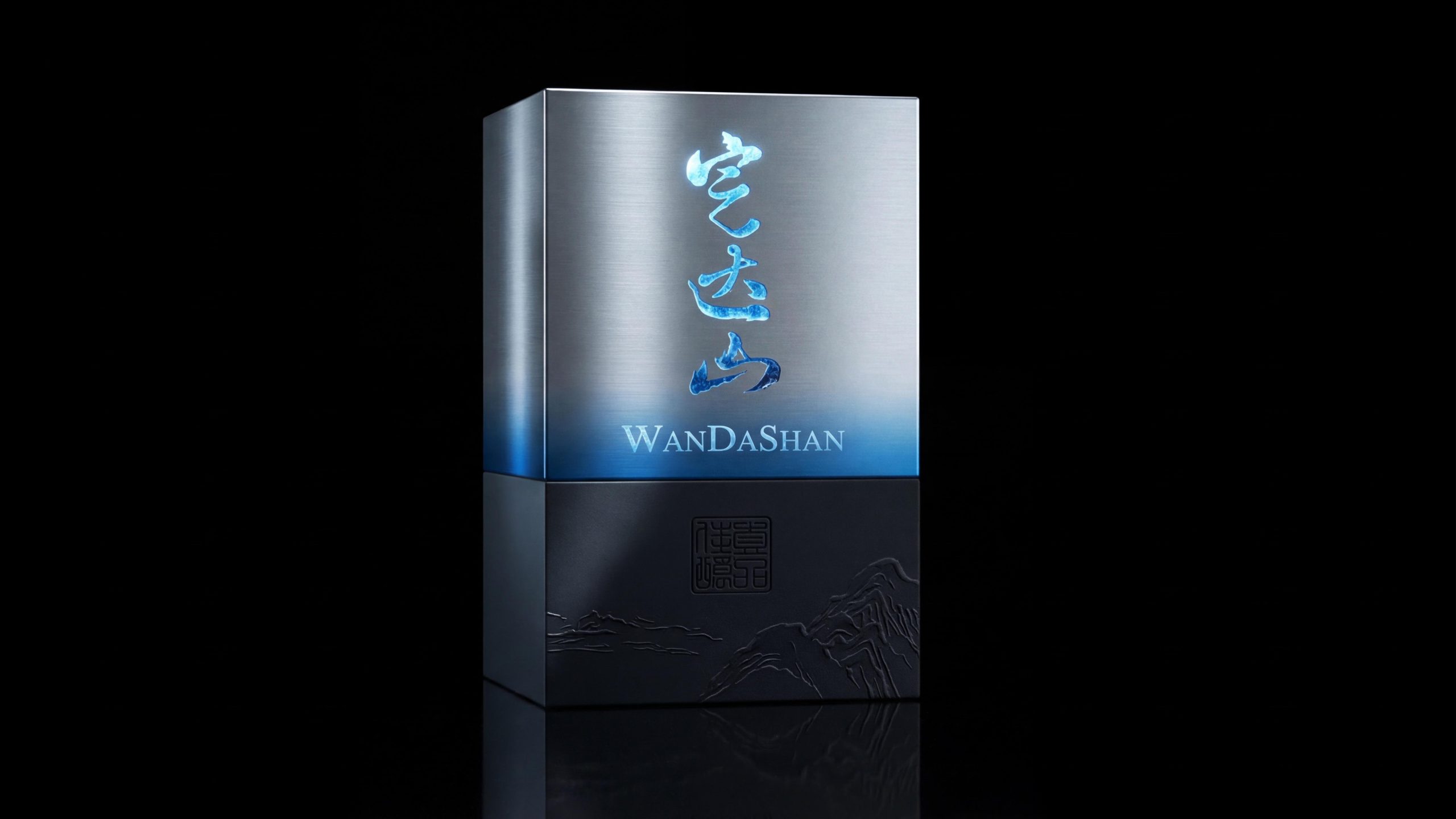
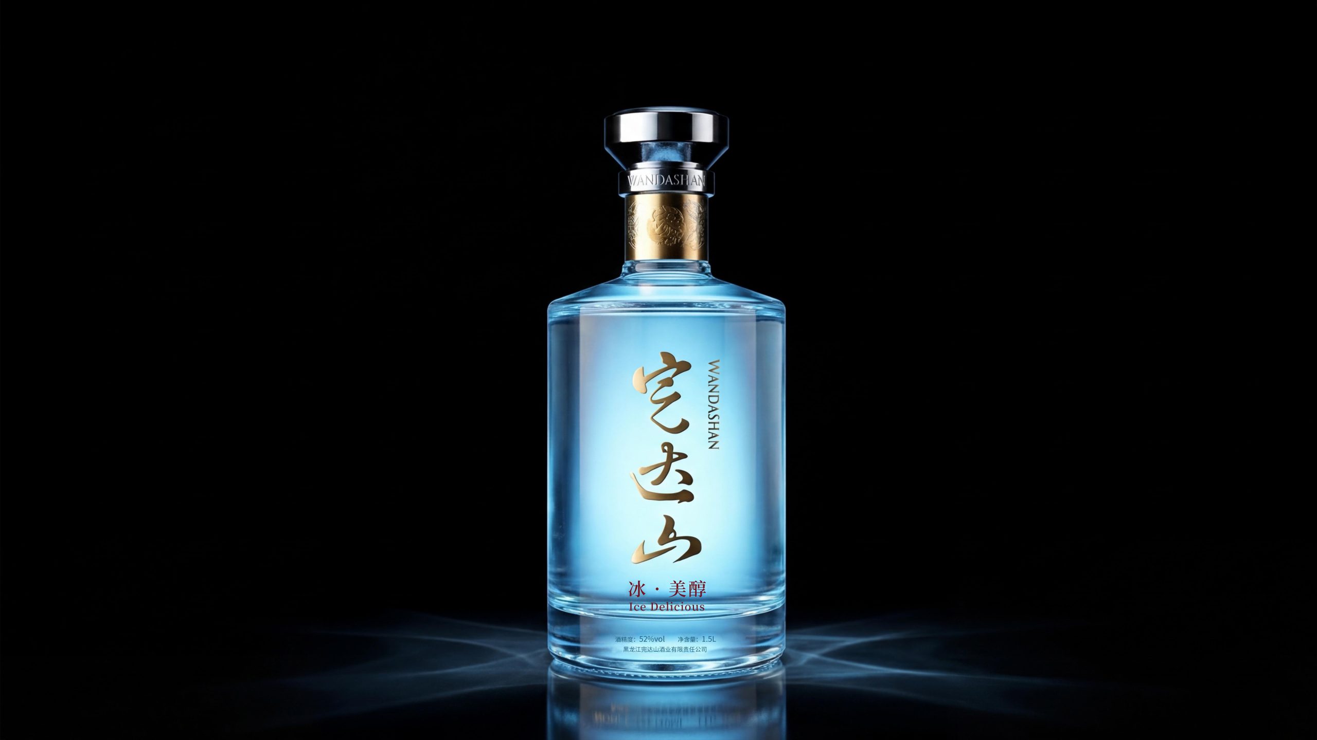
"Ice·Beautiful Wine" Blue Series (Ice Blue Glass Bottle × Blue Gold Carton): The bottle body is blown from transparent ice blue high white material glass. The bottle body is in the shape of an upright straight cylinder. The shoulders are narrowed to a short neck with a sharp arc. The bottle neck is tightened with a matte silver metal ring. The bottle cap is a flat cylindrical metal cap with the brand's circular emblem pressed on the top surface. The whole bottle is like a column of solidified glacier blue ice. The front of the bottle uses hot stamping technology to display the vertical calligraphy of "Wandashan" and "WANDASHAN" in Latin letters. The product name "Ice·Beautiful Brew" is marked in small white characters on the lower part of the bottle. The outer box is a square cardboard box, and the surface of the box is covered with a vertical gradient from dark blue to silvery white, which is like the visual experience of looking up at the Wanda Mountains in winter, transitioning from the dark blue night sky to the silvery white snow line. On the right side of the box, the golden characters "Wandashan" and the brand name "WANDASHAN" are arranged vertically. The red seal and the subtitle "Ice·Fine Wine" in the lower left corner are the finishing touch to break the cold tone of blue and silver. On the bottom side of the outer box, a golden mountain-shaped line drawing is closely arranged with the brand's historical text, forming a narrow information belt. The words "Beijing 1957" mark the starting point of the brand's history.
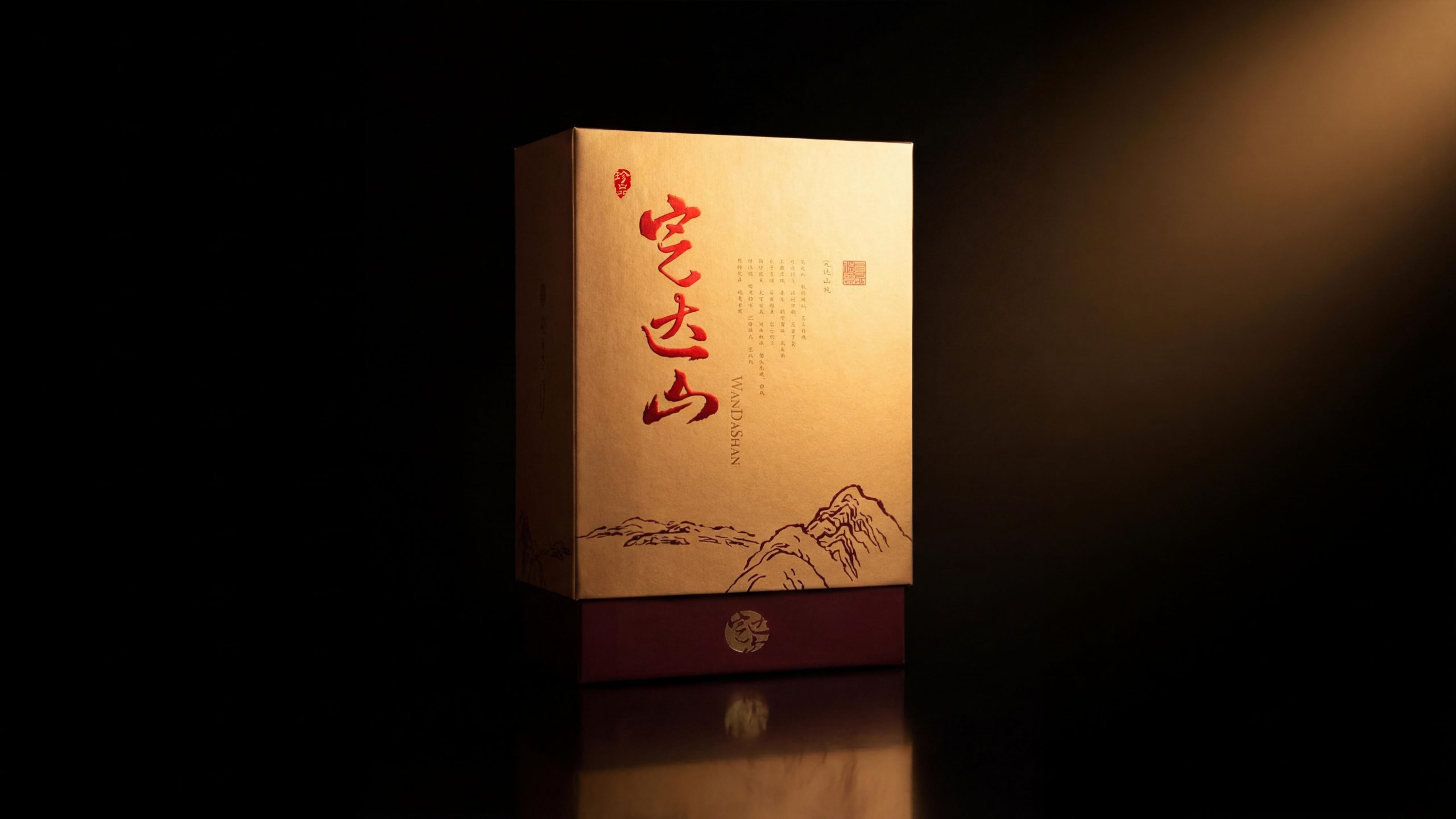
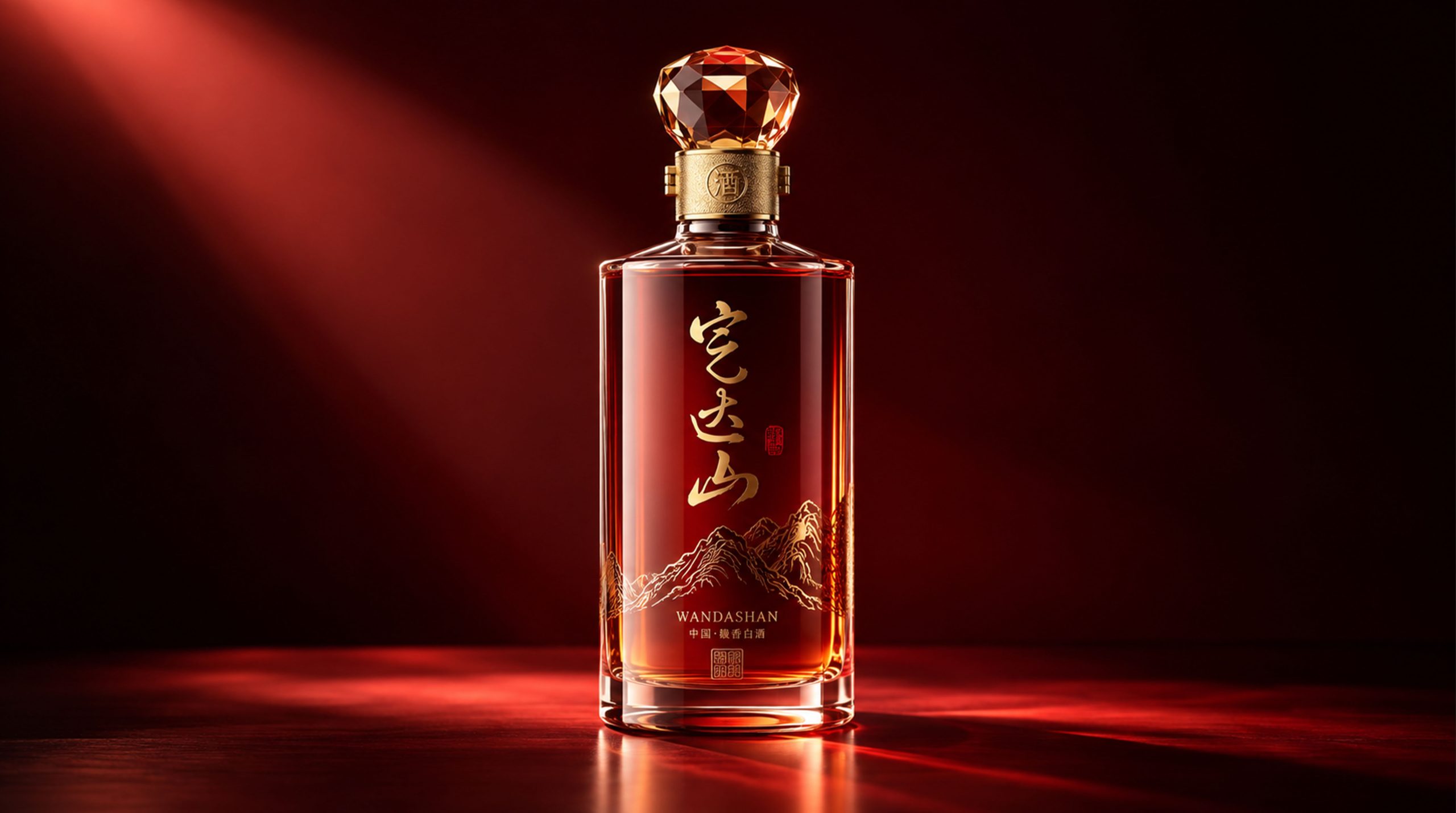
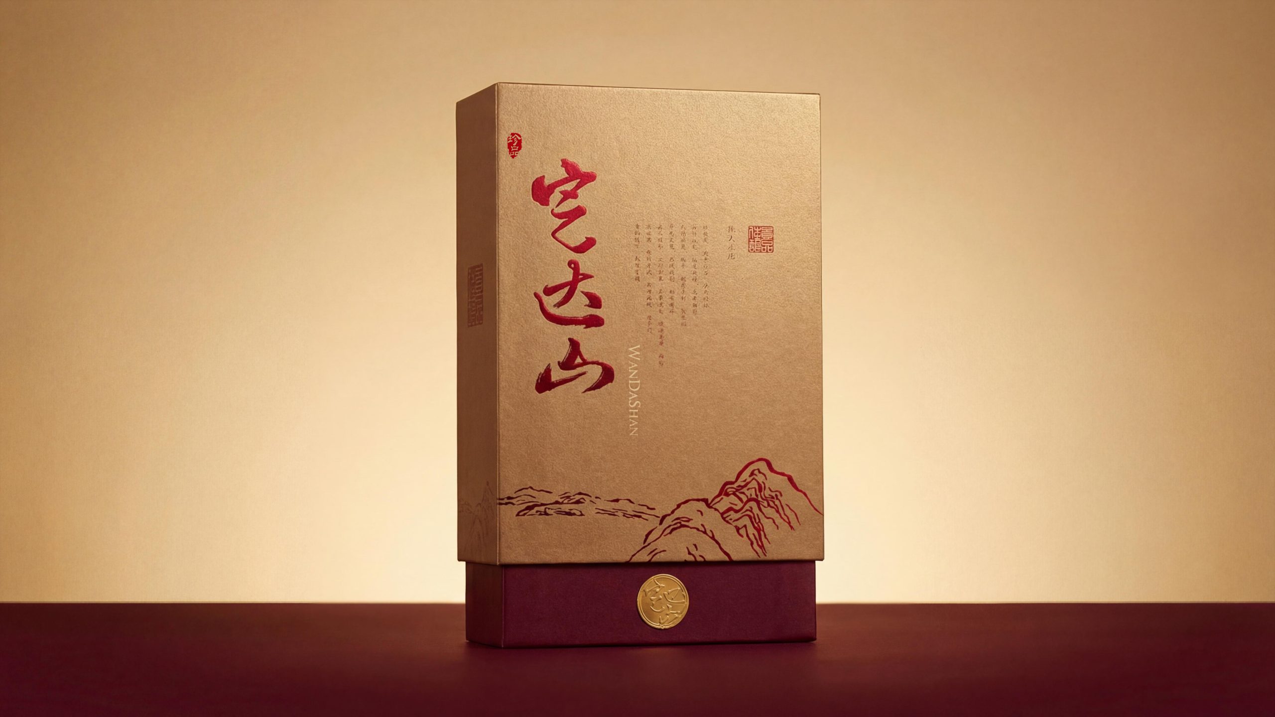
Classic red and gold series (amber glass bottle × golden earth paper gift box): The bottle is made of thick-walled transparent glass, and the amber wine inside shows a warm gem luster under the deep red background light. The bottle cap is highly recognizable - the top is capped by a multi-faceted amber crystal ball with a diameter of approximately 4cm, which reflects warm honey-like spots under the light, just like the moment when the first ray of sunlight penetrates the ice at sunrise in the mountains. The bottle neck is transitioned by a frosted gold metal ring, with the brand's circular emblem embossed on the ring surface. The front of the bottle is gilded with the vertical calligraphy of "Wanda Mountain", and the lower part is surrounded by golden lines depicting mountain shapes and ginseng patterns around the bottom of the bottle. The undulating mountains and ginseng roots are intertwined, implying the double gift of the place of origin - mountains and ginseng. The outer box is mainly made of golden earth paper, and the paper surface retains the natural rough fiber texture. The three characters "Wanda Mountain" are printed horizontally in large vermilion calligraphy characters in the center of the box, which is majestic and majestic, like a stone carving on a mountain cliff. Product information and brand stories are densely listed in small vertical characters on the right side of the box. The red square print in the upper right corner echoes the mountain-shaped line drawing in the lower right corner of the box. The bottom of the box is closed in dark red, like the thick rock formations at the foot of the mountain.
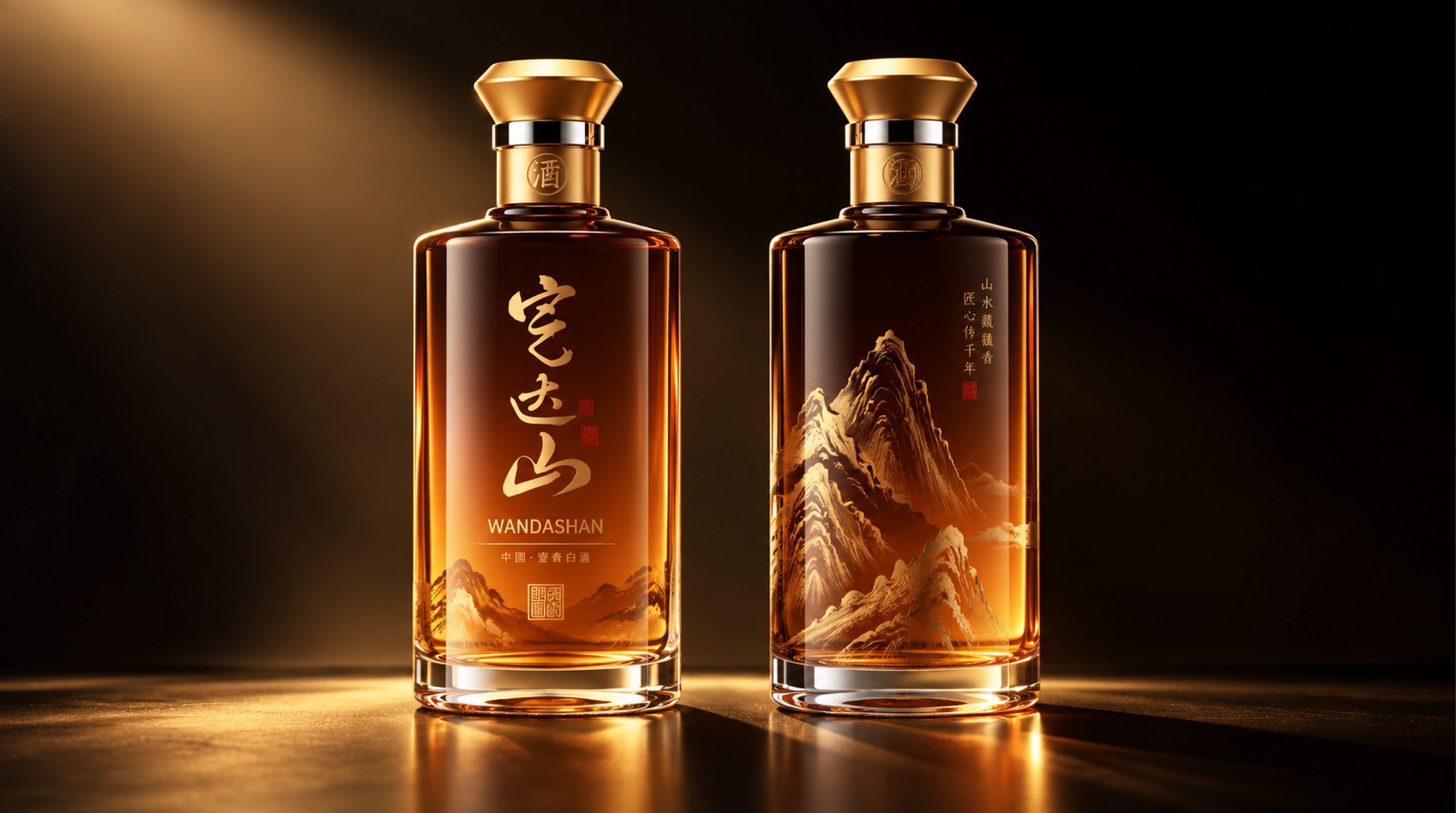
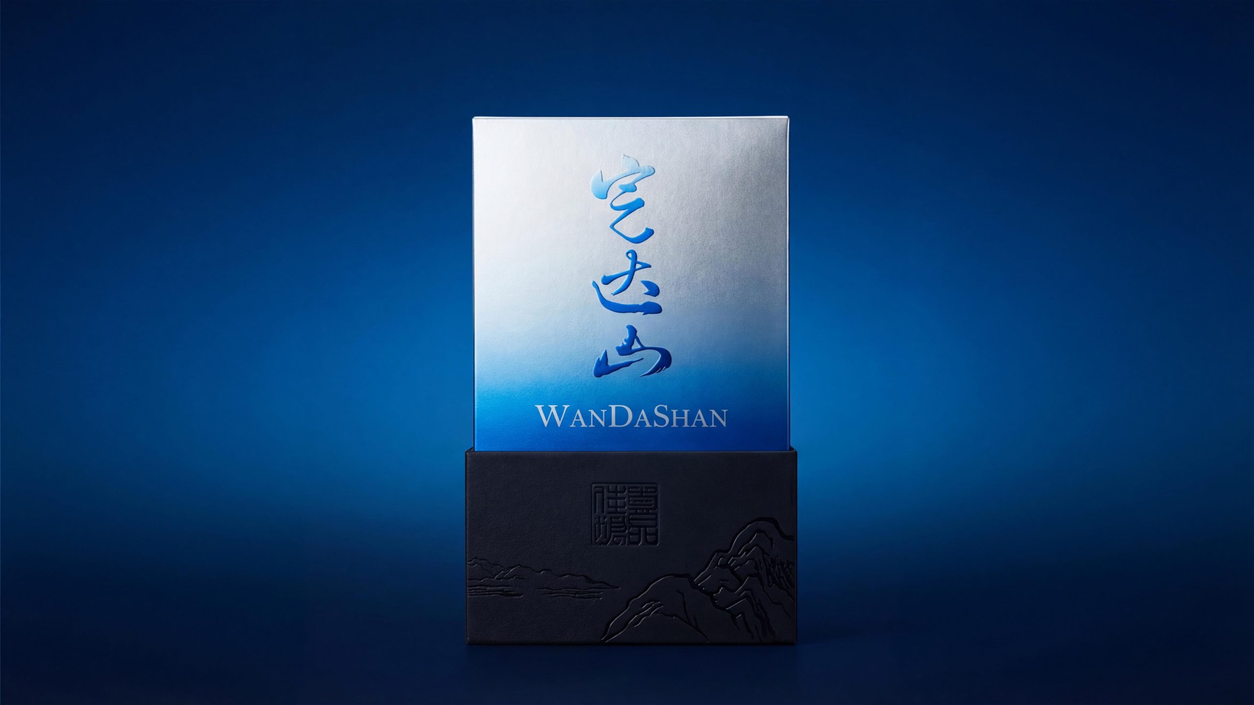
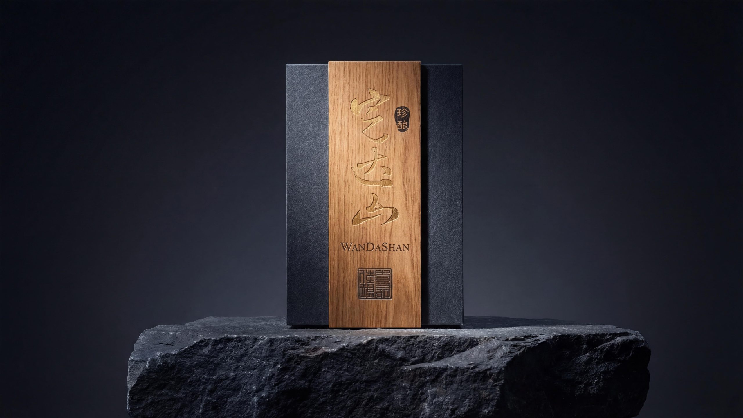
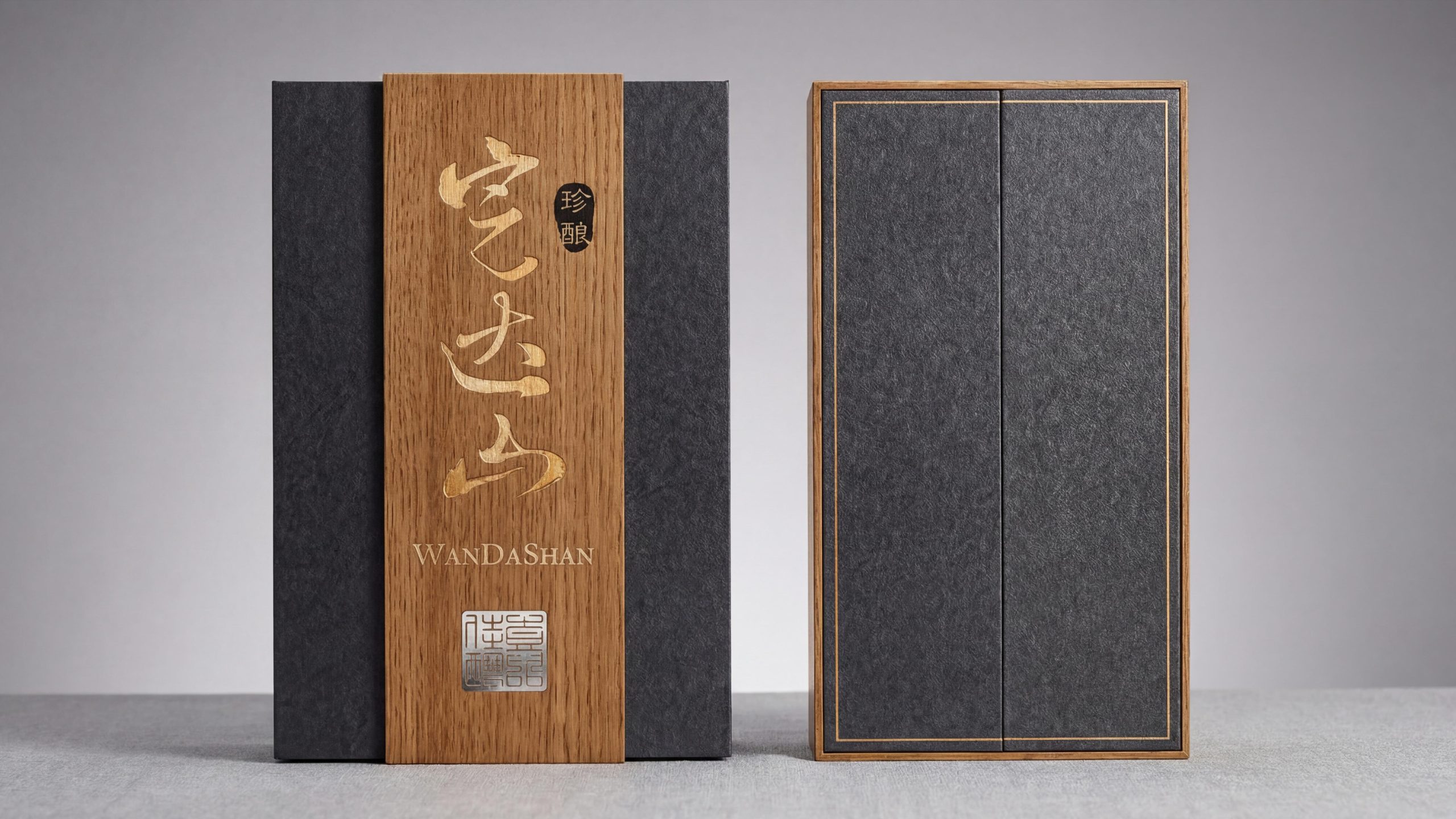
"Precious Wine" wood and stone series (dark gray fabric box × natural oak panel): This is the most collectible package in the entire series. The outer box is covered with dark gray fine-grained fabric, which feels like a finely polished volcanic rock surface. A complete natural oak panel is embedded in the center of the front of the box. The wood grain is natural and the color is warm. The surface is laser-engraved to show the vertical calligraphy of "Wandashan" and the brand name "WANDASHAN". The writing is of moderate depth, and the wood grain texture is looming through the writing, just like a mark carved on an ancient mountain wood. The upper right corner of the wooden panel is marked with the word "Zhenjiu" in small vertical characters, and the lower left corner is closed with a square seal script seal. There is no text decoration on the top of the box, and only the low-key texture of the fabric itself conveys calmness and restraint. Another blue and silver wine gift box uses a vertical gradient from silvery white to dark blue as the language of the box. The upper half of the box is silvery white like a snowfield, and the lower half is dark blue like night. The three characters "Wanda Mountain" are vertically arranged in blue calligraphy on the silvery white area, and the color of the words is integrated with the gradient of the box. The base of the box is an independent dark gray tray. The surface is embossed with the continuous outline of the Wanda Mountains and the square seal script brand seal, just like a miniature mountain bedrock.
visual languageVisual Language
Wandashan has constructed a visual system of "mountain-shaped motif × three-color matrix", using the same core symbol to complete brand expressions with different styles in three tones:
Color: The blue color range is mainly glacier blue (#1B3A6B to #C8D8E8). The gradient from dark blue to silvery white is like the color transition from the foot of the mountain to the snow line in Wanda Mountain in winter. It is cold and pure. The hot stamping text on the blue and silver background is like the warm light in the snow, providing the necessary visual temperature. The red gold series uses earth gold (#C8A96E) as the background color and vermilion (#B03A2E) as the main character color. The two colors collide to form the most classic noble color matching in traditional Chinese gift culture. It is warm but not tacky, and heavy but not boring. The wood and stone series uses dark gray fabric (#3A3A3A) and natural oak color (#A67C52) as the main material colors. It completely abandons printing ink colors and uses the natural color of the material itself to complete all visual expressions. It is the most restrained and restrained tone among the three series. The three sets of colors do not mix with each other, forming a clear identification of product levels in the display - blue for fresh, gold for gifts, and gray wood for hidden.
Pattern: The mountain shape is the core motif throughout the entire series. On the base of the blue and silver wine series, the mountain shape protrudes from the box surface in the form of a relief. The lines are as simple as the "axe splitting" in Chinese painting. The ridges are sharp and powerful. On the red gold series gift box, the mountain shape is depicted with golden thin lines on the lower right side of the box surface. Corners, the brushstrokes are more stretched and freehand, and the mountains and ginseng roots are intertwined, creating a stronger narrative; at the bottom of the red gold wine bottle, the mountain shape is traced with gilded lines around the lower half of the bottle, forming a visual image of "mountain floating on water" with the amber liquid surface. The seal script square seal is the second unified symbol, appearing in the fixed position of each package in the form of "Wanda Mountain" or brand badge, just like every mountain is stamped with the same square seal, declaring ownership.
Font: The three characters "Wanda Mountain" are always presented in customized cursive calligraphy. The strokes are opened and closed vertically and horizontally, the pen is started and pressed again, and the stroke is white when it is finished. The last stroke of the word "Shan" extends to the lower right like the remaining veins of a mountain range. The overall atmosphere is vigorous and heroic, which is highly consistent with the mountainous temperament of the brand. "WANDASHAN" follows the calligraphy in medium-weight serif capital letters below or to the side. The spacing between words is loose, and the font shape is straight and steady. The juxtaposition of Chinese and Western characters not only completes the international message transmission, but also visually creates a rhythmic contrast of "motion and stillness" and "opening and closing". Product sub-line names such as "Ice Fine Wine" and "Precious Wine" are marked in regular fonts with smaller font size and finer font weight, and the information level is strictly controlled within three levels.
language and toneTone of Voice
The written language of Wandashan is consistent with the calm tone of "mountain statement style" throughout. It does not pursue gorgeous rhetoric or use emotional marketing rhetoric, and builds trust with the power of geographical facts and time facts.
The three words "Wanda Mountain" itself are the core brand copy - it is not an invented brand name, but the name of a real mountain. This "named after the mountain" naming strategy gives the brand a natural trust foundation based on geographical coordinates. "Ice·Beautiful Wine" uses the word "ice" to refer to the water source and temperature advantages of extremely cold production areas. The word "Beautiful Wine" is straightforward and confident, without excessive modification; "Zhenjiao" uses a single Chinese character "zhen" to complete the value positioning and is restrained to the extreme. The four words "Beijing 1957" appear on the information tape at the bottom of the blue outer box. It does not say "inheritance" or "classic". It only quietly marks the starting point with a year and lets time speak for itself. The brand story text on the side of the outer box is presented in dense vertical rows of small characters. The reading rhythm is slow and solemn, just like the reading experience of an inscription. It is full of information but never overwhelms the focus. The whole set of packaging does not contain common clichés in the liquor industry such as "cellar aging", "original craftsmanship" and "quality selection". The brand leaves its persuasion to the material - the growth rings of oak, the texture of fabric, the refraction of crystal balls and the touch of mountain-shaped relief, which has completed all high-end narratives.
Brand ExperienceBrand Experience
Wanda Mountain builds a complete "mountain experience" for drinkers from three dimensions: visual, tactile and ritual:
Visual experience: When the three major series are juxtaposed, it is like the three light and shadows of the Wanda Mountains in one day - the blue series is the icy blue moment before dawn, everything is clear and pure; the red gold series is the noon when the sun shines on Jinshan, warm, grand and full of golden light; the wood and stone series is the silent mountain after nightfall, with only the outlines of rocks and ancient trees looming in the moonlight. The three colors do not conflict with each other but have their own aura, forming a strong sense of series recognition and visual hierarchy in terminal displays. The transparency of the ice-blue wine bottles under the light, the gem luster of the amber liquor through the thick-walled glass, and the starry spots reflected by the crystal ball bottle caps under the shelf spotlights are all carefully designed "attractions at first sight" - in the shelf environment where the liquor category is highly homogeneous, Wandashan achieves silent attention capture with the differentiation of colors and the high-end sense of materials.
Tactile experience: The red gold earth paper gift box is the highlight of tactile design - the uncoated special paper retains all the rough texture of natural fibers, and holding it in your hand is like holding a piece of weathered rock; the screen printing ink layer of large vermilion calligraphy characters is raised on the paper, and you can clearly feel the start and turn of each stroke when your fingertips brush it. The tactile experience of the rare wine wood and stone series is even richer: the fine graininess of the dark gray fabric and the warm wood texture of the oak panel form a tactile narrative of alternating cold and warm, and contrasting thickness on the same box surface. The laser-engraved handwriting depressions leave a subtle ravine feeling on the fingertips, just like touching a stone tablet inscribed with ancient inscriptions in the mountains. The cool temperature of the glass body of the ice blue wine bottle in the palm of your hand and the silky brushed touch of the metal ring on the bottle neck jointly strengthen the product proposition of "ice brew".
Ritual experience: The opening process of the rare wine wood and stone series is the most ceremonial design in the entire series - the box is closed magnetically. When opening, you need to hold both sides of the box with both hands and slowly pull it out. The weight of the fabric and wooden board in your hands makes this action naturally slow down, just like opening a miniature stone door in the mountains. The moment the box lid is fully opened, the wine bottle emerges from the black flocked lining, like taking out a treasure sealed by time from a deep mountain cave. The embossed mountain range on the base of the blue and silver rare wine gift box becomes an independent display stand after the wine bottle is taken out, implying that the wine bottle is not only a drink container, but also a mountain artifact worthy of display. The pull-out and screwing of the red gold crystal ball bottle cap have been adjusted with damping, and the hand feels thick and precise. Every time you open the bottle, there is a solemn sense of ritual - it reminds the drinker: what you are opening is not just a bottle of wine, but a gift from a mountain.
brand statementBrand Statement
A mountain makes a pot of wine. Time is silent, the mountain has its own answer. Wanda Mountain takes the Wanda Mountains in Heilongjiang as the brand's spiritual homeland, uses the visual system of "Mountain Motif × Three Color Matrix" as the carrier, and uses ice blue glass, earth gold paper, natural oak and dark gray fabric as the material language to translate the three expressions of a mountain - the purity of ice, the warmth of sunshine and the silence of night - into three sets of packaging narratives with different styles but unified spirit. The coldness of the blue series is the bones of the mountain, the warmth of the red gold series is the blood of the mountain, and the silence of the wood and stone series is the memory of the mountain. The three are combined into one, and the result is Wandashan - a liquor brand that speaks not with words, but with materials and shapes. Every time you pick it up, every time you open the box, every time you pour the wine, it is a silent dialog with a mountain.