










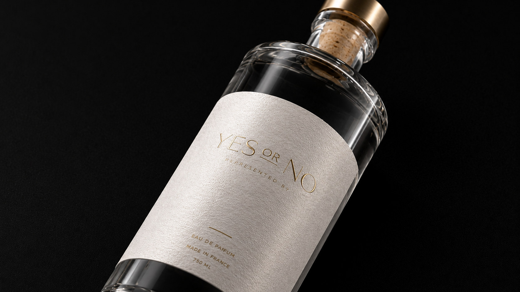
YES OR NO is a high-end distilled liquor brand with contemporary lifestyle as its core and Eastern rational aesthetics as its spiritual foundation. The brand name comes from the two most direct choices in daily life - "YES" and "NO". It not only represents frank and true expression between people, but also symbolizes the independent judgment that modern consumers have when facing life, relationships and themselves. The brand hopes to establish a more pure, restrained and thoughtful way of drinking through a bottle of wine, so that drinking is no longer just a release of emotions, but also a medium for sincere communication between people and themselves and between people and others.
Faced with changes in contemporary consumption aesthetics and social patterns, traditional wine packaging is shifting from complex and heavy expressions to a new stage with more design, cultural and lifestyle attributes. YES OR NO reshapes the visual image of distilled liquor with modern design language. While retaining the sense of quality and ritual of alcoholic products, it reduces the excessive decoration in traditional packaging and responds to the needs of the younger generation of consumers for quality, personality and spiritual value with a clear, quiet, and international visual system. The new packaging is not only an update of the product's appearance, but also a concentrated expression of the brand's attitude, representing a lifestyle that is loyal to oneself, respects choices, and does not cater to excessive needs.
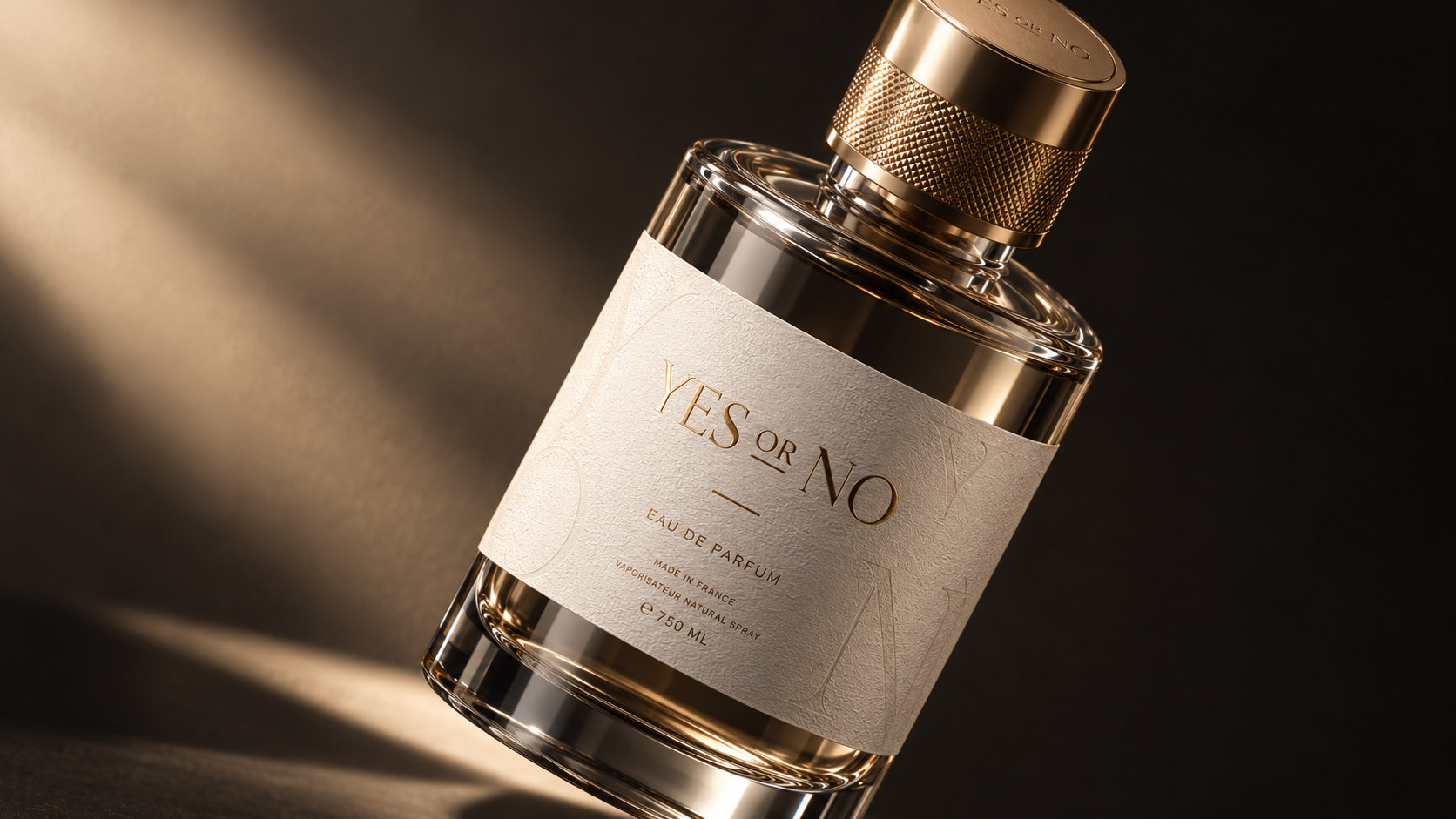
Brand spirit
The brand spirit of YES OR NO is based on authenticity, rationality and free choice. Its core spirits include:
Purity × Restraint × Frankness
Independence × Quality × Emotional Connection
These keywords together form the unique spiritual core of the brand. Pureness represents the insistence on the quality of raw materials, brewing and products, and is also reflected in the active deletion of complex elements in packaging design; restraint is a mature aesthetic judgment, showing a sense of high-end through white space, proportion and materials; frankness comes from the brand name itself, encouraging people to directly face their own feelings and choices. Independence represents the life attitude of modern consumers who are not defined by inherent standards. Quality reflects the brand's continuous pursuit of product details and drinking experience, while emotional connection makes YES OR NO more than just a wine, but also an emotional carrier for gatherings, solitude, celebrations and communication.
Brand concept
The brand concept of YES OR NO emphasizes the balance of "rational choice × emotional experience". The brand conveys rationality and professionalism with a clear and concise visual order, while retaining warmth and emotion for consumers through paper texture, glass gloss, metal details and tactile changes.
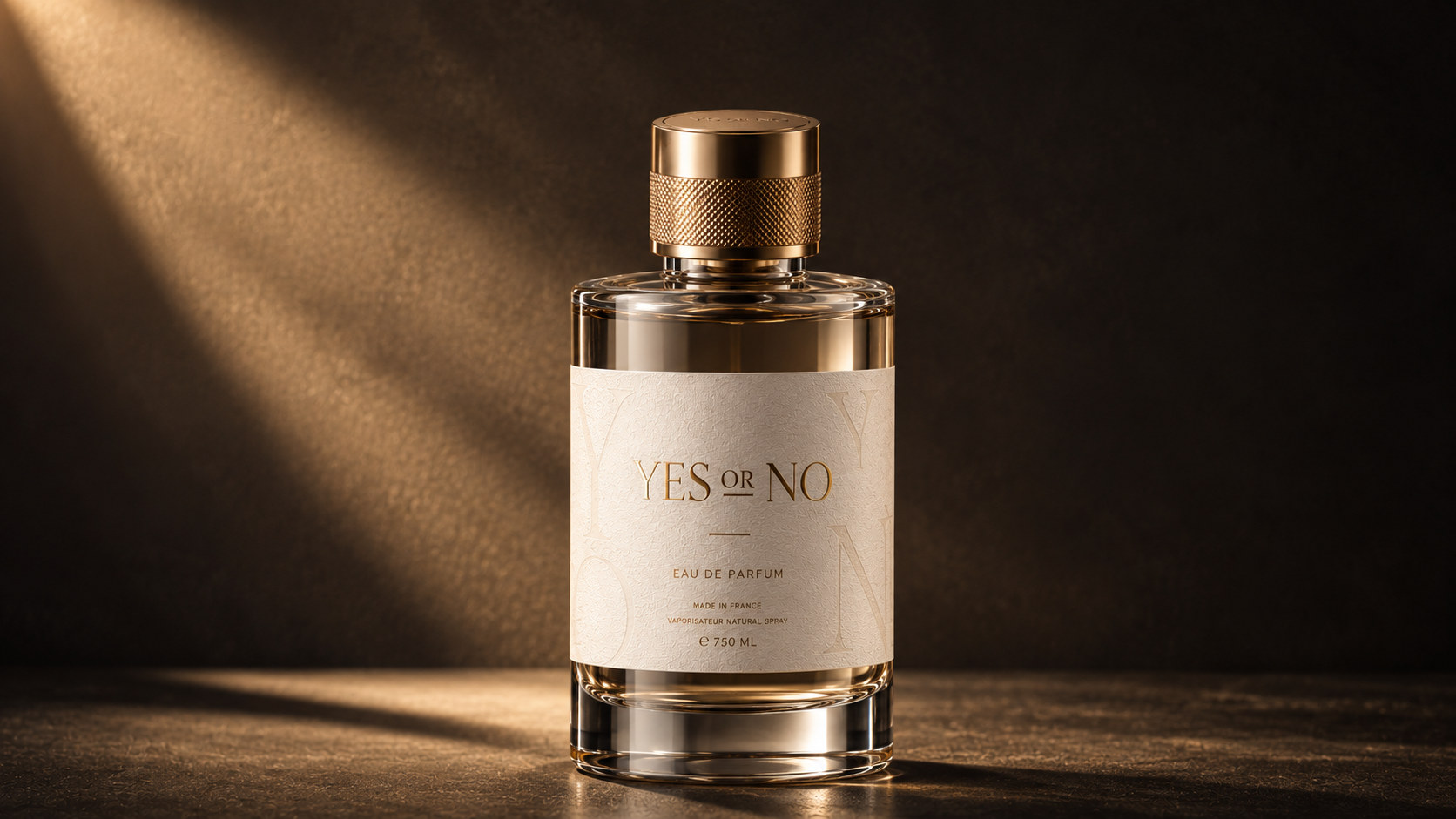
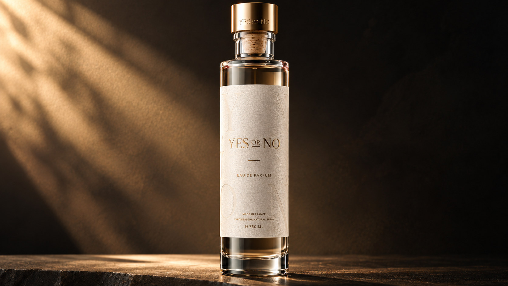
Under the guidance of this concept, packaging does not pursue superficial luxury, but creates a durable and high-end sense through materials, proportions and details. The bottle structure remains stable, straight and pure, and the label uses a large area of white space to carry the brand information, giving the product a quiet and clear recognition during display. YES OR NO hopes that consumers will feel a sense of ritual that unfolds layer by layer from sight to touch when they pick up the bottle, touch the label, open the bottle cap and pour the wine.
This design method allows the brand to form a balance between rational order and emotional expression, and also makes every choice of "YES" or "NO" a true response true to the heart.
visual language
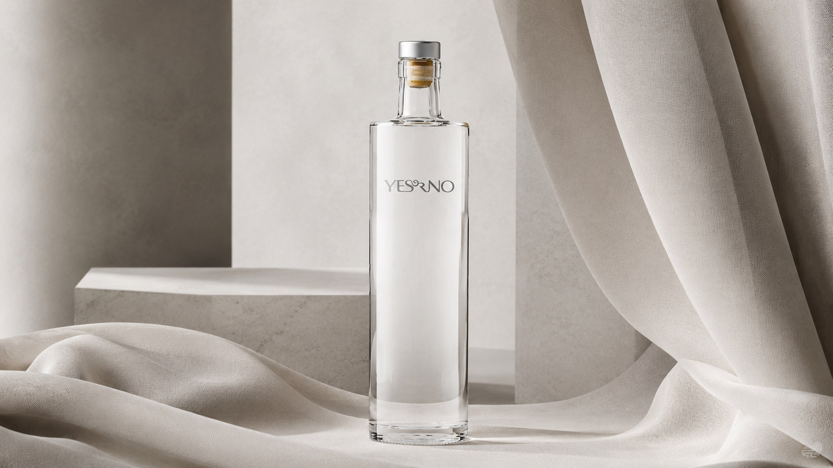
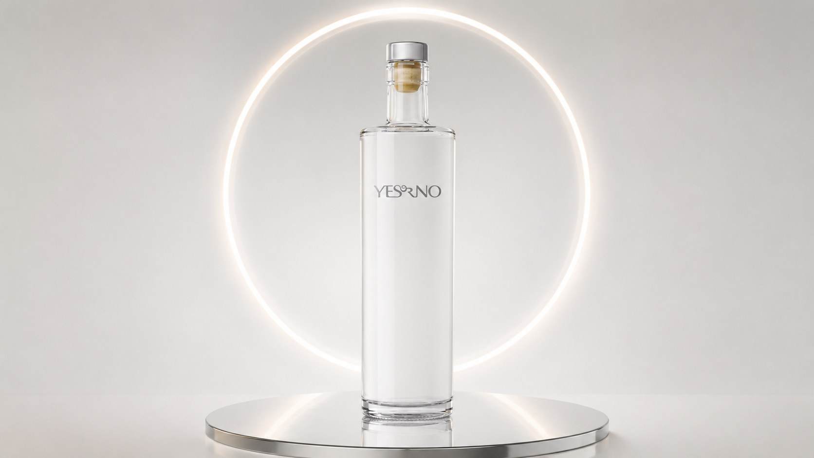
The packaging of YES OR NO is based on modern minimalist style, using transparent glass, warm white labels and low-saturated metallic colors to create a pure, quiet and international visual language.
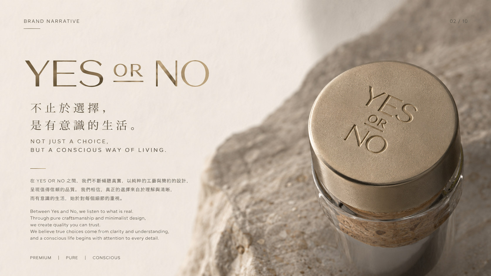
Color and structure: The packaging uses transparent glass and warm white as the main visual tone. The transparent bottle presents the purity of the wine and also strengthens the authentic and honest brand attributes of the product; the warm white label weakens the strong stimulation of commercial packaging and creates a soft, rational and lifestyle visual atmosphere with a tone close to natural paper. The champagne gold text and bottle cap are used as partial embellishments to enhance the sophistication and gift attributes of the product without being overly public.
Graphics and symbols: The brand uses "YES OR NO" as the core visual symbol. It does not add complicated illustrations and traditional decorations, but establishes recognition through the proportion, spacing and positional relationship between words. YES and NO are two opposite answers, but also form an open thinking relationship, giving the packaging a deeper emotional expression. The short horizontal line below the label is like a pause, leaving the image to breathe and symbolizing the moment consumers think before making a choice.
Material and texture: The bottle body is made of high-transparency glass, which reflects the stability of the product through its thick bottom, delicate refraction and edge highlights. The label uses high-quality paper with fine fibers and embossed texture, so that the simple picture still has rich layers when viewed at a close distance. Brand text can use delicate hot stamping, bas-relief or partial debossing process to present a restrained metallic luster in changes in light, enhancing the tactile memory of the packaging.
Font and typography: The font system is mainly simple and modern sans-serif fonts, establishing order through loose spacing and precise alignment. The brand name is placed in the visual center of the label, and product information is arranged downwards in smaller font sizes to form a clear information hierarchy. The overall layout avoids redundant decoration, and allows text, materials and space to jointly form the core expression of the packaging.
language and tone
The brand language of YES OR NO emphasizes directness, authenticity and restraint. The written expression does not deliberately create a sense of distance or over-exaggerate emotions, but conveys a clear attitude in concise sentences. The brand believes that truly powerful expressions do not require complex modifications. A "YES" or "NO" is sometimes accurate enough. In product packaging, brand communication and social media content, YES OR NO always maintains a calm but not cold, concise but not empty language style. Brands can talk about choices, relationships, time and self, or they can invite consumers to think through quick questions. Every sentence of copywriting is like a soft conversation, allowing the product to naturally enter consumers' lives, rather than emphasizing the brand itself in one direction. This sincere and clear communication method enables the brand to possess the rational temperament of contemporary design while retaining the emotional warmth that people should have when communicating with each other.
Brand Experience
The brand experience of YES OR NO starts from the first moment consumers see the bottle and runs through the entire process of purchasing, opening, drinking and sharing.
Product experience: The transparent bottle body, delicate paper and metal bottle cap together form a layered sensory experience. Consumers can feel the contrast between different materials when touching the label and opening the bottle cap. Clear information layout reduces the reading burden, and the stable bottle structure takes care of holding, pouring, and daily display, keeping aesthetics and practicality consistent.
Social experience: "YES OR NO" is naturally topical and can become an emotional entry point in gatherings and exchanges. It can be an invitation or a question; suitable for sharing with friends or drinking alone. The brand connects the product with different life scenarios through open names, allowing consumers to give it their own answers.
Digital experience: The brand continues the visual system of warm white, transparent and champagne gold on its official website, social media and online retail platforms, maintaining a unified expression with simple images, real light and restrained copywriting. Digital content does not create an overly noisy atmosphere, but continues to convey a pure and independent brand attitude through product details, drinking scenes and life clips.
Spatial experience: Whether in boutique liquor stores, catering spaces, art exhibitions or brand pop-up events, YES OR NO uses white space, light, shadow and materials as the focus of spatial expression, so that the products can naturally integrate into modern life scenes. The unified visual and sensory language allows consumers to recognize the pure temperament of the brand at every touch point.
brand statement
Be loyal to your feelings and respect every choice. YES OR NO redefines the brand experience of contemporary distilled spirits with pure products, restrained design and authentic expression. It does not preset answers for consumers, nor does it prove value with complicated decorations. Instead, it establishes a more direct relationship between people and products through transparent, concise and textured packaging. In an era of rapid change, YES OR NO hopes to preserve a moment of pause so that everyone can hear their voice. Regardless of whether the answer is yes or no, every real choice deserves to be taken seriously.