










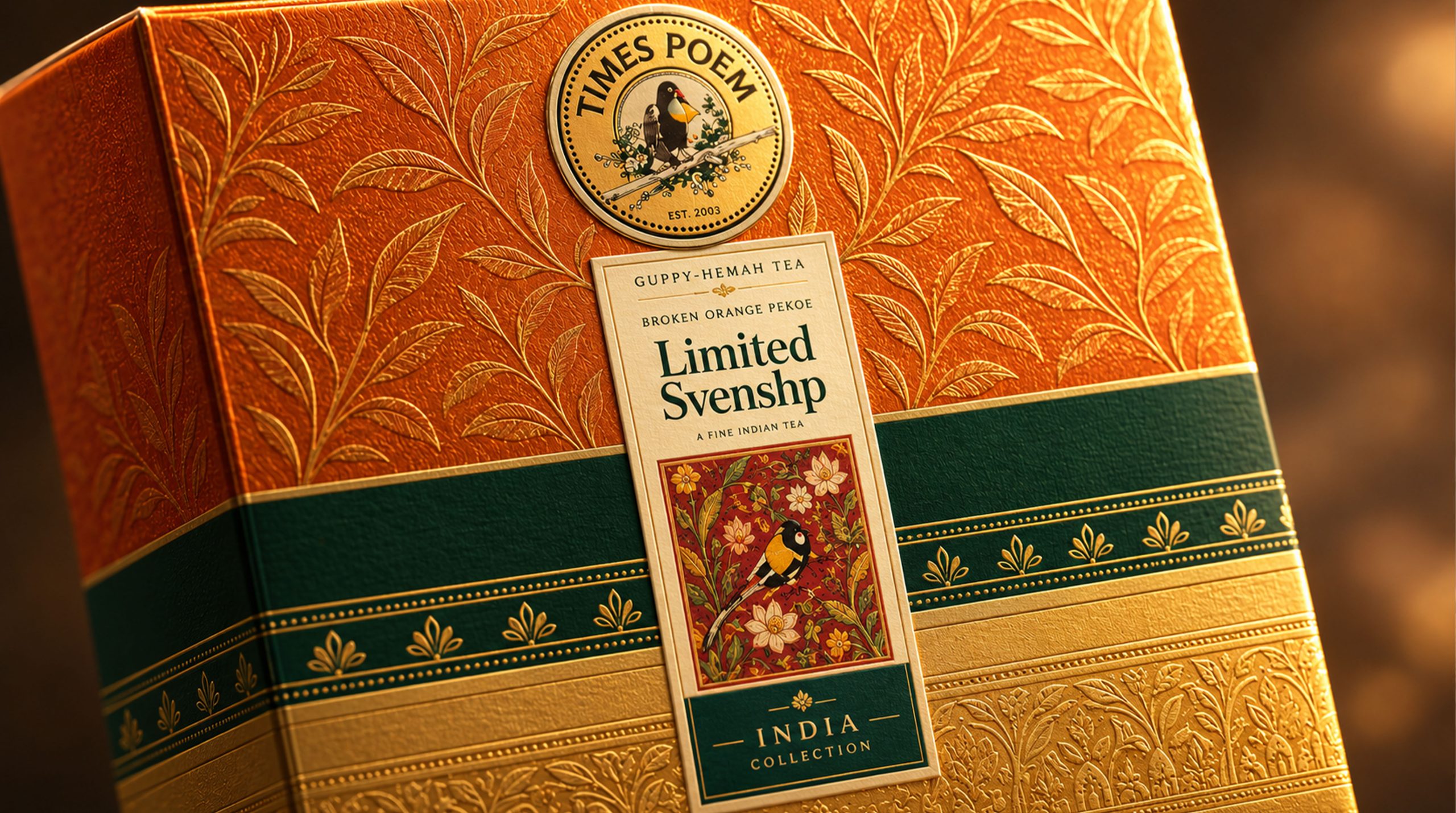
The Ceylon black tea brand is based on the highland tea gardens of Sri Lanka as its raw materials, continuing the long local planting tradition, manual picking methods and black tea production technology, and is committed to providing global consumers with pure, delicate and high-quality tea products with regional characteristics. With the development concept of "natural gifts, cultural encounters, and quality inheritance", the brand transforms the unique aroma, color and local memory of Ceylon black tea into a modern tea ceremony experience with emotional value and cultural recognition.
Facing the continuous changes in global tea consumption patterns and gift demand, brands are gradually transforming from traditional tea product suppliers to high-end tea gift brands that integrate origin culture, life aesthetics and international exchanges. The new packaging design is no longer just an external container for tea, but an important medium connecting Sri Lanka’s natural terroir with contemporary consumers. Through a more orderly format, bright and warm colors and modern traditional patterns, the packaging retains regional cultural characteristics while establishing a more refined, international and gift-worthy brand image.
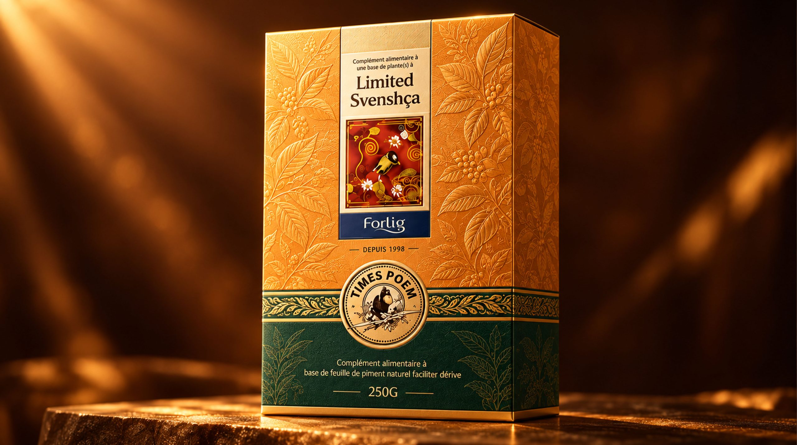
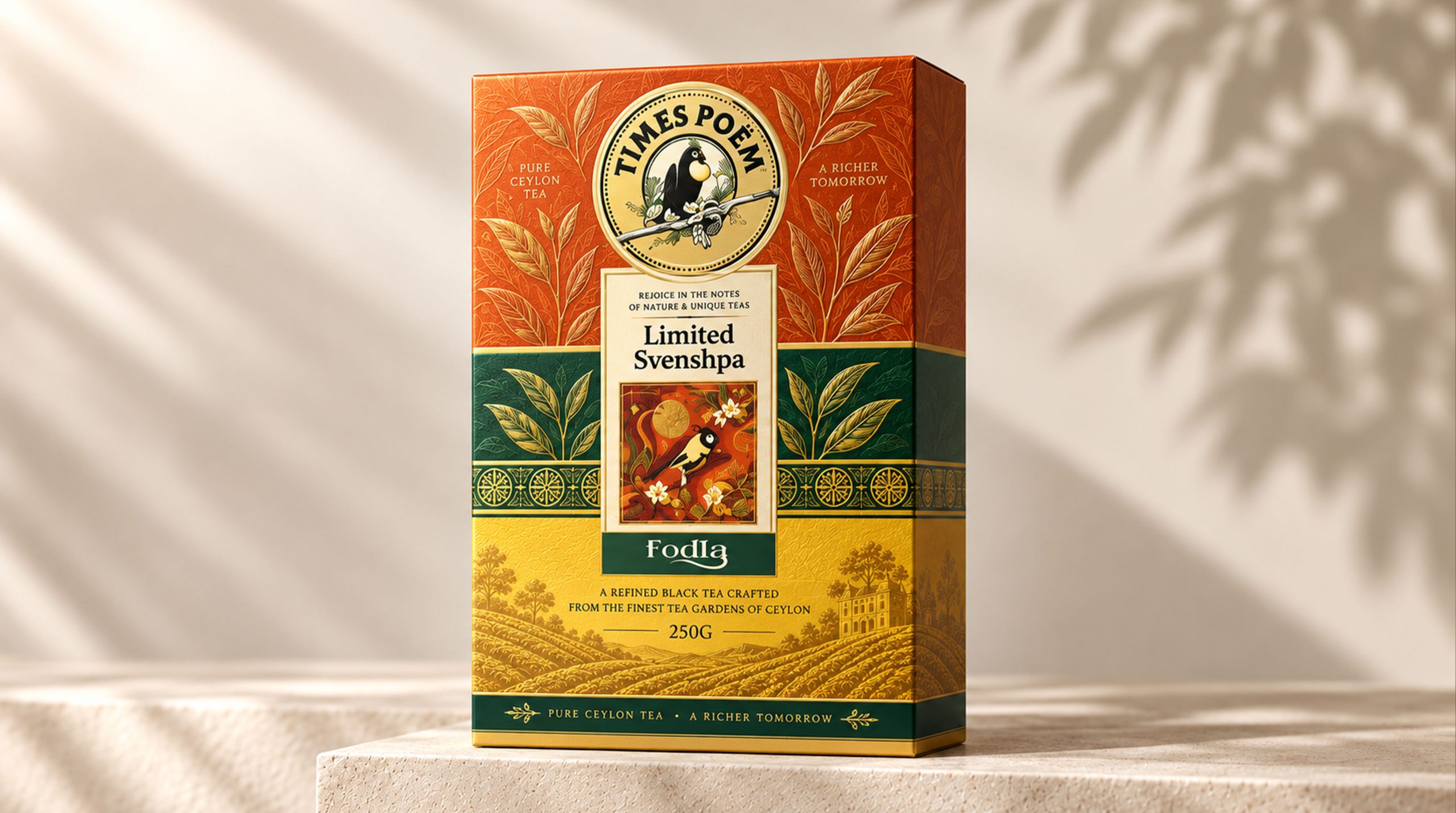
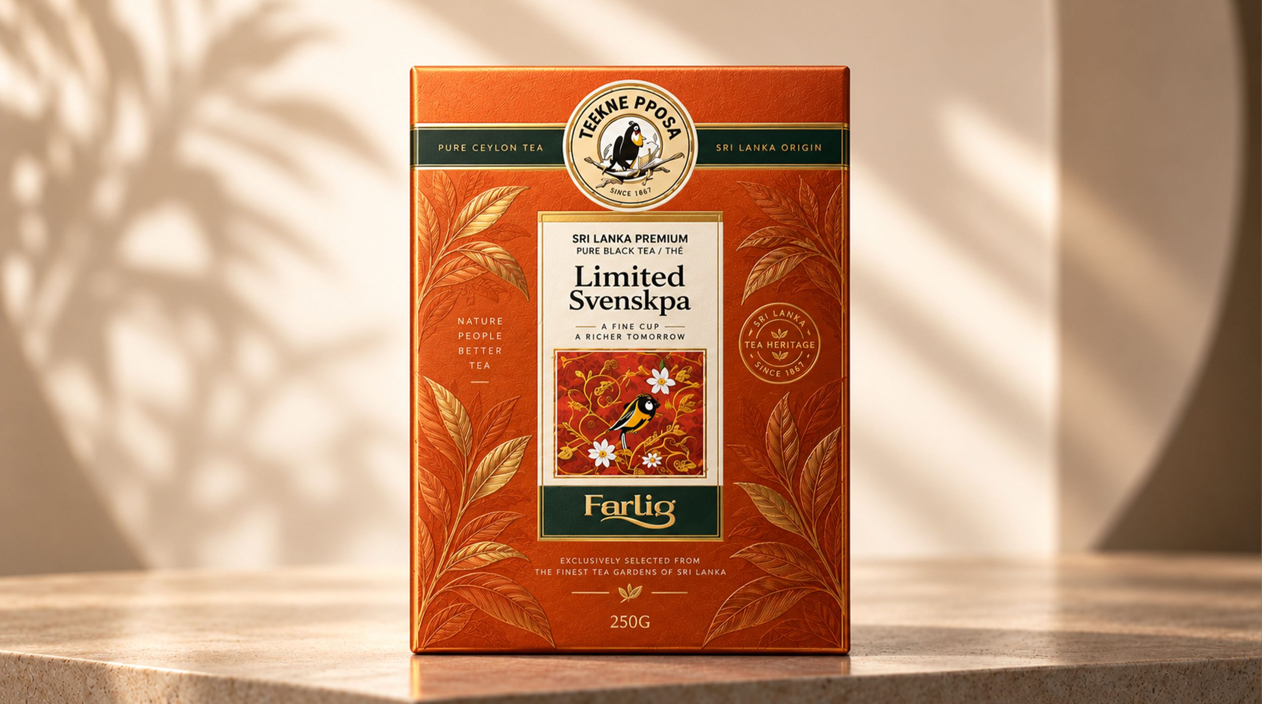
Brand spirit
The brand spirit is deeply rooted in Sri Lanka's natural environment, tea garden culture and long-term accumulated tea-making tradition. Its core spirit includes:
Nature × Heritage × Sincerity
Culture × Quality × Warmth Sharing
These keywords together constitute the brand’s unique value core. Nature represents the tea's origin from the pure terroir shaped by the highlands, sunshine, rain and monsoon; inheritance reflects the brand's respect for traditional picking, production techniques and origin culture; sincerity comes from long-term persistence in raw material quality, product information and consumption experience. Culture makes every tea gift not just a drink, but also a window to understand Sri Lanka's nature and humanity; quality reflects the brand's strict requirements for tea grade, aroma, taste and packaging details; warmth and sharing represent the value of black tea in establishing emotional connections among family, friends, festivals and business dealings.
Brand concept
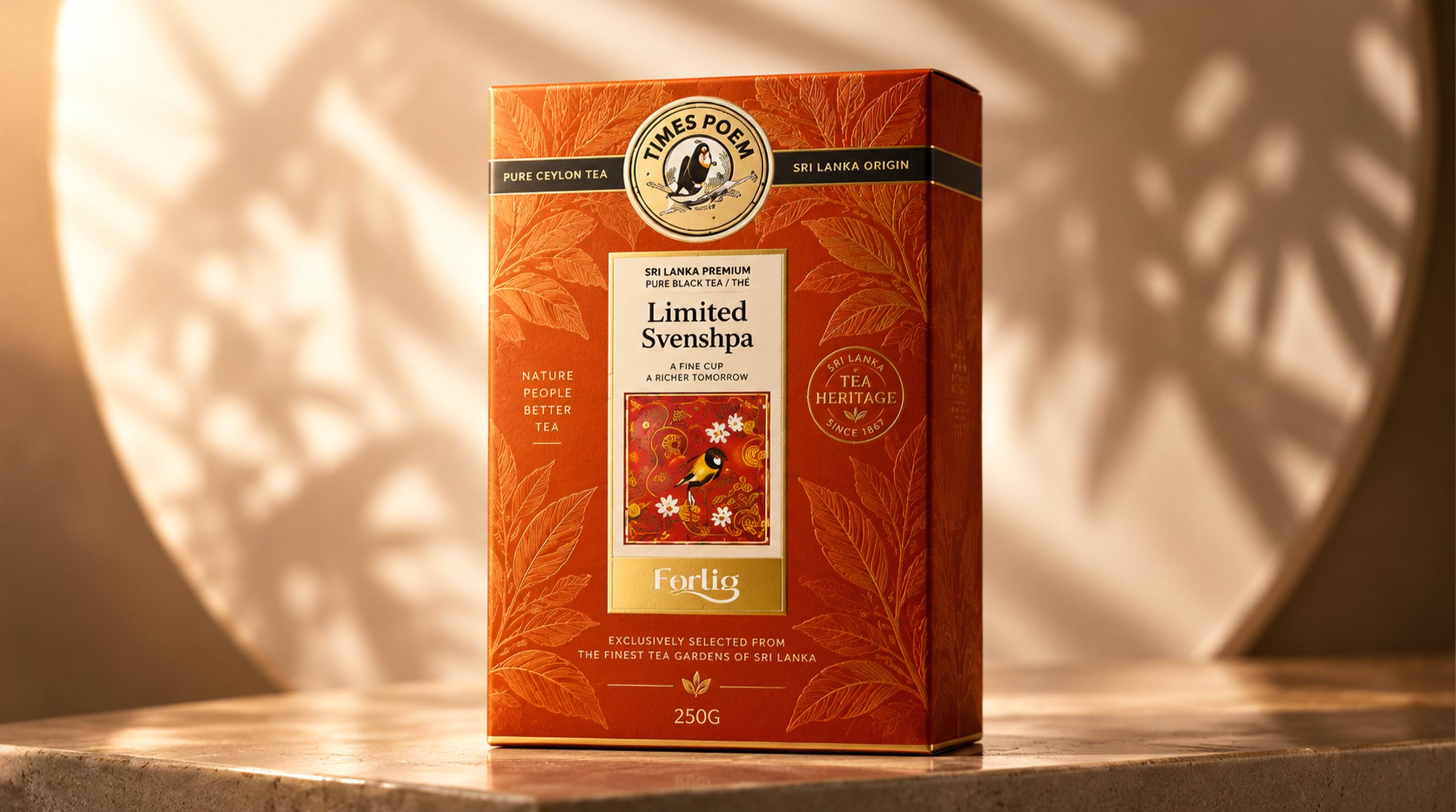
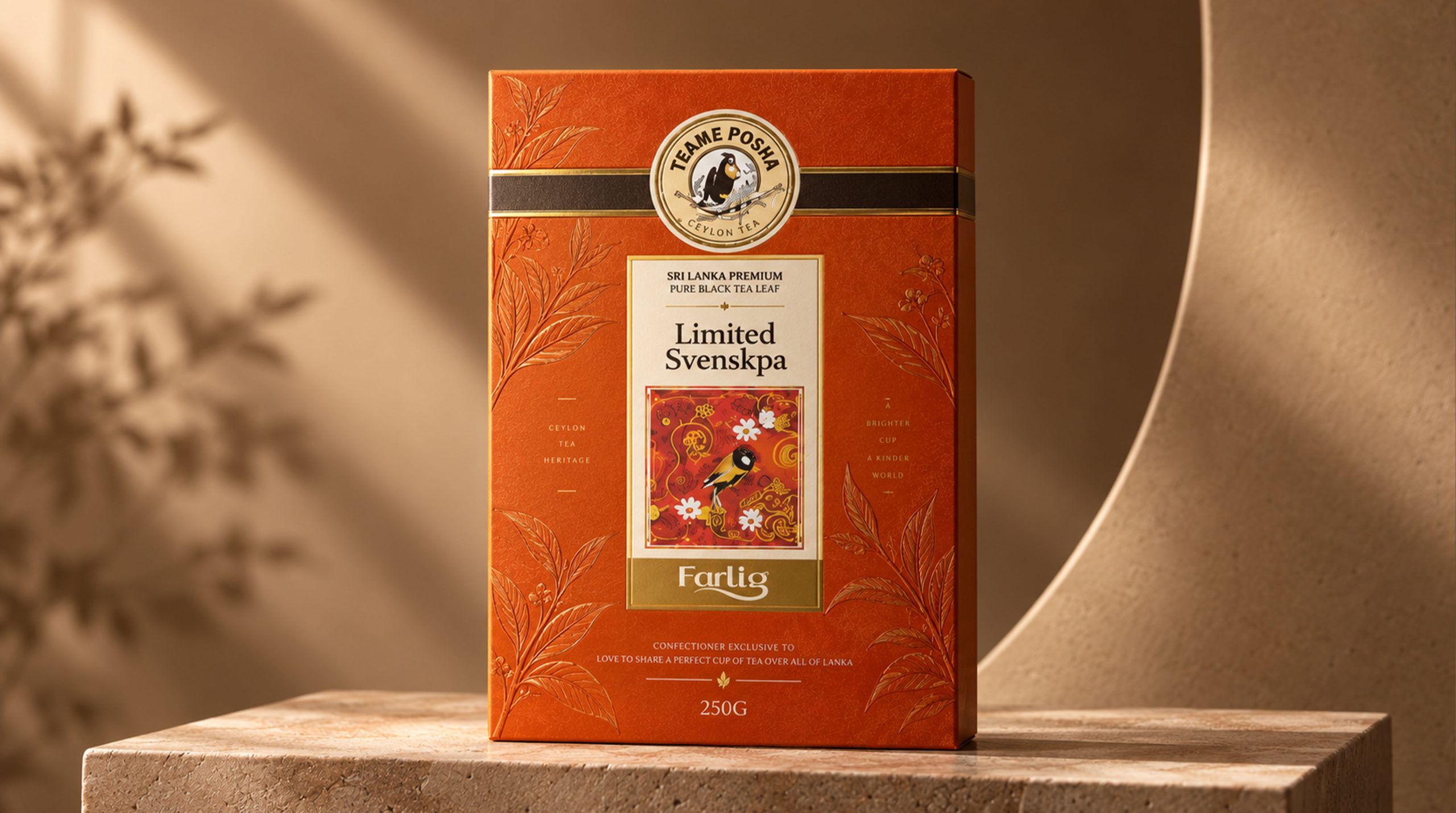
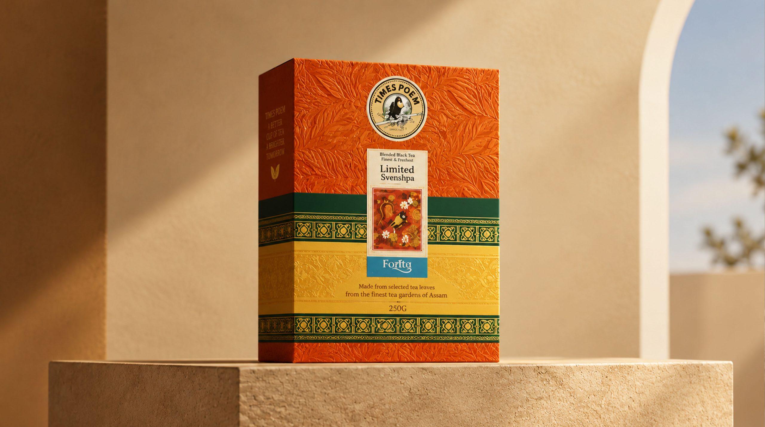
The brand concept emphasizes the design core of "cultural order × sensory temperature". The new packaging image presents the professionalism of the product with a clear and stable structure. Through warm colors, delicate patterns and hand-made picture details, it conveys the natural flavor and humanistic emotions carried by Ceylon black tea. Under the guidance of this concept, gift box design not only pays attention to the high-end sense and display value of the product, but also pays attention to the complete experience in the process of opening, taking, touching and giving. The central label is responsible for the main product information and tea category identification, the circular badge strengthens brand trust and the impression of the origin, and the surrounding patterns present plants, birds and regional decorative elements in a more restrained manner. Through the recombination of modern format and traditional cultural language, the brand establishes a balance between rational order and emotional expression, allowing consumers to feel the temperature of the tea, the story of the origin and the sincerity of the gift the first moment they see the packaging.
visual language
The brand packaging is based on modern oriental gifting aesthetics, integrating Sri Lanka's natural terroir, traditional fabric patterns and tropical plant elements to form a warm, sophisticated and internationally recognizable visual language.
Color and structure: Orange-red, golden yellow and dark green constitute the main color system of packaging. Orange-red symbolizes mature tea soup, tropical sunshine and festive atmosphere, giving the packaging a warm and enthusiastic visual experience; golden yellow strengthens the gift attribute and high-quality impression, while echoing the bright and transparent soup color of Ceylon black tea; dark green represents highland tea gardens and natural growth, adding a sense of stability to the overall picture. The packaging adopts a vertical central axis structure to form a clear hierarchy of brand logo, product name, illustrations and capacity information.
Graphics and symbols: As an important visual symbol of packaging, the bird badge symbolizes natural ecology, memory of origin and free communication. It has also become an important identification asset for the brand to connect with Sri Lankan culture. The central illustration uses birds, flowers, tea leaves and decorative patterns to form a miniature narrative scene, condensing regional customs into a limited picture. The background patterns refer to local fabrics, plants and traditional decorative arts, and the visual density is controlled through modern reorganization to avoid excessive complexity while retaining the cultural temperament.
Material and texture: The packaging uses high-quality paper with a delicate touch, and combines matte lamination, partial embossing, fine-line hot stamping and partial varnishing to enhance the level of color and pattern. The golden packaging can form a faint plant pattern through the same color embossing, so that the product can show restrained and rich changes under natural light. The combination of paper, printing and craftsmanship allows consumers to feel the delicacy and ritual that a tea ceremony should have when they touch and open the gift box.
Fonts and typography: The font system combines traditional temperament with modern readability. The product name uses a cultural serif font to reflect the history and gift attributes of tea; the description text uses a concise and clear modern font to ensure that product category, origin, specifications and drinking information are accurately conveyed. The overall layout remains stable, symmetrical and has moderate white space, allowing a variety of colors and patterns to be presented in a unified order.
language and tone
The brand language emphasizes warmth, sincerity and elegance. Echoing the visual temperament conveyed by the packaging, the brand copy not only retains the delicacy and poetry of tea culture, but also avoids overly gorgeous and empty modifications. Each paragraph of text should focus on the origin, aroma, taste, nature and sharing, so that consumers can understand the terroir value behind a cup of Ceylon black tea in a clear and true way of expression. Whether it’s packaging instructions, brand stories or communications across digital platforms, language should remain soft and measured. The brand does not deliberately create distance, but invites consumers into the highlands, sunshine and tea gardens of Sri Lanka with the temperature of a cup of tea, so that professional quality and emotional communication can be naturally integrated.
Brand Experience
The brand experience starts from the first moment when consumers see the gift box, touches the packaging and opens the product, and runs through every touch point of purchase, brewing, drinking and gifting.
Product experience: The distinctive and unified packaging system helps consumers quickly identify different tea series, flavors and gift box levels. The exquisite paper, pattern and opening structure jointly enhance the gift feeling of the product, making taking, brewing and sharing tea a ritualistic process. Packaging not only pays attention to visual beauty, but also takes into account protection, storage and convenience of daily use.
Digital experience: The brand continues the orange-red, gold and green visual system on its official website, e-commerce platforms and social media, and builds consistent online brand recognition through images of the origin, tea garden stories, brewing methods and product details. Consumers can more intuitively understand the origin, flavor differences and applicable scenarios of tea.
Spatial experience: Whether in boutique tea shops, gift shops, airport duty-free spaces or brand displays, packaging can form stable identification through bright colors and cultural patterns. The display space can continue natural materials, warm light and regional graphics, so that consumers can feel a unified brand atmosphere in different scenes.
brand statement
Deliver the warmth of a cup of tea with the gift of nature.
By reintegrating Ceylon black tea culture, natural customs and modern design language, the brand not only enhances the recognition and gift value of product packaging, but also allows traditional tea to enter contemporary life in a more refined, open and international way. From highland tea gardens to gift boxes, from natural growth to warm sharing, the brand is based on quality, connected by culture, and expressed by design, so that every opening becomes an understanding of the place of origin, and every cup of black tea becomes a sincere and warm encounter between people.