










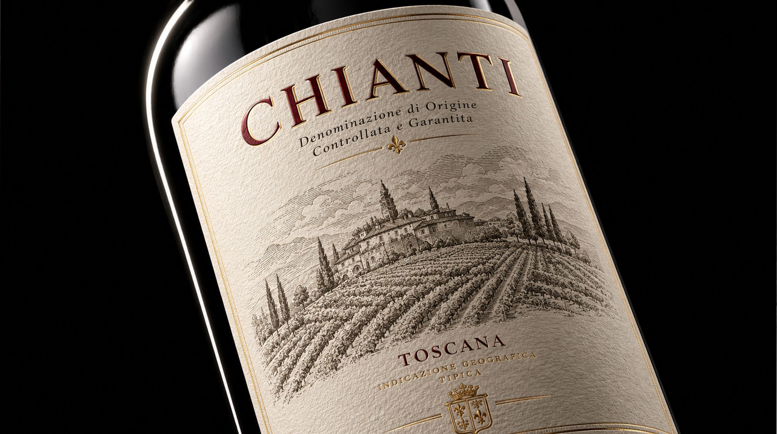
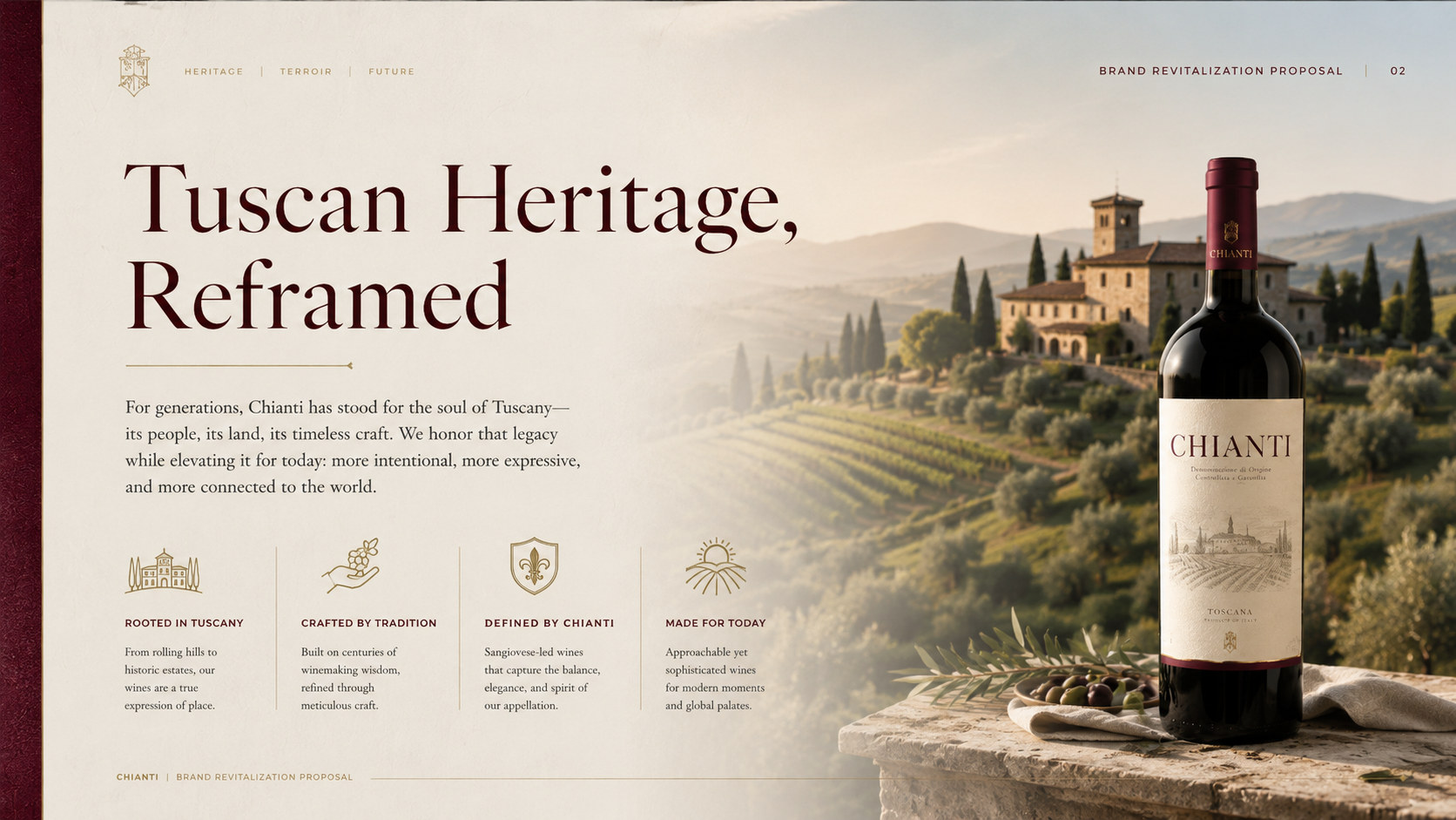
CHIANTI, as a wine brand centered on the Tuscan terroir, traditional wine culture and modern life aesthetics of Italy, carries the long-term accumulation of land, time and brewing techniques in classic European production areas. The brand draws inspiration from Tuscany's rolling hills, neat vineyards, ancient manors and rural architecture. With stable quality, restrained expression and humanistic design, it provides consumers with wine products that combine flavor experience, cultural value and gift attributes.
Faced with the continuous changes in global wine consumption patterns and aesthetic needs, brands are transforming from traditional wine production areas to more systematic, recognizable and internationally expressive lifestyle brands. CHIANTI not only needs to continue the classic, professional and historical sense represented by Tuscan wine, but also needs to use modern design language to establish a clearer, unified product image that is suitable for different consumption scenarios.
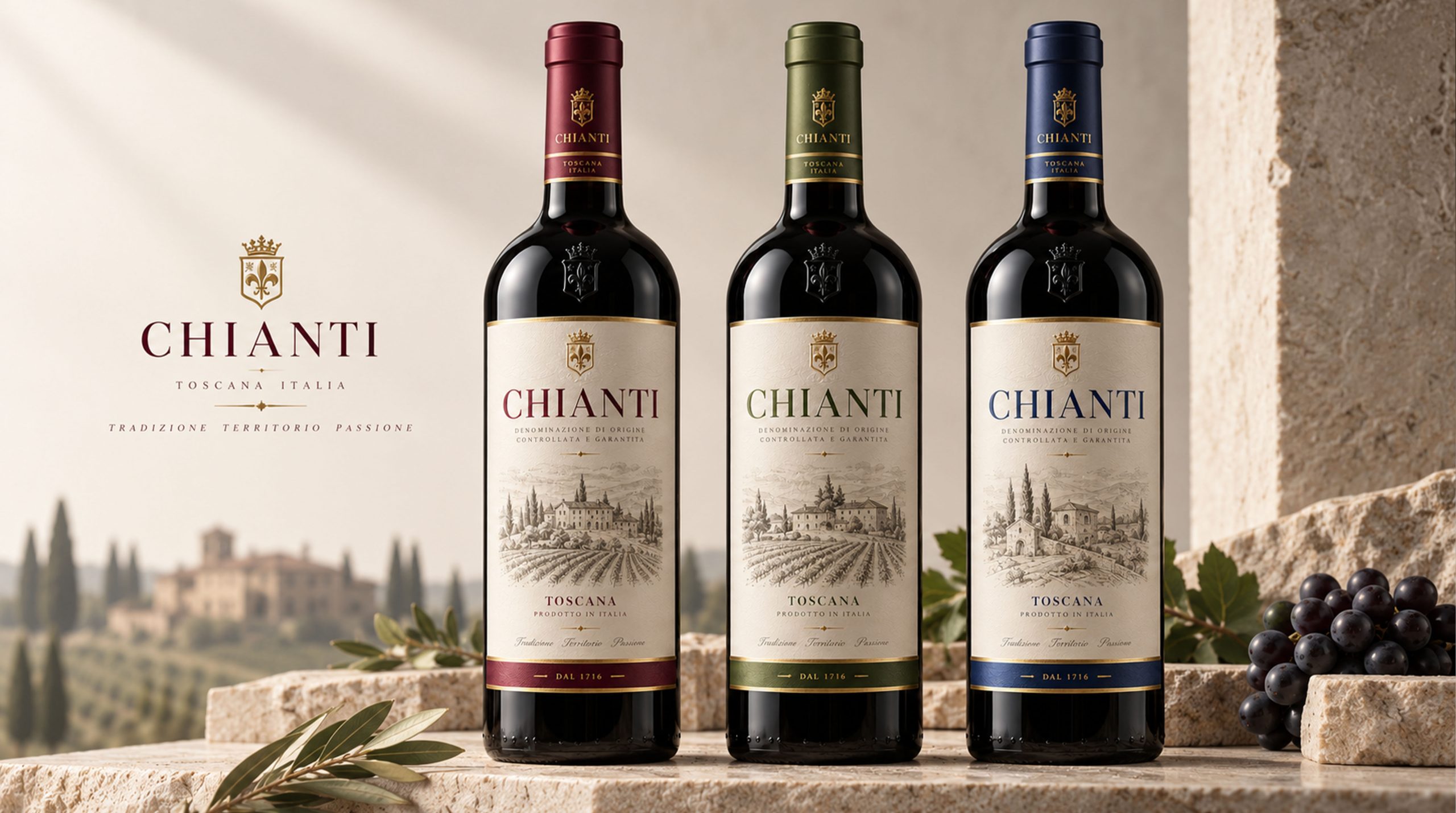
The new series of packaging is based on dark bottles, warm white labels, hand-painted manor landscapes and a graded color system. While retaining the traditional wine cultural temperament, it reduces overly complicated decorations and makes the products appear more quiet, mature and durable. It is not only a container for wine, but also an important medium for brands to connect the origin, terroir, brewing value and contemporary consumers.
Brand spirit
CHIANTI's brand spirit is deeply rooted in Tuscany's natural environment, grape growing tradition and long-term brewing culture. Its core spirit includes:
Terroir × Heritage × Trust
Time × Quality × Humanistic Temperature
These keywords clearly depict CHIANTI’s brand DNA. Terroir represents the inseparable relationship between wine and land, climate, sunshine and seasons; inheritance reflects the brand's respect for traditional planting methods, brewing experience and production area culture; trust comes from stable product quality, authentic expression of origin and long-term accumulated professional image. Time represents the patience required for grape maturation, fermentation, aging and flavor formation, and also symbolizes the brand's value judgment of not chasing short-term trends; quality reflects the continuous requirements for grape raw materials, production processes, bottling standards and detailed experience; humanistic temperature allows wine to transcend the simple drinking function and become an important medium for connecting people's emotions at dining tables, parties, gifts and daily life.
Brand concept
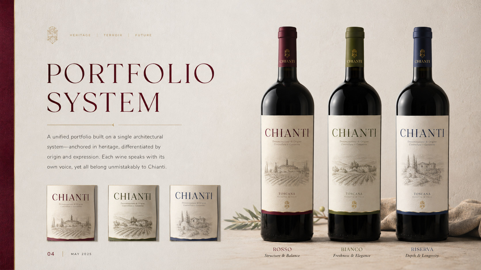
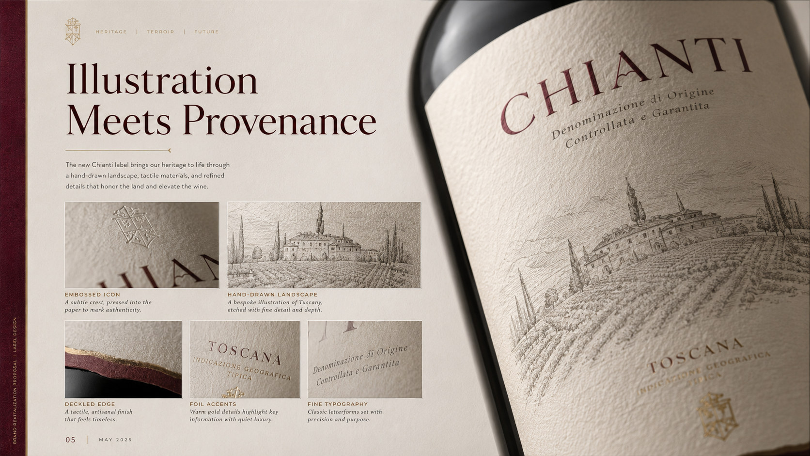
CHIANTI's brand concept emphasizes the design core of "classic order × local temperature". The new packaging image uses a stable and clear structure to show the professionalism of the wine brand. Through delicate paper, hand-painted landscapes and low-saturated colors, it conveys the natural, quiet and time-rich life atmosphere of the Tuscan countryside. Under the guidance of this concept, the packaging design does not pursue luxurious stacking on the surface, but uses bottle proportions, label structure, font relationships and material details to establish an attractive sense of quality. The brand name is placed above the label, and the production area description and product grade form a clear information hierarchy. The manor and vineyard line drawings in the center bear the terroir narrative, allowing consumers to perceive the regional origin of the product at the first time. Burgundy, olive green and dark blue in the series are used to distinguish different product types, vintages or flavor levels, establishing a clear product selection logic while maintaining a unified brand identity. By combining traditional wine label order with modern system design, CHIANTI creates a balance between classics, professionalism and emotion.
visual language
CHIANTI's packaging design is based on modern classicism, integrating Tuscan architecture, vineyard landscape and traditional winery culture to form a visual language that is calm, natural and internationally recognizable.
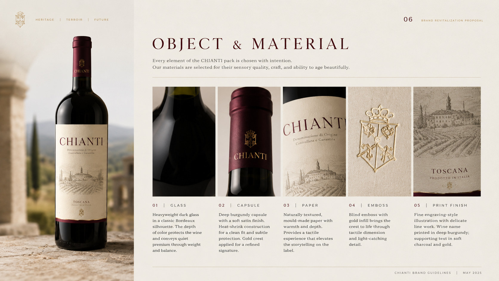
Color and structure: The dark glass bottle serves as the overall visual foundation, giving the product a mellow, mature and stable temperament, and at the same time plays a certain role in protecting the wine from light. The warm white label is close to the tone of natural cotton paper and old printmaking paper, giving the packaging a soft, authentic and time-traveled feel. Burgundy red, olive green and dark blue are respectively used on the bottle seal, brand text and bottom details of the label to form a unified and clear series identification. Gold badges and thin lines are used for local embellishment to enhance the quality and gift attributes of the product.
Graphics and symbols: Tuscan estates, vineyards, churches, cypress trees and hills form the most important graphic language of the packaging. The hand-drawn line drawing method not only retains the cultural atmosphere of traditional prints and travel manuscripts, but also avoids the commercial feeling brought by realistic photos. Different products adopt different manor landscapes, so that each bottle of wine has an independent imagination of its origin, while forming a complete series of relationships in a unified composition. The top badge symbolizes the winery’s tradition, quality certification and long-term reputation of the brand.
Material and texture: Labels can be made of high-quality special paper with natural fibers, slight grains and irregular textures. The visual and tactile levels are enhanced through matte printing, partial embossing, fine line hot stamping and slight embossing. The soft reflection of the dark bottle contrasts with the low-gloss texture of the paper, making the packaging appear richer under natural light and display lighting. The bottle seal is made of low-saturated matte material, which echoes the color of the wine label and strengthens the integrity of the series.
Font and typesetting: The brand name uses a serif font with a classical temperament, reflecting the sense of history, professionalism and order of European wine culture. Product grades, production area descriptions and capacity information are arranged using lighter and restrained fonts to establish a clear information hierarchy. The overall layout emphasizes the vertical central axis, symmetrical relationship and sufficient white space to maintain a stable and comfortable visual rhythm between the brand name, landscape illustrations and product information.
language and tone
CHIANTI's brand language emphasizes restraint, authenticity and elegance. Echoing the visual temperament presented by the packaging, the brand text should remain calm, clear and culturally rich, not only conveying the professional information of the wine, but also allowing consumers to feel the natural temperature of the Tuscan land, estates and lifestyle. Each piece of copy should focus on the place of origin, grapes, vintage, brewing method, aroma and table experience, and avoid using overly exaggerated or empty luxurious expressions. A brand can depict valleys, sunshine, ripe fruits and oak aging, but all emotional expressions should be based on the logic of authentic product characteristics and terroir. Whether it is bottle instructions, product manuals, brand stories or digital platform content, CHIANTI should communicate with consumers in a mature, sincere and measured way. Language can be poetic without losing clarity; it can emphasize history without appearing archaic; it can convey quality without proving value through noisy rhetoric.
Brand Experience
CHIANTI's brand experience starts when consumers see three wines displayed side by side, and runs through every touch point of product selection, touching, opening, tasting and sharing.
Product experience: The unified bottle shape, label structure and badge system enable consumers to quickly identify the brand; the classification methods of burgundy, olive green and dark blue help consumers distinguish different series, vintages or flavor characteristics. Delicate paper, hand-painted landscapes and dark glass together create a quiet and layered product experience, making the bottle suitable for table use as well as display and gift value.
Drinking experience: From opening the bottle cork, observing the color of the wine to smelling the aroma, entering the mouth and aftertaste, the brand regards drinking as a complete process of experiencing the terroir and time. Different series can establish independent flavor associations through color, scenery and product information, allowing consumers to make clearer judgments when choosing products, and allowing a bottle of wine to naturally integrate into family gatherings, formal meals, holiday gifts and moments of solitude.
Digital experience: The brand continues its warm white, dark glass and series of color systems on its official website, e-commerce platforms and social media, and establishes a consistent and professional online experience through vineyard images, winery architecture, brewing processes, vintage information and food and wine pairings. Consumers can quickly understand the differences between different products and receive clear drinking recommendations and origin information.
Spatial experience: Whether in boutique wine stores, restaurants, hotels, winery showrooms or brand tasting events, CHIANTI can create a unified atmosphere through natural stone, light stucco, dark wood and soft lighting. The manor line drawings and series of colors in the packaging can be extended to the guide, menu, wine list and display devices, forming a complete connection between the product vision and the actual space.
Brand Experience
Based on the land, the flavor is created with time.
By reintegrating Tuscan terroir, traditional brewing culture and modern design language, CHIANTI not only established a clear, unified and quality series of packaging, but also made the land, manor and time behind the wine more intuitively perceived by consumers. From a vineyard to a hand-painted wine label, from an ancient manor to a bottle of mature wine, the brand is based on terroir, takes quality as its commitment, and uses design as its connection, so that every opening becomes an encounter with Tuscany, and every drink retains the natural flavor, the precipitation of time, and the warmth between people that are worth cherishing.