











Agricultural Bank of China, as an important brand in China's financial service system, has long been rooted in urban and rural markets. With a stable, professional and extensive service network, it provides multi-level financial support to individual customers, corporate customers and industrial development. The brand not only carries the social responsibility of serving the real economy and connecting urban and rural resources, but also continues to promote digitalization, internationalization and high-quality financial service upgrades, forming a brand image that has both a solid foundation and the vitality of the times.
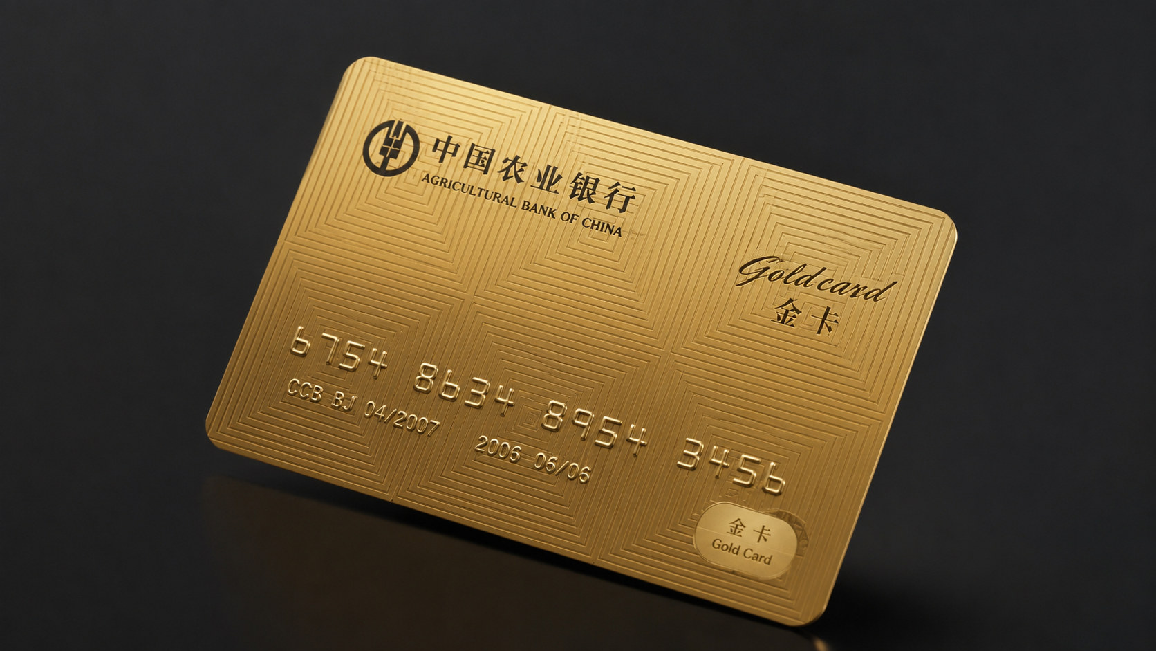
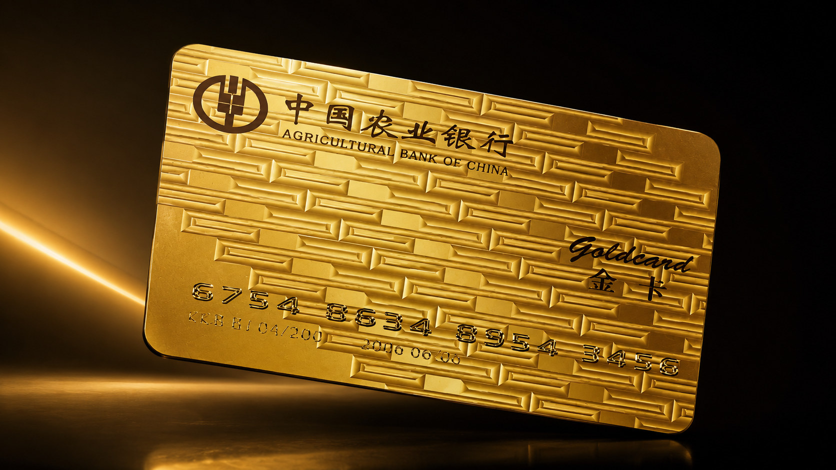
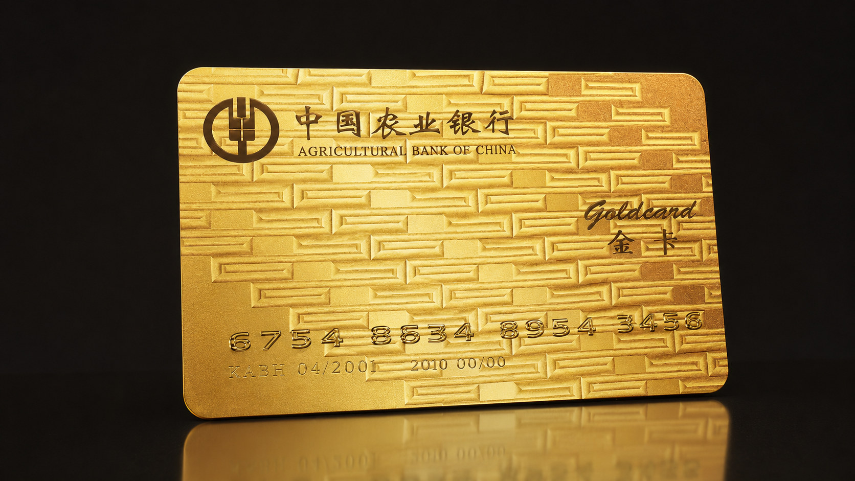
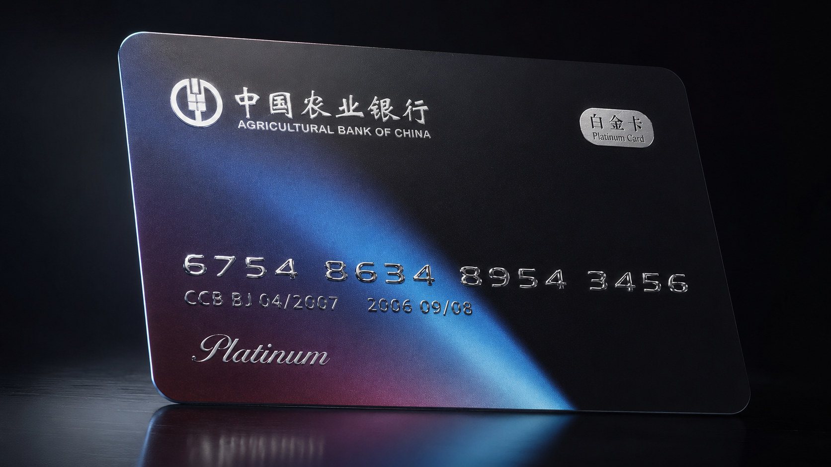
Faced with the changing needs of mobile payments, digital finance and high-net-worth customers, bank cards are no longer just a tool for payment and account management, but have also become an important carrier of customer identity, service level and lifestyle. It is against this background that the new gold card and platinum card visual systems reshape the image of traditional banking products. The design is based on the long-term brand trust accumulated by Agricultural Bank of China. Through the card surface language with a more sense of order, technology and high-end texture, it strengthens the identification of different levels of products and conveys the financial value of safety, dignity, professionalism and sustainable growth to consumers.










Brand spirit
The brand spirit of Agricultural Bank of China's high-end bank card system is based on long-term financial service experience, stable reputation and future-oriented innovation capabilities. Its core spirits include:
Steady × Professional × Trust
Wealth × Technology × Humanistic Services
These keywords clearly depict the brand DNA of high-end bank card products. Robustness represents the financial institution's insistence on asset security, service standards and long-term value; professionalism reflects the bank's comprehensive capabilities in account management, financial services and customer rights; trust comes from the brand's long-term accumulated market foundation and customer relationships. Wealth not only represents the assets themselves, but also symbolizes resource allocation, quality of life and growth opportunities; technology embodies the continuous upgrading of digital payment, intelligent services and modern financial experience; humanistic services allow rational financial products to retain their warmth, so that customers can feel clarity, peace of mind and respect in every payment, management and service communication.
Brand concept
This bank card visual upgrade emphasizes the design core of "financial order × distinguished experience". The new card surface shows the professional attributes of bank products with a stable and clear structure. Through metal materials, precise textures, gradient light and shadow, and restrained white space, it conveys the sense of quality and identity corresponding to high-end accounts.
Under the guidance of this concept, the design not only focuses on the visual impact of the front of the card, but also pays attention to the overall experience of customers during the process of taking, touching, using and displaying. The bank logo, brand name, card level and account information have been reorganized to form a clear information hierarchy, making the card surface more concise and efficient while maintaining a sense of solemnity and modern financial products.
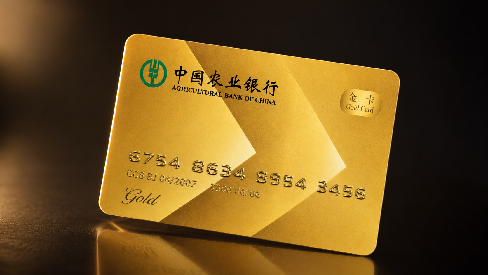
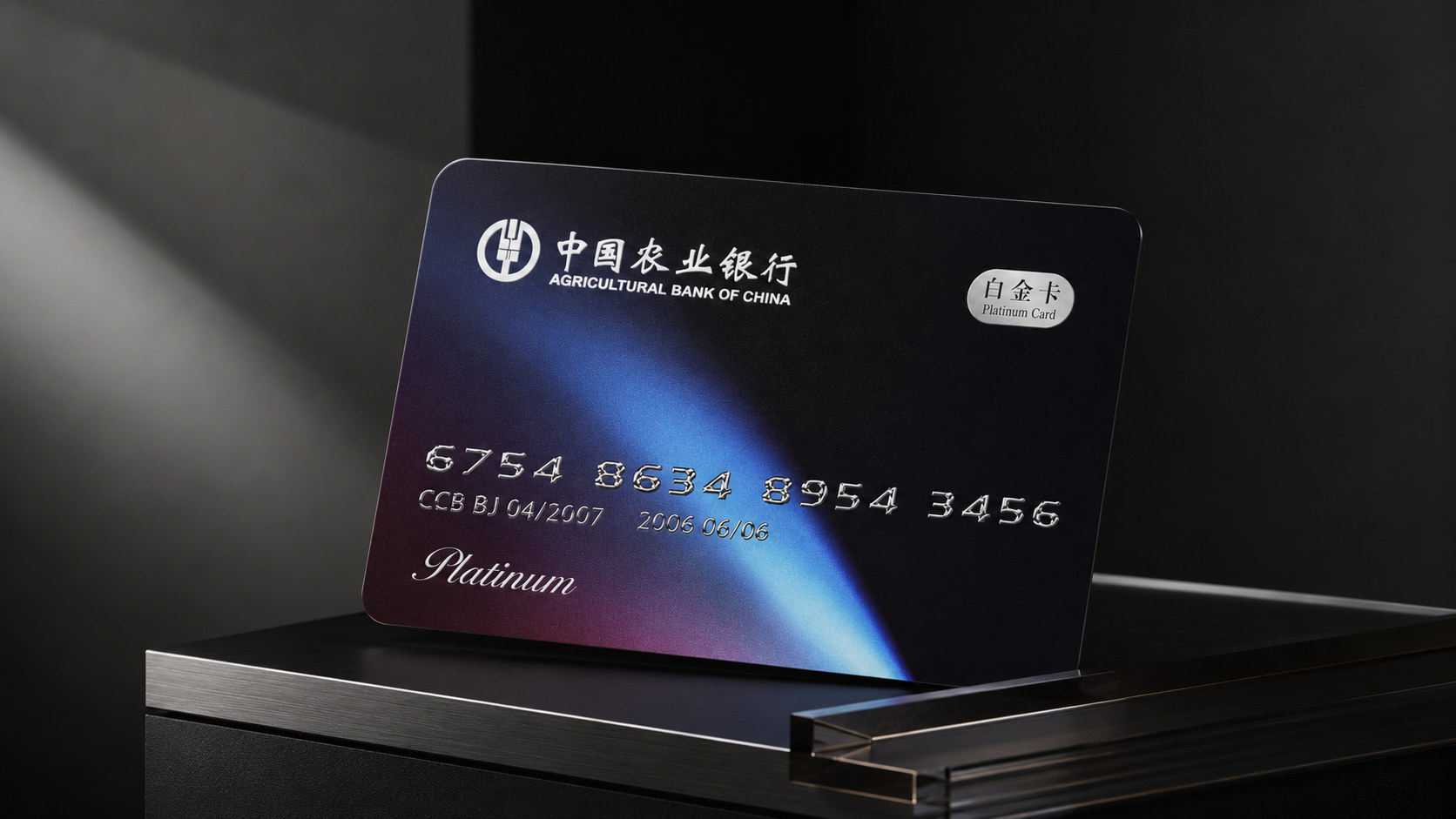
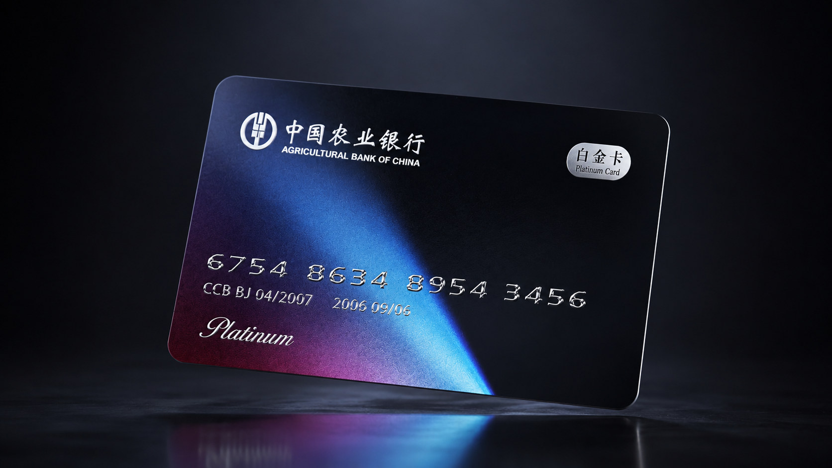
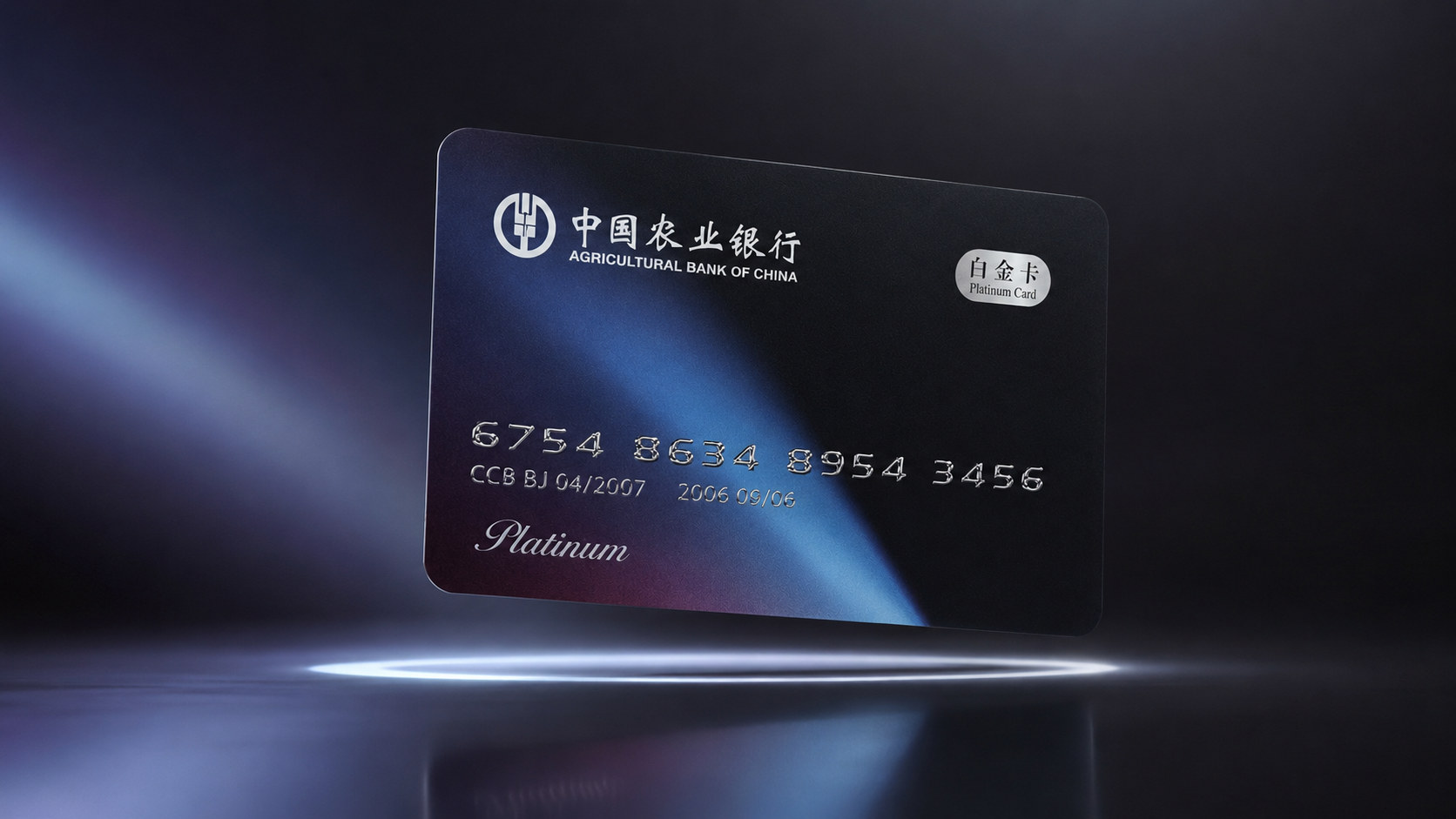
The gold card uses warm metallic colors to express value accumulation, harvest and growth; the platinum card uses a dark base, silvery white gloss and flowing light and shadow to present a calm, technological and elite feel. By combining differentiated color with unified structure, the product balances class distinction with brand consistency.
visual language
The high-end bank card design of Agricultural Bank of China is based on modern financial aesthetics and combines brand logo, metal craftsmanship, abstract light and shadow, and ordered textures to form a visual language that is stable, refined, and technologically inspired.
Color and structure: Gold is the core color of the gold card series, symbolizing value, growth, harvest and distinguished service. The card surface changes in levels of matte gold, bright gold and deep gold to avoid the exaggerated feeling brought by a single metallic color. The Platinum Card uses dark blue, black and silver as the main colors, reflecting rationality, professionalism, security and digital financial temperament. The overall structure emphasizes horizontal order and visual balance, maintaining a clear relationship between the bank's logo, product levels, account information and decorative graphics.
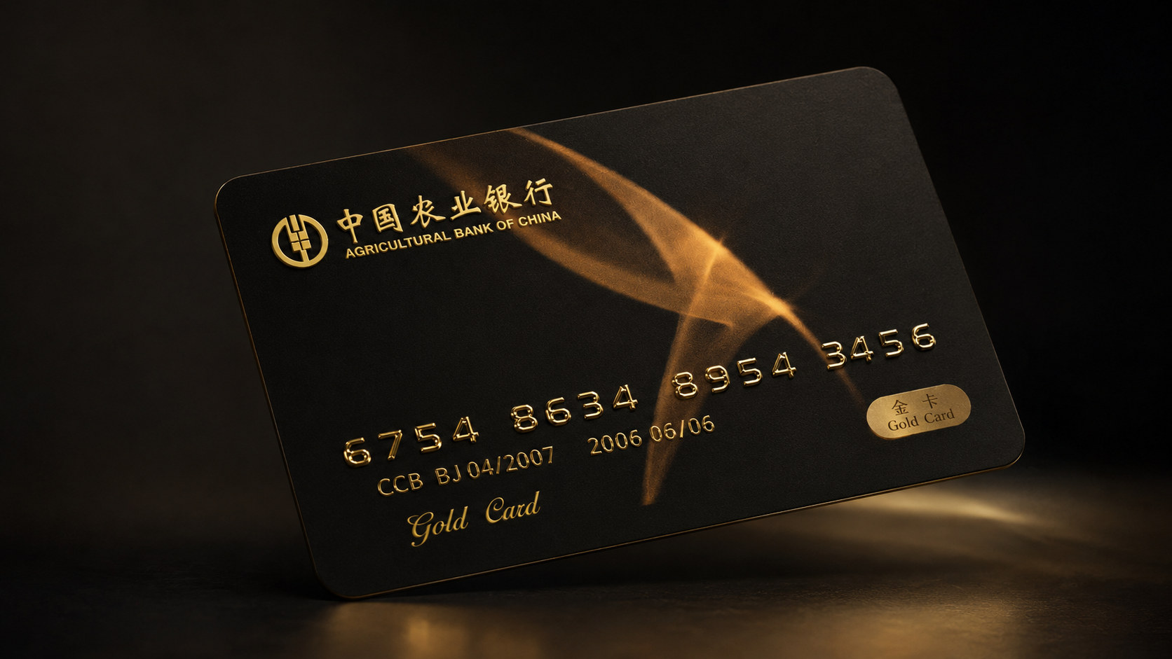
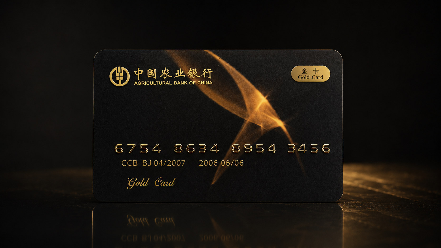
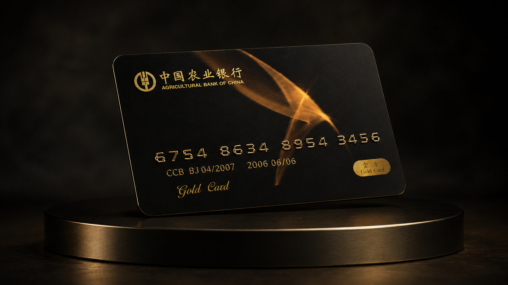
Graphics and symbols: The Agricultural Bank of China logo is the most important brand asset on the card surface. It is located in a high-recognition area and establishes a direct connection between the product and the bank's reputation. The background graphics are inspired by abstract wheat ear structures, field textures, architectural order, geometric folds and flowing light strips, transforming the brand foundation of Agricultural Bank of China into a more modern visual symbol. The graphic expression remains restrained, retaining cultural and industry associations while avoiding the direct stacking of traditional elements.
Material and texture: Gold cards can use metal coating, fine-grain brushing, partial mirror surface, embossed embossing and micro-engraved texture to form rich and stable gloss changes. The platinum card uses a dark frosted base, silver metal text and partial light film to create a sophisticated and calm technological texture. The card number, grade logo and brand text can be embossed with three-dimensional printing, metal plating or fine etching to make the card appear delicate and layered at different angles.
Font and typesetting: The Chinese brand name maintains a correct, steady and authoritative feel, while the English name adopts a clear and standardized font structure to strengthen international expression. Card numbers, dates and product levels are arranged according to a strict grid system, reducing the use of decorative fonts and making the information more visually clear and credible. The overall layout uses white space, alignment and proportion control to create a high-end feel, allowing materials, light and shadow to become the real visual subjects of the card surface.
language and tone
The brand language of Agricultural Bank of China's high-end bank cards emphasizes stability, clarity and credibility. Echoing the visual image on the card, the language expression should be professional and restrained, which not only reflects the rigor and responsibility that a financial institution should have, but also conveys the respect and warmth of high-end customer service. Each piece of product copy should focus on account rights, payment security, wealth management, exclusive services and life scenarios, avoid empty and exaggerated wealth promises, and ensure that the information is accurate and easy to understand. The brand tone is firm but not stiff, noble but does not create distance. Through clear service descriptions and sincere communication, customers can understand the value of the product and build stable trust during long-term use.
Brand Experience
The brand experience of Agricultural Bank of China's high-end bank cards starts when the customer sees the card, touches the material and completes the first use, and runs through every touch point of account opening, payment, use of rights, wealth management and customer service.
Product experience: Through a unified and clear card system, customers can quickly distinguish the service levels of gold cards and platinum cards. The metallic texture, delicate texture and precise information layout enhance the holding and use experience of the card, allowing financial products to maintain a balance between safety, durability and aesthetics.
Digital experience: The color, texture and grade system of physical cards can be extended to mobile banking, digital card surfaces, payment interfaces and member rights pages to ensure that offline cards and online services remain unified. Customers can get a clear, continuous and high-quality digital experience when checking accounts, managing assets and using rights.
Service experience: The visual image of bank cards further extends to account opening materials, welcome gift boxes, VIP spaces, service manuals and customer communication interfaces, allowing different touch points to form a complete high-end service system. Regardless of the online platform or offline outlets, customers can feel consistent professional standards, service efficiency and brand respect.
brand statement
Protect value with stability and connect with the future with professionalism.
By re-integrating the high-end bank card visual system, material technology and service experience, Agricultural Bank of China not only strengthens the level recognition of gold and platinum cards, but also transforms the brand's long-term financial trust into a more modern, clear and perceivable product language. From a card to a complete set of financial services, the brand is based on security, takes professionalism as its commitment, and uses technology as its driving force to make every payment more calm and build every wealth management on a long-term, stable and trustworthy relationship.