










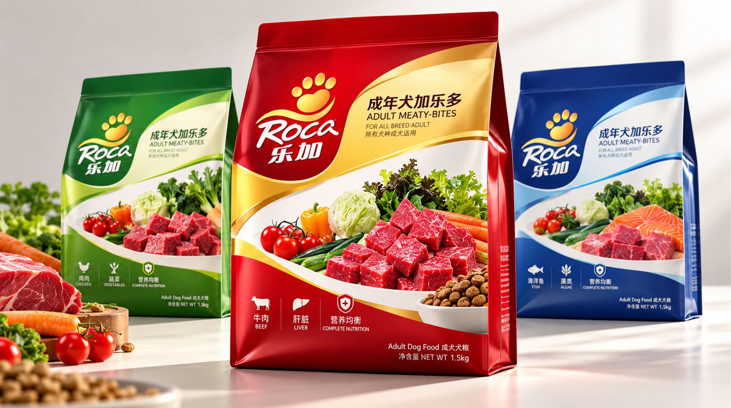
Lejia is a brand with pet food, canine nutrition and pet healthy life as its core. It is committed to providing balanced, scientific and delicious daily food for dogs of different ages, sizes and living conditions. As pets gradually become important members of the family, consumers have put forward higher requirements for the nutritional content, raw material quality and functional value of pet food.
This packaging design is based on "nutrition protection × vitality companionship" as the core. Through the distinctive red, blue and green packaging system, it combines real meat, vegetables and pet images to show Baolu's professional, reliable and friendly brand image, transforming pet food from a single daily feeding product into a lifestyle brand that connects pet health, family companionship and emotional care.
Brand spirit
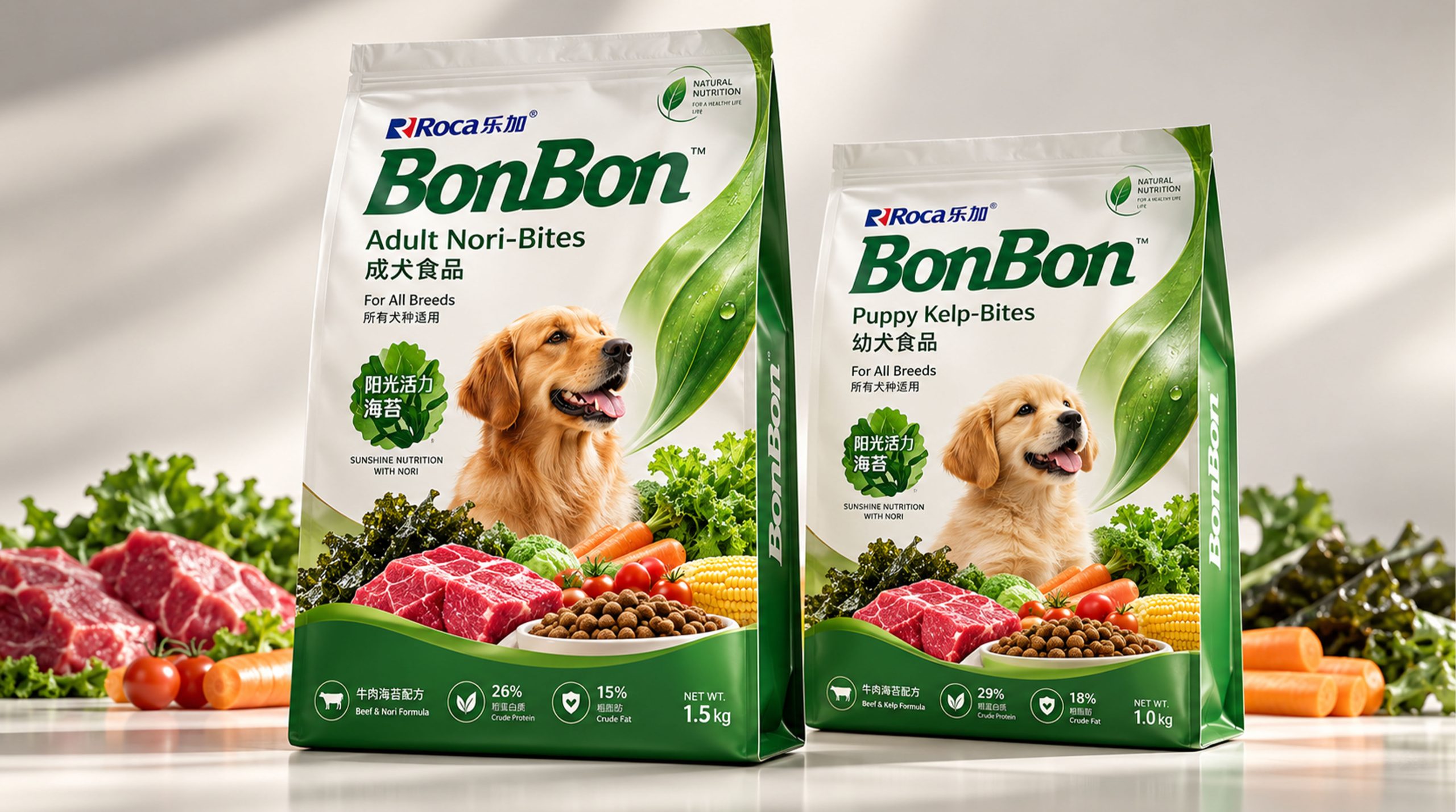
The brand spirit of Lejia is based on nutrition, care and trust, forming a brand DNA with affinity and professionalism.
Nutrition × Health × Companionship
Science × Deliciousness × Pet Care
Nutrition represents the brand's attention to pets' daily dietary needs, health reflects the product's support for the growth, vitality and physical condition of dogs, and companionship expresses the long-term and warm emotional relationship between pets and their owners. The science reflects the brand's professional capabilities in pet nutrition research and product formulation, while the delicious taste enhances the pet's eating experience. Pet care is the brand value that Baolu always adheres to.
design concept
Lejia's brand philosophy can be summarized as "scientific nutrition × warm companionship". The packaging design uses distinctive brand colors and clear information levels to highlight the product type, applicable dog breeds, main raw materials and nutritional characteristics, allowing consumers to quickly understand the product value.
Different products are distinguished by colors such as red, blue, green and so on. Red represents vitality, enthusiasm and delicious food, blue conveys professionalism, reliability and science, and green symbolizes nature, health and nutrition. The image of the dog in the packaging enhances the brand's affinity, makes the visual presentation more vivid, and allows consumers to feel the emotional connection between pet food and daily companionship.
Product packaging combines images of meat, vegetables, grains and pets to intuitively represent rich ingredients and balanced nutrition. The overall design establishes a balance between professional information and emotional expression, which not only reflects the brand strength of Baolu, but also conveys concern for the healthy growth of pets.
visual language
Baolu’s visual language follows the design principles of “distinctive, professional, friendly, and easy to recognize”.
Color and structure: Red embodies vitality, enthusiasm and appetite, and is suitable for expressing rich flavors such as beef and meat sauce; blue embodies science, stability and professionalism, strengthening the nutritional attributes of the brand; green represents nature, vegetables and health. Different colors correspond to different product lines, allowing consumers to quickly differentiate between tastes, dog breeds and product functions.
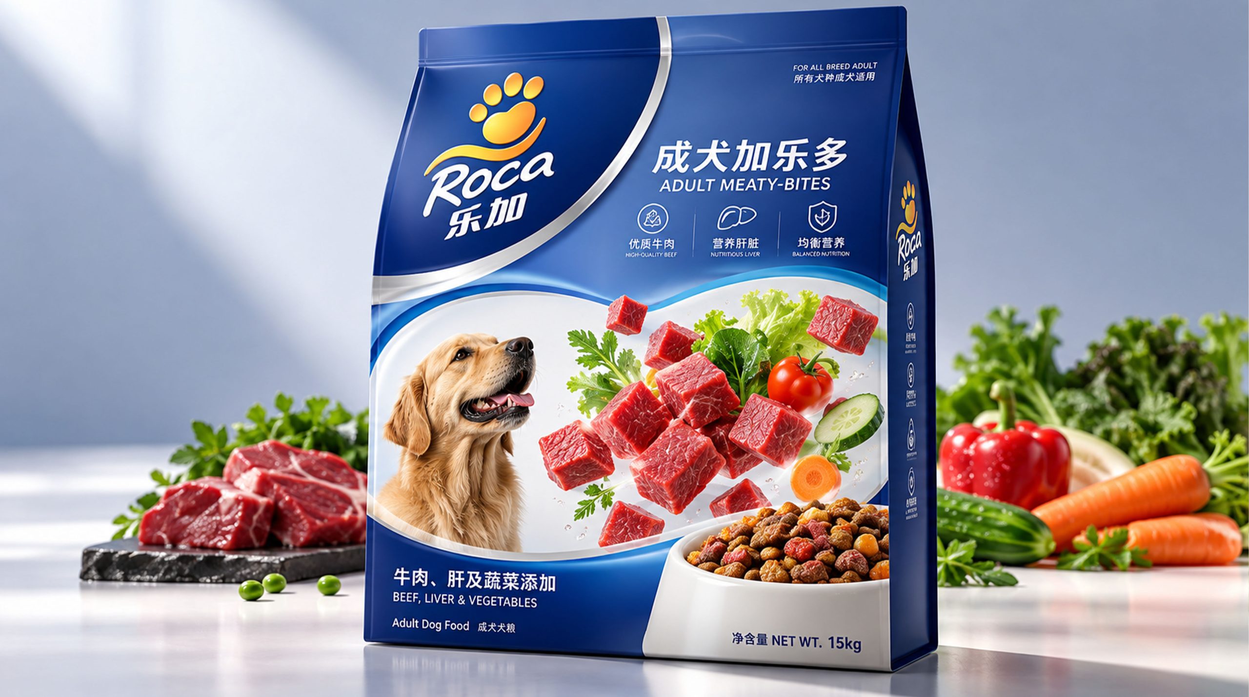
Logo and graphics: As the core identification element of the packaging, the Lejia logo combines graphics such as paw prints, dogs and brand names to reflect the pet food attributes and brand affinity. The paw print represents the identity of the pet and also symbolizes the companionship between Lejia and the canine.
Food and pet images: Use images of beef, liver, vegetables, grains and other food ingredients in the packaging to highlight the raw materials and nutritional sources of the product. The images of dogs of different breeds and states help consumers establish a connection between the product and the actual use object, enhancing the authenticity of the packaging and the convenience of selection.
Font and typesetting: The brand name is presented in an eye-catching and friendly font. The Chinese "Lejia" and the English "PEDIGREE" together form a complete brand identity. Product names such as "Adult Dog Food" and "Adult Dog Food" are typed in clear fonts to ensure that consumers can quickly understand the applicable objects and product categories. The bottom of the package presents information such as beef, liver, vegetables, protein and balanced nutrition through icons, reinforcing Baolu’s professional and transparent product communication method.
language and tone
Lejia's brand language is friendly, direct and caring, emphasizing the connection between pet nutrition and family emotions. Product copy should clearly explain the applicable dog age, taste, ingredients and nutritional characteristics, avoid over-exaggeration, and build consumer trust in a true and simple way.
Brands can be expressed around keywords such as "nutrition protection", "delicious companionship", "healthy growth" and "daily vitality". For example, "Good nutrition, companion every day", "Provide balanced nutrition for dogs", "Delicious every meal, healthy every day", etc., convey Baolu's brand attitude of warmth, reliability and closeness to life.
English auxiliary copywriting such as "Adult Dog Food", "Complete Nutrition" and "For All Breeds" further clarifies product positioning and scope of application, allowing the brand to maintain a unified and clear communication style in different markets.
Brand Experience
Baolu's brand experience runs through pet food packaging, terminal displays, online platforms and pet life scenes. From consumers choosing products and understanding nutritional information, to pet consumption and long-term companionship, every link should reflect the brand's professionalism and care.
Packaging experience: Packaging uses bright colors, real ingredients and clear information to allow consumers to quickly identify the product type. The red, blue and green series correspond to different flavors and product features respectively, making it easier for consumers to choose based on their pet's age, size and dietary needs.
Spatial experience: In supermarkets, pet stores and e-commerce platforms, Baolu can continue the unified color and pet graphic system to form an eye-catching shelf display effect. Different products are classified according to dog age, taste and function to improve consumers' purchasing efficiency.
Digital experience: On official websites, social media and pet communities, brands can spread content around canine nutrition, feeding knowledge, health management and pet companionship to help owners establish a more scientific concept of pet raising.
Product experience: Baolu provides pets with the daily nutritional support they need through clear product information, rich flavor choices and convenient packaging formats, and also allows owners to feel the peace of mind and reliability of the product during the feeding process.
brand statement
"Baolu, protect every companionship with nutrition."
Baolu's brand image is not only a combination of distinctive packaging, pet images and food ingredient information, but also an expression of health, companionship and responsibility. Red represents enthusiasm and energy, blue represents professionalism and trust, green represents nature and health, and paw prints and dog images reflect the emotional connection between pets and families. Through unified packaging design, product information and brand communication, Baolu has established a professional, friendly and reliable pet food image. The brand not only provides balanced nutrition and delicious experience for dogs, but also hopes to help pets grow up healthily through companionship with every meal, so that owners and pets can live a happier and more secure life together.