





BRISANDES
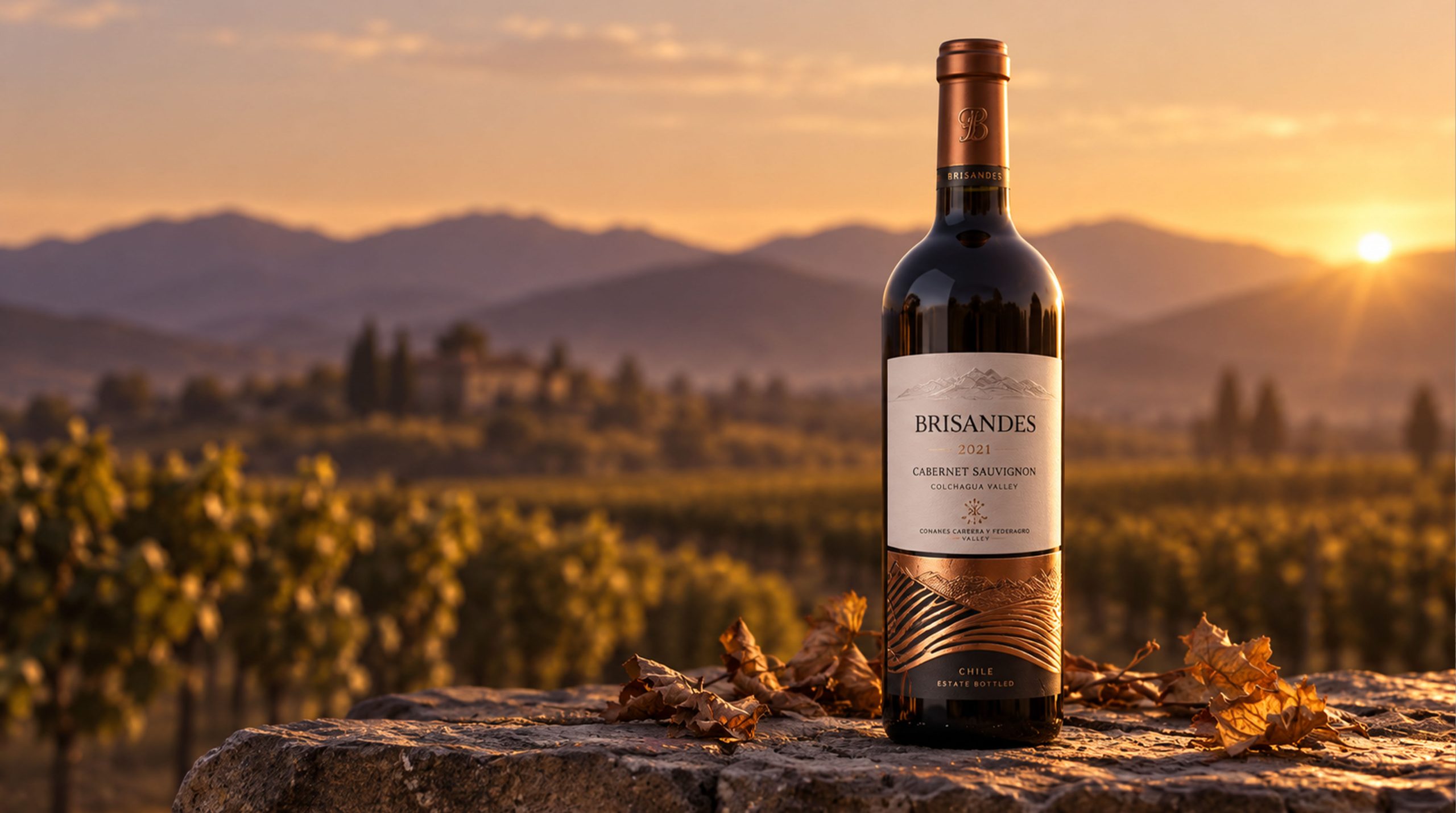
Brand Essence
The Brisandes brand spirit is built onTradition × Innovation × Refinement.
- Tradition × Innovation × Refinement
- Art × Fashion × Experience
These keywords capture the Brisandes brand DNA.Traditionrepresents the estate’s deep winemaking heritage and craftsmanship; Innovation reflects the brand’s continual breakthroughs in product and packaging design; andRefinementis the ultimate goal of the packaging, expressing quality, meticulous detail and luxury.Art, Fashion and Experiencelie at the heart of the product appeal and consumer engagement Brisandes pursues. Through a contemporary design language, the brand fuses traditional wine culture with today’s trends, standing apart in the market and capturing the attention of a younger generation.
Brand Philosophy
Brisandes pairs modern design with vibrant aesthetics. Fresh color combinations and graphic elements express the brand's perspective on fashion. Simple, modern visuals speak to a younger generation, reflecting the brand's forward-looking spirit and vitality. The packaging becomes an artistic expression of the brand, connecting through sight and emotion. Bold color contrasts and flowing lines reflect its affinity for modern art and youth culture, appealing to consumers who value style and quality of life.
Visual Language
The Brisandes Cabernet Sauvignon packaging expresses the brand’s personality and appeal through a distinctive visual language:
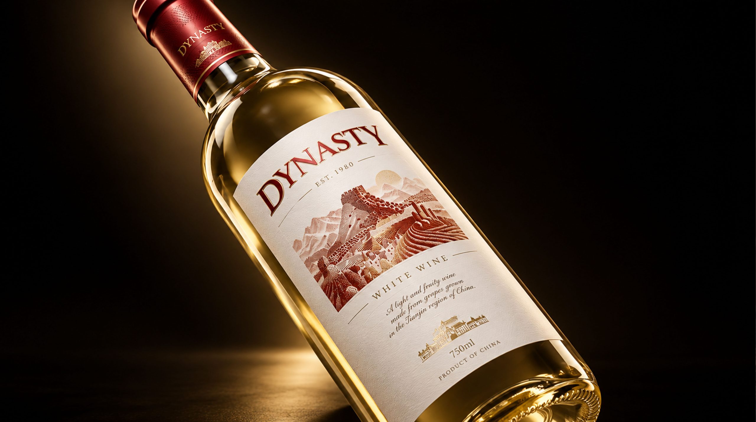
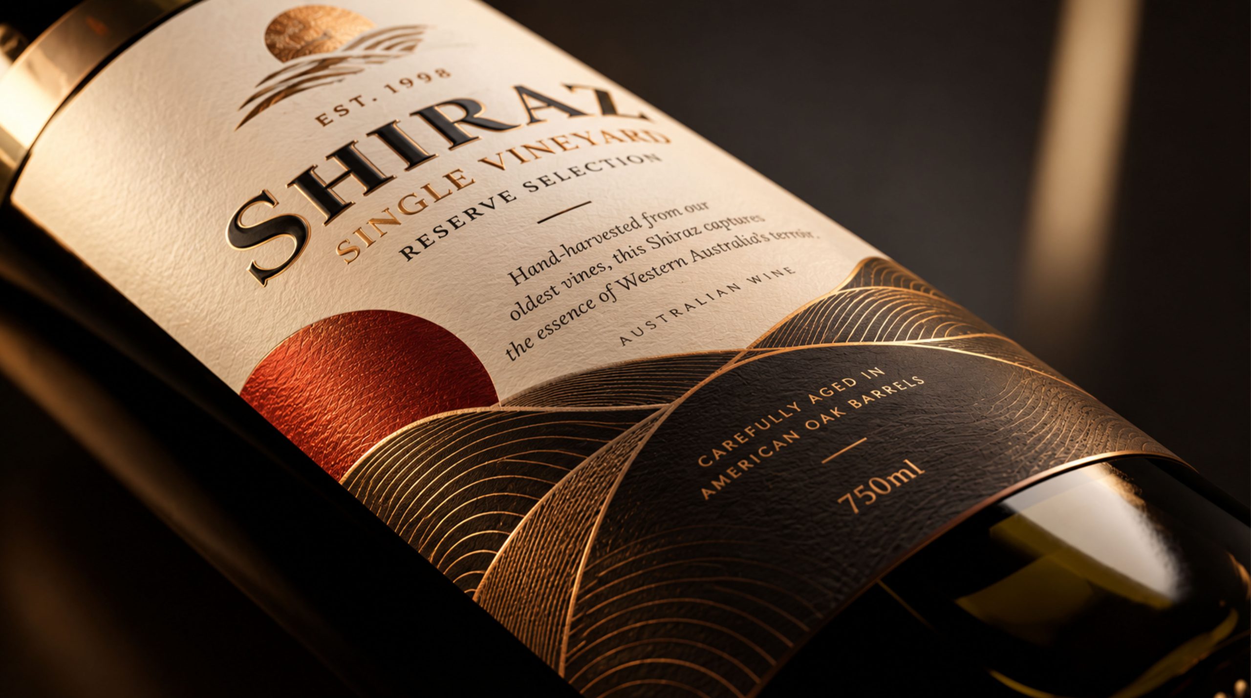
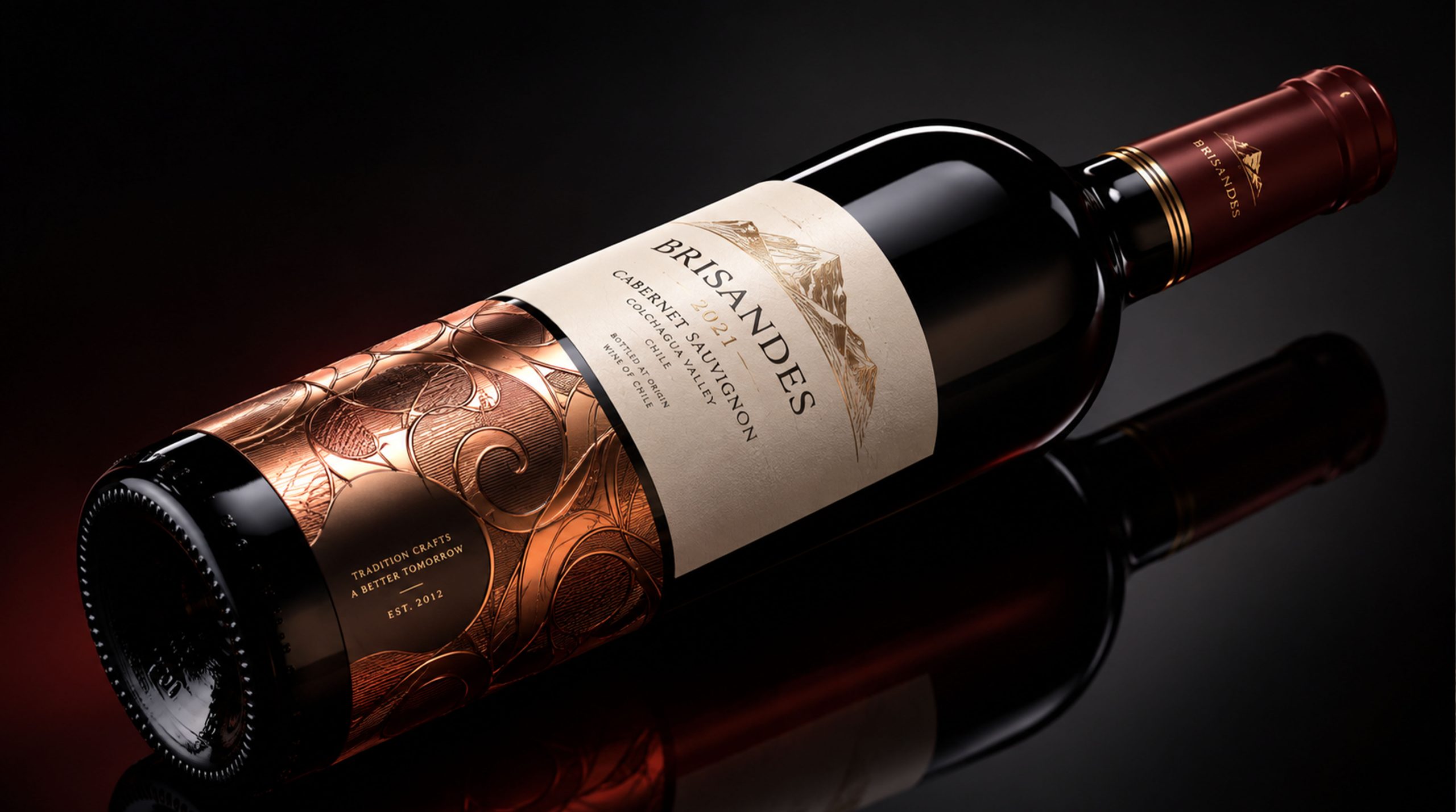
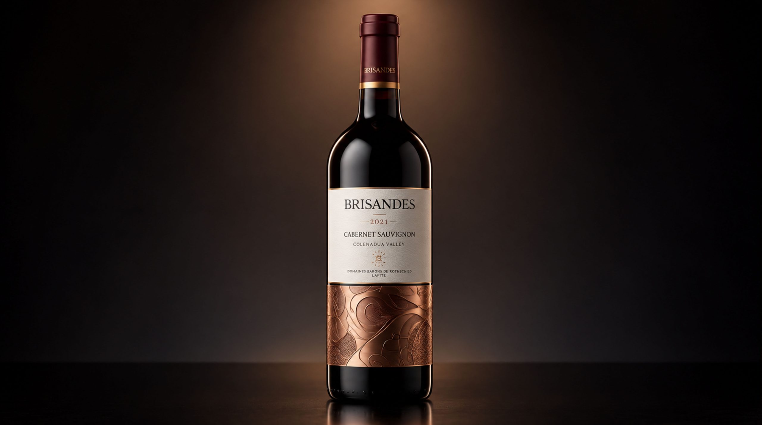
- Color and structure:The packaging pairs vivid red with black. Red stands for energy and passion, while black brings poise and luxury. This high-contrast palette delivers strong visual impact and heightens the premium feel. The box is clean, modern and assertive, and its angled design adds movement and dimension, giving the product a contemporary edge.
- Graphics and Symbols:The lower half of the packaging featuresmodern abstract line patterns— lines that evoke the rhythm of flowing wine, expressing both the vitality of the wine and the brand’s dynamic aesthetic. Interwoven and spiraling, the linework creates a sense of motion, giving the packaging a premium, fashion-forward look that suits younger consumers’ taste for modern design.
Tone of Voice
The Brisandes packaging voice is simple, modern, and confident. The copy is direct and clear, conveying the product's defining qualities: modern design, style, and innovation. Concise language and refined visuals express the brand's premium positioning and sense of style. Copy and visual identity work together to create a cohesive, distinctly modern presence.
Brand Experience
The Brisandes brand experience goes beyond visuals. The packaging delivers a complete experience, letting consumers feel the brand’s distinctive appeal at every moment of purchase.
- Tactile Experience:High-quality paper stock and fine craftsmanship make the packaging feel as premium and meticulous as it looks. Every time the pack is opened, consumers sense the brand’s uncompromising attention to detail.
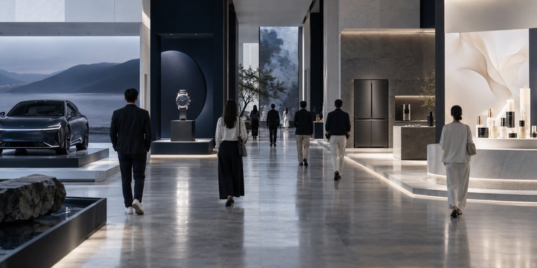
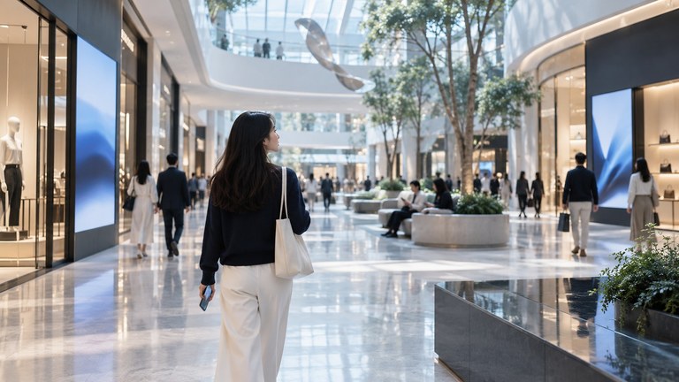
- Space experience:The packaging’s modern design language complements the product’s premium quality. On retail shelves and displays, Brisandes packaging stands out, making the brand instantly visible and memorable.
By fusing innovative packaging design with modern art elements, Brisandes has created a product image that is both contemporary and fashionable. The packaging showcases the brand’s distinctive visual style while building affinity and loyalty through detail and emotional resonance.