










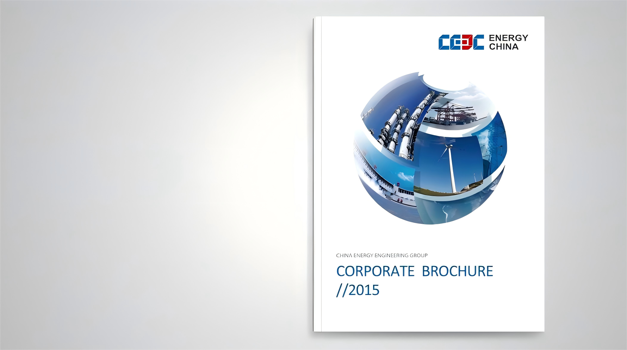
We created a strategy book for a diversified conglomerate, using a “modular integration” concept to showcase the Group's synergy across business units and its end-to-end solutions.
The design goal: to establish a structured, international and premium visual language, so that the book is not merely an information carrier but an expression of the brand's stature. The design centers on “clear structure × modular sections × international layout,” reinforcing the Group's image of integrated, comprehensive strength.
design challenge
The Group spans many business units with highly varied content, so presenting it with a unified logic was the first challenge. The design had to be both professionally credible and premium in brand feel—creating visual rhythm and a quality experience rather than a mere list of information. For international audiences, layout, color and charts had to meet international publishing standards to build trust overseas. The task, therefore: communicate an integration strategy through a modular language, and express the brand's global vision through international layout.
Strategy and philosophy
The design is based on the core concept of "beauty of structure and wisdom for the future". We translate the technical logic of HNA Cloud into a visual order language, and build a "readable data aesthetics" through modular structures, geometric grids, and hierarchical changes in information levels. The main colors are dark blue and silver gray, symbolizing rationality and trust in technology; the font selection emphasizes geometry and information density, making the visual rhythm consistent with the brand's technical attributes. The overall strategy is to make technology perceptible: design not only conveys information, but also expresses the company's intelligent thinking through structure and materials.
Design presentation
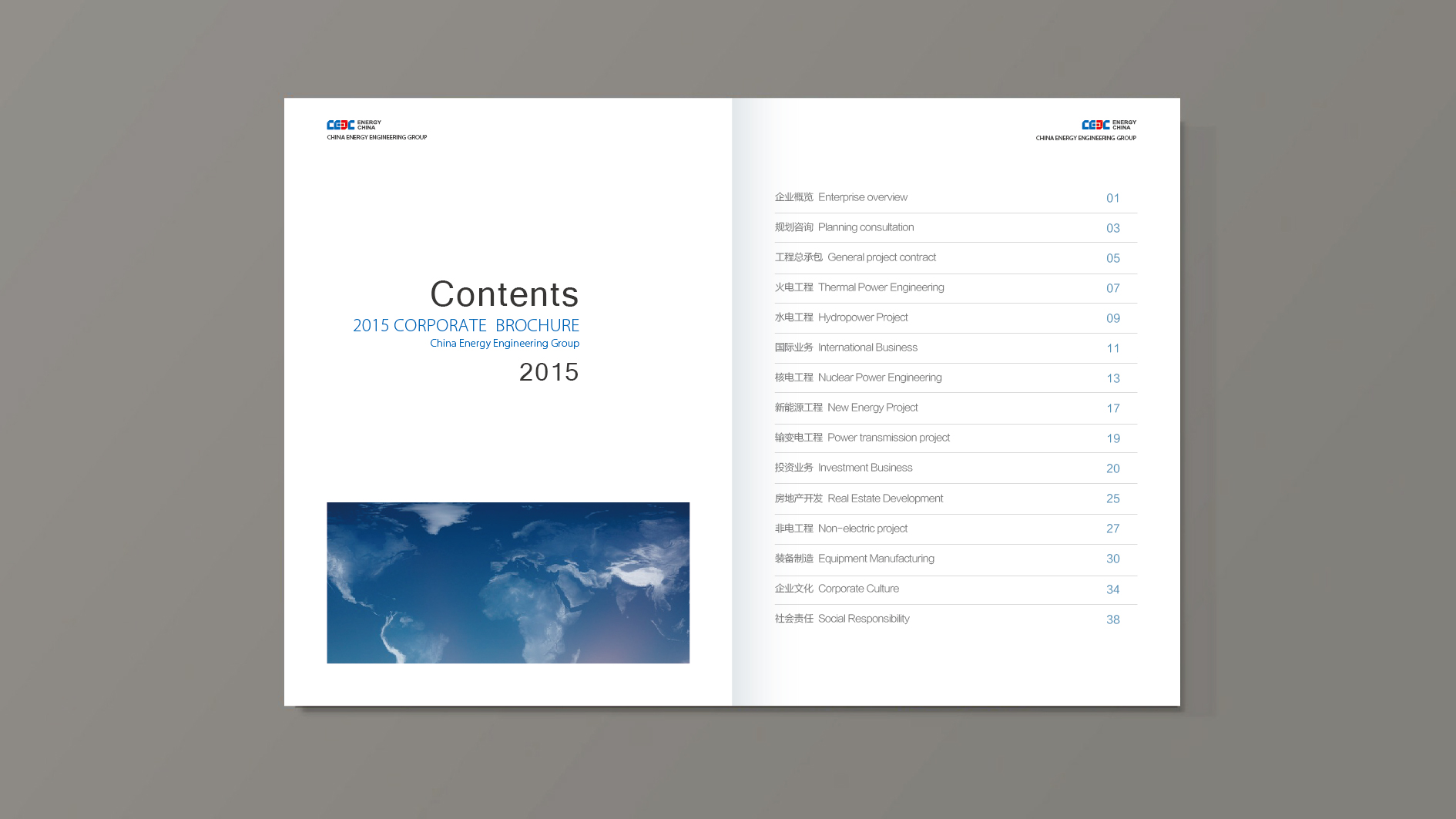
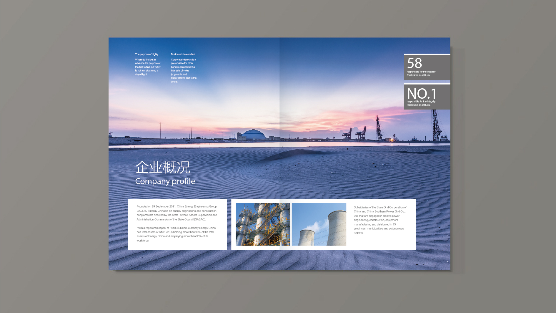
Cover: an abstract geometric grid with linear connections forms a visual symbol of the collaborative network among the Group's business units, printed on heavyweight matte stock with selective hot-foil gold or embossing for added texture. Inside pages: following a modular logic, each business unit has its own chapter, sharing a unified layout but distinguished by accent colors, with text on the left and charts and visuals on the right. Charts and information design: flow charts, relationship diagrams and data charts use a flat style with a restrained palette and precise lines, reinforcing professional credibility. International details: the layout follows international publishing conventions (proportions, white space, type scale), with English terms used subtly to signal the brand's international positioning. The overall result: “rational structure × brand stature × international quality.”
Achievements and Impact
After launch, the book became a key tool for the Group's internal strategic communication and external presentation, and its visual system was extended to the website, presentation decks, decision handbooks and other touchpoints. Its modular, international design language gave clear visual expression to the Group's integration strategy, strengthening its global trust and professional image. The client described the book as “turning a complex group structure into a brand asset that is readable, visible and usable.”