










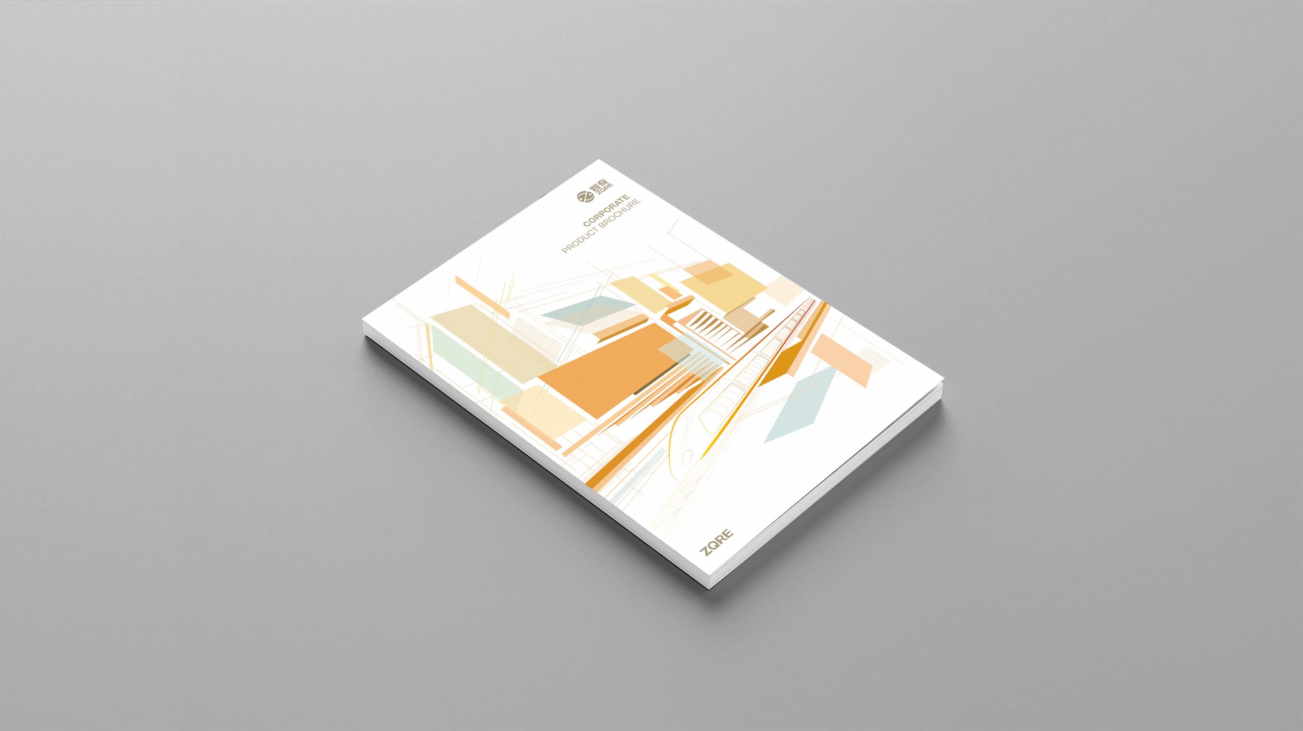
A corporate brochure for Zhiqi, presenting the rail transit equipment and supporting solutions it supplies to CRRC in a clear, systematic way.
Designed for B2B technical procurement, international trade shows and project negotiations, the brochure uses an international, engineering-led and trustworthy visual language to communicate the product portfolio, technical capabilities and quality system with clarity.
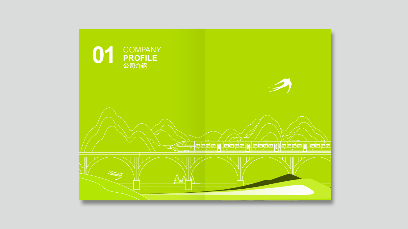
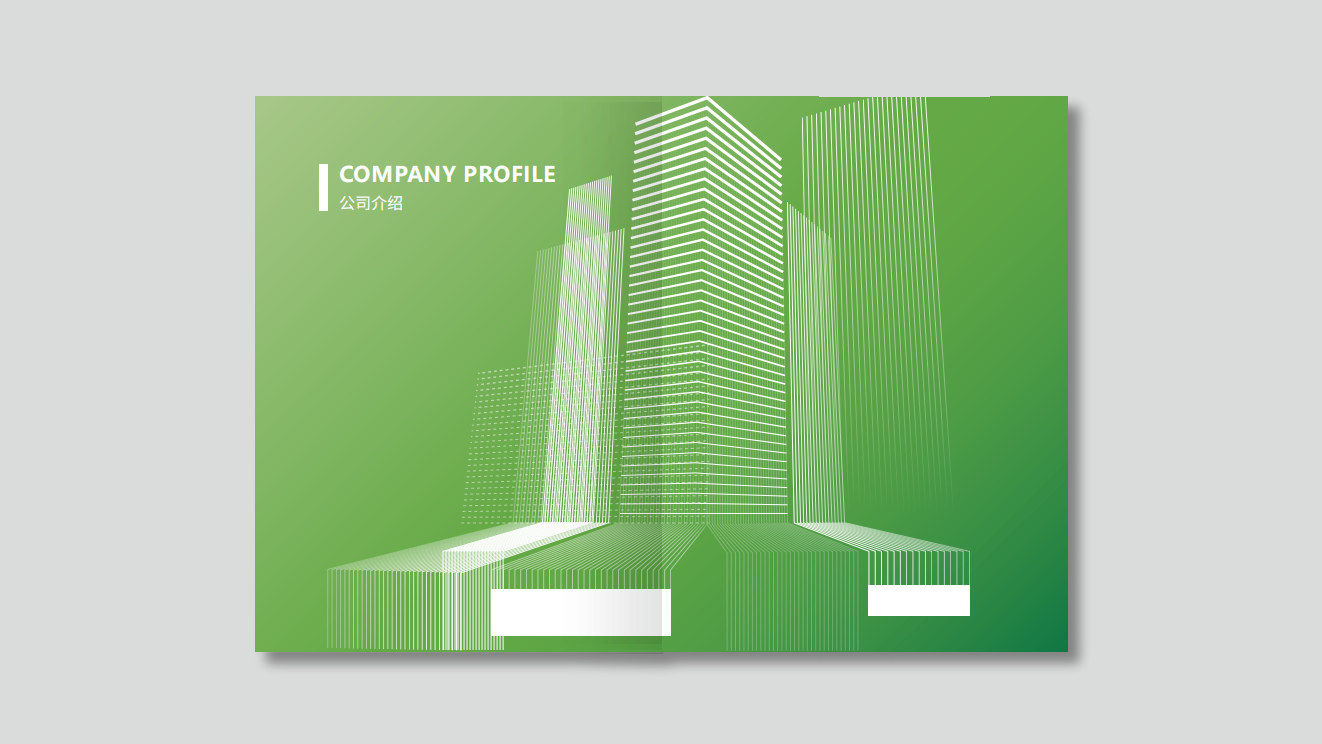
design challenge
Broad product lines and complex specifications: vehicles, systems and components span multiple series, with many parameters and high information density. A specialist audience: procurement and engineering readers care most about performance metrics, interface standards, reliability certifications and full life-cycle service. International requirements: the brochure had to align with overseas materials, with a bilingual structure, consistent chart conventions, and unified units and standards.
Strategy and philosophy
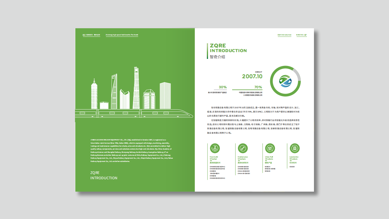
Theme: Engineering Clarity, building trust through clarity. Modular information architecture: content is organized in a hierarchy of Product Family → Key Systems → Core Components → Applications, creating a fast, navigable reading path. Data-led expression: system block diagrams, interface schematics, parameter matrices, performance curves and comparative radar charts turn complex specifications into intuitive information. Visual order: a 12-column grid, generous white space and fine rules sustain rhythm and readability across a long document. Brand tone: a graphite-gray and steel-blue foundation accented with CRRC Red conveys engineering robustness and partnership. International alignment: SI units, standard numbers and terminology are unified, with Chinese and English set side by side throughout.
Design presentation
Cover: linear structural drawings and an isometric grid form a “shape of the system,” with spot UV on a matte black ground and metallic red foil marking key modules. Overview spread: a single page maps the product family and platform capabilities, noting each series’ load range, operating conditions and interface standards. Technical pages: parameter tables in a three-column matrix (performance / structure / environment), with interface and installation diagrams alongside; reliability and warranty pages visualize service-life lines, MTBF and process capability (Cpk); certification pages present EN, ISO, IRIS and other certificates and test items as badge-style icons. Case pages: four-quadrant cards (route / climate / load / maintenance) showcase overseas applications, paired with construction and operations photography and key KPIs. Materials and finishing: fine matte laminated cover with a debossed grid; interior pages on heavyweight matte coated stock to reproduce fine linework and isometric grids with precision.
Achievements and Impact
The brochure has performed consistently at overseas trade shows, as a tender and roadshow attachment, and in technical client meetings, markedly improving how efficiently information lands and how professional the brand is perceived to be. The product portfolio structure and modular layouts have been reused across presentations, technical white papers and the website, building a consistent library of engineering visual assets and reinforcing the brand perception of “working in step with CRRC, delivering worldwide.”