










BHGB is a technology company specializing in green energy technology, environmental engineering and sustainable urban systems. With the vision “technology driving a green future,” it is committed to building clean energy, circular systems and smart city solutions.
The company sought a mark combining rational structure with ecological imagery to convey its brand spirit: “the beauty of systems × the power of sustainability.”
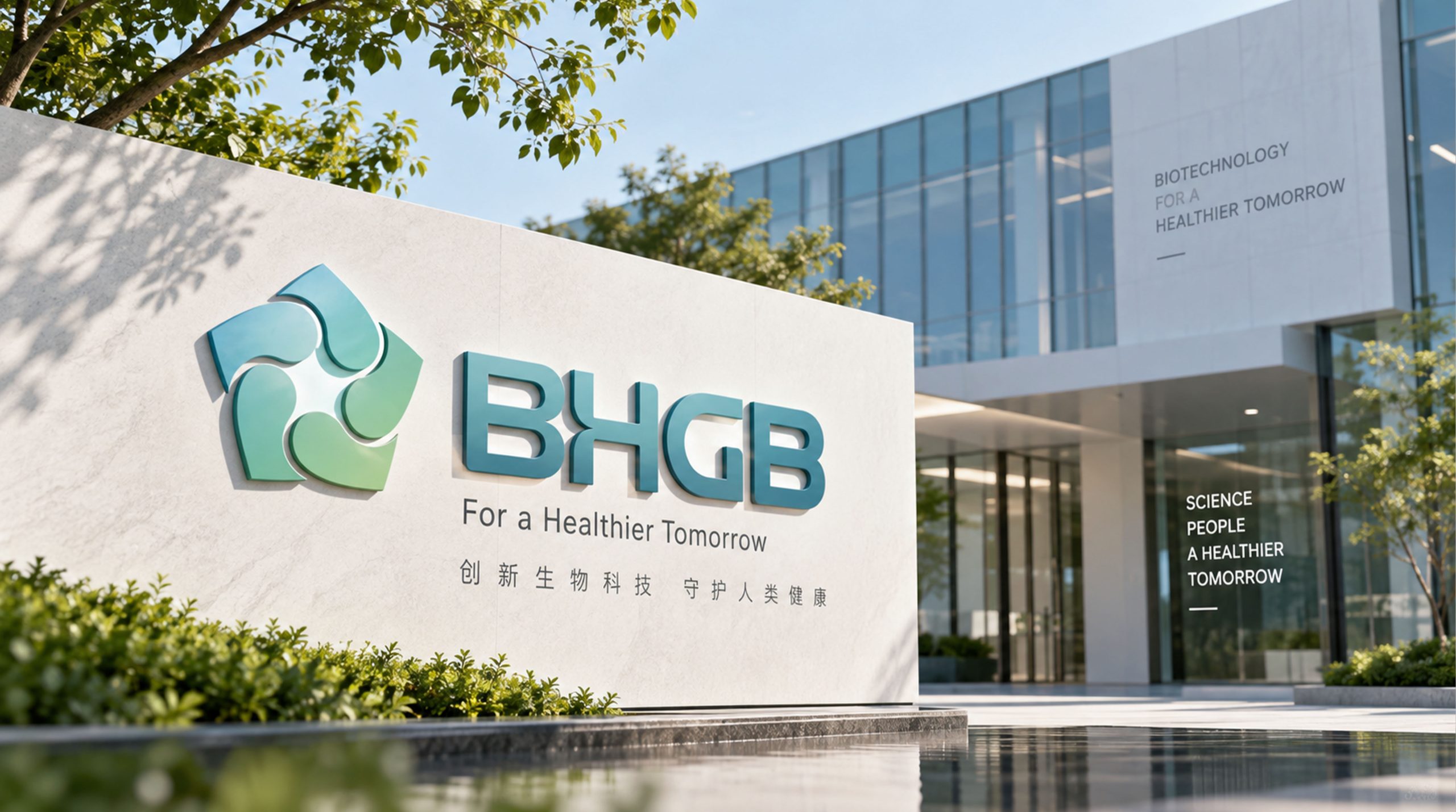
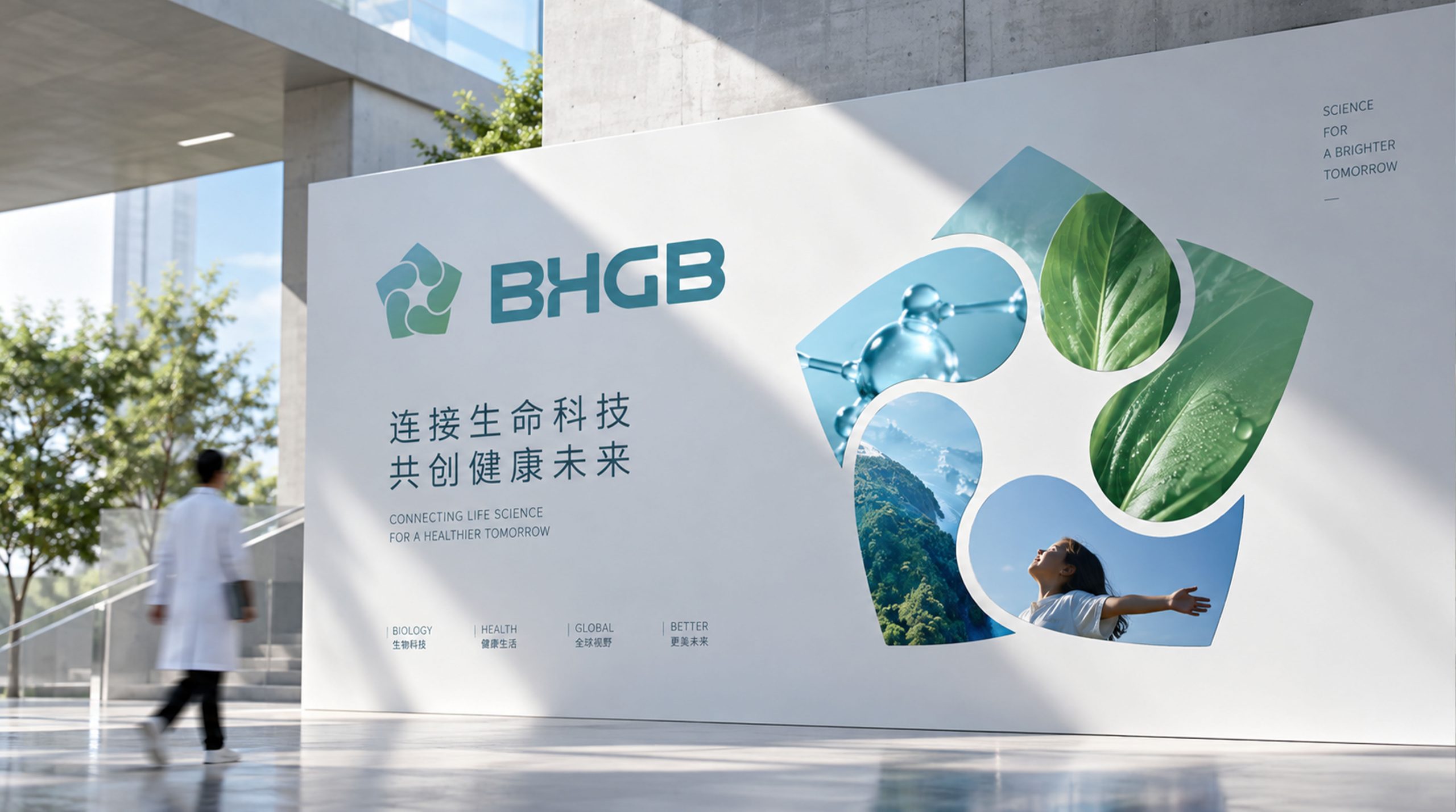
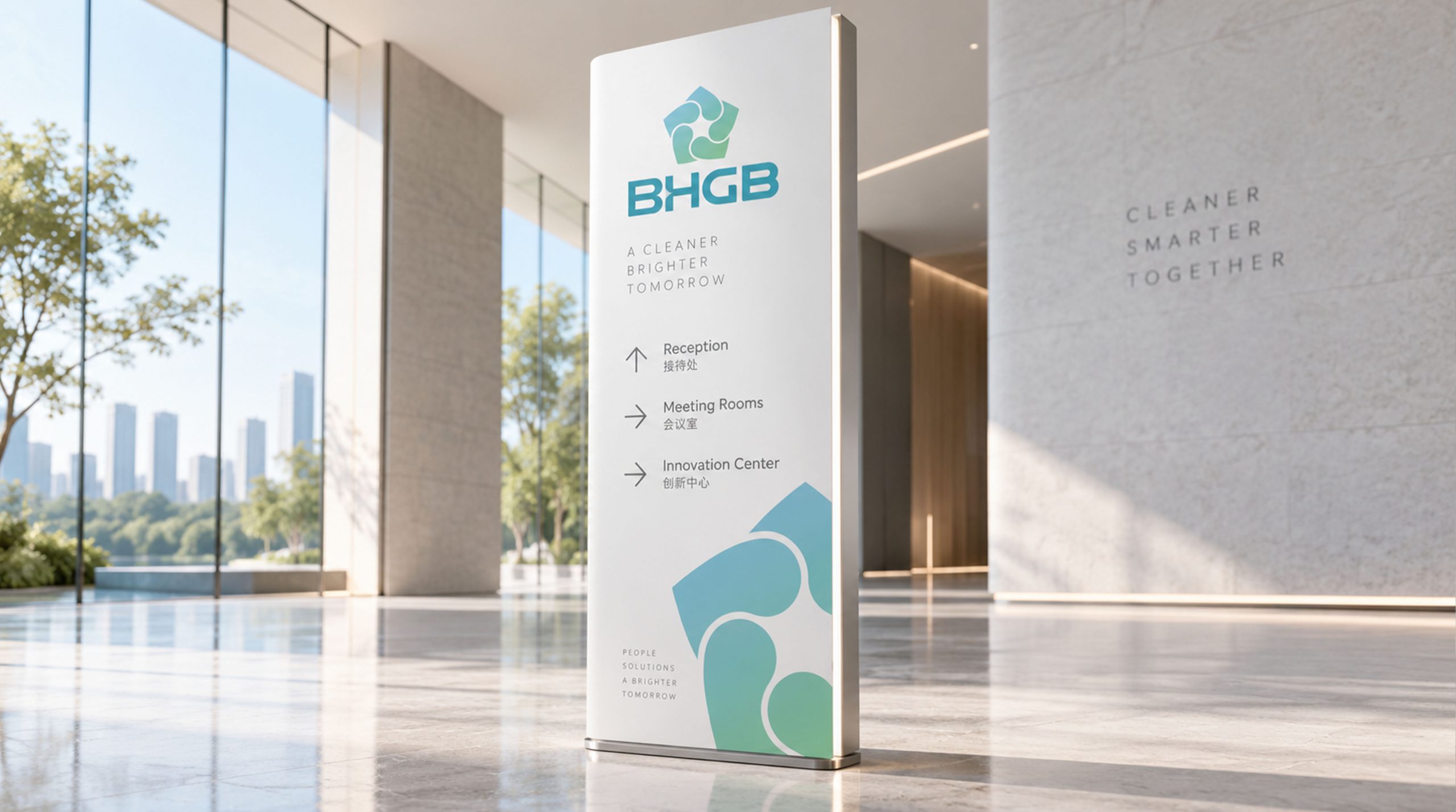
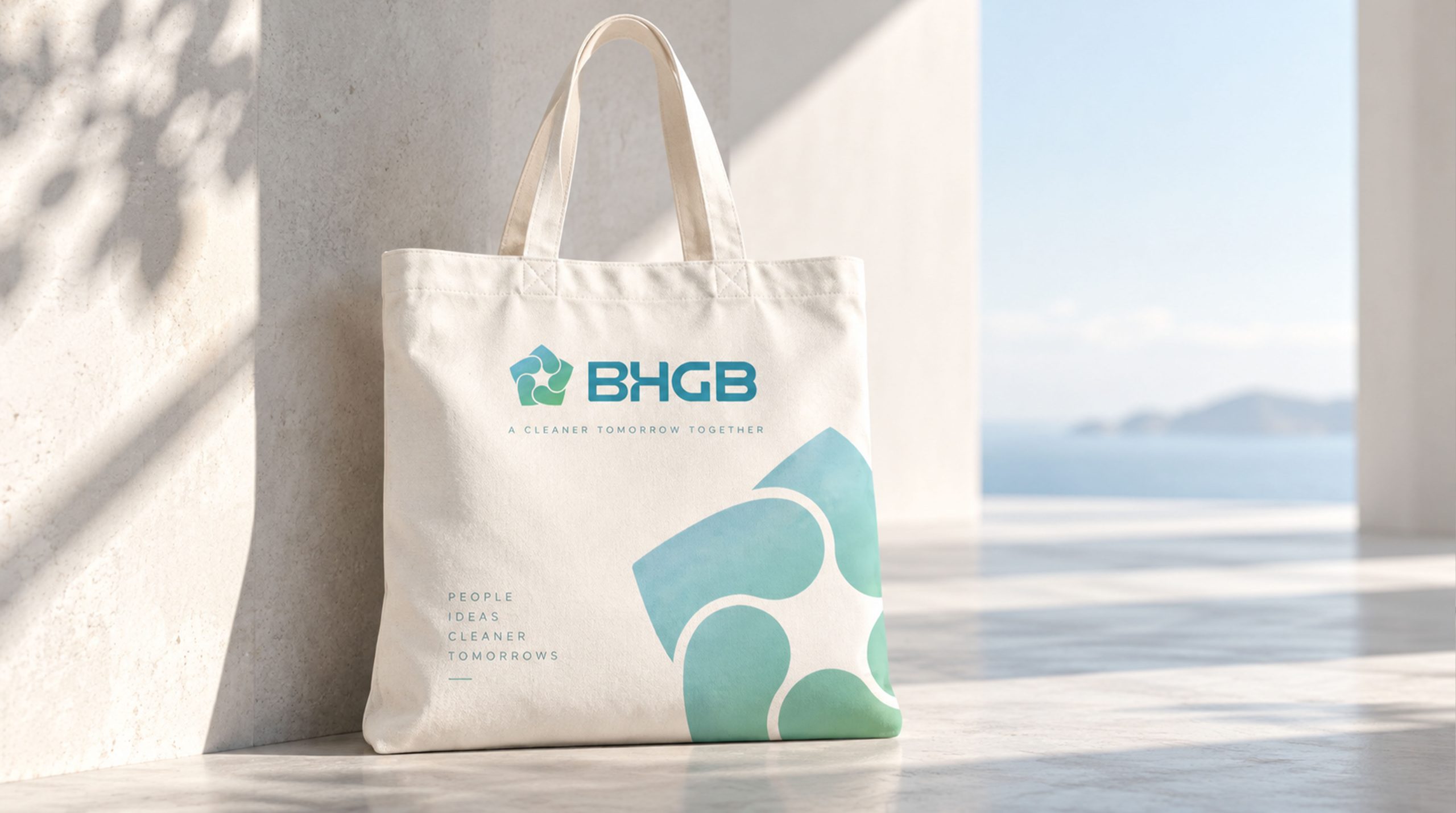
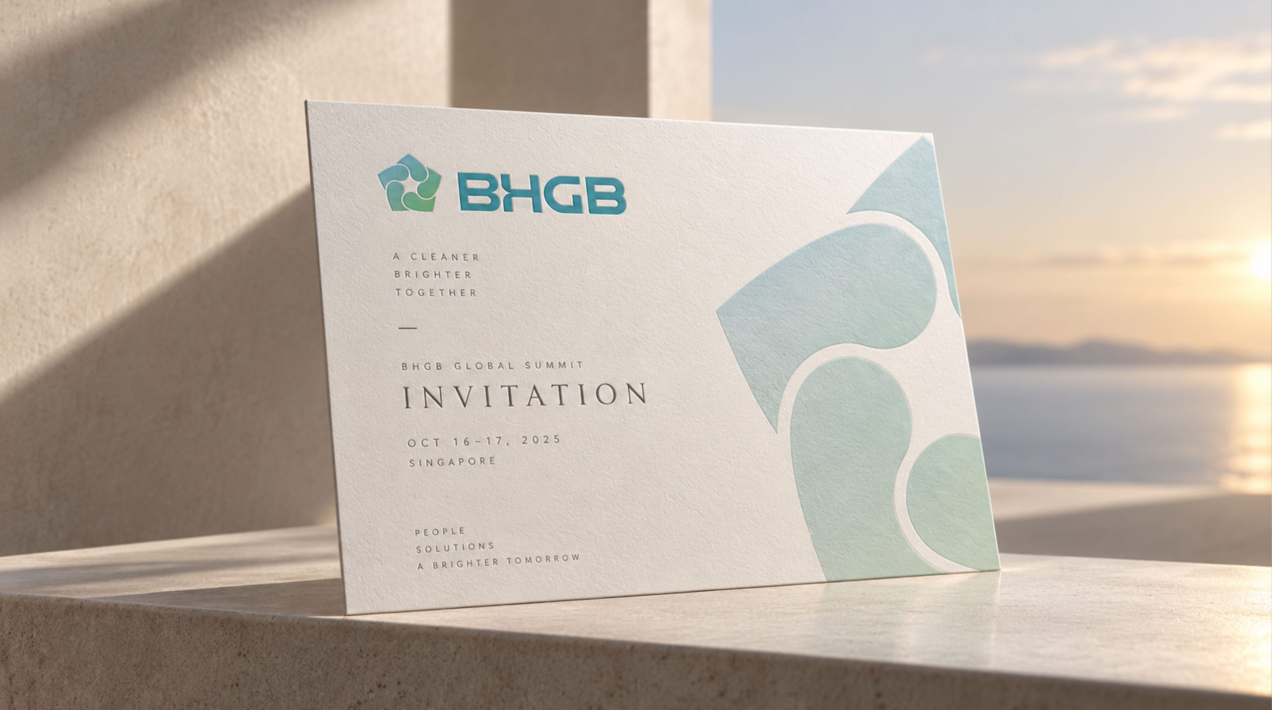
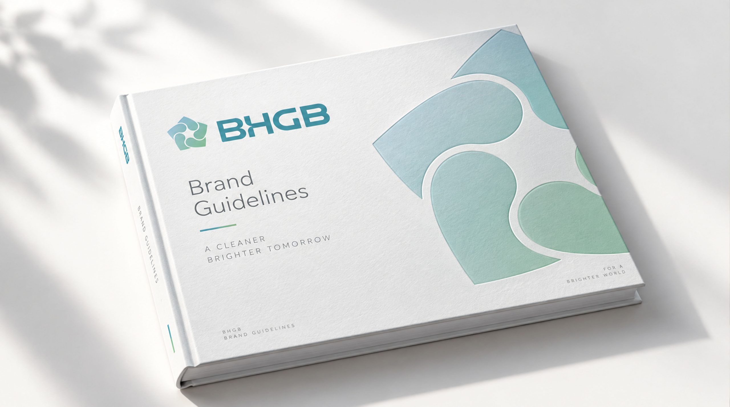
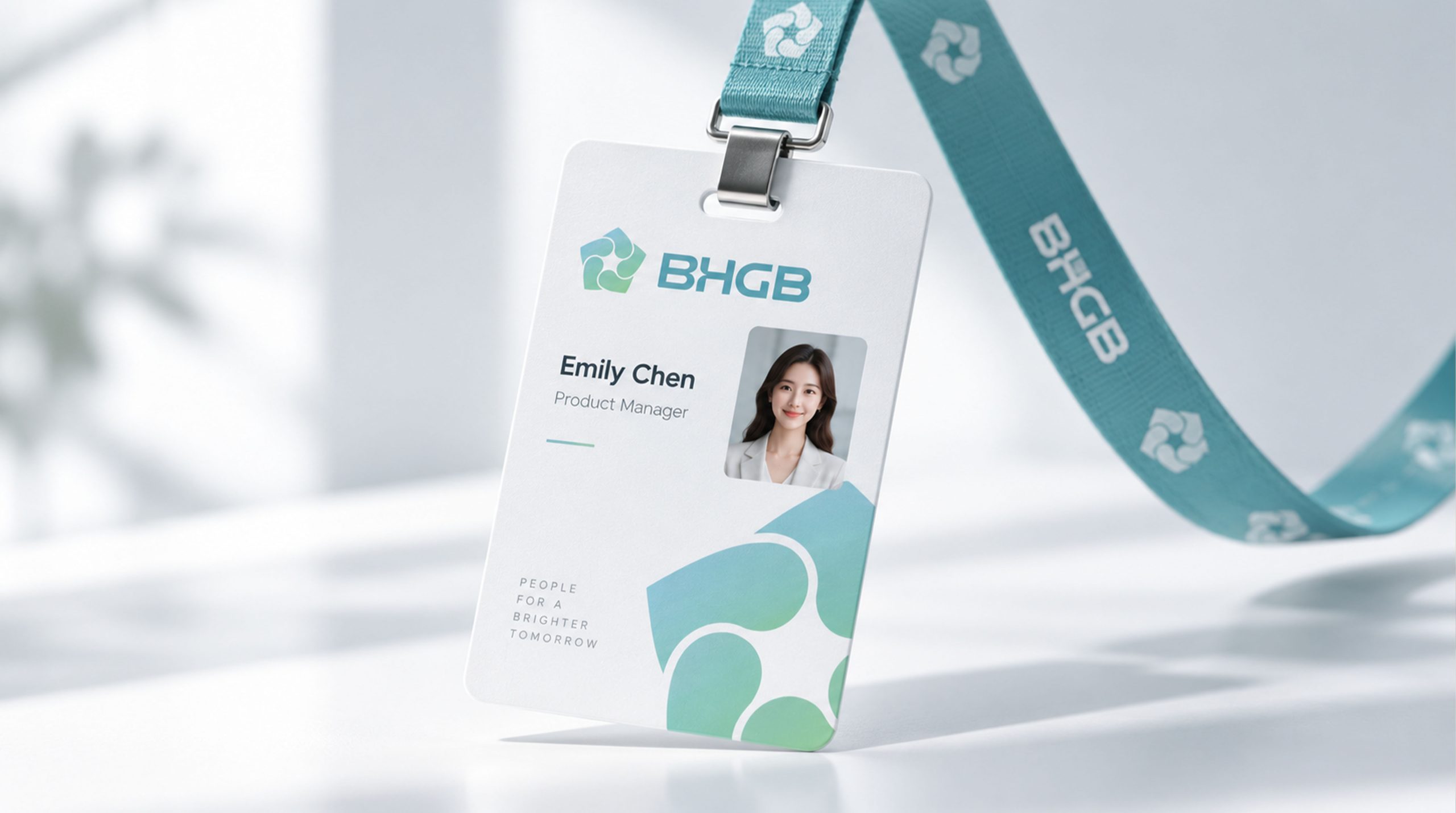
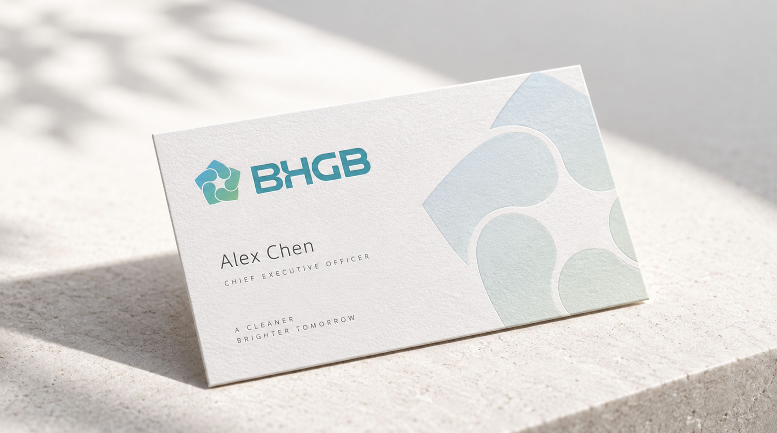
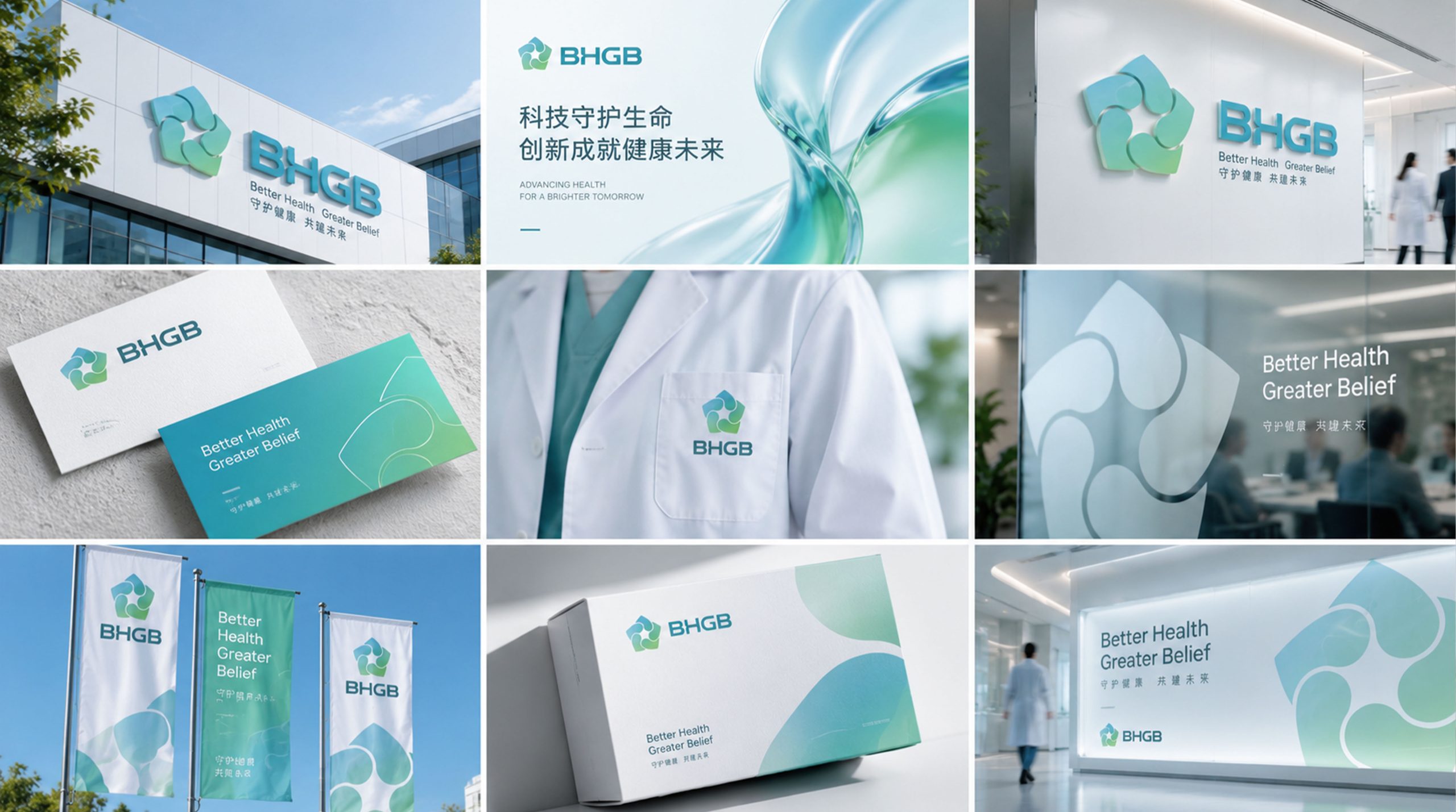
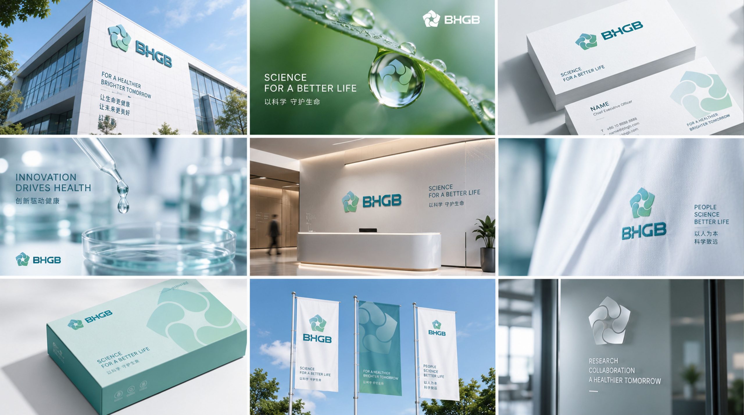
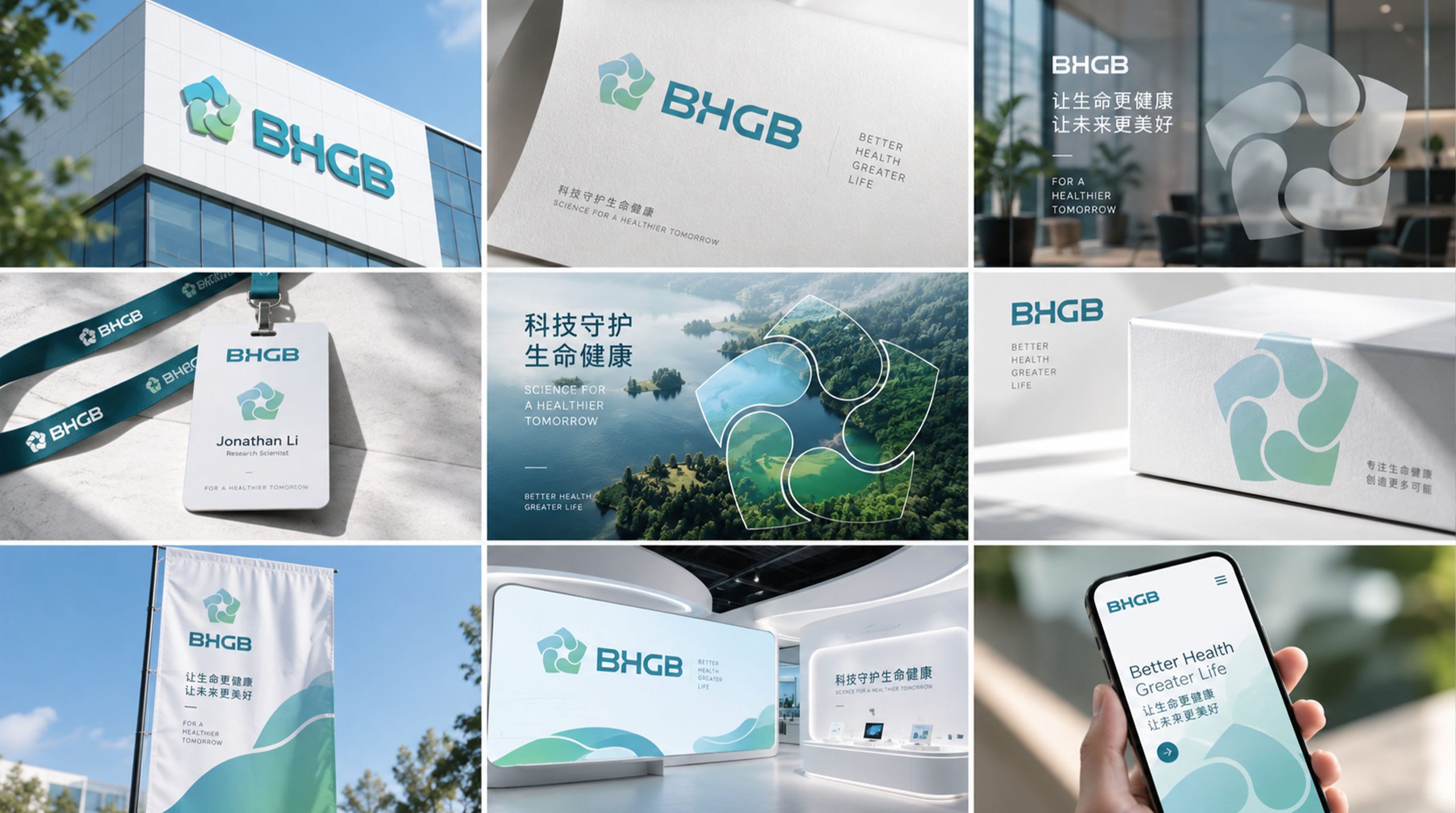
design concept
The core concept lies in “the fusion of ecological cycles and technological systems.” A pentagon forms the outer framework, representing completeness, balance and systematic structure; within it, four interconnected, fluid curved units symbolize the cyclical interplay of wind, water, energy and life. The composition follows a logic of convergence and symbiosis, uniting technological rationality with ecological warmth.
graphic language
Pentagonal frame: system integrity and engineering stability. Four flowing units: the four natural elements (wind, light, water, energy) and their symbiotic cycle. Rotational movement: a visual rhythm of energy flow and dynamic balance. Central convergence point: the brand's core technology and the intelligent hub of system coordination. Combining rational geometry with natural flow, the graphic expresses the company's belief in “technology building ecological order.”
Fonts and composition
The BHGB name is set in a modern geometric sans serif with balanced stroke weights and rounded corners, in keeping with the soft geometry of the symbol. Tightened letter spacing creates a solid, stable structure. The balanced proportion between wordmark and symbol reflects the company's character: “scientific structure × visual order.”
color system
Blue-Teal Gradient #75B8C9 → #A3D3B5: the fusion of technology and nature. Pale Gray-White #F4F8F9: purity, environmental care and transparency. Deep Blue #3E6E7C (secondary): trust and rationality. The blue-to-green gradient reinforces the perception of “eco-tech,” forming a visual language of “nature × system × balance.”
Application and extension
Highly adaptable and systematically extensible, the mark applies across three levels. Corporate: website, brochures, ESG reports and exhibitions. Product: equipment nameplates, packaging and energy module labeling. Spatial: building facades, wayfinding and interactive installations. In motion, the inner flowing lines rotate and “breathe,” symbolizing the living rhythm of energy cycles and sustainable development.
brand meaning
The BHGB mark embodies the brand's core philosophy of “technological rationality × ecological balance”: Pentagon → stable system architecture; Four flowing forms → natural cycles and collaborative symbiosis; Blue-green gradient → the fusion of technology and environment; Central convergence → the intelligent driving force of core technology. More than an identifier, it is a visual manifesto: “technology that lets nature keep breathing.”
Improper Usage (Protection Specification)
Do not alter the pentagon's proportions or the shapes of the inner units. Do not change the gradient direction or colors. Do not add shadows or outlines, or apply the mark at an angle. Recommended minimum display width: 28 mm.
design results
Since the launch, BHGB has established a clear brand impression of “green technology × systemic energy.” Its soft geometry and gradient palette achieve strong recognition across the energy, environmental and technology sectors. The project represents a mature expression of Qingmei Future's work in sustainable design and ecosystem visual language, unifying “structural rationality” and “ecological cycles” in a single identity.