










BIOHYALUX is a professional, medical-research-driven hyaluronic acid skincare brand from Bloomage Biotech. Guided by its philosophy of “Scientific Innovation · Bio-Renewal”, it focuses on hyaluronic acid science and skin regeneration.
The brand sought a visual identity that conveys professional credibility, scientific aesthetics and international medical expertise, balancing the rigor of biotechnology with the gentle strength of women’s skincare.
design concept
The logo draws its core inspiration from molecular structure and fluid aesthetics. The strokes of the wordmark echo the flowing form of the hyaluronic acid molecular chain, while the final letter “X” is formed by two intersecting curves, symbolizing molecular bonding and the expansive tension of life. The design idea: using the form of science to express how beauty is made.
graphic language
Stroke structure: fluid curves interlace with geometric lines, balancing precision and softness. Letter extension: the double curve of the "X" adds motion and reach, symbolizing technical innovation and aesthetic exploration. Negative space: the gaps between strokes evoke skin's breath and glow, expressing the purity of a skincare brand. Bilingual harmony: the light, simple Chinese characters echo the English wordmark, forming one unified system.
Fonts and composition
The BIOHYALUX name is set in a bespoke custom typeface. Precise stroke proportions emphasize scientific rigor. Soft rounded transitions express the gentleness of the products. Both English and Chinese are center-aligned, lending the brand stability and a premium feel. The overall structure is clear and airy, suited to multilingual and international communication.
color system
Primary Amethyst #5E3E8B: technology, elegance and feminine strength. Secondary Silver Gray #B4B4B4: medical rationality and modern science. Highlight White #FFFFFF: purity, transparency and care. The balance of purple and silver creates an atmosphere of reason and warmth, a signature high-recognition palette for medical aesthetics brands.
Application and extension
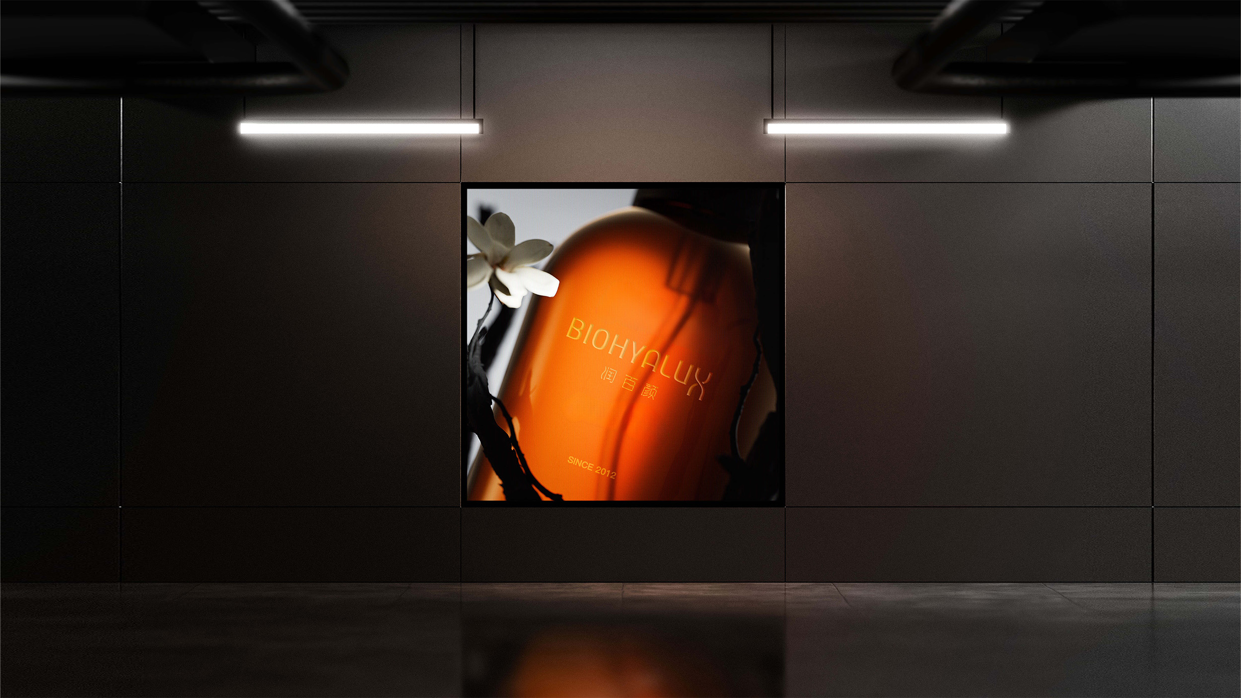
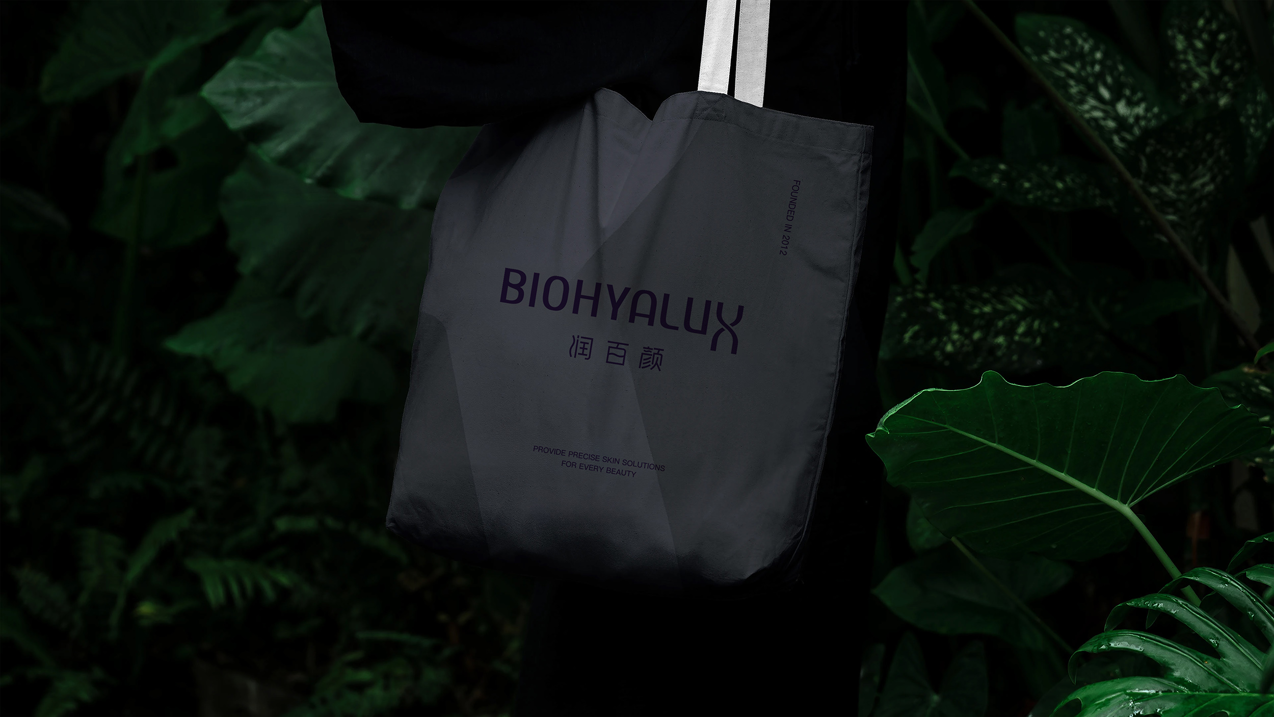
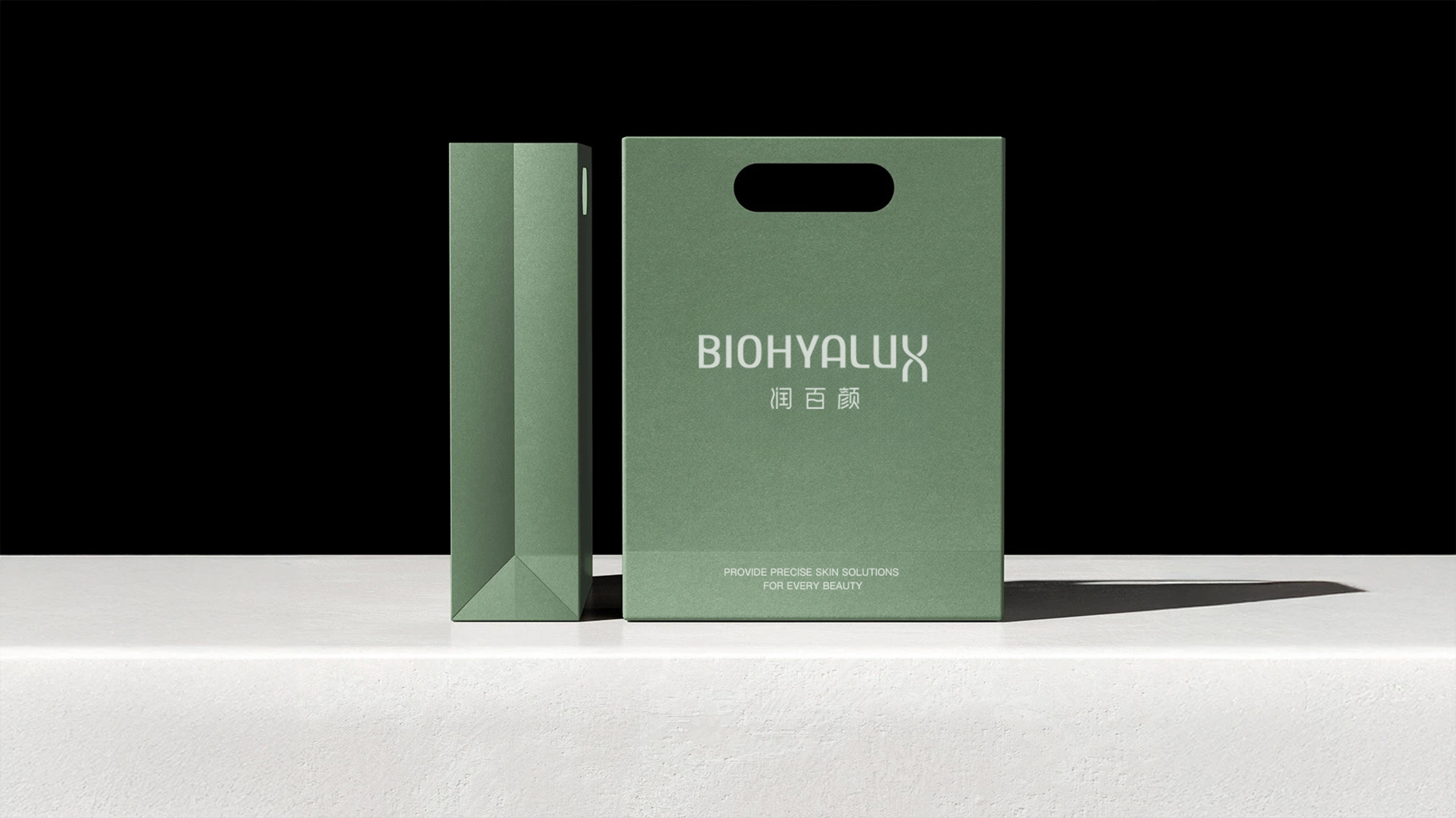
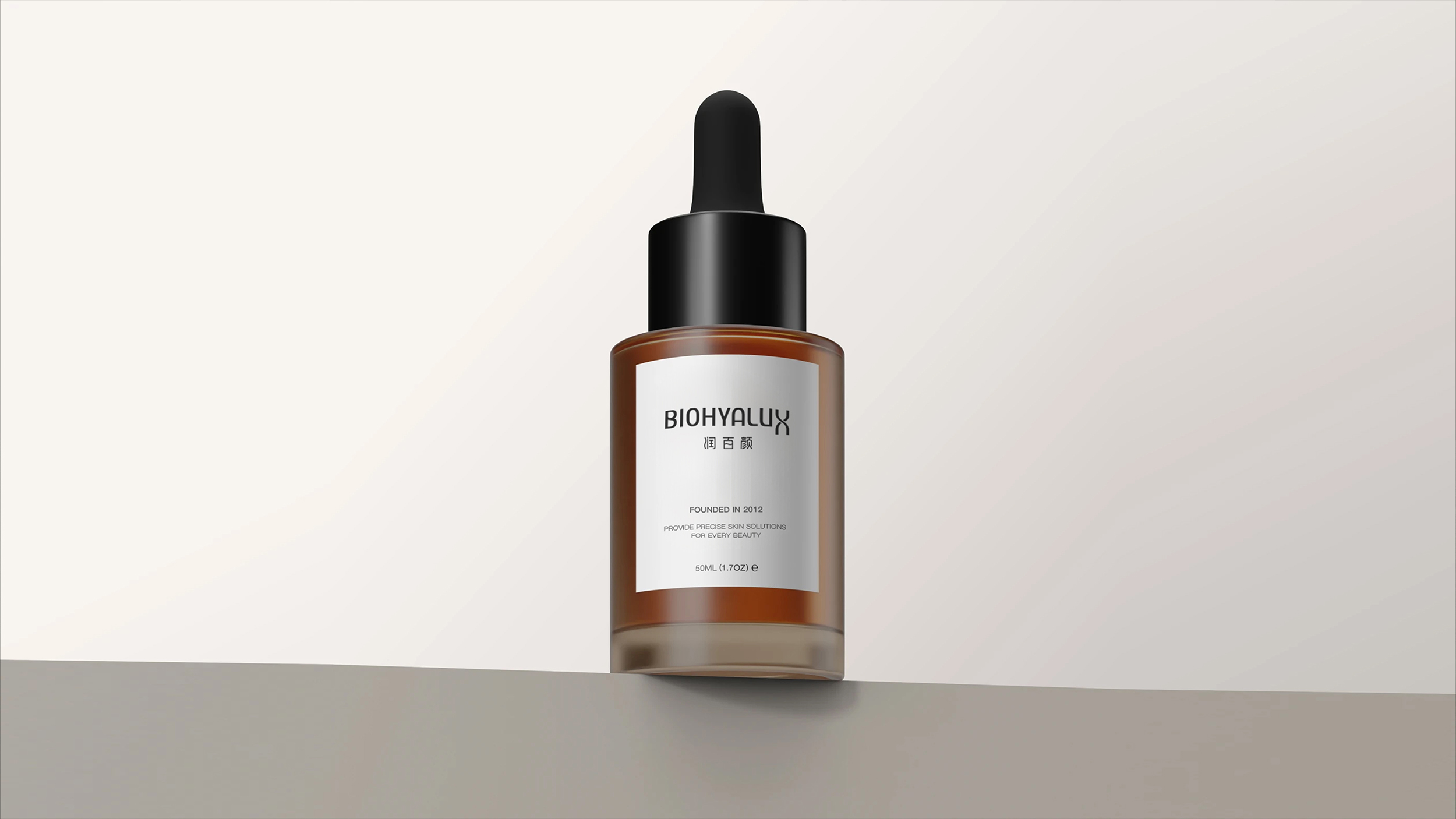
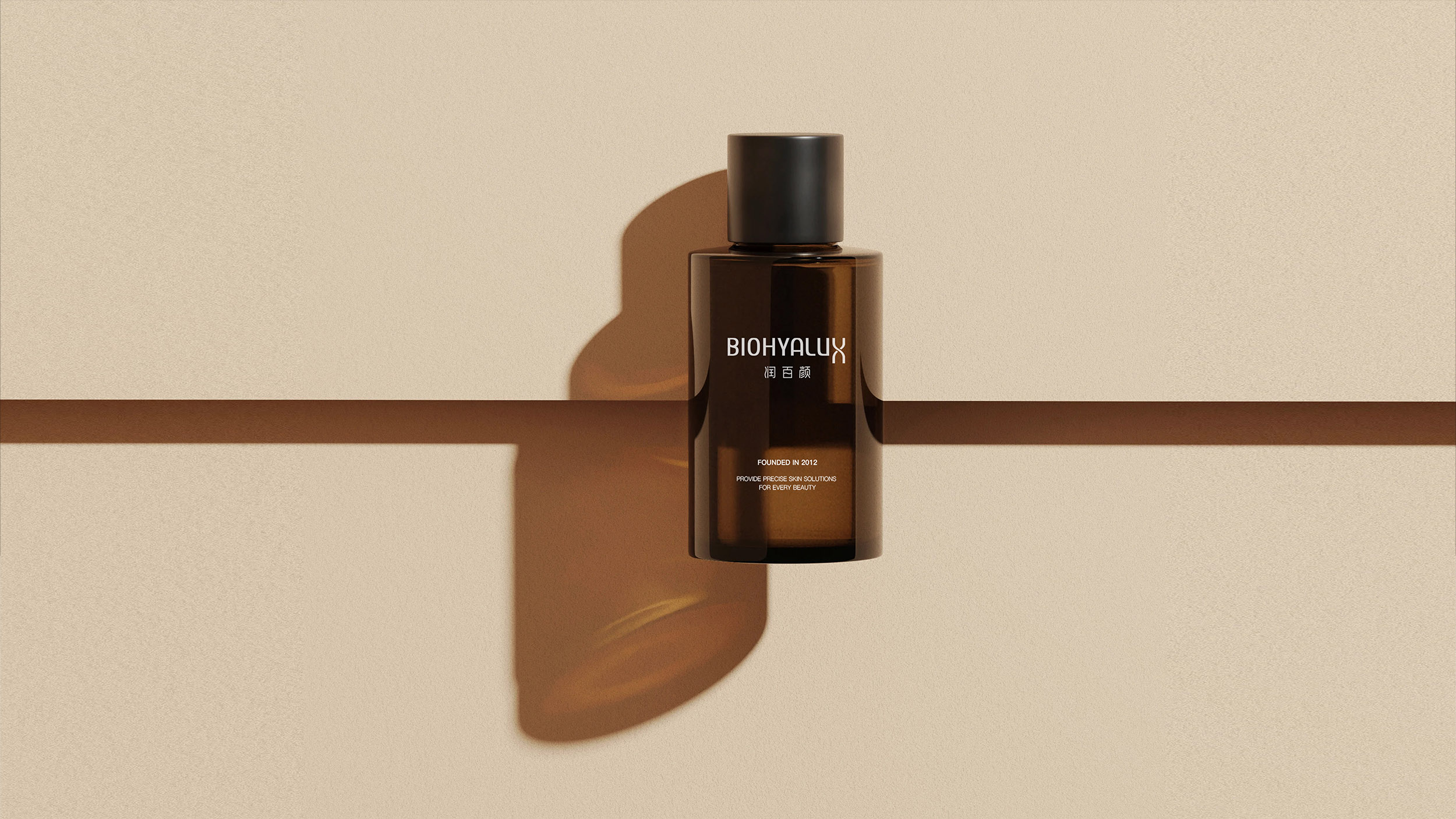
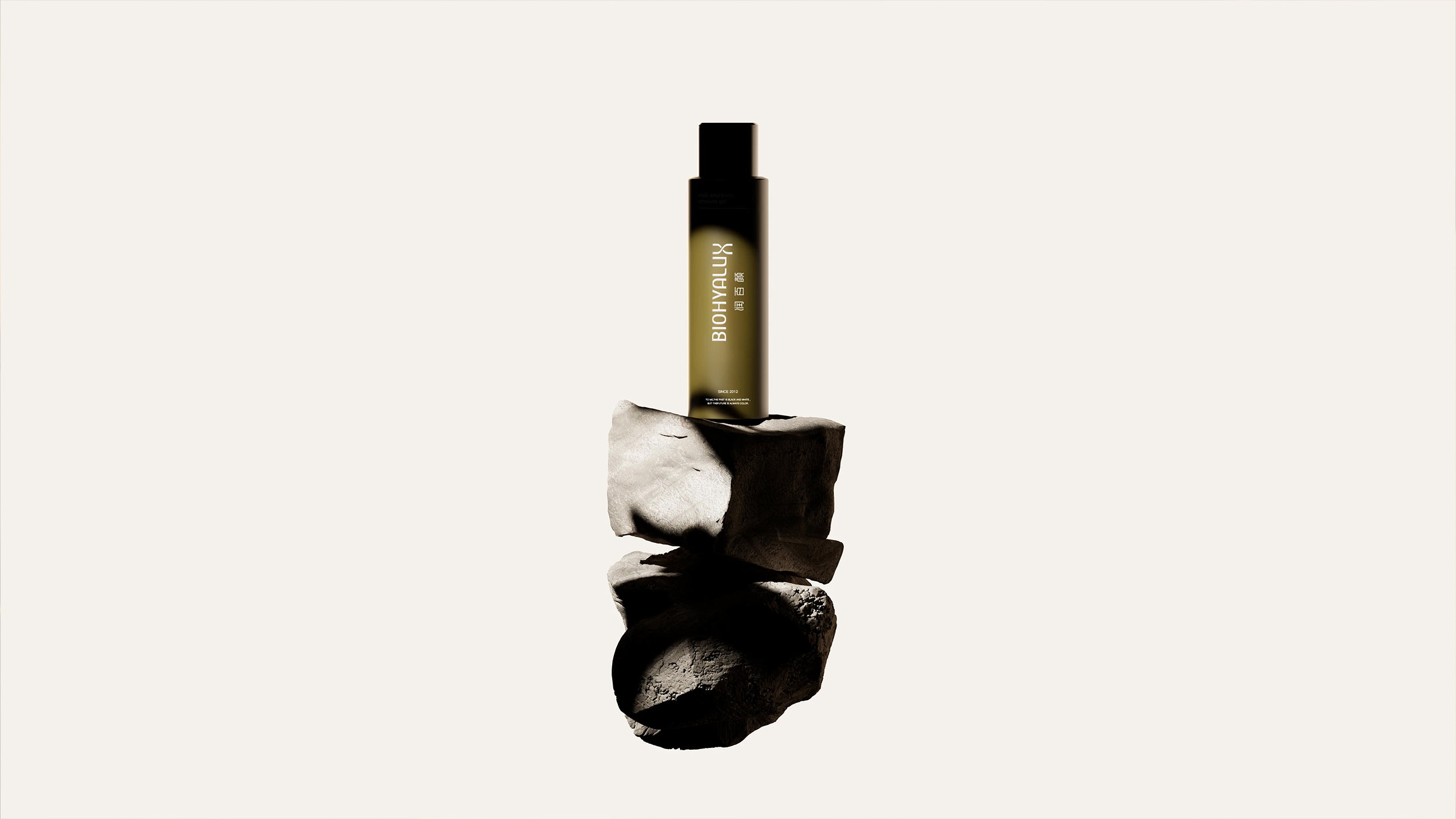
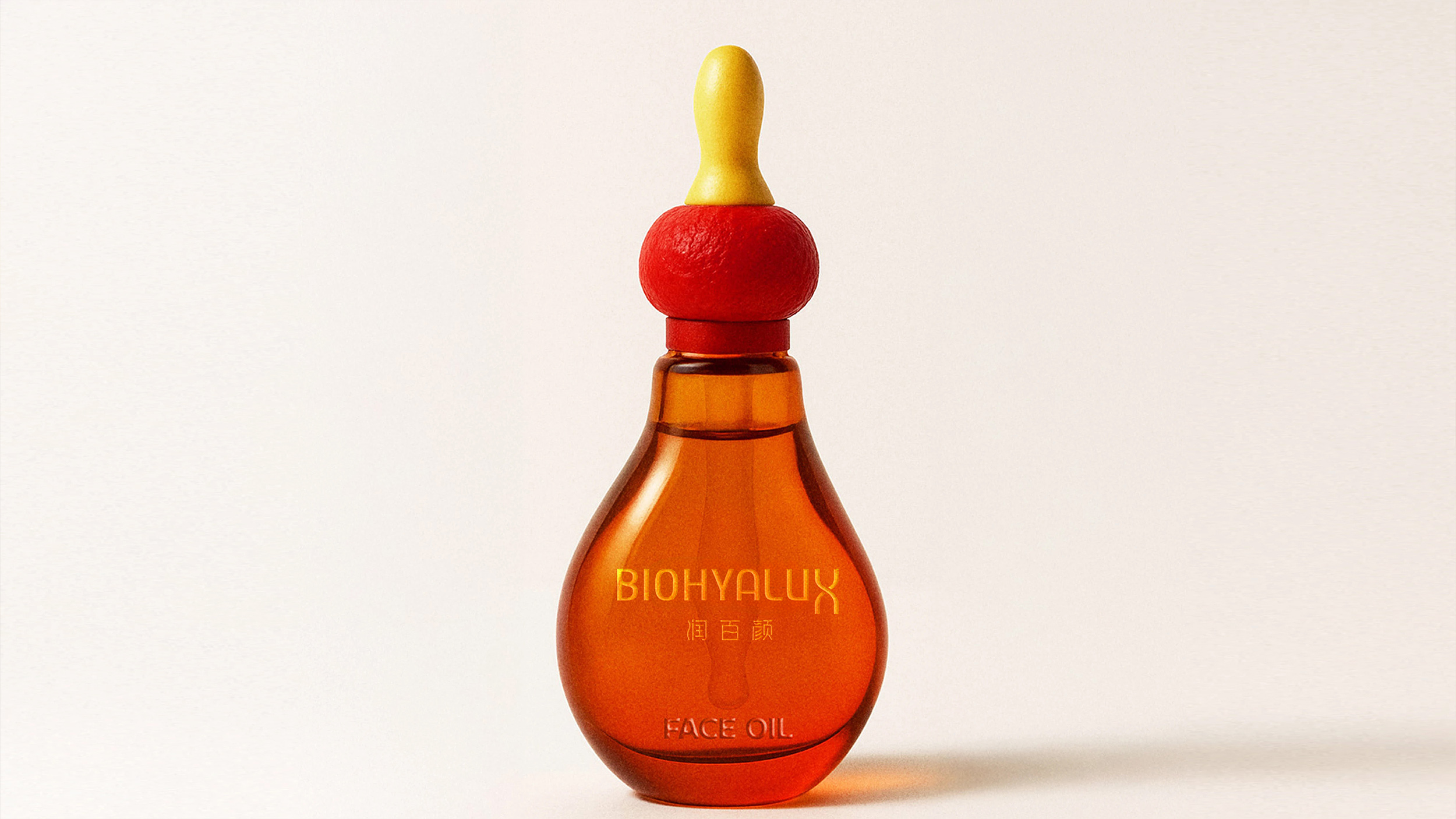
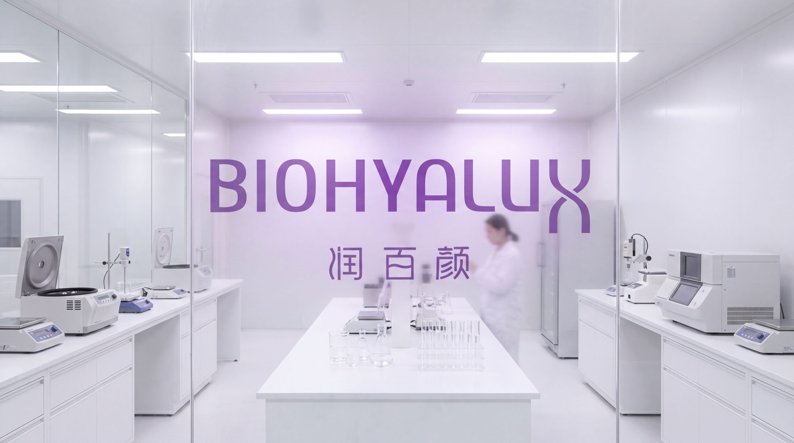
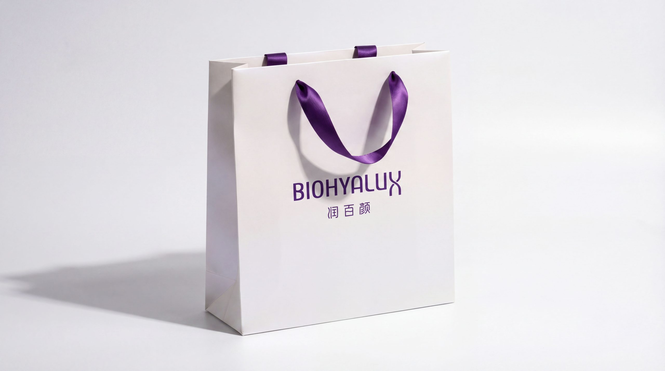
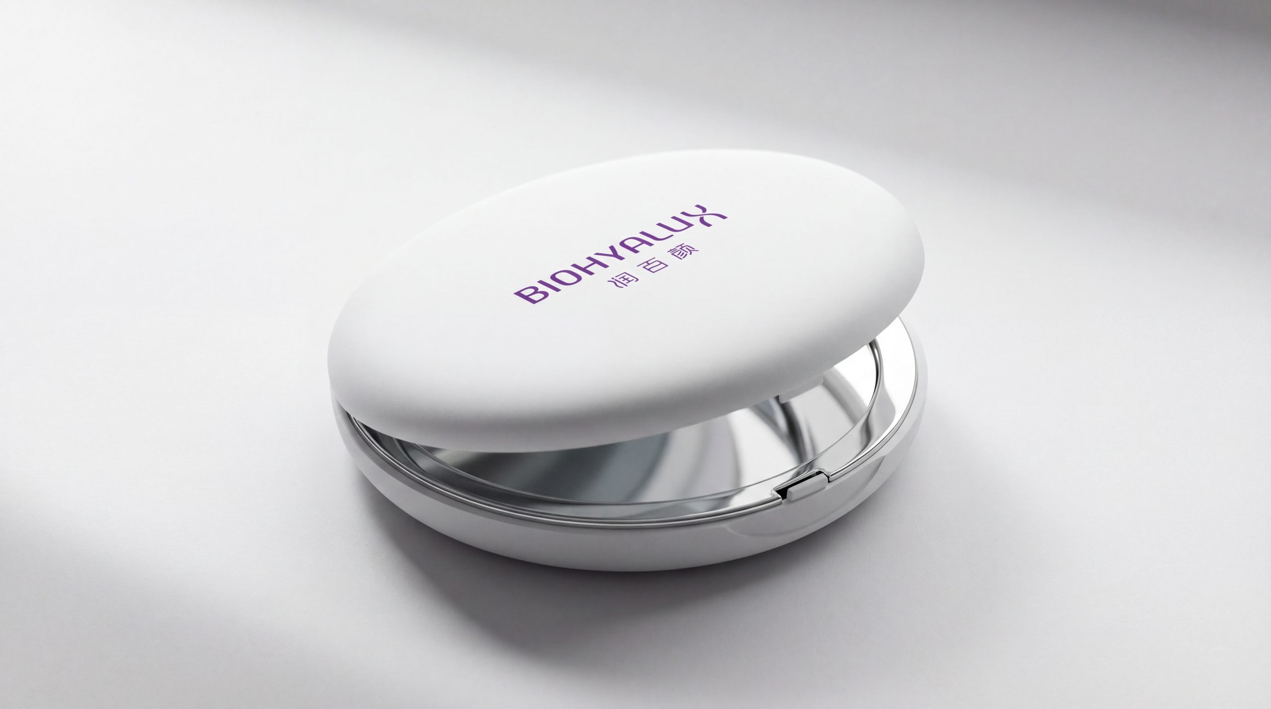
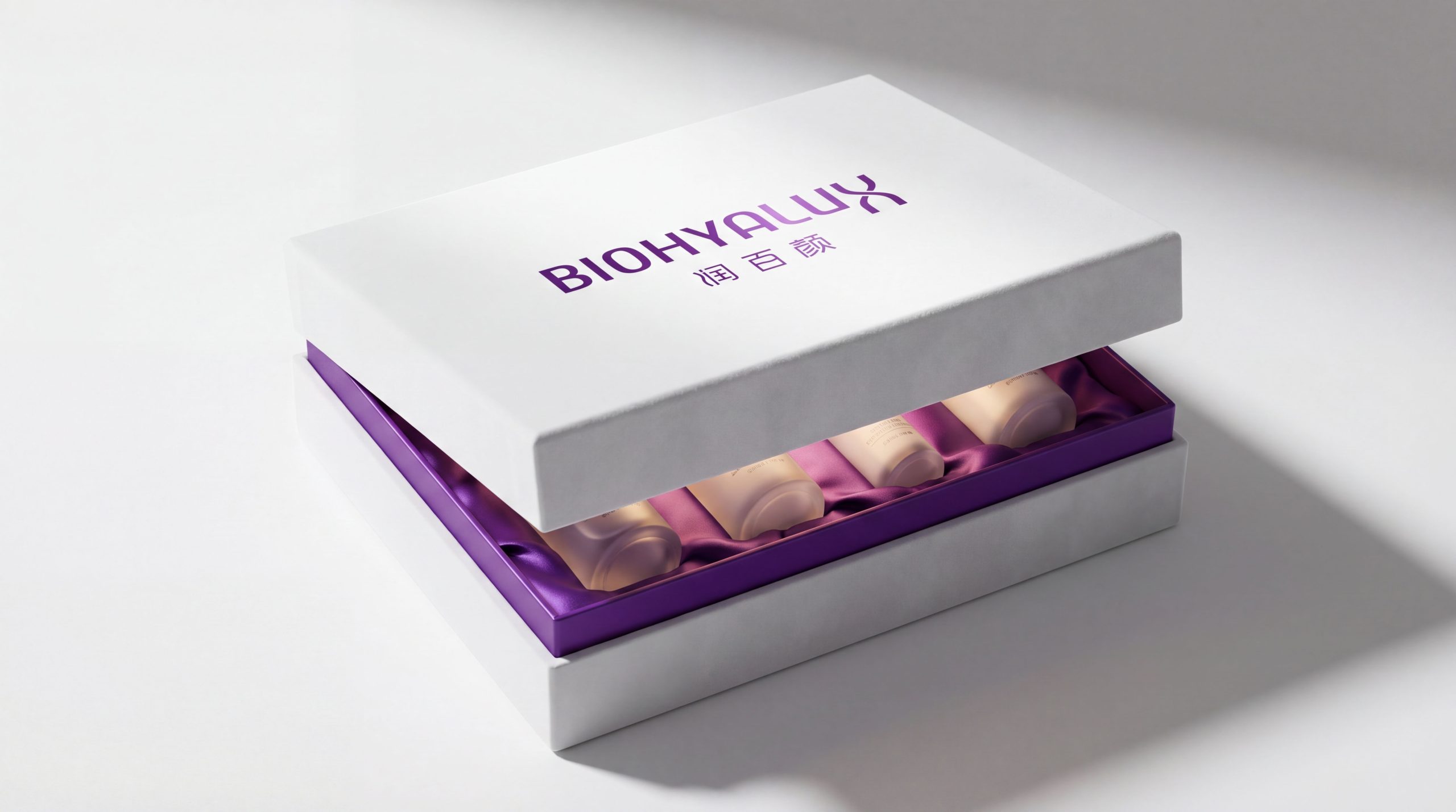
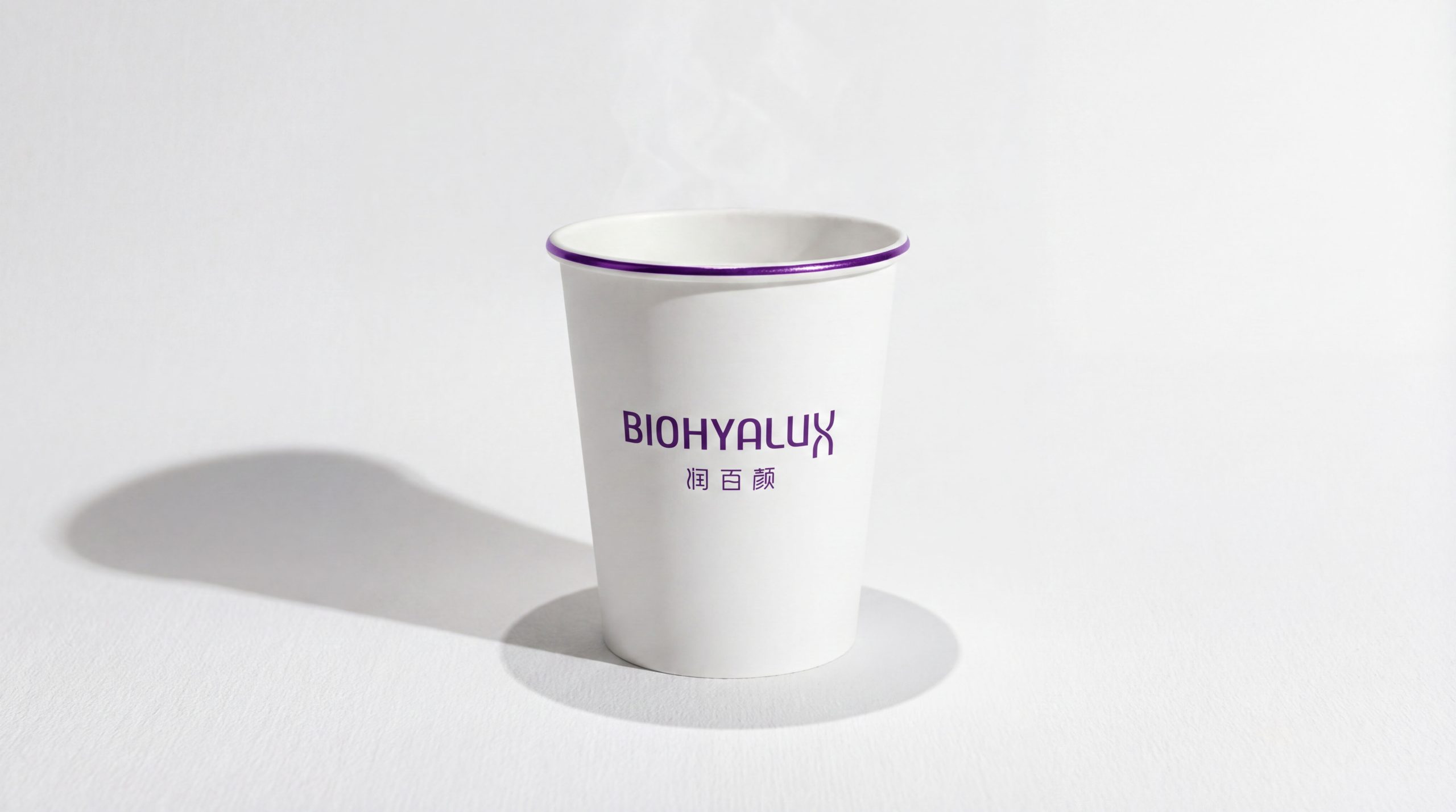
The logo adapts seamlessly across medical and retail settings. Packaging: applied to bottles, outer cartons and leaflets for a consistent scientific finish. Communications: used across the brand website, medical journals, product advertising and medical conference materials. Spatial: in aesthetic clinics, exhibitions and experience spaces, the logo can serve as an illuminated feature wall. Motion: the double-curved “X” can act as the lead animated element in video openers, screen launches and ripple effects.
brand meaning
The BIOHYALUX logo is more than a name. It is a visual expression of scientific aesthetics. BIO (life): the rational science of biotechnology. HYALU (hyaluronic acid): the brand’s core technological DNA. LUX (light): radiance, renewal and the glow of beauty. Together they convey the brand’s core belief: “Let science bring out beauty, and let beauty return to nature.”
Improper Usage (Protection Specification)
Do not alter the proportions or rotation of the “X”. Do not replace the primary color or add gradients. Do not add outlines, shadows or decorative backgrounds. Recommended minimum width: 35mm.
design results
Following the launch of its new visual system, BIOHYALUX has become one of the leading premium brands in medical-grade bio-skincare. Its visual system, combining scientific aesthetics, brand trust and international minimalism, has firmly established the brand in consumers’ minds. The logo’s pure structure and scientific feel give the brand a unified visual asset across medical aesthetics and retail channels. The project stands as a landmark Qingmei Future achievement at the intersection of medical skincare, biotechnology and scientific visual language, elevating the brand from a research image to a lifestyle aesthetic.