










Minute Maid
Brand Essence
Minute Maid's brand spirit is summed up in the following keywords:
- Natural × Healthy × Innovative
- Vibrant × Modern × Approachable
- Clean × Bright × Refined
These keywords capture the core ideas behind the Minute Maid beverage packaging. Natural reflects the brand's commitment to health and natural ingredients; innovative reflects the modern, stylish sensibility of the design; vibrant and modern express the brand's youthful energy through color and pattern.
Brand Philosophy
The core concept of the Minute Maid packaging is “simplicity meets vitality; health balanced with innovation.” Through bold color, geometric shapes and minimal lines, the design pairs the qualities of a healthy beverage with a contemporary design language, expressing the brand's youthful energy while emphasizing its healthy, natural essence.
Every detail addresses what today's consumers expect from beverage packaging: it must be attractive and stylish while communicating the product's health and natural attributes. Each design aims to convey freshness and energy at a glance.
Visual Language
Through contemporary artistic forms and fresh color pairings, the Minute Maid packaging creates a vibrant visual language:
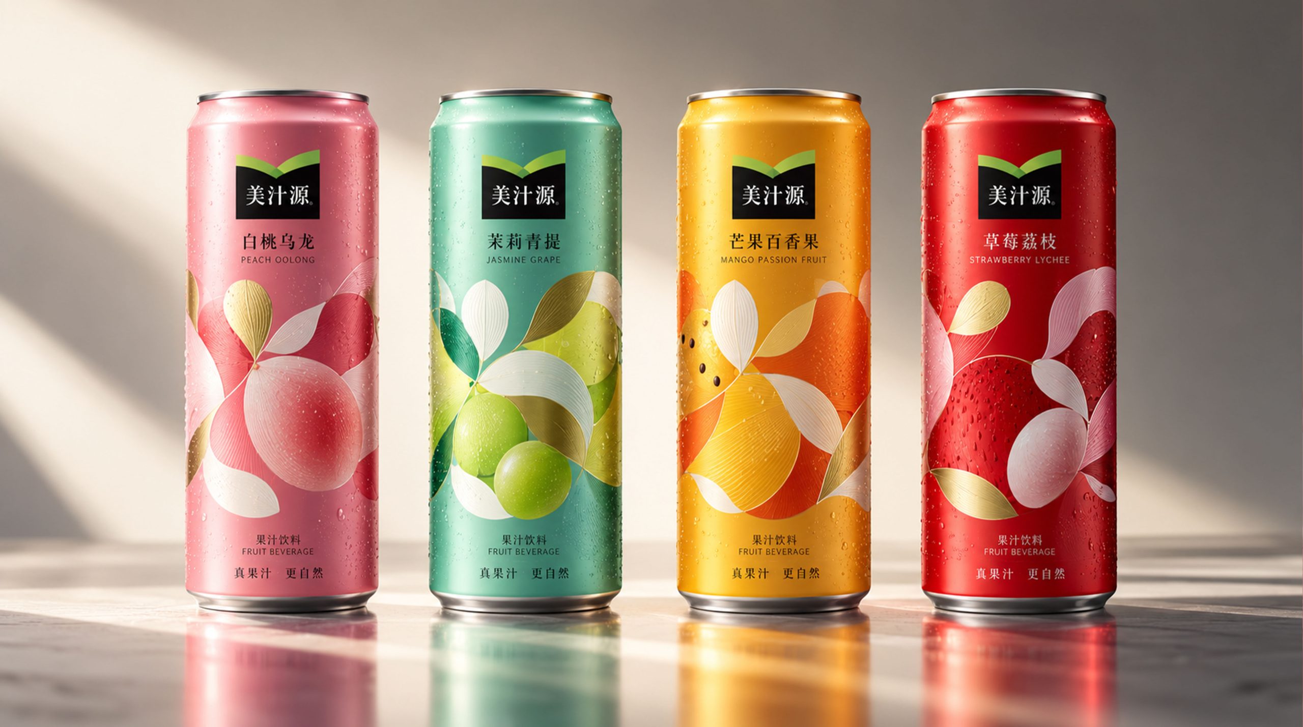
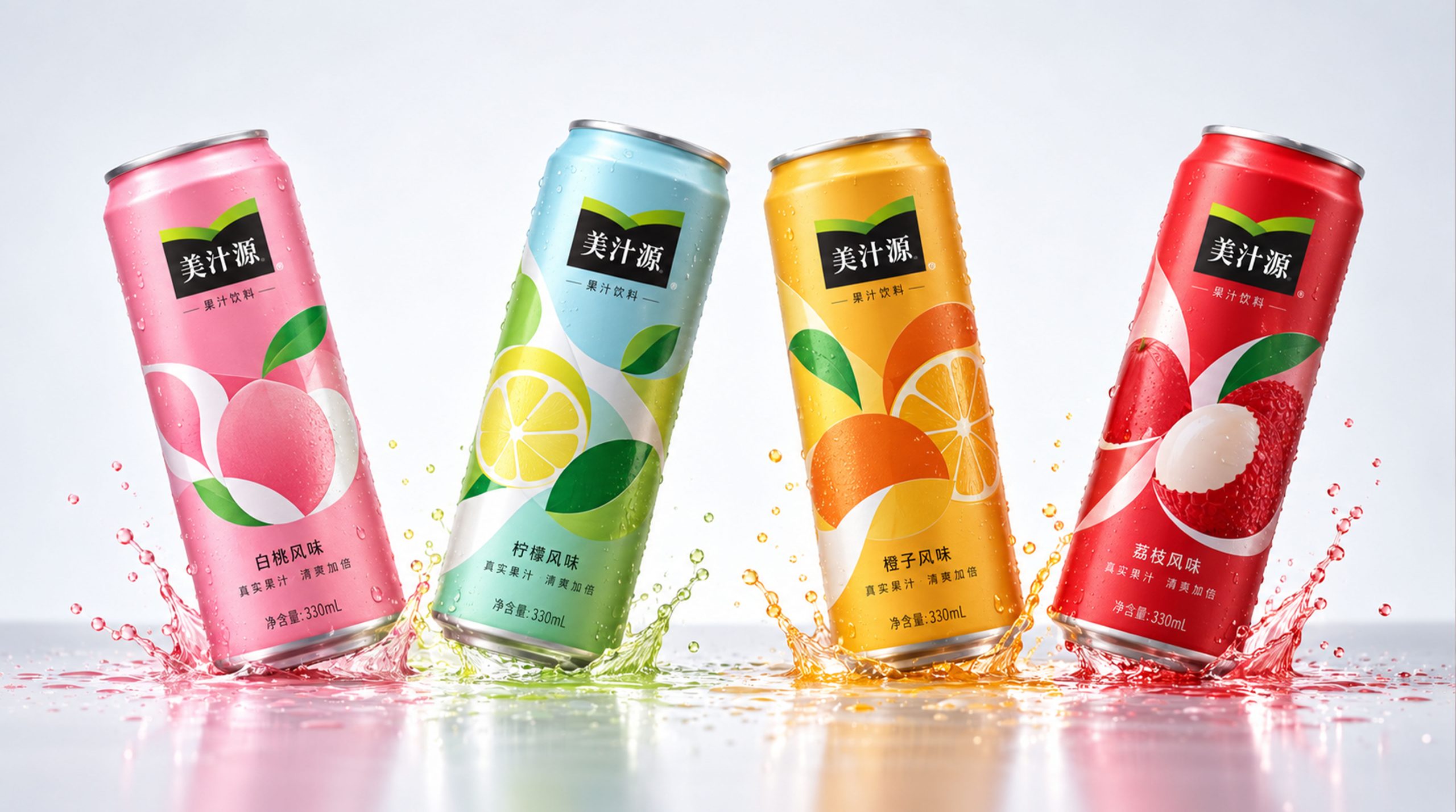
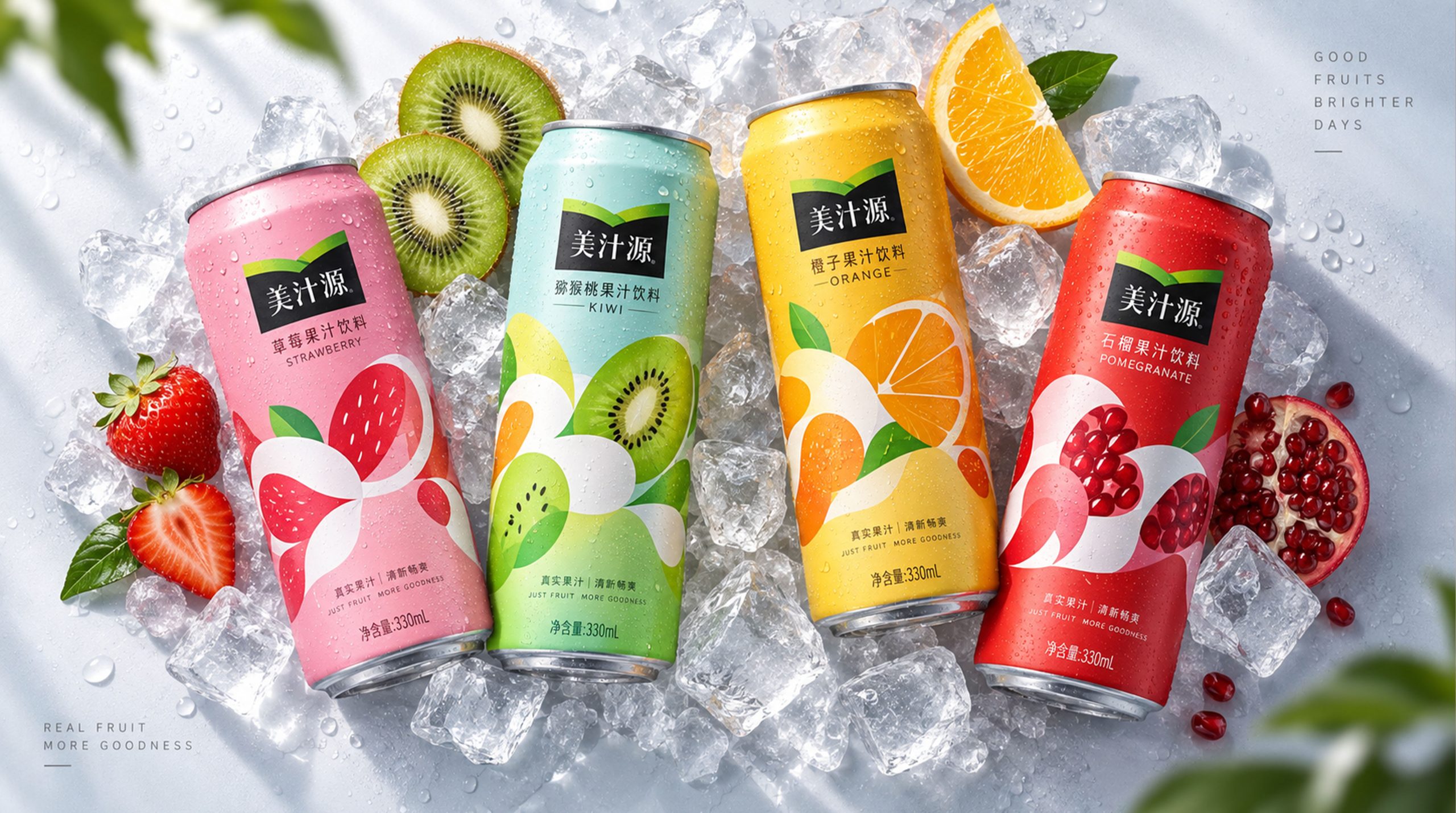
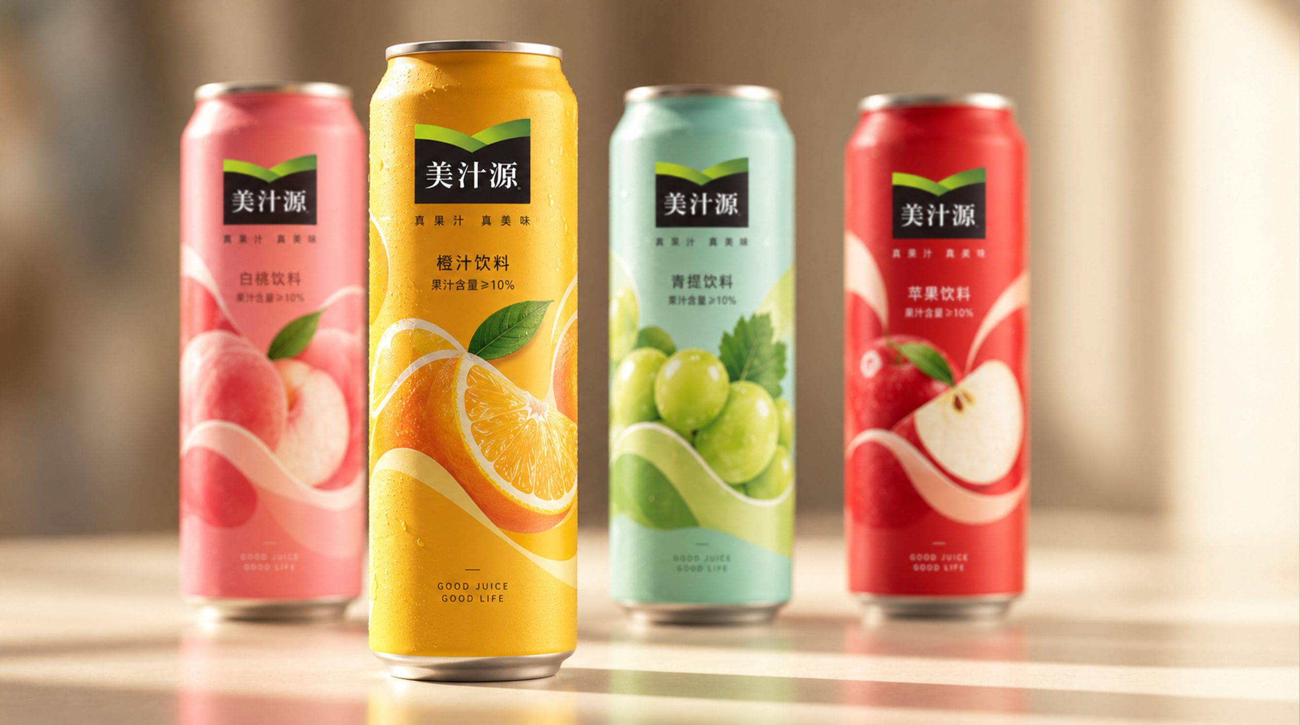
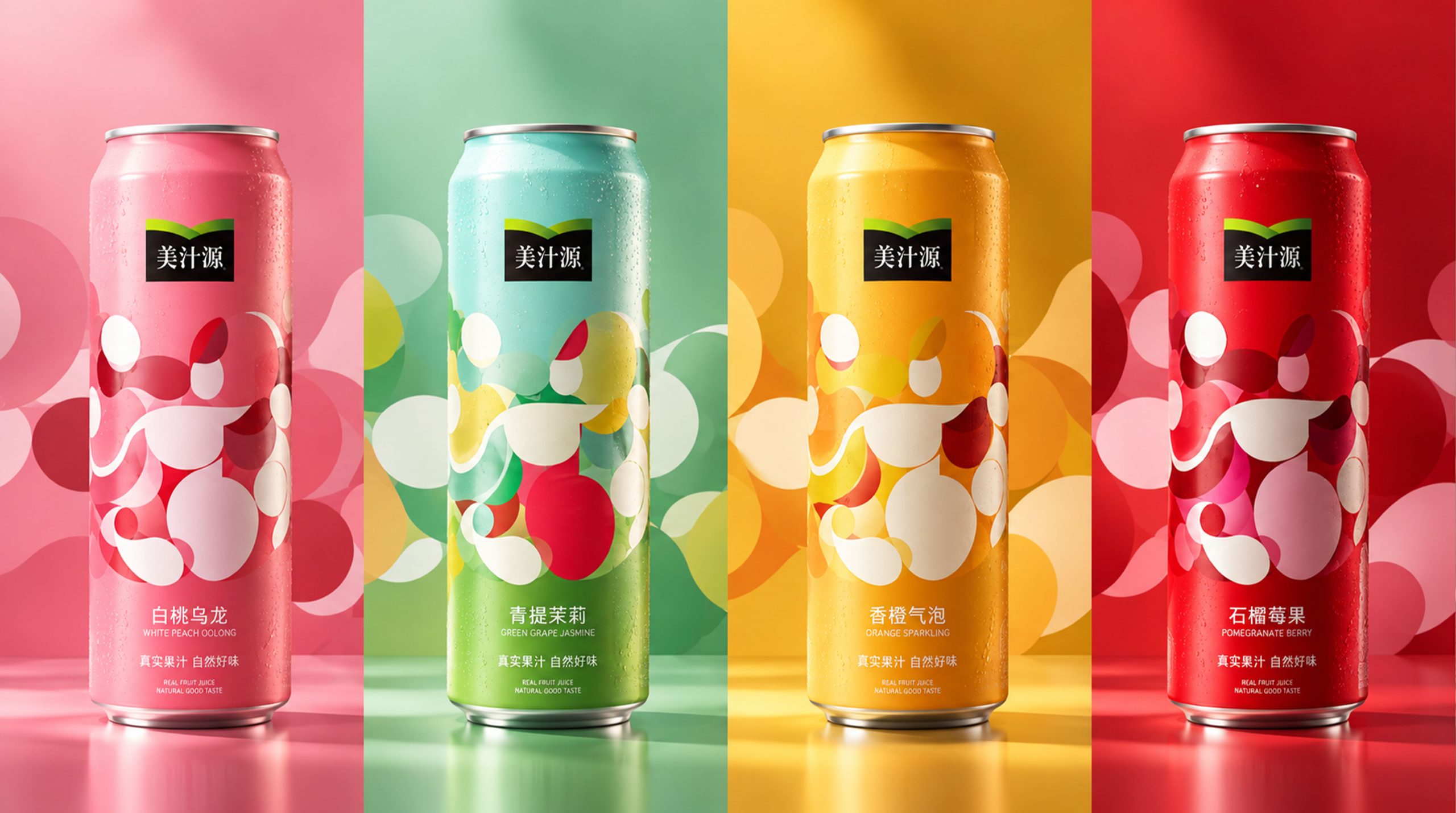
- Color and structure:The primary palette of bright red, blue, green and yellow represents freshness, vitality and nature. Each pack's colors correspond to its flavor, creating strong visual contrast that catches the consumer's eye.
- Pattern Design:The front of the pack features circular motifs and geometric lines for a modern, dynamic feel. Each design is built on flowing curves and color blocks, expressing the brand's energy and youthfulness.
- Logo:The Minute Maid name appears on the front in clean, modern type that contrasts sharply with the graphics. The logo's placement and color make the brand instantly recognizable.
- Bottle Design:The tall aluminum can has a smooth body and a clean, modern top, giving the pack a streamlined look and easy usability. The can's sheen heightens the drink's modern, stylish appeal.
Tone of Voice
Minute Maid's brand voice is concise, modern and approachable. On-pack copy is brief and easy to understand, communicating the product's features and benefits directly. Each can lists its flavor and key ingredients, clearly conveying the drink's healthy, natural qualities.
The overall tone is confident and relaxed; concise copy highlights the product's taste and health benefits. The voice is modern and energetic, in tune with younger consumers.
Brand Experience
Minute Maid's packaging delights both the eye and the hand, while thoughtful detailing adds new layers to the brand experience:
- Visual Experience:A bold palette and geometric patterns give the packaging exceptional shelf presence: contemporary in feel, yet true to the brand's energy and youthful spirit. Every design expresses the brand's distinct personality.
- Tactile Experience:Premium aluminum cans with a smooth, refined finish heighten the product's sense of quality and premium appeal.
- Emotional Experience:With every sip of Minute Maid, the packaging lets consumers feel the brand's vitality and commitment to wellness. Vivid colors and graphics don't just catch the eye; they spark the desire to buy.
Brand Statement
“The perfect blend of vitality and wellness, bringing freshness and energy to every sip.”
Through this packaging, Minute Maid has built a vibrant, contemporary brand image. A clean design language and a bright palette give each drink a boundless sense of energy and naturalness, conveying the brand's unwavering pursuit of health and quality.