









Lenovo
Brand Essence
The brand spirit of the Lenovo F360 portable hard drive is expressed through several core elements:
- Innovation × Efficiency × Refinement
- Simplicity × Functionality × Reliability
Together, these keywords capture the F360's excellence in both technology and user experience. Innovation speaks to its breakthroughs in storage technology; efficiency and reliability express its core value as a piece of electronics; and a minimalist design language lets the product deliver high performance while offering a light, uplifting visual experience.
Brand Philosophy
The design concept for the Lenovo F360 can be summed up as “modern technology meets minimalist design.” Distinctly contemporary visual elements are set within a simple structure, so that the packaging itself expresses the drive's seamless blend of performance, modernity and practicality.
The packaging concept goes beyond visual appeal, placing equal emphasis on functionality and ease of use. Beyond protecting the product, the F360's pared-back packaging communicates its quality and technological sophistication.
Visual Language
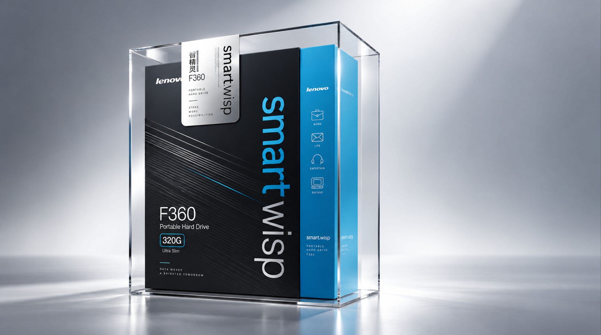
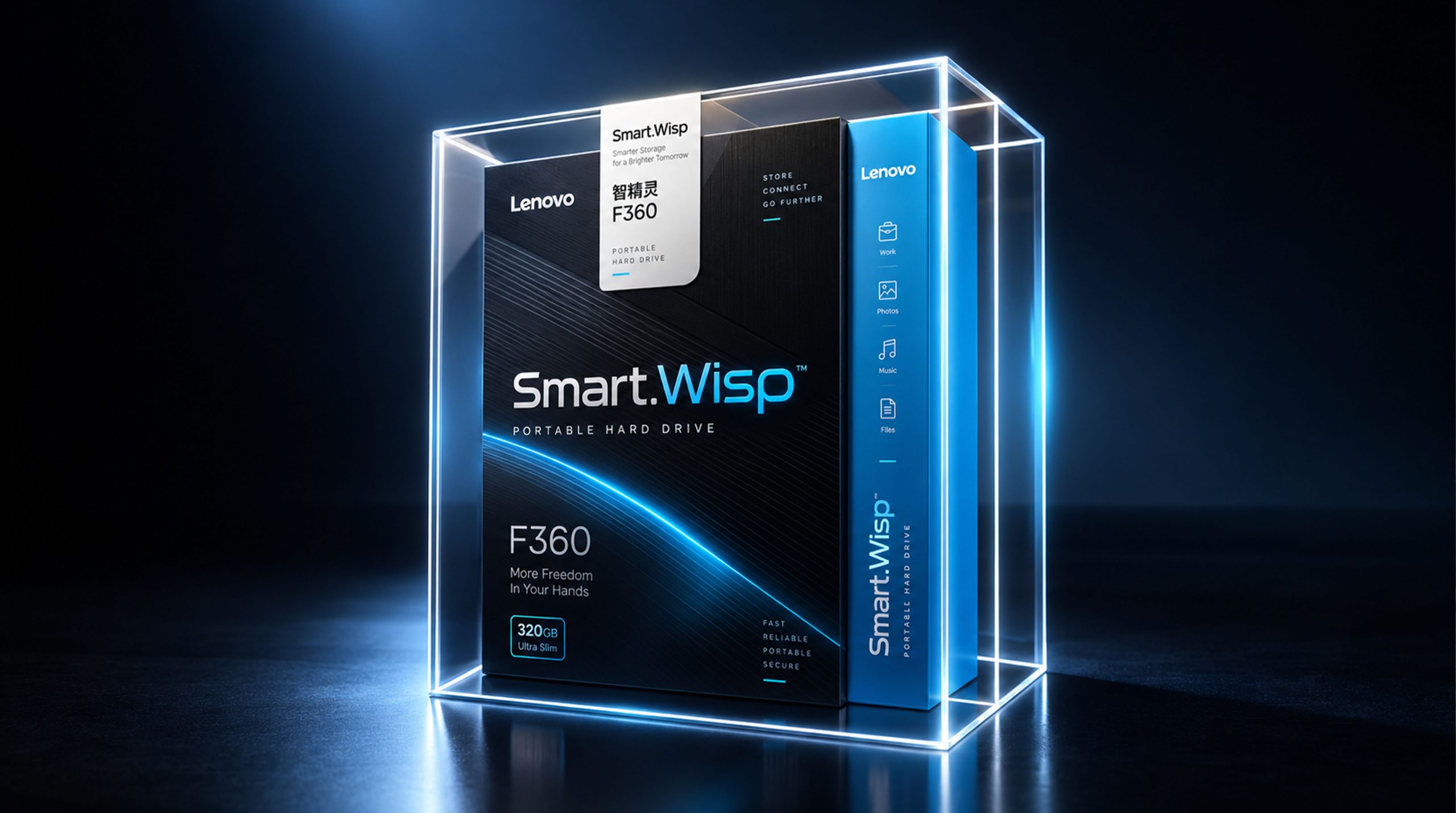
The visual design of the Lenovo F360 centers on “simplicity, modernity and technology.” Clear, simple graphics and a considered color palette give the packaging a character that is both technical and contemporary:
- Color:The packaging is built on a primary palette of black and blue, a combination that feels grounded while underscoring the product's high-tech character. Black conveys stability and professionalism; blue brings a fresh, modern feel.
- Fonts and typography:The product name “smart wisp” is set in a clean, modern bold sans-serif with excellent legibility. Brand information is concise and uncluttered, ensuring consumers grasp the key product details at a glance.
- Graphics & Structure:Simple straight lines and geometric shapes give the packaging a modern, high-tech feel, while crisp linework and a minimal layout make the whole pack look clean and refined.
Tone of Voice
The packaging copy for the Lenovo F360 portable hard drive is direct and concise, focused on communicating product information efficiently and precisely. There is no superfluous wording; it states the product’s core function outright: “Portable Hard Drive.”
The tone is clear and succinct, projecting a professional brand image. Whether describing functions or presenting specifications, the copy avoids embellishment, using a simple, direct approach so consumers can understand the product’s features in the shortest possible time.
Brand Experience
The Lenovo F360 packaging design goes beyond visual impact, with careful thought given to the consumer’s tactile and usage experience:
- Visual Experience:The packaging’s modern, technological feel lets consumers sense the drive’s high-tech credentials at first glance. Clean color blocks and clear typography keep the pack crisp and uncluttered, reinforcing the brand’s technological character.
- Tactile Experience:The packaging uses high-quality paper stock, combining an exterior sheen with structural stability for a comfortable feel in the hand.
- Emotional Experience:Through clear, concise design and a considered color palette, the packaging reinforces the Lenovo F360’s premium market positioning, deepens consumer affinity with the brand, and creates an emotional connection built on quality and performance.
Brand Statement
“Simple design. Breakthrough technology. A more efficient, effortless digital world.”
Through clean geometric forms, a distinctly modern color palette and clear typography, the Lenovo F360 packaging conveys the brand’s professionalism and high-tech character. More than the product’s exterior, the packaging embodies the brand’s image and function, letting consumers see the brand’s value and quality for themselves.