












NESCAFE
Brand Essence
The brand spirit of the Nescafé Latte range can be distilled into a few core elements:
- Modern × Simple × Convenient
- Innovation × Quality × Enjoyment
These keywords reflect Nescafé’s leadership in the coffee industry and the brand’s commitment to product quality and consumer experience. Modernity and simplicity express the brand’s style and efficiency, while convenience speaks to how naturally the product fits into everyday life. Innovation and quality underline Nescafé’s technical strength in coffee development, and enjoyment emphasizes the sensory pleasure consumers find in every Nescafé product.
Brand Philosophy
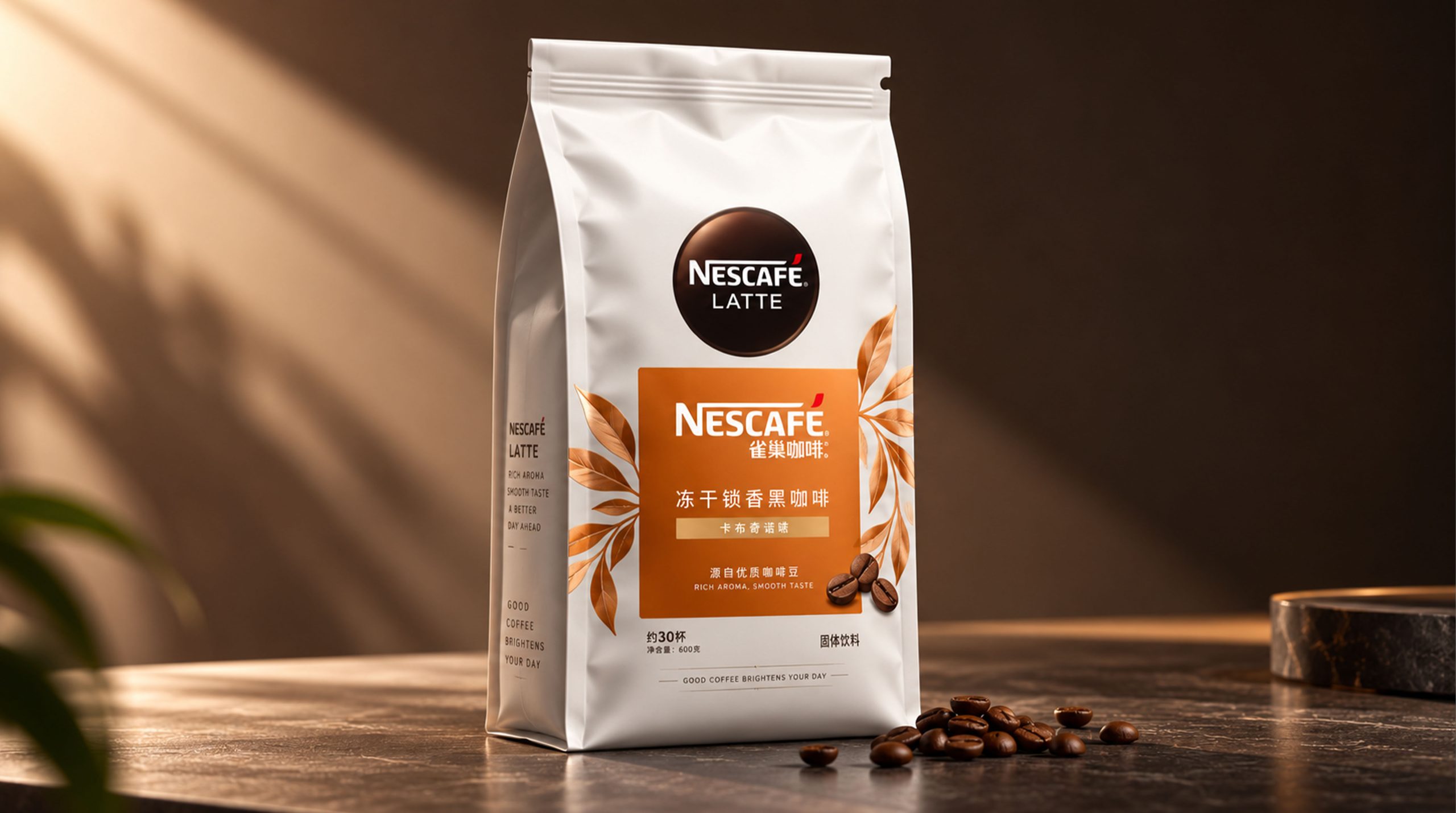
The Nescafé Latte packaging concept centers on modernity, simplicity and quality. Minimal yet refined, the design uses a clean exterior to highlight the product’s quality and efficiency, letting consumers sense Nescafé’s modern, premium positioning at first glance.
Packaging design is more than visual expression; it is a way of communicating the brand’s philosophy. Every detail reflects Nescafé’s pursuit of excellence and innovation, while the clean design offers consumers a moment of freshness and ease amid busy lives.
Visual Language
The Nescafé Latte packaging language is clear and contemporary, uniting detail and function throughout:
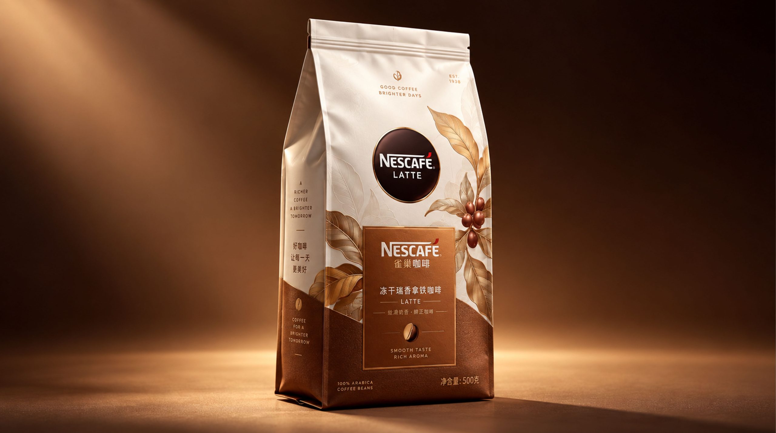
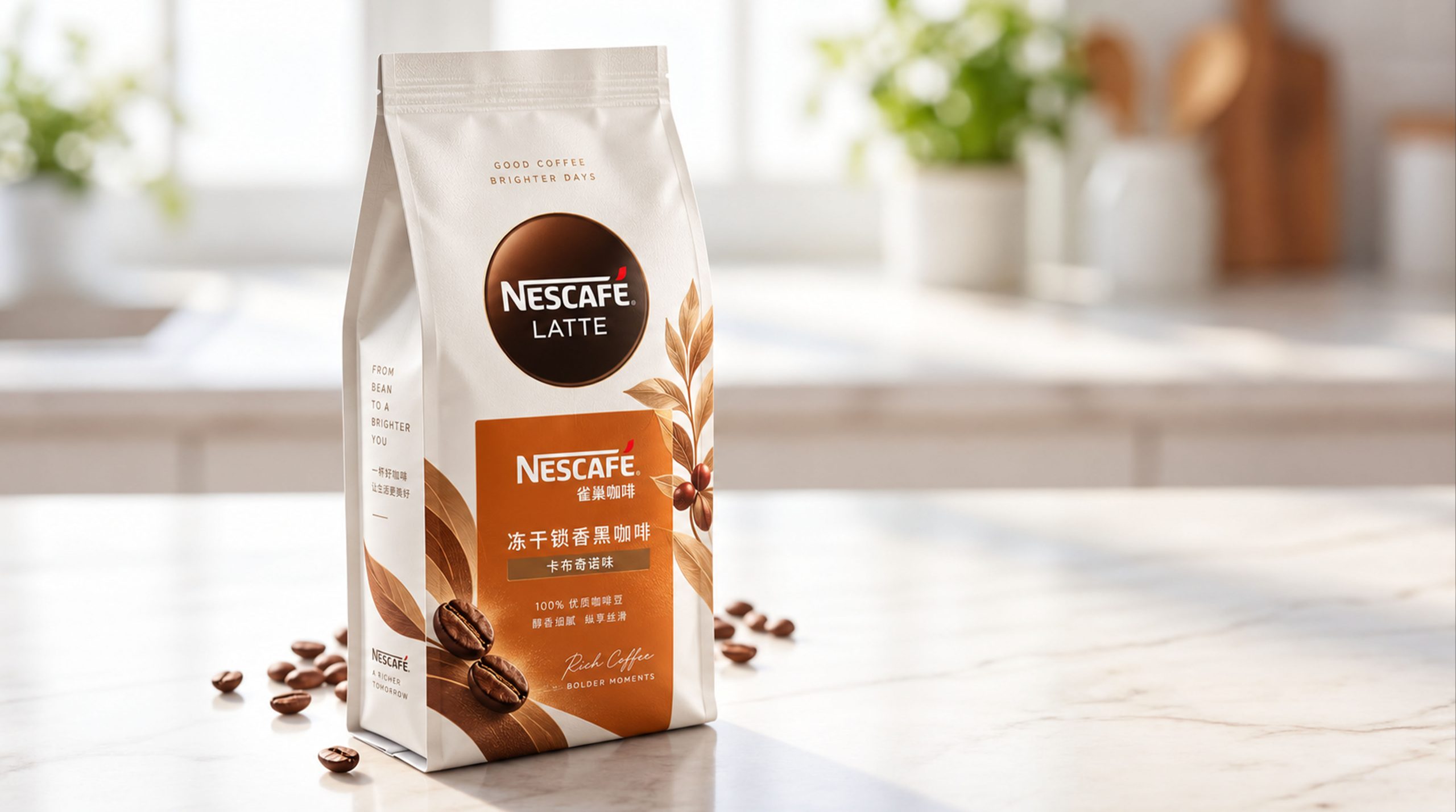
- Color:The primary colors are white and orange: white for purity and freshness, orange for energy and warmth. Together they give the pack a modern, vibrant look that matches Nescafé Latte’s youthful, stylish positioning.
- Fonts and typography:The packaging uses a clean, modern sans-serif typeface that emphasizes the brand’s contemporary feel and legibility. Clear, direct typesetting of the brand name and product information builds consumer recognition and trust.
- Graphics & Structure:Botanical illustrations on the front of the pack create a striking contrast with modern linework. The delicate botanical detailing complements the clean graphics, conveying Nescafé Latte’s natural, wholesome positioning.
Tone of Voice
The packaging copy is fresh, concise and full of energy. Free of embellishment, the text on the Nescafé Latte pack states the product’s core values and features directly. Brand name, product range and key selling points are presented in clean, simple copy that avoids redundancy, so consumers can quickly grasp the product’s strengths.
The packaging speaks in a natural, approachable voice. Rather than overstating its case, the copy communicates the product's practicality and quality directly. Concise messaging helps consumers grasp the product at a glance while conveying a brand that feels modern and welcoming.
Brand Experience
The Nescafé Latte packaging goes beyond visual appeal, designed to resonate on both a tactile and an emotional level:
- Visual Experience:A clean design language, paired with a considered palette and graphic patterns, gives the packaging a modern, energetic presence, signaling quality from the very first glance.
- Tactile Experience:The materials are refined, robust and pleasant to hold. Picking up the product, consumers feel its premium quality and sense the care Nescafé puts into every detail.
- Emotional Experience:The packaging projects a brand image that is both warm and stylish. Through a clean design language and a contemporary palette, Nescafé Latte conveys reliability and warmth.
Brand Statement
“Crafting a premium coffee experience through simplicity and modernity.”
Through a clean, modern visual language and a carefully curated palette, the Nescafé Latte packaging expresses the brand's quality and contemporary spirit. Every detail reflects Nescafé's deep commitment to quality, innovation and the user experience.