










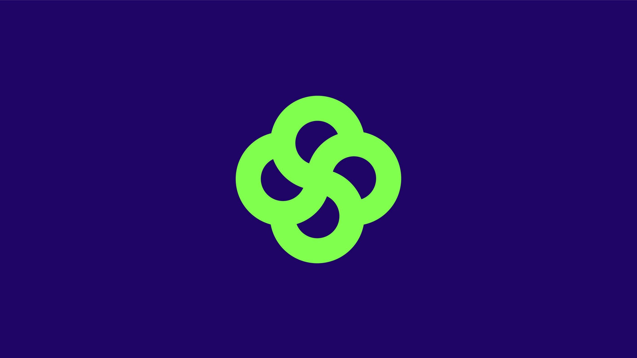
LIVELINK is a brand dedicated to intelligent ecosystems and sustainable technology. Its vision: “Connecting everything through intelligence, empowering the future through ecology.”
The brand sought a visual symbol embodying life cycles and systemic order, one that expresses the coexistence of technological innovation and natural harmony and builds an impression that is friendly, open and enduring.
design concept
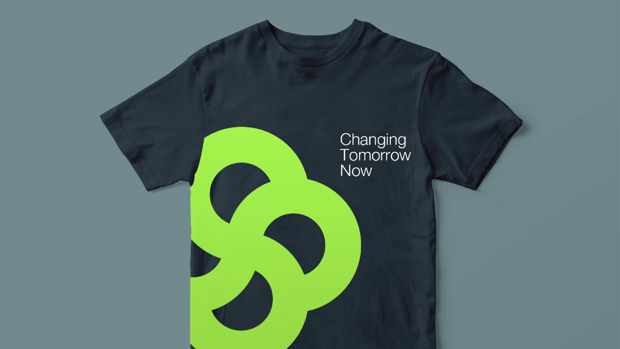
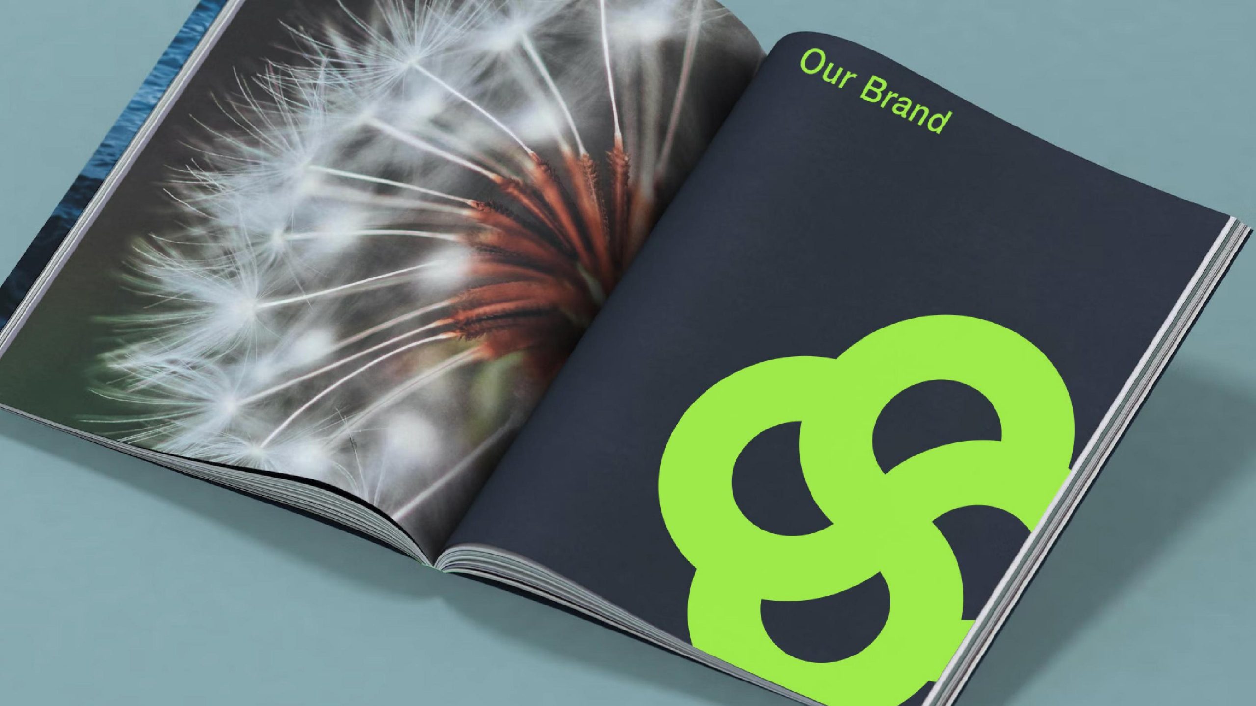
The logo draws on the idea of a “Living Link.” Four interlocking rings form a closed system, symbolizing the mutual support and symbiotic cycle of four dimensions: nature, technology, humanity and the future. Its organic, symmetrical structure expresses the brand's balance between technological rigor and ecological warmth.
graphic language
Four interlocking rings: systemic collaboration and ecological symbiosis — the brand connecting people with nature, and technology with everyday life. Open interior: the rings flow into one another without boundaries, signifying an open, shared tech ecosystem. Soft curves: dissolving the cold hardness of technology to convey a friendly, flexible and sustainable brand personality. Central negative space: hinting at the brand's core of innovation and the flow of life energy. The mark reads as an abstract “flower of life” — rational in structure, yet full of the momentum of natural growth.
Fonts and composition
The LIVELINK wordmark is set in a rounded geometric sans serif with balanced proportions and soft strokes, echoing the organic curves of the symbol. The bilingual Chinese–English lockup is horizontally centered, expressing balance and inclusiveness. Generous breathing room between wordmark and symbol creates a light, modern visual rhythm.
color system
Life Green #A8EB5E: nature, growth and regeneration. Soft White #FFFFFF: purity and transparency. Light Gray #E5E5E5: a backdrop of rationality and technology. Green leads the palette, establishing a distinctive ecological identity and a brand character of “vitality × balance × hope.”
Application and extension
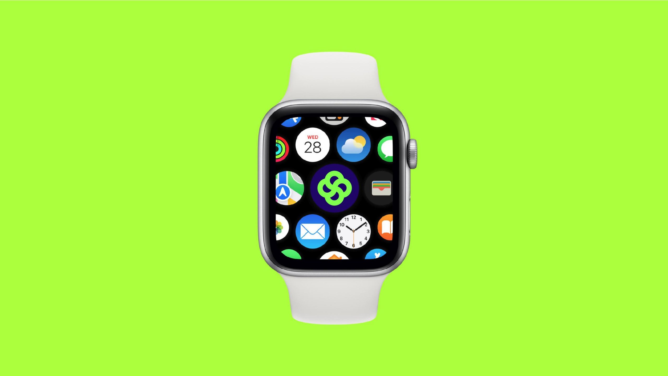
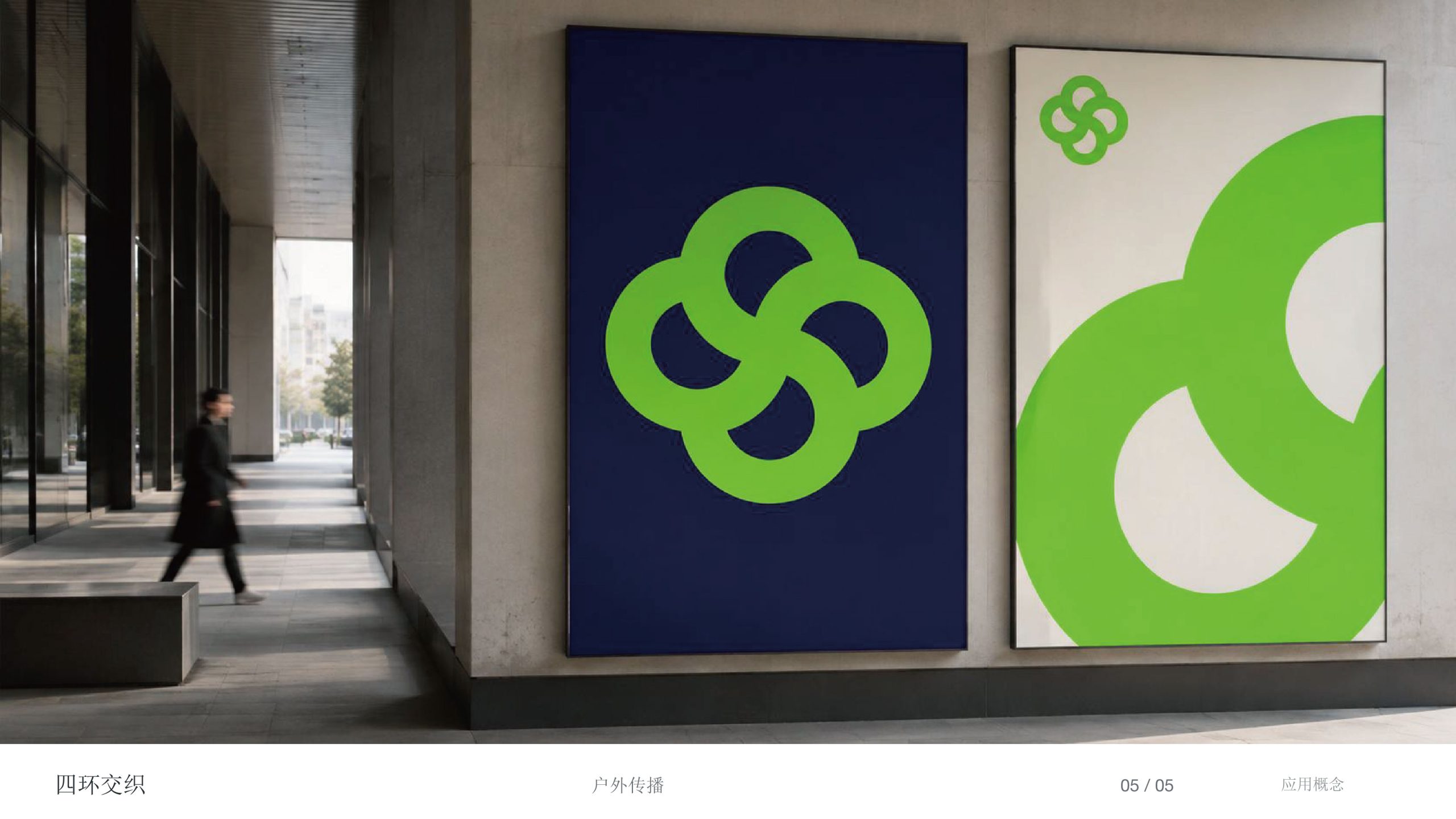
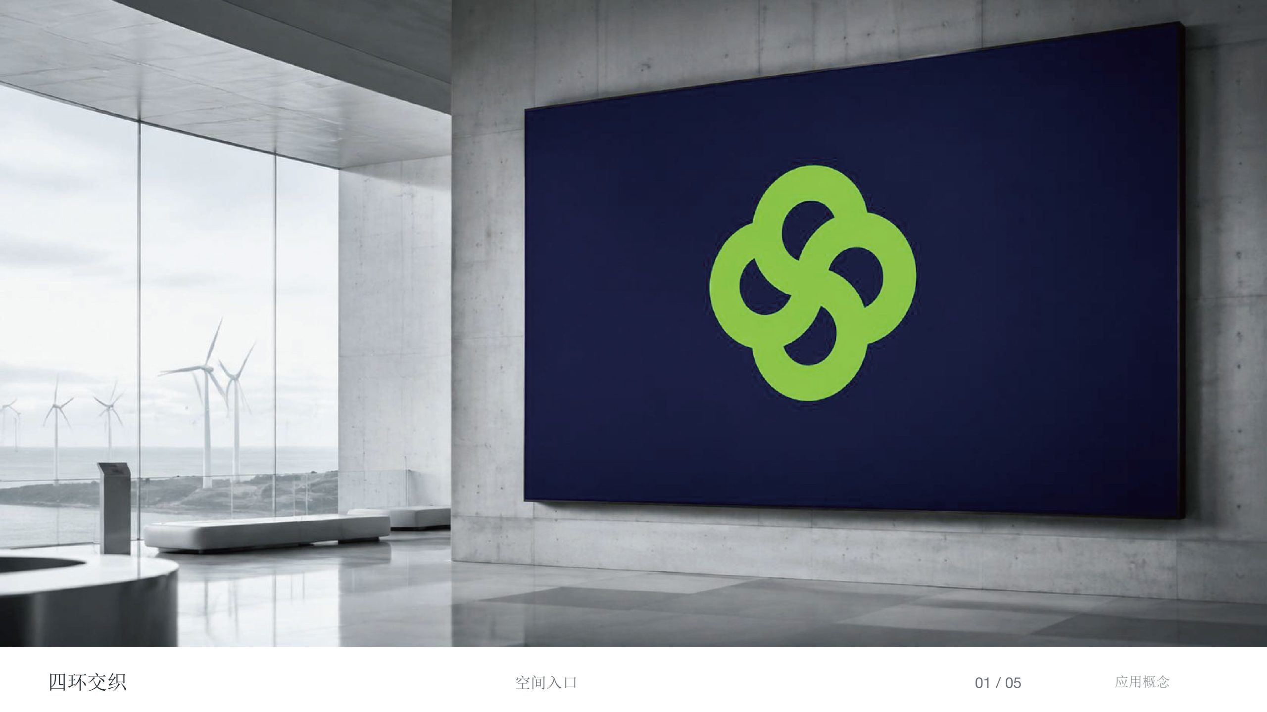
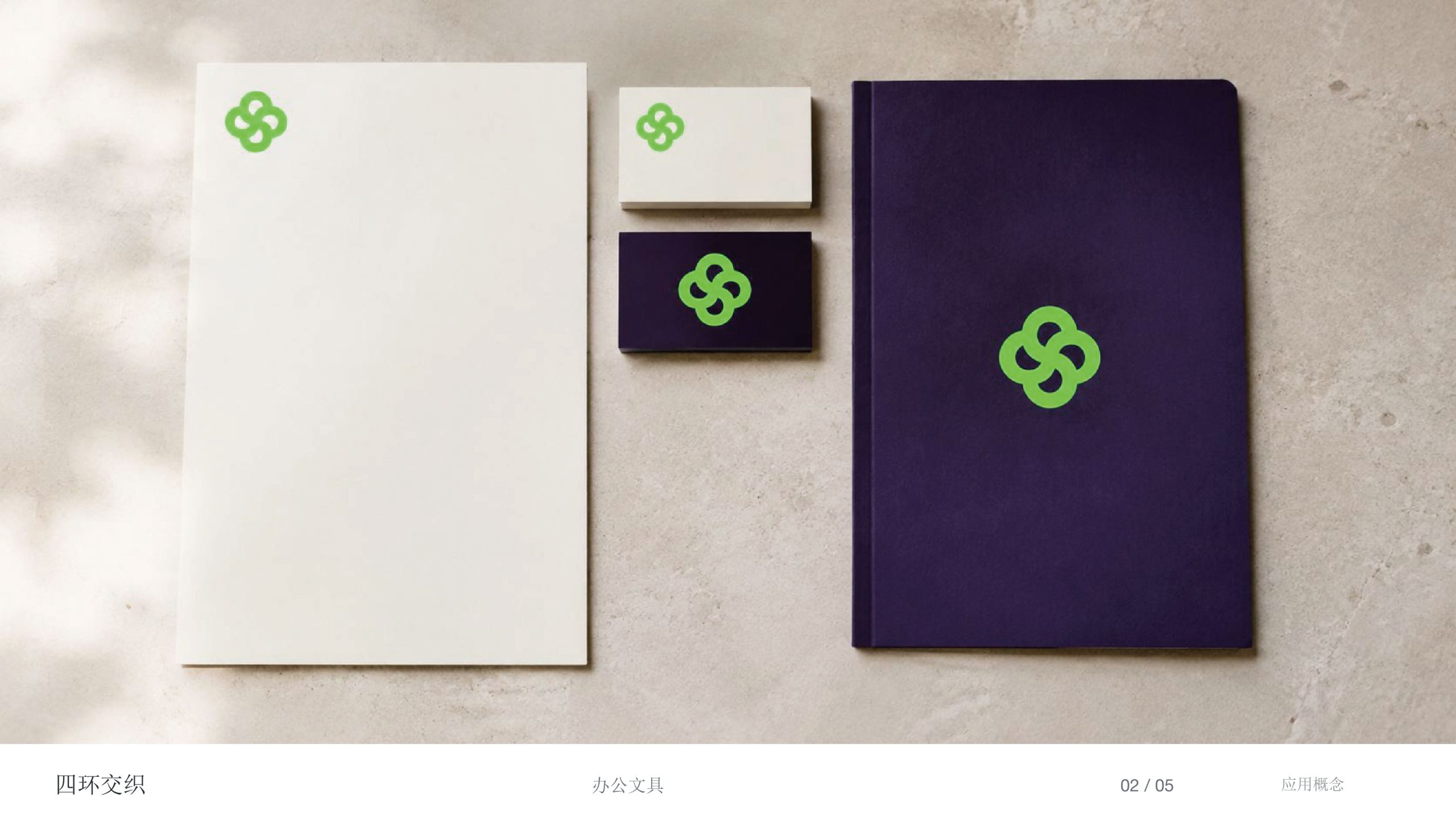
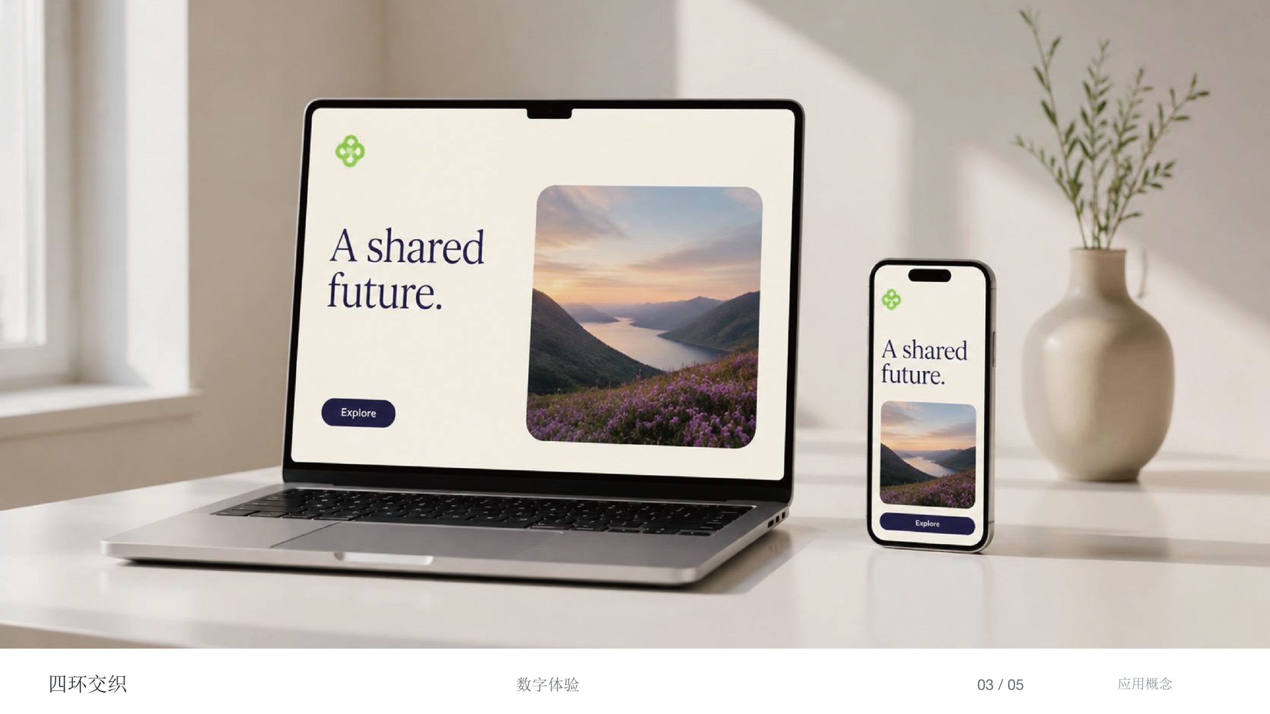
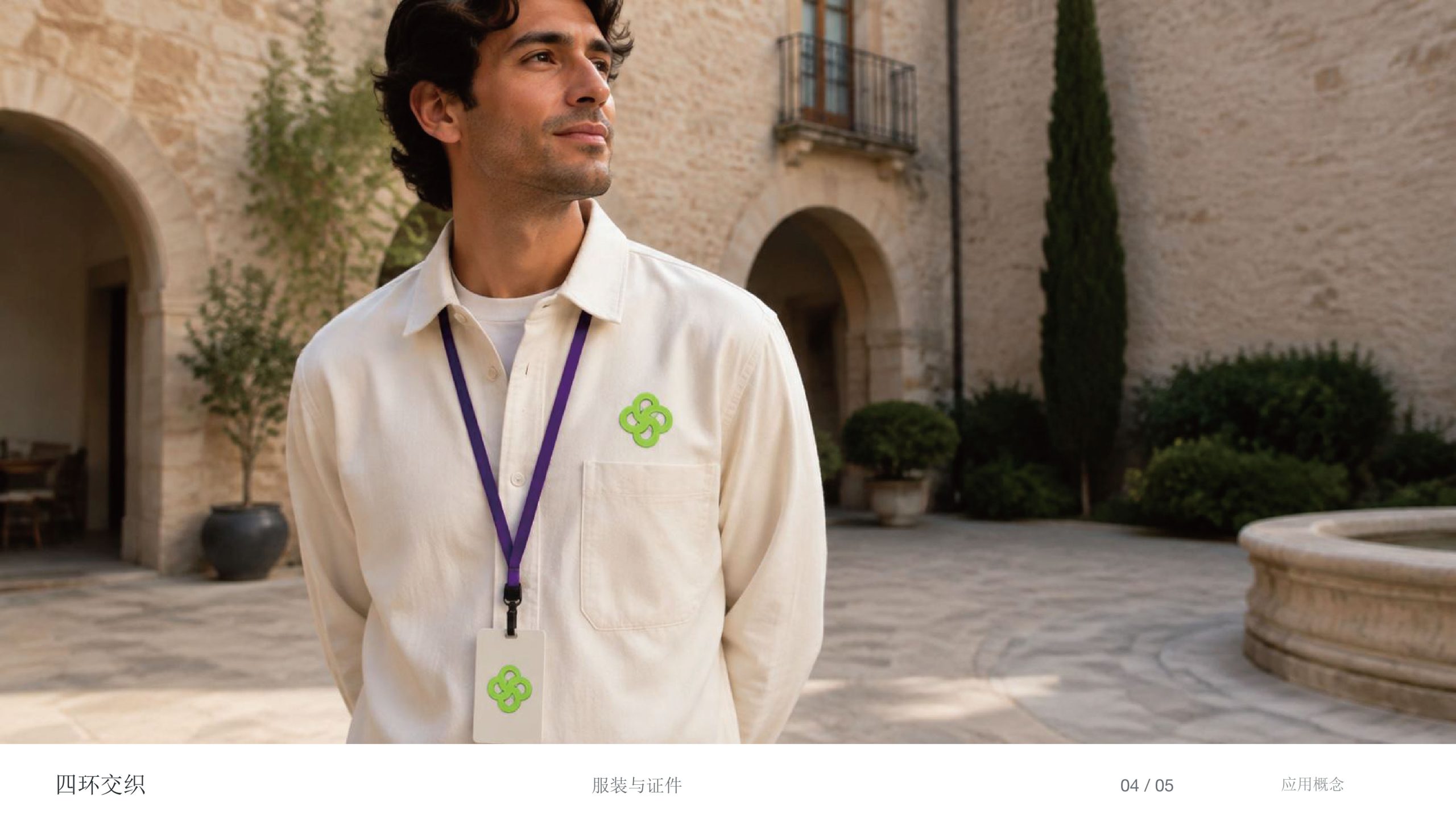
Highly adaptable, the logo works across: Corporate — ESG reports, the brand website and corporate collateral; Product — smart ecosystem devices, sustainable packaging and IoT tags; Spatial — showroom wayfinding, installations and interactive interfaces. In motion, the interlocking rings can rotate or pulse with a breathing light, expressing the brand's living rhythm of “energy cycles × system linkage.”
brand meaning
The LIVELINK logo captures the brand's essence of “intelligent connection × ecological symbiosis”: four rings → balance and collaboration; curves → life and flow; green → growth and hope; negative space → innovation and extension. More than a brand identifier, it is a forward-looking ecological philosophy: connecting life through technology, and expressing sustainability through design.
Improper Usage (Protection Specification)
Do not alter the proportions of the four rings or the way they connect. Do not use any green other than the specified brand green. Do not add outlines, shadows or 3D effects. Recommended minimum display width: 28 mm.
design results
Built on a core visual language of “ecology × technology × symbiosis,” LIVELINK quickly became a defining image in the emerging eco-tech sector after launch. Its soft curves and high-saturation green form a distinctive identity system, applied widely across brand communications, product packaging and interactive installations. The project represents a mature expression of Qingmei Future's work in ecological design and the visual language of future technology, bringing visual unity to the journey from “natural imagery” to “systems philosophy.”