










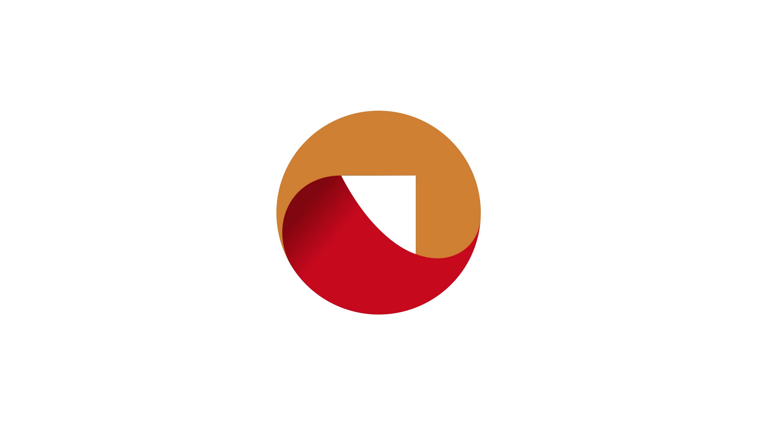
ARCSTONE is a firm specializing in architectural design, urban planning and structural materials technology. Guided by the philosophy of “structural aesthetics × engineering intelligence,” it shapes sustainable spatial identities through reason and creativity.
As part of upgrading its visual system, the brand sought a logo that combines architectural logic with material presence — a symbol of its professional ethos: “Beginning with stone, shaping with light.”
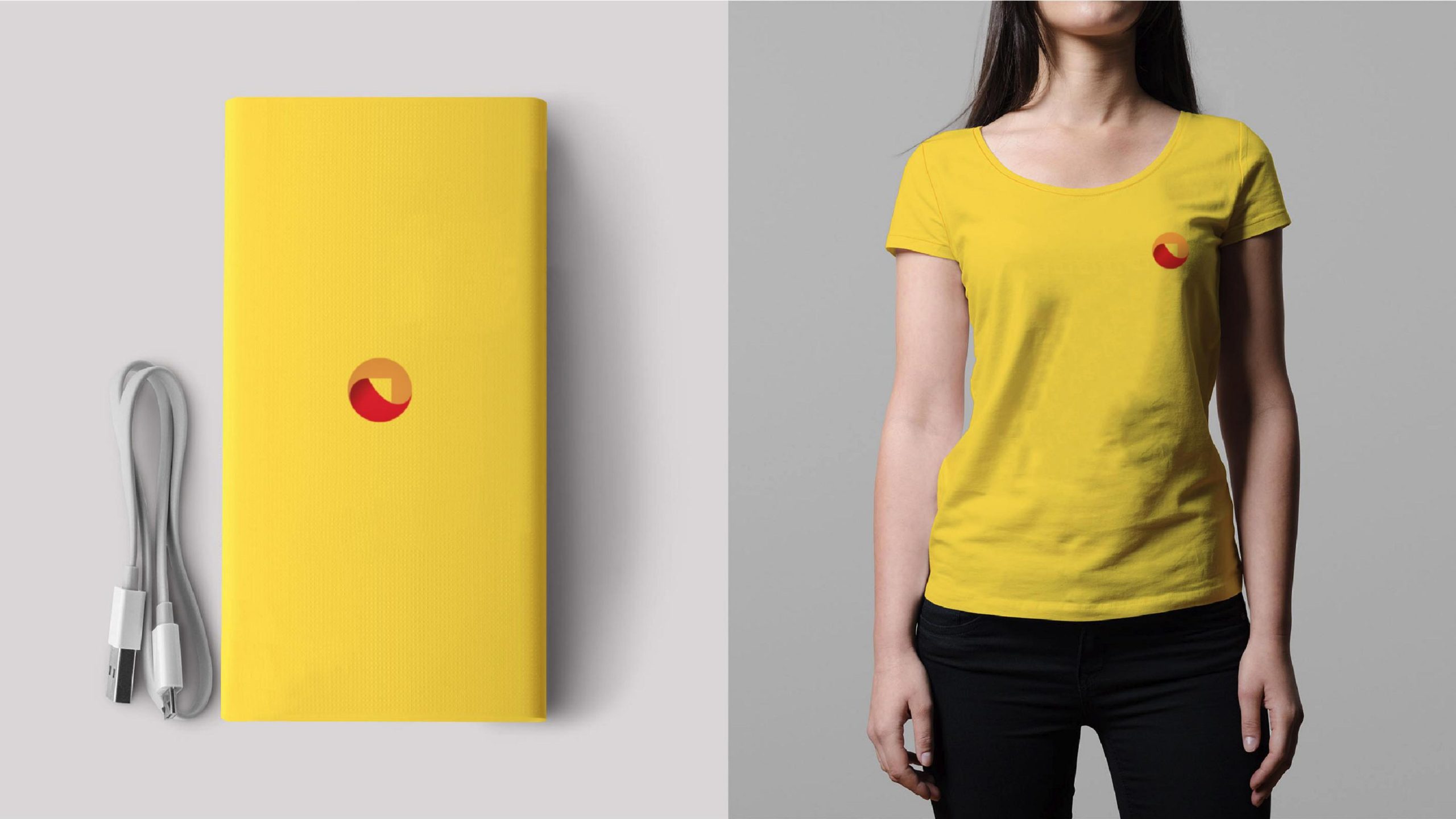
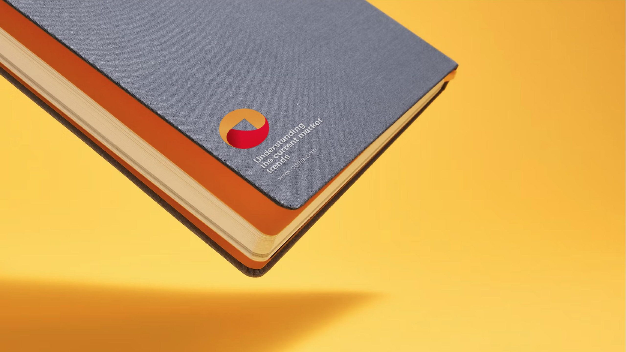

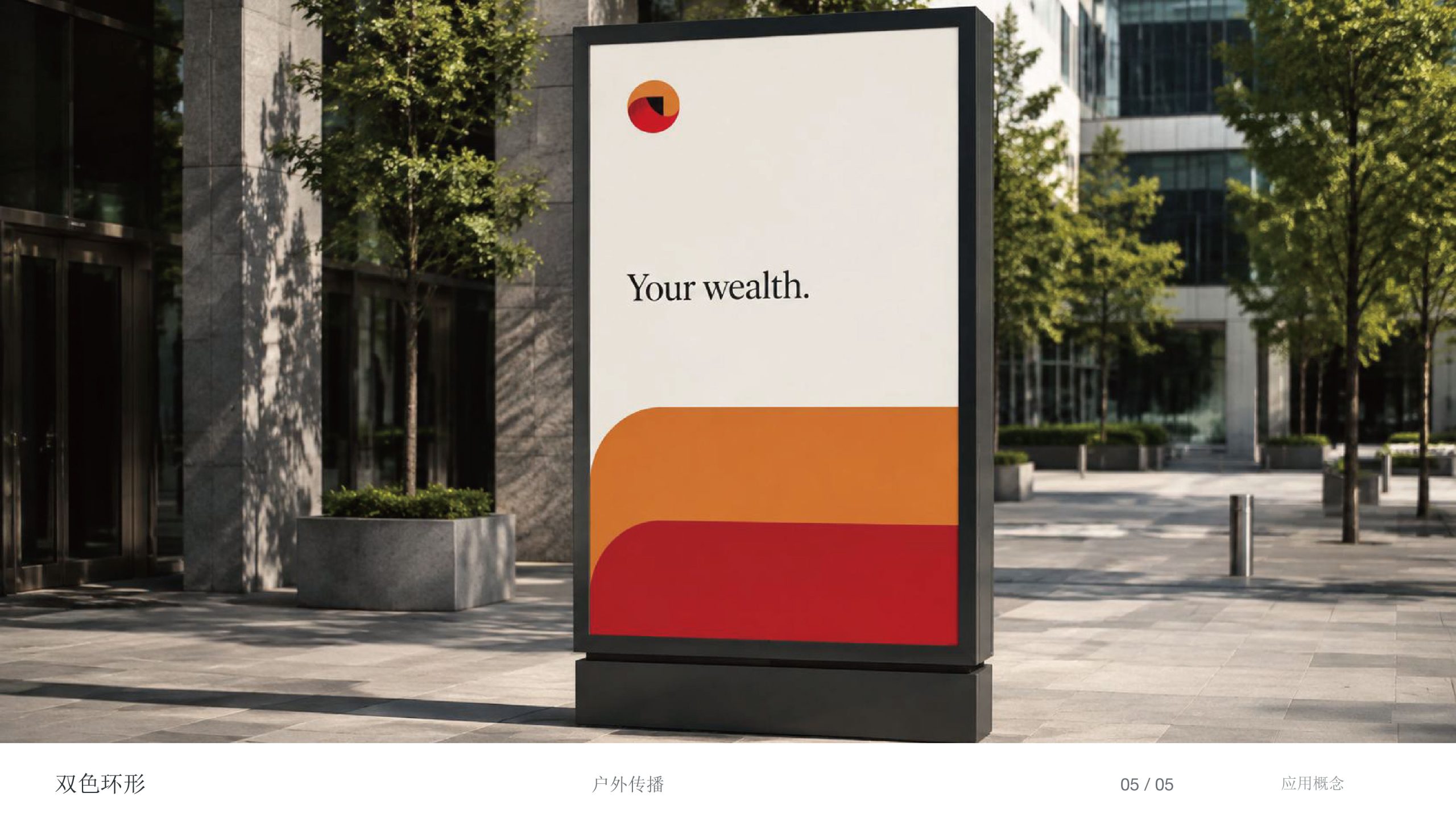
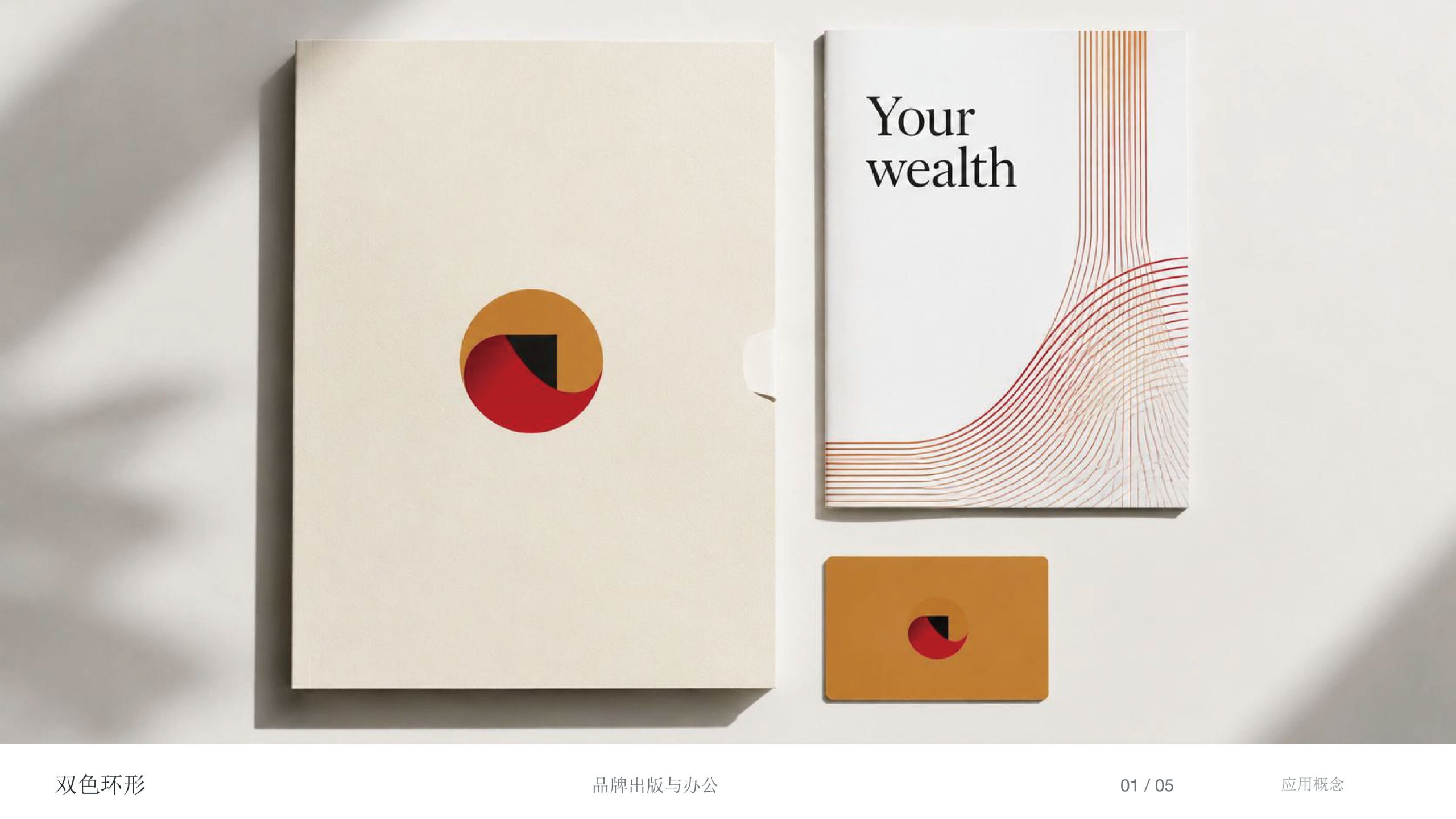
design concept
The logo takes the arch and the structural cross-section as its point of departure, interweaving geometric rings and curved surfaces into a visual language of space and material. The composition conveys an architectural order of “a square within a circle, with light held inside” — spatial spirit emerging from solid structure, aesthetic tension arising from rational construction. The core idea: form as body, light as soul.
graphic language
Arch structure: drawn from architecture's most stable structural form, symbolizing strength and extension. Negative space: the open interior forms a “gateway of light,” representing spatial openness and hope. Two-layer gradient: shifting from deep red to ochre gold, it signifies the transformation of “earth to light” and “material to spirit.” Geometric logic: perfect symmetry throughout reflects architecture's rational order and precise scale.
Fonts and composition
The ARCSTONE wordmark uses a custom sans serif — steady and clean, with stroke proportions referencing the spacing of beams and columns to reinforce a sense of spatial structure. Set in dark gray or metallic silver, it stays consistent with the material language of the symbol. The centered layout projects the professional presence of an international architecture practice.
color system
Primary Ochre Gold #B77B3C: architectural materials and the patina of time. Secondary Deep Red #8B1E14: strength, depth and human warmth. Neutral White #FFFFFF: the purity of space and the entry of light. Together, they establish a visual order of “material × light × space.”
Application and extension
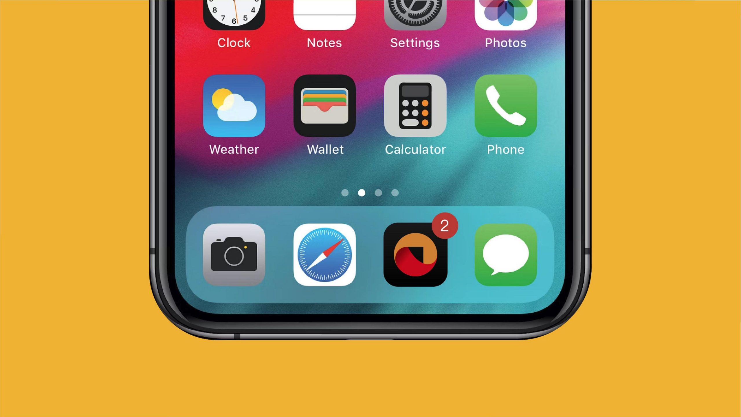
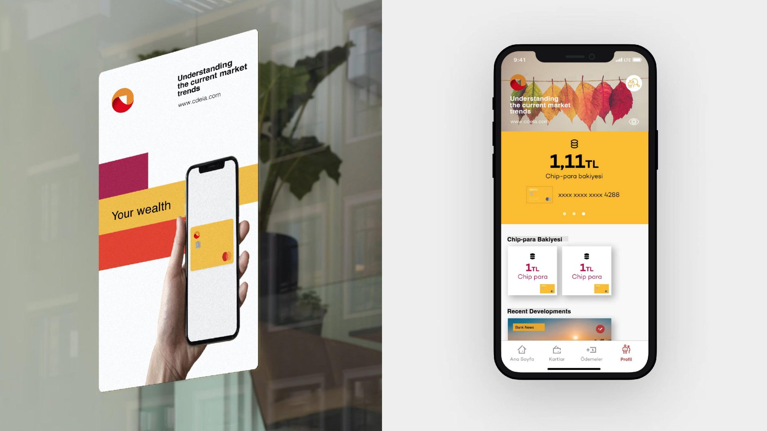
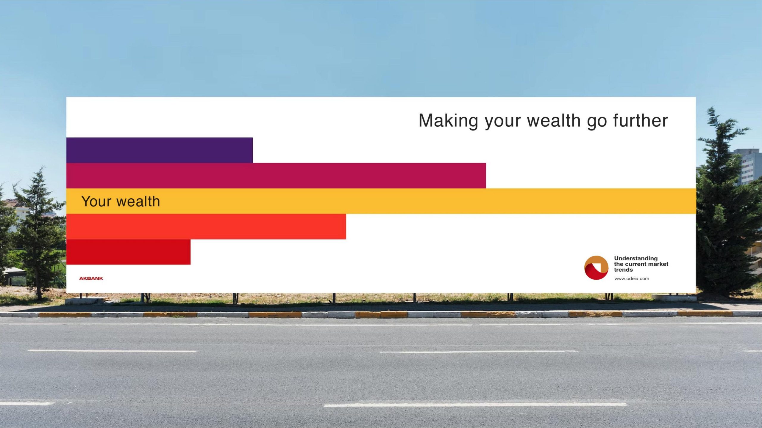
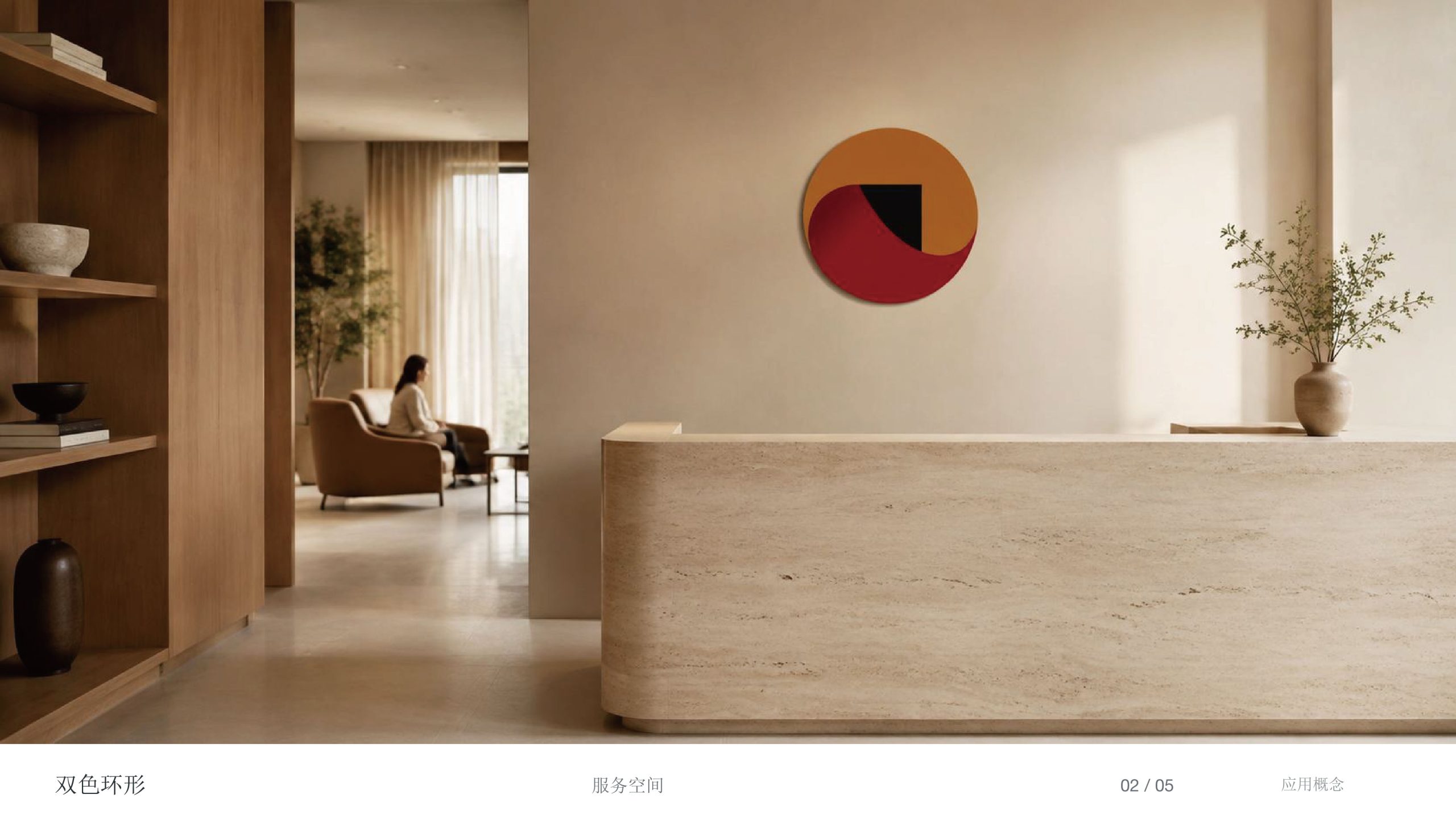
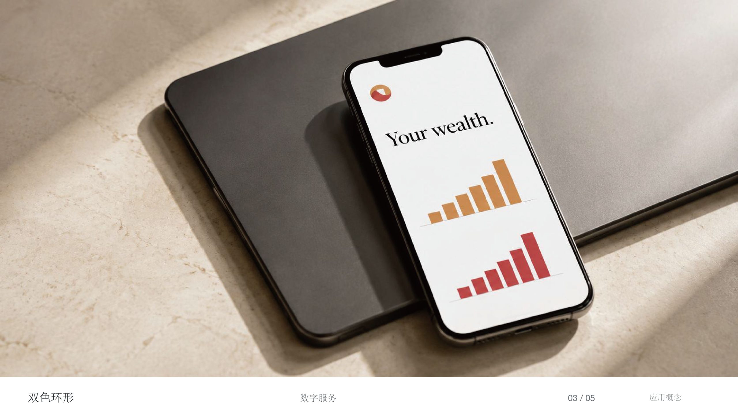
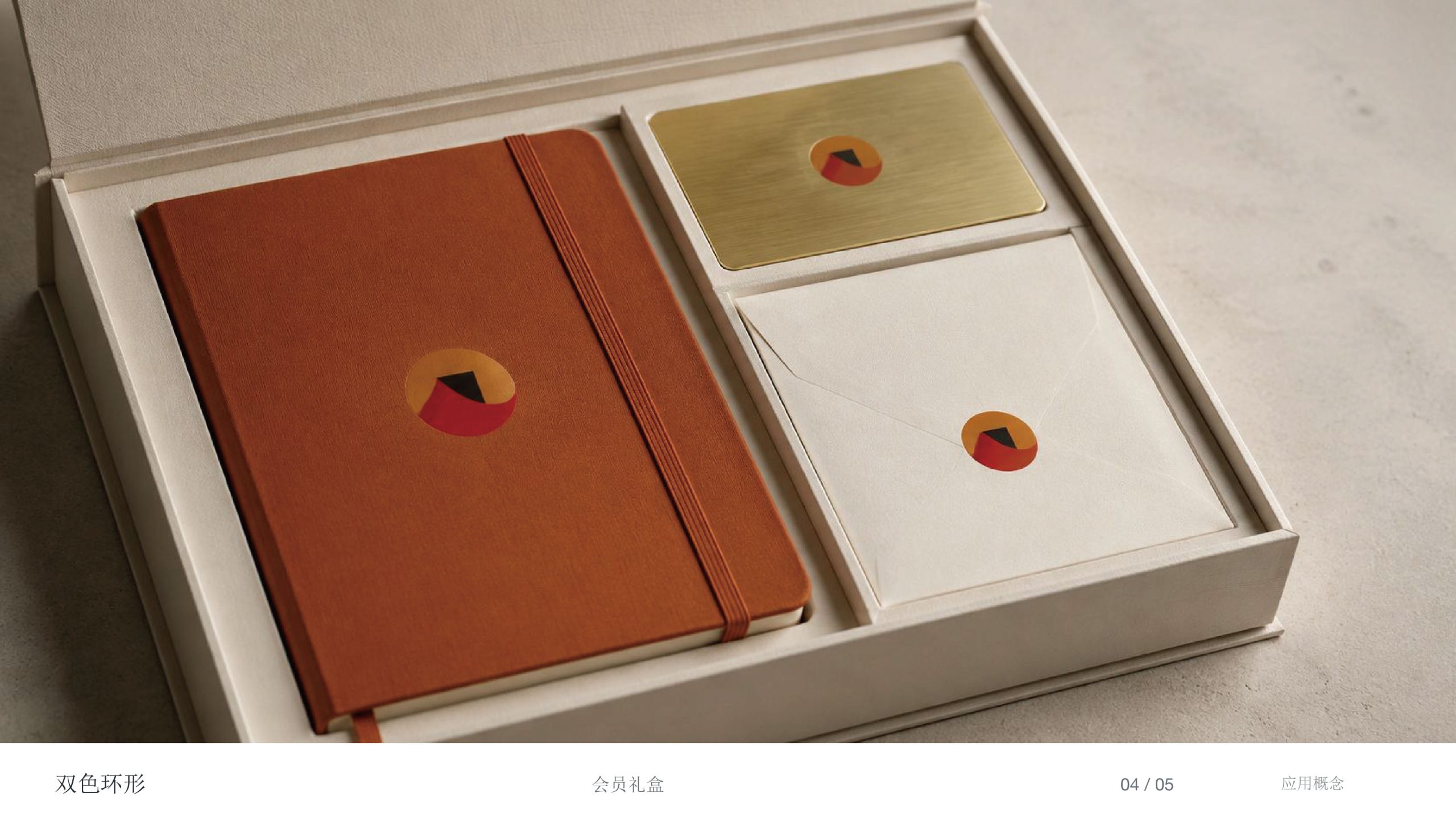
The logo adapts exceptionally well across spaces and materials: Architecture practice — entrance signage, business cards, drawing covers and proposal templates; Building materials — product packaging, exhibition systems, nameplates and construction hoardings; Digital — on the website and in project videos, the arch can be animated to simulate “light passing through structure,” enhancing the spatial experience.
brand meaning
The logo fuses “the strength of architecture” and “the spirit of light” into a single visual metaphor: the arch — architecture's capacity to bear the world; the ring — wholeness and continuity; the open aperture — the spirit within reason, and the path of exploration. Together they embody ARCSTONE's design philosophy: “Between solidity and softness, we find the poetry of architecture.”
Improper Usage (Protection Specification)
Do not alter the arch proportions or rotate its orientation. Do not replace the primary colors or add high-saturation colors. Do not add shadows or 3D embossing. Recommended minimum display width: 25 mm.
design results
Following its launch, ARCSTONE's new logo established a distinctive visual presence in architecture and design. Its singular expression of “material aesthetics × geometric rationality × the philosophy of light” has been regarded as a benchmark for architectural brand identities that combine strength and warmth. The project represents Qingmei Future's mature practice at the intersection of spatial design, material philosophy and brand visualization, extending the idea that “the form of architecture is the form of thought.”