










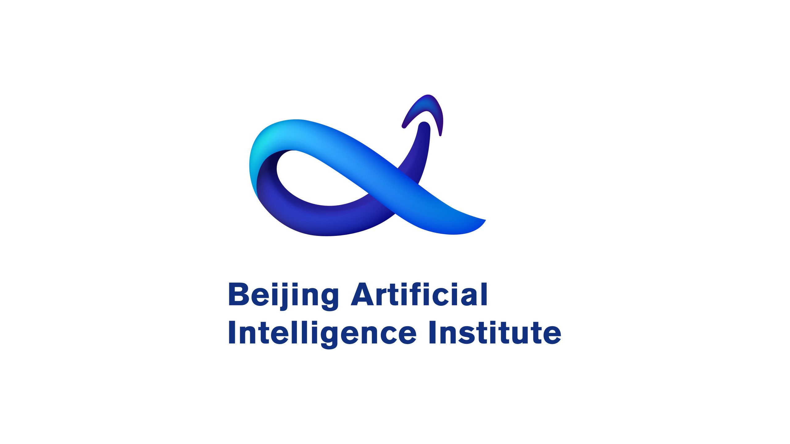
Beijing Artificial Intelligence Institute is a technology organization focused on fundamental AI research and application development, dedicated to advancing collaborative innovation across AI theory, algorithms, and industry ecosystems.
The brand visual system aims to convey the research spirit of 'intelligence, integration, and evolution' through a minimal yet futuristic symbolic language, forming an internationalized visual identity representing the forefront of Chinese technology research.

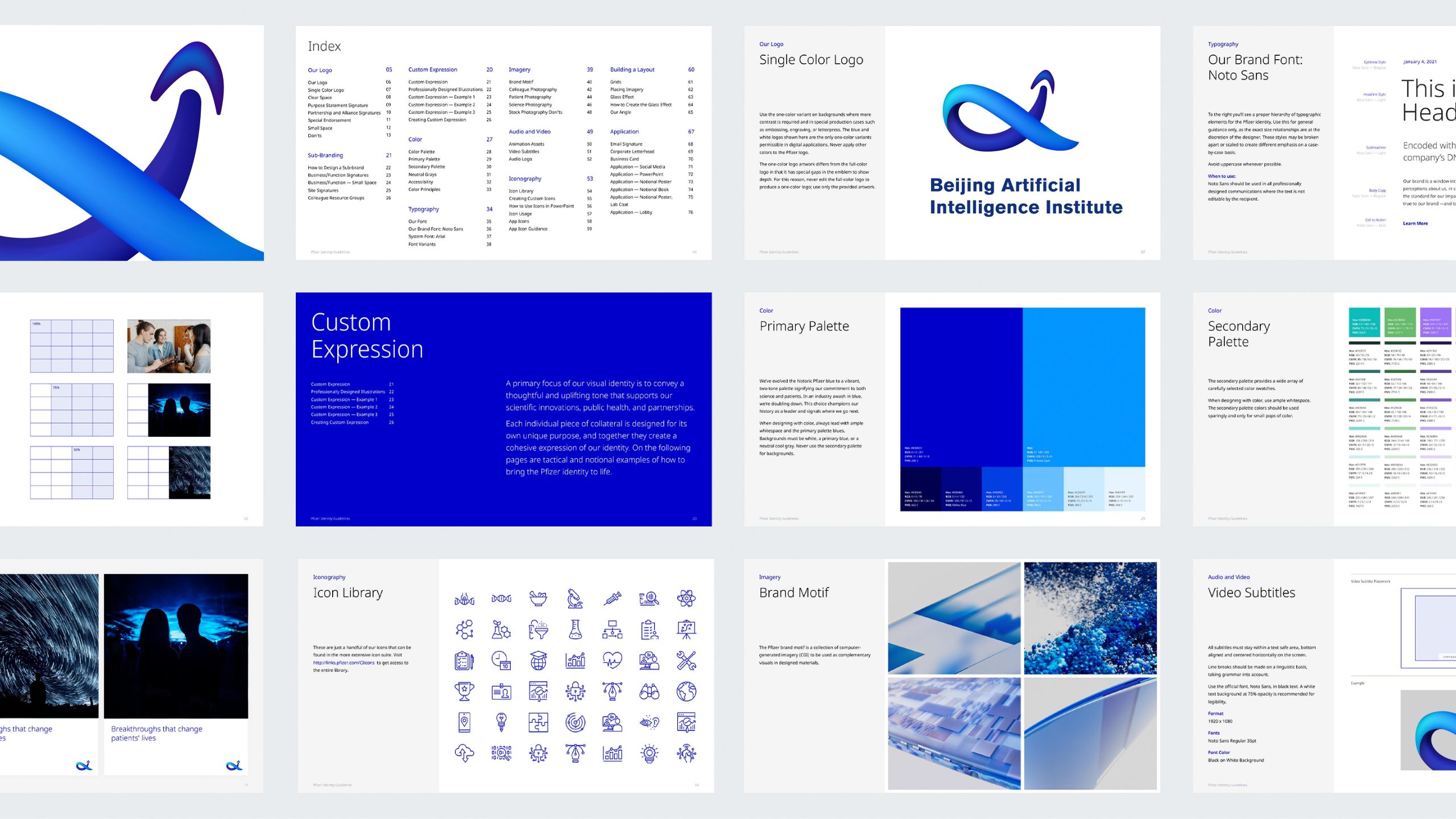

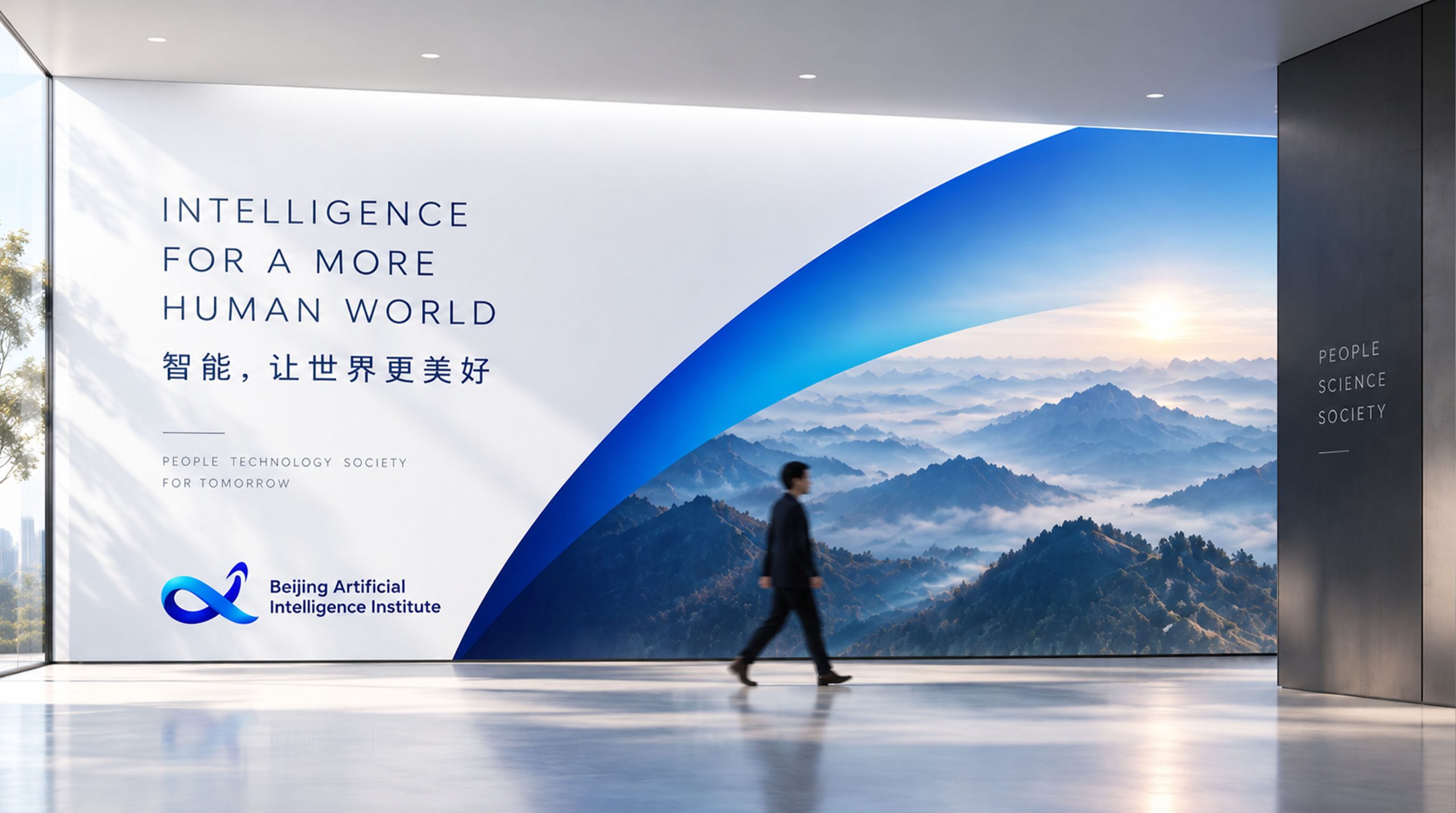
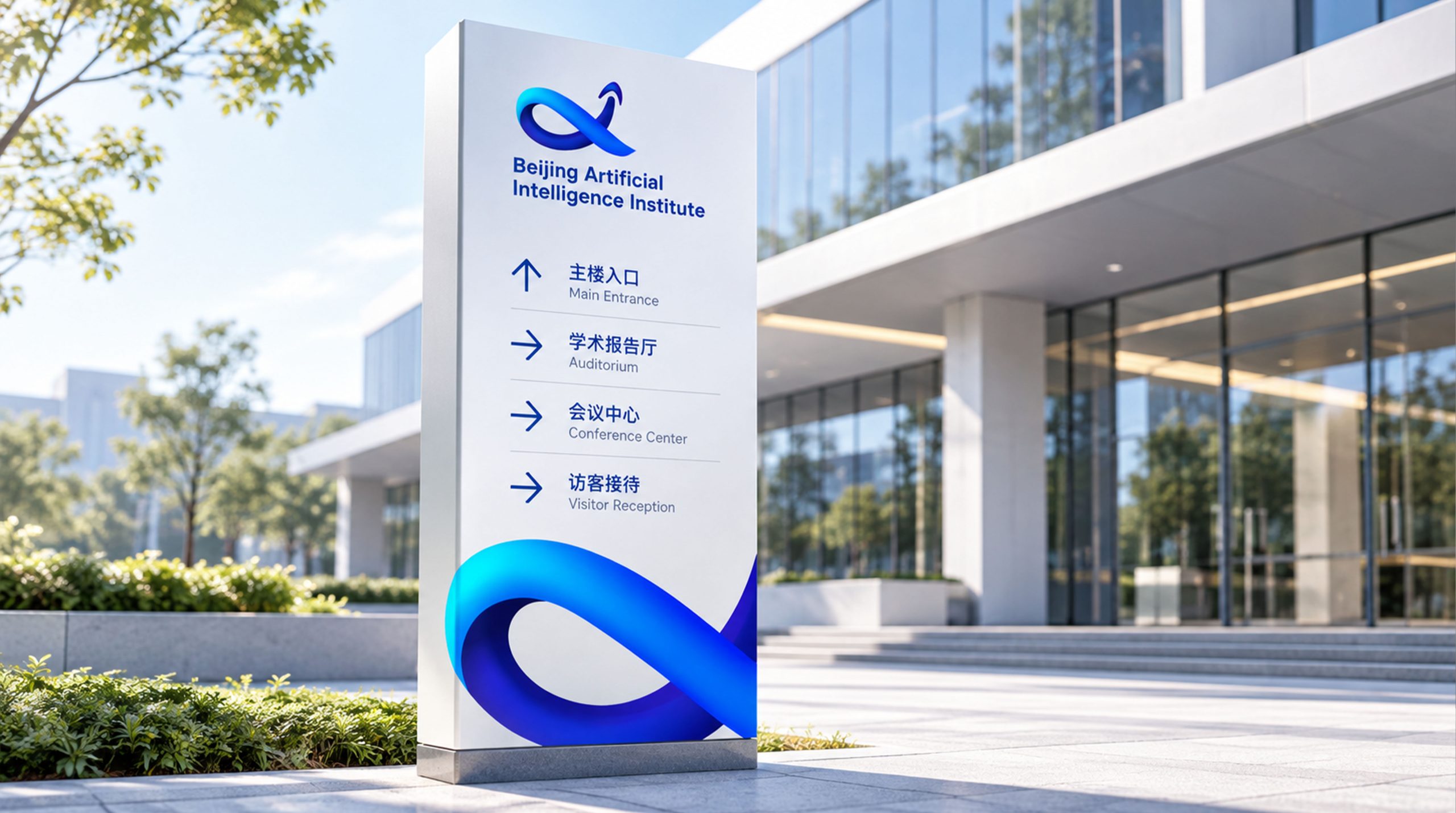
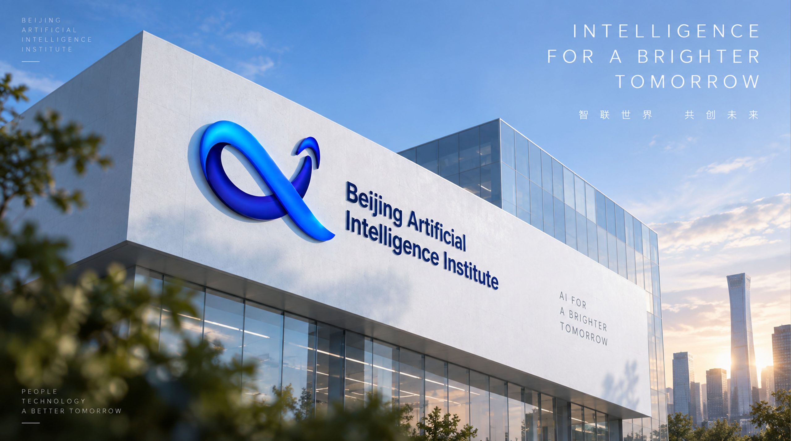
design concept
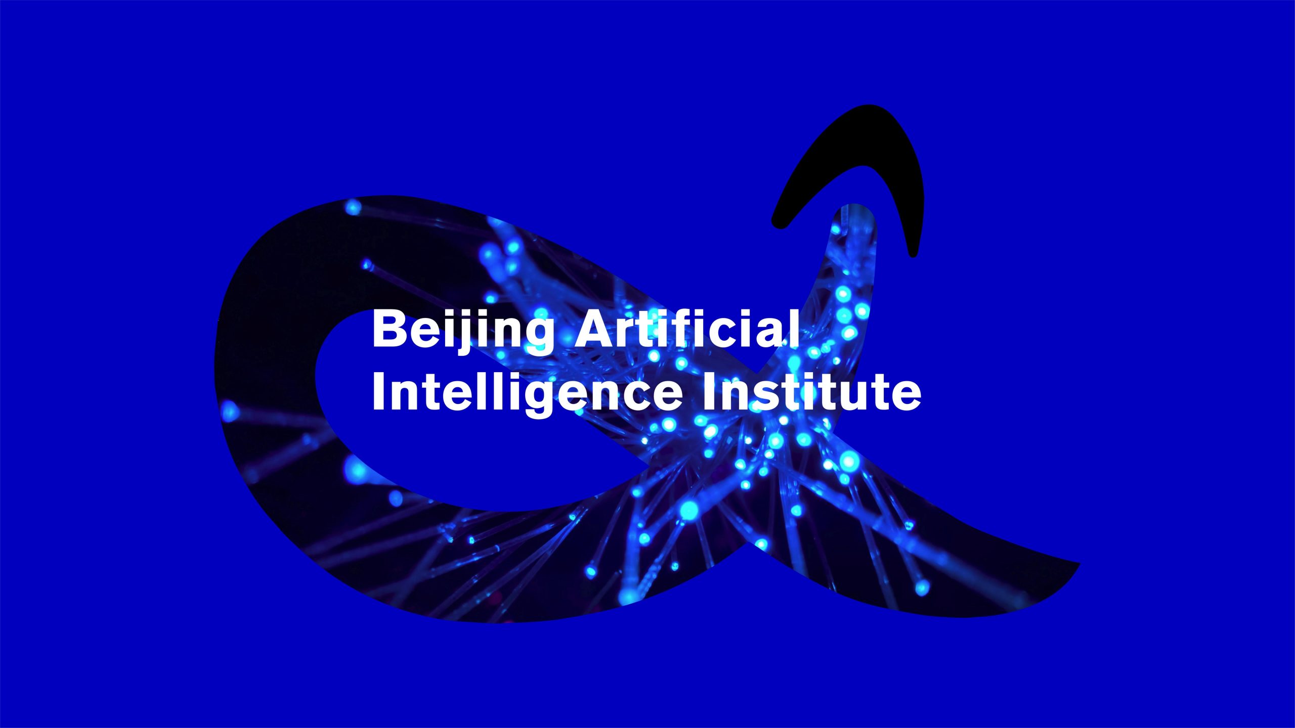
The logo evolves from the infinity symbol (∞), representing the limitless potential of artificial intelligence in learning, feedback, and evolution. The design merges 'data flow' and 'intelligent curves' into a continuous three-dimensional loop, shaped like 'AI's thinking trajectory,' representing a cyclical system of self-learning and self-evolution. The gently upward-lifting curve at the top symbolizes the spirit of breakthrough and innovation, signifying the institute's constant posture of exploring the future. Core concept: Intelligence without boundaries, thought eternal.
graphic language
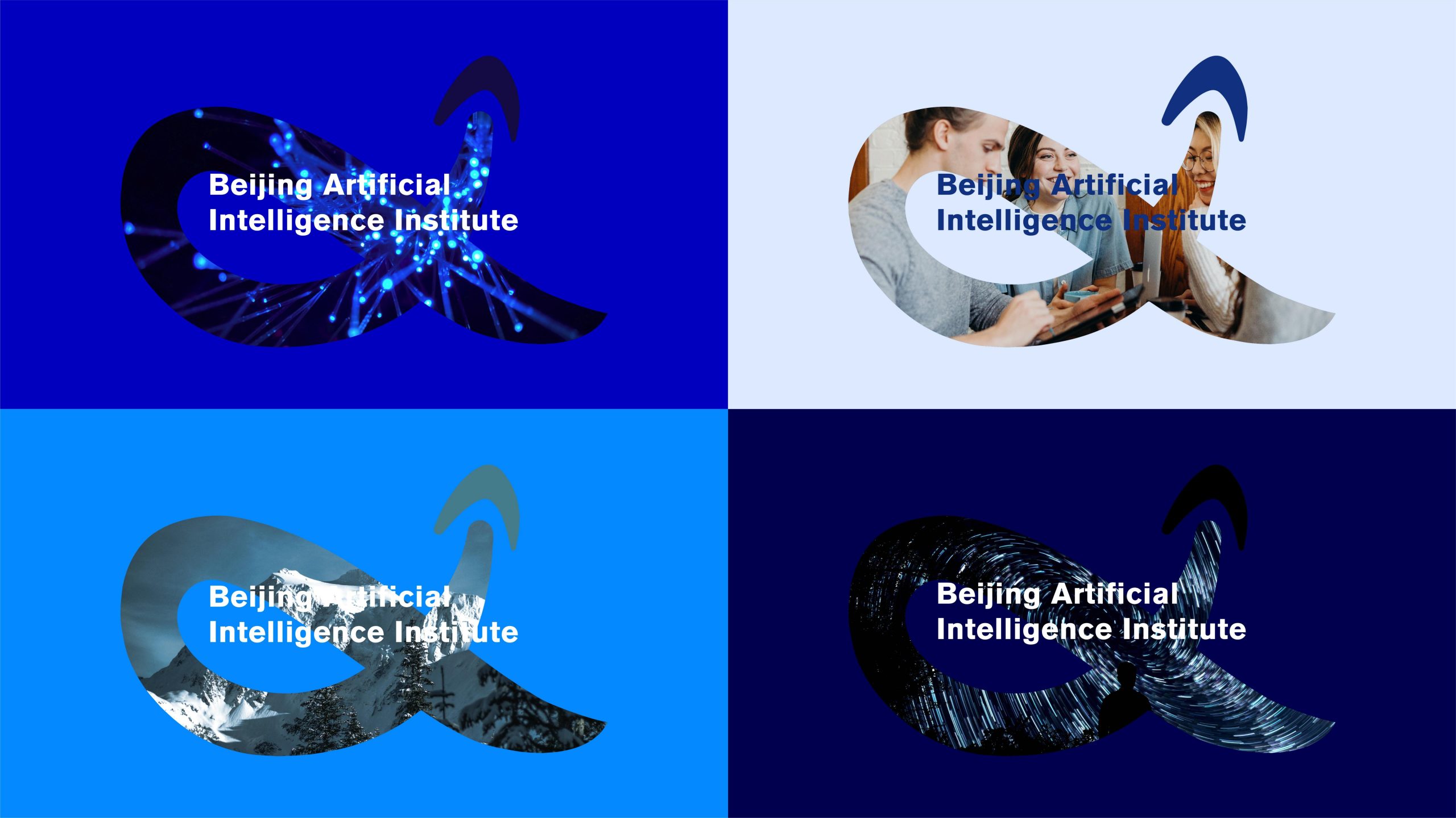
Core form: A continuous curve creates a closed yet open circular structure, symbolizing AI's self-optimization and logical loop; Spatial logic: Lines rotate and intersect in three-dimensional space, creating visual tension between 'data ring' and 'thinking ribbon'; Directional momentum: The upward terminal stroke signifies 'technology for good, wisdom ascending'; Negative space breathing: The central void creates dynamic balance, embodying the coexistence of scientific rationality and human warmth.
Fonts and composition
The English name is set in a modern sans-serif with balanced weight and steady strokes, conveying professionalism and a technological edge. A vertically centered lockup reinforces the authority of a research institution and its alignment with international standards. The type shares the blue of the symbol, keeping the system visually coherent.
color system
Primary Intelligent Blue #1A56D1: technology, reason and trust. Secondary Deep Blue #091C6D: deep learning and scientific exploration. Gradient #00AEEF → #1A56D1 → #091C6D: layered depth that evokes a flow of intelligent energy. Highlight White #FFFFFF: innovative insight and the purity of knowledge. Together, the palette conveys a brand that is calm, intelligent and forward-looking.
Application and extension
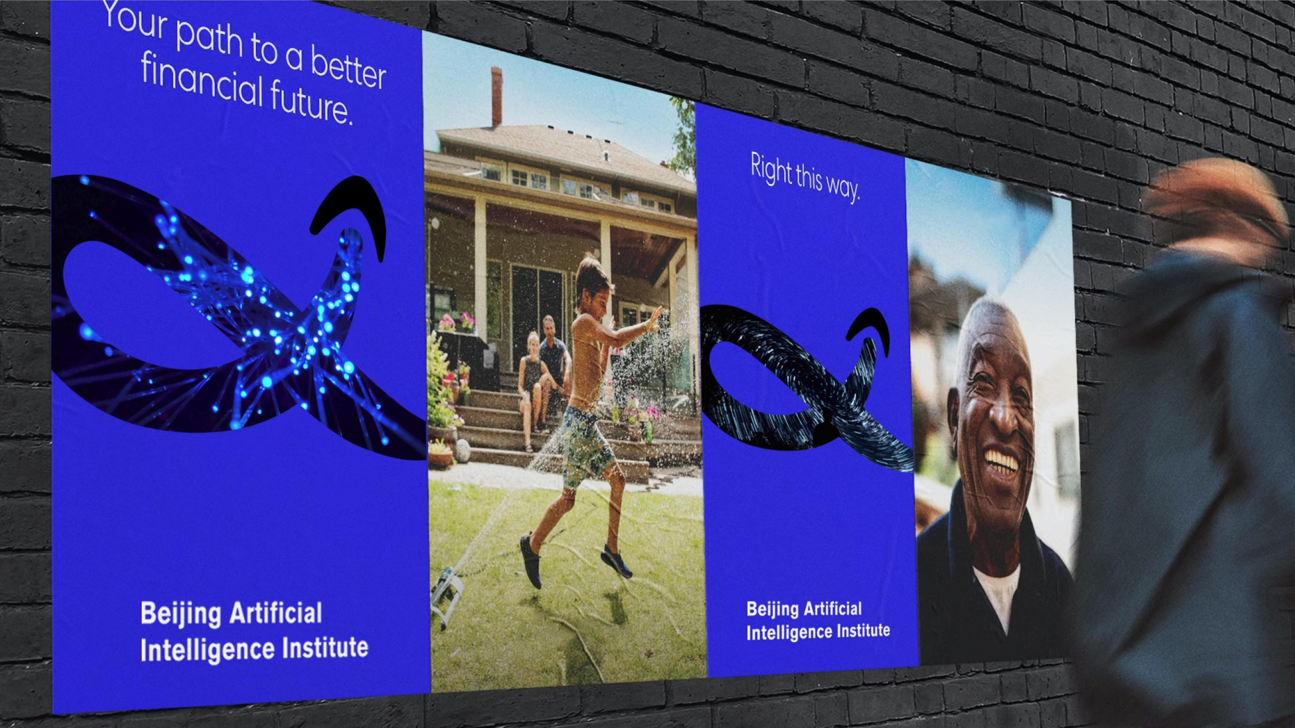
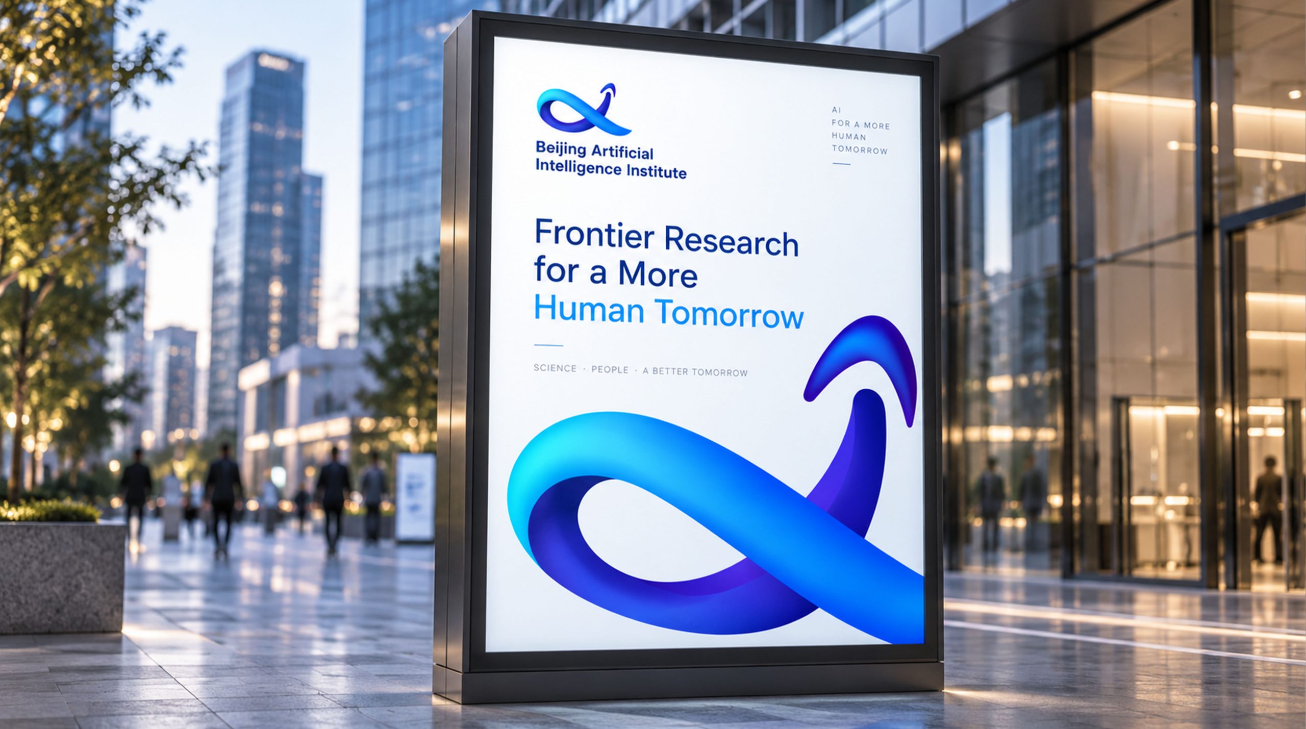
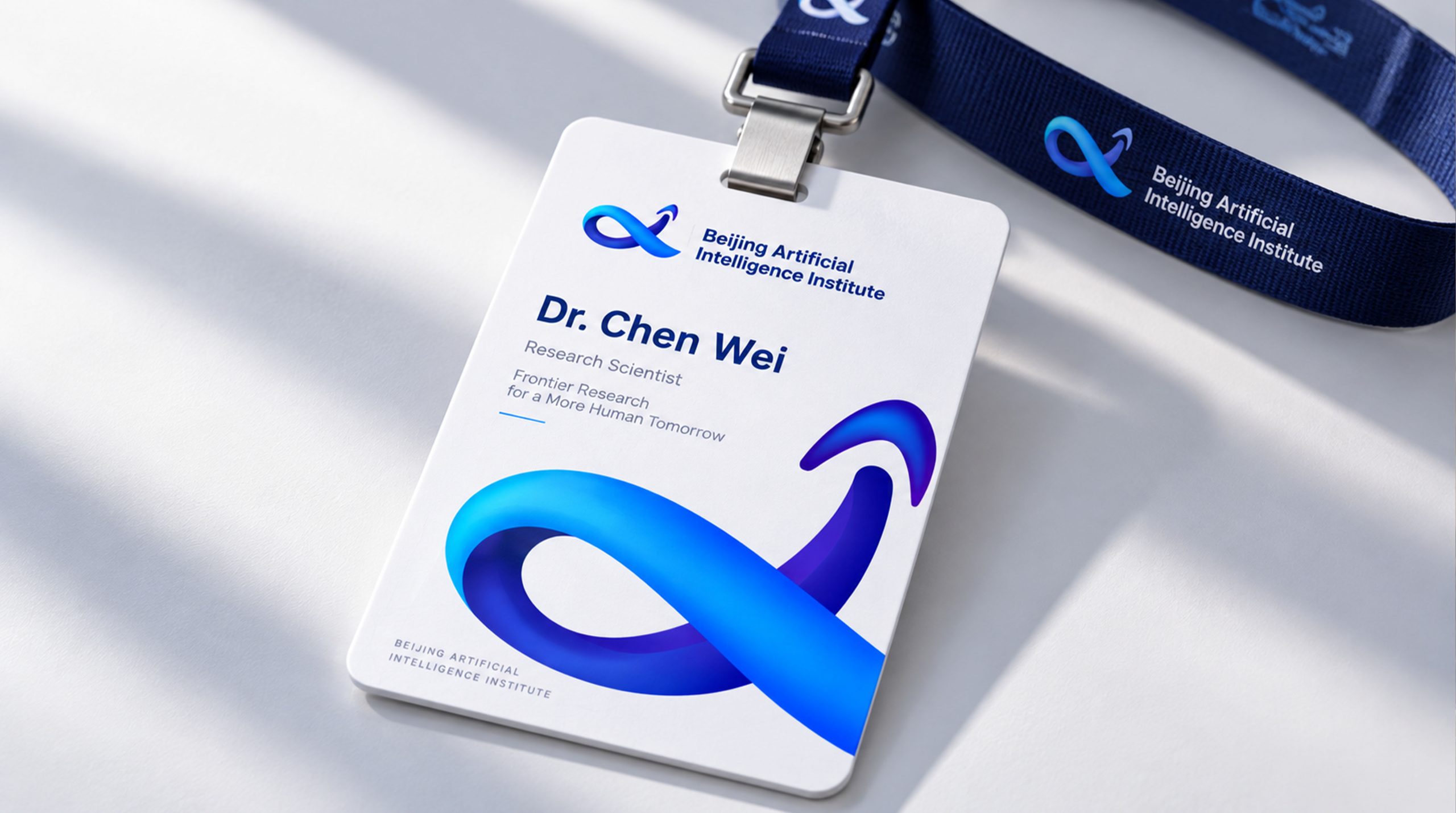
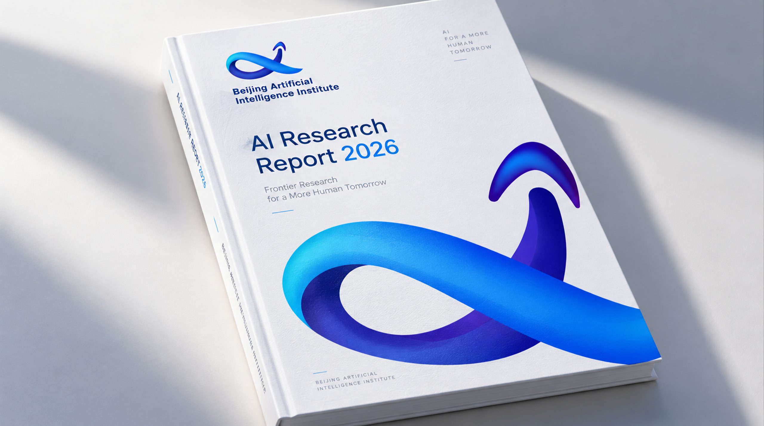
In research and technology-exhibition settings, the mark delivers strong recognition and a distinctly technological presence. Institutional: report covers, academic publications, conference systems and research-project identifiers. Technology: a unified brand presence across lab equipment, AI chips and algorithm-demo interfaces. Digital: the 3D loop extends into motion, visualizing intelligent algorithms in flow and data that iterates on itself. Wayfinding: rendered in illuminated materials at entrances and exhibition areas to create a futuristic spatial context.
brand meaning
Through the image of an infinite loop, the mark conveys three principles of AI research. Continuous evolution: the closed loop of algorithms that constantly optimize themselves. Integration and symbiosis: the interweaving of cross-disciplinary technology and the humanities. Upward breakthrough: the exploratory, innovative spirit of science. More than a visual symbol, it is a philosophical statement about AI research that presents intelligence as a force of thought driving human progress.
Improper Usage (Protection Specification)
Do not alter the proportions or rotational direction of the loop. Do not change the gradient direction or add drop shadows. Do not separate the curves from the points of light. Recommended minimum width: 35 mm.
design results
Since the launch, the Beijing Artificial Intelligence Institute’s “Ring of Intelligence” has gained wide recognition across academia and the tech sector. Its visual system of technological rigor × intelligent energy × international aesthetics has become a benchmark for branding AI research institutions in China. The project reflects Qingmei Future’s mature exploration of AI, research-institution branding and design rooted in the philosophy of technology. It uses “the logic of form” and “the flow of thought” to create a visual emblem for the AI era.