










Dongzhimen 8 is located in the heart of Beijing, an urban complex integrating high-end commercial office space, city apartments, and art exhibition venues.
The brand image must balance metropolitan sophistication with Eastern sensibility to reflect the cultural depth and modern taste of this Beijing landmark.
The design objective is to establish a premium brand identity system with international communication power, architectural artistry, and Eastern aesthetic refinement.
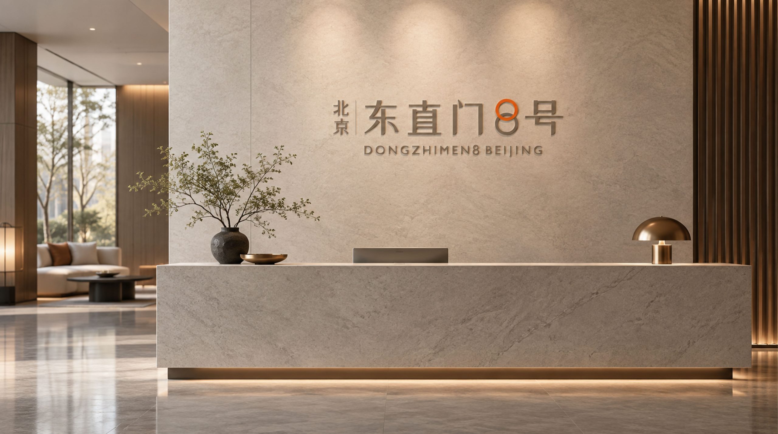
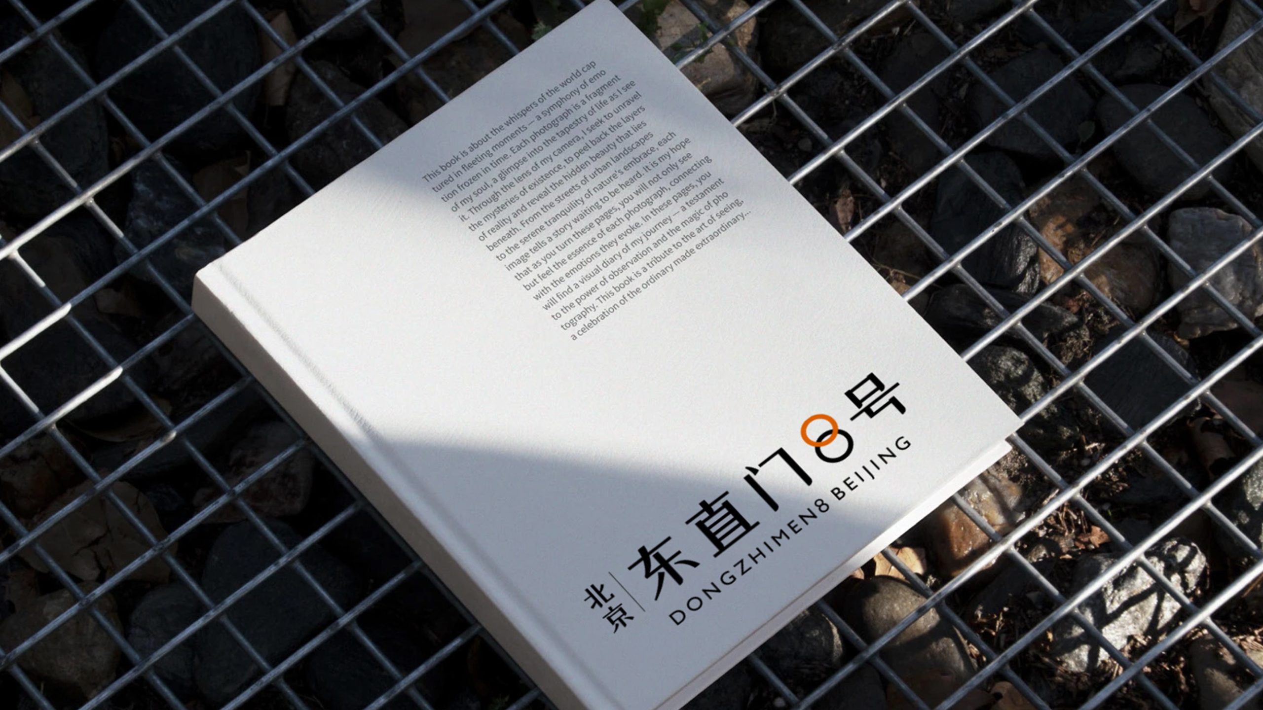
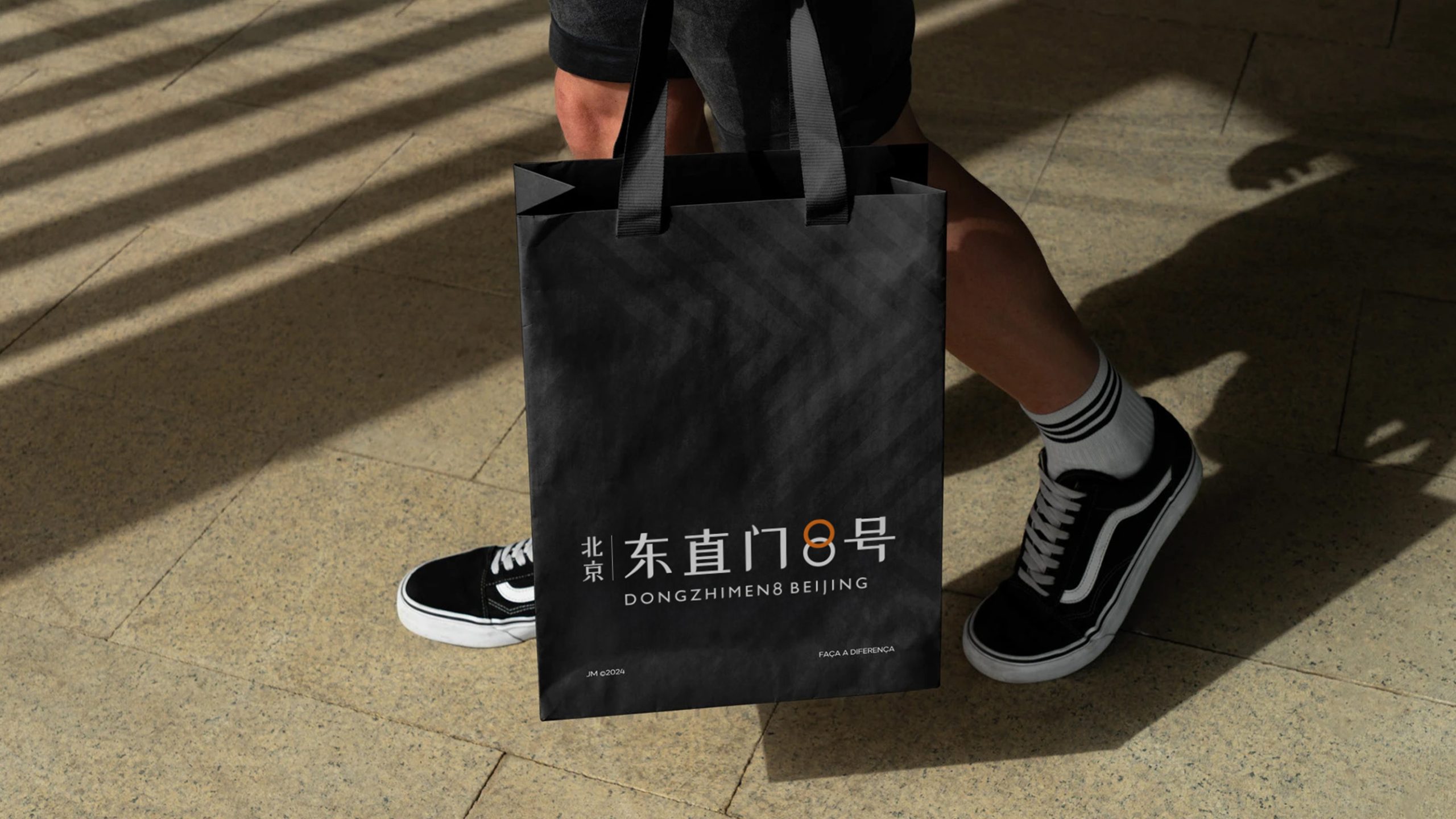
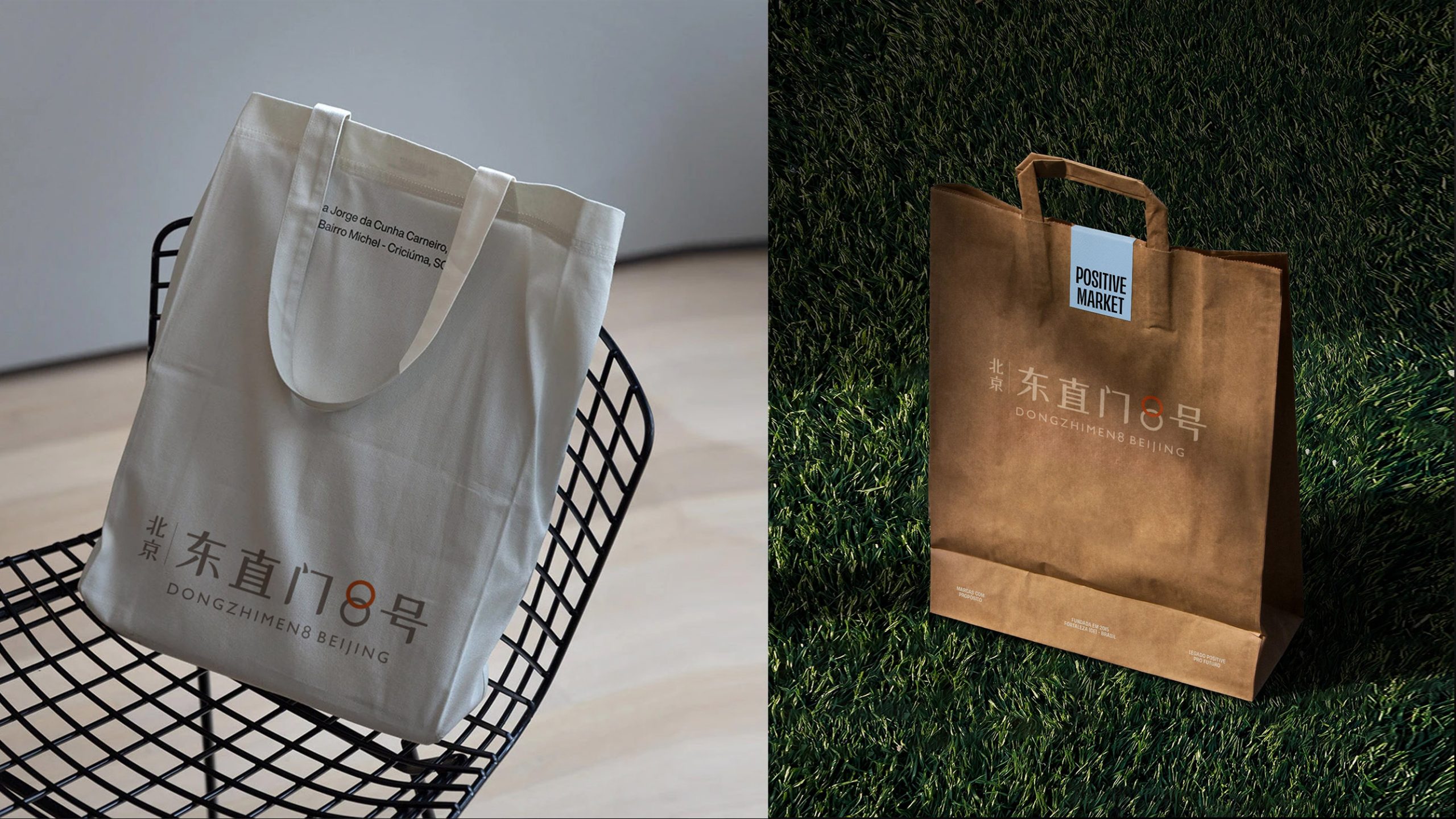
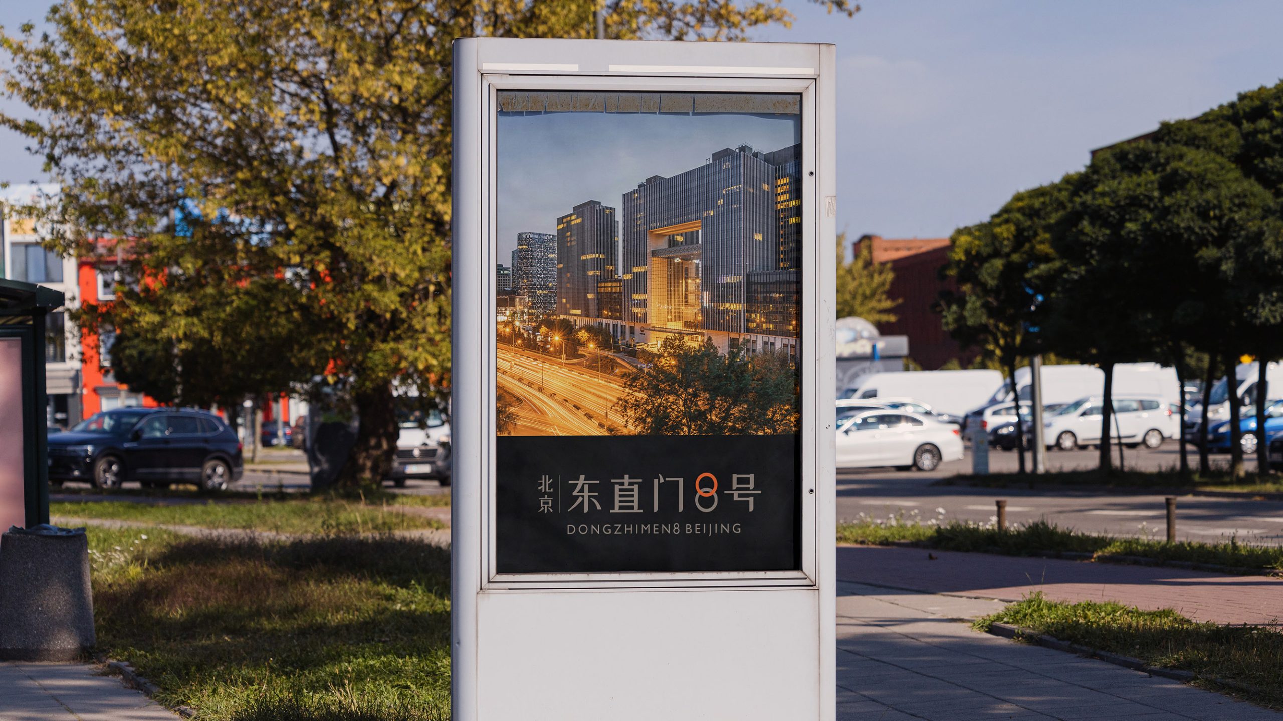
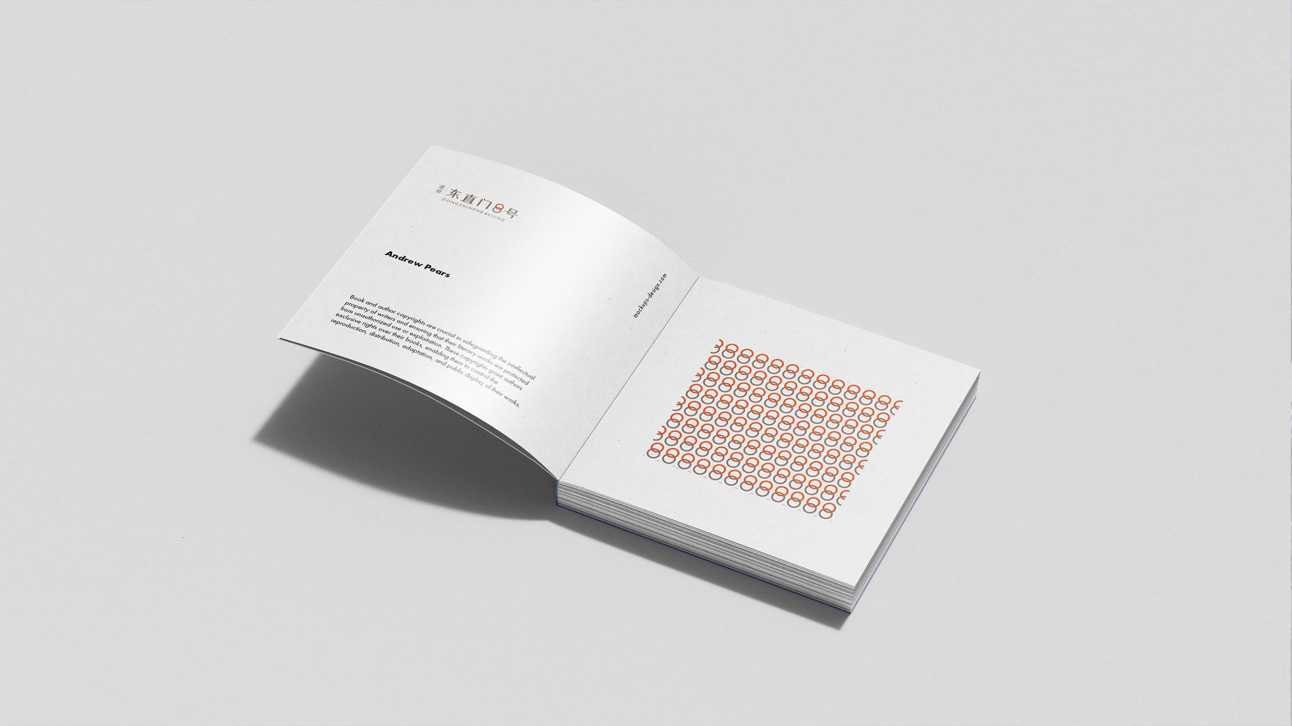
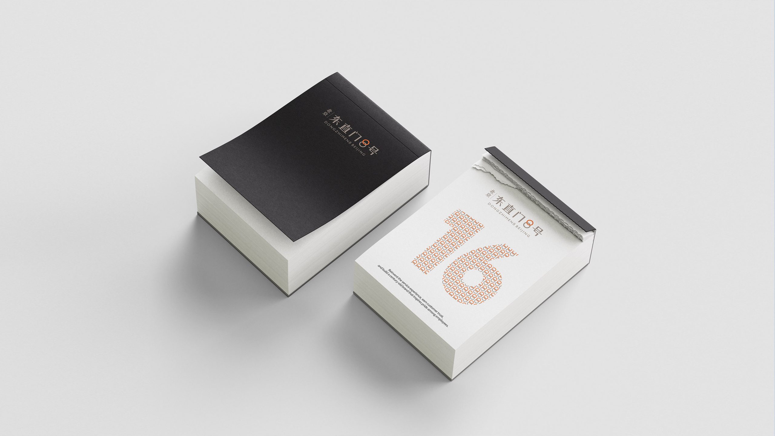
design concept
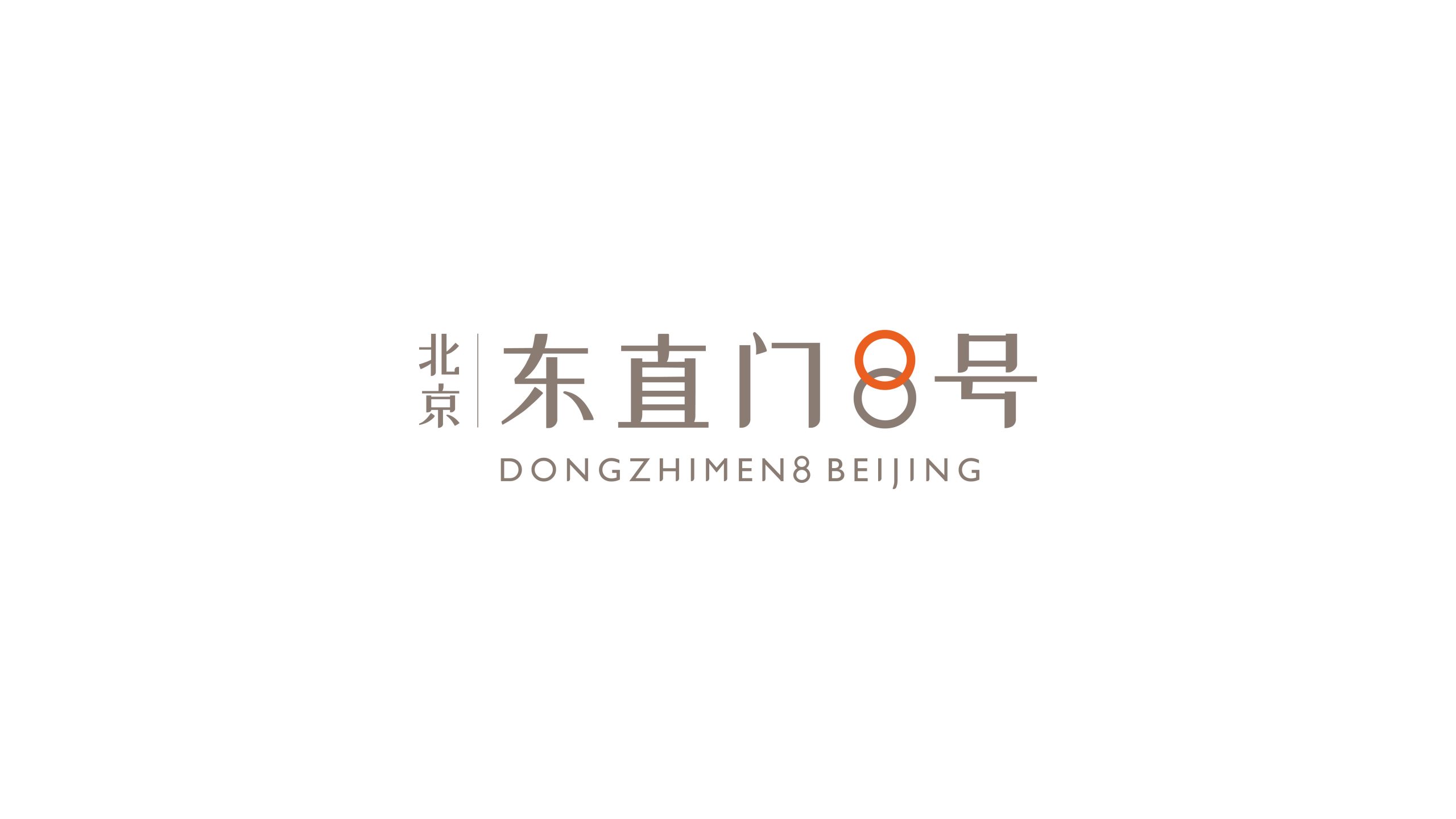
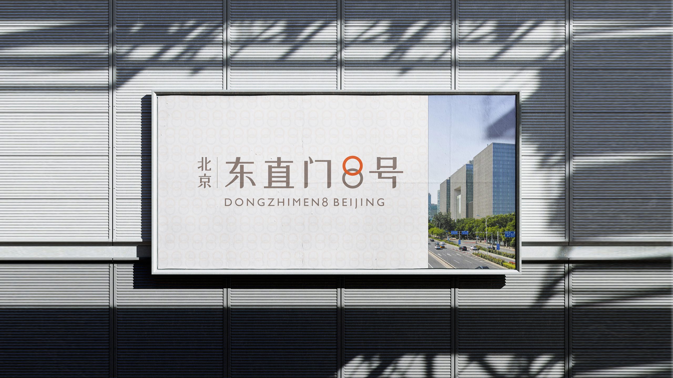
The logo positions 'Dongzhimen 8' as the visual core, fusing the linear qualities of architectural facades with the geometric order of the numeral '8.' The figure '8' symbolizes the traditional Chinese concepts of 'auspiciousness, completeness, infinite extension,' while also signifying a geographic and spiritual epicenter. The orange '8' is integrated into the overall composition with graceful linework, balancing traditional culture with modern minimalist aesthetics, expressing the brand spirit of 'urban axis · artistic living.' The core design concept: 'A coordinate connecting Eastern culture and modern life.'
graphic language
Numeral 8: symbolizes auspiciousness and eternal circulation, representing the project's premium value and lifestyle taste; Eastern typographic structure: upright strokes and balanced proportions embody an architecture-like sense of order; orange circular form: symbolizes warmth, vitality, and urban life force, becoming the brand's visual focal point; bilingual integration: clean overall composition with ample negative space, presenting an internationalized spatial quality.
Fonts and composition
The logo typeface employs a customized hybrid of geometric sans-serif and Song-style elements: Chinese components carry calligraphic rhythm and architectural vertical structure; English 'DONGZHIMEN8 BEIJING' is rendered in ultra-light weight to enhance modernity; the '8' is differentiated by independent color, serving as both visual focus and cultural symbol; overall composition emphasizes symmetry, negative space, and graceful proportion, aligning with the visual logic of premium real estate and urban landmarks.
color system
Primary: Refined Gray (#B1A79B)—represents architectural stone texture and urban composure; accent: Eastern Orange (#E16A2A)—symbolizes vitality and cultural warmth; supporting: Pure White (#FFFFFF)—reinforces spatial quality and minimalist atmosphere. The overall palette achieves balance between 'Eastern elegance' and 'modern minimalism,' providing an elegant and enduring visual identity system for premium commercial and residential spaces.
Application and extension
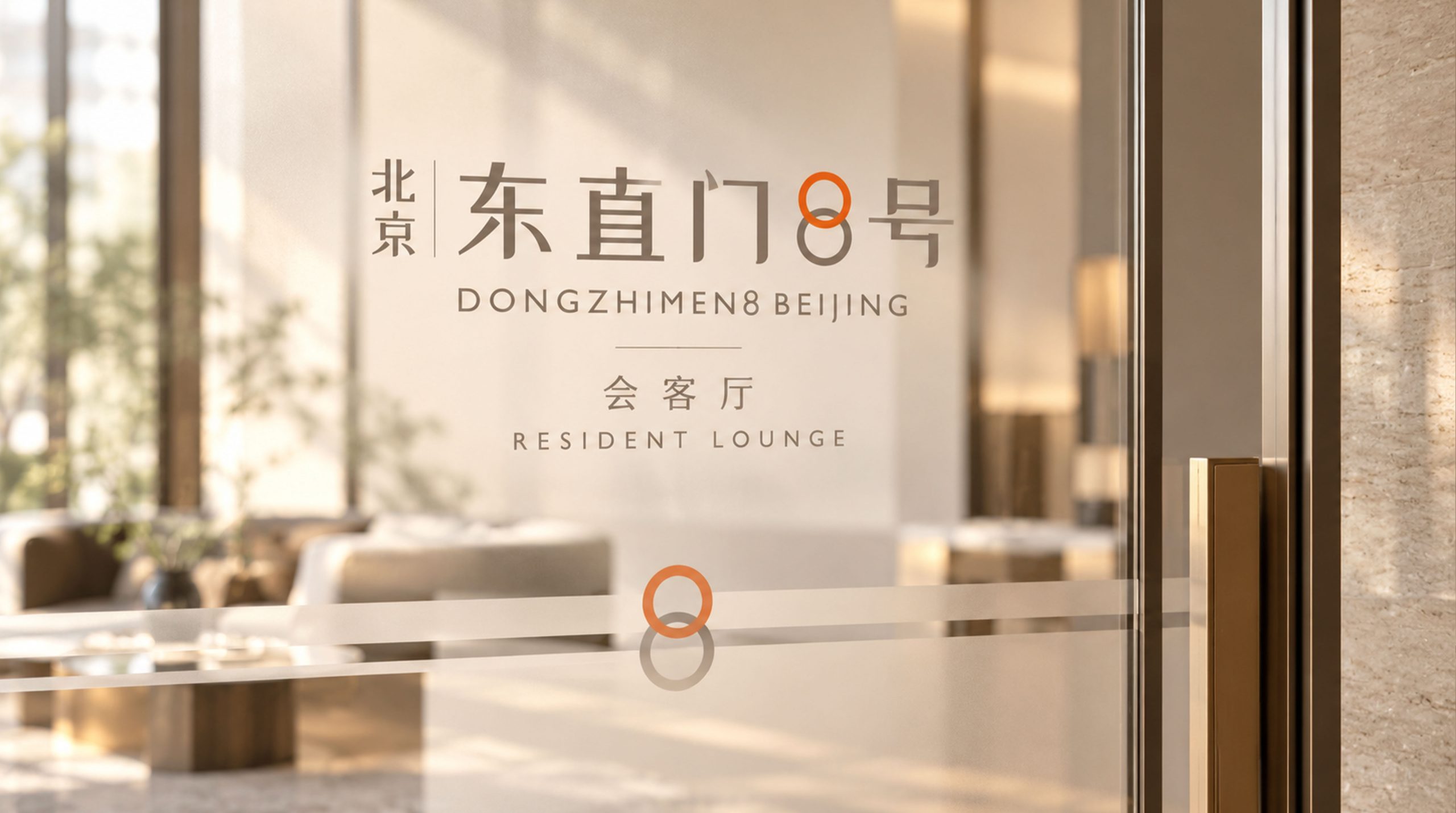
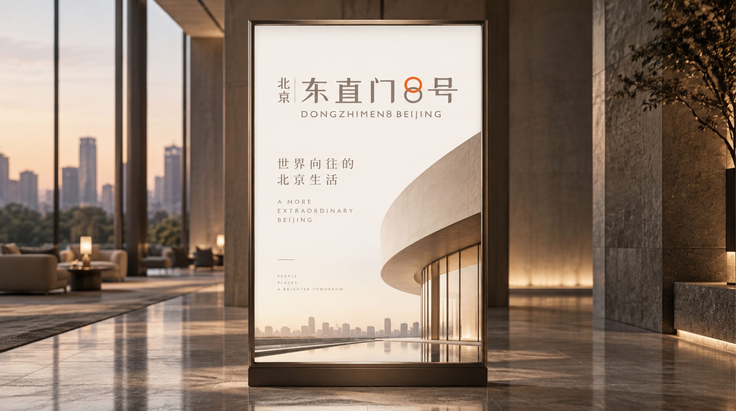
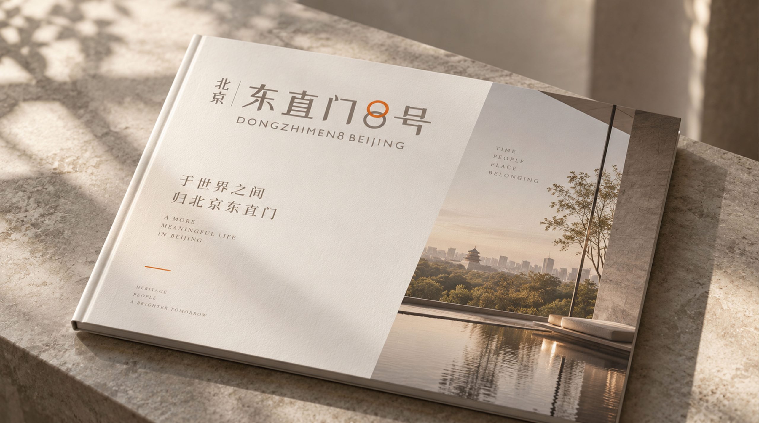
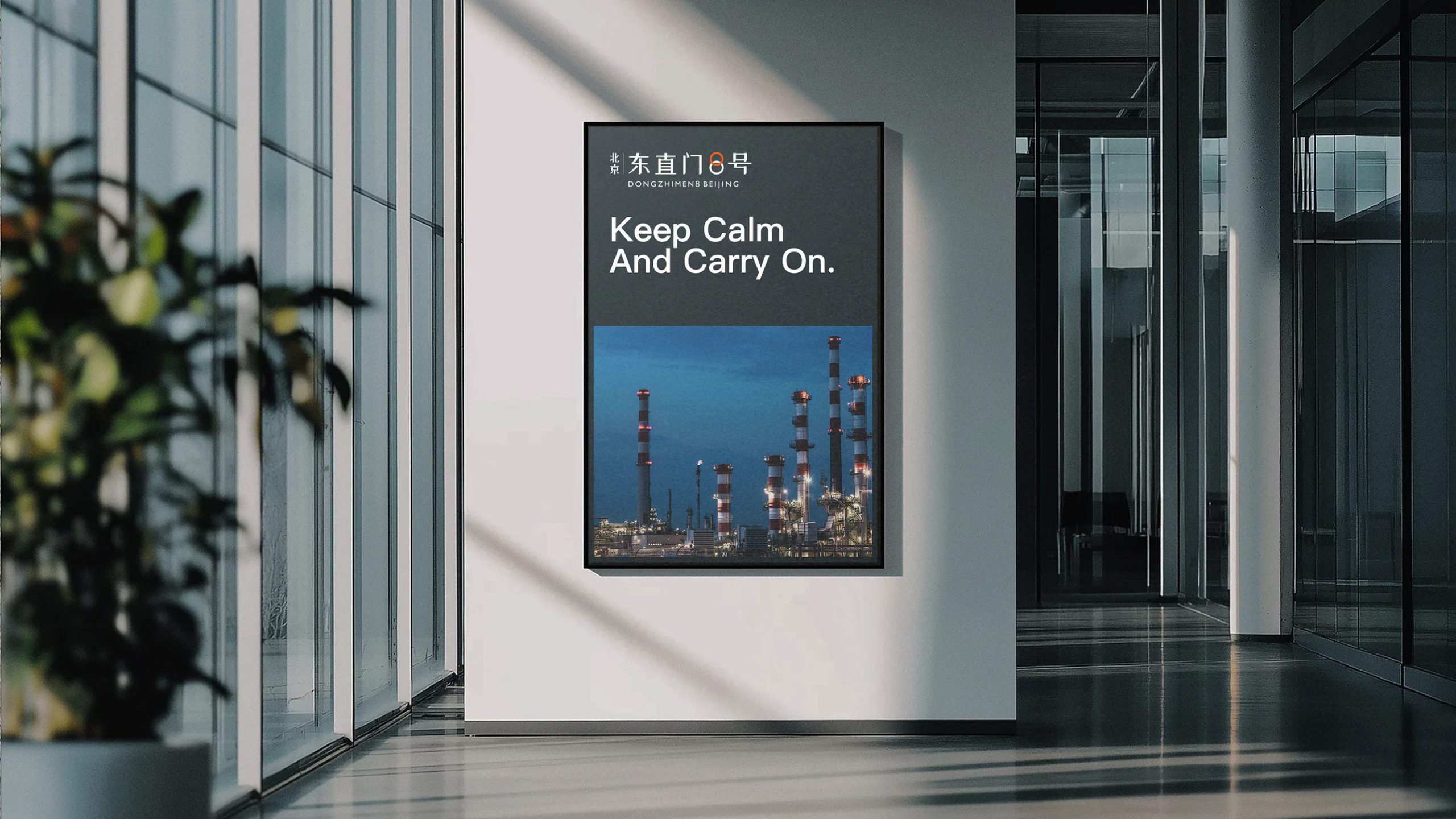
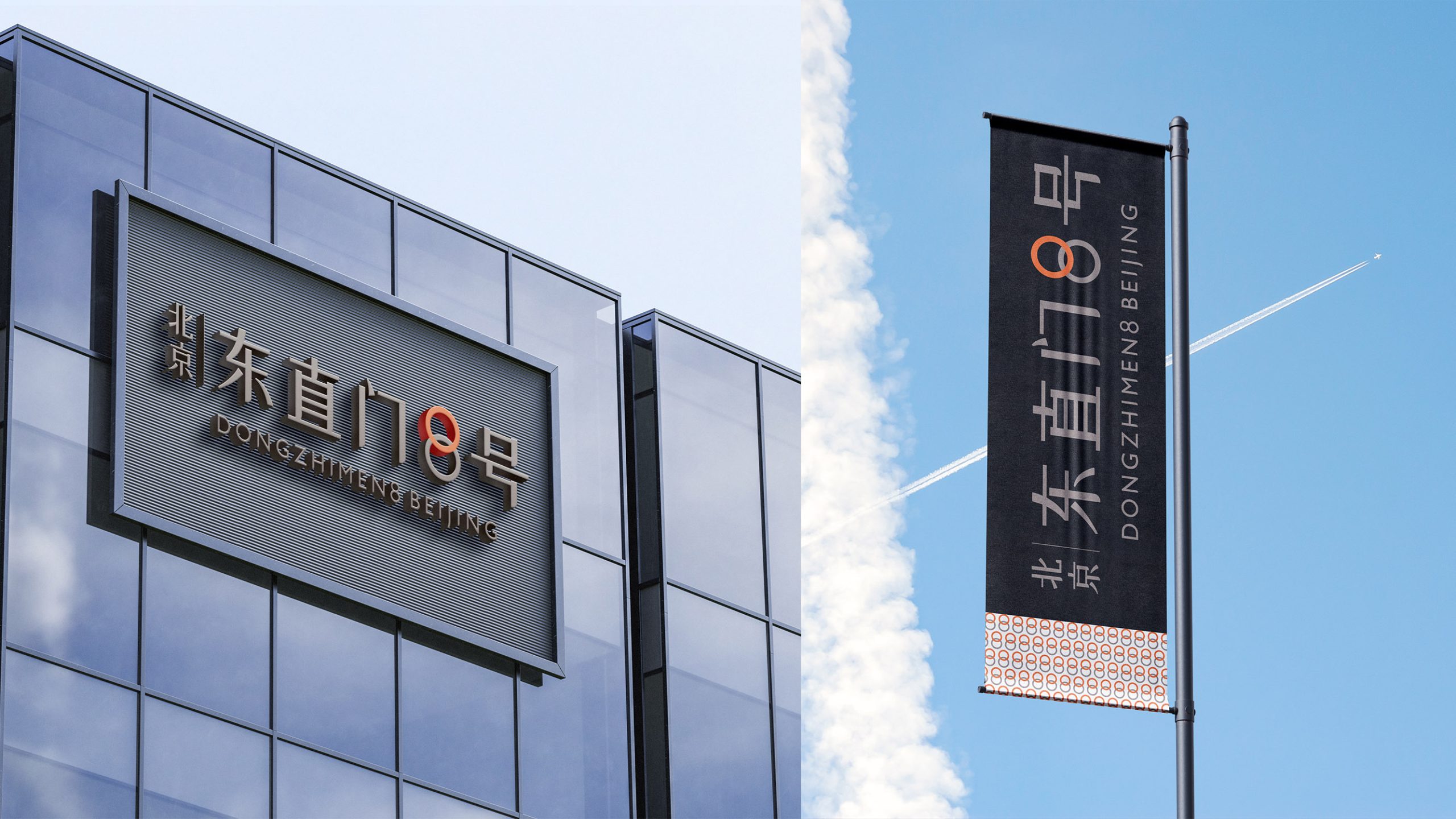
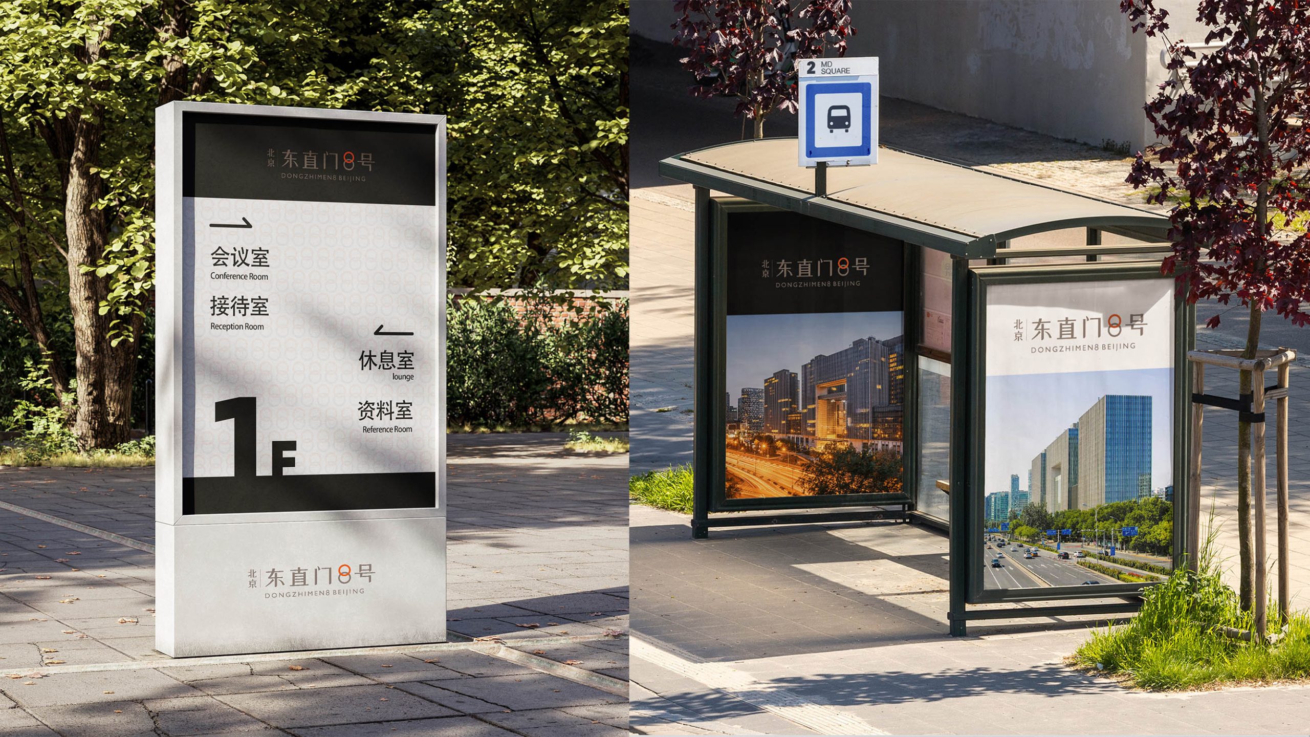
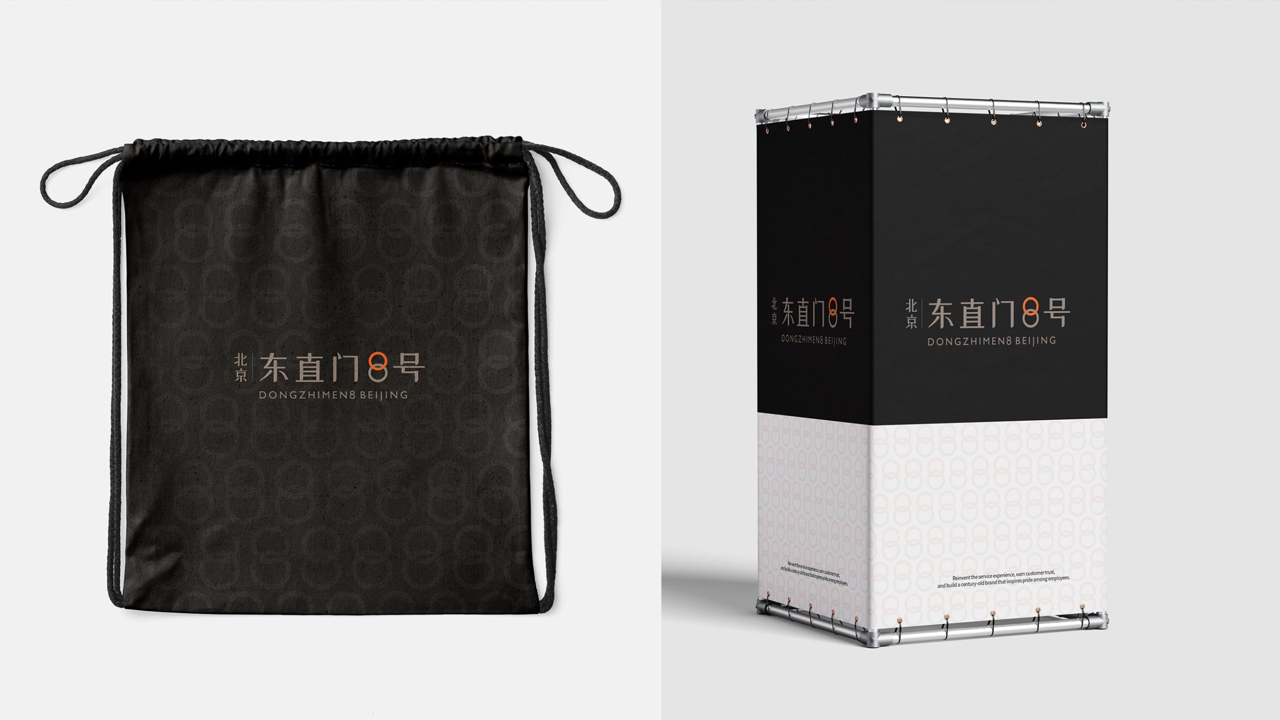
This logo system can be widely applied across: building facade and entrance wayfinding systems; real estate marketing brochures and property launch event key visuals; business cards, contract covers, invitations, exhibition lightboxes; interior signage, directional systems, art gallery nameplates; digital interfaces (website, video titles, interactive displays). In kinetic media, the '8' can rotate with luminosity, signifying 'prosperity in motion, life ever renewed.'
brand meaning
The Dongzhimen 8 logo embodies three core values: Cultural character—inheriting the auspicious meaning of the Eastern symbol '8'; spatial artistry—typographic structure as architectural facade, revealing order and taste; international perspective—bilingual juxtaposition reinforcing global metropolitan recognition. The overall visual identity carries emotional warmth through rational order, projecting the project's premium image as a 'Beijing urban cultural landmark.'
Improper Usage (Protection Specification)
Do not alter the color value or proportion of the orange '8'; do not adjust bilingual positioning or spacing; do not apply shadows, gradients, or background interference to the graphic; maintain logo clearance of at least 20% of logo height; minimum usage width: print 30mm / digital 120px.
design results
Following its launch, the new logo has been widely applied in real estate marketing and spatial wayfinding systems, earning unanimous praise for its understated, refined, culturally resonant design language. This design was completed by Qingmei Future as a comprehensive visual system development, standing as an exemplar of 'premium urban complex identity aesthetics.'