










One of the core ecological legacies of the 2008 Olympic Games, Beijing Olympic Forest Park is a landmark urban park that brings together natural ecology, sporting culture and public leisure.
The identity carries the Olympic spirit forward, using a modern visual language to express an ecological philosophy of green, harmony and coexistence, and extending the legacy of the “Green Olympics” through Beijing’s city image and international communications.


design concept
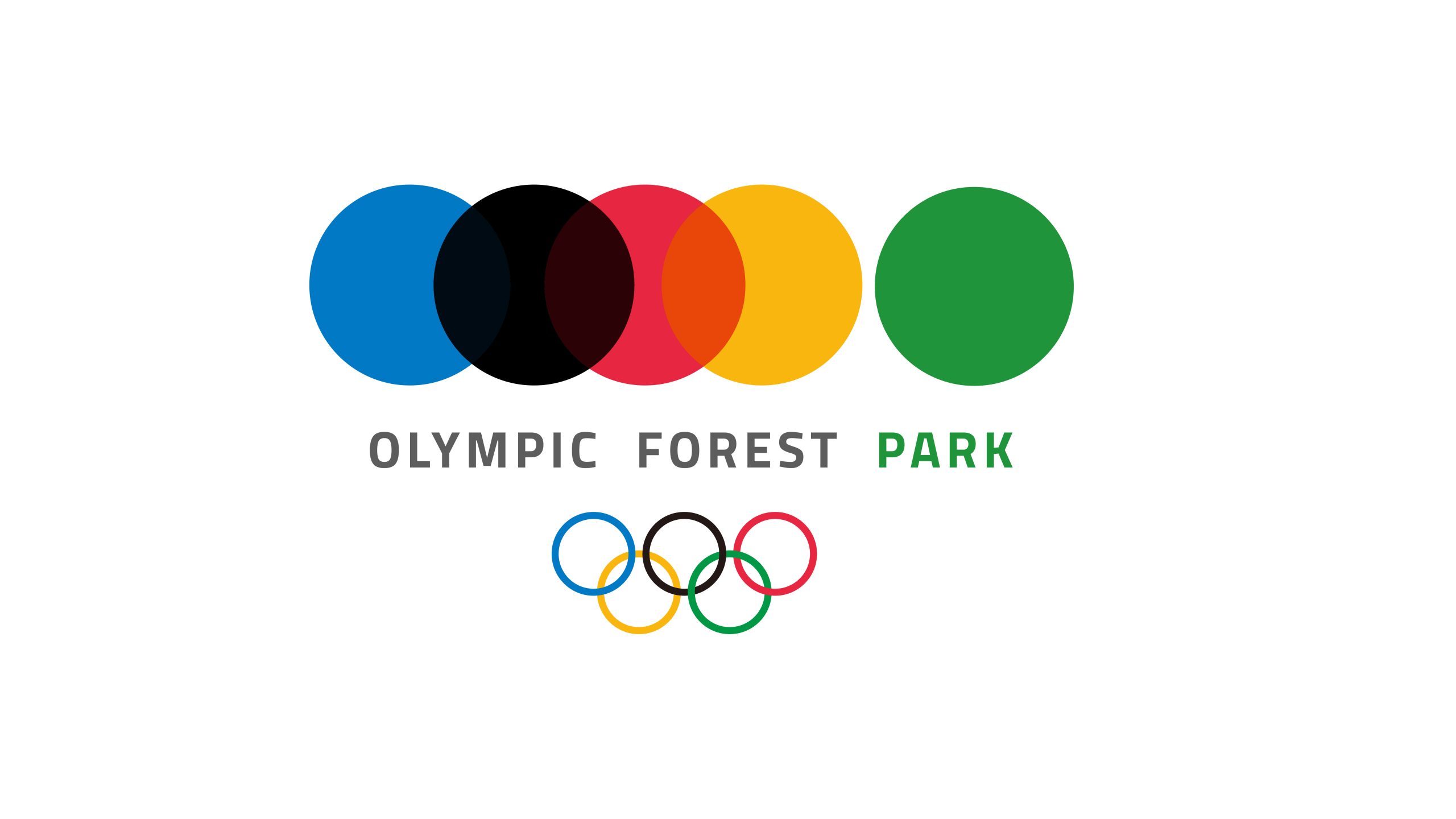
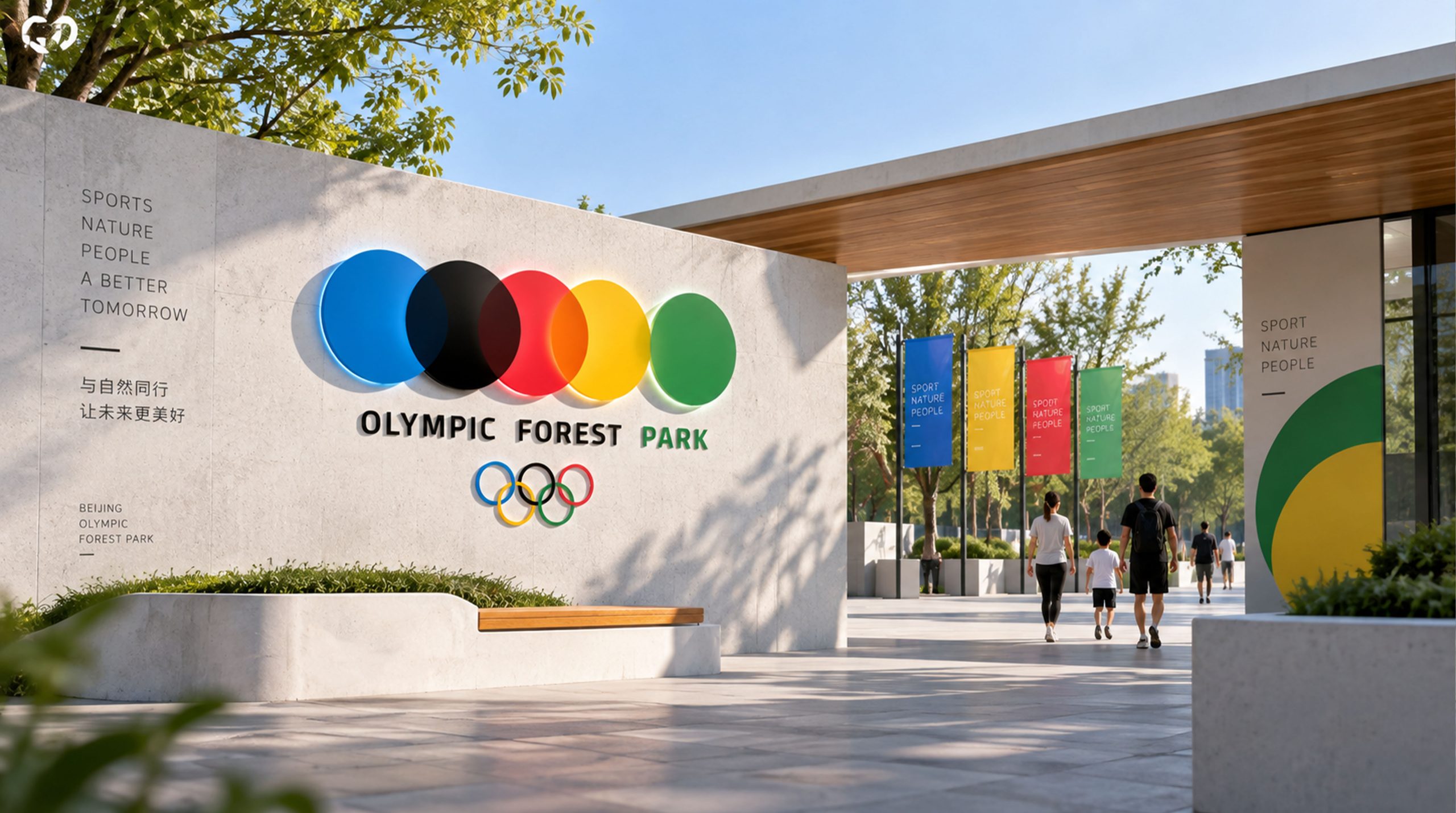
The mark is composed of five dots inspired by the five colors of the Olympic rings. Merging and overlapping, they symbolize ecological coexistence and the meeting of diverse cultures. The fifth, green dot stands for life and forest, and for the park’s role as the city’s “green lung.” The composition marks a shift from competition to coexistence: the Olympic spirit living on in nature and renewed in the forest.
graphic language
Five dots: based on the Olympic colors of blue, black, red, yellow and green, representing the five continents and the unity of humankind; Overlapping transparency: symbolizes ecological integration and urban coexistence, creating natural color transitions; Green final dot: the “heart of the forest,” signifying sustainable ecological development; Circular form: unified, whole and inclusive, echoing the cyclical relationship between nature and people. The result is a simple yet richly layered ecological symbol, expressing the balance of environment and culture as a “natural spectrum.”
Fonts and composition
The English wordmark is set in a custom sans serif with clean lines and balanced proportions, with FOREST in light gray and PARK in green to strengthen thematic recognition. The Olympic rings sit beneath the type, creating a vertical visual order: the circles above symbolize ecology; the rings below symbolize the Olympics; together they form a dual symbol of sport and nature.
color system
The brand palette carries forward the colors of the Olympic rings, with adjusted saturation to reflect the ecological theme: Blue (#0072CE) — sky and water; Black (#000000) — soil and the roots of life; Red (#E31937) — passion and cultural vitality; Yellow (#FFD200) — sunlight and hope; Green (#4BAA4F) — forest and life. Bright and balanced, the palette builds a layered “ecological spectrum.”
Application and extension
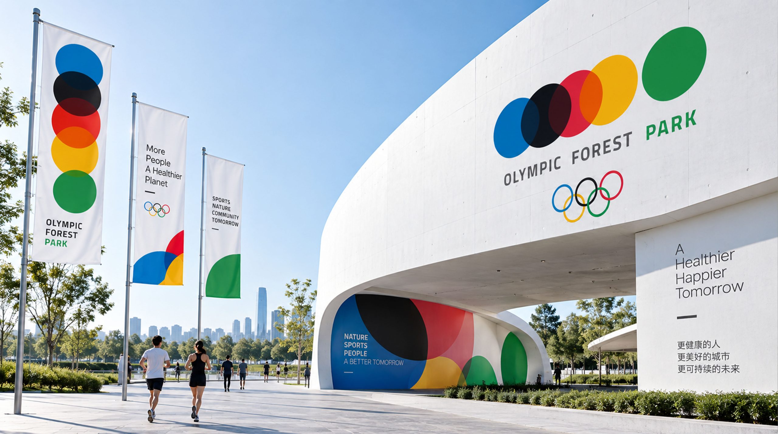
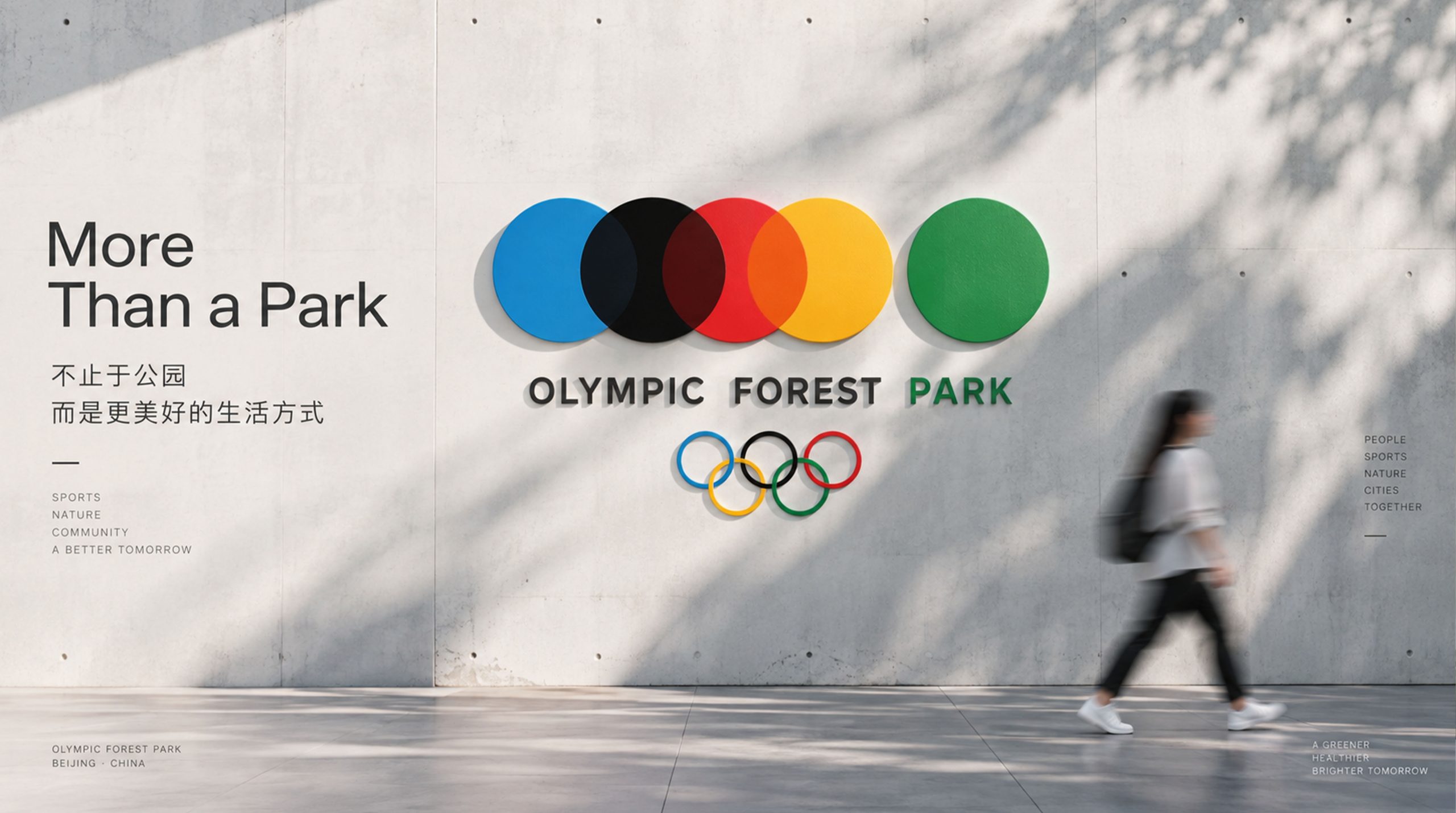
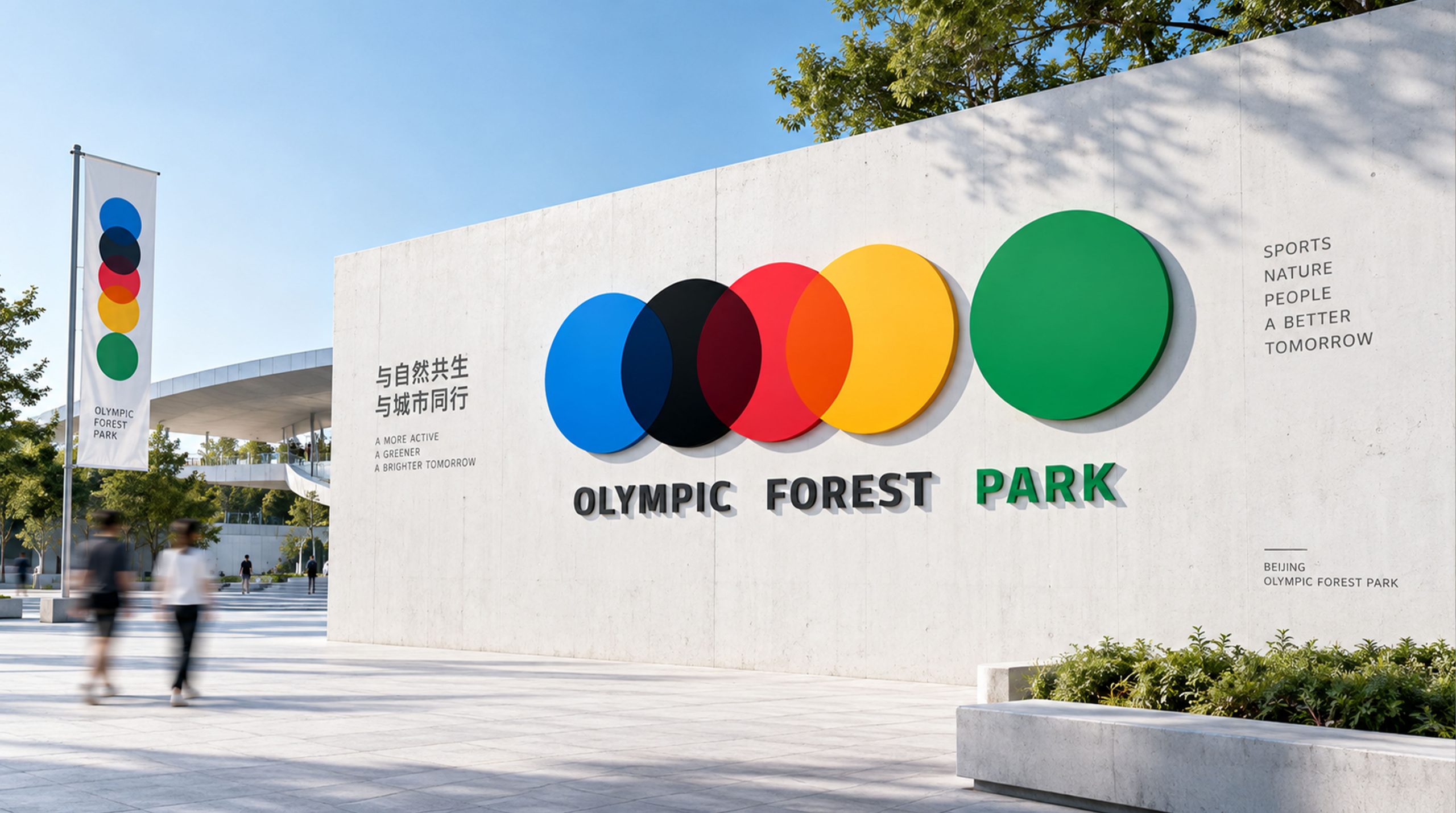
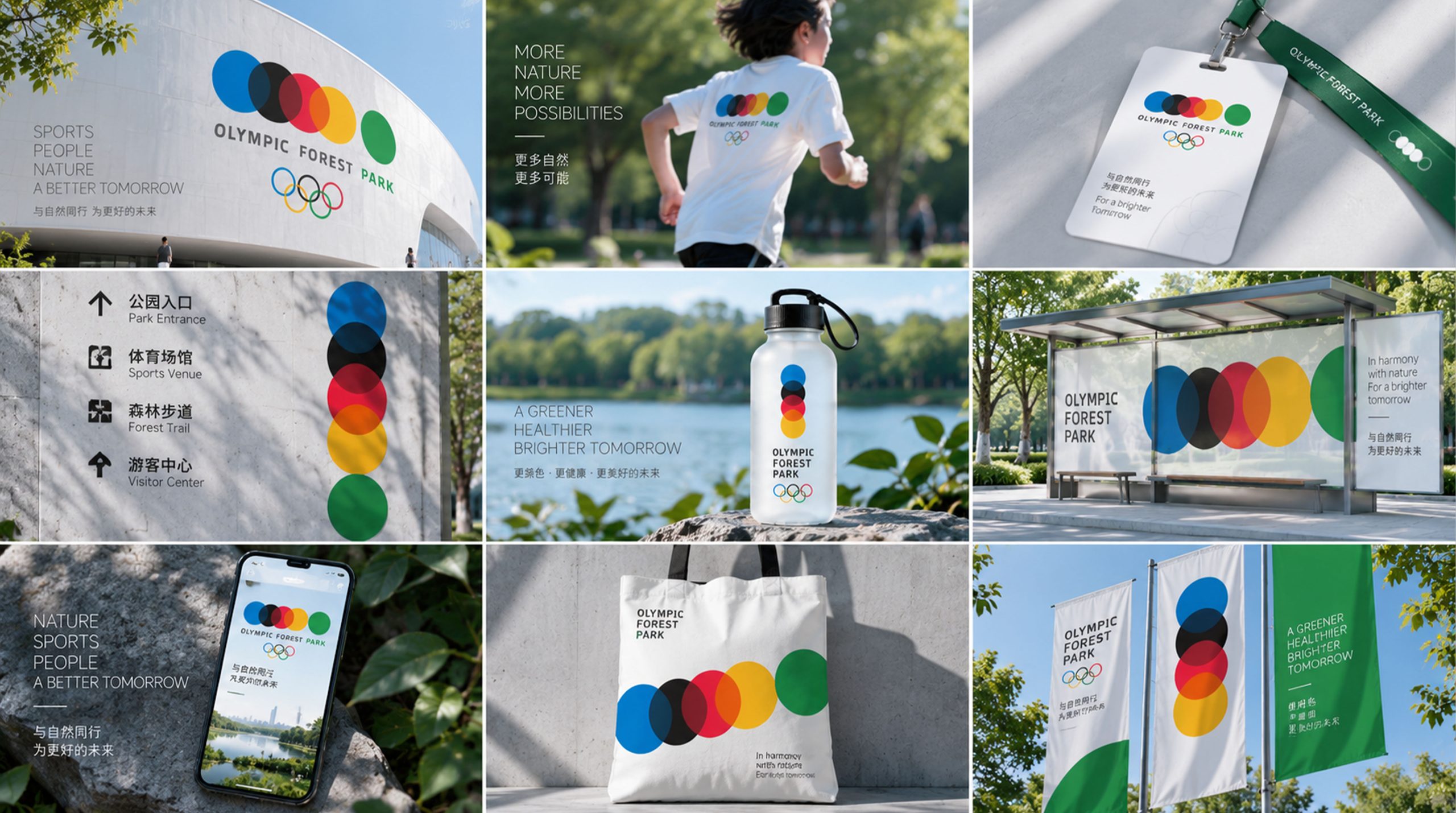
The mark is used across: park wayfinding, visitor maps and signage; merchandize (T-shirts, badges, postcards and cultural products); event key visuals (the Forest Marathon, nature education festivals and more); digital channels and cultural promotion projects. The overlapping dots extend into a dynamic visual module for interactive screens and digital guides, producing a “breathing” ecological animation.
brand meaning
The mark expresses three layers of brand meaning: Olympic Legacy — the Olympic spirit living on in the city’s ecology; Urban Nature — the integration of green ecology and public life; Cultural Symbol — a globally shared green ideal expressed through simple geometry. More than a visual identifier, the design is a cultural manifesto: “Let nature be the city’s most enduring Olympic spirit.”
Improper Usage (Protection Specification)
Do not alter the dot proportions or color order; do not adjust the transparency of the overlapping dots; do not remove the Olympic rings; do not add shadows, outlines or gradient backgrounds; maintain clear space ≥ 30% of the logo height; minimum print size: 28mm.
design results
Widely acclaimed within the industry, the mark has been described as “a model for the ecological reinterpretation of Olympic legacy identity.” By giving Olympic symbols new meaning, it remains in continuous use at international ecology conferences, in cultural tourism promotion and across the park’s official brand communications. Qingmei Future built the visual system and designed its application guidelines.