










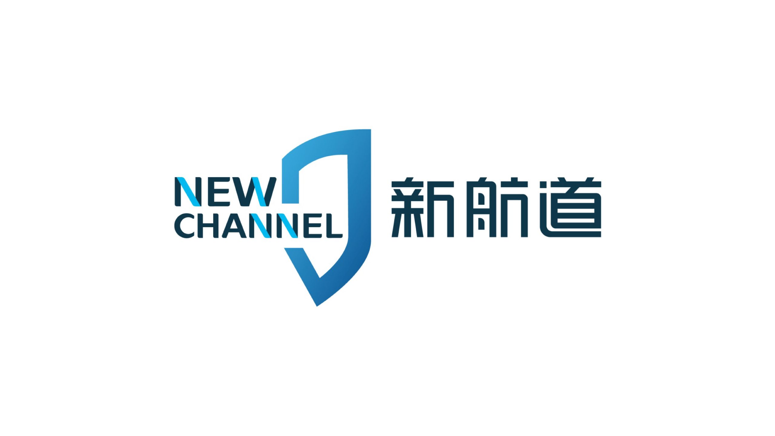
New Channel International Education Group is one of China's most influential international education brands, specializing in language training, study-abroad services and education technology innovation.
As part of a comprehensive brand upgrade, the goal was a visual system that conveys an international outlook, expertise and trust. Its visual language reinforces the brand vision of “guiding Chinese students to the world.”
design concept
The logo's core visual language combines a shield with the letter N, symbolizing New Channel's educational ethos of “guarding dreams and charting the future.” The shield stands for the power of knowledge and the security of learning, reflecting the rigor and authority of the education system. Its opening forms a fluid “channel curve,” a metaphor for the path students take through New Channel to the international stage. Layered shades of blue convey the modernity and depth of technology-driven education.
graphic language
Shield composition: guardianship, authority and trust in the education system. Abstracted N: a visual symbol of navigation and direction. Inset path lines: students' growth along their learning journey. Balanced composition: the bilingual lockup gives a rational, stable impression of an education brand. The overall form is clean and assured, with strong upward momentum.
Fonts and composition
The English NEW CHANNEL is set in a clean modern geometric sans-serif, reflecting the rigor and modernity of international education. The Chinese name is custom-drawn with uniform stroke weight and rounded corners, adding soft touches to a firm structure for cultural warmth. Text and symbol align to equal heights for visual balance and consistency across platforms.
color system
Primary Channel Blue #1C75BC: rationality, trust and knowledge. Secondary Deep Blue #003D73: reinforces a sense of technology and educational depth. Gradient Blue #4FA7E4 → #1C75BC: growth, exploration and the future. White background #FFFFFF: clarity and the purity of international education. The palette continues the brand's signature blue, conveying a professional, rational and inclusive international brand.
Application and extension
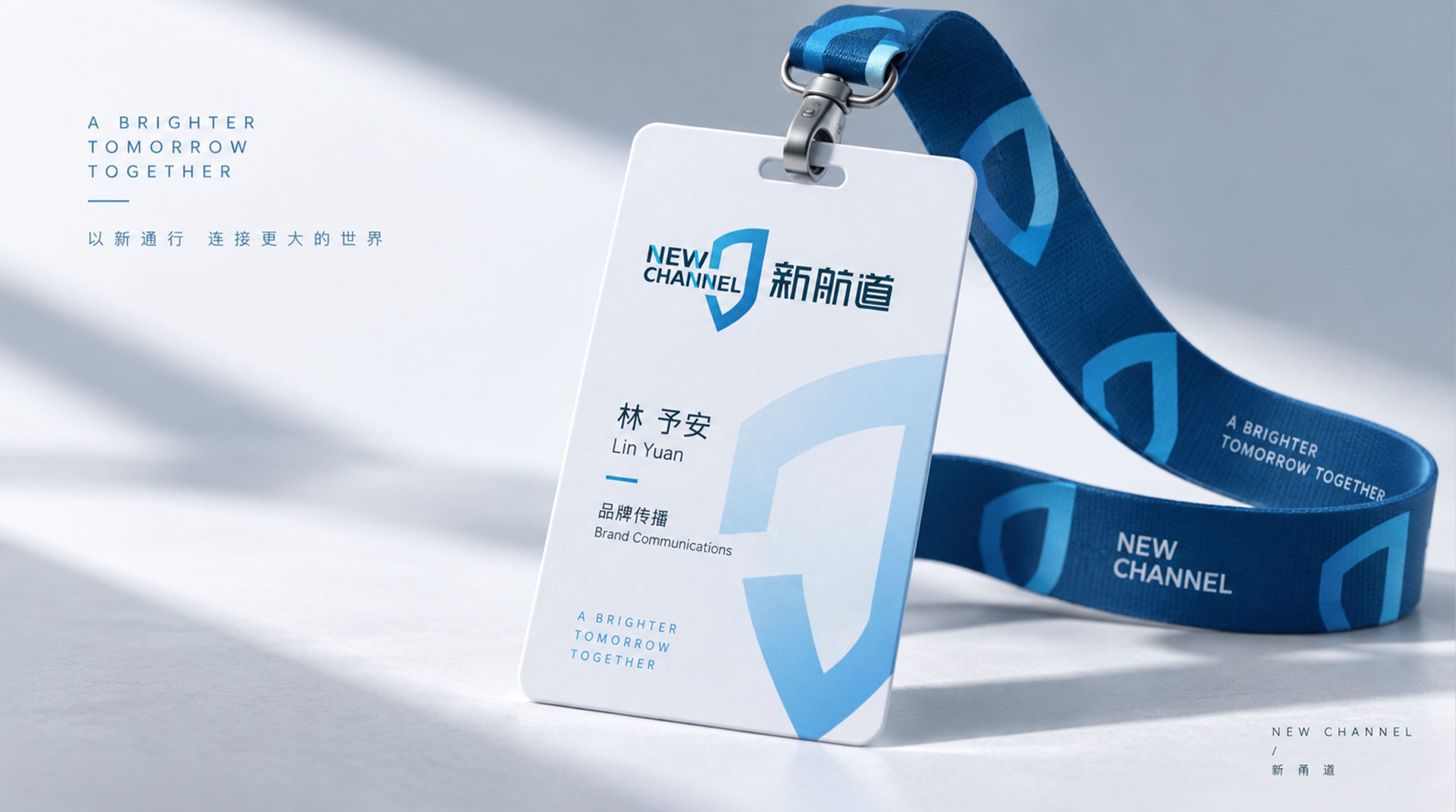
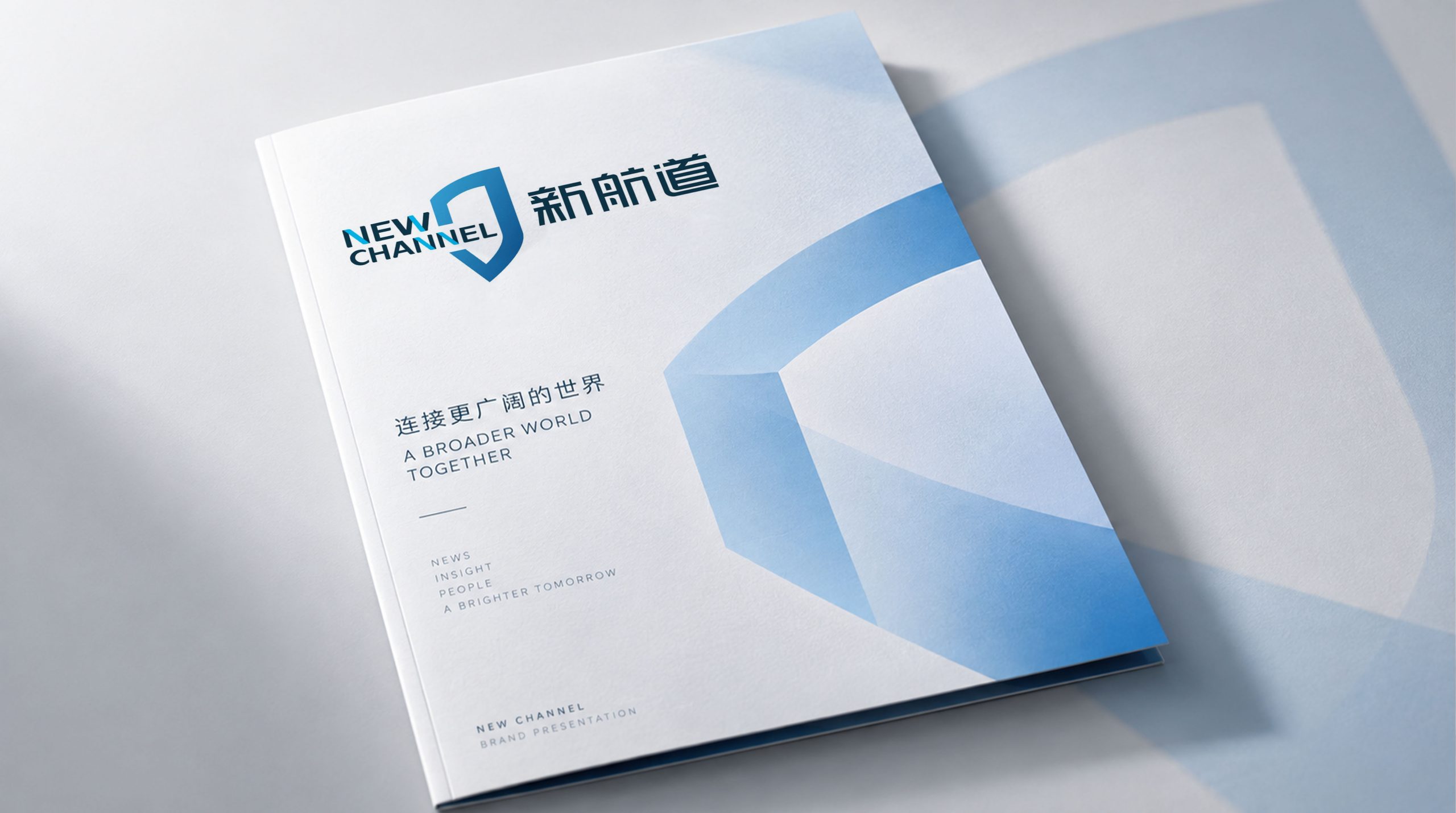
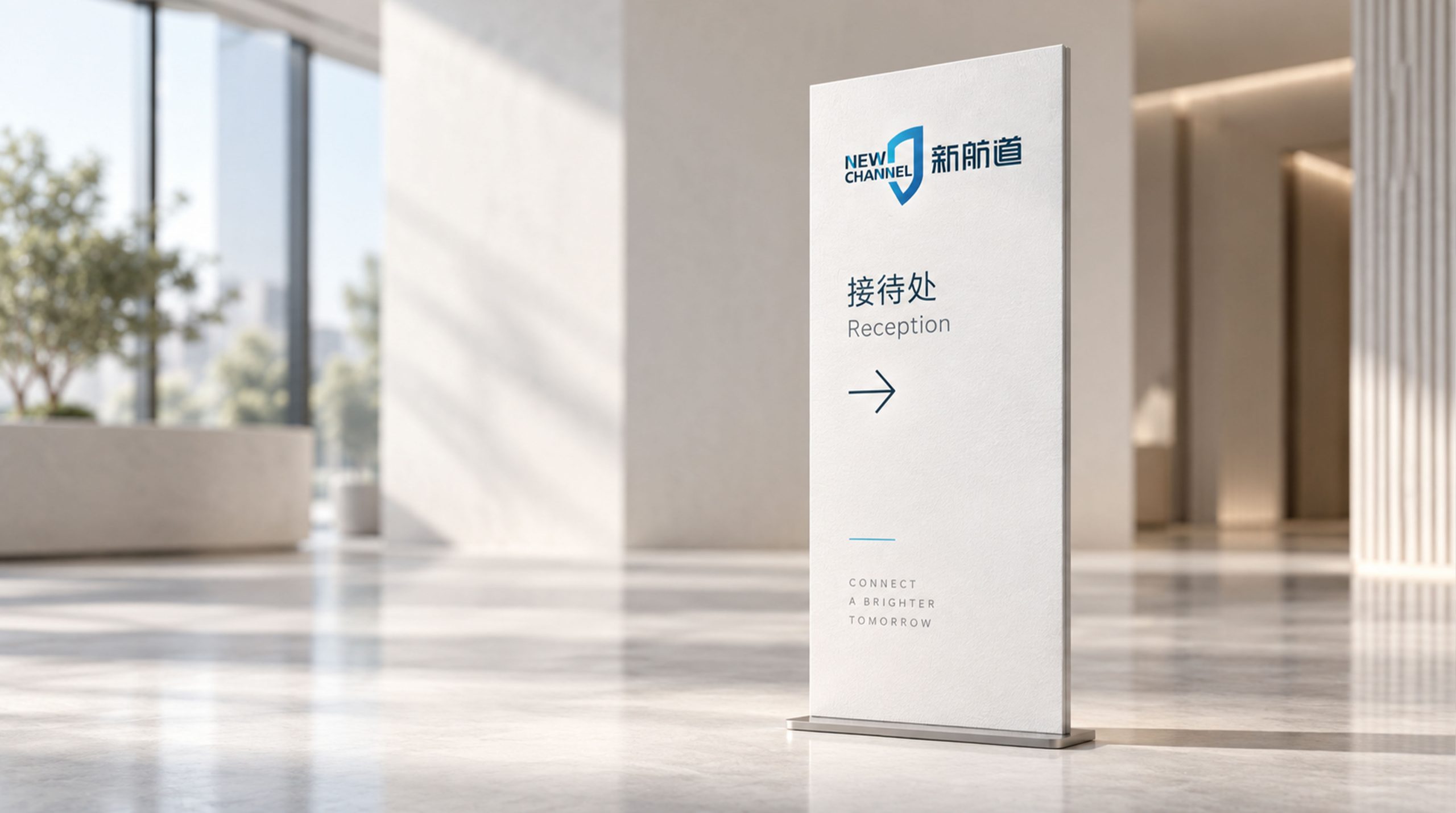
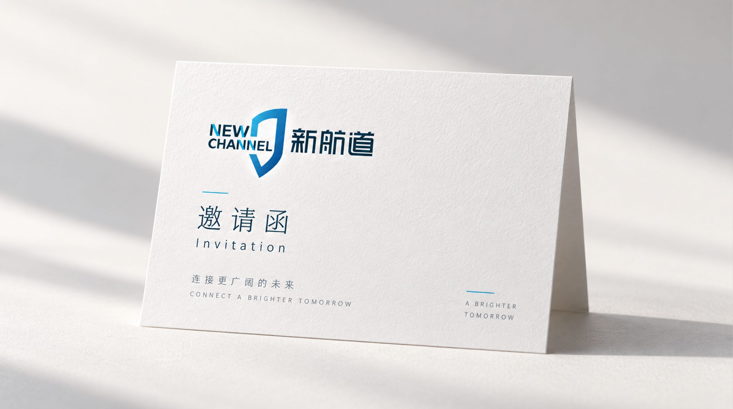
Applications: campus entrance signage and learning-space wayfinding; textbook covers, student IDs, certificates and event materials; websites, app interfaces and social media; education product extensions, online courses and video systems. The shield can also be used on its own as an accreditation mark or medal, which strengthens recognition and authority.
brand meaning
The logo captures New Channel's core values: New, a constantly evolving approach to education; Channel, a pathway for learning and growth; Way, the passing on of culture and knowledge. As a “Blue Guardian,” the identity positions New Channel as a bridge to world education, guiding students as they set out toward the future.
Improper Usage (Protection Specification)
Do not alter the proportions or angles of the shield. Do not replace the primary blue or add shadows. Do not separate the bilingual lockup or rotate the logo. Keep clear space ≥ 20% of the logo height. Minimum display width: 30 mm.
design results
After the new logo launched, New Channel gained both recognition and trust across China's education sector. The “blue shield channel” symbol has become one of the standard visual emblems of the education industry. Designed by Qingmei Future, the logo was featured in the International Education Brand Visual Design Yearbook and won the Best Education Brand Visual System award.