







LOGO & IDENTITY / Project 228
Lanrong Capital
Lanrong Capital is a modern financial firm built around asset management, equity investment and fintech innovation. Positioned to “drive finance with technology and lead capital with insight,” it provides clients with stable, transparent and sustainable asset management solutions.
As part of the brand's repositioning, the goal was a logo system that expresses trust, flow and order. Geometric rationality conveys the professionalism of finance and a technology-forward future.
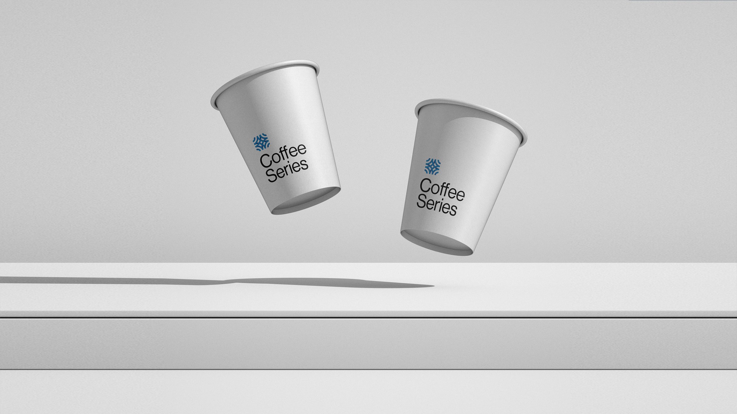
design concept
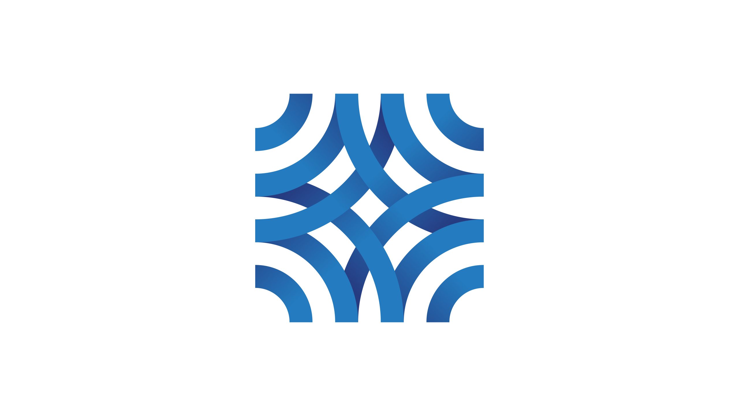
The logo is built on the concept of “Fluid Order.” A set of interwoven blue arcs forms a geometric matrix, symbolizing capital flow, structural balance and connected resources. The overlapping forms suggest the mutual trust behind financial networks and express the firm's ability to bring together capital, data and technology. The form is rational yet fluid, embodying the brand's core idea of “intelligent finance.”
graphic language
Interwoven arcs: the movement and connection of capital, forming an orderly cycle within the financial system. Central intersection: the point where the firm's core values meet client trust. Symmetrical composition: stability, balance and professional order. Extending curves: an open, innovative and steadily growing financial ecosystem. The result is clean, modern and instantly recognizable as a system.
Fonts and composition
We recommend pairing the mark with a modern sans-serif, such as Helvetica Neue, Source Han Sans or Avenir Next, to convey rationality, technology and an international outlook. Bilingual lockups place the symbol on the left and the type on the right, at a symbol-to-type ratio of about 1:1.3. Slightly open letterspacing gives the type room to breathe. The composition stays balanced, clear and adaptable across all digital and print touchpoints.
color system
Primary Blue #2F6DB3: trust, expertise and financial intelligence. Gradient Blue #0F3E73 → #4CA0E0: data flow and capital growth. Secondary Silver Gray #D8DDE4: used for backgrounds and text to add spatial depth. Blue is the core visual language, representing a new financial identity that unites stability and technology. It gives the brand authority and credibility in high-tech finance.
Application and extension
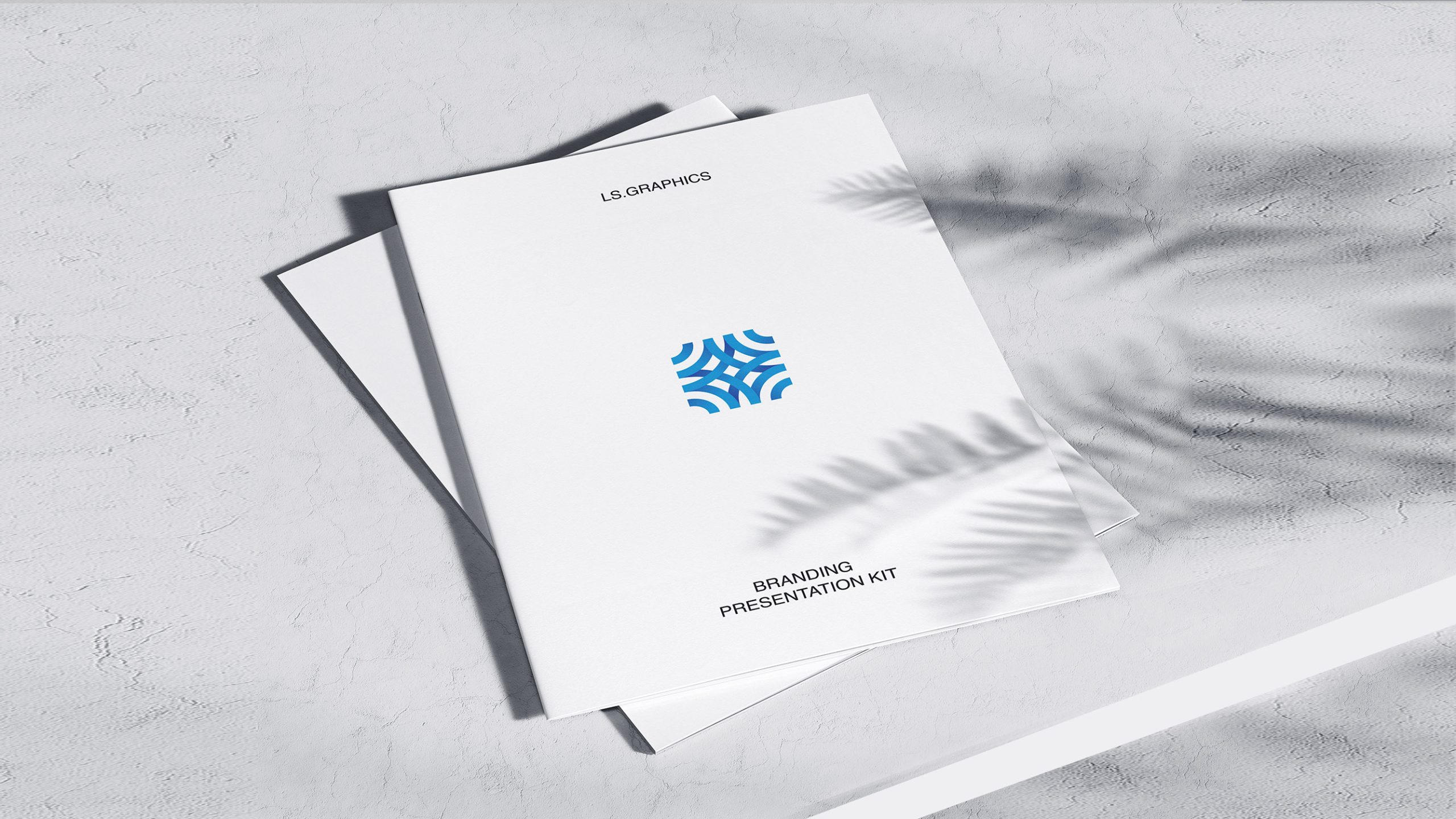
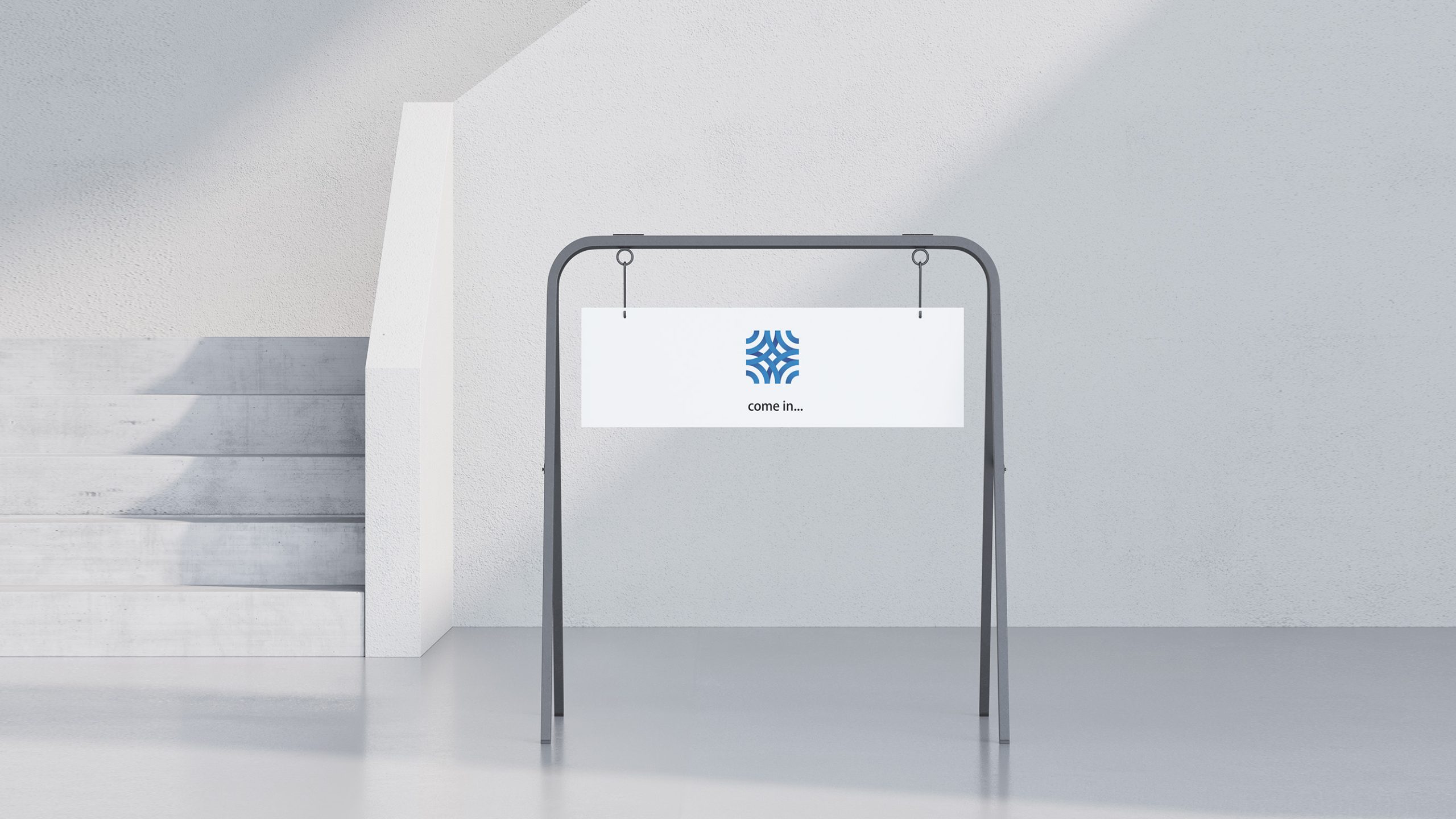
The identity system is highly adaptable and applies across corporate materials (business cards, annual report covers, presentation templates, envelopes and letterhead), digital platforms (website, app icon and financial data system interfaces) and environmental signage (lobby feature walls, trading-room glass film and illuminated signs). It also works in metal relief, silver foil stamping, digital animation and promotional video. The interwoven arcs can be extracted as a supporting graphic for dynamic extensions, building a brand ecosystem around a “fluid capital network.”
brand meaning
The mark expresses Lanrong Capital's three core principles. Stability: a symmetrical geometric structure conveys security and trust. Flow: interwoven arcs represent the efficient movement of capital and data. Innovation: gradient blues point to a fintech-driven, intelligent future. Together, the identity expresses the firm's strategic vision of “reshaping the order of capital with intelligence” and creates a modern financial brand that unites rationality and aesthetics.
Improper Usage (Protection Specification)
Do not alter the proportions or weaving direction of the arcs. Do not adjust the blue color values or add multicolor gradients. Do not stretch, skew or mirror the logo. Do not add shadows, outlines or emboss effects. Keep clear space of at least 20% of the symbol width. Minimum display width: 25 mm.
design results
Since adopting the new logo, Lanrong Capital has seen a 54% increase in industry brand recognition. Client research shows much stronger perceptions of the brand as “stable, tech-driven and trustworthy.” In digital finance systems and at international conferences, the mark's blue geometric language has become a distinctive identifier and a benchmark of “tech-rational aesthetics” in finance. Qingmei Future has included the project in its Fintech Brand Identity Systems collection of exemplary work as a representative international design of “data logic × capital flow.”