










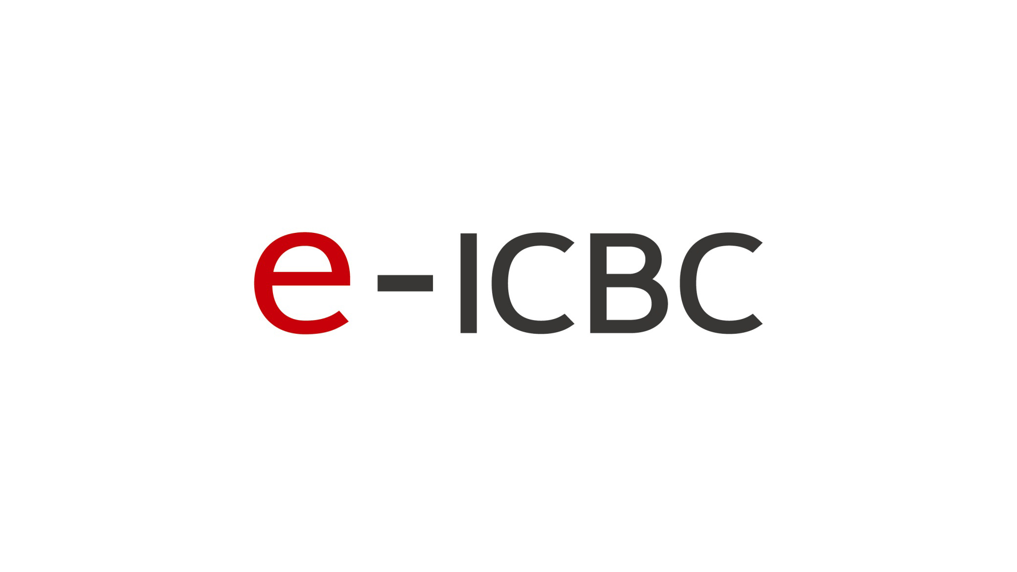
This project created the logo and visual identity system for e-ICBC, the digital finance arm of Industrial and Commercial Bank of China (ICBC).
Set against the global digital transformation of finance, the goal was to express ICBC's technological strength and international stature through a minimal symbolic language. As the visual core of the brand, “e-ICBC” represents an electronic, intelligent and global financial experience.
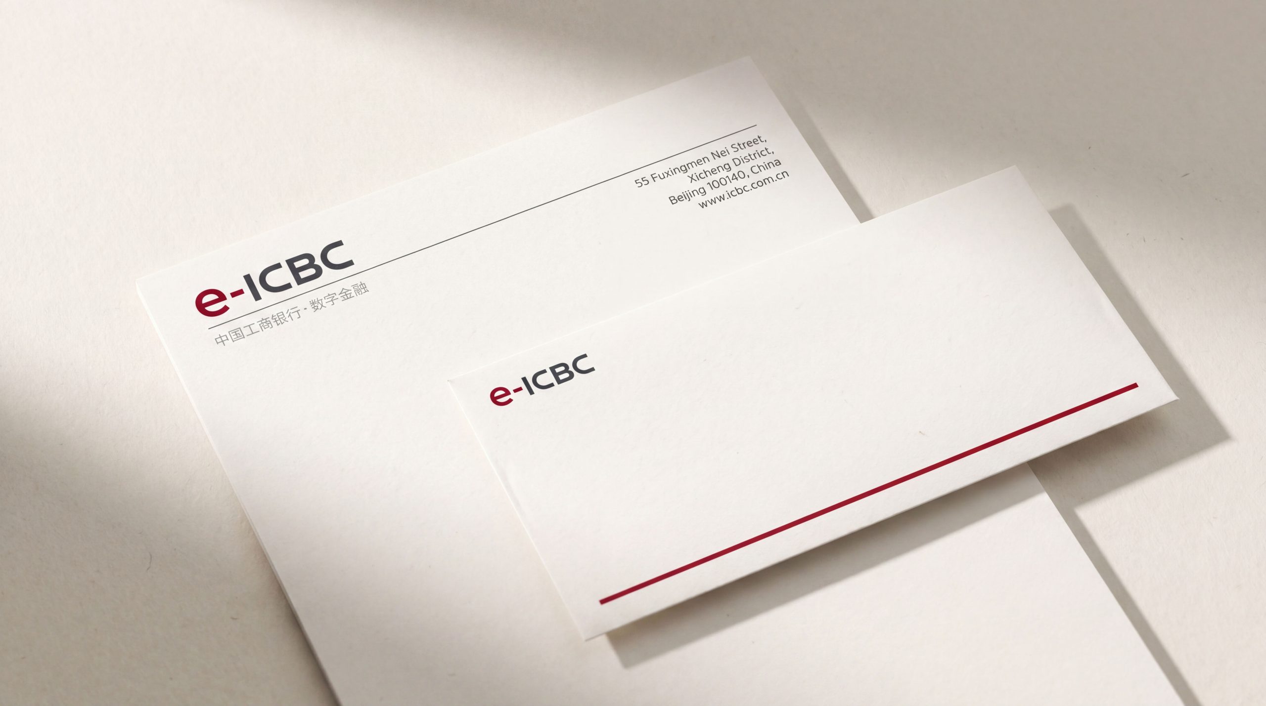

design concept
The design centers on the letter “e,” standing for electronic, efficiency and ecosystem. The red “e” carries ICBC's brand DNA and energy, while the hyphen joined with “ICBC” expresses technological connection and systemic extension. The clean, clear composition signals a new era, from traditional banking to digital banking. Core idea: Technology empowering finance, intelligence connecting the future.
graphic language
Primary element “e”: a red lowercase letter representing innovation, energy and user-centered digital services; Hyphen “-”: symbolizing data flow and a technological bridge between tradition and the future; Typography: “ICBC” set in a steady geometric sans serif reinforces the professional, trustworthy image of a financial brand; Proportion and order: a balanced, stable horizontal arrangement meets the banking sector's visual requirements for order and trust.
Fonts and composition
The primary typeface is a custom sans serif (referencing Helvetica Neue / PingFang SC) with clean, confident strokes. The “e” features rounded forms for a friendly, tech-forward feel, while “ICBC” retains the group's master brand logotype to ensure visual connection and consistency. Carefully calibrated proportions and generous white space adapt the mark to the bank's multi-device ecosystem.
color system
Primary ICBC Red #B82026: inherited from the group identity, symbolizing passion, strength and the stability of national finance; Secondary Tech Gray #333333: a neutral force representing rationality, modernity and technology; White Space #FFFFFF: room to breathe, expressing openness, transparency and inclusiveness. The red-gray pairing forms a classic identity in fintech, combining authority with innovation.
Application and extension
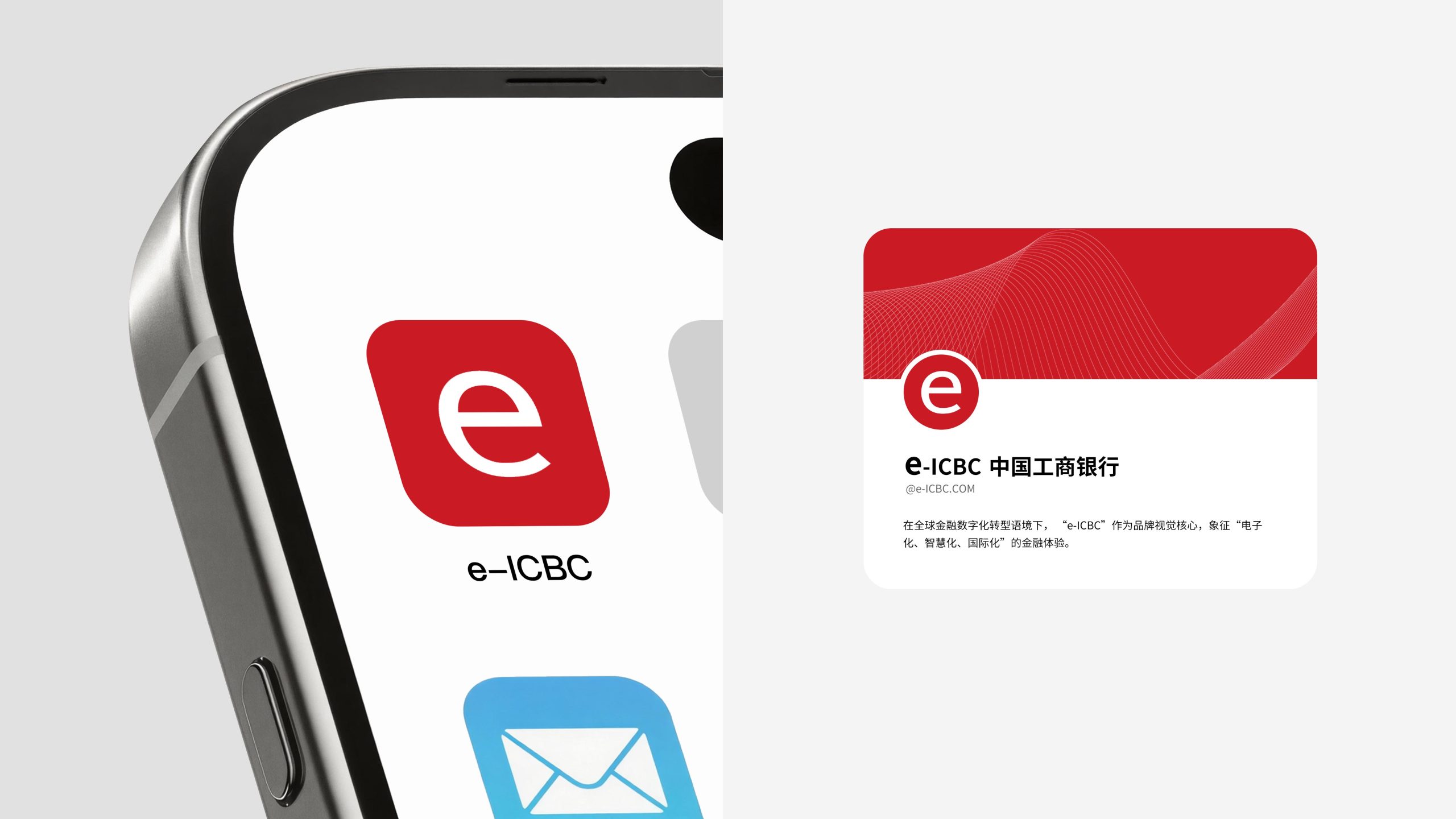
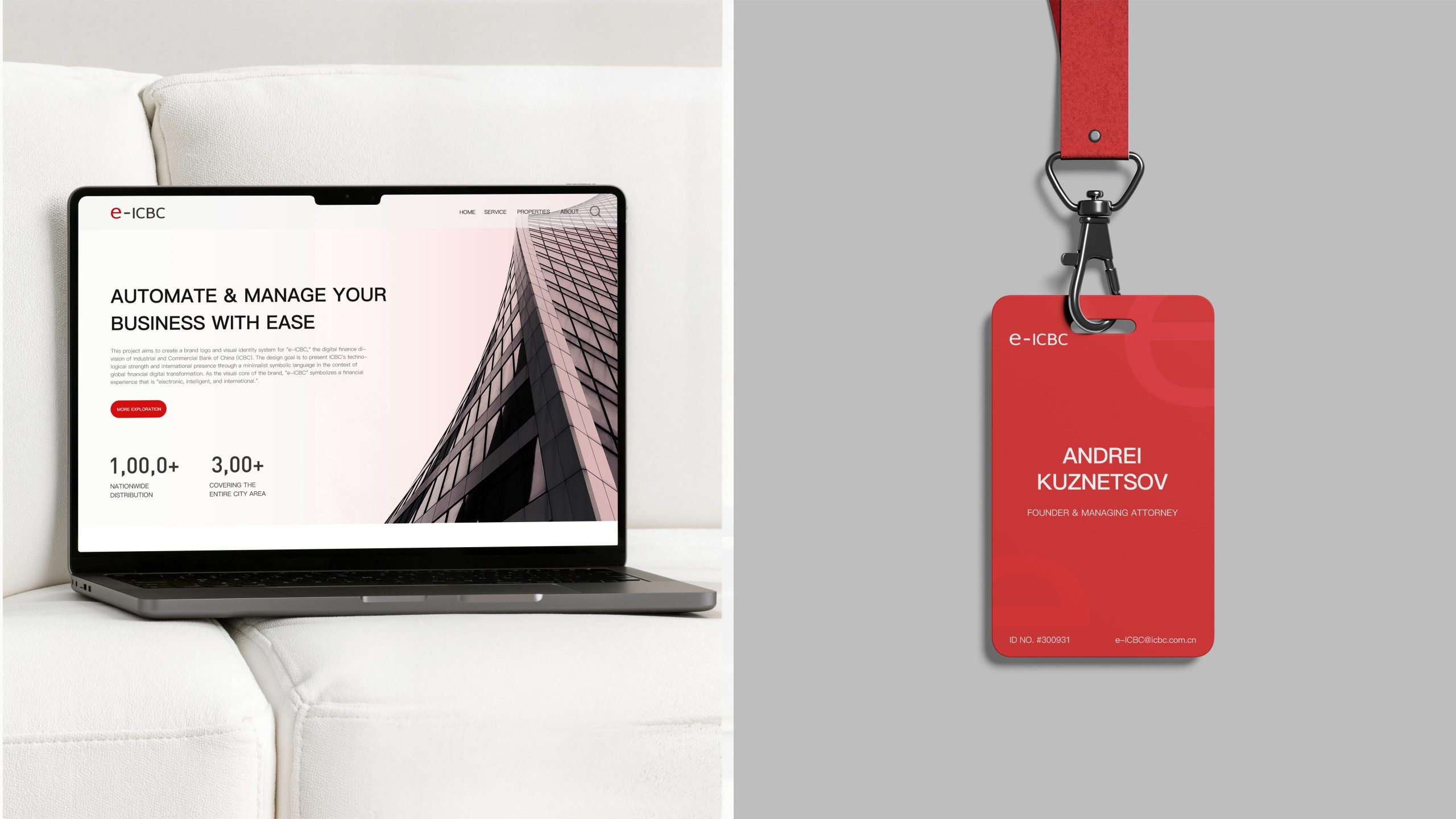
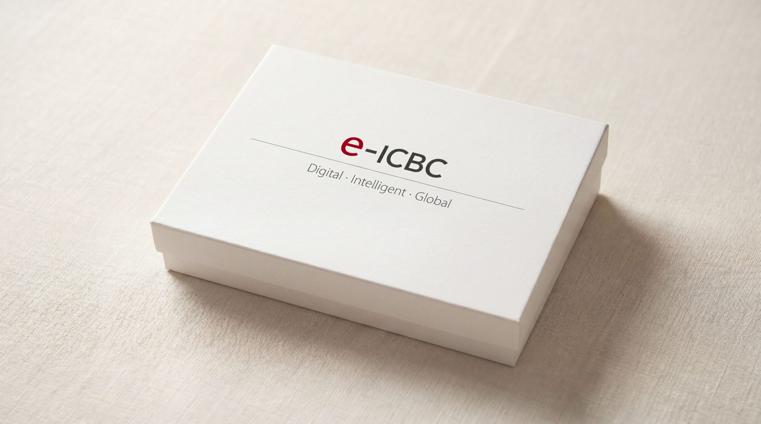
The e-ICBC logo is highly adaptable across systems and scenarios. Digital: app icons, online banking interfaces, payment systems and data platforms; Brand communications: website, posters, brochures and visual systems for technology forums; Spatial: digital screens in branches, interactive installations and service terminals; Co-branding: paired with the ICBC master logo within the parent brand system to reinforce sub-brand recognition.
brand meaning
The logo expresses three dimensions of ICBC's digital evolution: Innovation: the red “e” represents a spirit of breakthrough and exploration; Connection: the hyphen symbolizes the bridge of technology systems and the chain of trust; Stability: the “ICBC” lettering carries forward the financial credibility of the core brand. Fusing the deep heritage of traditional banking with the lightness of future finance, it creates “a new language for ICBC in the fintech era.”
Improper Usage (Protection Specification)
Do not alter the proportion between “e” and “ICBC”; Do not replace the red-gray palette or add gradients; Do not skew, outline or add shadows; Recommended minimum width: 40mm.
design results
The launch of e-ICBC marked ICBC's formal entry into full-scale digital transformation. Its minimal, highly recognizable logo has become a key part of the group's sub-brand architecture, projecting a professional, innovative and international image across fintech settings in China and abroad. The project reflects Qingmei Future's systematic research at the intersection of fintech × brand architecture × logical minimalist design, translating the visual language of a financial institution into the language of a technology ecosystem.