










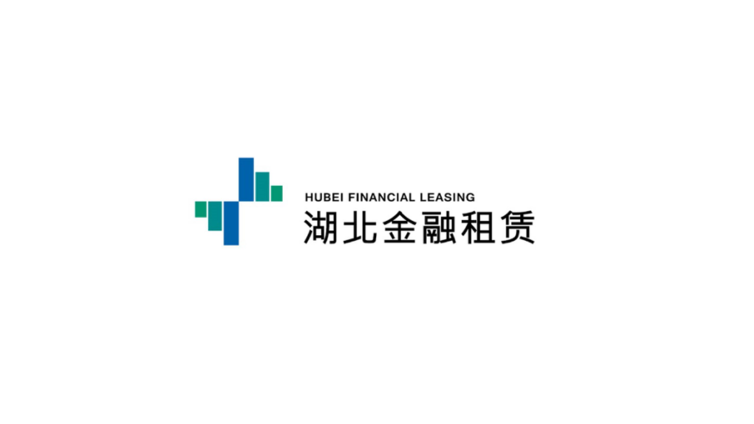
Hubei Financial Leasing Co., Ltd. is a financial institution focused on capital operations, financial leasing and asset management, with services spanning industrial investment, infrastructure development and SME financing.
As part of the company’s brand upgrade, the visual system set out to create a steady, rational and trustworthy financial brand, meeting the rigorous standards of financial regulation while reflecting the innovative spirit and vitality of Hubei’s regional economy.
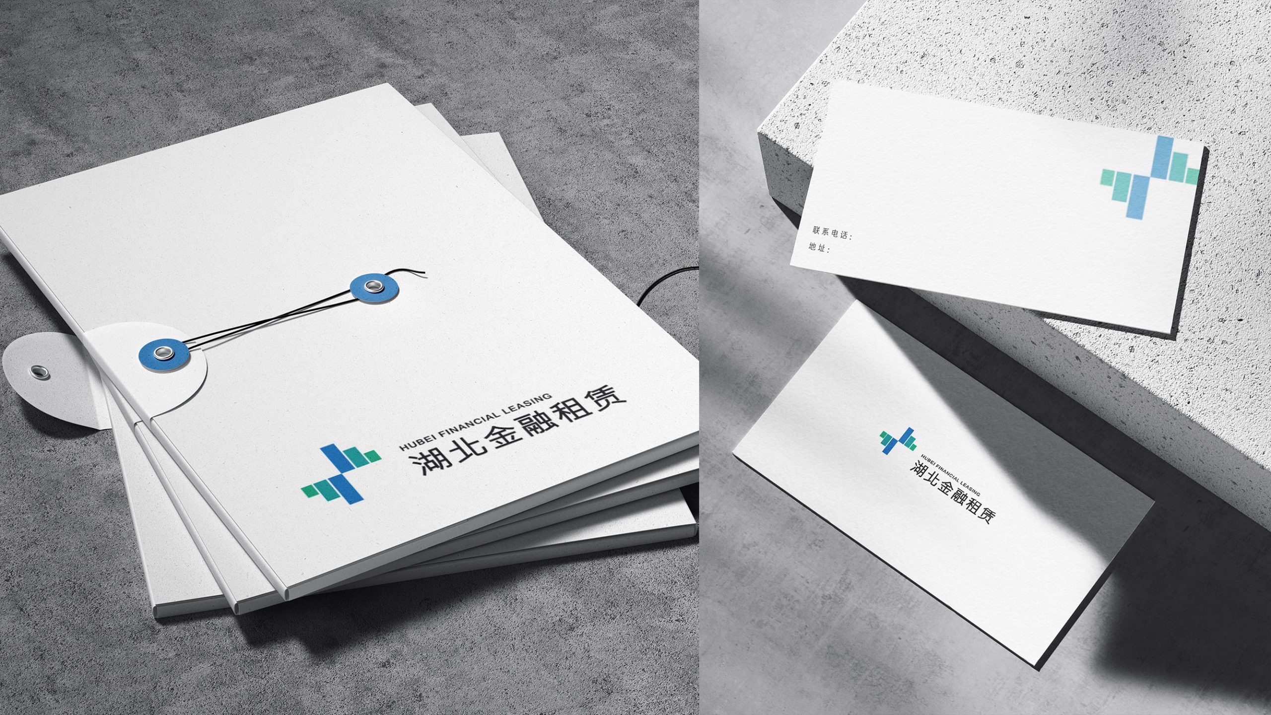
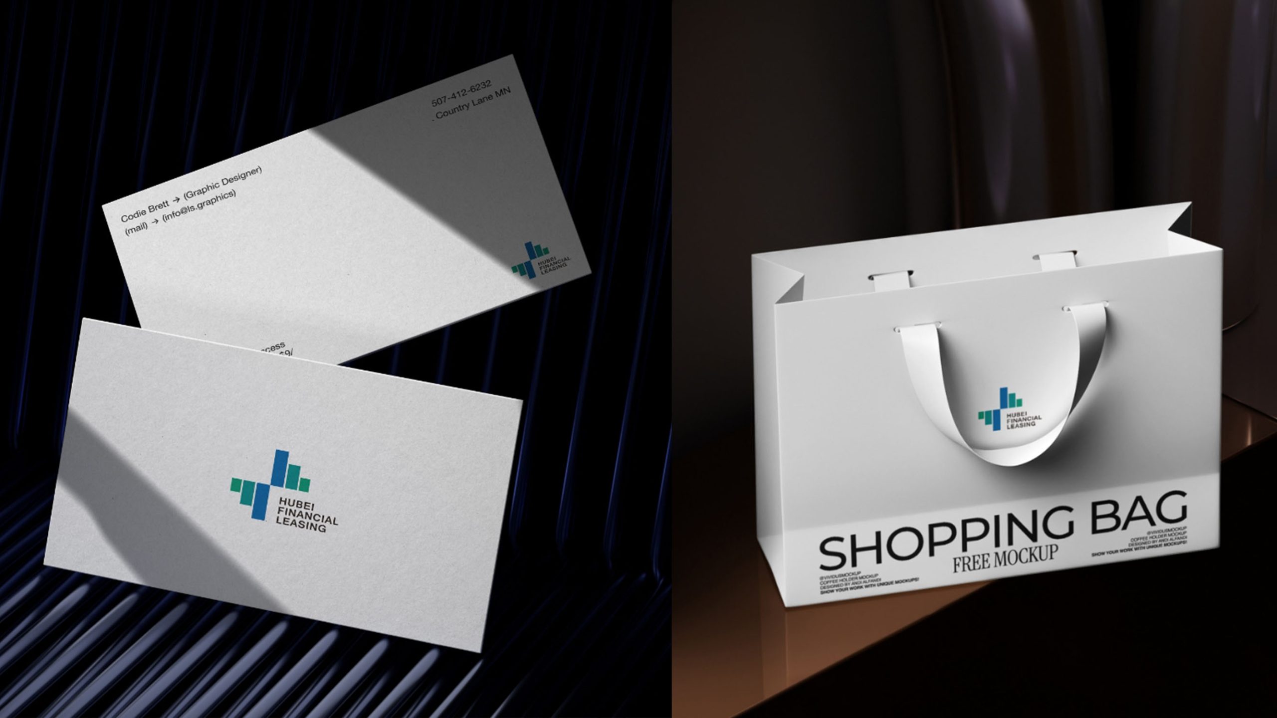
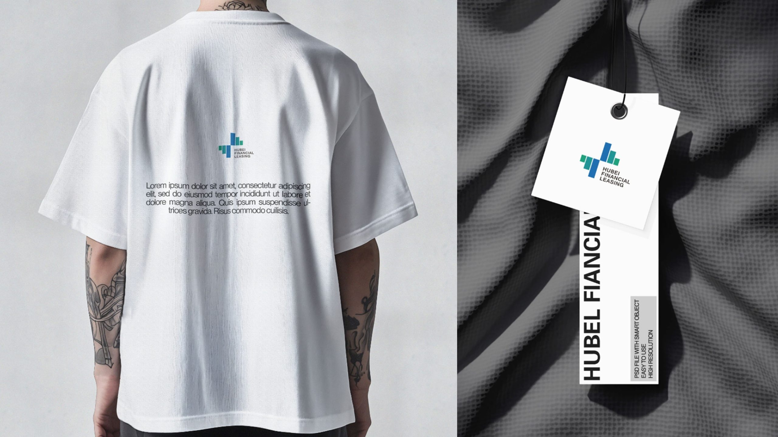
design concept
The mark is built on a “Financial Growth Matrix”: interlocking rectangular columns, rising and falling, form a stable cross-shaped coordinate that symbolizes orderly capital flows and balanced market growth. Abstracted from financial charts, the geometry also represents the core values of trust, support and growth. Clean and rational, the composition reflects the company’s professional discipline and momentum within the financial system.
graphic language
Vertical columns: capital flows, asset accumulation and the upward growth of financial markets. Cross-shaped intersection: balance, trust and connectivity across diverse businesses. Stepped composition: the company’s vision of steady ascent. Open center: an open financial ecosystem and an inclusive strategy. With a minimum of geometric elements, the mark achieves a highly recognizable brand symbol.
Fonts and composition
The English name HUBEI FINANCIAL LEASING is set in a sans serif (e.g., Helvetica Neue or Source Sans Pro) to convey an international, rational financial character; the Chinese uses a modern Hei typeface with clean, strong strokes to reinforce stability and trust. The symbol-to-type ratio is 1 : 1.5. A horizontal lockup with the symbol on the left and type on the right is recommended, in line with international financial conventions, ensuring optimal clarity and consistency on business cards, contracts, reports and digital platforms.
color system
Deep blue #2A64A1 symbolizes trust, rationality, and the power of fintech; dark green #366C59 represents stability, growth, and ecological sustainability; neutral gray #333333 is used for text and information interfaces to enhance authority; white space embodies the transparency, fairness, and openness of the financial system. The blue-green pairing creates a balanced financial character of 'rationality × vitality,' signifying the enterprise's bidirectional synergy and steady expansion between capital and industry.
Application and extension
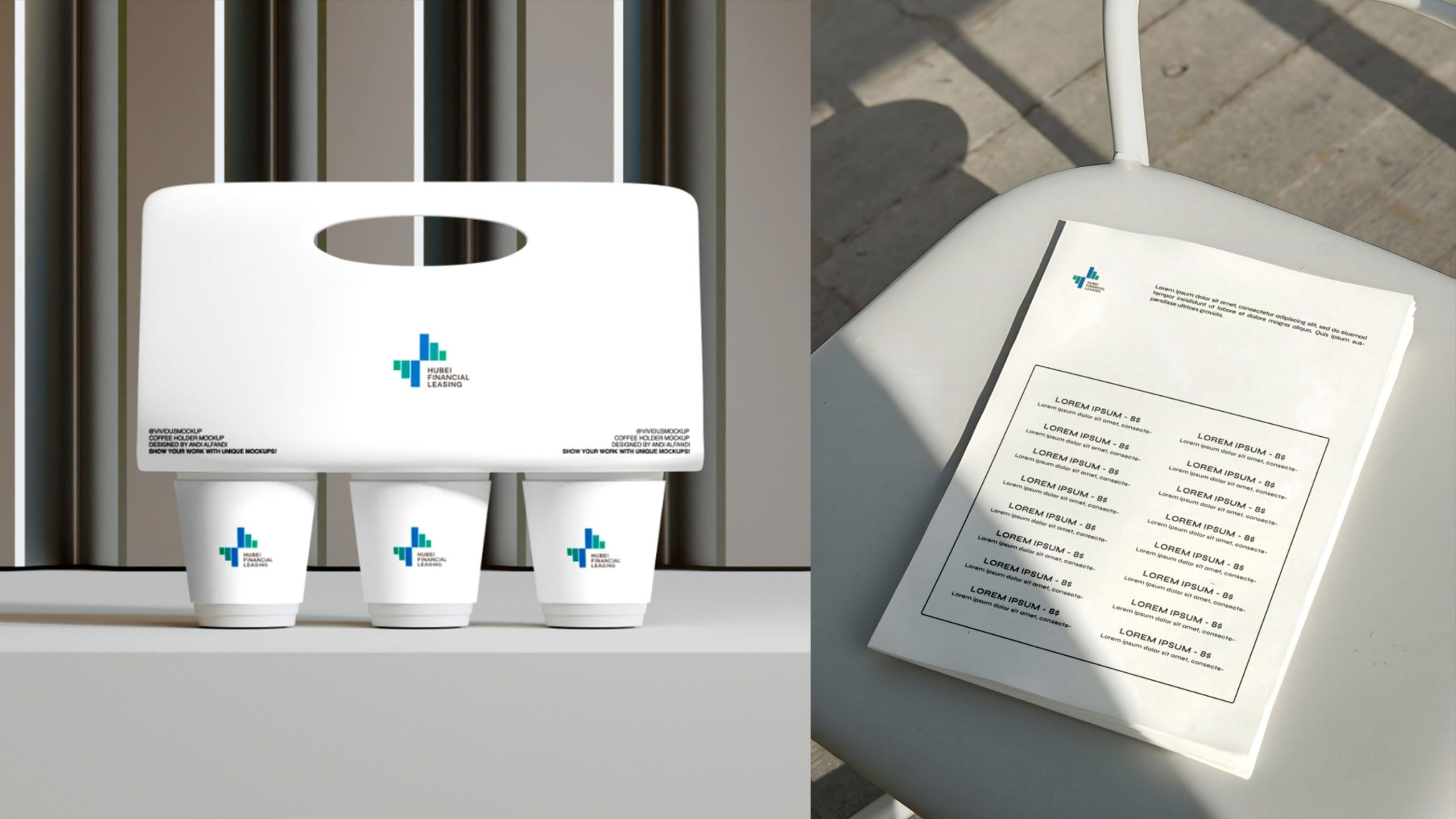
The logo can be widely applied across: corporate office systems (business cards, letterhead, contracts, financial report covers); digital media (official website, mobile app, data dashboard interfaces); spatial systems (door signage, reception backdrops, conference systems and exhibition panels); promotional materials (financial reports, client briefings, corporate image films). The columnar modules can extend as auxiliary graphics for data charts, PPT backgrounds, or interface zoning, forming the brand's proprietary 'financial data visualization language.'
brand meaning
The logo embodies 'steady progress and mutual prosperity' as its core values, expressing Hubei Financial Leasing's positioning in the new era of finance: a stable financial foundation — the blue column symbolizes the enterprise's professionalism and security; a sustainable growth curve — the green column represents economic vitality and innovation; a systematic financial ecosystem — the cross structure signifies win-win cooperation and regional coordinated development. The overall visual conveys the brand spirit of 'orderly capital flow and symbiotic trust value.'
Improper Usage (Protection Specification)
Do not adjust column proportions, spacing, or colors; do not rotate or tilt the overall structure; do not add shadows, outlines, or gradient effects; maintain consistent graphic-text proportions and left-right structure; do not use reverse or conflicting backgrounds; minimum display width must not be less than 25mm.
design results
After the new logo launched, Hubei Financial Leasing's visual recognition within the industry rose 43%, and the identity was rolled out across its digital finance systems and regional investment projects. By combining geometric clarity with ordered color, the brand gained a fresh visual presence that is both steady and modern. Qingmei Future now features the project in its Financial Services and Capital Management Visual Systems collection as a benchmark for the international brand upgrade of a regional financial institution.