













LOGO & IDENTITY / Project 218
NovaTech
NovaTech is a technology company focused on digital technology, information and communications, and intelligent solutions.
In the brand upgrade process, the enterprise sought to build a visual system expressing 'innovative energy, intelligent drive, and global vision,' using symbolic logo language to convey the company's foresight and connectivity in the tech era.




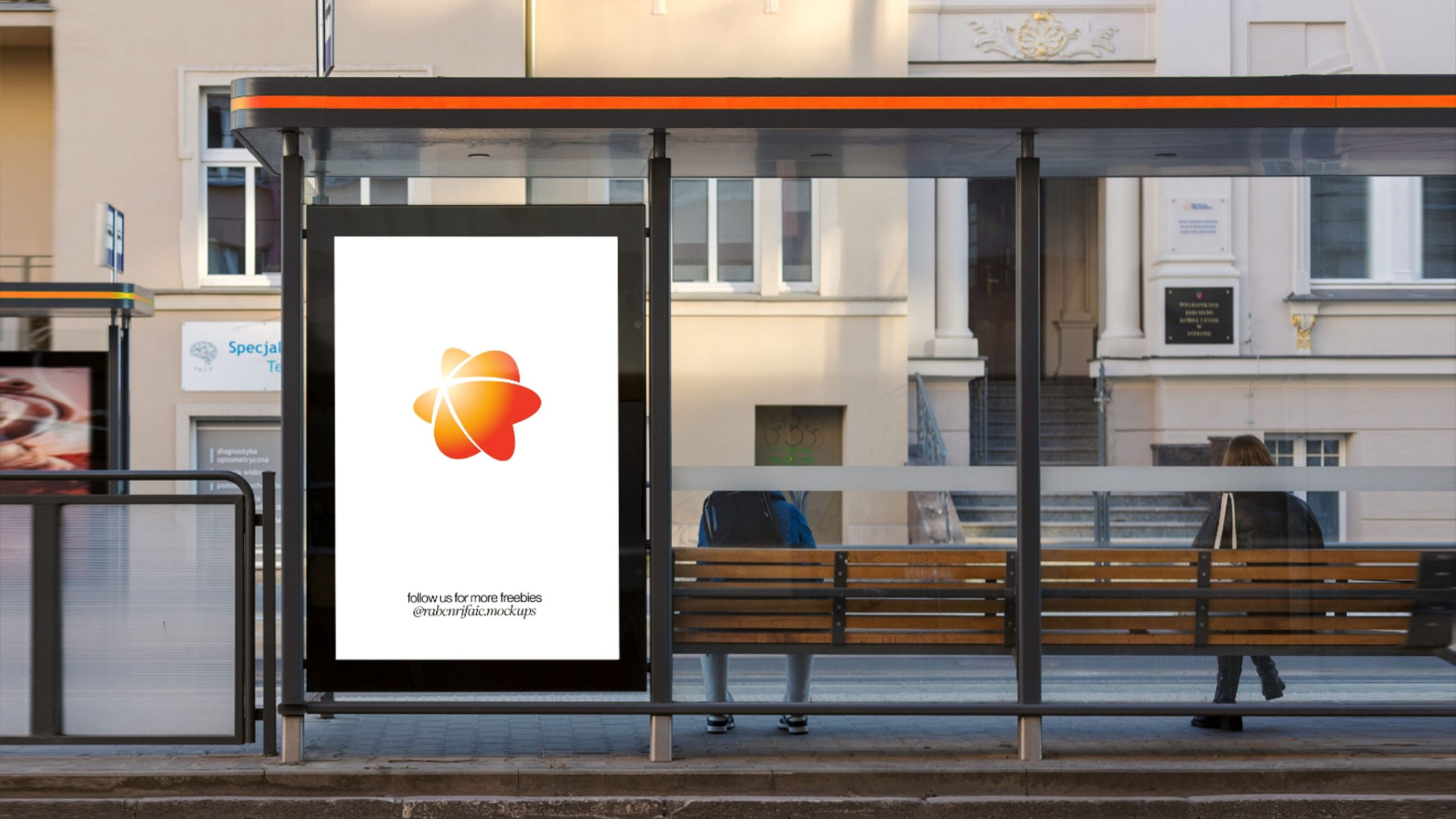
design concept
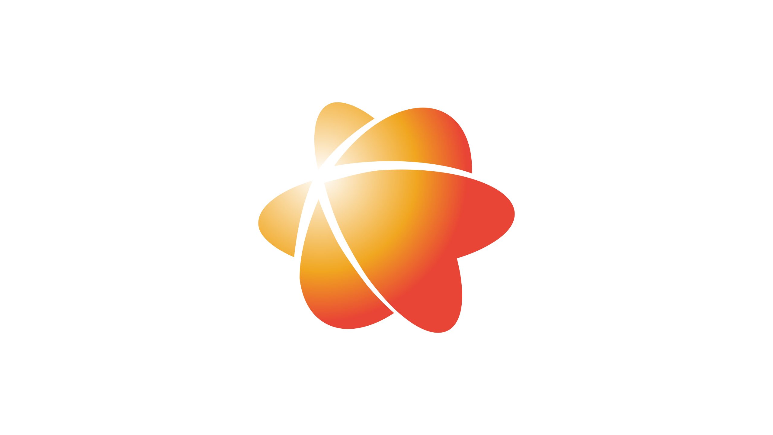
The logo takes 'energy burst' and 'information trajectory' as its design core, with forms derived from the imagery of electron orbits and converging light. Three dynamic curves rotate around the center, forming an atom- or star-like shape, signifying the infinite potential and energy flow driven by technology. The core design concept: technology as light, connecting the world; innovation as energy, igniting the future.
graphic language
Trajectory form: three curves symbolize technology's three dimensions—innovation, connection, intelligence; center light point: represents the brand's innovation origin and intelligent core; dynamic balance: the overall form shows a rotating upward momentum, symbolizing technological progress and sustained growth; spatial layers: gradients and overlapping relationships create a three-dimensional feel, reflecting technology's multi-dimensional ecosystem and systemic nature.
Fonts and composition
The brand name NovaTech uses a clean sans-serif typeface with rounded stroke terminals, harmonizing with the main graphic's fluidity. The type strokes maintain visual continuity with the graphic curves, forming a unified tech language. The bilingual combination can be flexibly arranged according to use scenarios, ensuring consistent recognition in international contexts.
color system
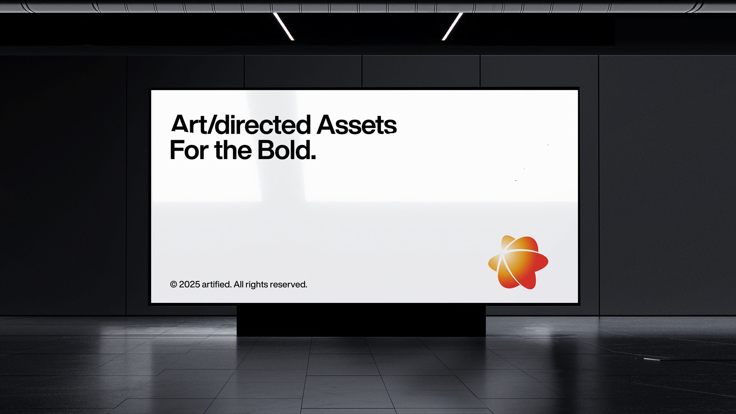
Primary orange-red #E84A27: symbolizes energy, intensity, and innovative passion; secondary golden yellow #F7C548: represents light, wisdom, and warmth; highlight white #FFFFFF: expresses technological purity and brightness; gradient system: energy gradients from deep orange to golden yellow symbolize energy circulation and wisdom bursts driven by technology. The overall color system is dynamic and luminous, presenting a 'warm technology' visual character.
Application and extension
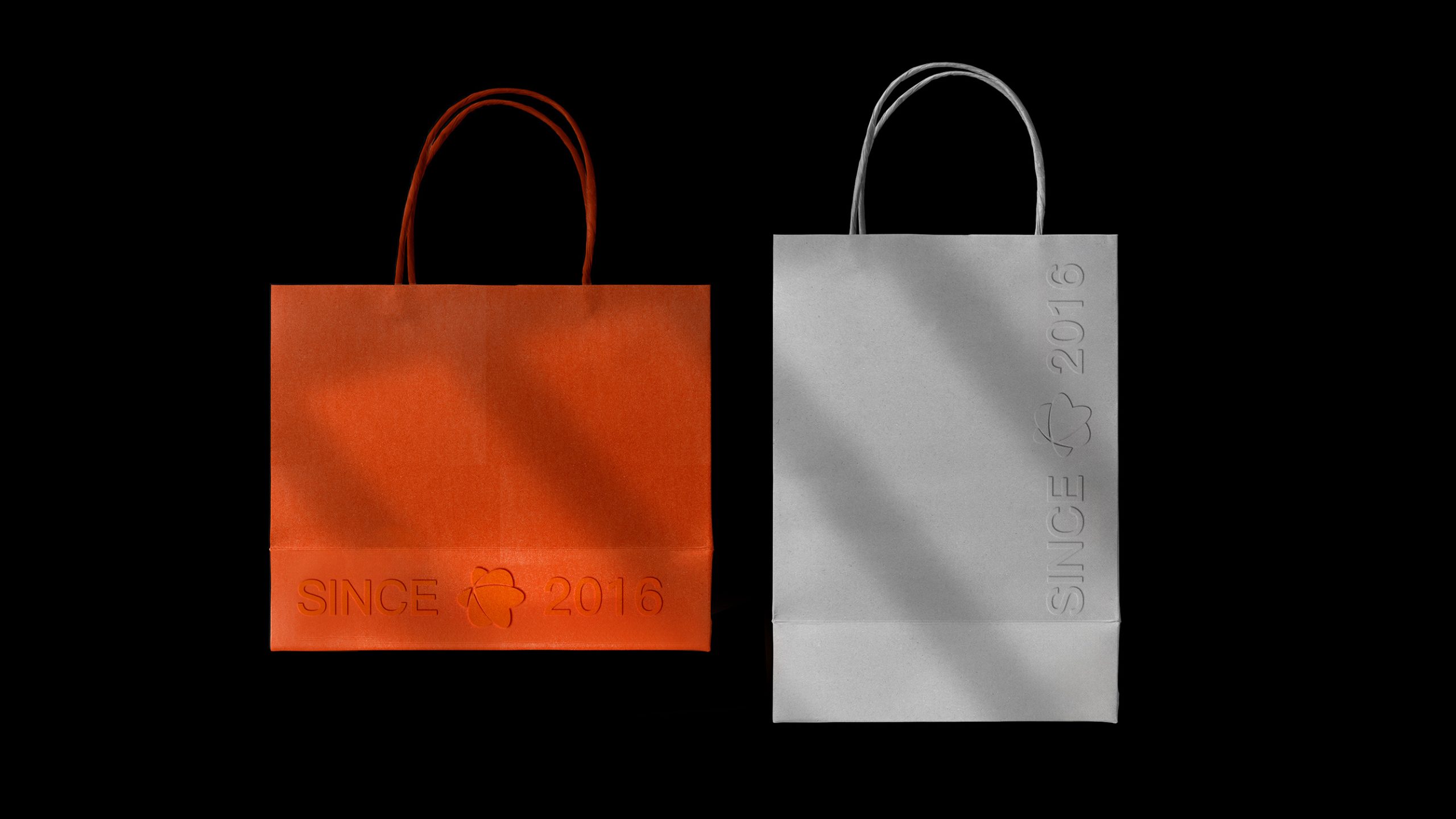
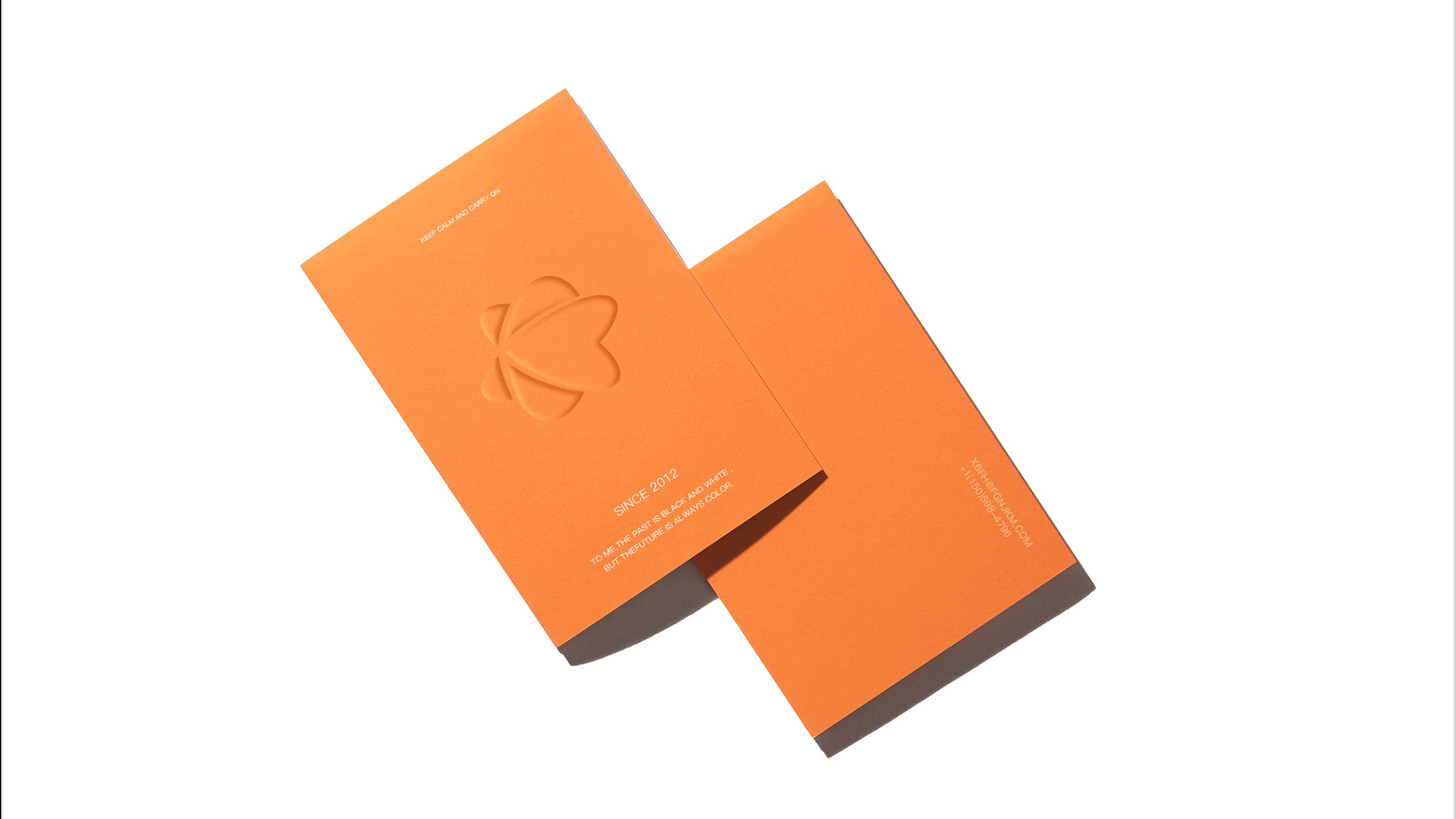
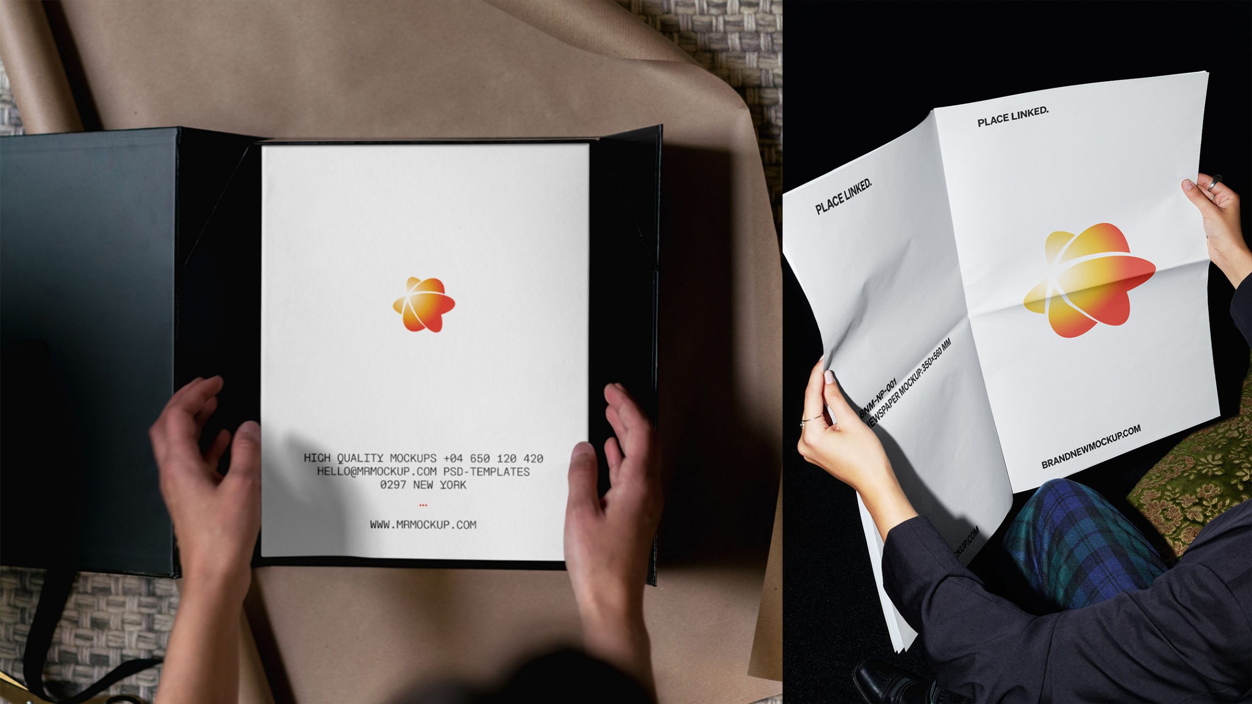
The logo performs excellently across digital and physical media: digital communication: applicable to website homepage, system login interfaces, and tech display animations; product identification: suitable for device appearance, packaging, and brand labeling; spatial applications: in office environments, conference stages, and exhibitions, the light gradient structure can extend as brand background vocabulary; animated version: the logo's center light point can serve as the animation core, forming energy convergence and radiation effects to enhance the tech atmosphere.
brand meaning
The logo uses light as its core symbol, representing 'the origin of wisdom and energy': the central light represents the spark of innovation; the circular trajectory symbolizes the global tech network and data flow; gradients express technology's warmth and the brand's open spirit. The overall visual communicates NovaTech's brand mission: illuminating the intelligent future with the light of technology.
Improper Usage (Protection Specification)
Do not adjust trajectory angles or light point position; do not alter gradient direction or substitute with solid colors; do not add shadows, outlines, or excessive light effects; recommended minimum display width ≥ 25mm.
design results
Following the NovaTech logo launch, it became the core identification symbol for the enterprise's digital communication. In tech exhibitions, system platforms, and product packaging, it demonstrates unified brand visual energy, reinforcing the enterprise's brand impression of 'innovative technology · intelligent warmth.' This project became one of Qingmei Future's representative cases in tech visual language innovation, demonstrating how design uses 'light' as a medium to construct a corporate tech symbolic system.