










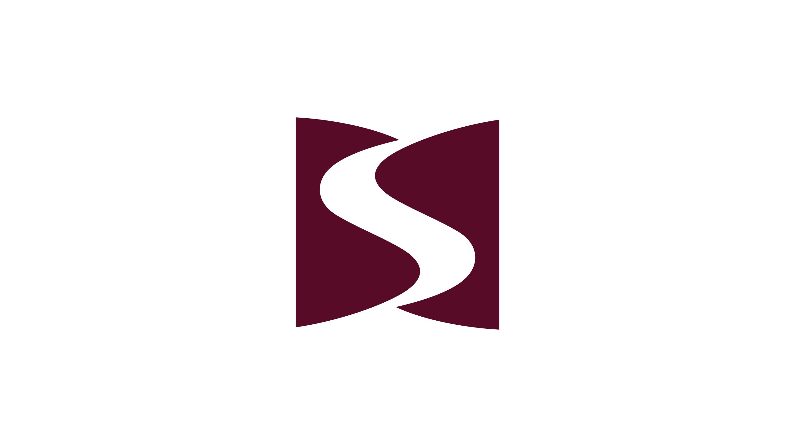
This logo belongs to an innovative company focused on technology services, system integration, and brand upgrade consulting. Its core business spans technology integration, digital communications, and corporate strategy consulting, using systems thinking to create lasting growth for clients.
In the brand visual system reshaping, the design goal was to create a concise, highly recognizable core symbol representing systemic fluidity, embodying the enterprise's brand spirit of 'wisdom, collaboration, stability, advancement.'
design concept
The letter S anchors the mark, standing for both System and Smart. Two mirrored curved surfaces form a flowing S-shaped channel at the center, representing information circulation, energy flow, and collaborative innovation. The stable outer structures reflect organizational strength and strategic focus, while the fluid central curve represents innovation, communication, and growth. Combining rational structure with fluid form, the logo expresses balance and insight within complex systems.
graphic language
The central “S” curve represents the flow of information, resources and value, expressing the brand’s role in coordinating interconnected systems. Two enclosing forms protect the core like a shield, conveying stability, security and trust. The symmetrical composition reflects the order and balance of systematic thinking, while the open contours suggest collaboration and unlimited possibilities. Simple yet powerful, the mark is distinctive across international markets.
Fonts and composition
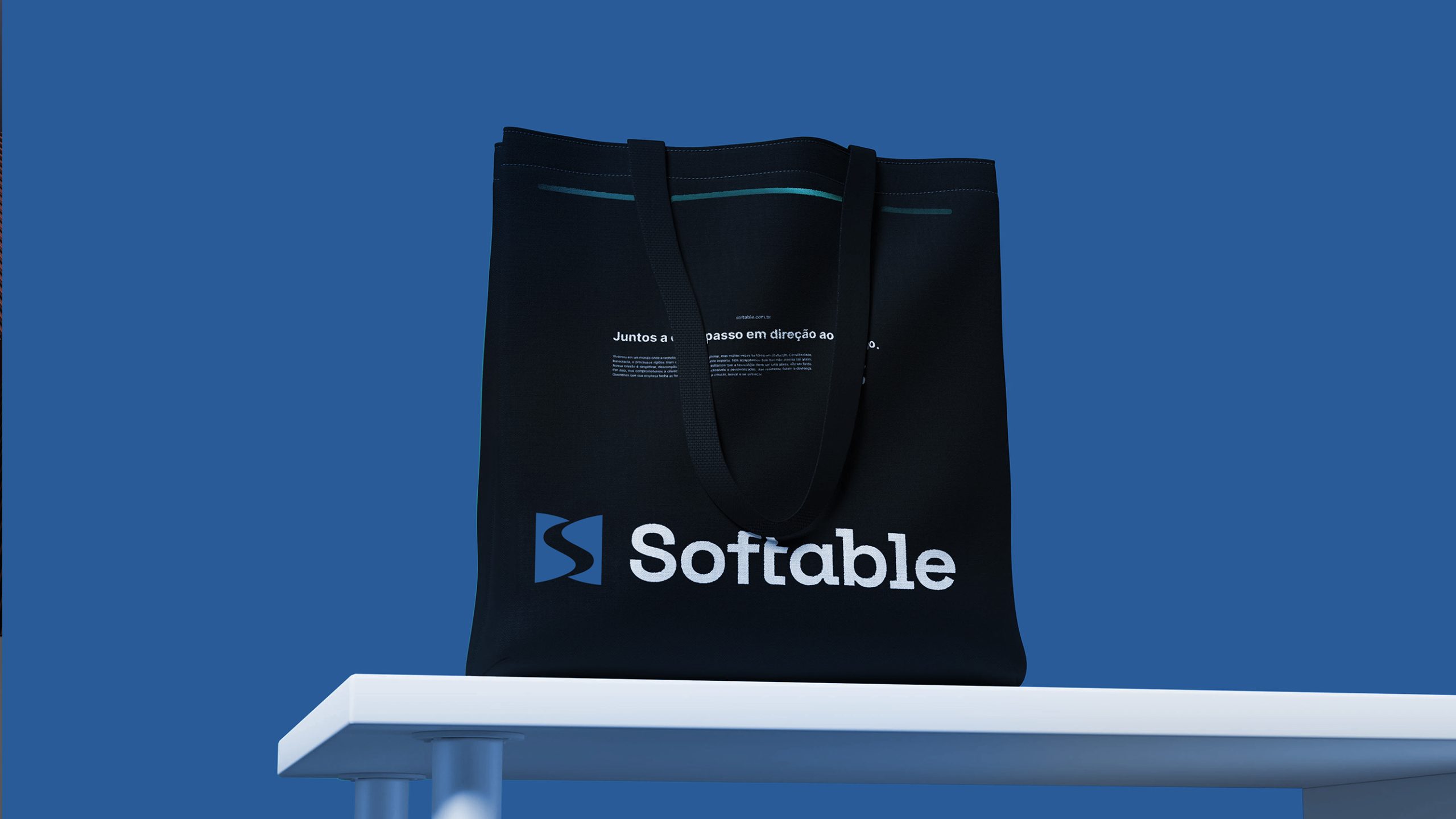
Pair the symbol with a modern sans serif typeface, such as Helvetica Neue or Source Han Sans, to create a cohesive identity with a precise, technological character. In bilingual lockups, the English name can appear in uppercase to convey professionalism and authority. Maintain a symbol-to-wordmark ratio of approximately 1:1.2. The symbol can also stand alone on digital platforms, app icons and architectural signage, retaining clarity and presence at every scale.
color system
Primary burgundy #5A162E conveys clarity, strength and stability, reflecting the company’s long-term strategic perspective. Supporting off-white #F5F5F5 balances the composition, adds depth and gives the identity room to breathe. Black #1A1A1A is used for typography and formal applications to reinforce professionalism. Departing from the cool palettes common in technology, the deep burgundy brings warmth to the brand’s rational character and energy to its sense of stability.
Application and extension
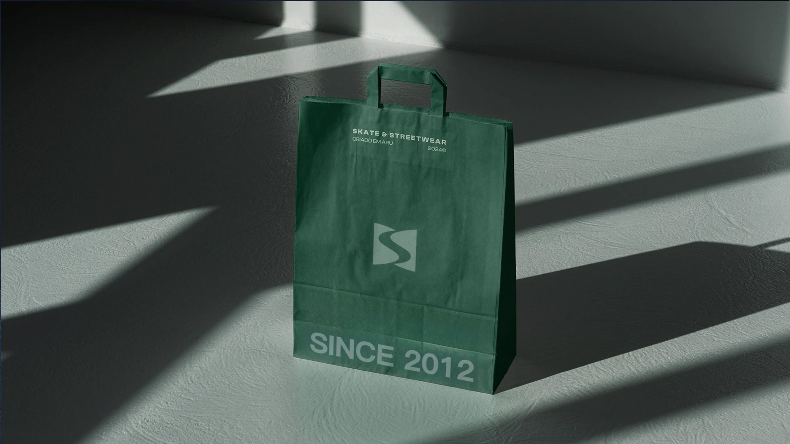
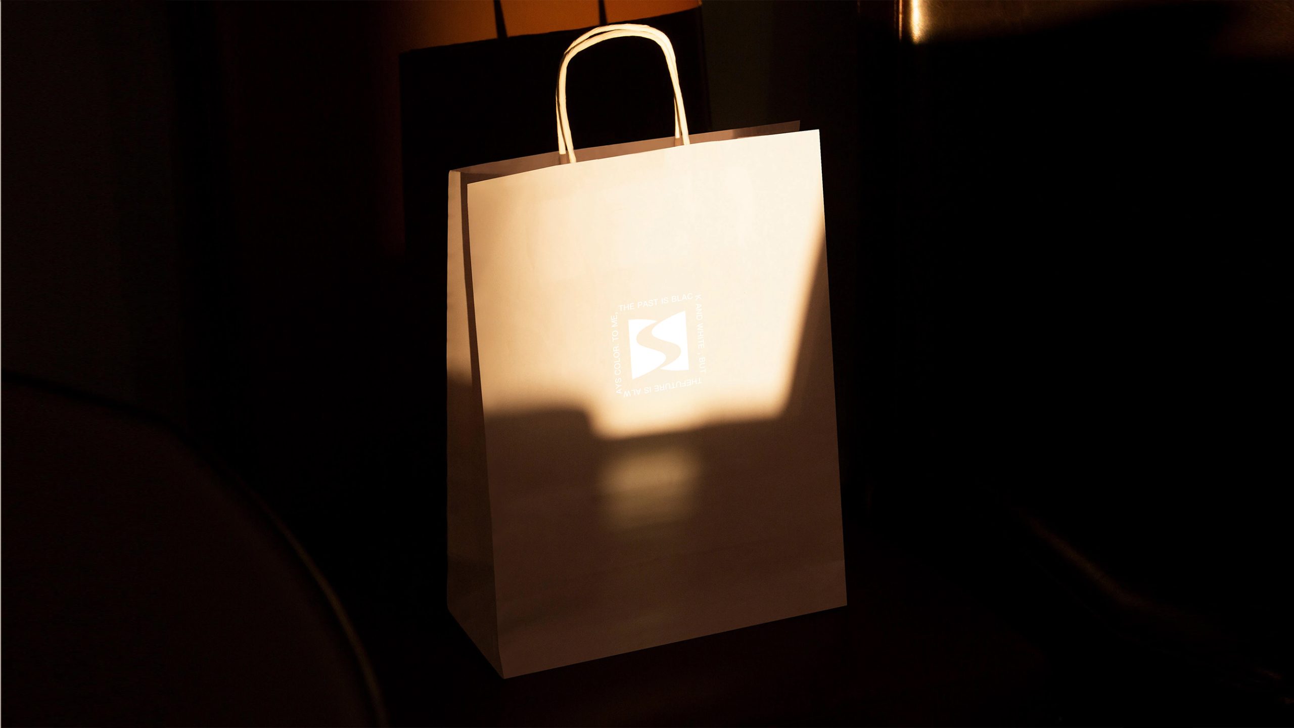
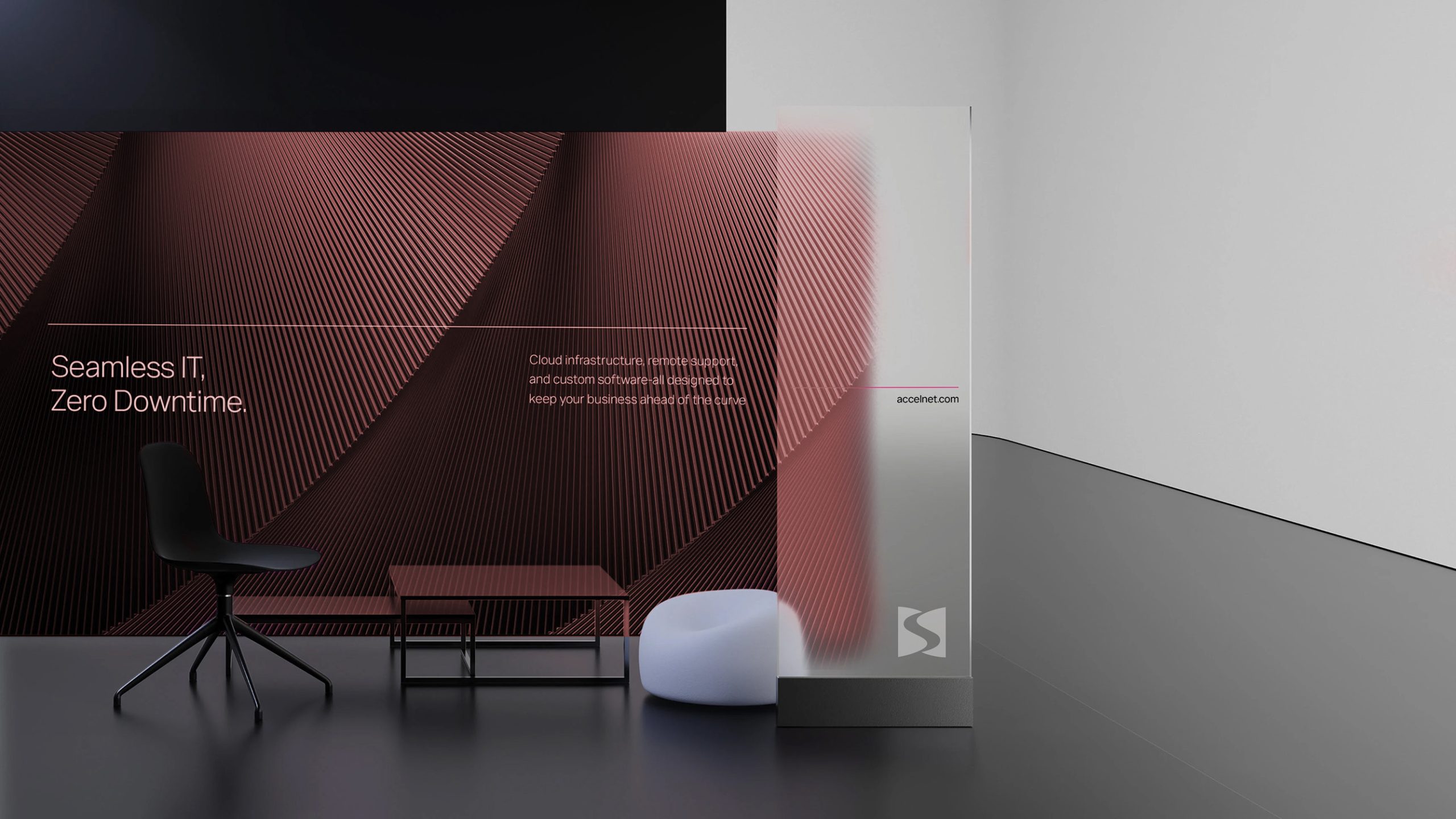
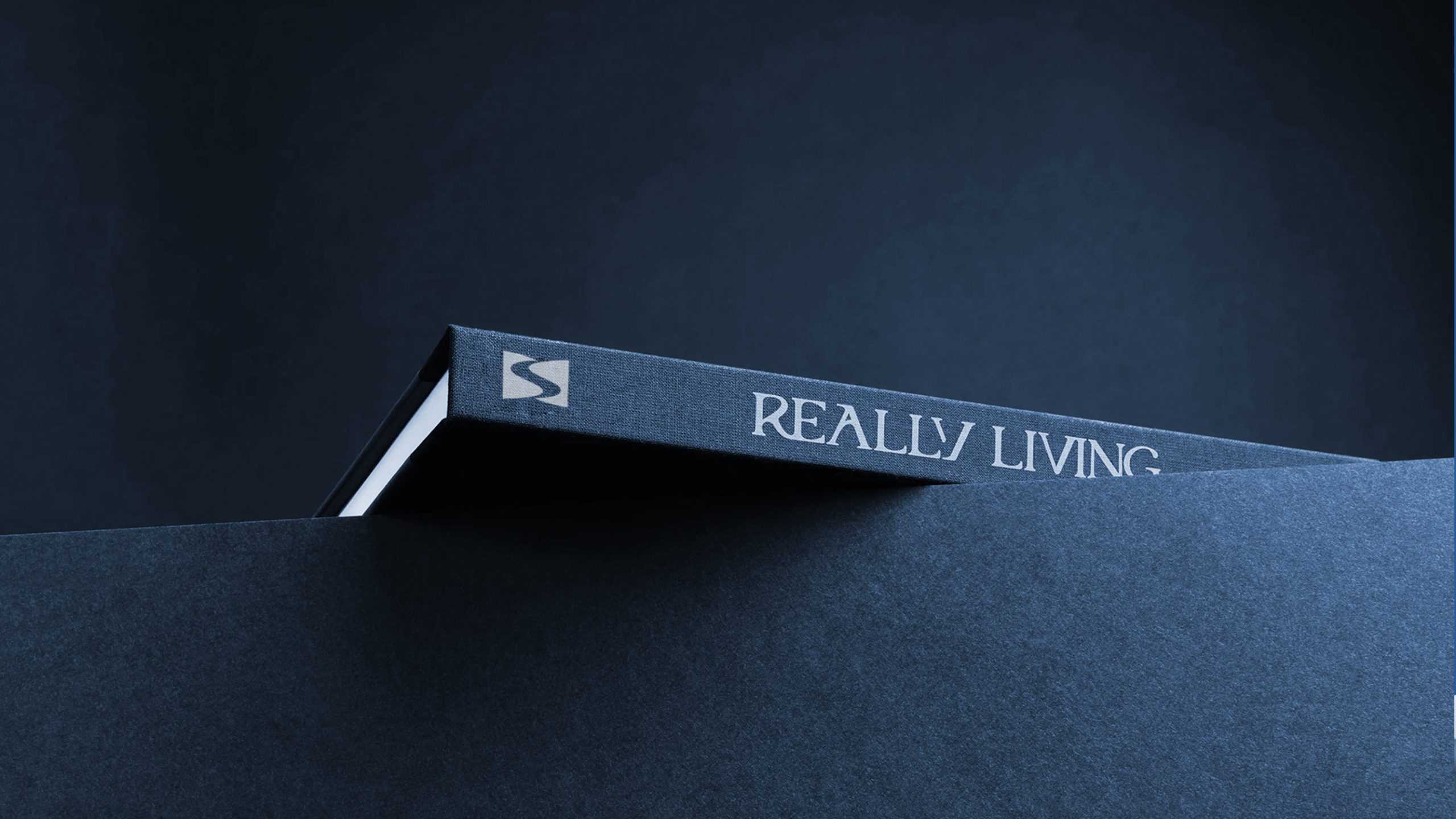
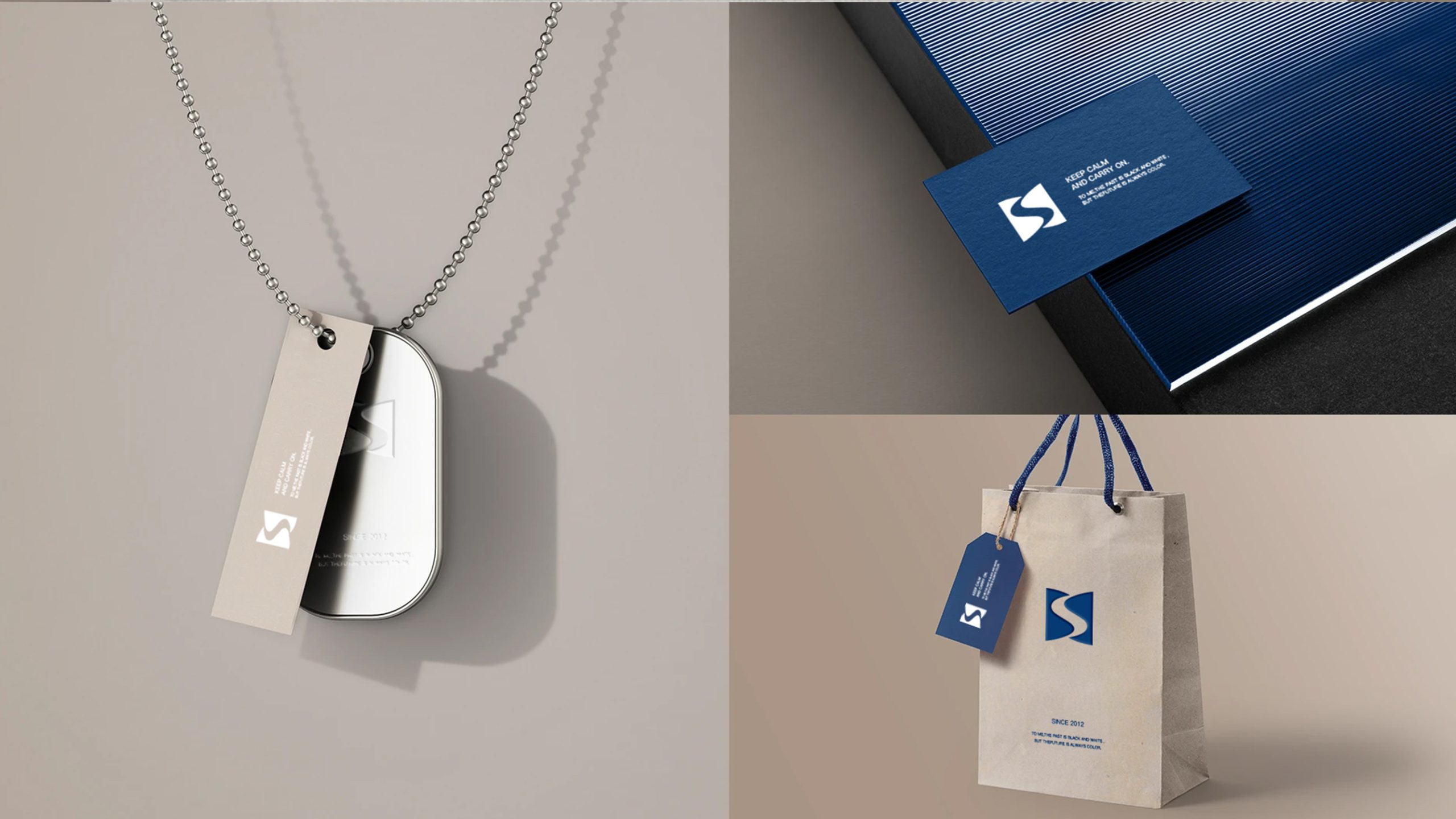
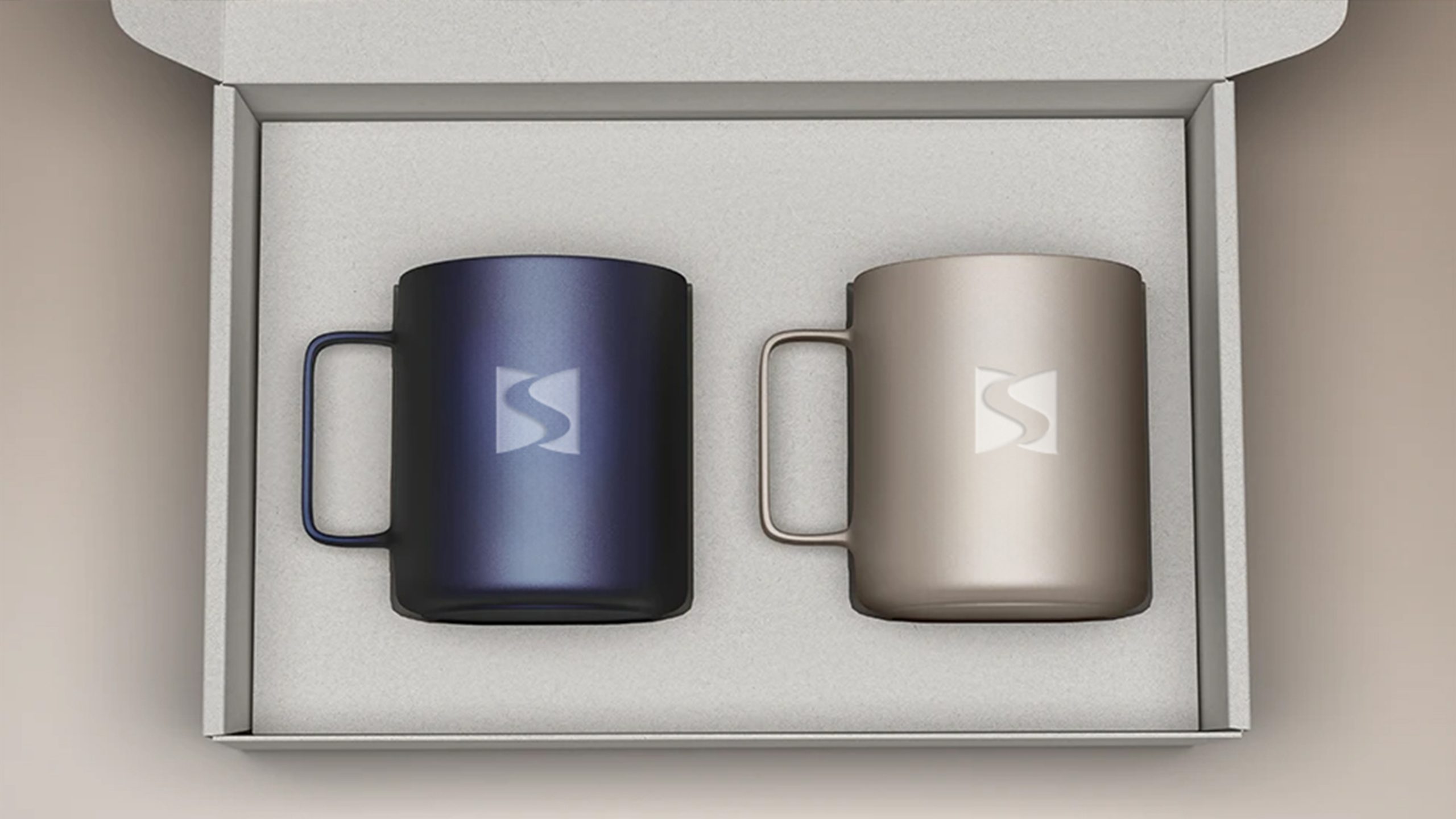
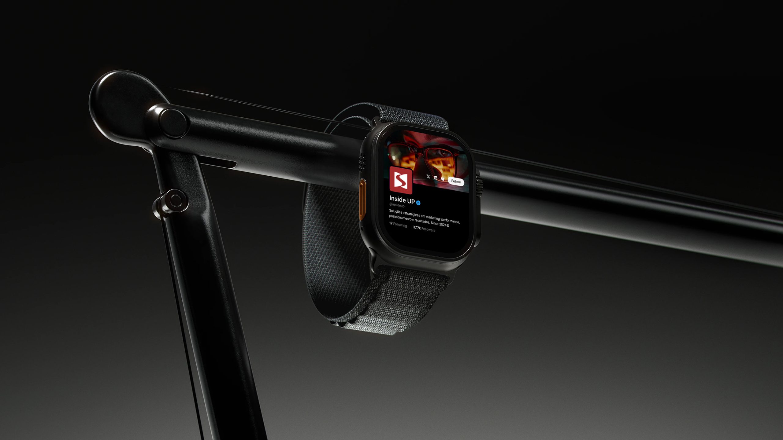
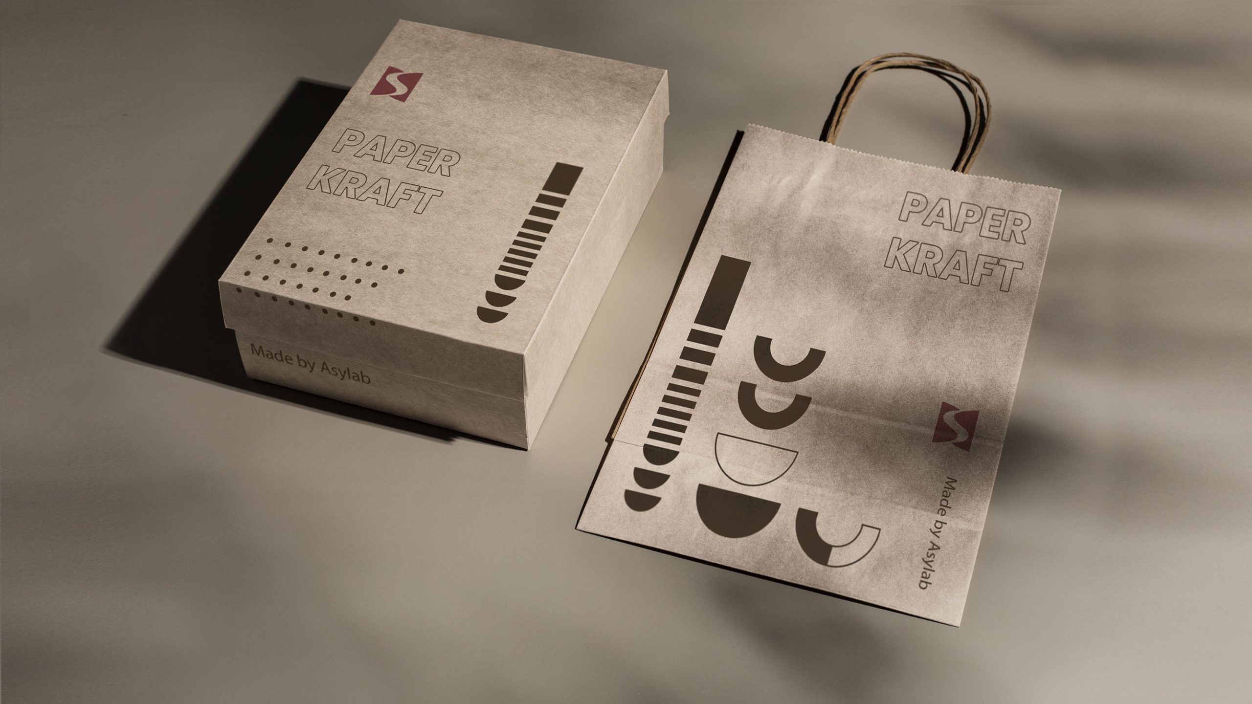
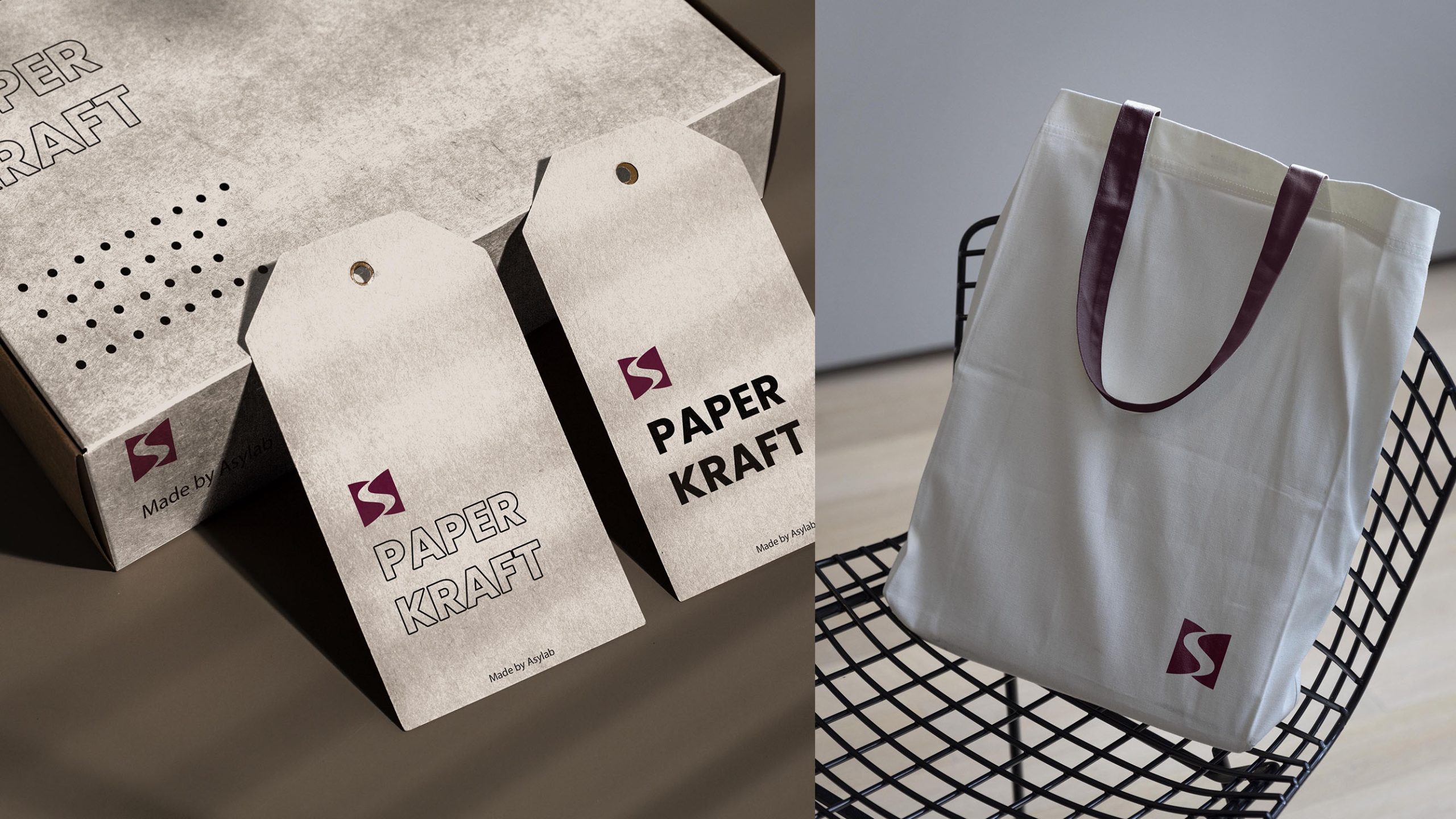
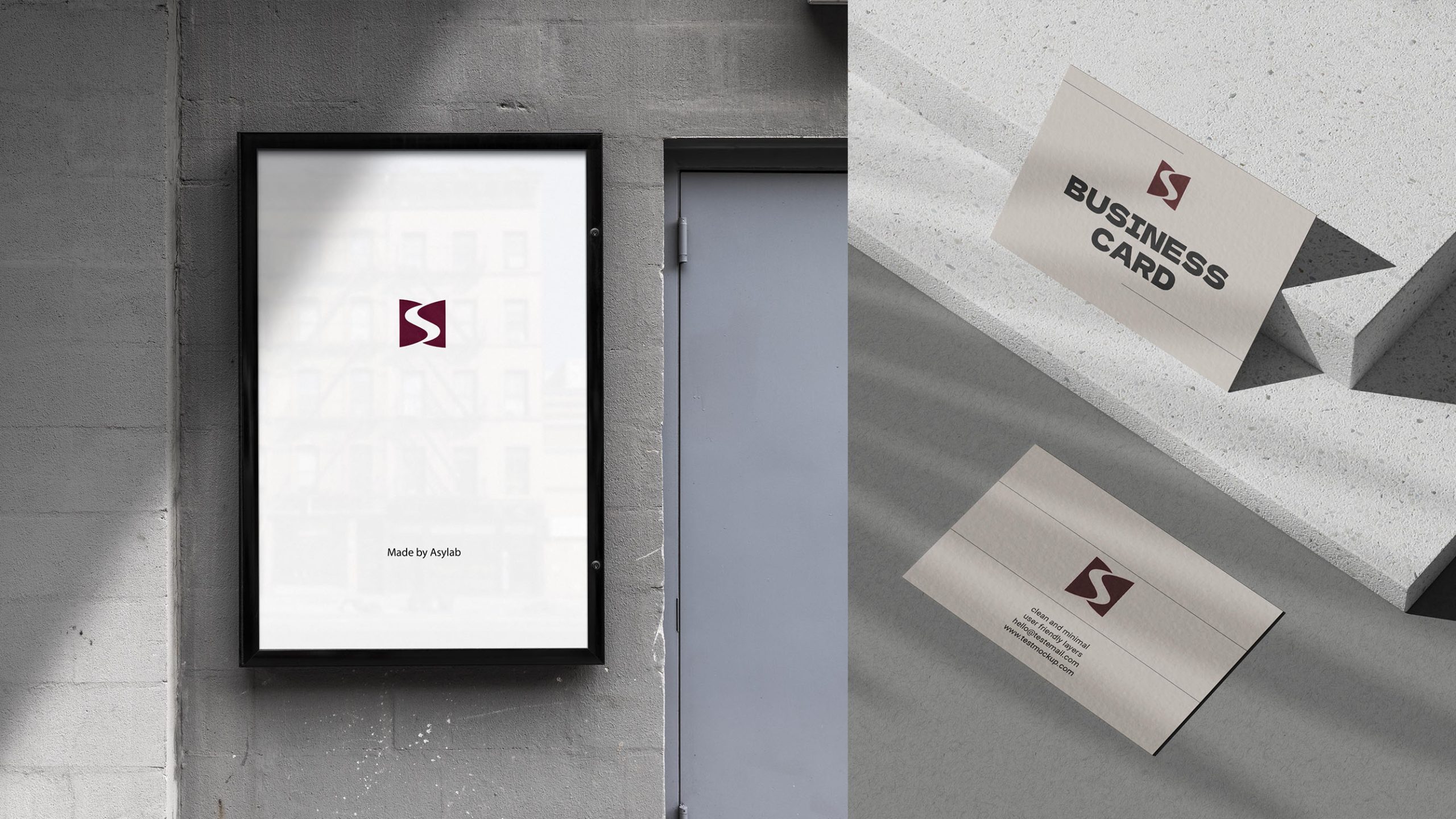
The logo works across corporate stationery, websites, exhibition wayfinding, business cards, product packaging and video opening sequences. The central “S” curve can become a motion graphic expressing energy flow, signal transmission or collaborative creation. In physical spaces and print, UV finishes, embossed metal and red-gold foil can add a premium finish. For digital applications, the standalone “S” provides a distinctive and memorable brand signature.
brand meaning
The “S” embodies three dimensions of the brand: System—structured thinking, organizational strength and execution; Smart—innovation powered by data and intelligence; and Synergy—shared growth through open collaboration. The symbol distills complex ideas into a minimal form, giving visual expression to the brand’s combination of order and innovation.
Improper Usage (Protection Specification)
Do not alter the proportions of the “S” curve or the shapes on either side. Do not change the primary burgundy or add gradients. Do not rotate, skew or mirror the logo. Do not add shadows, outlines or glow effects. The minimum reproduction width is 22 mm. Maintain clear space on all sides equal to at least 15% of the symbol’s width.
design results
Following the launch of the new logo, brand recognition increased by 49%, with clients consistently describing it as “simple, powerful and distinctly modern.” The “S” symbol established a unified identity across the corporate website, system login pages and mobile applications, strengthening associations with systematic thinking and innovation. Qingmei Future has included the project in its Technology and Systems Services Brand Identity collection as an example of rational design expressed through fluid structure.