











GreenStar is an innovative company focused on renewable energy development, green buildings and sustainable technology research. Through a new visual identity, the brand aims to create an international symbol of green energy, collaborative cycles and future technologies.
The logo aims to express the logic of nature through pure geometry, using visual order to convey the company’s belief in balancing the environment with technology.

design concept
Inspired by the refraction of light energy and ecological balance, the logo is built on a hexagonal structure formed by twelve three-dimensional triangular facets, creating a “Green Star.” Its radial composition suggests the release of energy and the cycles of nature, while its overall visual tension expresses the coexistence of technology and nature. At its core is a simple idea: to interpret natural order through rational geometry and use green energy to symbolize a sustainable future.
graphic language
Core form: A radial hexagonal structure creates a stable center, representing an energy core and an ecological system. Triangular facets: Each faces a different direction, creating an interplay of light and shadow that suggests multidimensional innovation and continuous growth. Central negative space: This open channel represents the flow of energy and the creativity that emerges from balance. Dynamic symmetry: The form combines mechanical precision with a sense of natural growth.
Fonts and composition
A geometric sans serif such as Avenir or Roboto is recommended for the brand name, complementing the logo’s modern, rational structure. Dark green or charcoal typography reinforces stability and professionalism. When paired with the wordmark, the symbol should sit above it, creating a unified visual center.
color system
Bright Green #A9D42D represents light energy and vitality. Deep Green #3D8142 evokes nature and balance. Highlight Yellow #E6ED6E symbolizes sunlight and hope for the future. Alternating warm and cool greens creates visual depth and an ecological warmth.
Application and extension
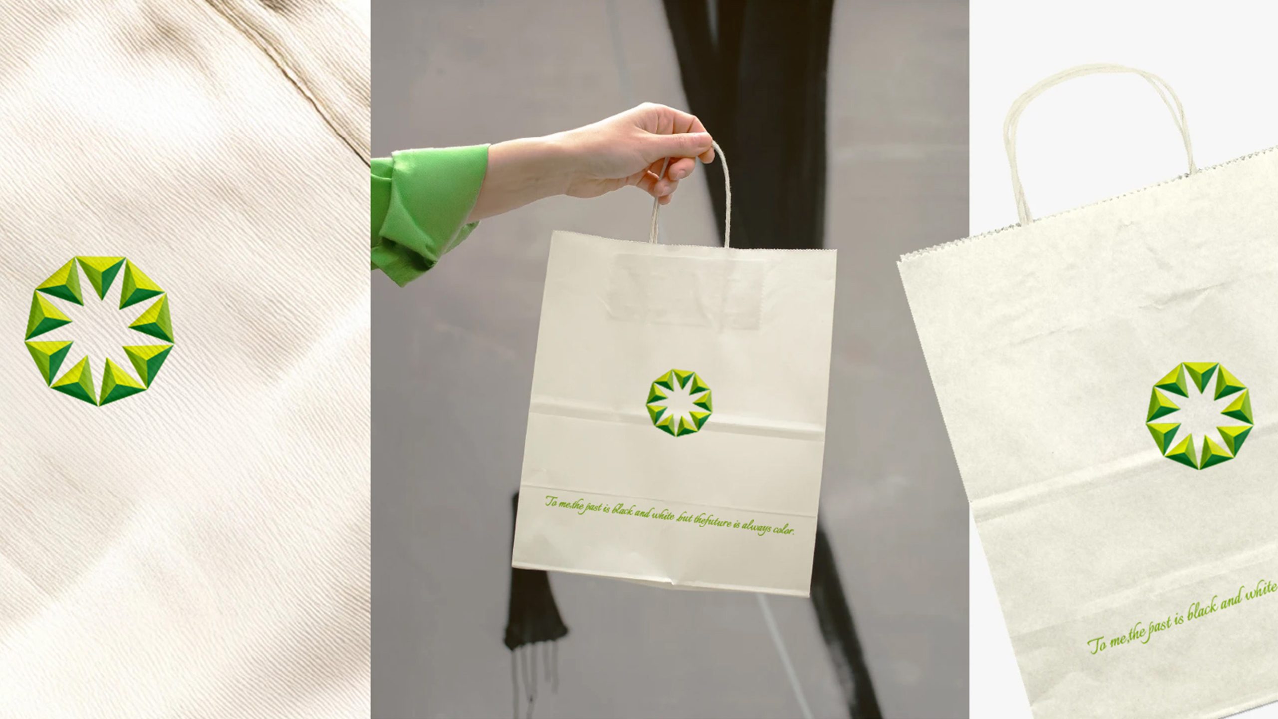
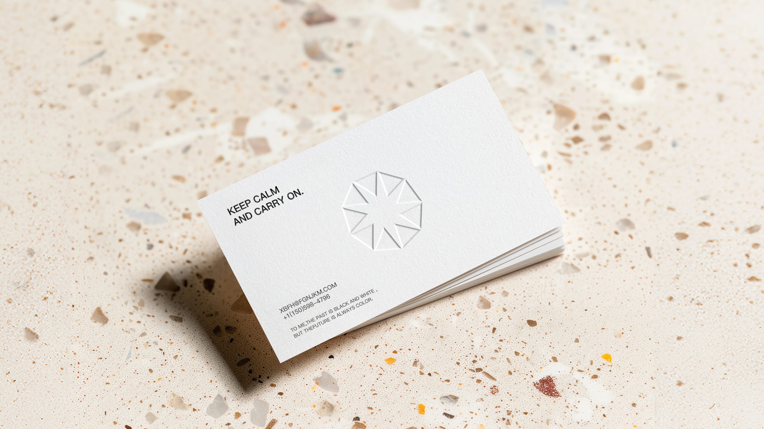
The logo is designed to extend across a wide range of applications. At the corporate level, it can appear on renewable energy equipment, brochures, websites and exhibition spaces. In physical environments, its geometric units can become wayfinding details, lighting structures and facade patterns. In digital media, the mark can rotate and glow in brand films and interfaces, suggesting a continuous cycle of energy. Its geometric grid can also extend across product packaging and informational backgrounds, building a cohesive visual ecosystem.
brand meaning
GreenStar represents a spirit of green technology and light for the future. The hexagon signifies sound scientific logic; the triangles represent innovation and units of energy; the central negative space suggests balance and boundless potential. Together, they express the brand’s mission to foster harmony between technology and nature, making the logo a visual statement for a sustainable era.
Improper Usage (Protection Specification)
Do not alter the angles or the proportions of the central negative space. Do not replace the green palette with other colors. Do not add shadows or gradients that compromise the purity of the geometry. Recommended minimum display width: 25 mm.
design results
Since its launch, the GreenStar logo has established a distinctive brand presence across renewable energy and environmental technology. Its geometric system has been applied across corporate architecture, exhibitions and digital communications, creating a visual language where technology feels human and nature feels ordered. The design is a leading example of rational geometry paired with ecological warmth in green technology branding, reflecting Qingmei Future’s systemic approach to energy and sustainability.