










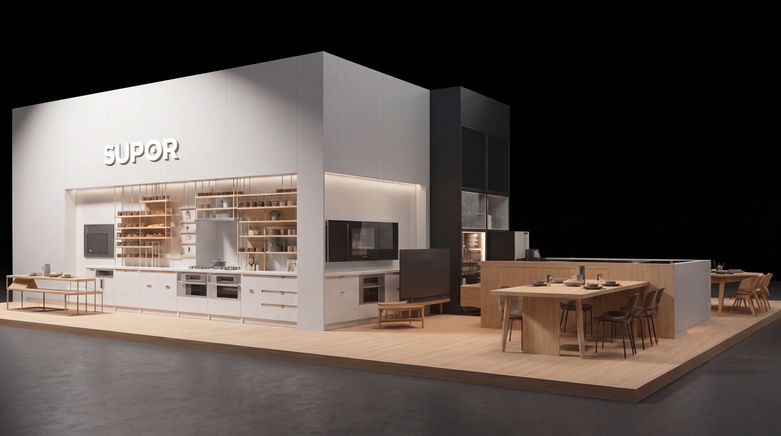
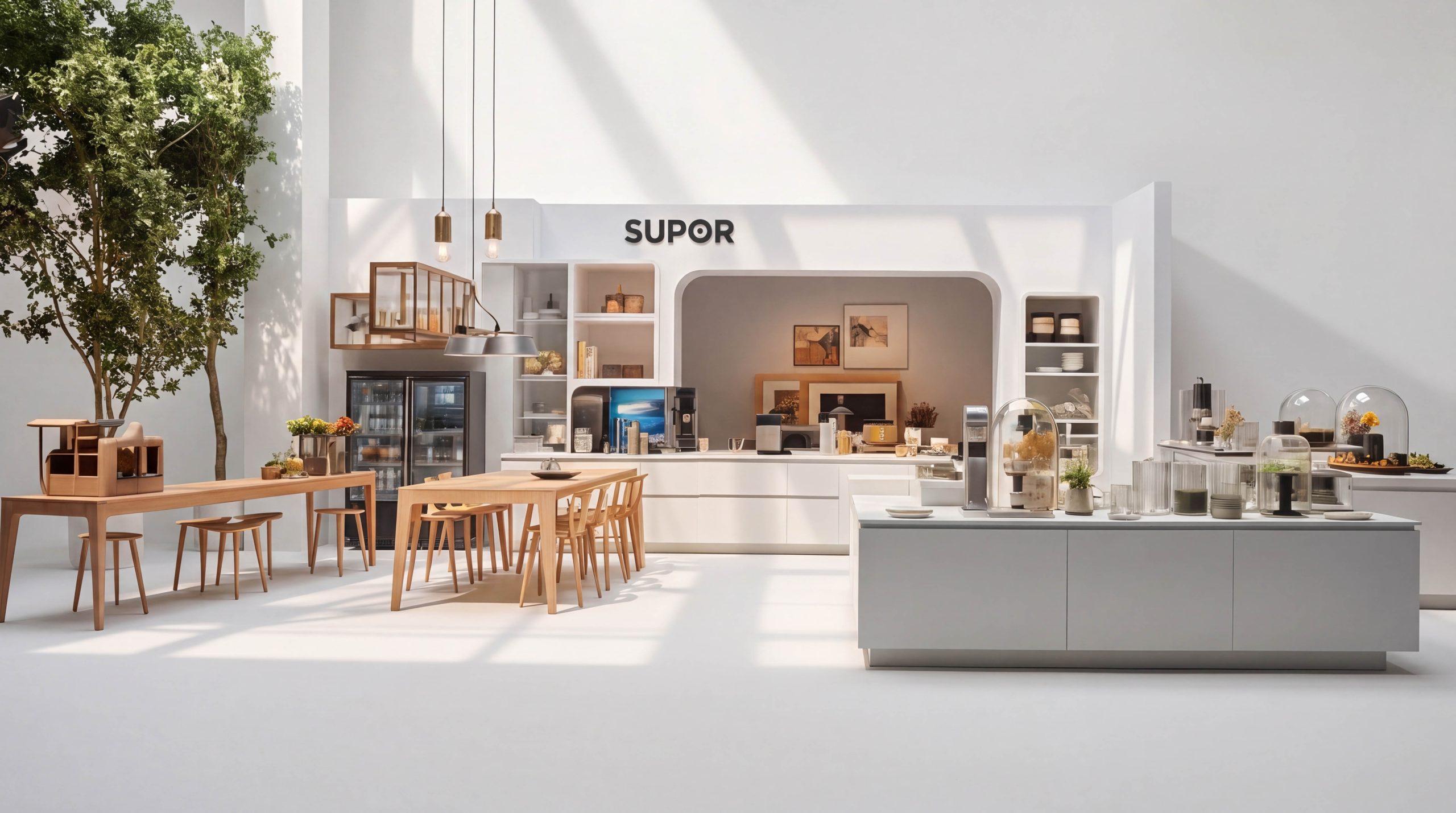
SUPOR smart kitchen appliance retail and experience store wayfinding system. Formats include city flagship stores, standard shopping-mall stores and temporary exhibition stands.
The scope covers exterior identification, entrance and welcome, functional zones and demo islands, pricing and service information, checkout and pickup, after-sales service, accessibility and emergency wayfinding.
The goal: in a high-traffic, demonstration-heavy, SKU-dense environment, build a wayfinding system that is replicable, low-maintenance and scalable. First-time visitors should gain a sense of direction within 30 seconds, returning customers should reach their target product in three steps, and the operations team should be able to maintain the system in a standardized, data-driven way.
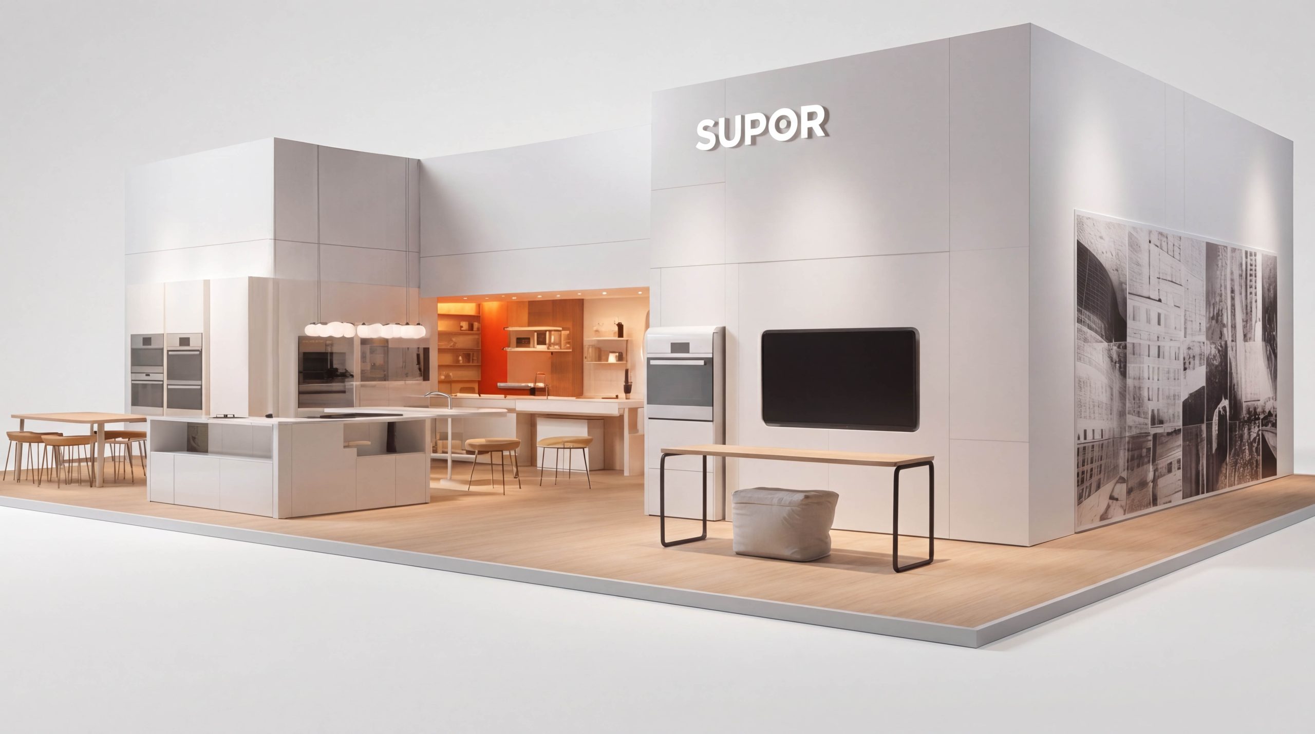
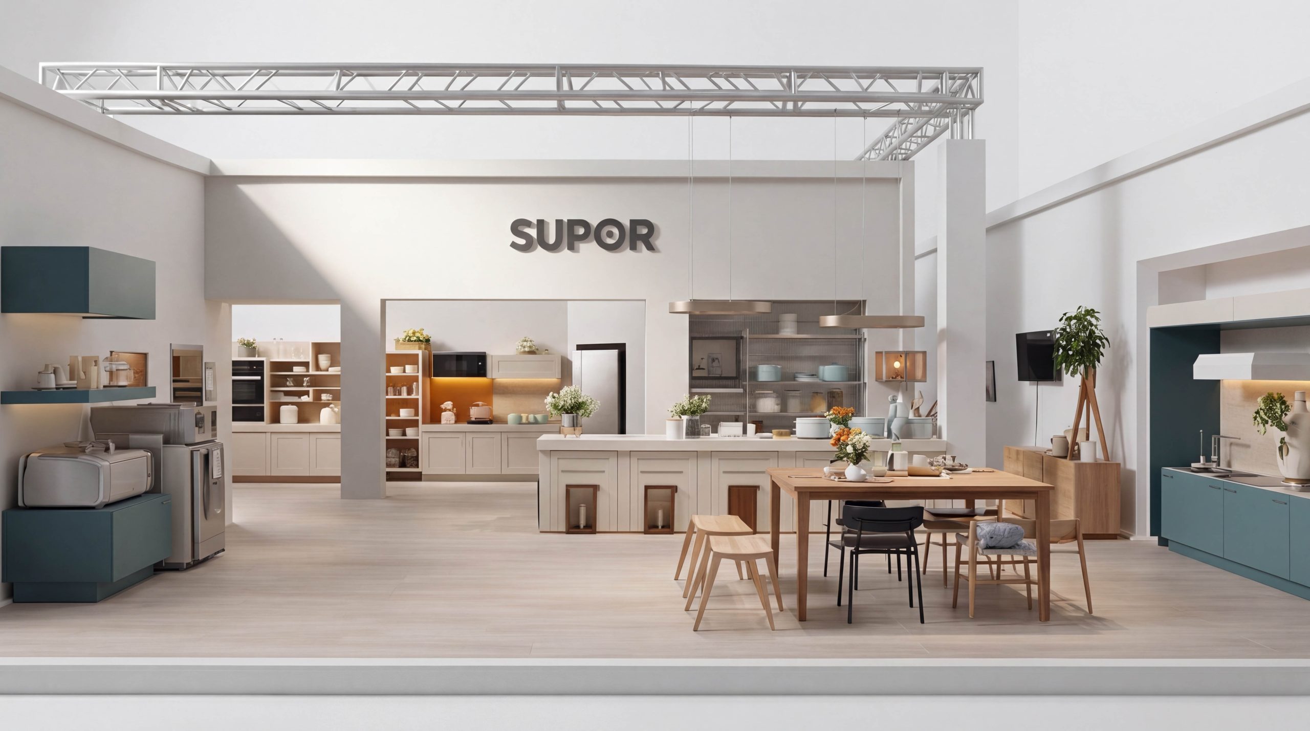
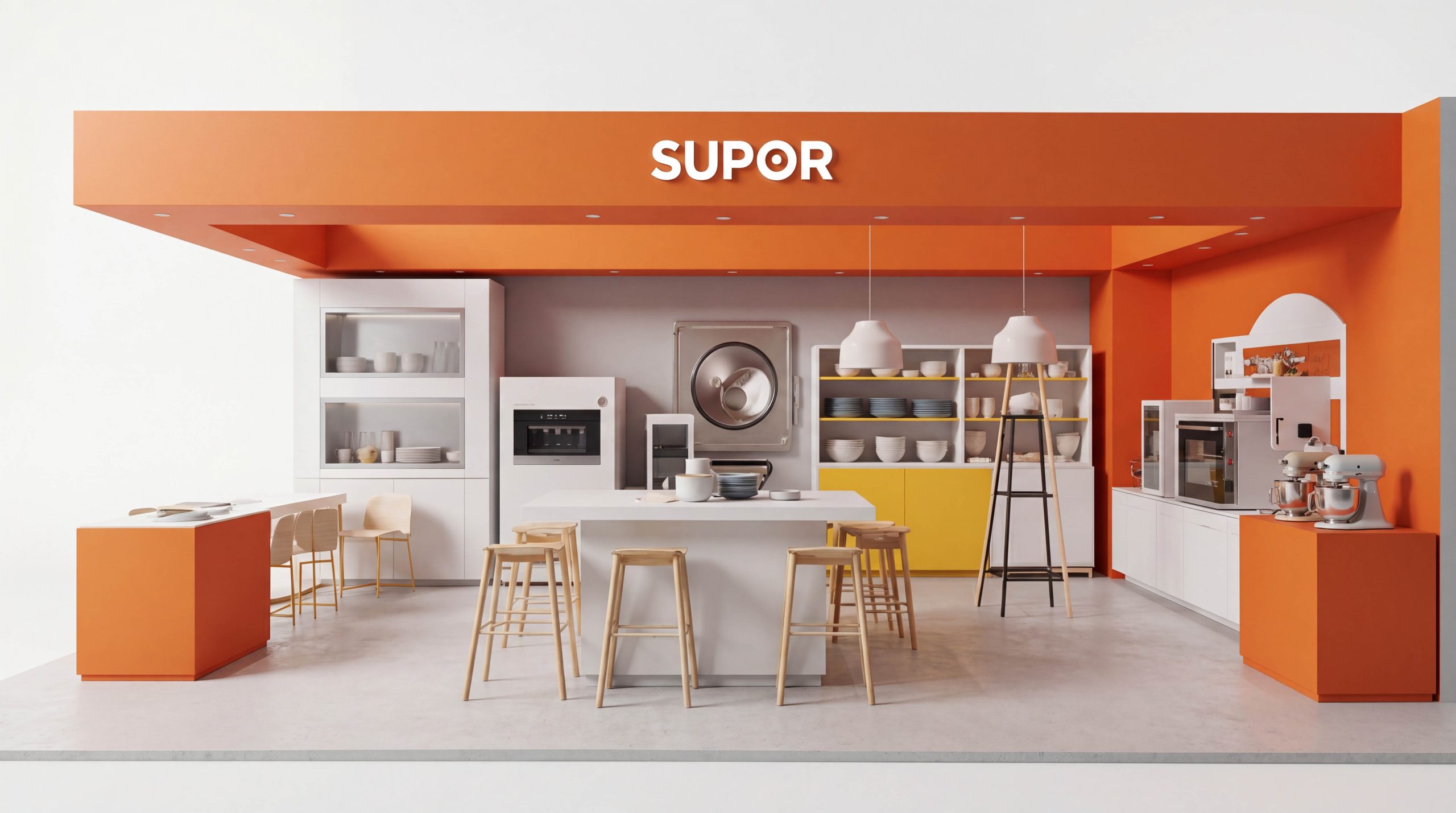
Assess the current state and define the goal
Site surveys and time-slot sampling revealed poor long-range visibility at corners; inconsistent explanations across demo islands for rice cookers, air fryers and combi steam ovens; a muddled hierarchy between price tags and promotional benefits; reflections from stainless steel and glass impairing legibility; and temporary promotional materials interfering with the core system. These findings defined three objectives: continuous guidance (advance notice at key turns plus progress confirmation); stable legibility (parametric control of viewing distance, type size, contrast and illuminance); and efficient operations (templated variable information, 5–10-minute changeovers per store, consistent across stores).
Systematic method and coding strategy
One grid: a unified 8 pt / 4 mm module runs through both sign layouts and hardware tooling, reinforcing typographic order and batch consistency. Two viewing distances: long range (12–25 m) for storefront signage and category indexes; short range (1–7 m) for directional, operating and safety instructions, each with its own minimum illuminance and contrast thresholds. Three carrier types: fixed signage (storefront, zone signs, overview maps), variable information (price tags, featured products, energy efficiency/capacity/warranty, promotions) and temporary guidance (peak-hour flow management, maintenance detours, emergency evacuation), all sharing a unified magnetic/slot-in interface. Four-level coding: store – zone – position – unit (letters + numbers); complete kitchen solutions add a “solution code + part number,” linked to inventory, picking, pickup and after-sales systems. Five-step implementation: survey and modeling – prototyping – pilot calibration – full rollout – handover of the asset register and O&M SOPs.
Visual and information rules
Color: brand orange serves as the functional accent over a base of stone white and deep gray; accessibility and safety use international-standard blue/yellow to avoid conflict with marketing colors. Typography and sizing: highly legible sans-serif Chinese and Latin typefaces; storefront ≥180 mm, zone signs 80–120 mm, aisle directions 30–40 pt, operating notes 18–24 pt; specs, prices and codes set in tabular figures. Iconography: unified stroke weights and corner radii, with a pictogram library covering heating methods (steam/bake/fry/boil) as well as capacity, power, energy efficiency, noise, cleaning modes and IoT connectivity; arrows and numerals share the same geometric rules. Layout: left-aligned, evenly spaced columns, fixed leading; the reading order runs category – key selling points – key specs – price/benefits – installation and service, reducing backtracking. Optical control: 4000–4500 K neutral, glare-controlled lighting; matte information surfaces; shading frames and reflection-angle control around highly reflective metal, ensuring legibility up close and at oblique angles.
Touchpoint Design and On-Site Implementation
Façade and entrance: illuminated storefront signage plus corner blade signs create visibility from multiple sides; the first panel at the entrance combines a zone index, the day’s demo schedule and a service list (measurement, installation, extended warranty, trade-in). Zones and demos: five zones, covering small-appliance experience, integrated steam ovens, water purification and wellness, cleaning appliances, and accessories and consumables. Demo islands use a three-tier nameplate (function – operating steps – safety notes), with NFC/QR codes linking directly to energy consumption, capacity, inner-pot material, installation requirements and app pairing. Pricing and benefits: a unified price-tag template on end caps and shelf edges presents model, selling points, price, membership/installments, extended warranty and trade-in in clear layers; energy efficiency, noise, capacity and power appear side by side using fixed color bands and icons. Checkout and pickup: a “be prepared” checklist at the cashier prompts for invoices, installments, delivery booking and installation time slots; the pickup area is organized by number ranges and one-way circulation, with real-time wait times and the required verification documents. After-sales and safety: the service desk uses a three-part format (request – documents – estimated time); AED, fire safety, evacuation and accessible routes use high-contrast templates, with secondary confirmation points along long corridors and at corners.
Delivery and operation and maintenance mechanism
We established a closed operational loop of “asset register + template library + data integration.” Every sign carries a unique code, installation coordinates and a maintenance log. Price tags, spec cards, demo schedules and flow-management materials are generated automatically from templates and can be printed in-store, so one person can update them in five minutes. QR codes connect to live floor plans, spec sheets, installation and maintenance SOPs and emergency plans; inspection checklists define frequency, tolerances, cleaning and illuminance requirements. Deliverables include the master wayfinding plan and location drawings, layout and icon manual, hardware exploded views and bill of materials, mounting heights and optical parameters, and O&M SOPs and training materials. The system can be rapidly replicated across store formats, sustaining clear order, stable legibility and a professional standard consistent with the SUPOR brand over the long term.