










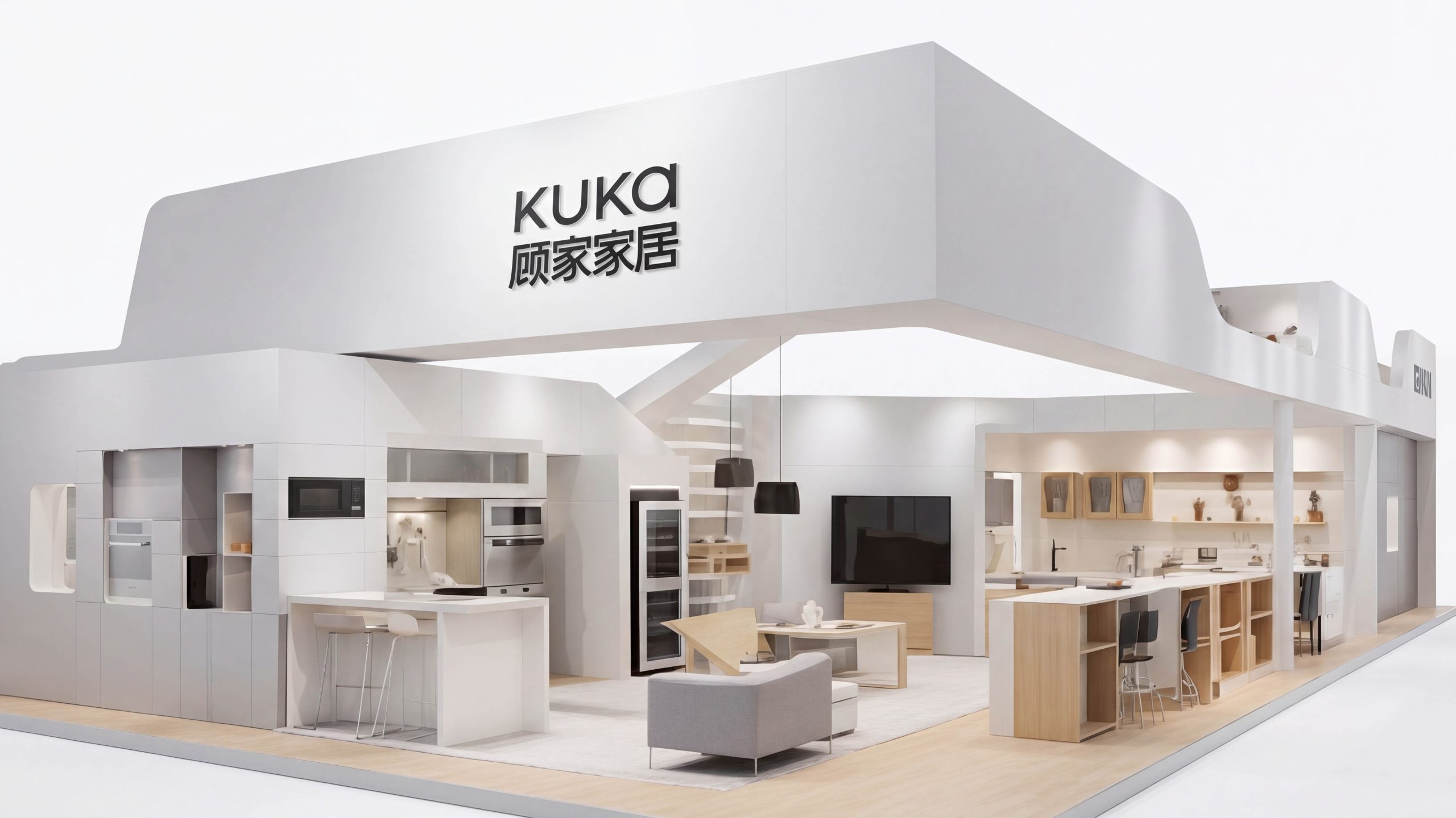
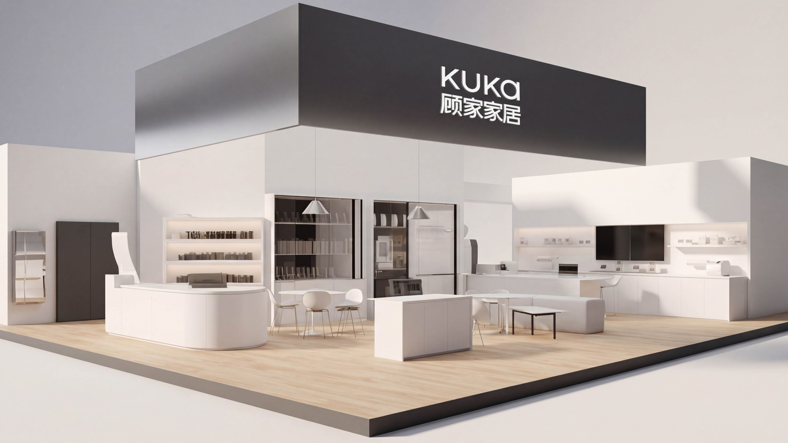
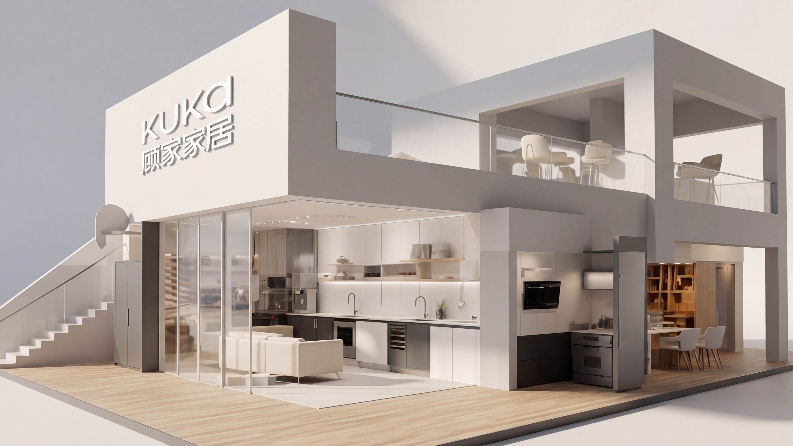
A showroom and retail wayfinding system for KUKA HOME, spanning urban flagship showrooms, standard shopping mall stores and temporary exhibition installations.
The scope covers facade identification, entrance and lobby orientation, room-set displays and category directories, materials and craftsmanship experience zones, checkout and collection, after-sales service, accessibility and emergency wayfinding.
The aim is a repeatable, low-maintenance wayfinding system that can scale across varied settings, high visitor volumes and service-intensive environments. First-time visitors can orient themselves within 30 seconds, returning customers can reach their chosen area in three steps, and teams can manage operations consistently.
Assess the current state and define the goal
Site surveys and observations at different times identified several issues: poor visibility at corners and over longer distances; an unclear hierarchy from room setting to category, collection and individual product; temporary promotional materials disrupting the information structure; and inconsistent usage and hygiene guidance in mattress and sofa trial areas. These findings shaped three priorities. Continuous guidance: eliminate uncertainty at key decision points, flag turns in advance and provide progress confirmation along long corridors. Consistent legibility: define viewing distance, type size, contrast and illumination to support reading by day and night across different surfaces. Ease of operation: use templates for changing information, allowing updates in 5–10 minutes while maintaining consistency across stores.
Methodology and Coding Strategy
One grid: a consistent 8 pt / 4 mm module guides sign layouts and hardware tooling for a unified appearance across stores. Two viewing ranges: 12–25 m for storefront identification and main category directories; 1–7 m for directions, specifications and service information, with minimum illumination and contrast thresholds. Three sign types: fixed signage for storefronts, zones, floors and overviews; variable information for prices, collection lists, featured products and promotions; and temporary guidance for peak-time traffic, maintenance diversions and emergency evacuation. All use standardized magnetic or slide-in fittings. Four coding levels: store–zone–location–product, using letters and numbers. Product combinations add a collection code and component number, linking to inventory, picking, collection and after-sales systems. Five delivery stages: survey and modeling, prototyping, pilot testing and refinement, full rollout, then handover of the asset register and operations and maintenance SOPs.
Visual and information rules
Color: warm brand grays and natural wood tones establish the environmental palette, with white for information and deep green for functional emphasis. Highly visible yellow and blue distinguish safety and accessibility information from promotional messaging. Typography and sizing: highly legible Chinese and Latin sans serif typefaces give both languages equal prominence. Storefront lettering is at least 180 mm high; zone lettering, 80–120 mm; directional text, 30–40 pt; and notices, 18–24 pt. Dimensions, prices and codes use tabular numerals. Icons: consistent stroke weights, corner radii and clear space define pictograms for living rooms, bedrooms, dining rooms, storage, customization and children’s furniture; environmental certification, materials and care; and delivery and installation. Layout: left alignment, evenly spaced columns and fixed line spacing establish a reading sequence of room setting, category, key benefits, specifications and dimensions, price, then service, reducing backtracking. Lighting: neutral 4000–4500 K light sources with glare control, matte information surfaces and anti-glare accessories on product spotlights minimize reflections.
Applied in Context
Facade and entrance: illuminated storefront signage and projecting corner signs provide visibility from two directions. Window displays pair room settings with collection lists, while floor lines lead directly to the lobby. Lobby and overview: the first display combines a room-setting directory, today’s featured products and a service list covering measurement, delivery, installation and furniture recycling. At aisle entrances, popular-destination lists point to living rooms, bedrooms, dining rooms, children’s furniture, customization and after-sales service. Experience and purchase: sofa and mattress zones provide trial instructions and hygiene guidance. NFC and QR links open material information, load limits, environmental ratings, stock availability and care instructions. Customization areas follow a four-part guide: process, lead time, cost breakdown and completed room examples. Consultation and checkout: planning desks use a structured form covering floor plan, area, style, budget and delivery window. Checkout checklists cover documentation, delivery bookings, stair and lift restrictions, and installation considerations. Collection and after-sales: collection areas combine order-number ranges with one-way circulation. Service signs follow a request–required documents–estimated time format, with separate routes for repairs and replacements. Accessibility and safety: high-contrast templates identify accessible routes, parent and baby rooms, AEDs, fire safety facilities and evacuation routes. Reassurance signs appear along long corridors and at corners, with minimum illumination maintained at night.
Delivery and operation and maintenance mechanism
An integrated operating framework connects the asset register, template library and live data. Every sign has a unique ID, installation coordinates and maintenance history. Templates automatically generate price labels, collection lists, promotional materials and queue-management signs, enabling one person to complete updates within 5 minutes. QR codes link to current floor plans, specification sheets, delivery and installation SOPs, and emergency plans. Inspection checklists define frequency, tolerances, cleaning and illumination requirements. Deliverables include a sitewide wayfinding plan and sign location drawings, layout and icon guidelines, exploded assembly drawings and bills of materials, mounting heights and lighting specifications, operations and maintenance SOPs, and training resources. Designed for rapid rollout across cities and store formats, the system maintains clear information hierarchies, consistent legibility and a professional expression of the KUKA HOME brand over time.