










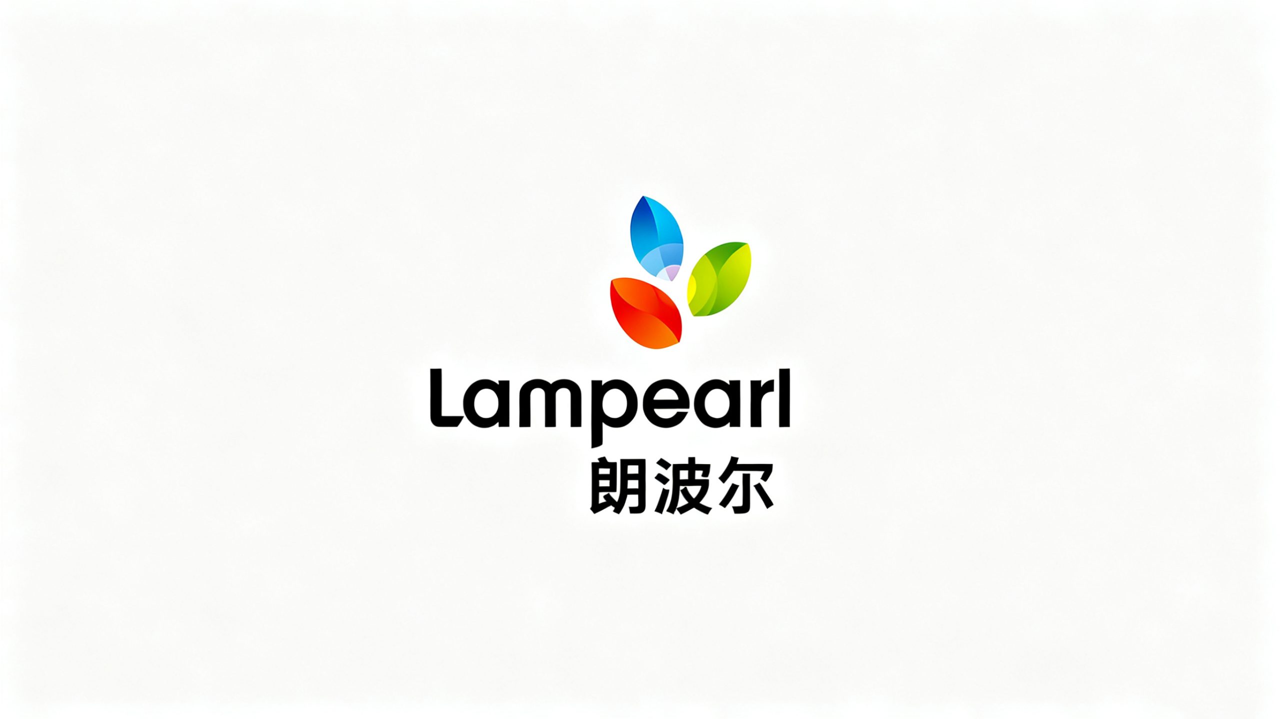
Lampearl is an innovative company specializing in optical lighting and smart living technologies. Through optical materials, intelligent controls and human-centered design, it creates healthier, more efficient and more inspiring experiences of light. As the business expanded globally, it needed a visual identity that could unite technological precision with natural beauty, expressing its positioning as a lighting innovator and its commitment to sustainability.
design concept
Built around the idea of “light in growth,” the symbol brings together the refraction of light, the concentration of energy and the vitality of natural forms in three interwoven leaves of light. Inspired by the way light scatters and reflects through crystals, the design conveys Lampearl’s belief that technology can nurture the world around us—bringing warmth to spaces and everyday life through light. The three leaves represent Technology, Nature and Humanity, the foundations of the brand.
graphic language
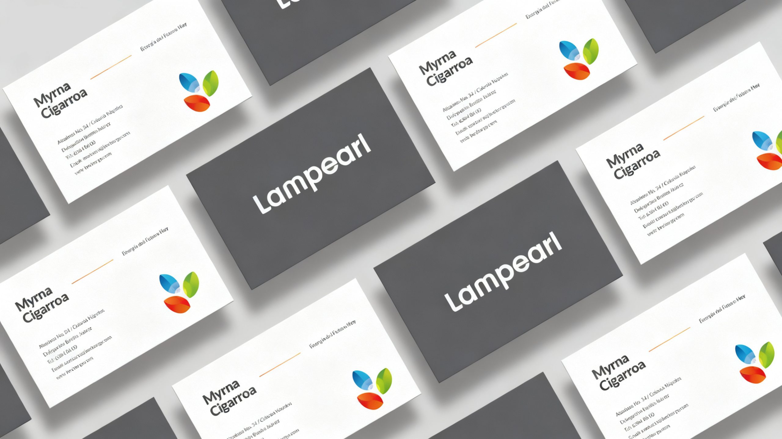
Three intersecting leaves gather like particles of light into a flower of energy, expressing innovation and connection. The symmetrical composition creates a soft center of light through negative space, reflecting the philosophy “Light begins within; warmth comes from the heart.” Translucent gradients echo the layers of the natural spectrum, giving the digital identity a luminous, progressive quality. The leaves extend upward to suggest growth, hope and creative momentum. The overall form balances softness and strength, combining organic vitality with geometric precision.
Fonts and composition
The Lampearl wordmark uses a rounded geometric sans serif with consistent stroke weights, conveying modernity and approachability. The contrasting heights of the “L” and “p” create rhythm and establish a stable visual relationship with the three-leaf symbol above. The Chinese wordmark uses custom geometric lettering, with simple strokes and slightly broad proportions that echo the rounded English letterforms. A shared central axis gives the composition balance and clarity.
color system
Blue #4CA7E6 represents technology, purity and the future; green #9ECB45 stands for nature, ecology and sustainability; orange-red #E84C2A conveys warmth, creativity and energy. Charcoal #2A2A2A grounds the wordmark with a professional, dependable presence. Translucent gradients overlap across the three leaves, creating a layered spectrum that expresses the integration of technology and nature. The identity remains distinctive and reproduces clearly on both light and dark backgrounds.
Application and extension
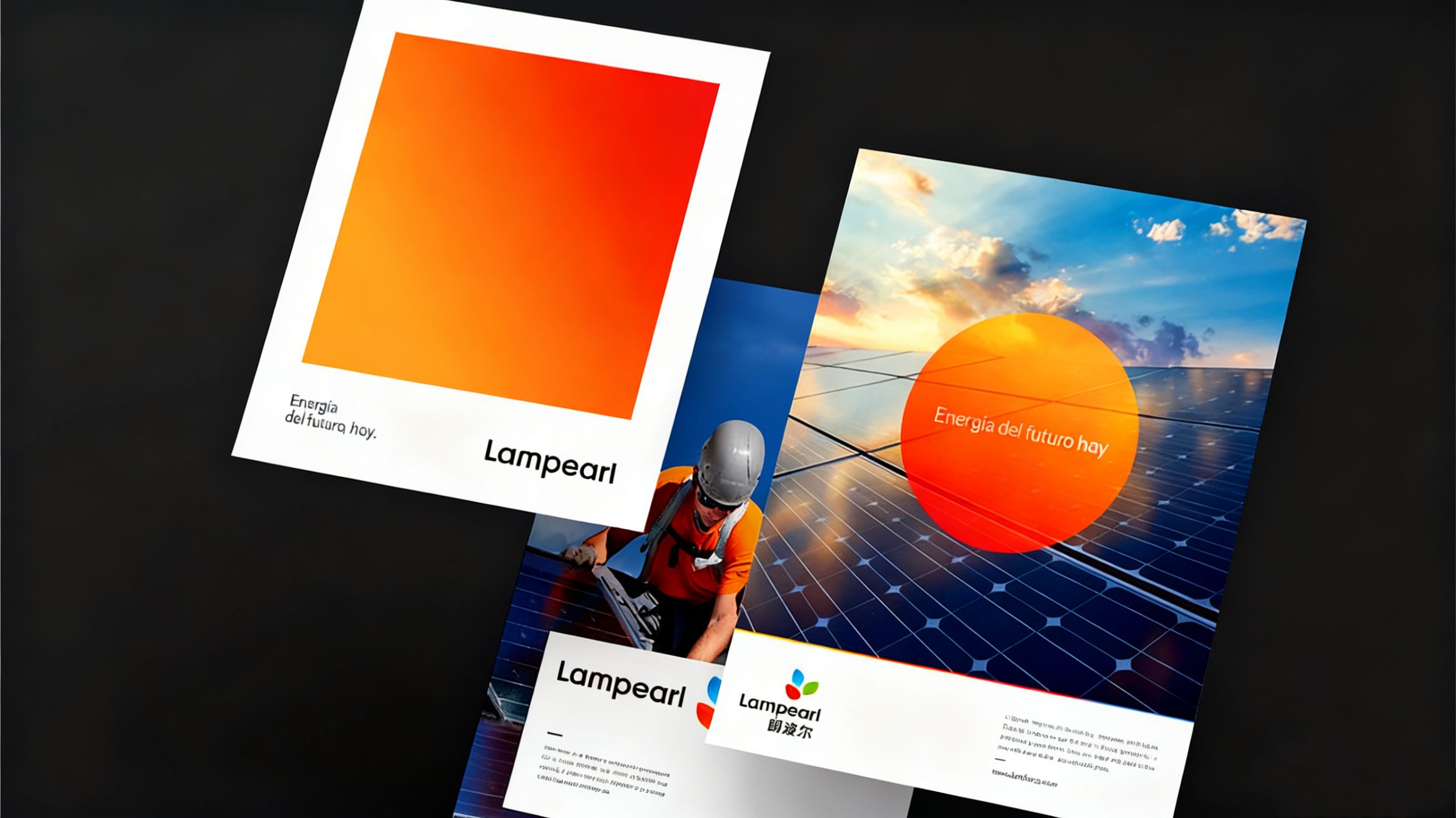
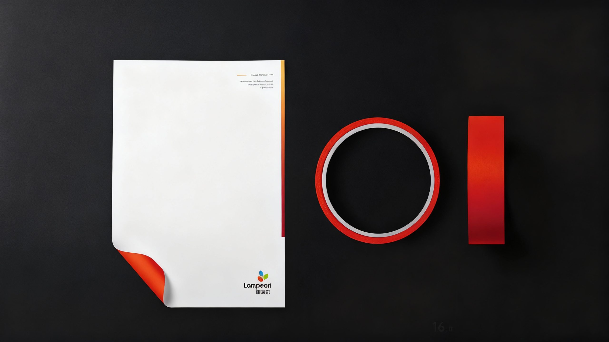
The identity adapts to smart lighting packaging, lighting control interfaces, app icons, showroom wayfinding and corporate motion graphics. The three-leaf symbol also works independently as a supporting graphic, generating patterns, animated light effects and launch sequences that express the brand’s technological character. Applications on finishes and materials such as brushed silver, matte white and sustainable paper reflect Lampearl’s commitment to bringing low-carbon thinking and aesthetics together. In static and animated form, the identity evokes the softness of natural light.
brand meaning
“Lampearl” combines “Lamp” and “Pearl,” suggesting the intelligence of light distilled into something as refined as a pearl. Through the image of growing leaves of light, the identity expresses the company’s belief: let technology illuminate the beauty of nature, and let every beam bring warmth to life. The mark embodies a commitment to continuous innovation, with light at its core and people at its heart.
Improper Usage (Protection Specification)
Do not change the orientation of the three leaves or their color proportions. Do not add shadows, outlines or mirror reflections. Do not rotate or tilt the leaf structure. Maintain a 1:1.2 ratio between the wordmark and symbol, and do not stretch either element. Minimum reproduction width: 22 mm. Monochrome versions may use only the approved black or white.
design results
Following the launch, research showed a 46% increase in Lampearl’s brand recognition at global lighting exhibitions and in industry media. Clients and partners described the new visual identity as more contemporary and international. Consistent, frequent use of the leaf-of-light symbol across customer touchpoints helped reposition Lampearl from a traditional manufacturer to a brand shaping intelligent lighting environments. The project is now featured in Qingmei Future’s Technology and Sustainable Brand Design collection as an example of visual innovation in the optoelectronics industry.