










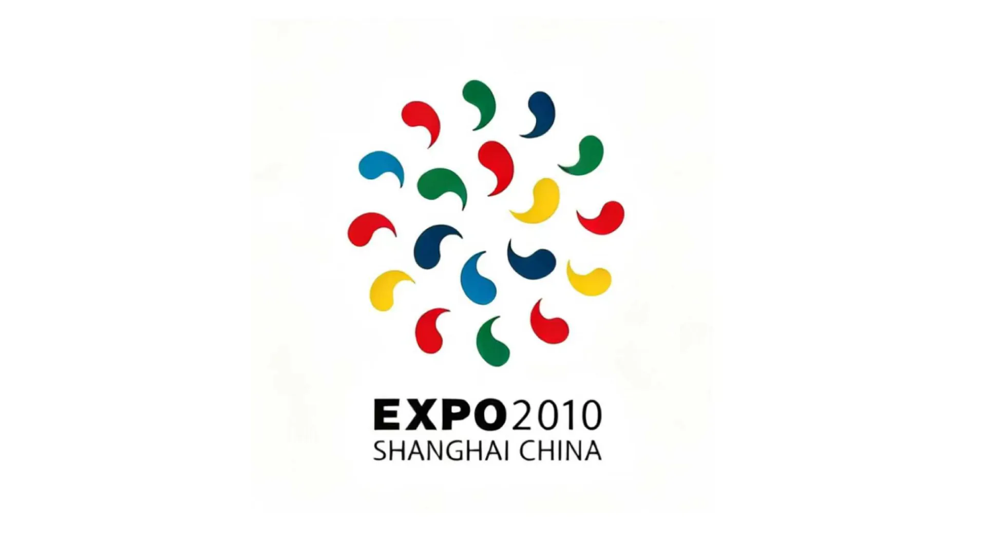
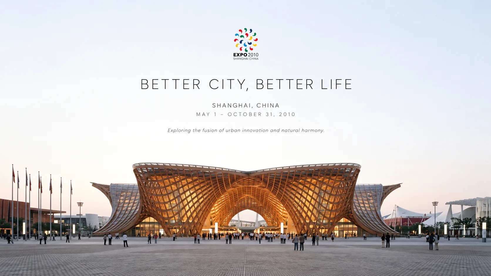
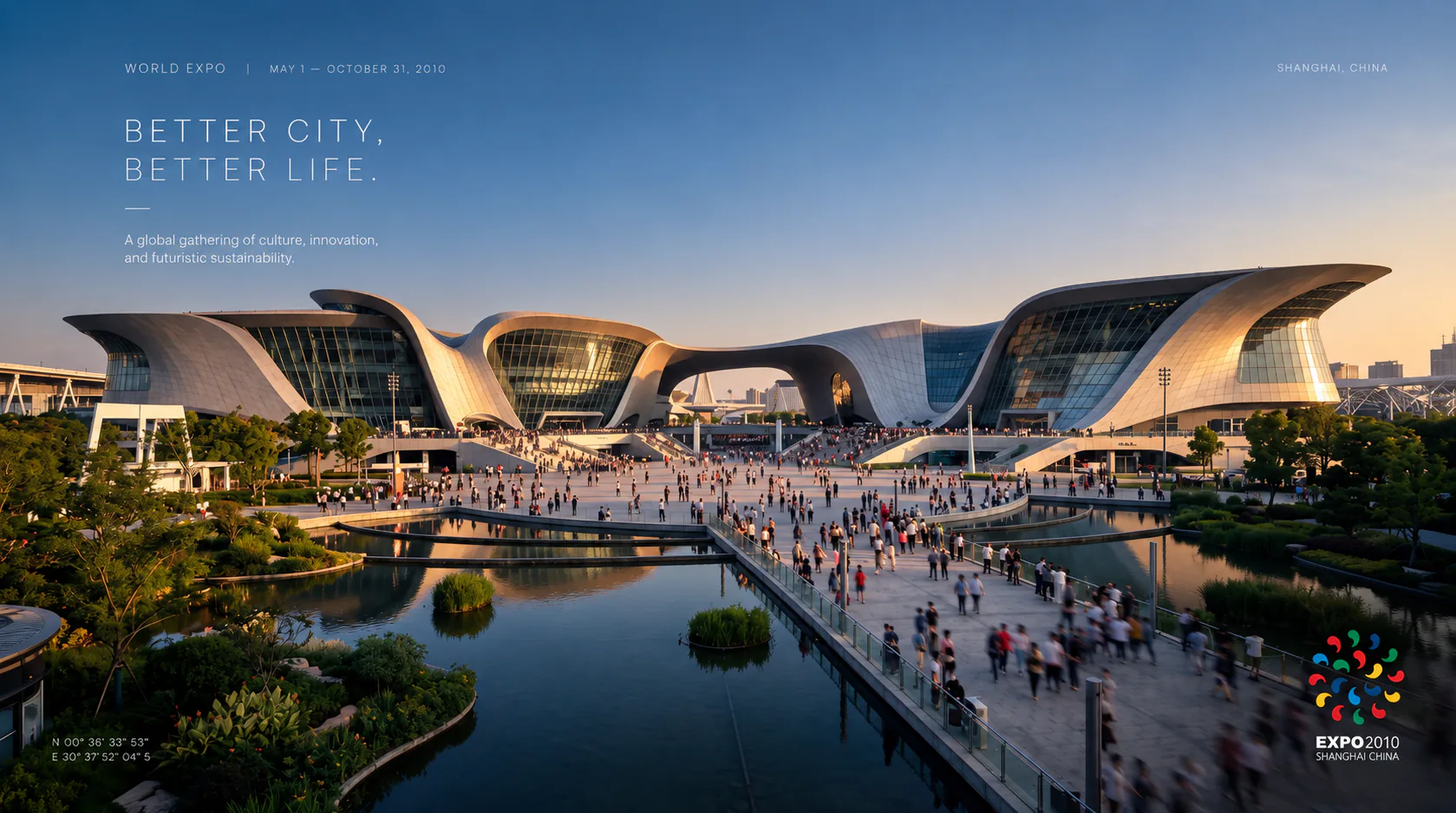
With the theme “Better City, Better Life,” Expo 2010 Shanghai was the first World Expo hosted in China and a major platform for exploring contemporary urban life and ideas for the future. Its identity needed to communicate across cultures, capture the spirit of its time and convey human warmth, representing China and its contemporary design on a global stage.
design concept
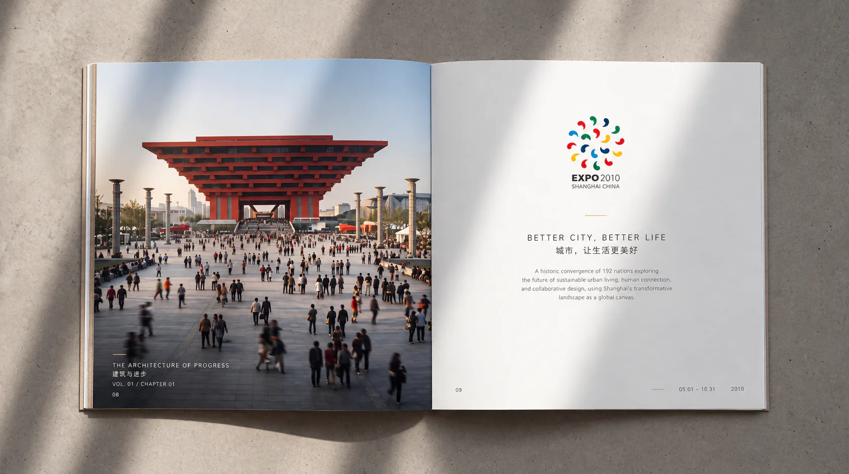
The logo centers on the human figure, using colorful abstract forms gathered into a circle to represent people from around the world building cities and the future together. Grounded in the Eastern philosophy of harmony in diversity, it reflects coexistence, exchange, and mutual learning. Its free, open forms express the unity of city and people, nature and civilization, tradition and future.
graphic language
More than 20 curved color segments form a circular, rotating composition, suggesting the convergence of cultures and energy. Each segment evokes a human figure, distinct yet connected to the others, creating a whole with a lively sense of rhythm. The circle represents the Earth and the inclusive spirit of the World Expo, expressing a shared future home for humanity.
color system
Red, yellow, blue, green and black draw on the visual language of the Olympic colors, representing five continents, five civilizations and five ways of life. Each color holds equal weight, creating a visual expression of harmony through diversity. Bright, lively and rhythmic, the palette brings an open, contemporary urban spirit to the exhibition identity.
Fonts and composition
“EXPO 2010 SHANGHAI CHINA” is set in a modern sans serif for international recognition and clear legibility. The black lettering provides a stable visual foundation for the multicolored symbol above. A symmetrical composition allows the identity to adapt across applications, from posters and badges to building façades.
Application and extension
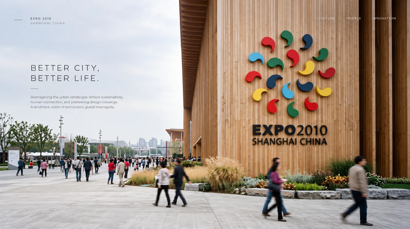
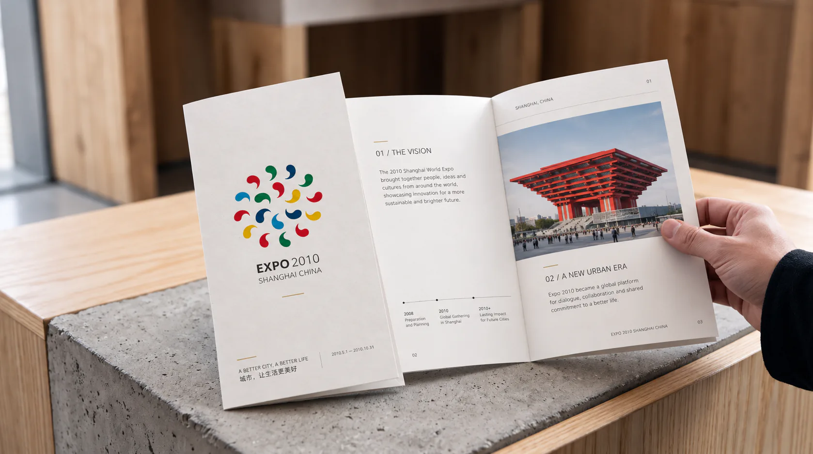
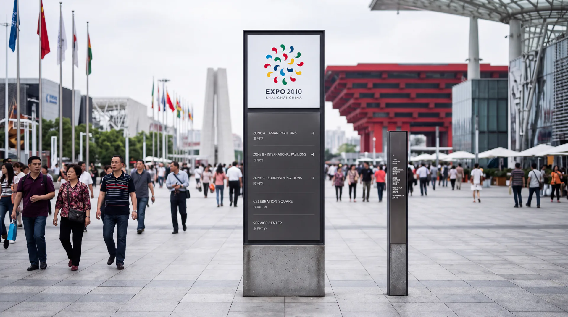
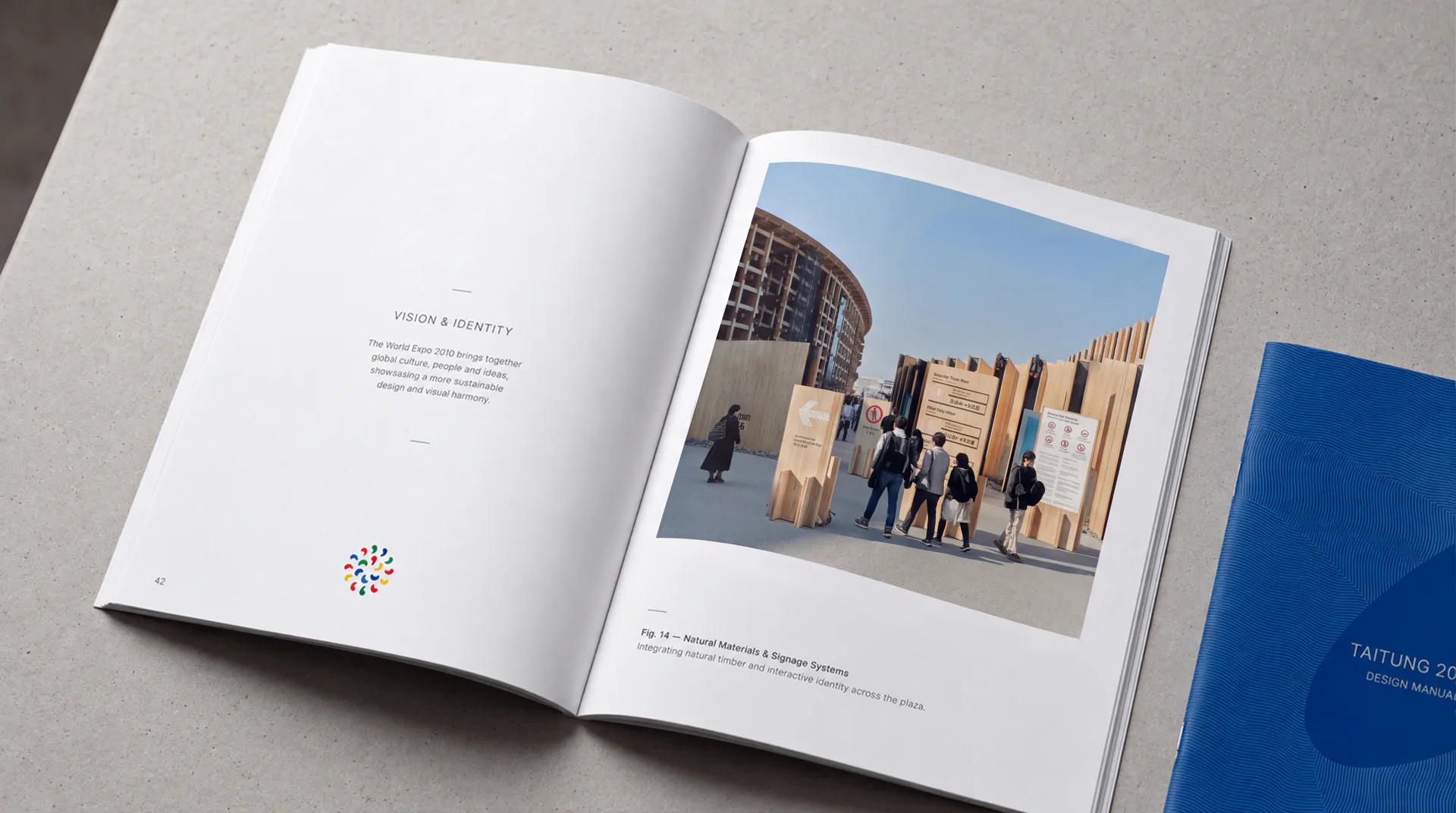
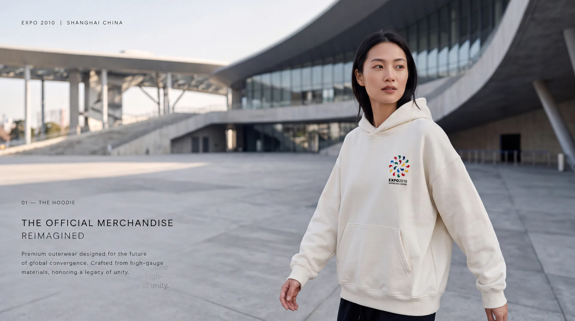
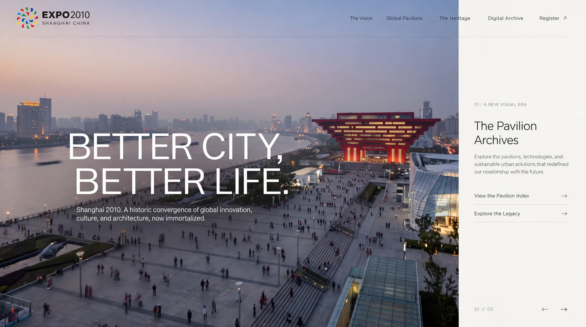
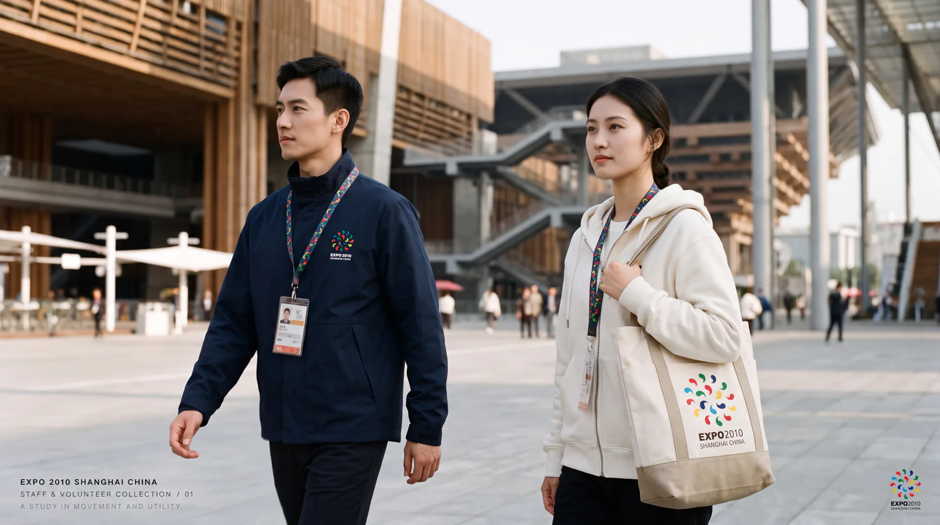
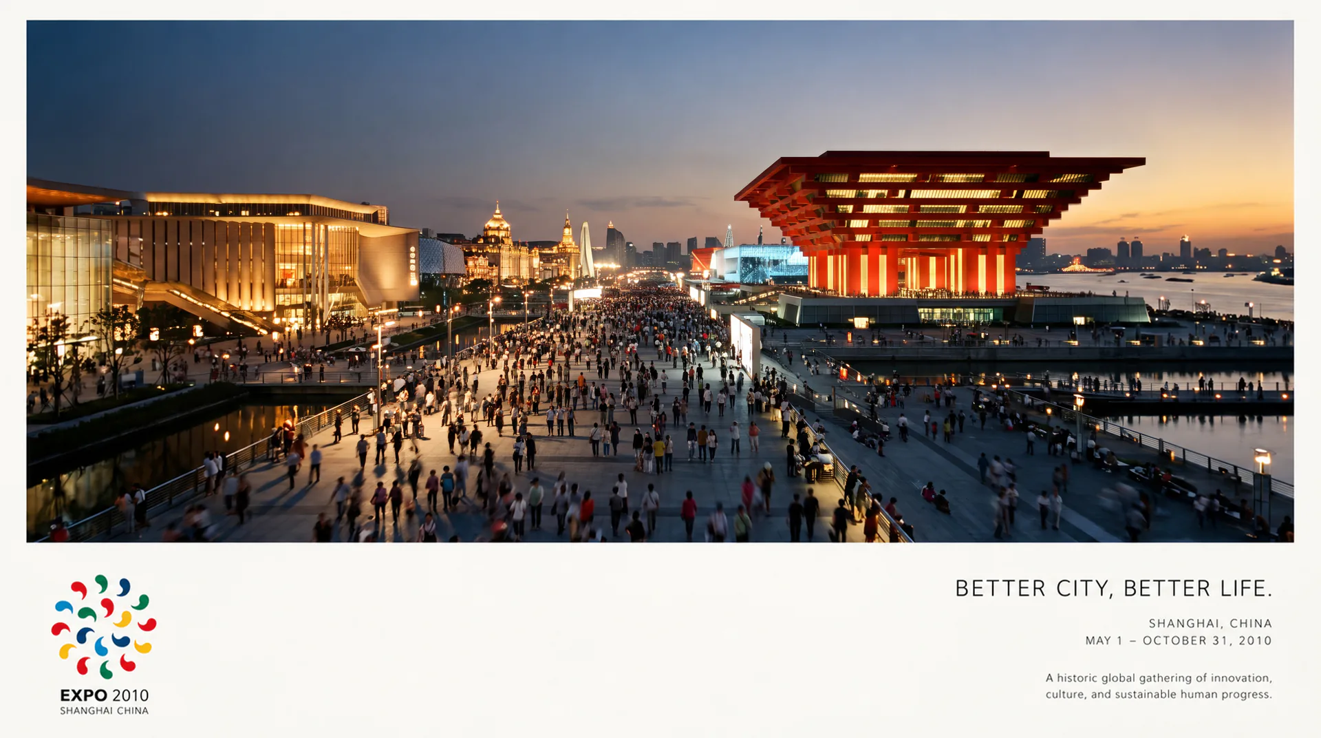
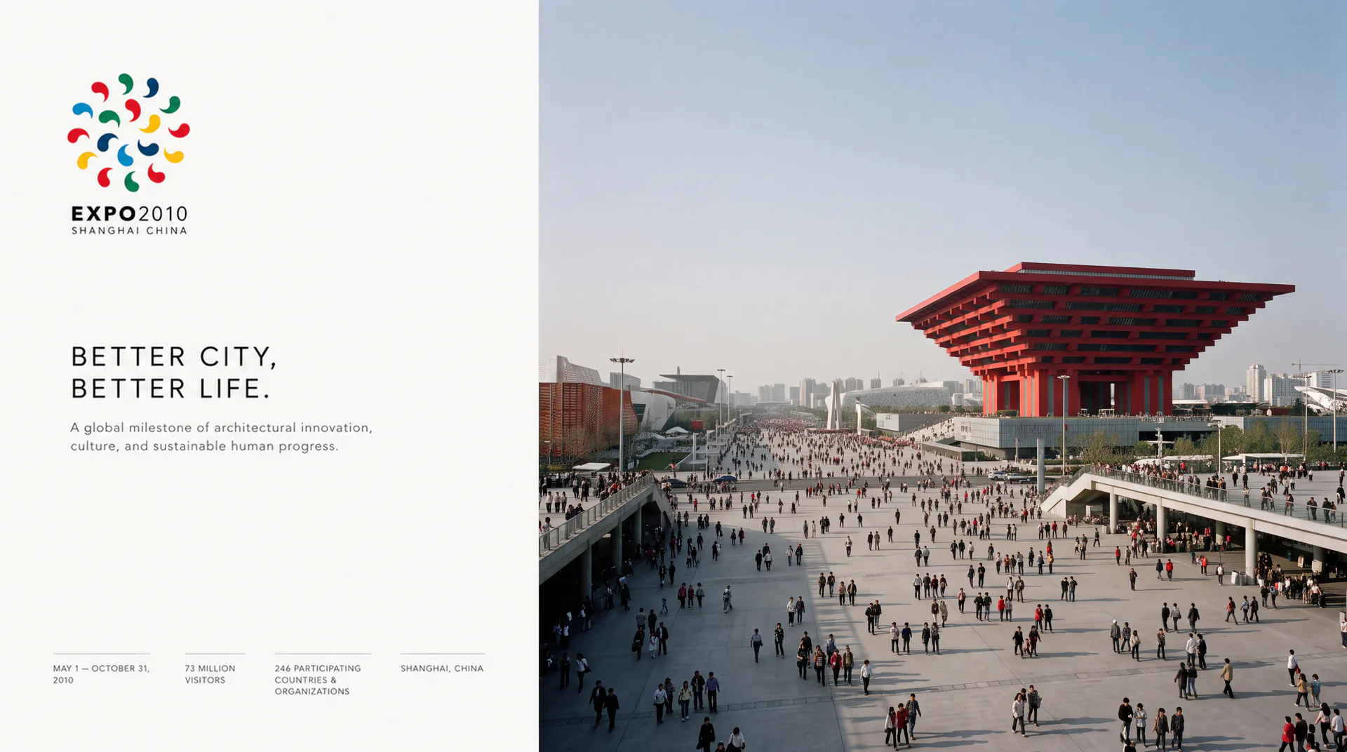
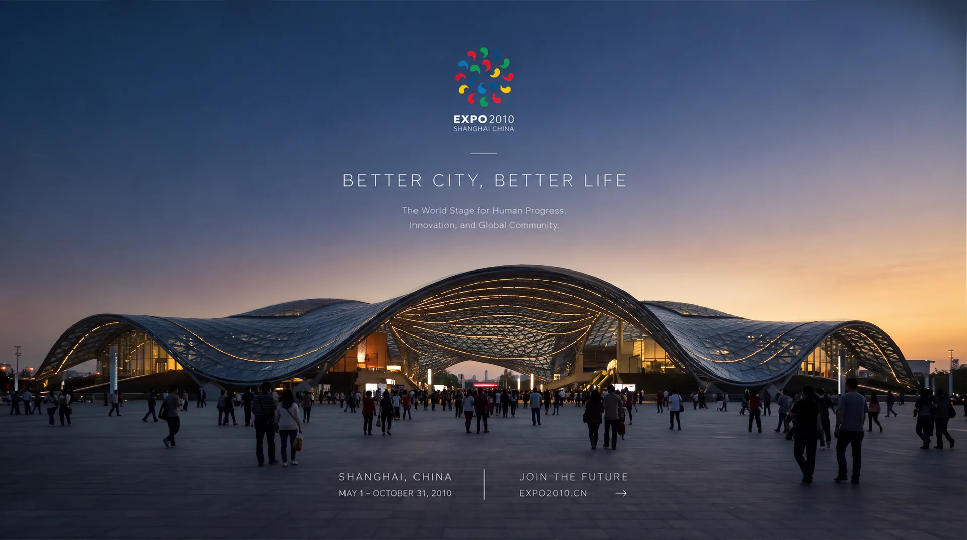
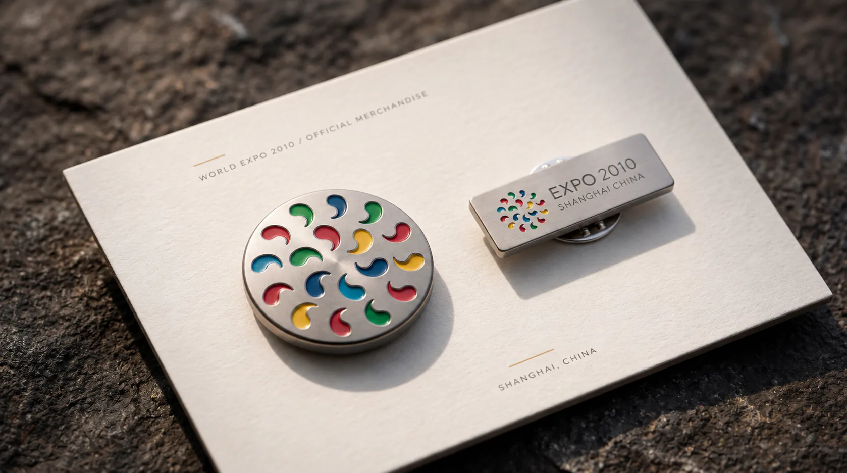
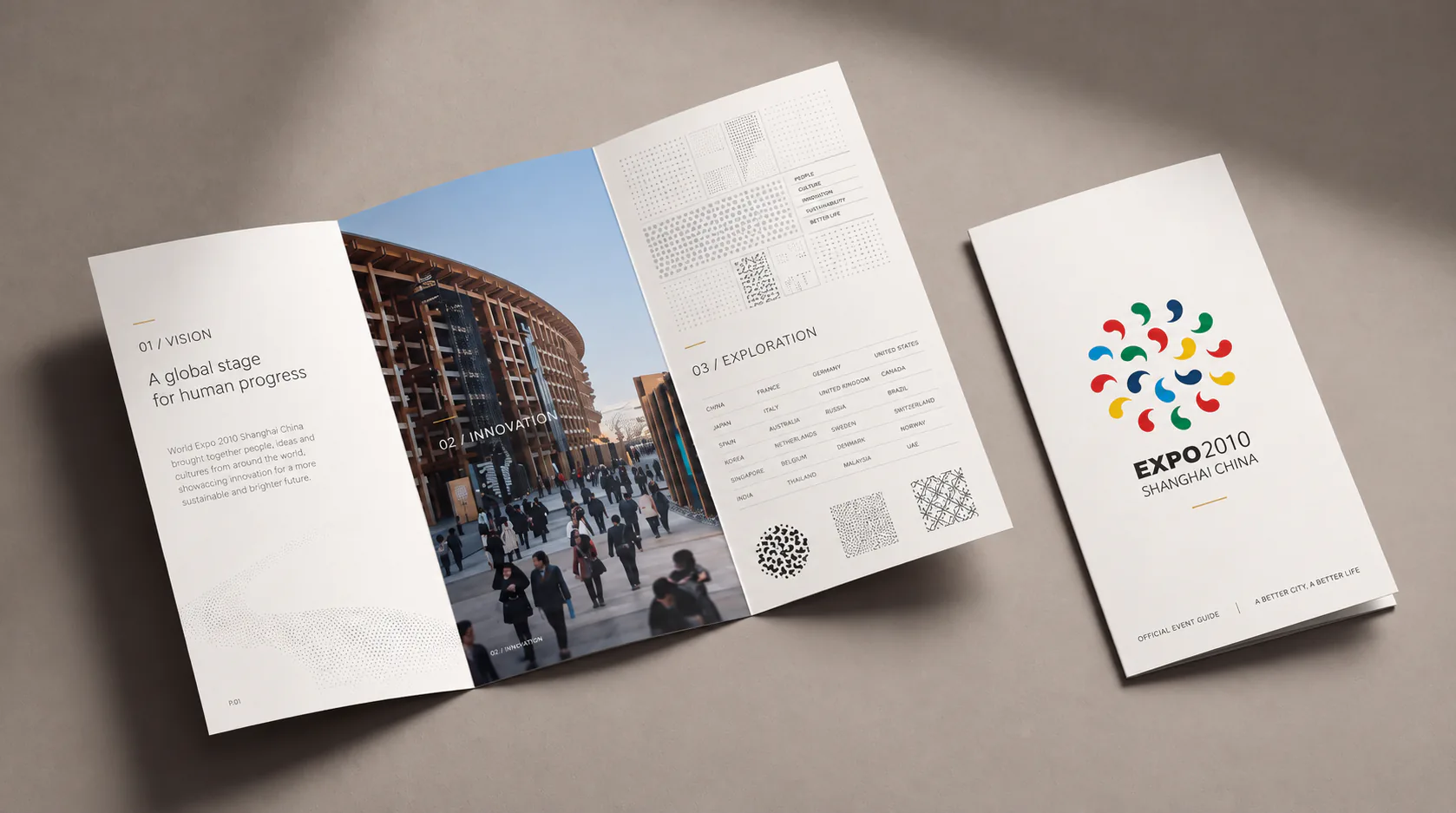
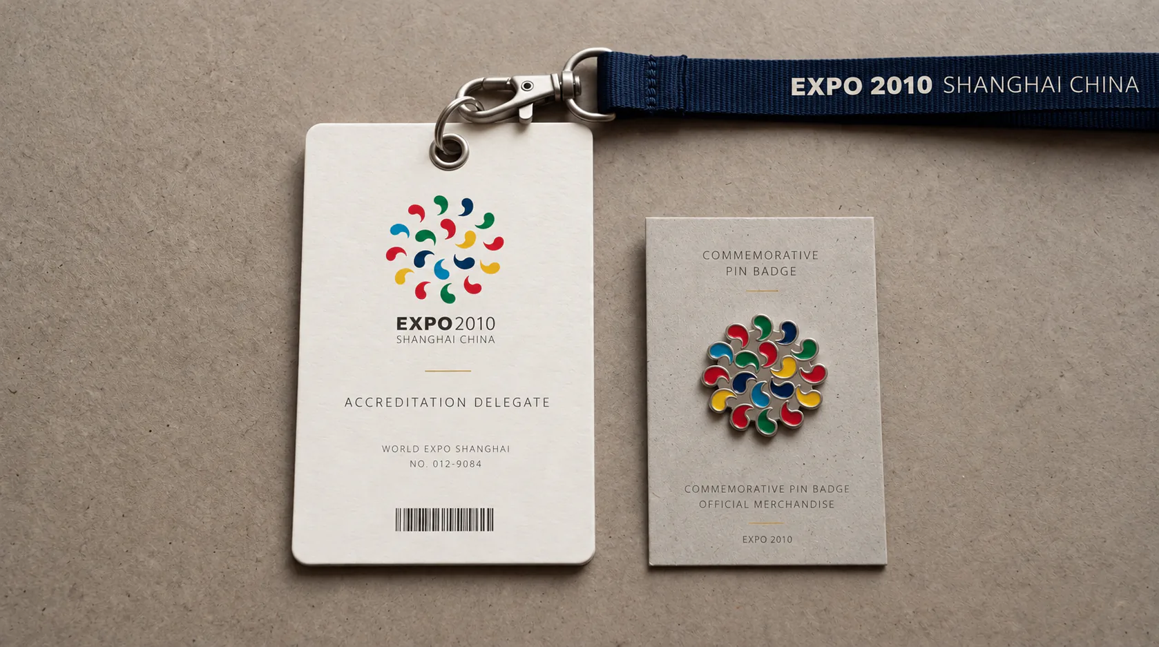
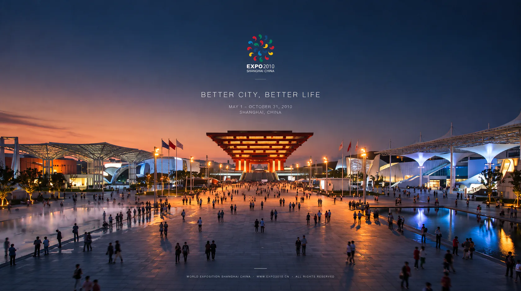
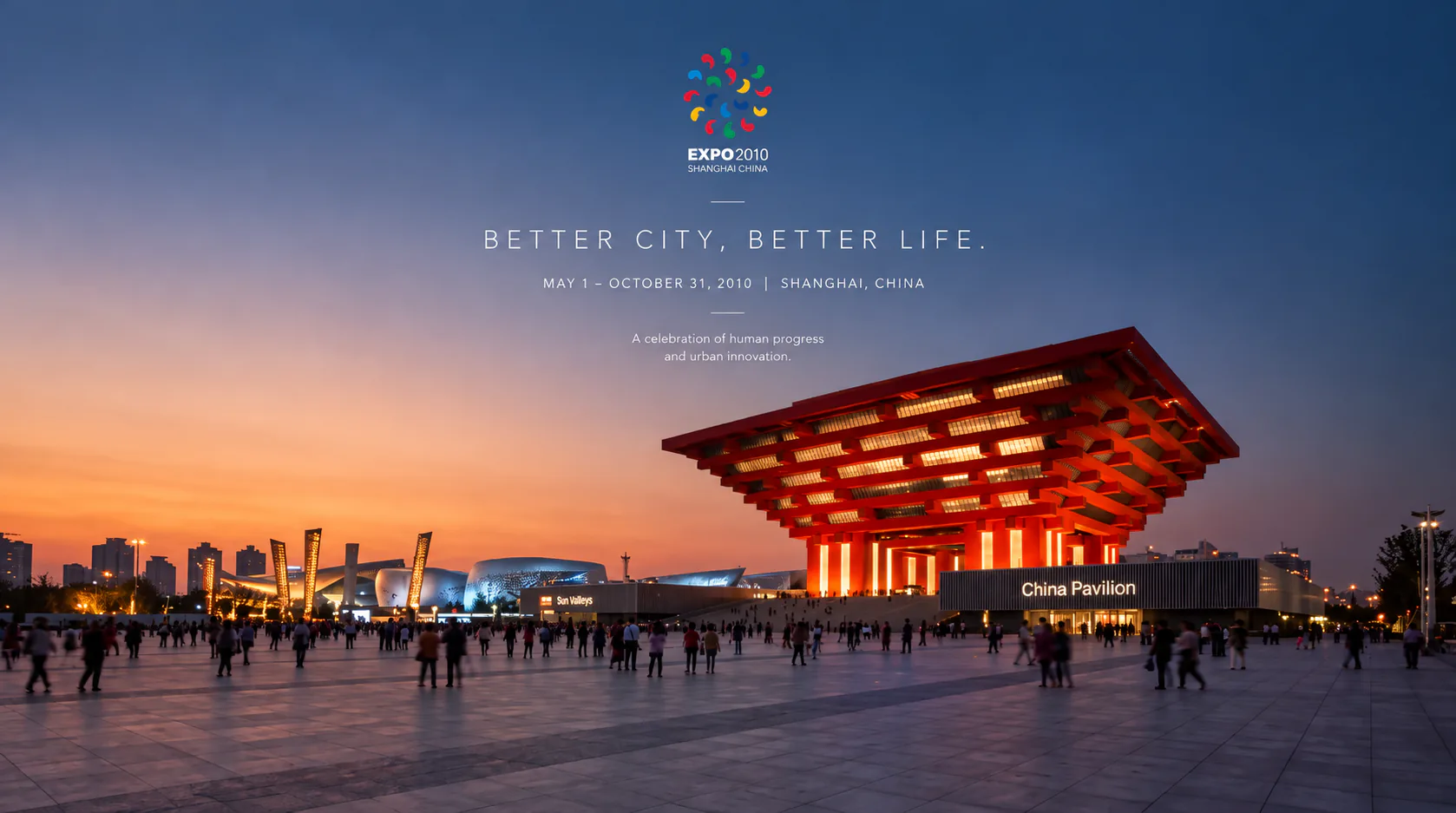
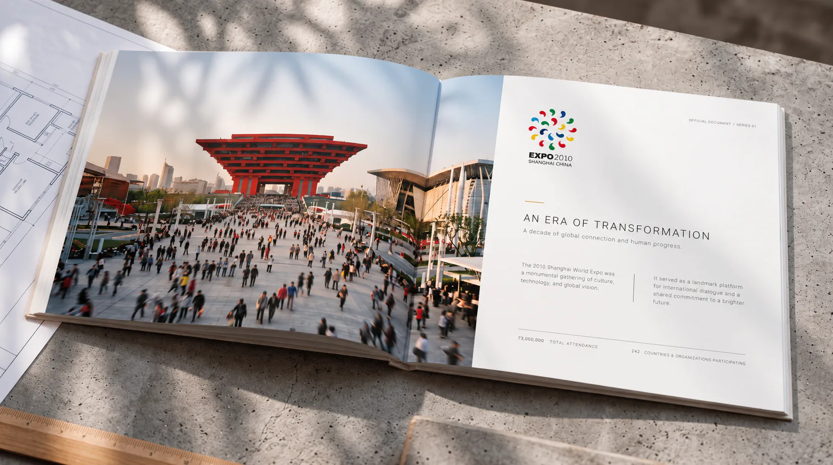
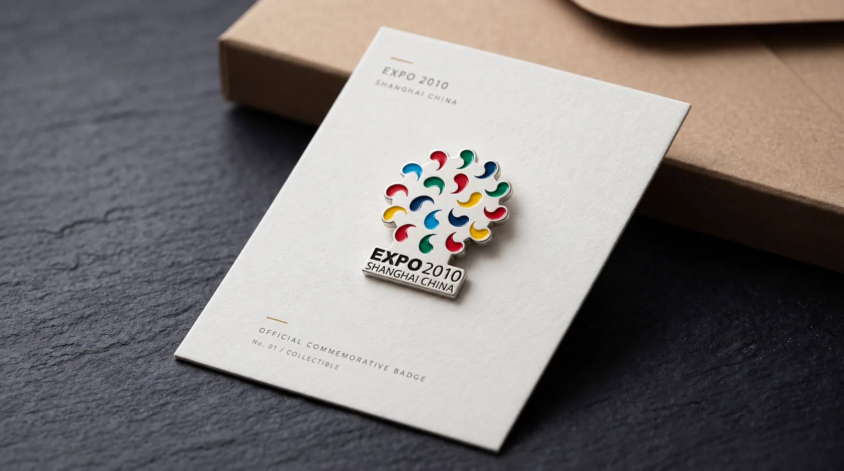
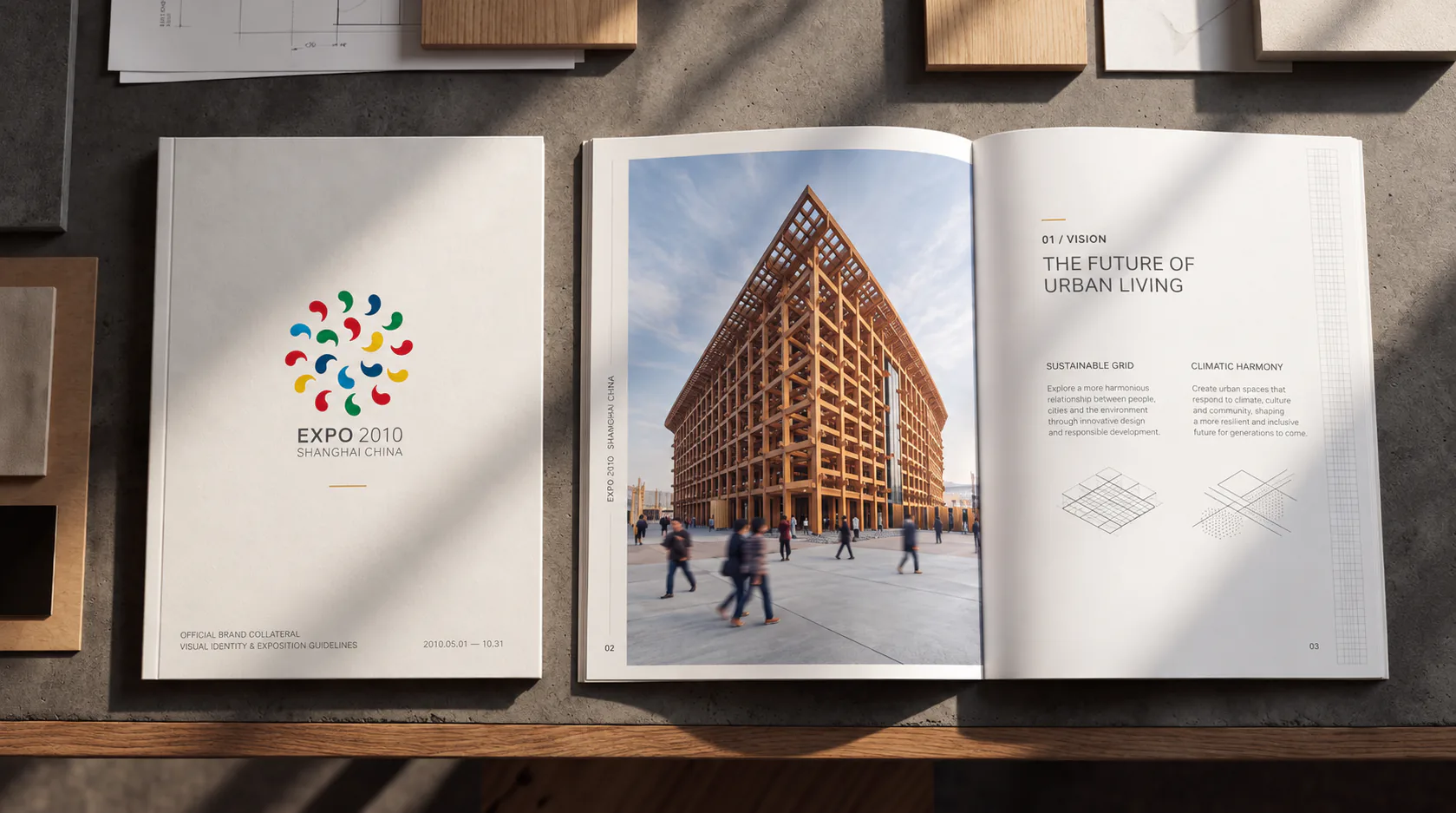
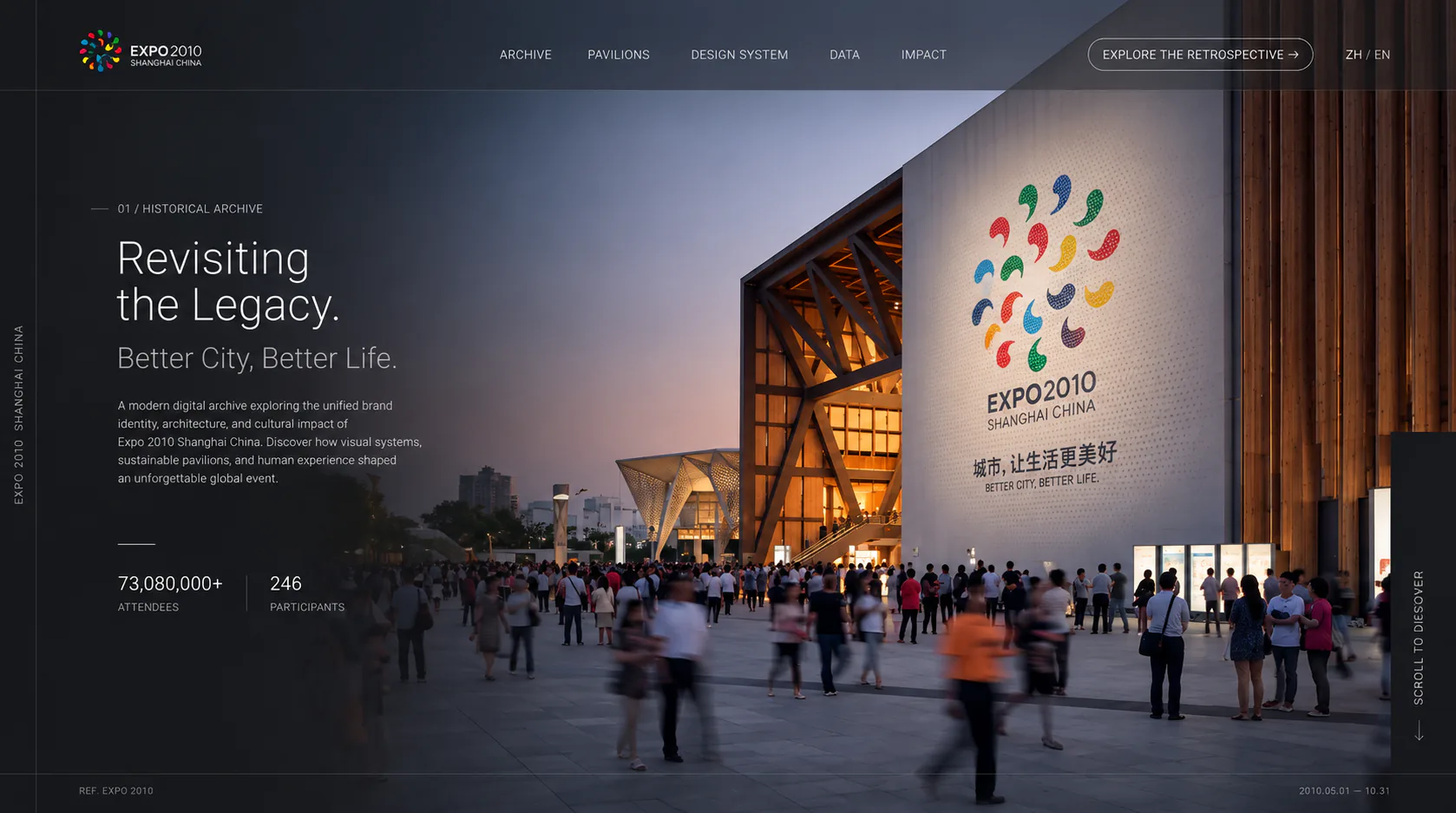
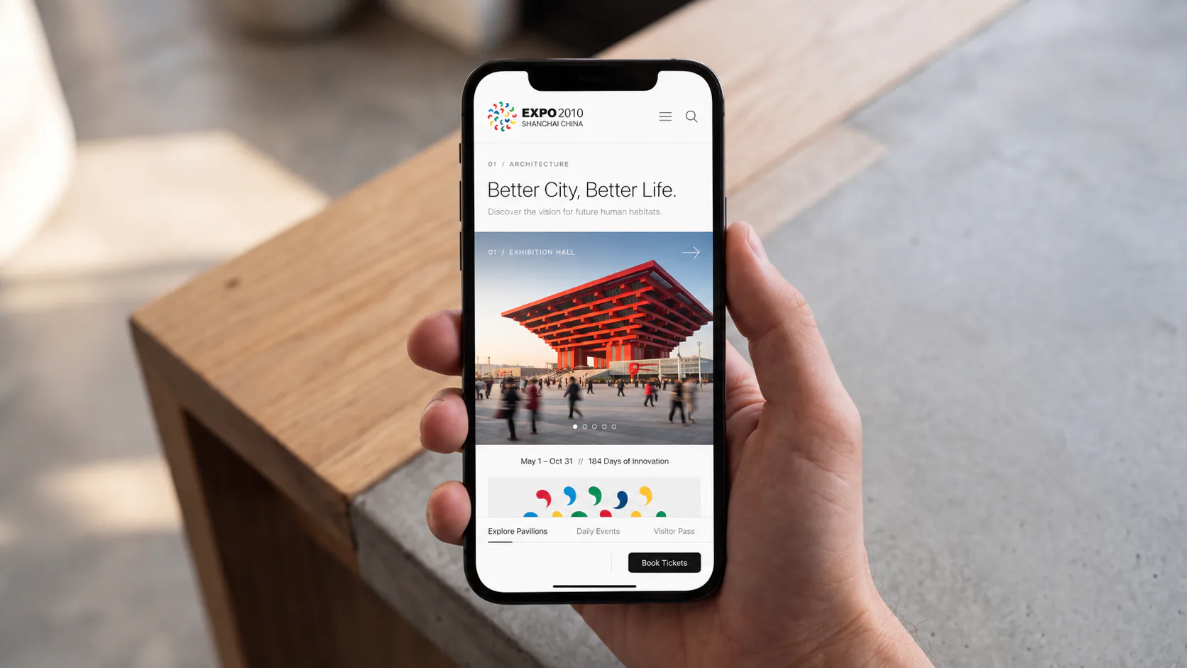
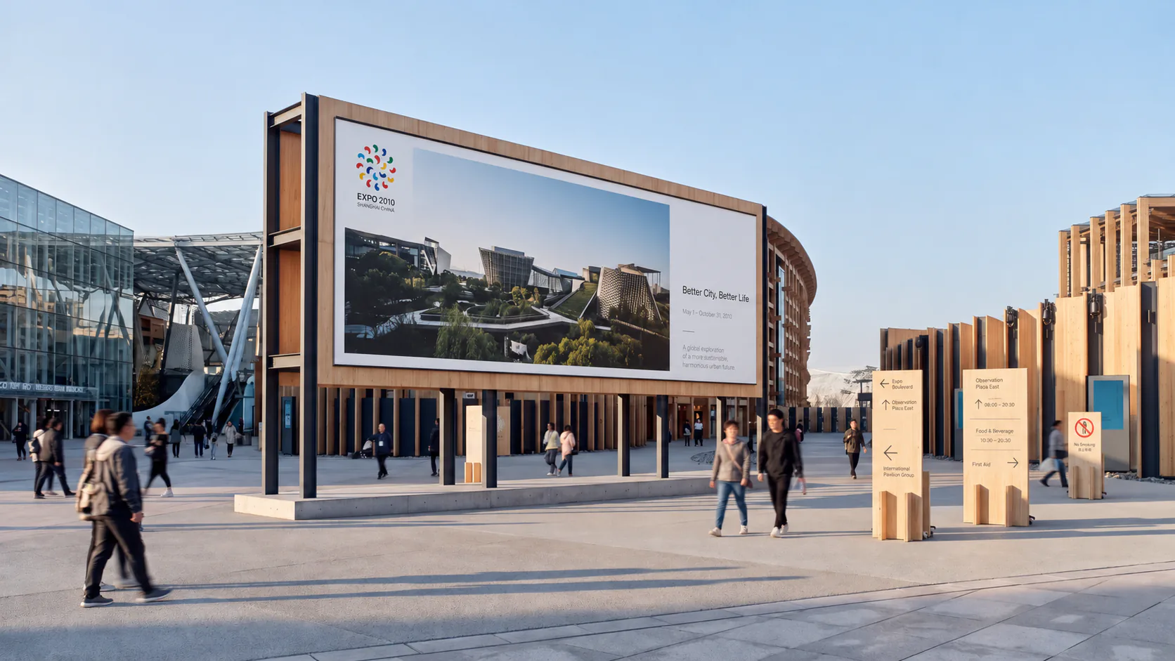
The identity was applied across Expo venues, souvenirs, wayfinding, media communications and digital interfaces. Its multicolored forms could rotate in motion or separate into modules for animated graphics, lighting installations and multimedia displays. Within architectural settings, the mark served as a recognizable focal point and a core element of the Expo’s visual identity.
brand meaning
Beginning with the human figure, guided by harmony and looking toward the future, the identity expresses a belief in the shared progress of civilization. Its circular composition represents global prosperity, its flowing forms evoke the rhythms of life and the city, and its five colors celebrate cultural diversity and mutual understanding.
Improper Usage (Protection Specification)
Do not change the number or sequence of the curved segments. Do not substitute colors or add shadows. Always use the symbol and wordmark together. Recommended minimum reproduction width: 40 mm.
design results
Since its launch, the Shanghai Expo identity has become a widely recognized example of visual identity design. Its open, inclusive and simple visual language helped establish a contemporary image of an Eastern city and influenced the identities of later major international events. The mark presents a modern expression of Chinese culture while embodying the ideal of a world built on sharing, harmony and coexistence.