










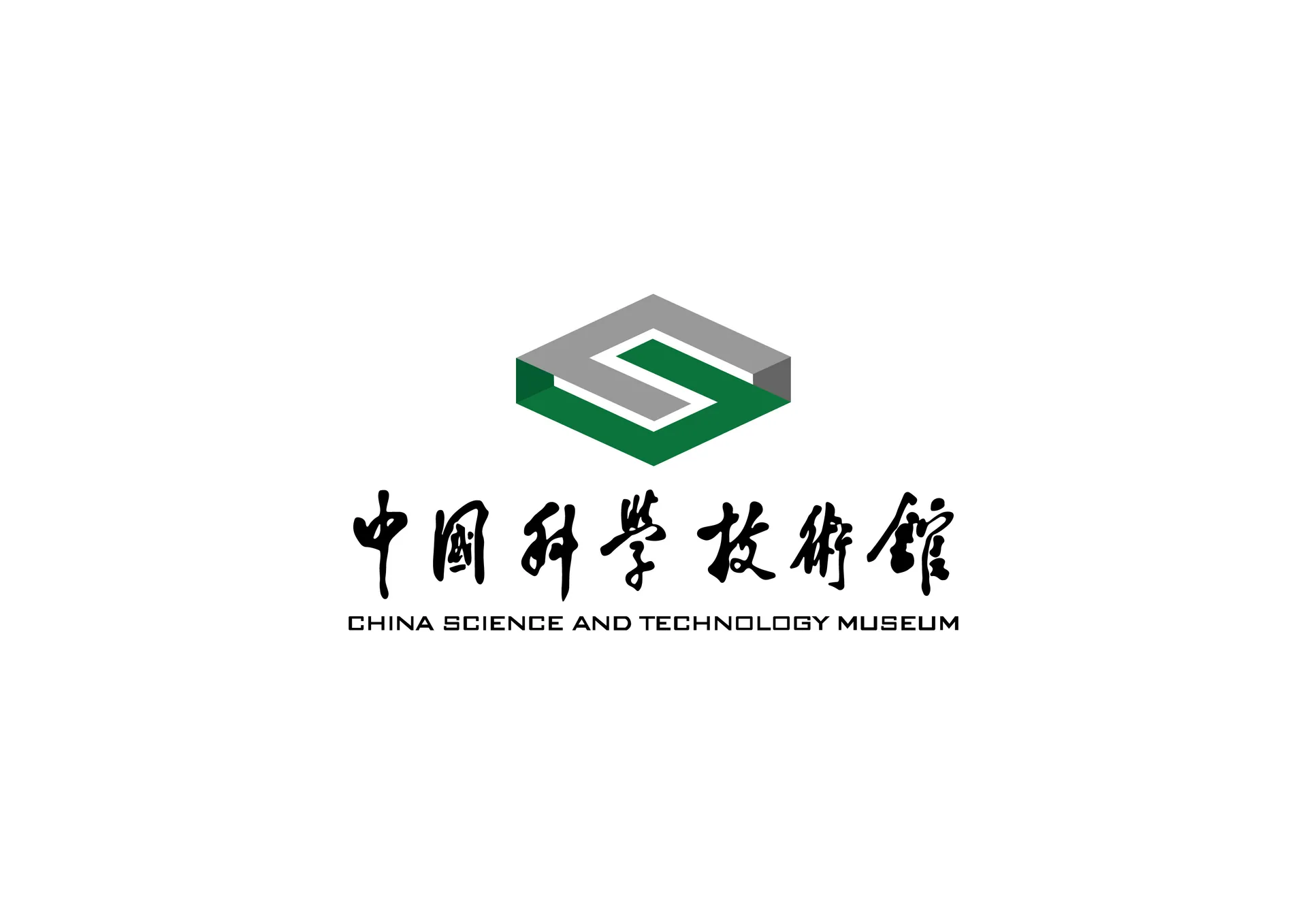
The China Science and Technology Museum is a national institution for science exhibition, charged with the vital mission of science communication, education and inspiring innovation. Its logo needed to strike a balance between rigor, authority and modernity — embodying the nation's scientific image while remaining approachable and contemporary.



design concept
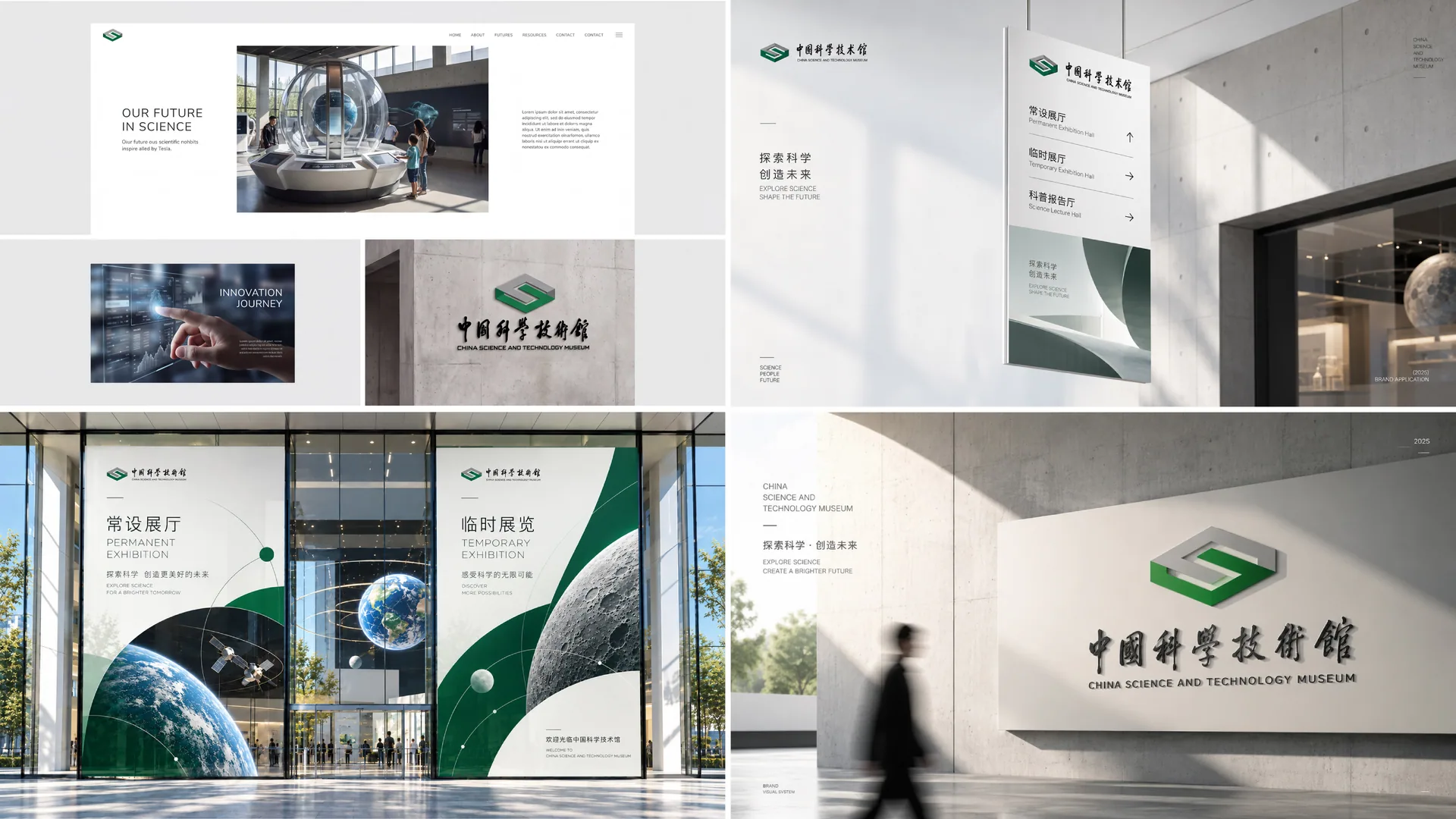
The logo is built around a three-dimensional geometric form, creating an “S”-shaped composition with a strong sense of perspective. The “S” is the initial of “Science” and also symbolizes the path of exploration. Built on the cube — representing the rigorous logic and systematic structure of science — the mark as a whole expresses the idea: “Science lays the foundation; knowledge lights the future.”
graphic language
Three-dimensional structure: Isometric volumes express the rationality and order of the scientific world; Dual layering: Overlapping layers of gray and green symbolize thought and nature running in parallel; Central negative space: The “S” path at the center represents the road of exploration, inspiration and scientific innovation.
Fonts and composition
The Chinese name is set in lettering that blends calligraphy with modern strokes, balancing dignity and cultural character. The English CHINA SCIENCE AND TECHNOLOGY MUSEUM is set in a sans-serif for international recognition and consistency. Vertical alignment reinforces the stability of the logo and the institution's authority.
color system
Primary Science Green #4B7D48: nature, innovation and the life sciences; Secondary Gray #808080: technological rationality and structural beauty; Together, green and gray create a dialog of “Nature × Reason,” expressing the dual dimensions of scientific exploration and social responsibility.
Application and extension
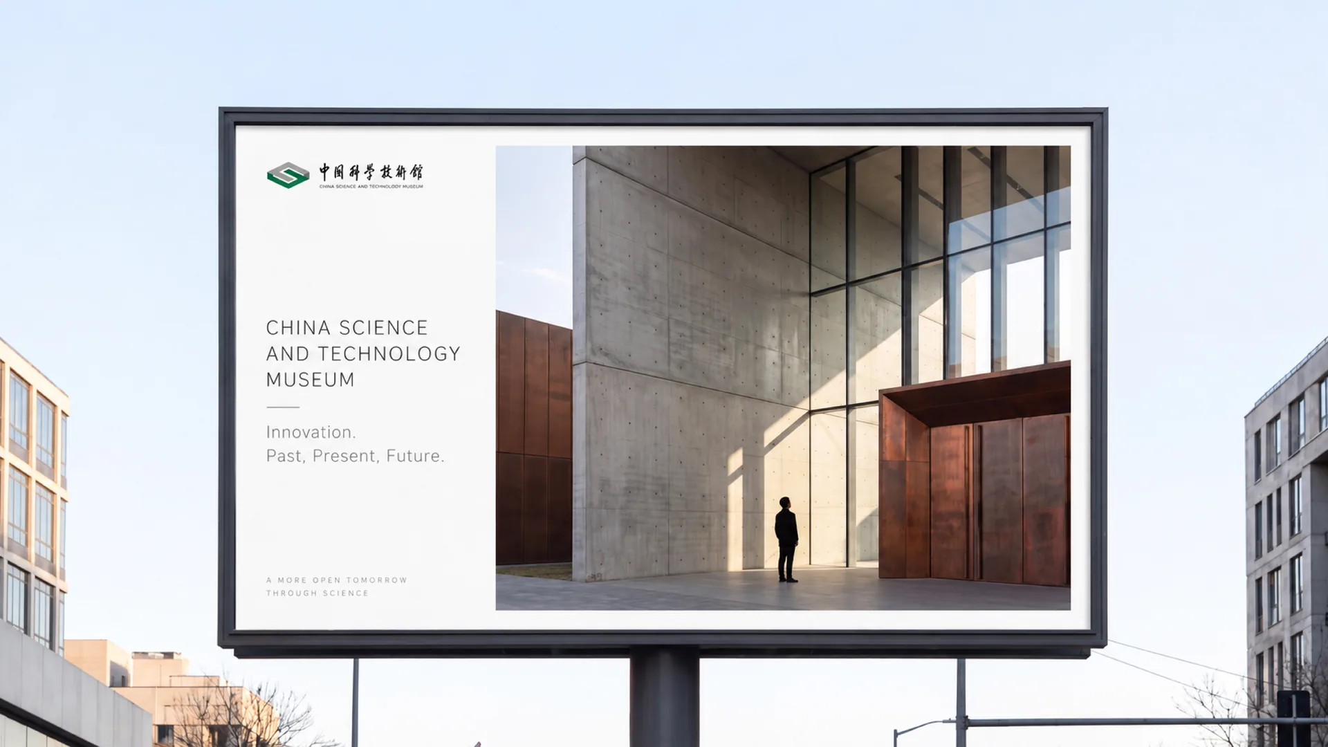
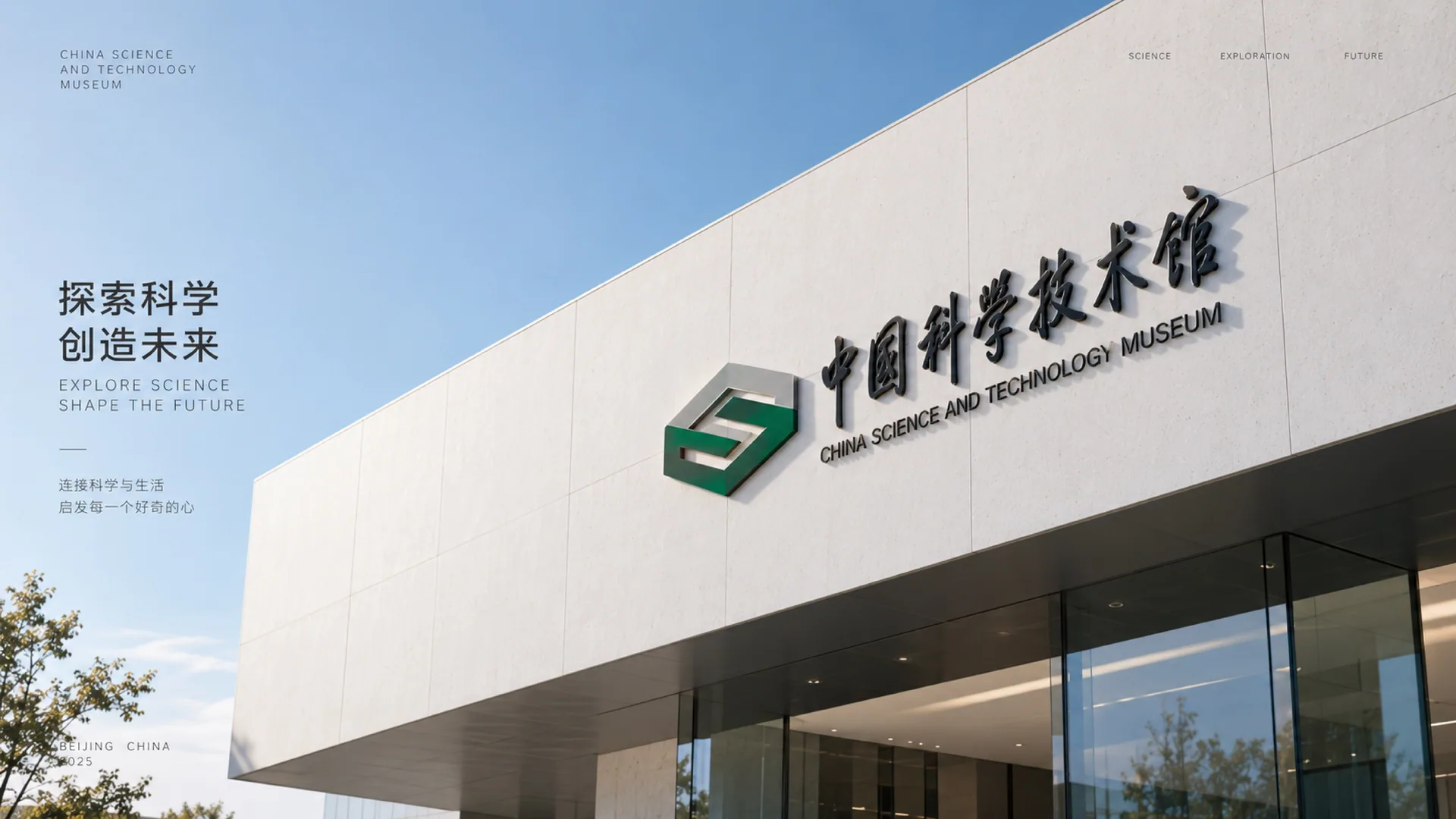
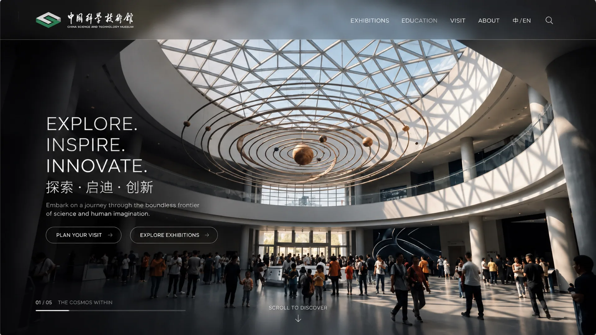
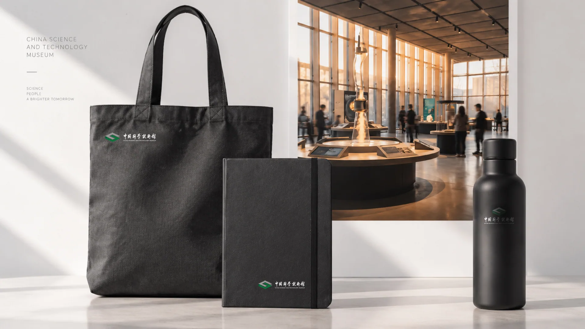
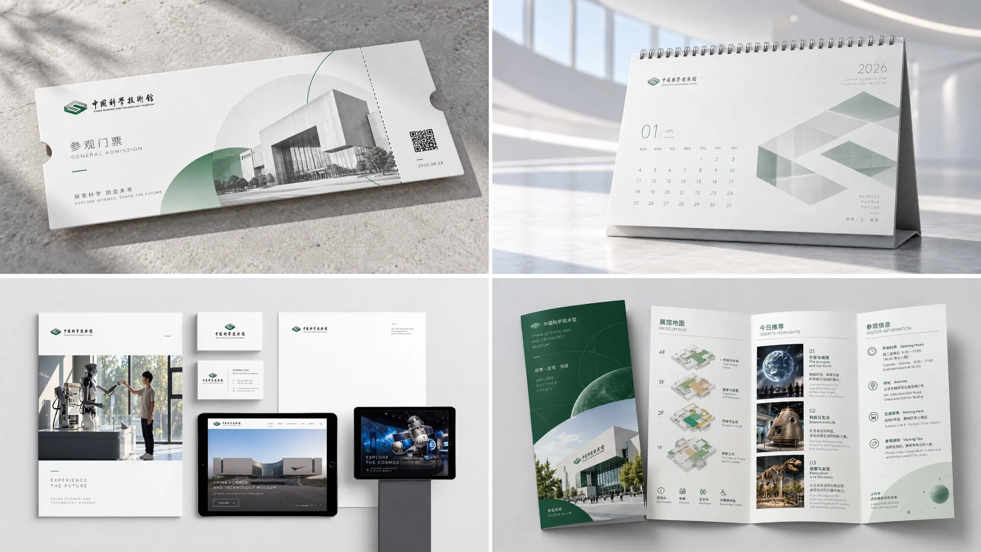
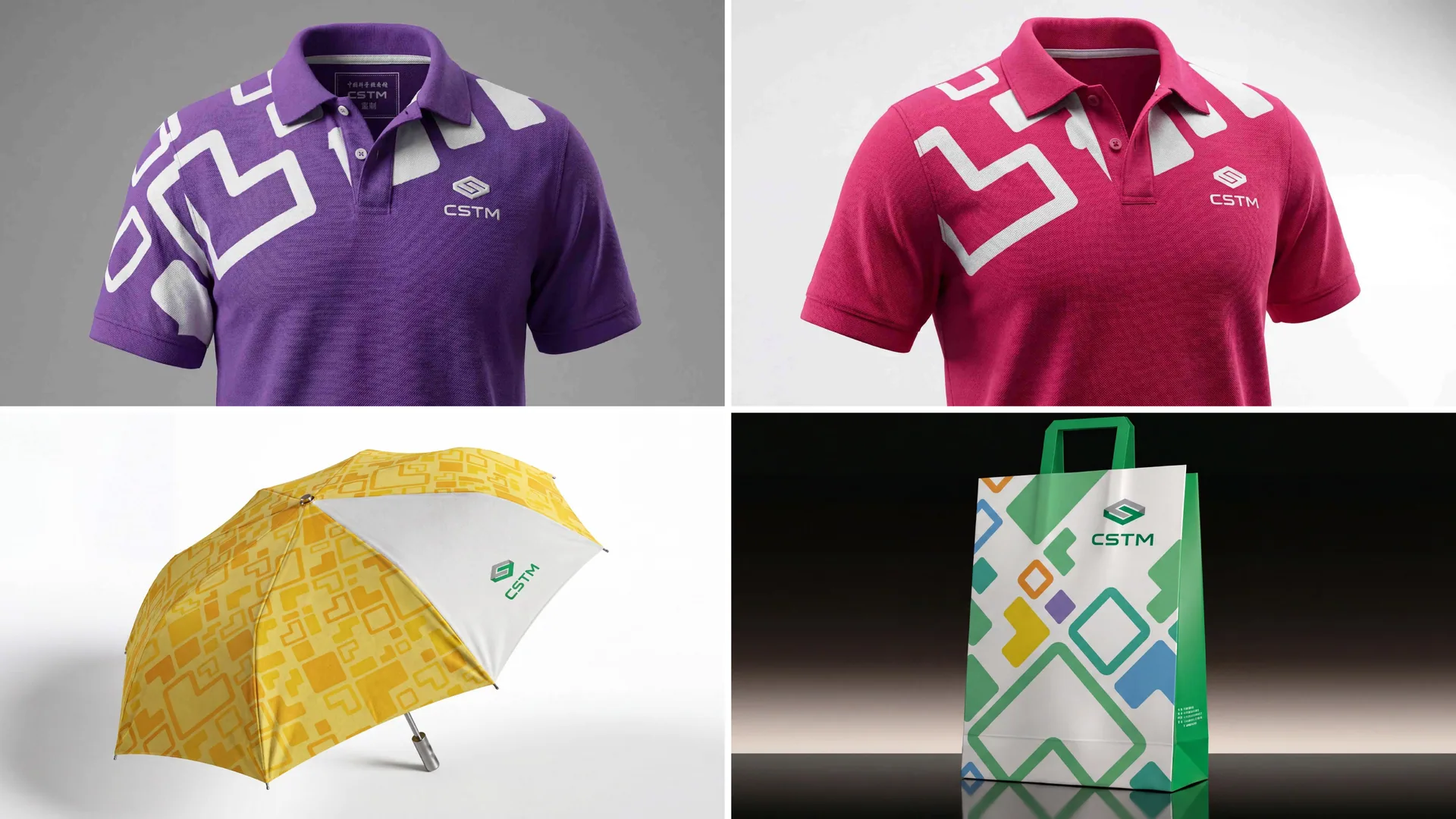
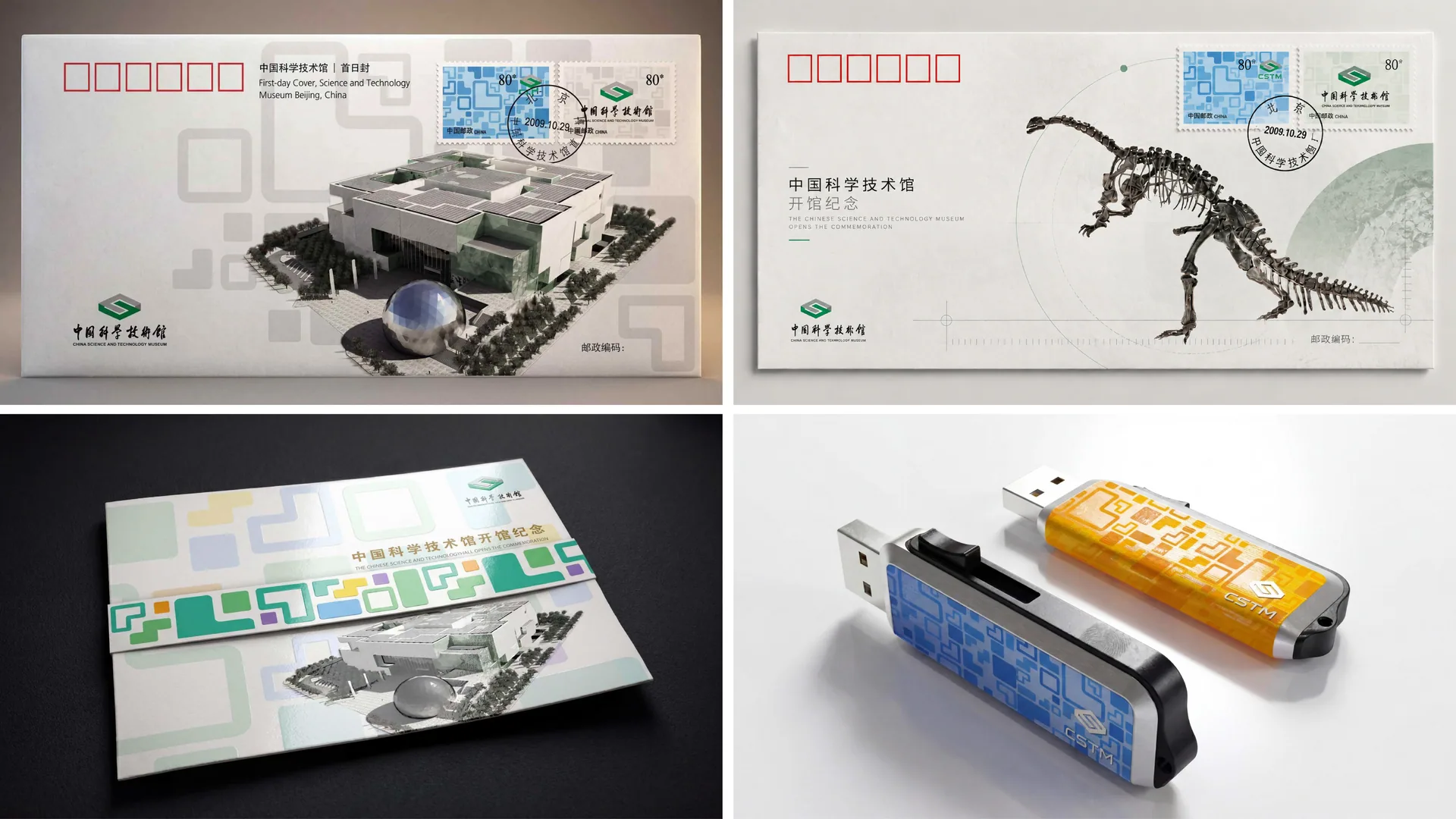
The logo adapts seamlessly across the museum's wayfinding system, publications, educational merchandize, exhibition spaces and digital media. The three-dimensional “S” can extend into 3D models, animated motion lines or architectural motifs, serving as the core grammar of the entire visual system.
brand meaning
The logo embodies the spirit that “science begins with exploration, and innovation leads the future.” Its rational geometry captures the orderly beauty of the scientific spirit, while its spatial depth expresses the reach of exploration and inquiry. More than the museum's logo, it is a symbol of the nation's science education system.
Improper Usage (Protection Specification)
Do not alter the angle or proportions of the “S” structure; do not modify the green or gray color values; do not add shadows or gradients; minimum display width: 35 mm.
design results
Since its launch, the logo has become a benchmark of visual identity for science education institutions across China. Its three-dimensional geometry is widely applied in exhibition spaces and derivative designs, forming a national visual language of “science, order and inspiration.”