










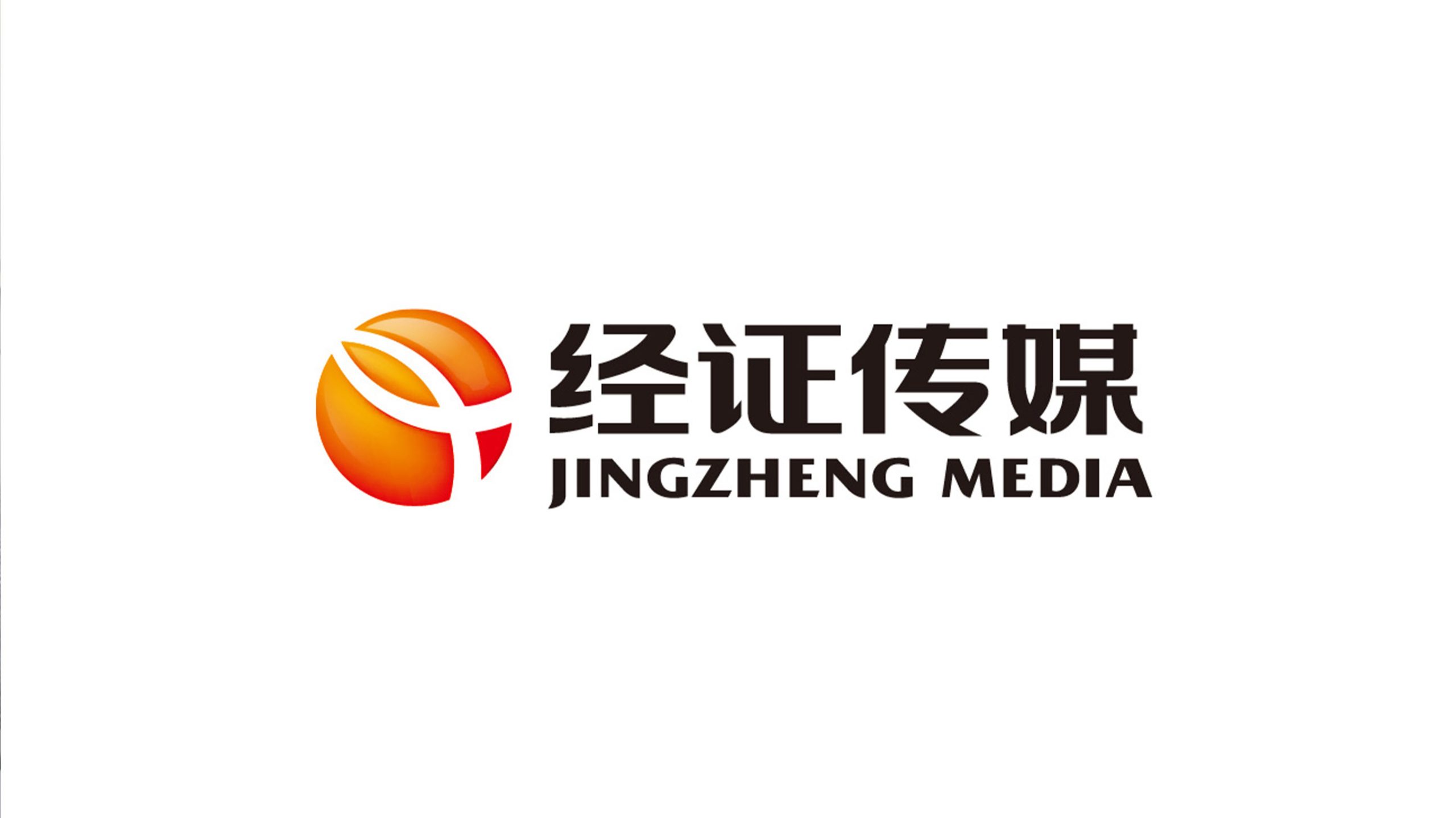
Jingzheng Media is an integrated media organization focused on film and television production, integrated communications and digital content innovation. During a comprehensive brand upgrade, the company sought a mark that would convey professional communication strength, creative spirit and trust, while adapting to multi-screen media and international distribution.
design concept
The mark is built on the concept of “the energy of communication and the light of truth.” Its composition draws on the image of light penetrating and converging, symbolizing how Jingzheng Media uses content and technology to give truth greater impact in the information age. The orange sphere represents warmth, creativity and communicative energy; the abstract “Y” path within it suggests the refraction and direction of light, and expresses the brand’s mission: to deliver content to audiences more truthfully and more precisely.
graphic language
Sphere of light: the circle represents wholeness and inclusiveness, suggesting a multidimensional media ecosystem. Central dividing line: like the path of a beam of light, it stands for the transmission of information and the revealing of truth. Dynamic tilt: an upward-right orientation signals progress, reach and growth. The overall form combines speed with stability, embodying a brand that is “creatively driven × rationally communicated.”
Fonts and composition
The English JINGZHENG MEDIA is set in a bold sans-serif, steady and modern. The Chinese name, Jingzheng Media, uses a balanced geometric gothic that shares a single rhythm with the English. A horizontal “mark left, text right” layout strengthens international recognition. Letter strokes echo the curves of the symbol, creating balance and a shared direction.
color system
Primary orange #E85A1C: creativity, warmth and communicative energy. Red-orange gradient #C7342B → #F2C94C: the movement of information from focus to diffusion. Charcoal #2B2B2B: professionalism, steadiness and trustworthiness. White background: space and clarity, reflecting the brand’s open, transparent approach to communication.
Application and extension
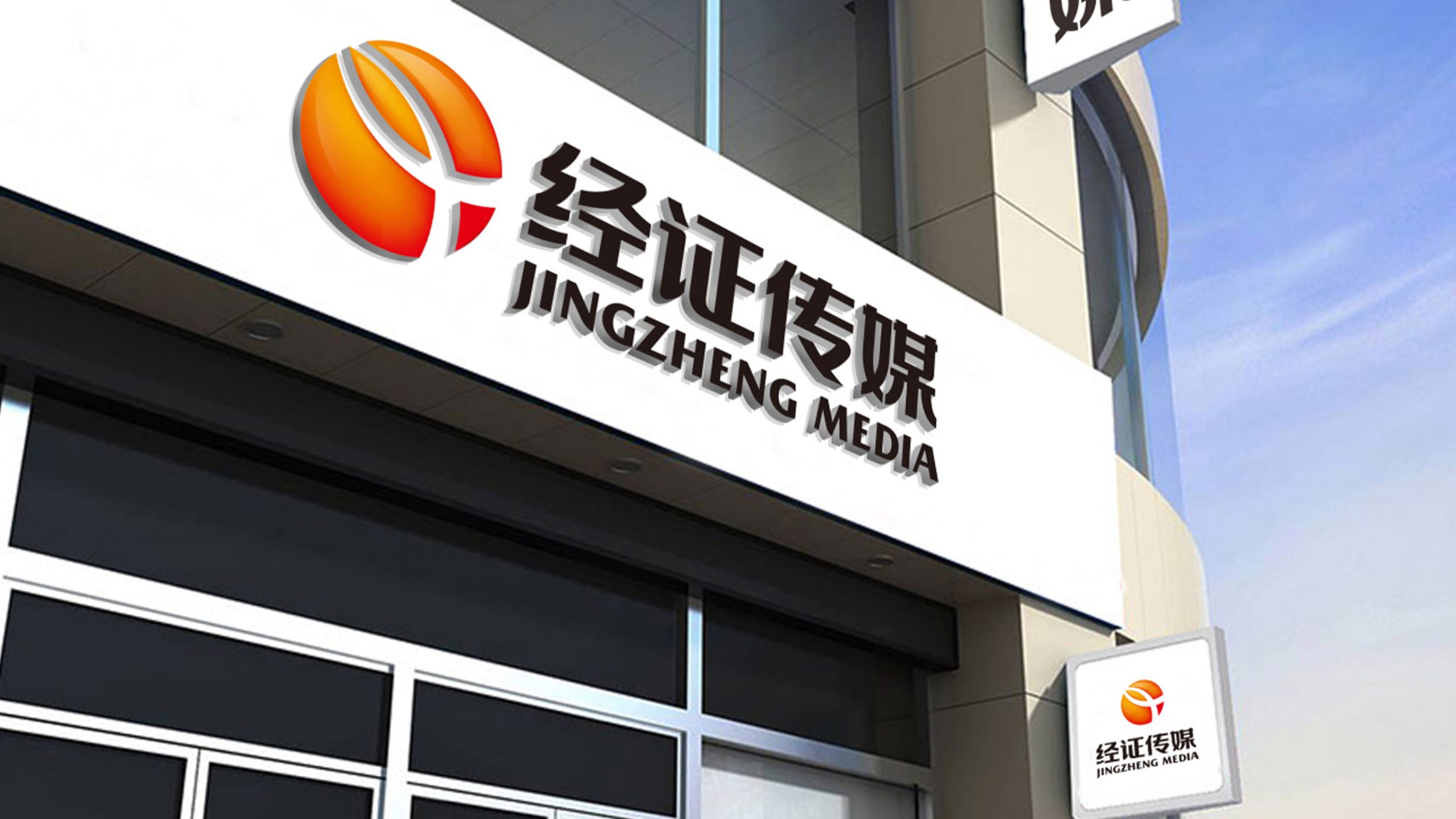
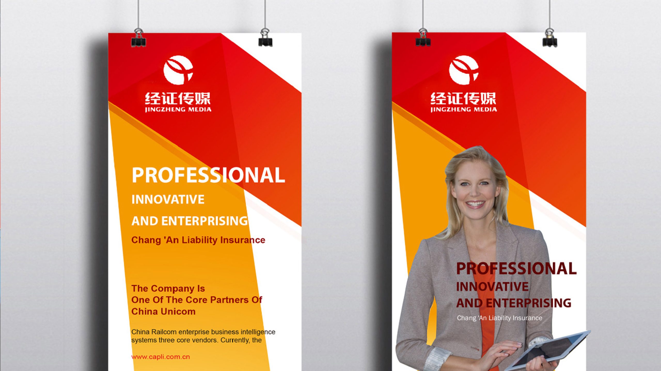
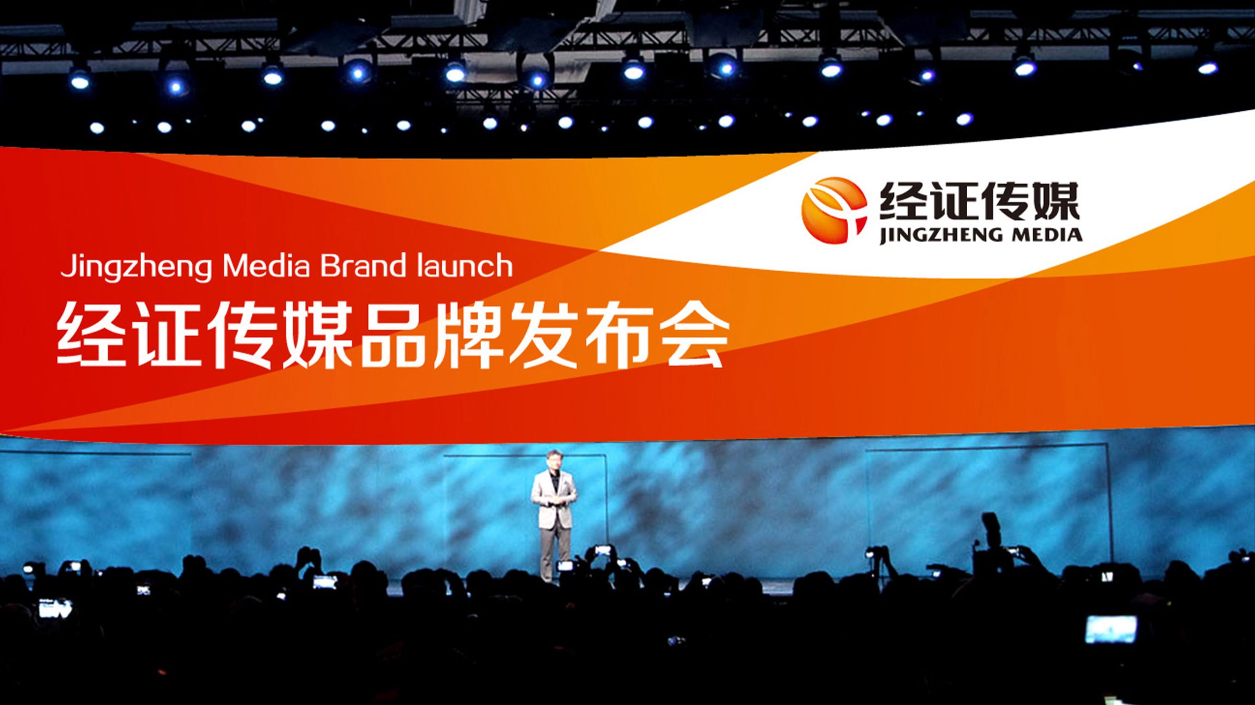
The mark is highly systematized and adapts to TV openers, press conference key visuals, social media avatars, app icons, video end cards and more. The sphere can be used independently as a supporting symbol in motion ripples, video loading animations and digital patterns to reinforce recognition. It maintains clarity and luminous depth on dark backgrounds and in single-color applications.
brand meaning
Jingzheng means “fact as the foundation, communication as the proof,” reflecting the brand’s commitment to truth and responsibility. The mark turns light, a medium of truth and hope, into a visual symbol that expresses the company’s vision: to use professional communication to illuminate facts, inspire understanding, and connect the world. The identity pairs Eastern warmth with a global outlook, conveying trust and forward momentum in media.
Improper Usage (Protection Specification)
Do not alter the primary orange or the direction of the gradient. Do not modify the shape or angle of the inner “light beam.” Do not skew, or add shadows or transparency. Minimum display width: 25mm. Maintain a symbol-to-text ratio of 1:1.6; do not compress or stretch.
design results
Since the launch of the new mark, Jingzheng Media’s industry recognition has risen by 36% (internal brand awareness research). Clients report significantly improved visual consistency across press events and video openers, with the brand perceived as both warmer and more professional.