










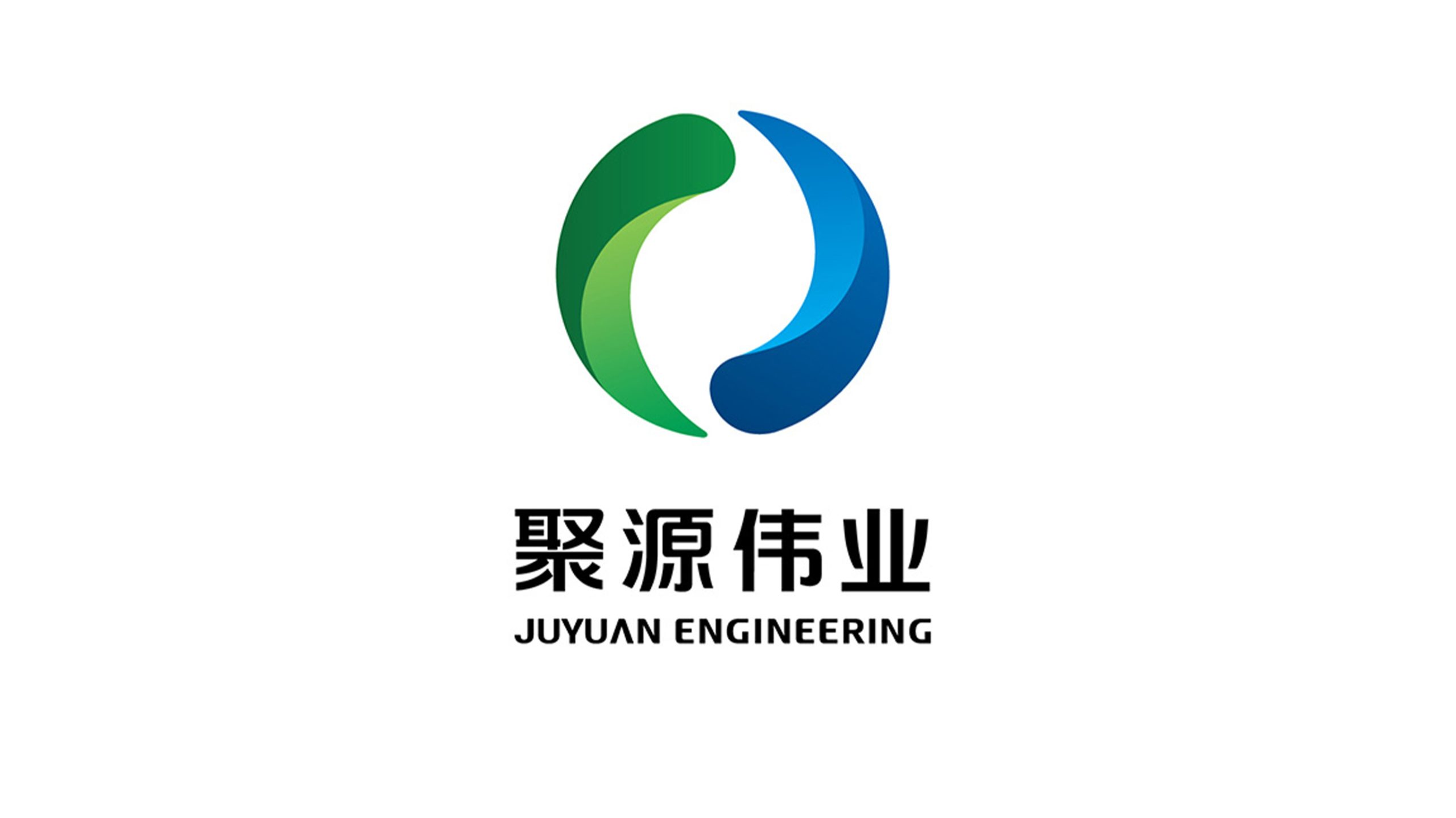
Juyuan Weiye is an integrated company spanning energy engineering, green construction, and systems integration. Its new visual identity system reinforces the corporate image of “Uniting Energy, Building the Future Together” and establishes a modern, international brand in the engineering sector.
design concept
The mark is centered on the idea of “convergence and circulation”: two mirrored curves form a circle, symbolizing the flow of energy and a closed-loop system. This language of “stillness within motion” expresses the balance and sustainability the company pursues in energy engineering, and embodies the brand spirit of “converging resources, endlessly renewing.”
graphic language
Ring construction: two mirrored curves form a structure that is both stable and dynamic. Dynamic balance: the green and blue forms create a sense of energy in exchange, representing the fusion of natural energy and technology. Open circle: a gap at the top symbolizes continuous innovation and room for growth.
Fonts and composition
The name JUYUAN ENGINEERING is set in a heavy sans-serif with upright strokes, reinforcing its engineering expertise. The Chinese name, Juyuan Weiye, has steady forms and a low center of gravity, supporting the circular symbol above. Center alignment expresses the visual logic of “strength gathered, growth upward.”
color system
Blue #1976D2: technology, rationality and engineering precision. Green #43A047: nature, ecology and sustainable development. The two colors merge in a gradient, symbolizing the symbiosis of technology and ecology and forming a distinctive “green technology” identity for the sector.
Application and extension
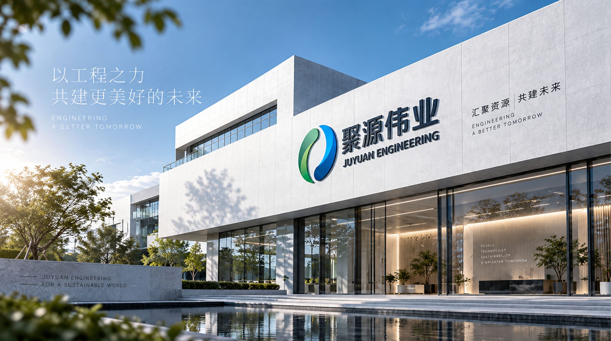
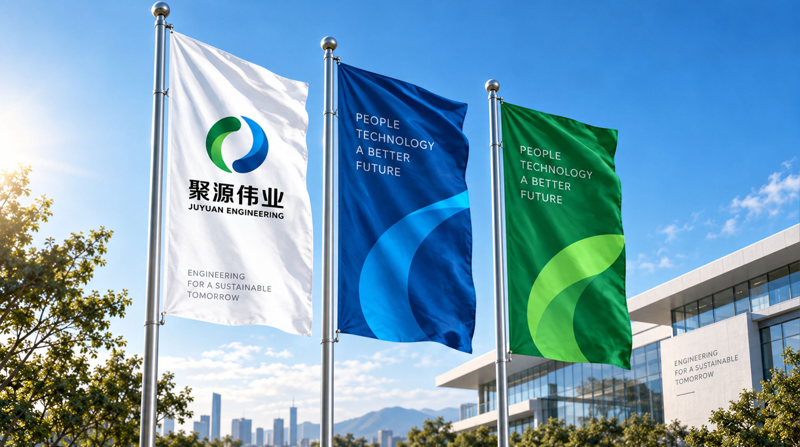
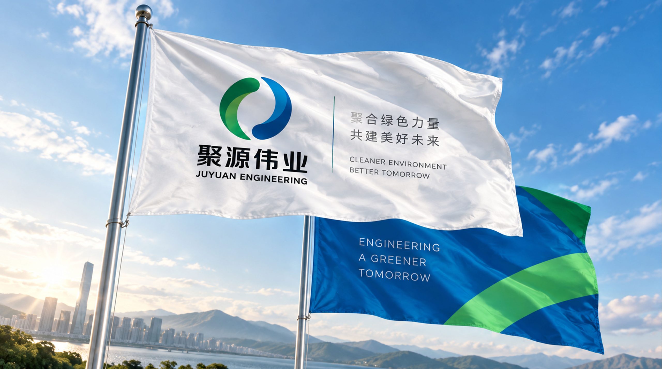
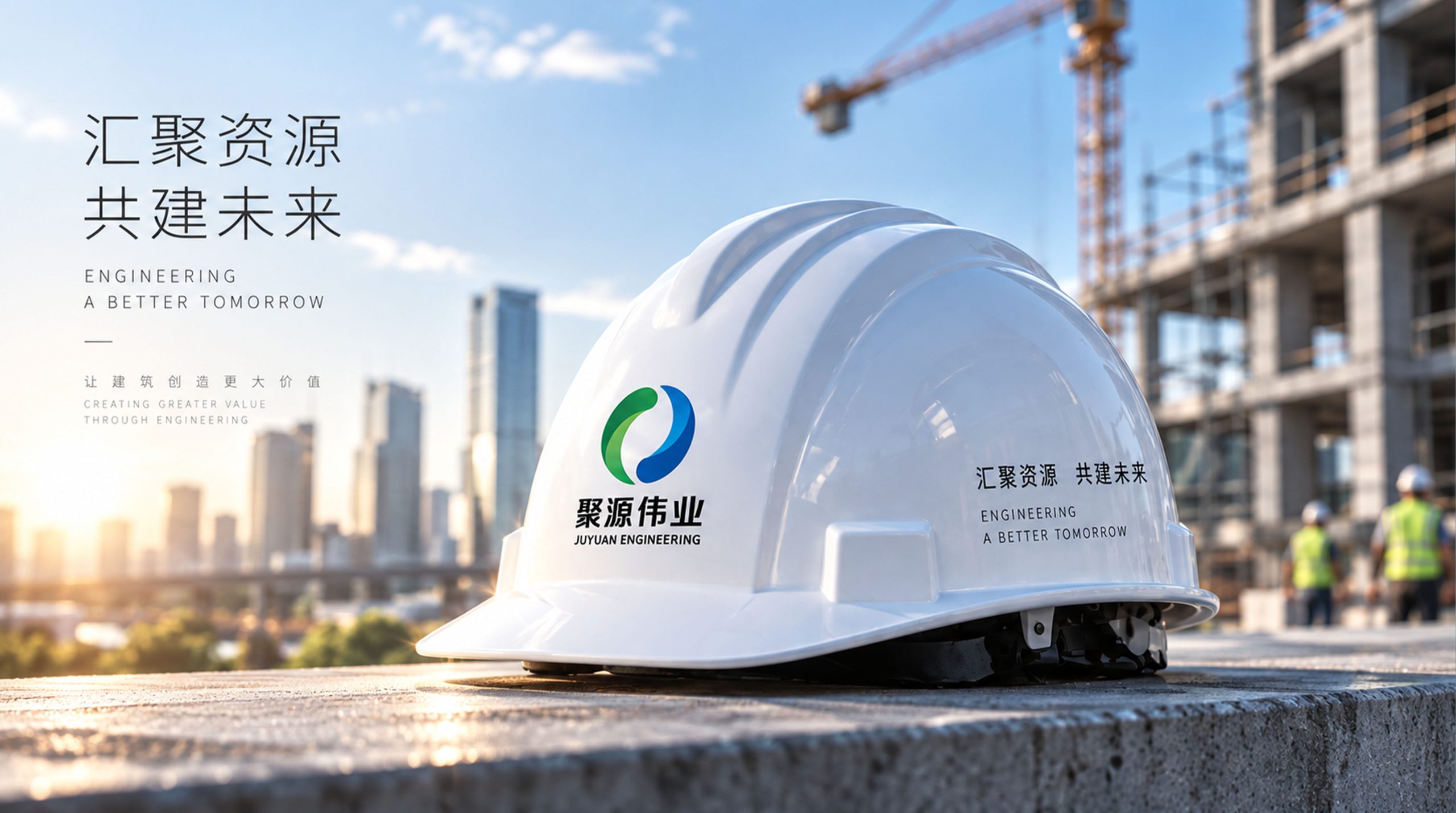
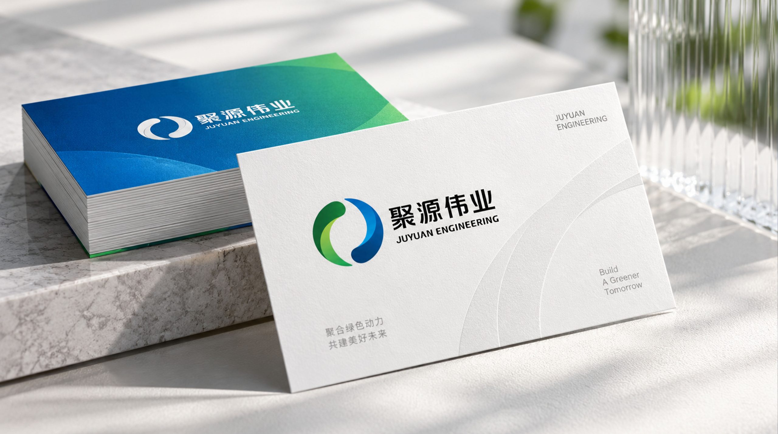
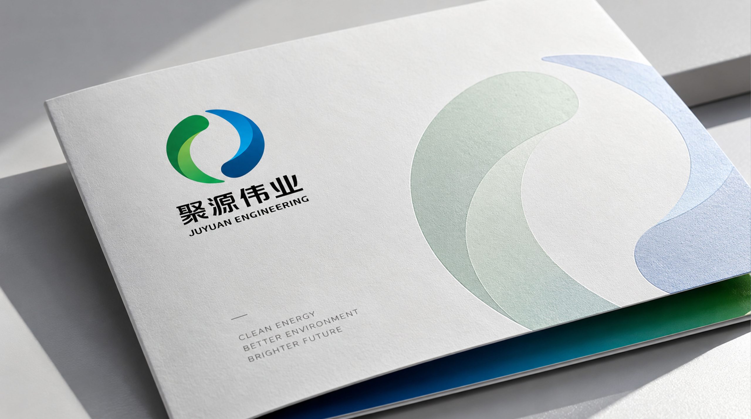
The mark applies across project documents, construction equipment, company vehicles, offices and digital media. The ring can extend independently as a supporting visual element in motion video and exhibition backdrops, creating a cohesive brand identity system.
brand meaning
Juyuan means bringing together resources and strength; Weiye stands for lasting social value. The flowing circular mark conveys the company’s integration across energy and engineering and its commitment to sustainability, giving visual form to the brand’s core spirit.
Improper Usage (Protection Specification)
Do not alter the proportions or rotational direction of the curves. Do not replace the primary gradient with a single color or highly saturated hues. Do not place over busy or colorful backgrounds. Minimum display width: 25mm.
design results
Following the launch of the new visual system, Juyuan Engineering established a unified identity across engineering projects and energy exhibitions, with brand awareness rising significantly. The ring has become a symbol of the company in external partnerships and international projects, reinforcing its positioning as a “systematic green energy service provider.”