










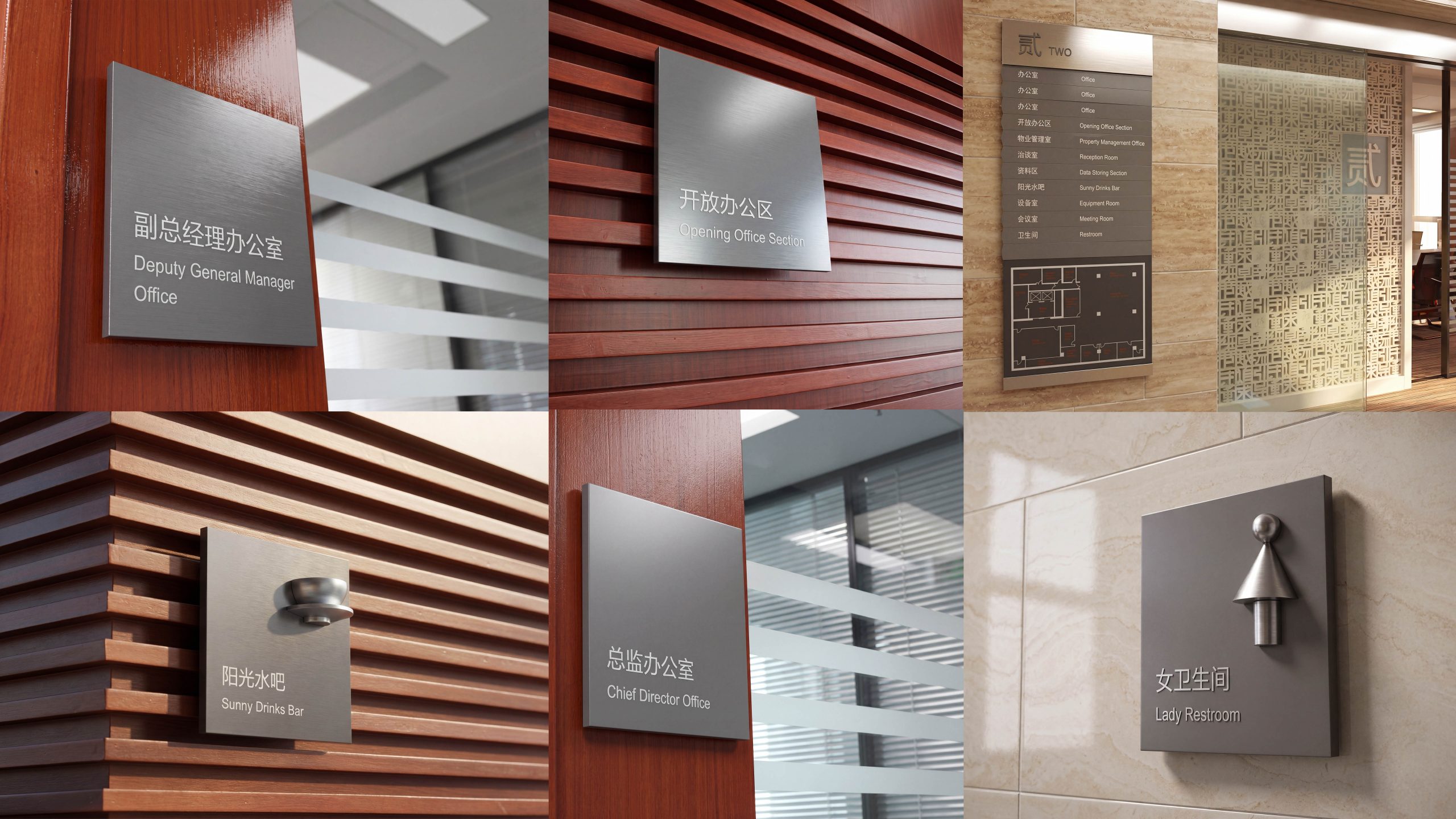
Wayfinding system for the Sunshine Water Bar chain, covering three store formats: street-front stores, mall corner stores and office-amenity stores. The scope spans façade identification, arrival and queue management, ordering and cup pick-up, dine-in and recycling, back-of-house and safety, and accessibility.
The goal: a replicable, low-maintenance, scalable wayfinding system that keeps customers moving smoothly and signs reliably legible at peak hours.
Assess the current state and define the goal
Site surveys and footfall sampling showed that entrance recognition and brand communication worked well. Confirmation at turns was lacking, however, the menu hierarchy was unclear, temporary materials interfered with the main system, and information at the cup pick-up point was fragmented. This defined three goals. Wayfinding: clear one-way circulation, predictable key turns, and distance confirmation points along longer routes. Legibility: viewing distance, type size, contrast and illuminance matched one-to-one for reliable reading day and night. Operations: templated variable information, menu and promotion changes in 5–10 minutes, and consistency across stores.
Methodology (Systematic Strategy)
The approach follows “one grid, two viewing distances, three carrier types, four-level coding, five-step implementation.” One grid: a unified 8pt/4mm module runs through sign layouts and hardware tooling for a consistent look at scale. Two viewing distances: long range (10–20 m) for the exterior approach and main category indexes, and short range (1–5 m) for ordering rules and operating prompts. Three carrier types: fixed signage (storefronts, zone signs, overviews), variable information (menus, prices, featured items, number ranges) and temporary guidance (peak-hour diversion, equipment maintenance, emergency evacuation), with unified magnetic/slide-in interfaces. Four-level coding: store, functional zone, workstation and equipment (A/B/C… + number), linked to queue calling, SOPs and back-of-house maintenance. Five-step implementation: survey and modeling, prototyping, pilot calibration, full rollout, and handover of the asset register and SOPs.
Visual and information rules
Color: “Sunshine White” serves as the information ground, with lemon yellow and mint green for functional emphasis. Safety and accessibility use a high-visibility yellow/blue pairing. Typography and sizing: a highly legible sans-serif family for Chinese and Latin text, with both languages given equal weight. Storefront lettering is 180–240 mm, zone signs 80–120 mm, ordering and operating text 24–36 pt, and notices 18–24 pt. Numbers and prices favor tabular figures. Icons: unified stroke weight and corner radii, redrawn to ISO and accessibility standards. Arrows, numbers and number ranges share geometric parameters so they read the same near and far. Layout: left-aligned, evenly spaced columns with fixed leading. Menus read in the order category, size, temperature, sweetness, add-ons, price and calories, which reduces hesitation. Optics: 4000–4500 K neutral, glare-controlled light sources and matte-laminated primary information surfaces keep glass reflections from washing out information.
Touchpoint Rollout (Scenario-Based Implementation)
Exterior approach: illuminated channel letters on the storefront and a corner blade sign give two viewing faces. Window displays feature “Today’s Pick” with calorie labeling, and floor guide lines lead straight to the entrance. Entry and ordering: a Quick Menu sits to the right of the entrance and an illustrated customization guide to the left. Railings and floor graphics form a one-way queue, with parallel lanes opened at peak times. Waiting and pick-up: call screens show number ranges and estimated wait times. The pick-up counter uses a four-line confirmation (name/number, flavor, temperature, sugar level), next to an integrated straw, lid and napkin module. Dine-in and recycling: table cards combine Wi-Fi details, pick-up reminders and self-clearing prompts. Recycling stations sort graphically into liquids, cups, straws and other waste, with QR codes linking to feedback and nutrition information. Back-of-house and safety: storerooms, cold storage and washing areas are coded independently. Signage for fire extinguishers, evacuation routes, AEDs and accessible routes repeats at key points, and minimum illuminance is maintained at night.
Delivery and operation and maintenance mechanism
An operational loop built on an asset register, template library and data integration. Every sign carries a unique code with installation and maintenance records. Menus, featured items, number ranges and diversion materials are generated from templates and printed locally, so one person can complete an update in five minutes. QR codes link to live floor plans, nutrition tables, SOPs and emergency plans, and inspection checklists define frequency, tolerances, cleaning and illuminance requirements. Deliverables include the wayfinding master plan and location drawings, layout and icon manuals, hardware exploded views and bills of materials, mounting heights and optical parameters, and operations SOPs with training materials. The system can be replicated quickly across store formats, sustaining clear order, stable legibility and a consistent brand image over the long term.