










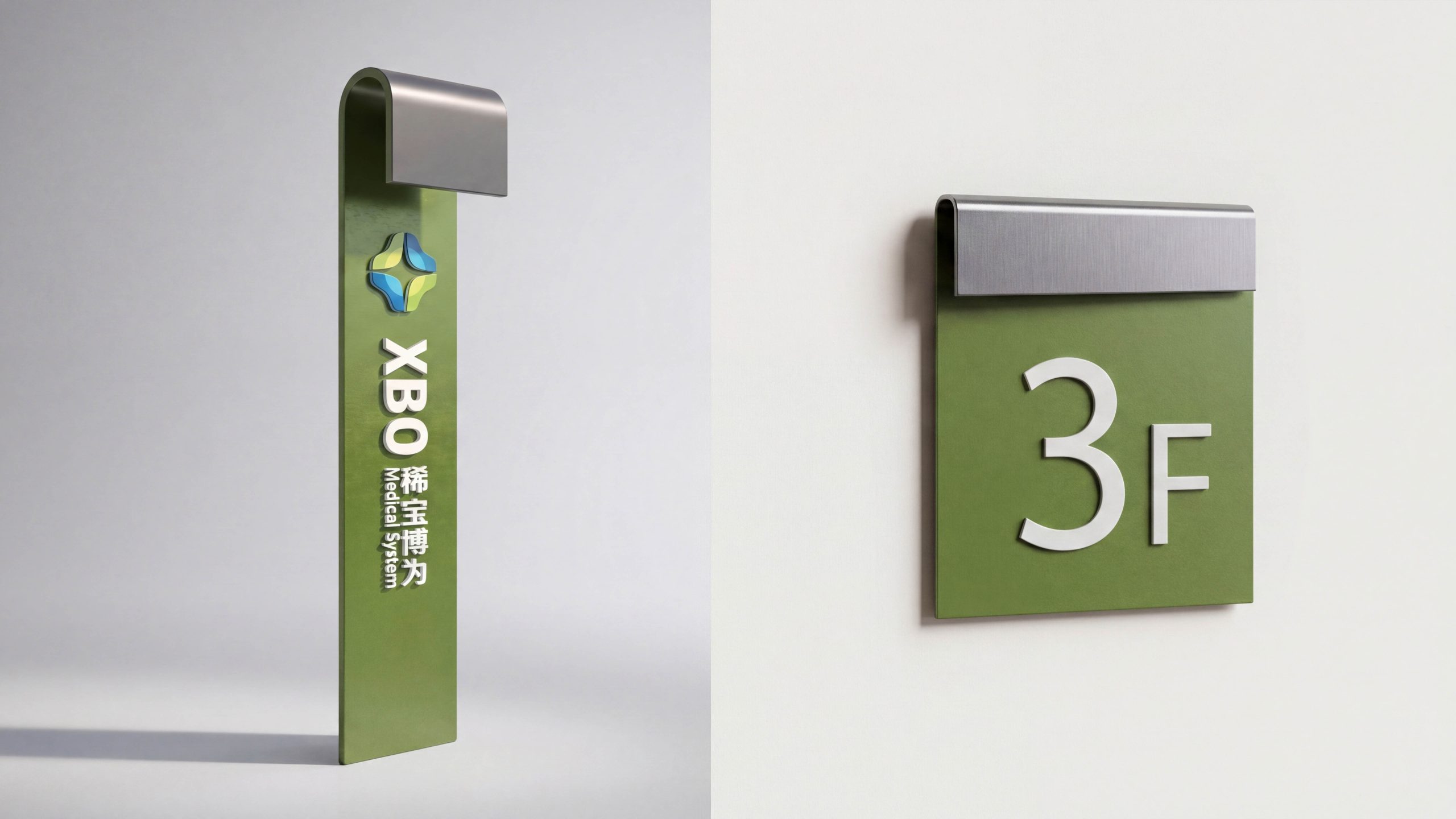
Campus wayfinding system for Xibao Bowei Medical System. The scope covers the streetscape interface and entrance plaza, vehicle and pedestrian arrival, lobbies and floor directories, clinical departments and office areas, parking and back-of-house logistics, and accessibility and emergency systems.
The goal was to build a replicable, low-maintenance, scalable wayfinding system for a combined healthcare and R&D setting. It needed to help first-time visitors find their way quickly and keep staff and logistics moving efficiently. Critical information had to stay legible day and night, in all weather.

Current-State Assessment and Design Principles
Site surveys found weak entrance recognition, discontinuous floor and room numbering, visually inconsistent temporary notices, and night-time reflections impairing legibility. Three principles were established. Structure first: the hierarchy of circulation, nodes and interfaces takes precedence over decoration. Consistency first: naming, coding, grids and layouts are unified across buildings. Safety first: medical notices, accessibility and emergency information take priority over marketing messages.
systematic strategy
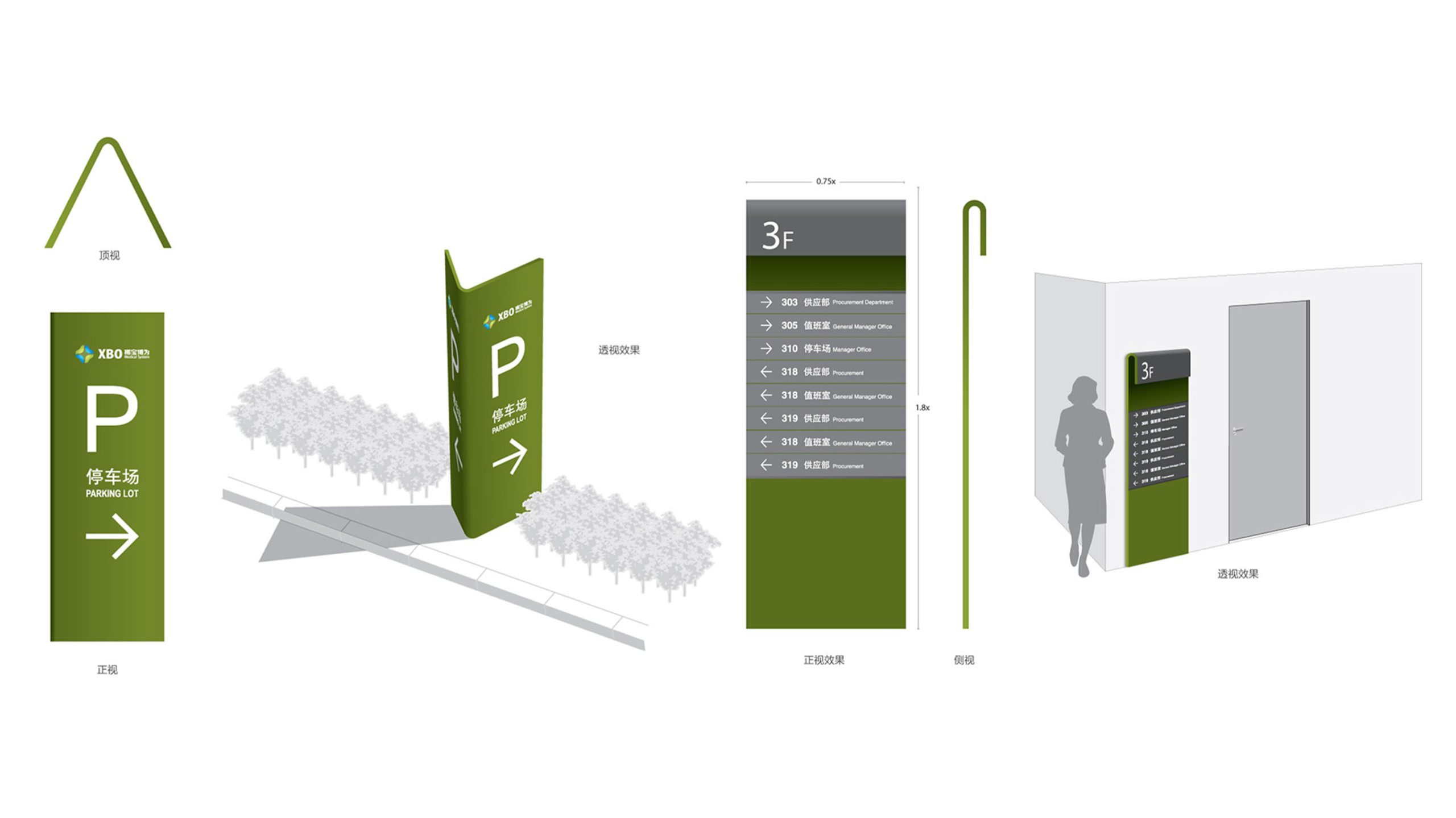
The approach follows “one grid, two viewing distances, three carrier types, four-level coding, five-step rollout.” One grid: a unified 8pt/4mm module runs through sign layouts and hardware tooling. Two viewing distances: long range (20–60 m for vehicles, 10–25 m for pedestrians) and short range (1–7 m), each with its own type size, contrast and illuminance thresholds. Three carrier types: fixed signage (gateway structures, floor directories, zone signs), variable information (department name changes, outpatient schedules, parking information) and temporary guidance (maintenance detours, emergency diversion), with unified magnetic/slide-in interfaces. Four-level coding: campus, building, floor and room (letters + numbers), supporting integration with HIS, visitor management and security systems. Five-step rollout: survey and modeling, prototyping, pilot calibration, full implementation, and handover of the asset register and SOPs.
Visual and information rules
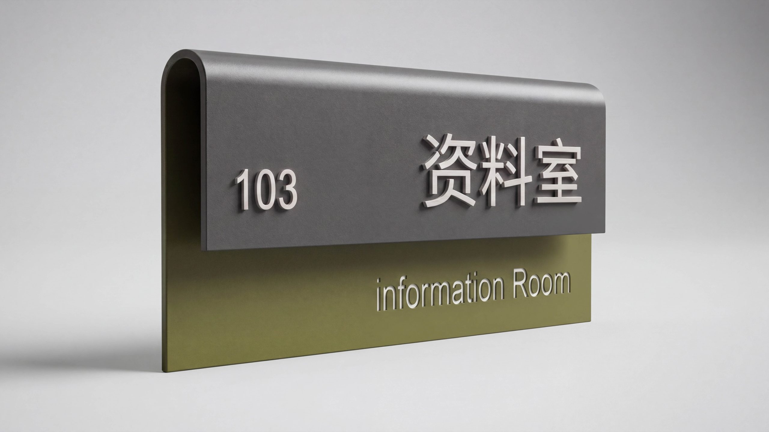
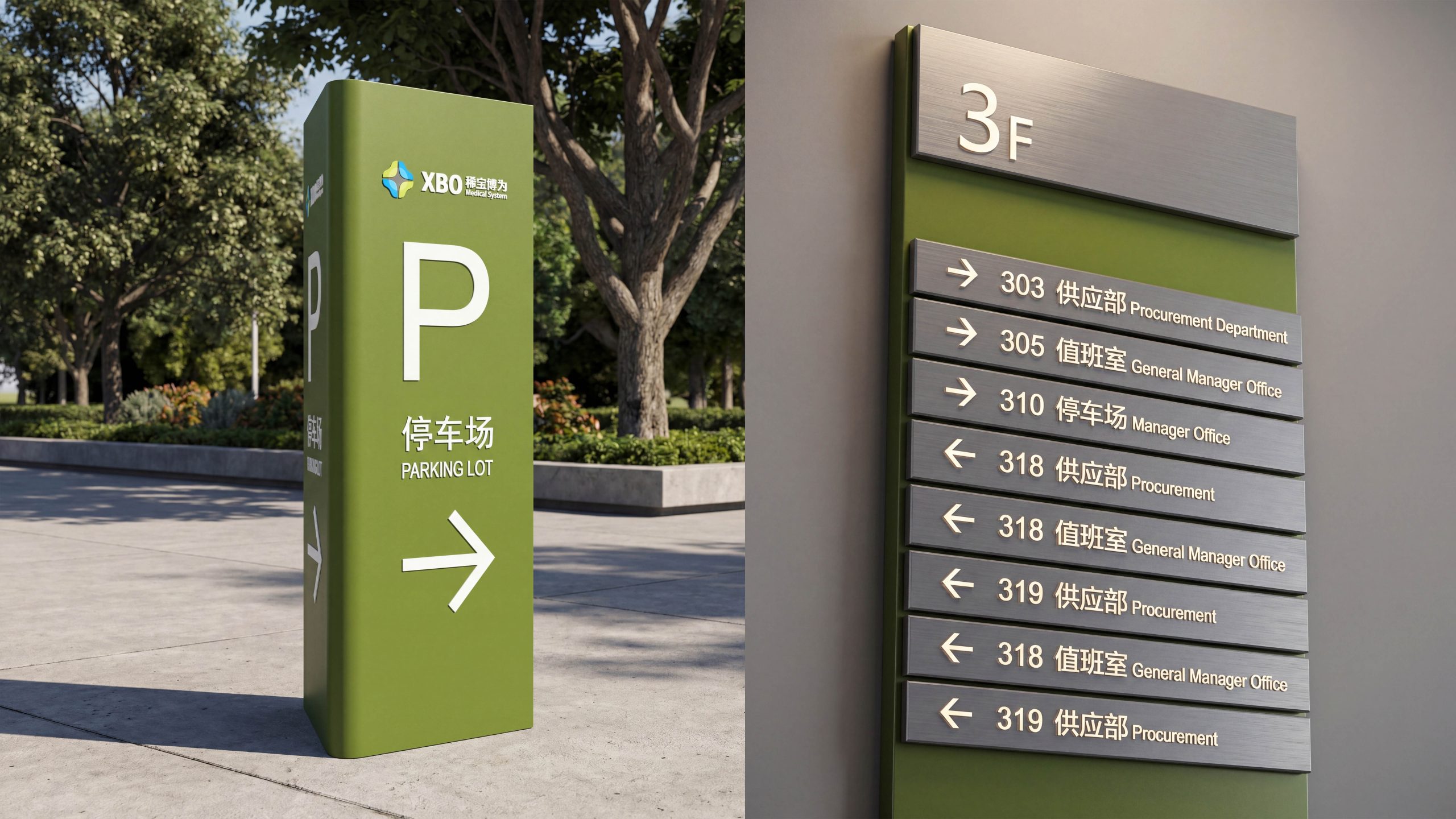
Color: a clinical dark gray serves as the information ground, with brand green for functional emphasis. Emergency and safety information uses high-visibility red/yellow, and accessibility follows the international standard blue/white contrast. Typography and sizing: highly legible sans-serif Chinese and Latin typefaces, with tabular figures for numbers and times. Floor indexes are ≥120 mm, zone signs 60–90 mm, directional text 30–40 pt, and notices 18–24 pt. Icons: redrawn to ISO 7010 and common healthcare symbols, with unified stroke weight and corner radii. Layout: left-aligned, evenly spaced columns with fixed leading. Information follows the sequence Where am I, Where to, How to get there, Which floor, Which room and What to note. Optical control: 4000–4500 K neutral light sources and matte panels, with dual thresholds for minimum night-time illuminance and maximum glare.
Touchpoints and Scenario-Based Rollout
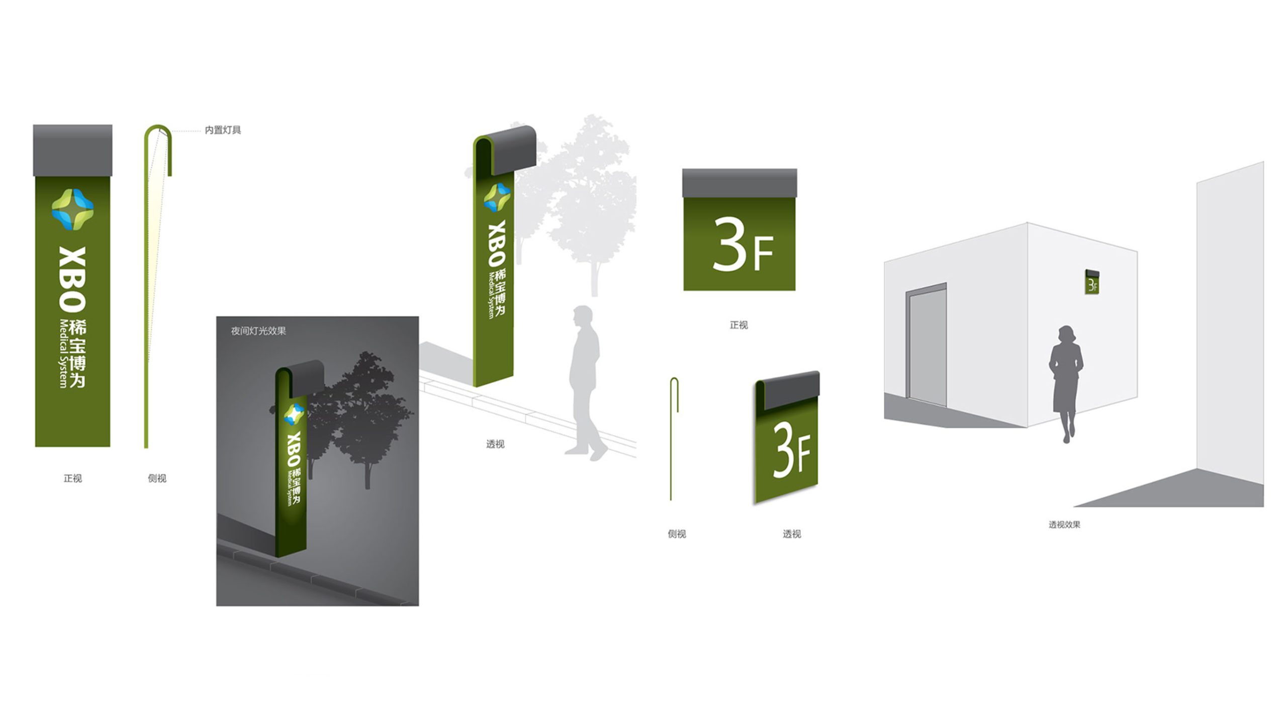
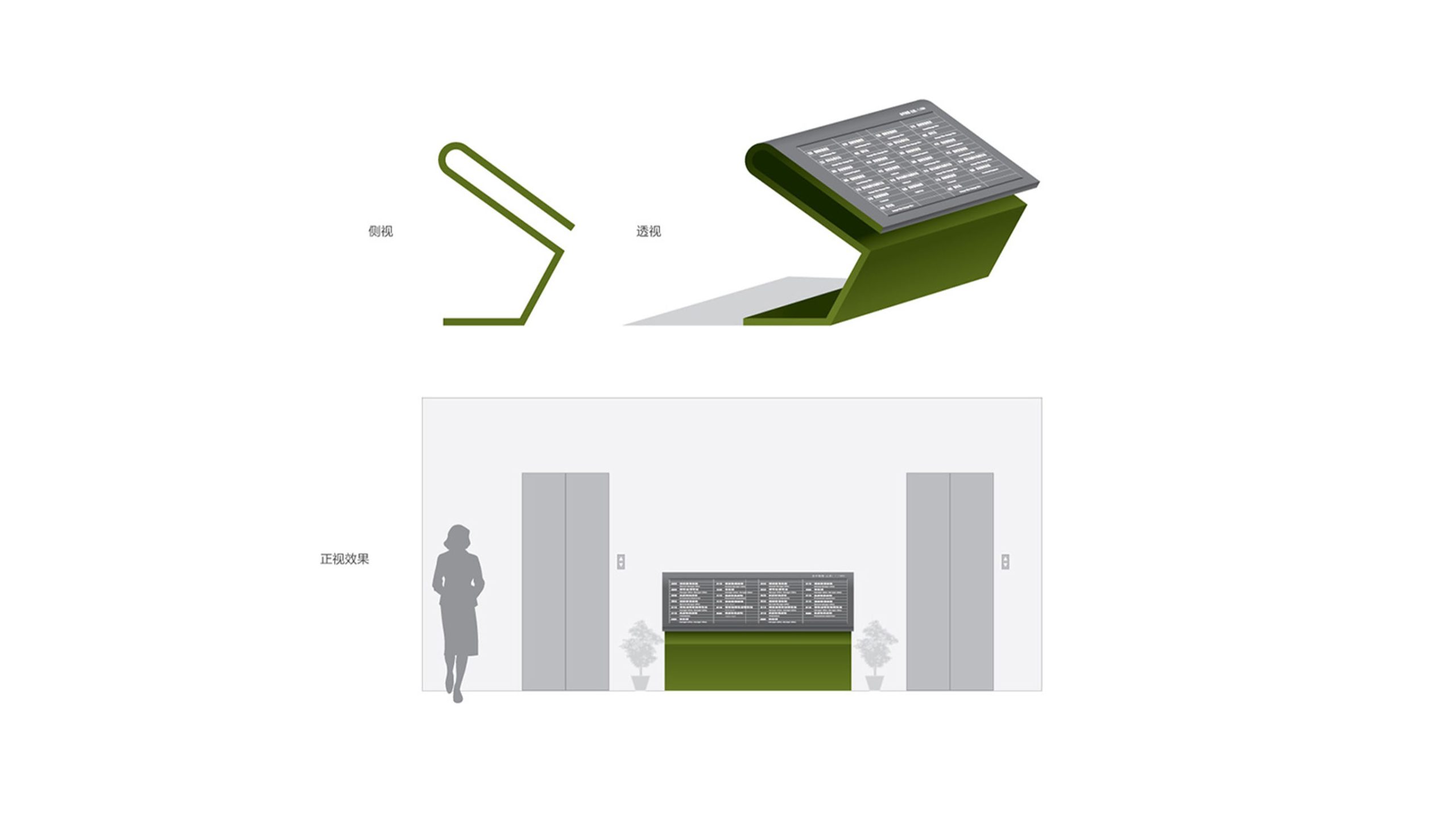
Streetscape and arrival: the entrance features integrated folded-metal monoliths and tall directional pylons. Separate vehicle and pedestrian guidance begins 50–80 m ahead, at the approaching intersection. Lobby and vertical circulation: the main directory adds the visit process and today’s schedule. Escalator and elevator landings preview destination floors and accessible alternative routes. Floors and departments: turn arrows appear ahead of corners, angled at 30°, and long corridors have distance confirmation every 12–15 m. Department door signs combine code, Chinese and English names, and service hours, and high-traffic points such as laboratory and imaging repeat their signage for confirmation. Parking and logistics: P-zone pylons match the color bands, and elevator lobbies list the nearest entrances and key departments. Logistics, waste and hazardous-materials routes are coded separately so they never cross patient and visitor flows. Emergency and compliance: evacuation maps, fire extinguishers, AEDs, isolation zones, handwashing and waste-sorting signage share unified templates for easier inspection and auditing.
Delivery and operation and maintenance mechanism
An operational loop built on an asset register, template library and data integration. Every sign carries a unique code with installation and maintenance records. Schedules, department changes and parking information are generated from templated files, and local updates take under five minutes. QR codes link to live floor plans, visitor guides, accessible routes and emergency SOPs. Deliverables include the wayfinding master plan and location drawings, layout and icon standards, hardware exploded views and bills of materials, mounting heights and illuminance standards, and operations SOPs with training materials. The system can be replicated quickly in new buildings or expansion phases, sustaining rigorous order and a professional image over the long term.