








Case Study 04
Perennial
Ventures
Positioning a VC Fund as the Patient Partner
01
Brand Positioning
A Critical Misalignment
Perennial Ventures, a venture capital fund with family office roots.
In a venture capital market obsessed with quick exits and IPOs within three years, Perennial's patient approach was misunderstood, making it difficult to attract the exceptional founders best aligned with its philosophy.
Market Misperception
Criticized for slow decision-making and limited resources
Strategic Misalignment
Aggressive marketing borrowed from peers felt out of place
A Fractured Identity
Caught between speed and patience
02
The Founder's
Underlying Anxiety
The Qingmei Future team immediately put a stop to every attempt to imitate competitors.
Through in-depth interviews with leading founders, we uncovered a fundamental anxiety.
Core insight
The entire VC industry was selling growth. What leading founders truly lacked was stability.
The Curse of Fast Money
Almost every founder fears fast money: VCs pushing them into short-term, high-risk growth sprints to secure an exit within 3–5 years.
The Desire for an Ally
Founders don't want another adviser. They want a strategic ally—a patient partner who will stand by them through the downturns.
03
Brand Positioning Strategy
Evergreen Capital
Patient Capital. Permanent Capital.
For
Leading founders committed to building enduring businesses, not chasing short-term gains
PERENNIAL Is
The only evergreen capital partner that stands beside you, a decade at a time
It delivers
Strategic patience through market cycles. Long-term interests, fully aligned.
Because
Our capital structure is built for long-term ownership. Our success depends not on a quick exit, but on your enduring success.
Brand Tagline
Built for Decades,
Not Quarterly Earnings.
Built for decades, not quarterly earnings
04
Brand Identity and Visual System
Visual Identity System
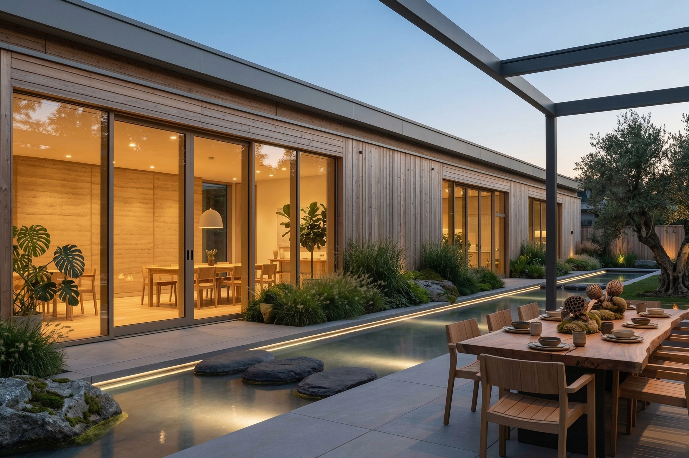
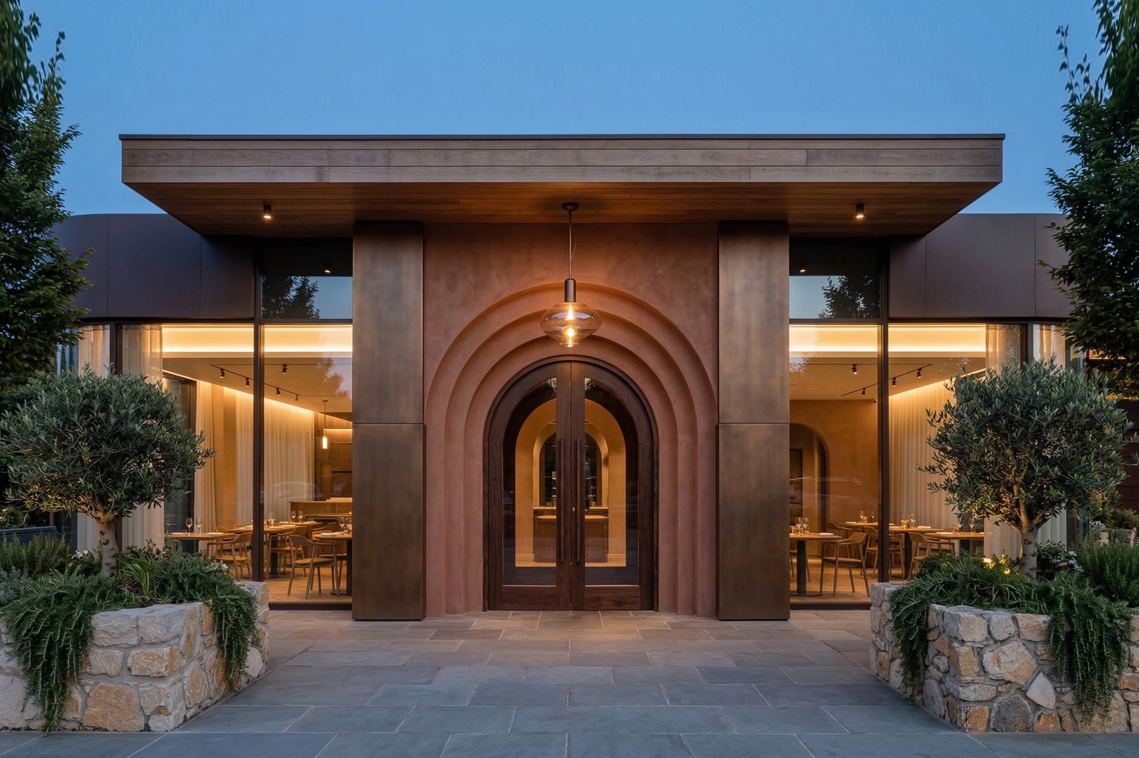
We rejected the rockets, rising arrows and lightning bolts that dominate VC branding. Instead, we drew inspiration from tree rings and redwoods.
Forest green and deep ocean blue, complemented by warm beige, convey composure, wisdom and lasting vitality.
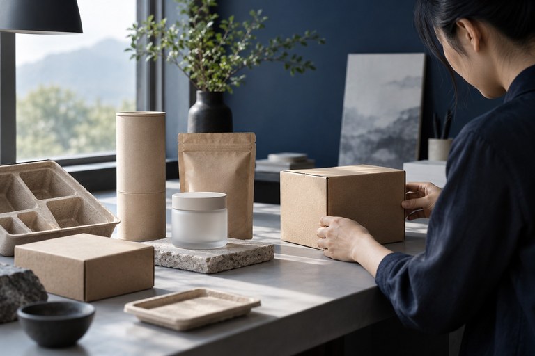
Packaging Design
Business cards and pitch decks use exceptionally heavyweight, eco-friendly specialty paper. The moment a founder receives a card, its substantial feel makes the brand's promise of reliability and stability tangible.
Digital Experiences
The website avoids rapid-fire animation. Slow parallax scrolling allows the content to unfold steadily, like a scroll.
05
Market Impact
Attracting Top-Tier Deal Flow
The new positioning prompted inbound interest from serial entrepreneurs and founders who value patient growth. Perennial no longer needed to compete with fast-money funds for deals.
LP Endorsement
The patient-capital positioning aligned closely with the needs of long-term LPs, including family offices, significantly strengthening fundraising.
Brand Premium
Greater negotiating leverage in competitive deals. Founders chose Perennial for its strategic fit.
Industry Standing
The tree-ring logo and evergreen-capital philosophy offered a refreshing alternative in venture capital, establishing the firm as a benchmark for long-term investing.