










SINOLAND is a real estate company focusing on high-end real estate development and urban space construction. It is committed to exceeding expectations with excellent quality and building a better future for human settlements with ingenuity.
The brand hopes to present a balanced state of "outstanding quality x excellence" through a visual system that combines cultural connotation and modern quality.
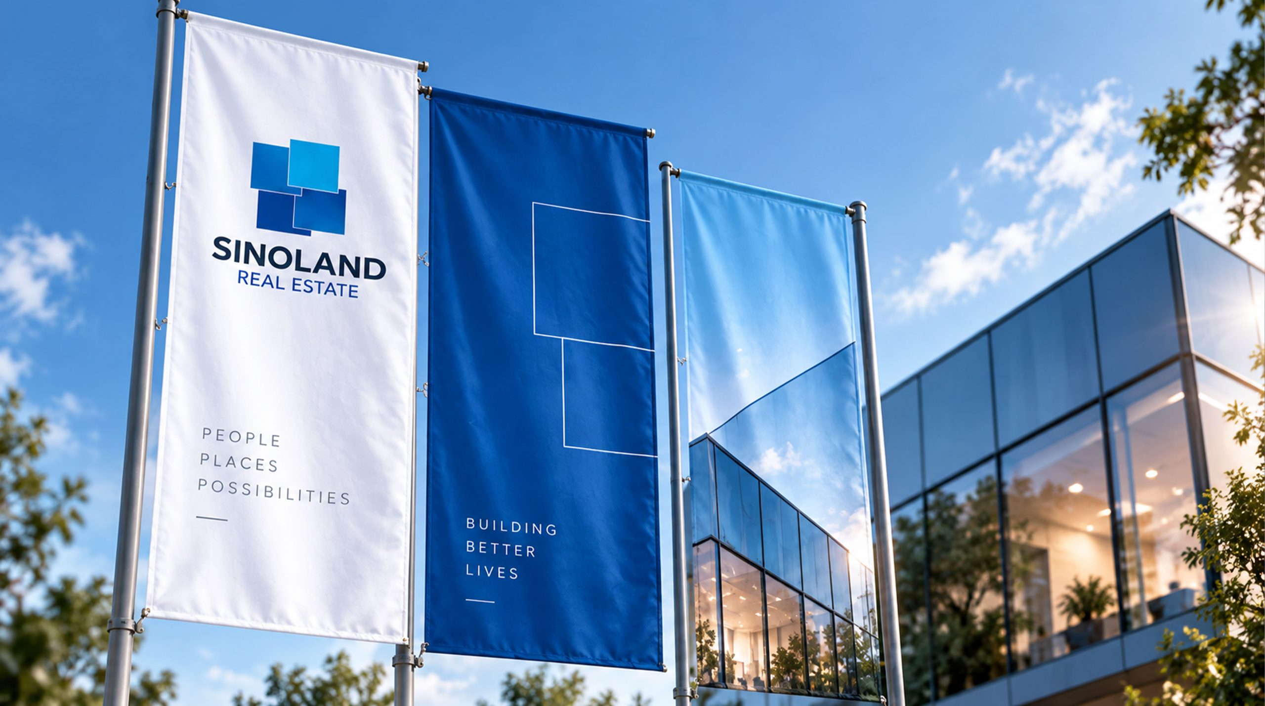
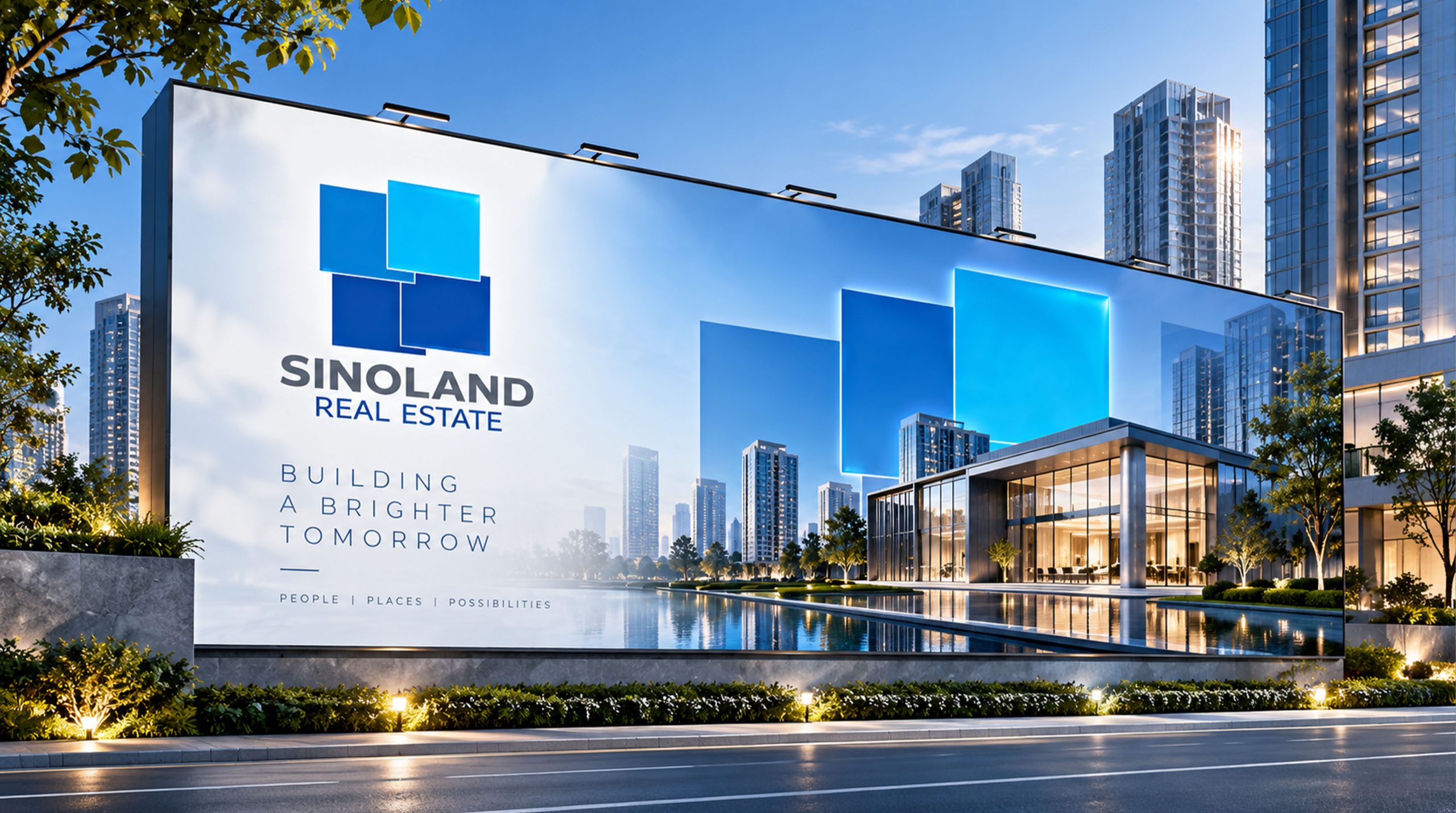
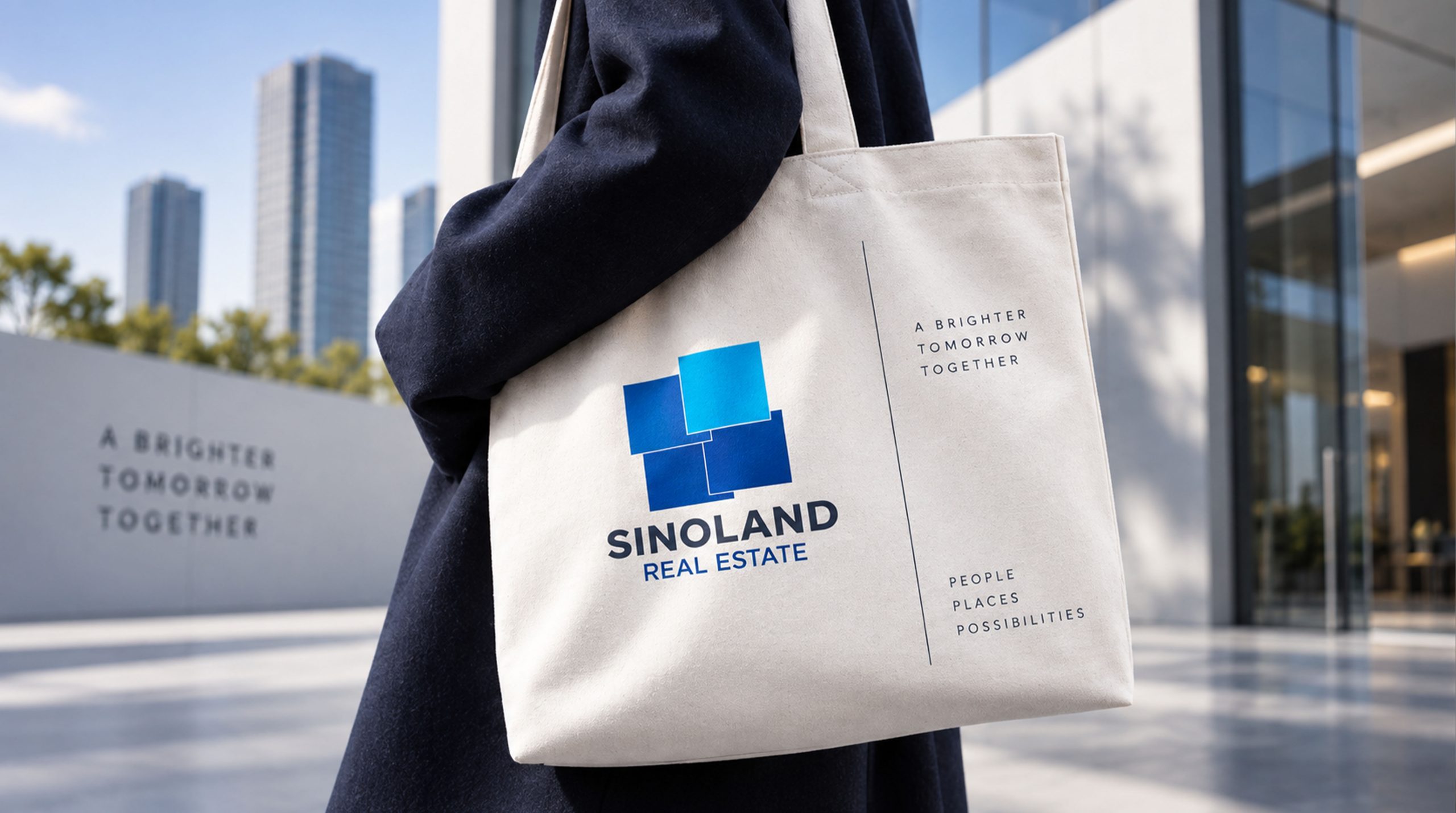
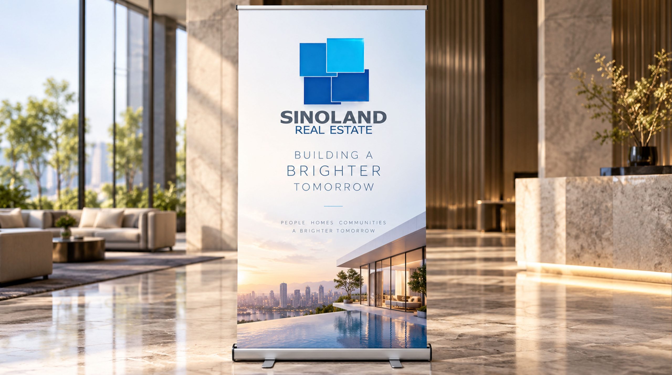
design concept
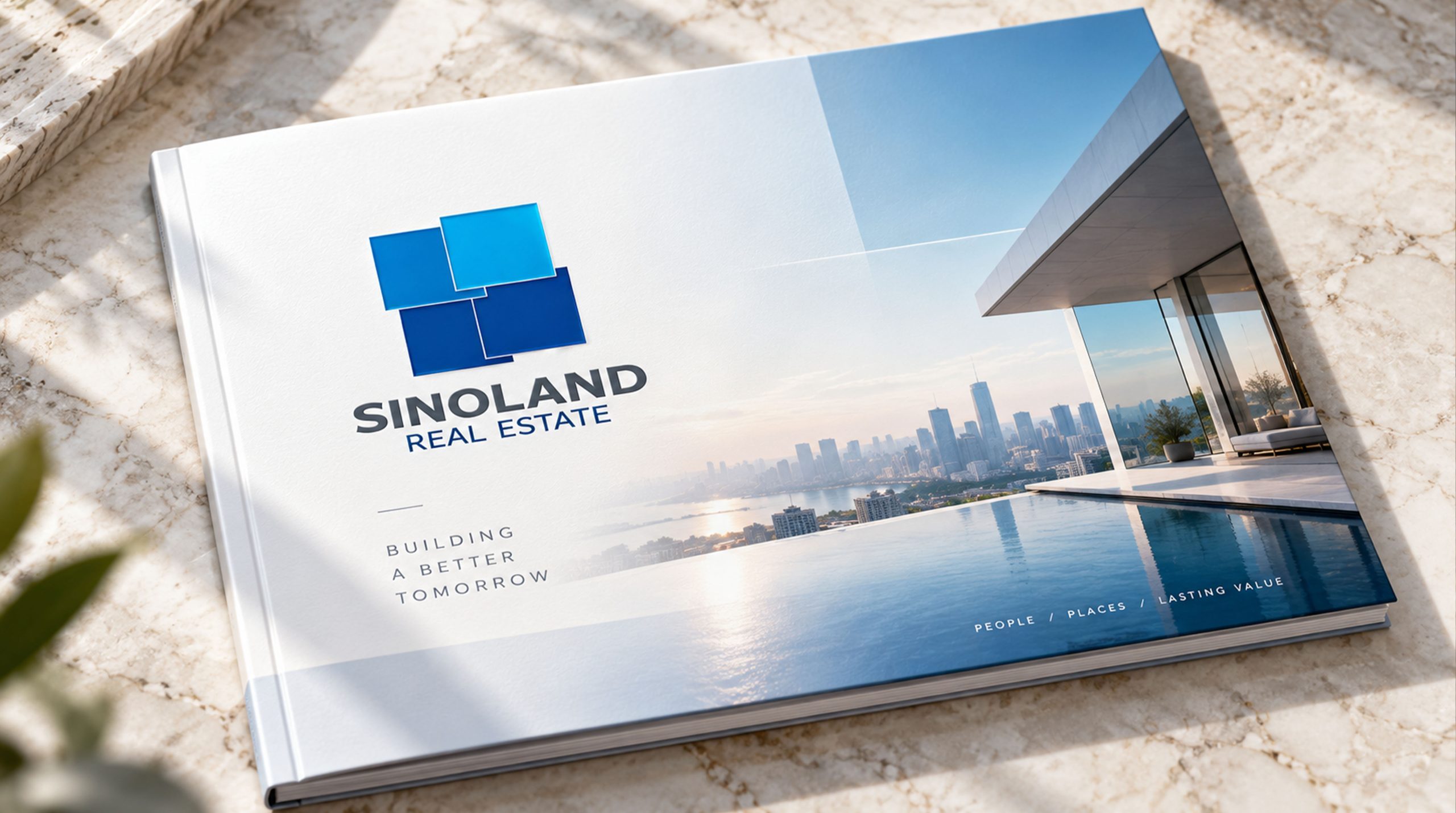
The core idea of the logo comes from the concept of "Excellence Beyond". The design is based on four overlapping square color blocks, which overall form the image of the Chinese character "field", symbolizing the core attributes of land and the real estate industry, and representing foundation and development. The four squares adopt a blue gradient from dark to light, reflecting the brand philosophy of "blue is better than blue" - innovation in inheritance, transcendence in excellence. The overall shape is both stable and professional in the real estate industry, and full of aggressive tension in the pursuit of excellence, implying SINOLAND's brand mission of continuing to exceed industry standards with higher quality and leading the ideal of human settlements. The transparent layering of glass texture shows the brand’s modernity and international vision.
Graphic composition and color system
Composition of the word "Tian": the four sides overlap to form the image of the word "Tian", which represents the foundation of the land and real estate industry; overlapping and interlacing: the overlapping relationship of the squares symbolizes resource integration and value superposition; blue gradient sequence: from dark to light blue reflects the brand concept of "green is better than blue"; glass transparent texture: the modern visual effect presents the brand's internationalization and high-end positioning.
The brand name "SINOLAND" uses a modern sans-serif font with a stable shape and balanced proportions, consistent with the geometric temperament of the logo. The subtitle "REALESTATE" uses a thin line font to convey the brand's "delicacy in power". The whole arrangement is arranged up and down to strengthen visual stability and international communication attributes.
Deep blue #1A3A6E: symbolizes depth, professionalism and industry foundation; sky blue #2E7CB8: represents development, innovation and enterprising spirit; clear sky blue #5BCOEB: symbolizes transcendence, future and pursuit of excellence; pure white #FFFFFF: symbolizes purity, quality and architectural authenticity. The blue progresses in the gradient, forming a visual balance of "inheritance and transcendence" and "stability and progress", and building a professional and pursuing brand impression.
Application extension and brand significance
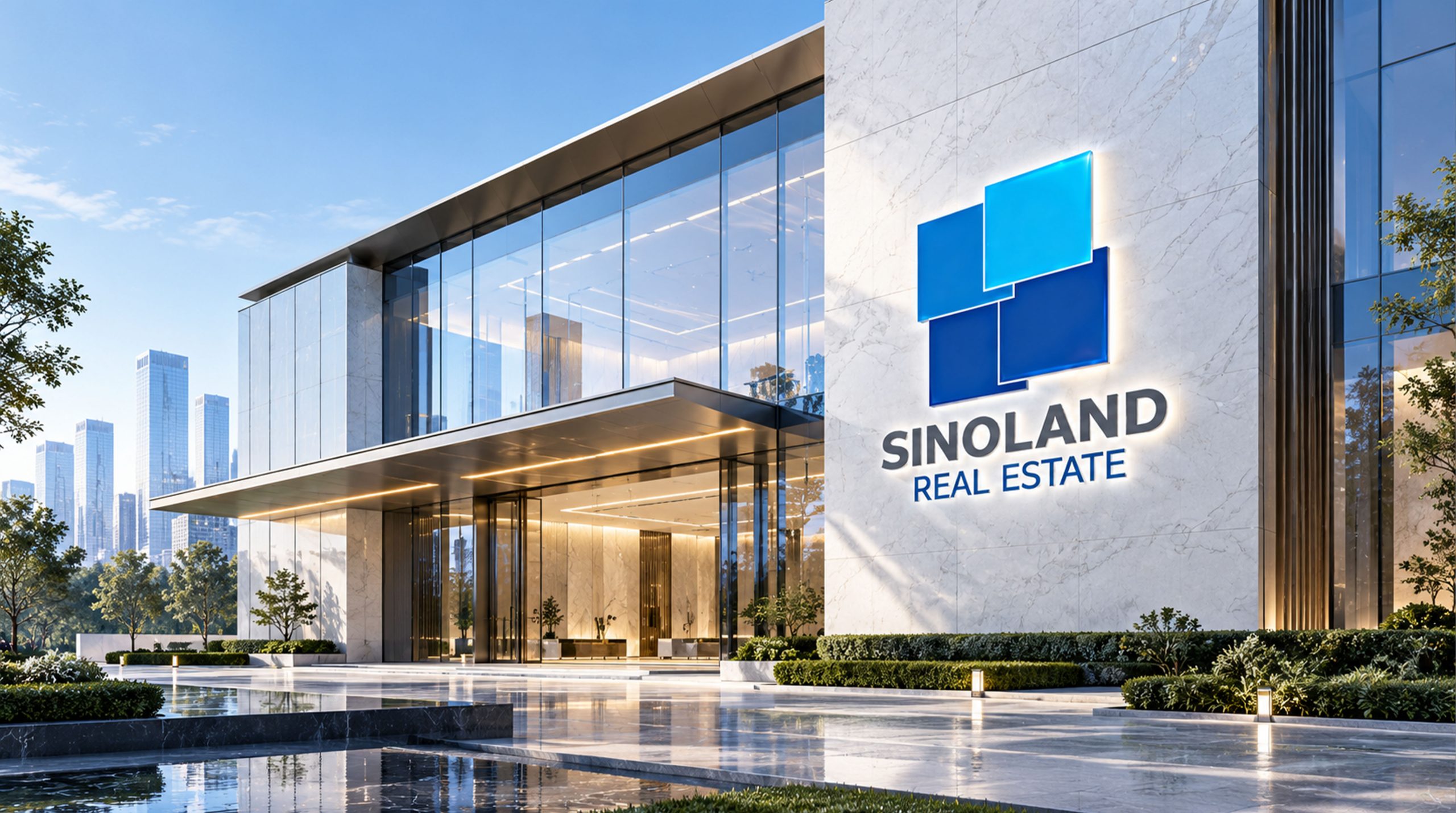
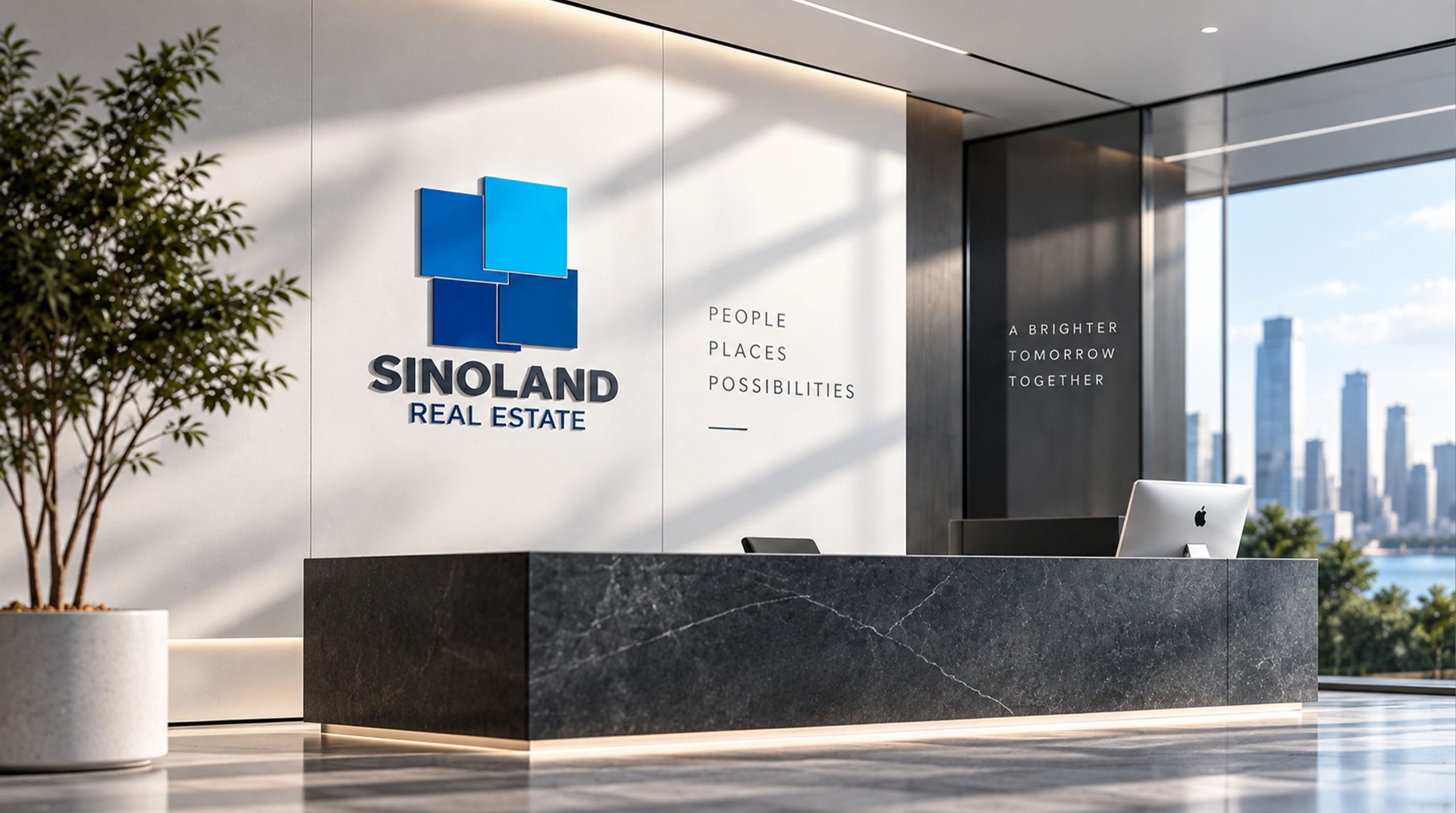
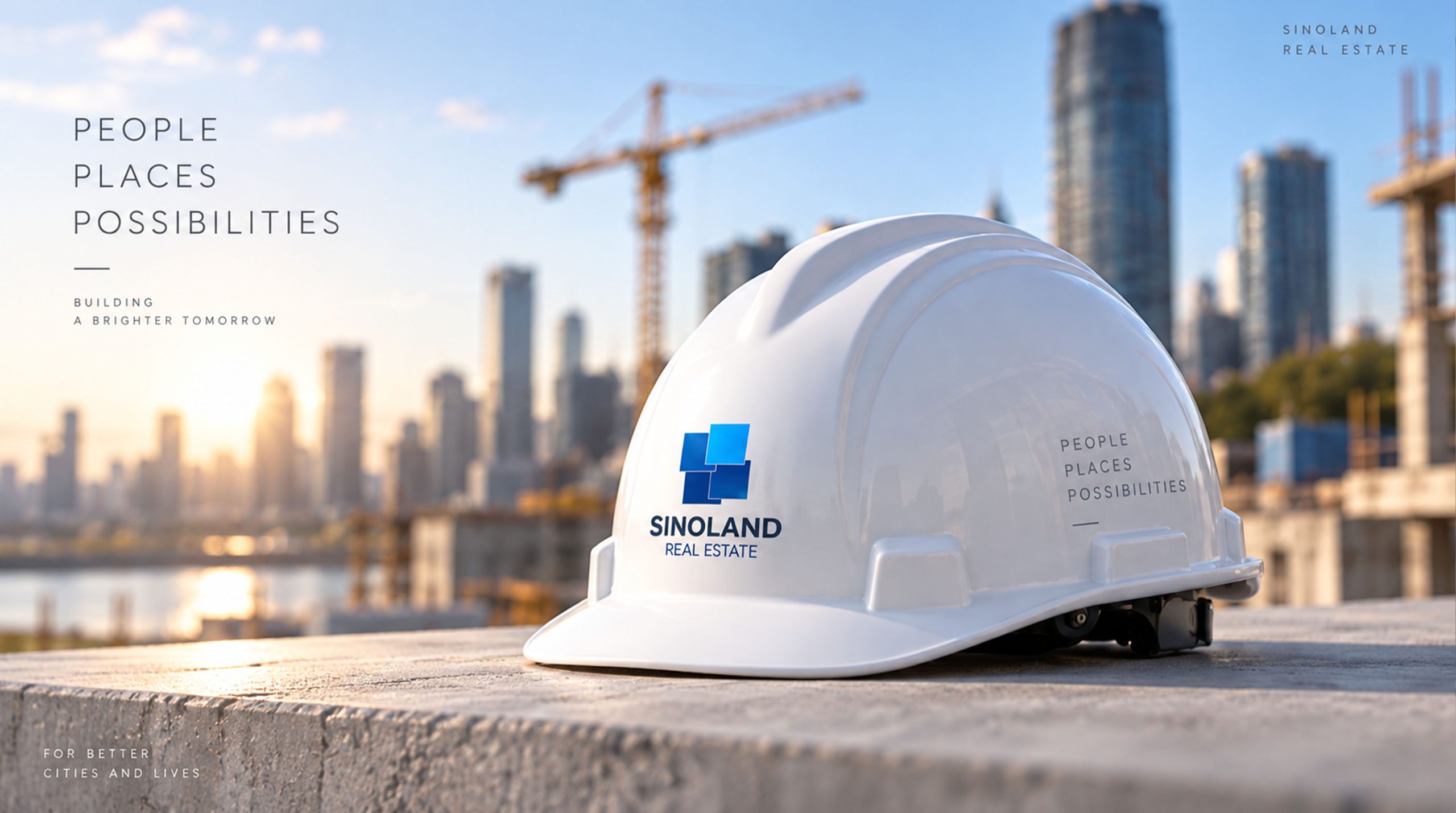
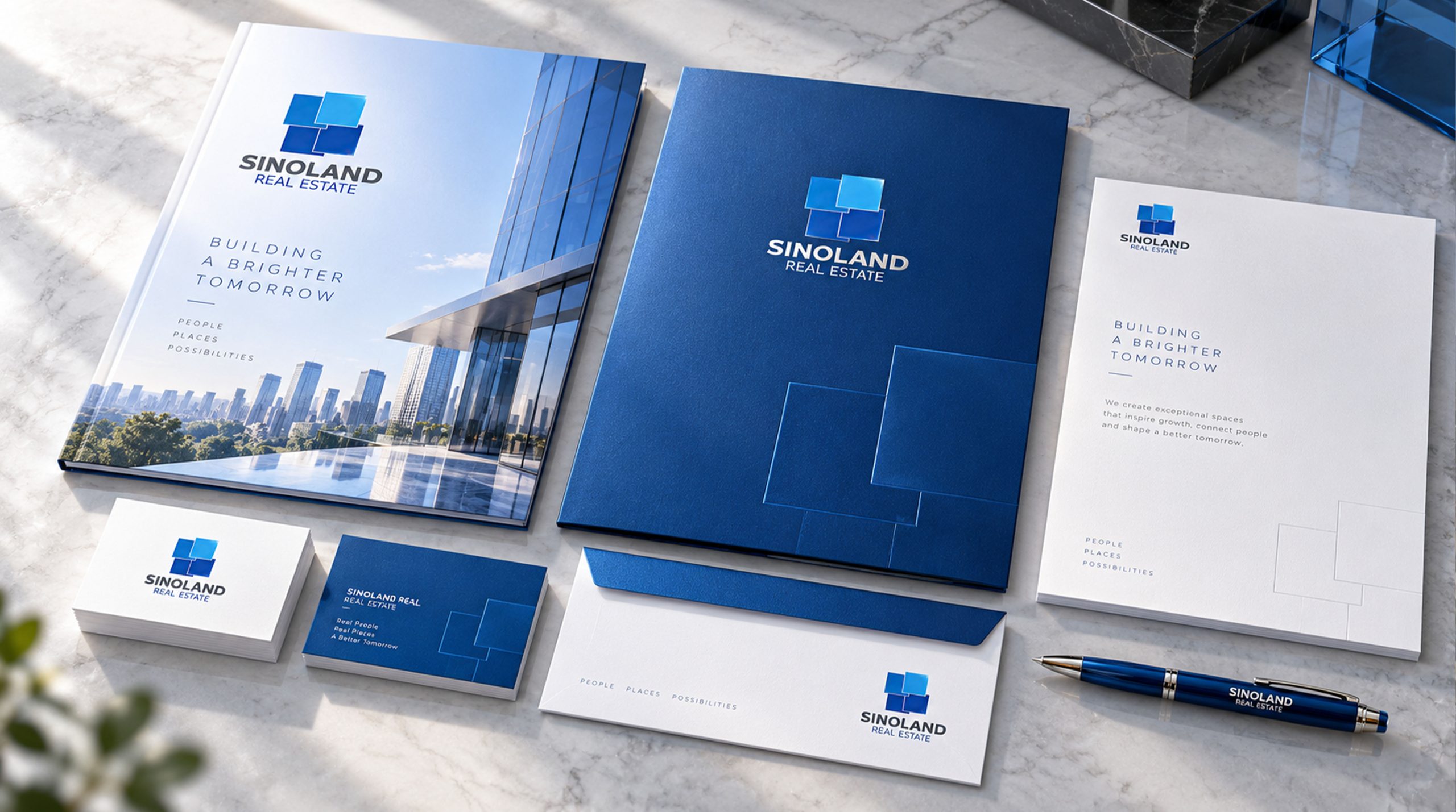
The logo has strong cross-field adaptability: corporate level: applied to brand launches, real estate exhibitions, annual reports and strategic cooperation; product level: suitable for real estate logos, sales centers and property service signs; spatial level: in the sales office, guidance system and building facades to form a unified visual language. In the dynamic version, the squares can be used as "cascading" or gradient flowing animations, symbolizing the continuous pursuit of quality transcendence.
The SINOLAND logo embodies the dual value of "green out of blue x excellent quality": the word "tian" constitutes → the industry foundation of the land; blue gradient → the brand pursuit of transcendence; layered structure → the symbiosis of inheritance and innovation. This is not only a brand identification symbol, but also a visual expression of the real estate philosophy. With the heart of excellence, we build an ideal residence that exceeds expectations.
design results
After the launch of the new visual system, SINOLAND has become an iconic brand image in the high-end real estate sector. The composition of the blue square and the word "Tian" is widely used in real estate exhibitions, brand communication, and project promotions. With the visual expression of "cultural structure × international language", it has established a new aesthetic standard in the real estate field. This case represents the mature expression of the brand in the direction of high-end real estate, quality residences and systematic visual language design, achieving the unification from "brand design" to "excellence philosophy".