










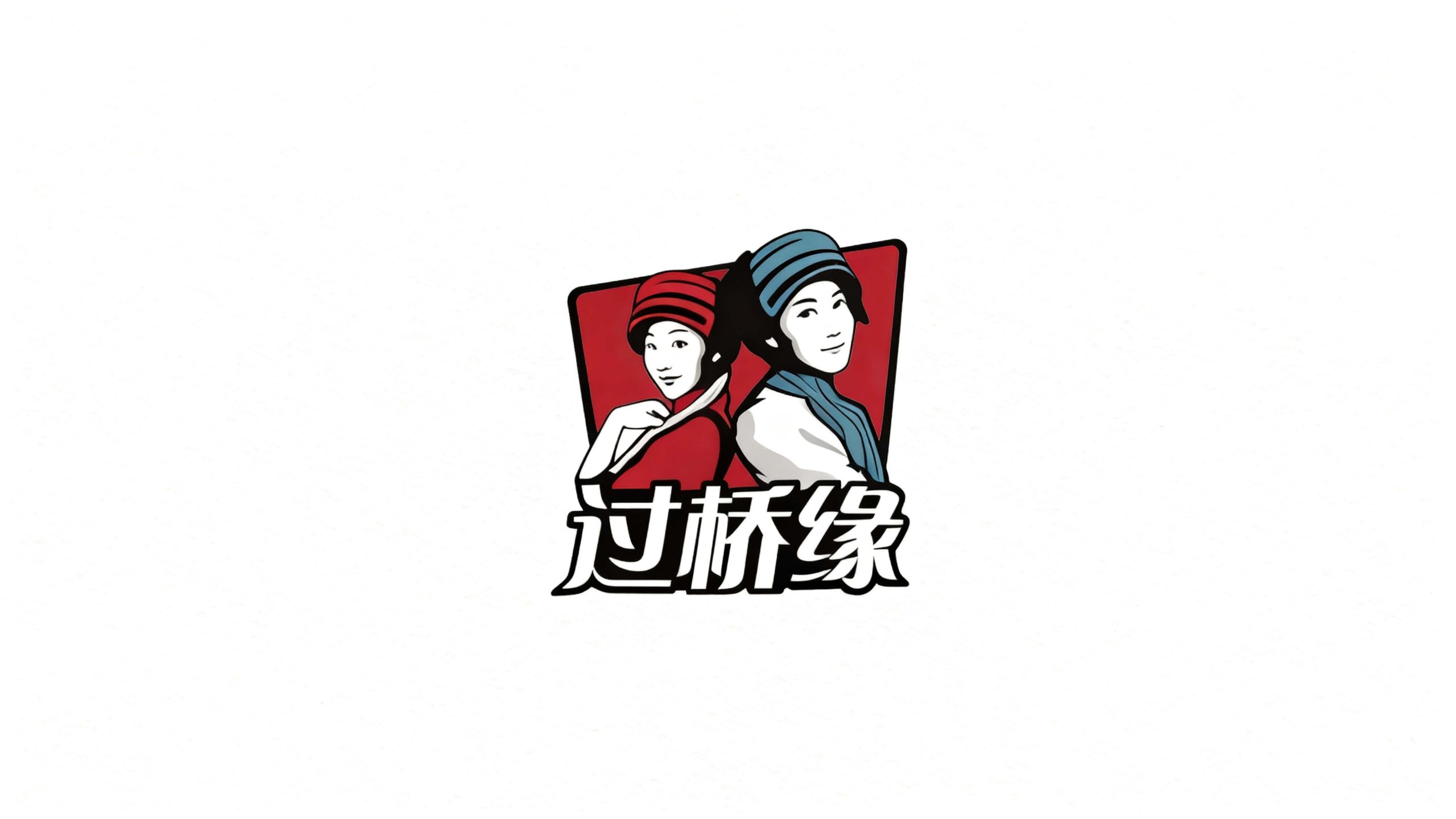
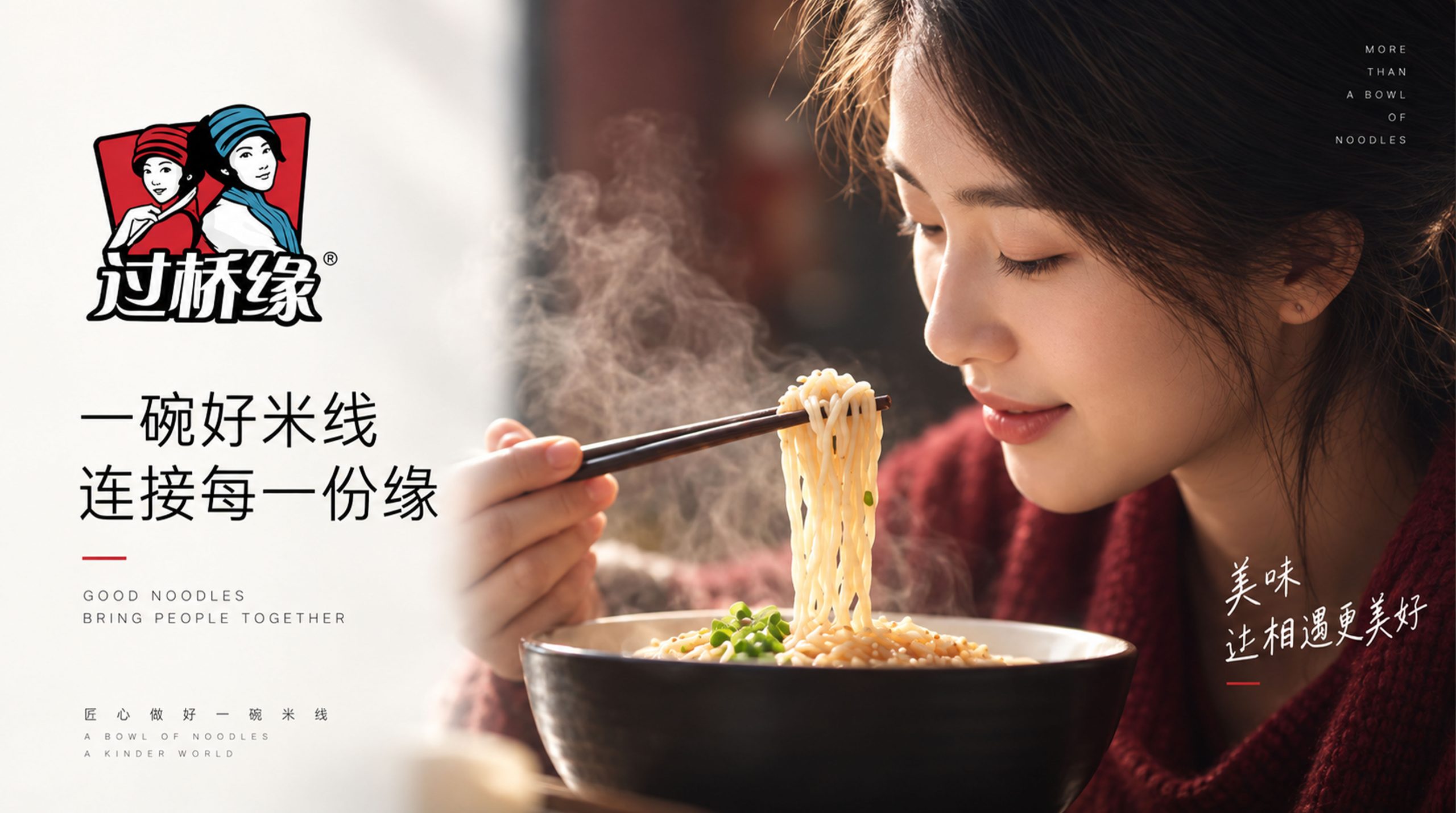
Guoqiaoyuan is a catering brand focusing on Yunnan Guoqiao rice noodles and authentic Yunnan cuisine. It is committed to inheriting regional culture with traditional food and connecting wonderful taste bud experiences with stories and feelings.
The brand hopes to present a balanced state of "traditional beauty x love story" through a visual system that combines cultural storytelling and national sentiment.
design concept
The core concept of the logo comes from the concept of "Bridge of Love". The design is based on the image of two Yunnan ethnic minority women side by side, symbolizing the century-old love story behind the bridge-crossing rice noodle - the moving legend of the wife delivering soup across the bridge and the deep love between the couple, representing true love and inheritance. The red and blue national costumes reflect the colorful national culture of Yunnan, and the interdependent postures of the characters symbolize the emotional connection contained in the word "Yuan". The overall shape not only has the profound heritage of national culture, but also is full of the warmth and tension of the story, implying Guoqiaoyuan’s brand mission of continuing to inherit food culture and continuing love stories. The artistic expression of illustration style gives the brand a strong story and recognition.
Graphic composition and color system
The structure of the two-person image: represents the emotional bond and cultural inheritance in the love story of rice noodles across the bridge; the characteristics of national costumes: the headdress and clothing of Yunnan ethnic minorities present the regional cultural characteristics; the posture of dependence: the two people standing side by side symbolize "fate, companionship" and the emotional temperature behind the food; the red background frame: the square outline conveys the stability of the brand and the enthusiastic tone of the catering industry.
The brand name "Guoqiaoyuan" is written in a handwritten font, with flexible fonts and full ink, which is consistent with the story of the logo. The round strokes of the font are designed to convey the brand's "traditional affinity". The Chinese brand name and graphics are arranged up and down to unify the whole, strengthening visual recognition and cultural communication attributes.
Passion red #D32F2F: symbolizes enthusiasm, celebration and the pyrotechnic atmosphere of catering; national blue #5B9BD5: represents the colorful charm of Yunnan, nation and culture; pure white #FFFFFF: symbolizes purity, cleanliness and the authentic taste of food. Red and blue are harmonious in contrast, forming a visual balance of "enthusiasm and freshness", "tradition and vitality", and building a warm and story-telling brand impression.
Application extension and brand significance
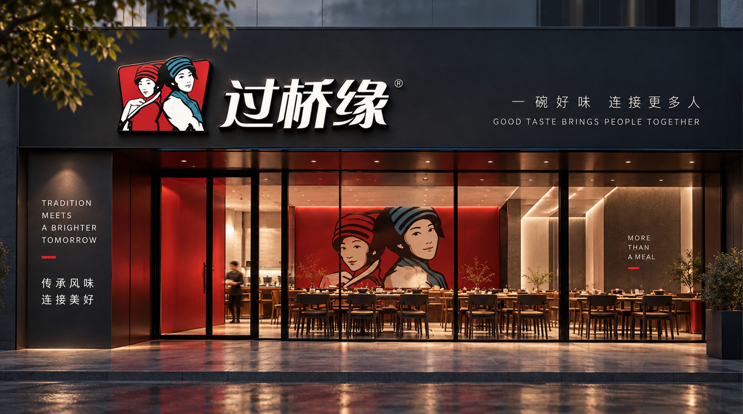
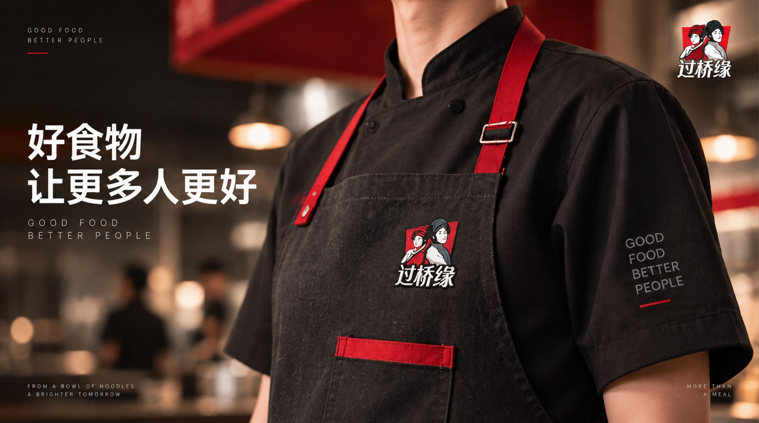
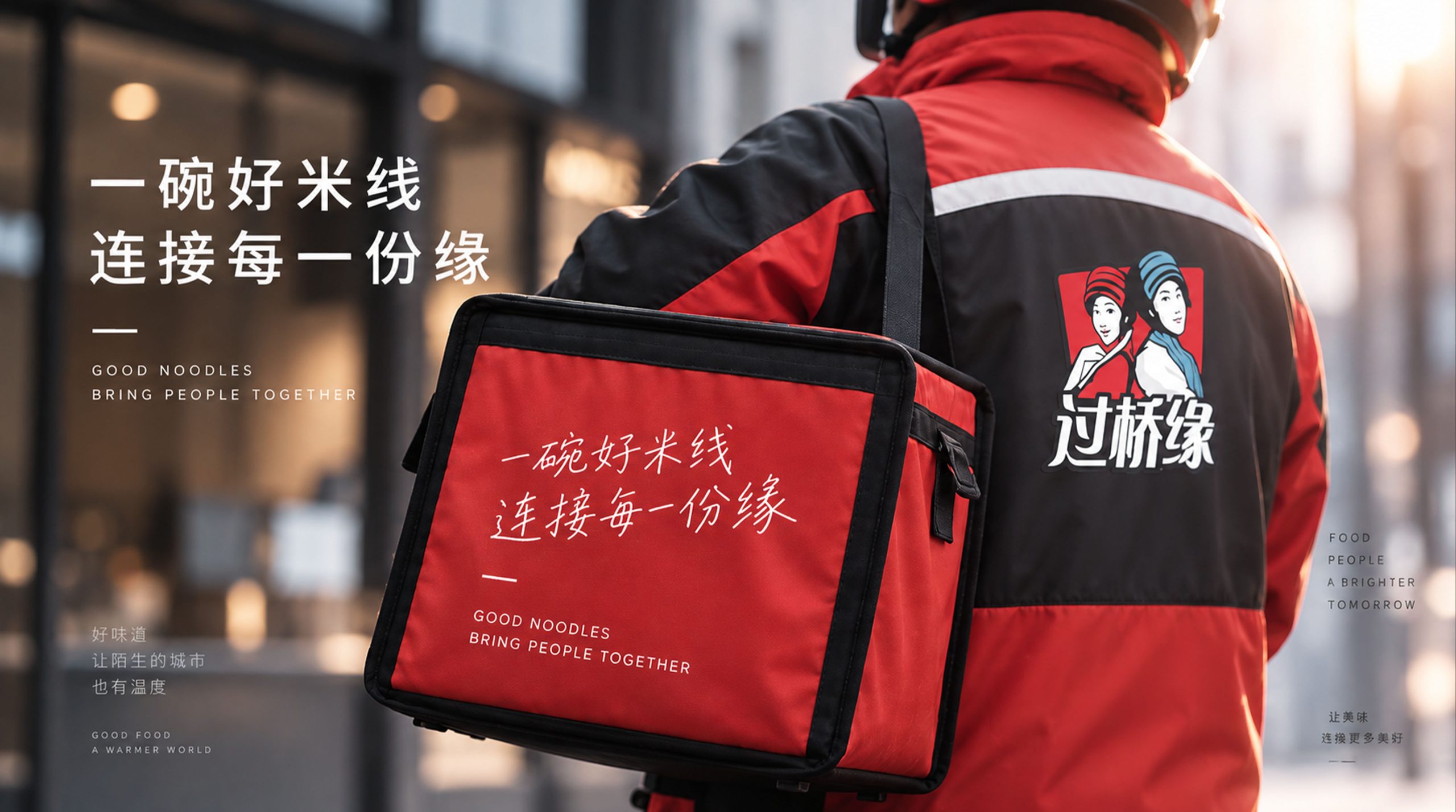
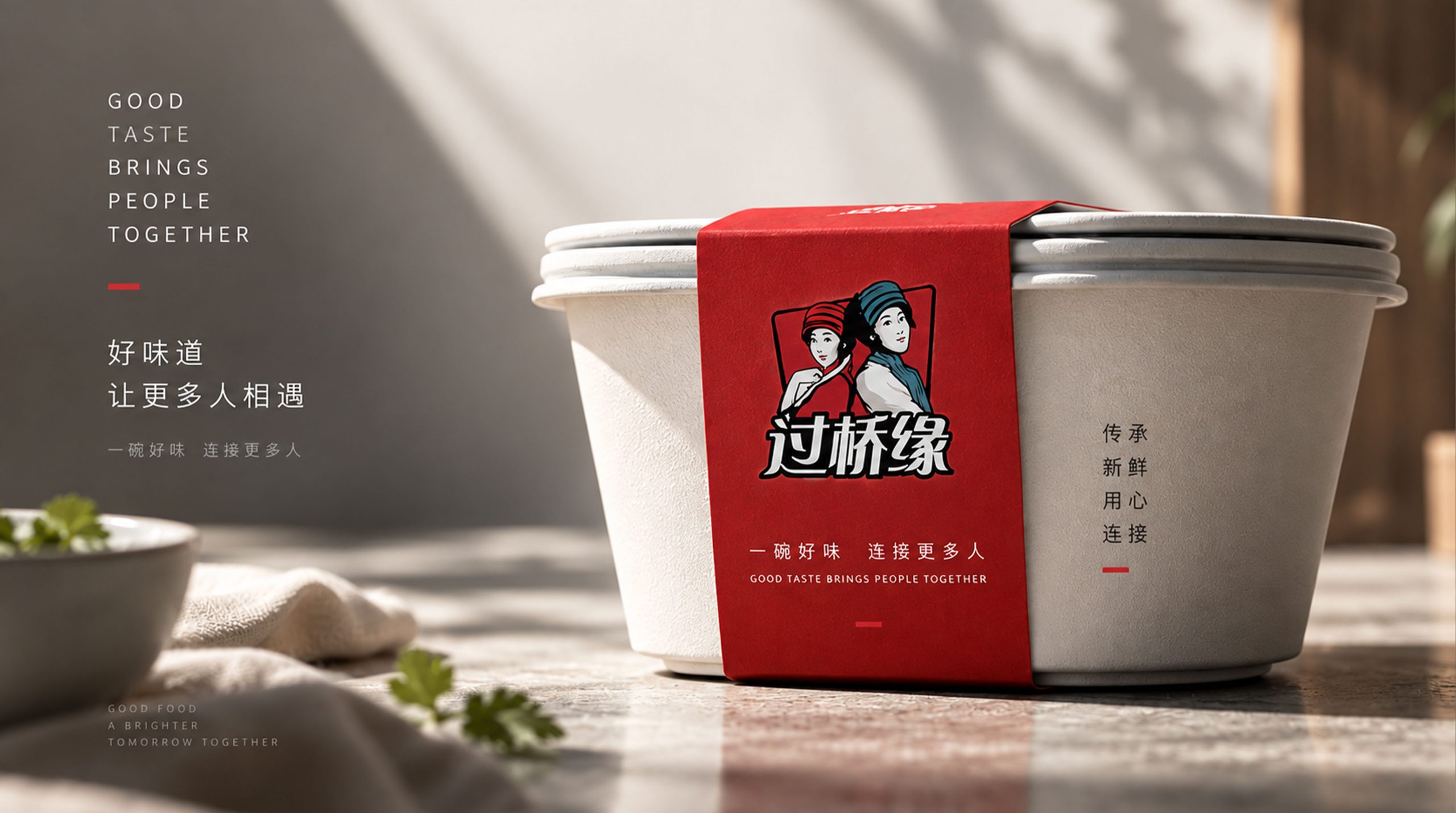
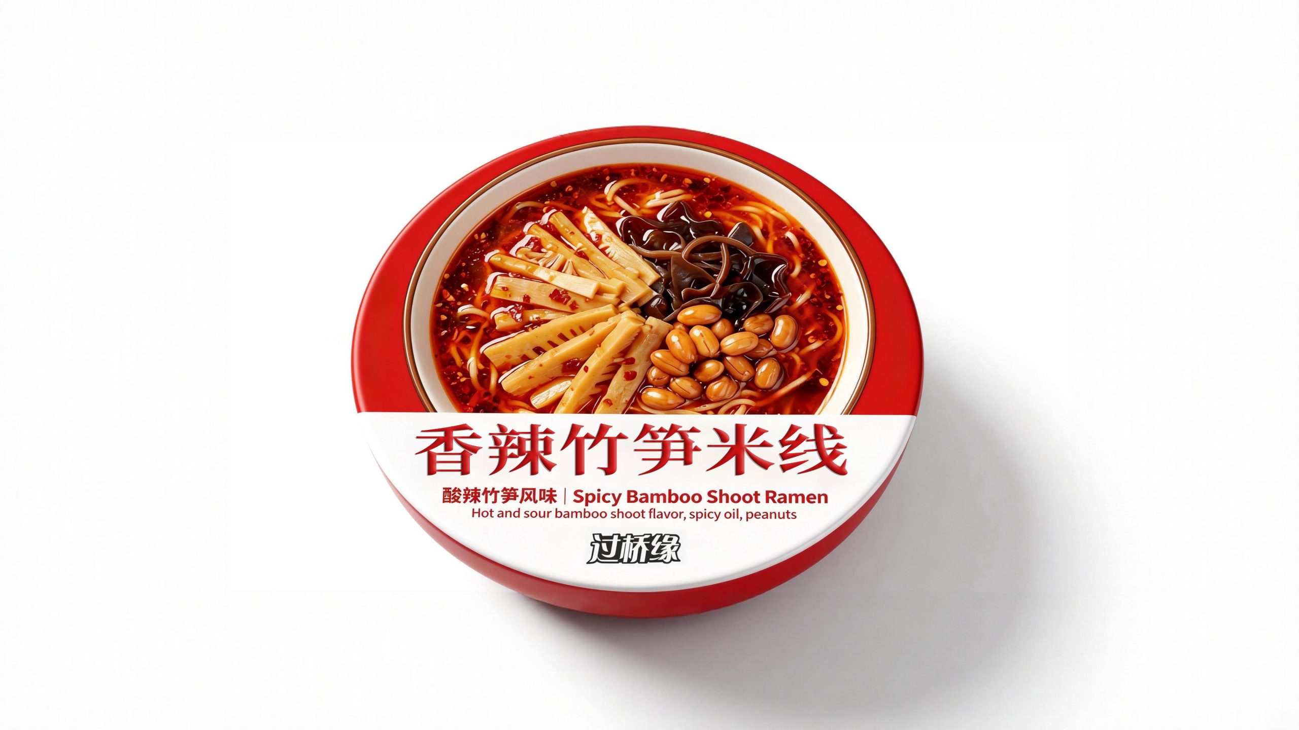
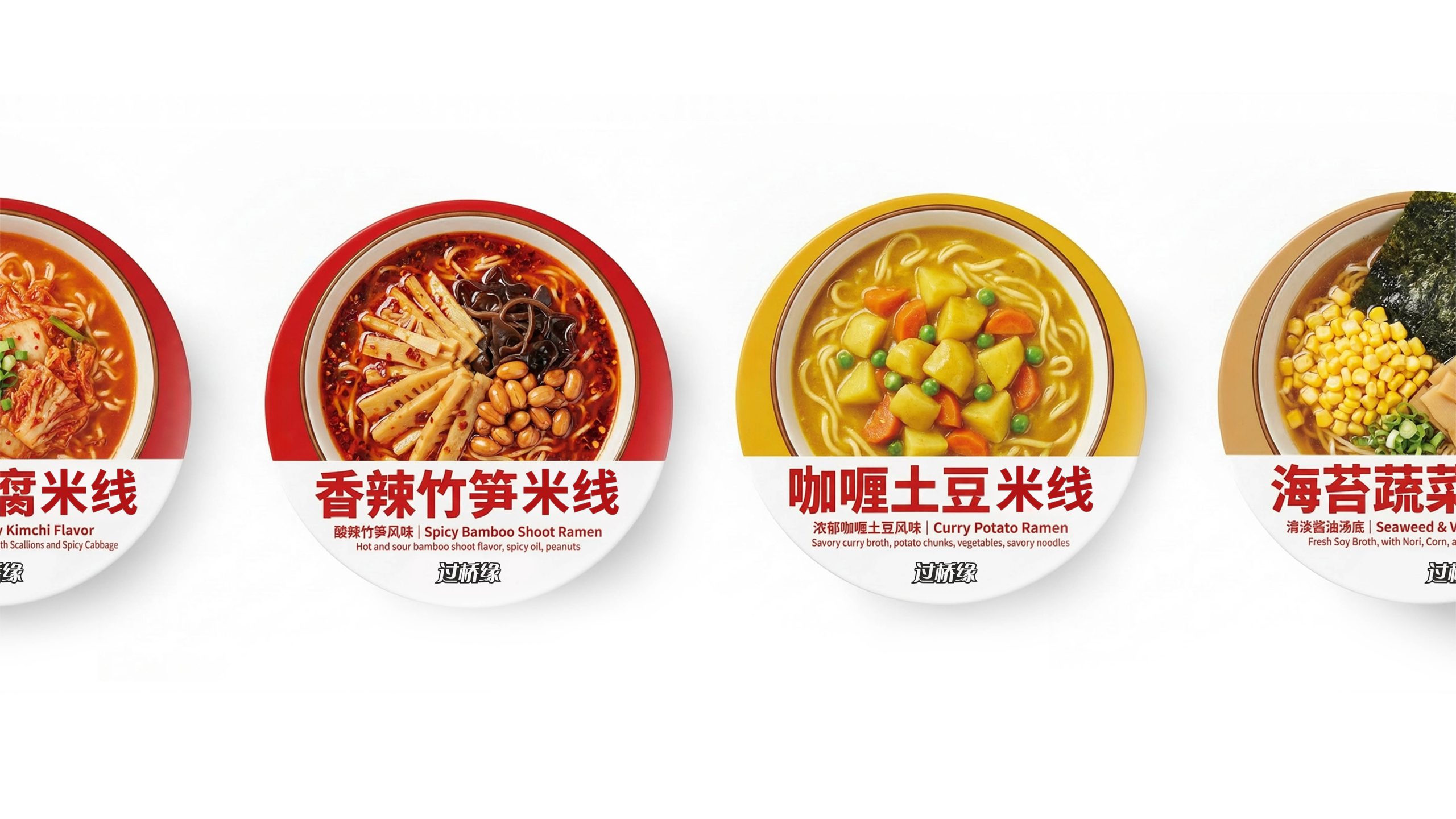
The logo has strong cross-field adaptability: corporate level: applied to store image, brand promotion, menu design and cultural display; product level: suitable for tableware, takeout packaging and souvenir logos; spatial level: forming a unified visual language in the restaurant space, guidance system and cultural walls. In the dynamic version, the image of the two people can be used as a "looking at each other and smiling" or a storytelling animation to symbolize the continued inheritance of the love story.
The Guoqiaoyuan logo embodies the dual value of the "traditional food love story": the image of the two people → the emotional core of the story; the national costume → the regional foundation of culture; the red and blue color combination → the symbiosis of enthusiasm and freshness. This is not only a brand identification symbol, but also a visual expression of a philosophy of beauty - a feeling of crossing a bridge and connecting with customers from all over the world.
design results
After the release of the new visual system, Guoqiaoyuan has become an iconic brand image in the domestic Yunnan rice noodle catering field. The double national image is widely used in store image, brand communication, and cultural promotion. With the visual expression of "story structure × national language", it has established a new aesthetic standard in the field of local food and catering. This case represents the brand's mature expression in the direction of traditional food, cultural heritage and systematic visual language design, achieving the unity from "food design" to "love philosophy".