










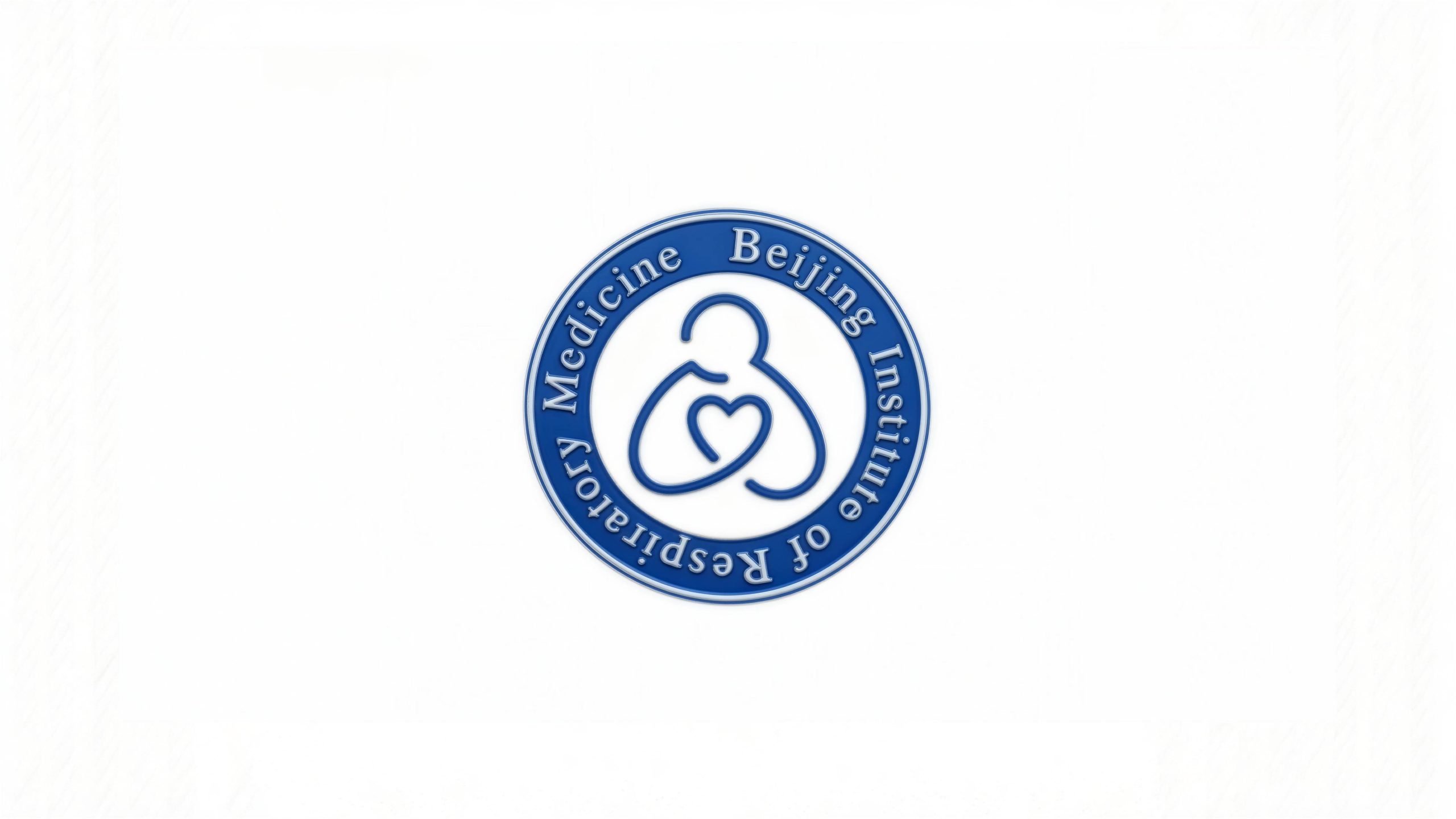
Beijing Institute of Respiratory Medicine is an authoritative medical research institution focusing on the research and clinical diagnosis and treatment of respiratory diseases. It is committed to protecting life and health with medical innovation and promoting the development of respiratory medicine through academic research.
The brand hopes to present a balanced state of "scientific rigor × life care" through a visual system that combines medical authority with humanistic care.
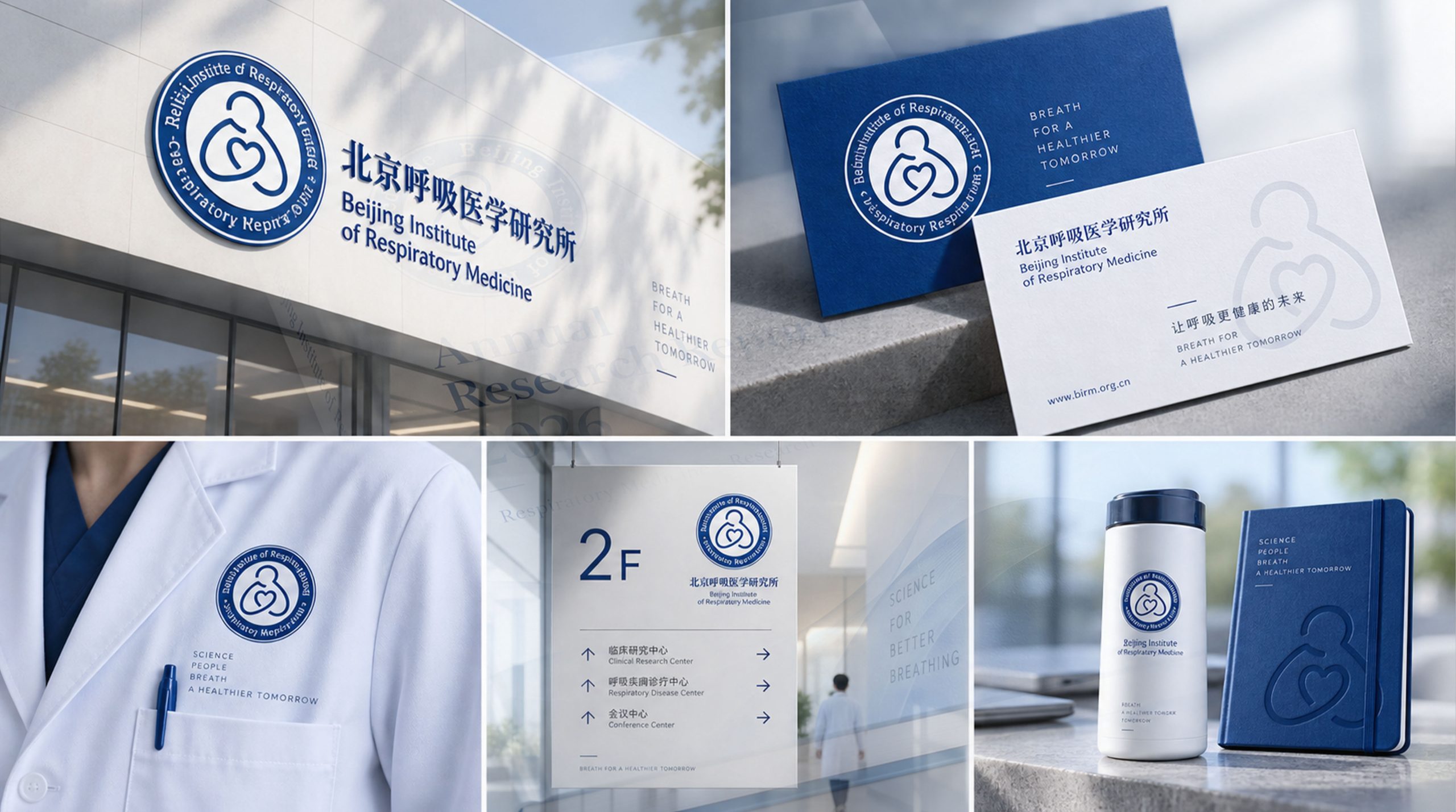

design concept
The core concept of the logo comes from the concept of "Cardiopulmonary Care". The design is based on a circular badge, which symbolizes the authority and integrity of the medical institution and represents stability and security. The internal line graphics reflect the medical concept of "heart and lung unity", and the human-shaped outline surrounds the heart shape, symbolizing the medical spirit of "people-oriented and careful protection". The overall shape is both academically rigorous and full of humanistic warmth, implying the institute’s lofty mission of continuing to protect respiratory health and care for life. The round outer frame gives people a sense of stability and trust, conveying the professionalism and reliability of the medical institution.
Graphic composition and color system
The circular badge structure: represents the integrity of medical authority and the stable trust of the institution; the humanoid outline: outlines the human body posture with smooth curves, implying the patient-centered medical service concept; the heart-shaped core: symbolizes the core driving force of the institute - the benevolence of doctors and care for life; the blending of lines: the organic fusion of heart and lung graphics, representing the life symbiosis system of "breathing and circulation".
The brand name "Bejing Institute of Respiratory Medicine" uses a classic serif font with dignified shape and balanced proportions, consistent with the circular structure of the logo. The fonts are arranged around the badge to strengthen the sense of authority and academic attributes of the badge. The blue and white color scheme reflects the professionalism and purity of the medical industry and conveys the brand's "rigor and warmth". The combination of Chinese and English strengthens the attributes of international academic exchanges.
Medical blue #1E5AA8: symbolizes professionalism, trust and medical authority; pure white #FFFFFF: represents cleanliness, health and life hope. The blue and white colors form "professional and pure". The visual balance of "science and care" creates a solemn and warm brand impression.
Application extension and brand significance
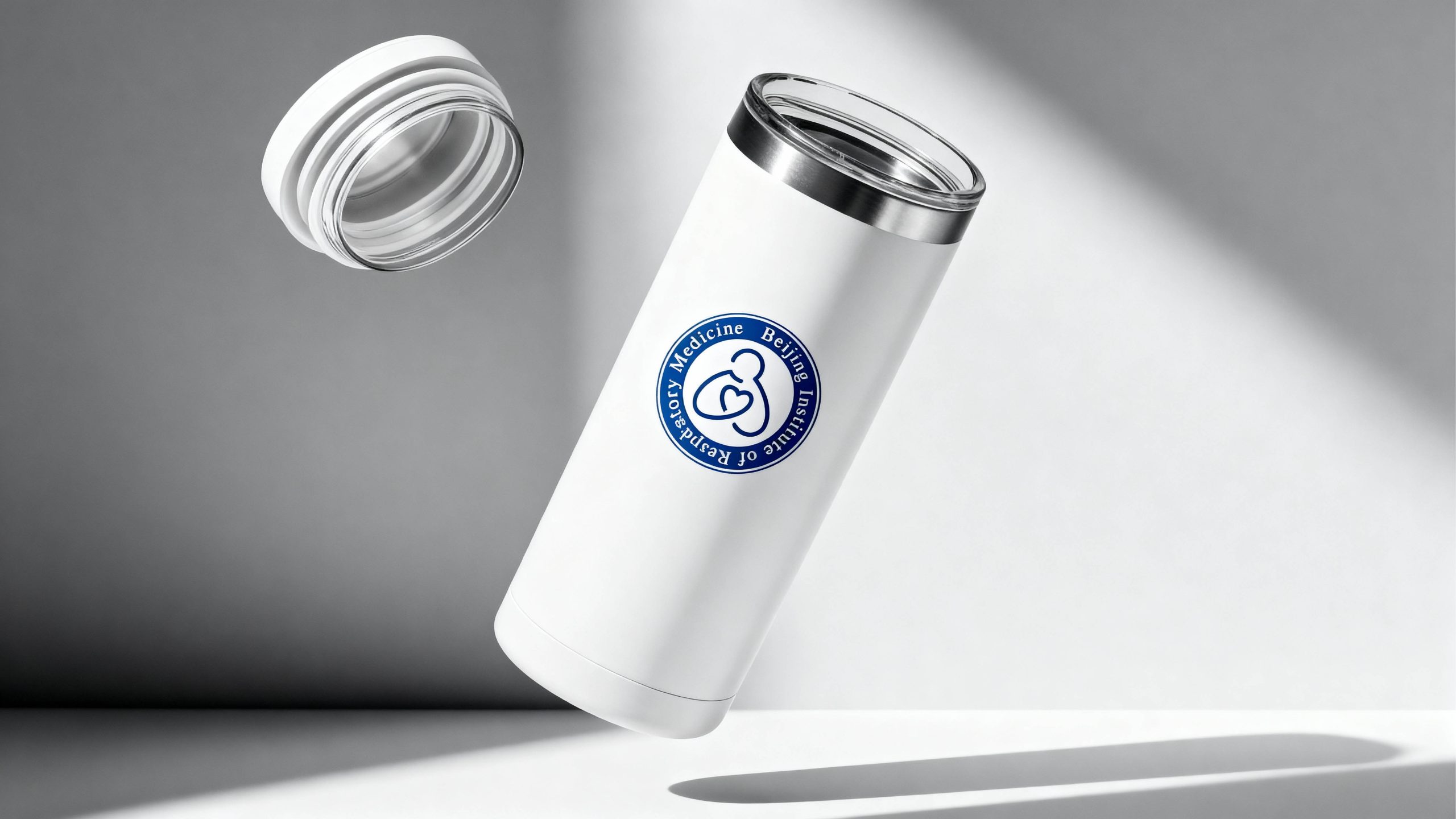
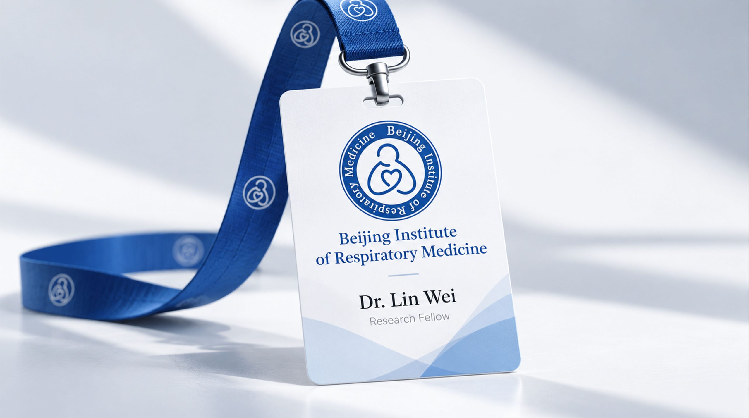
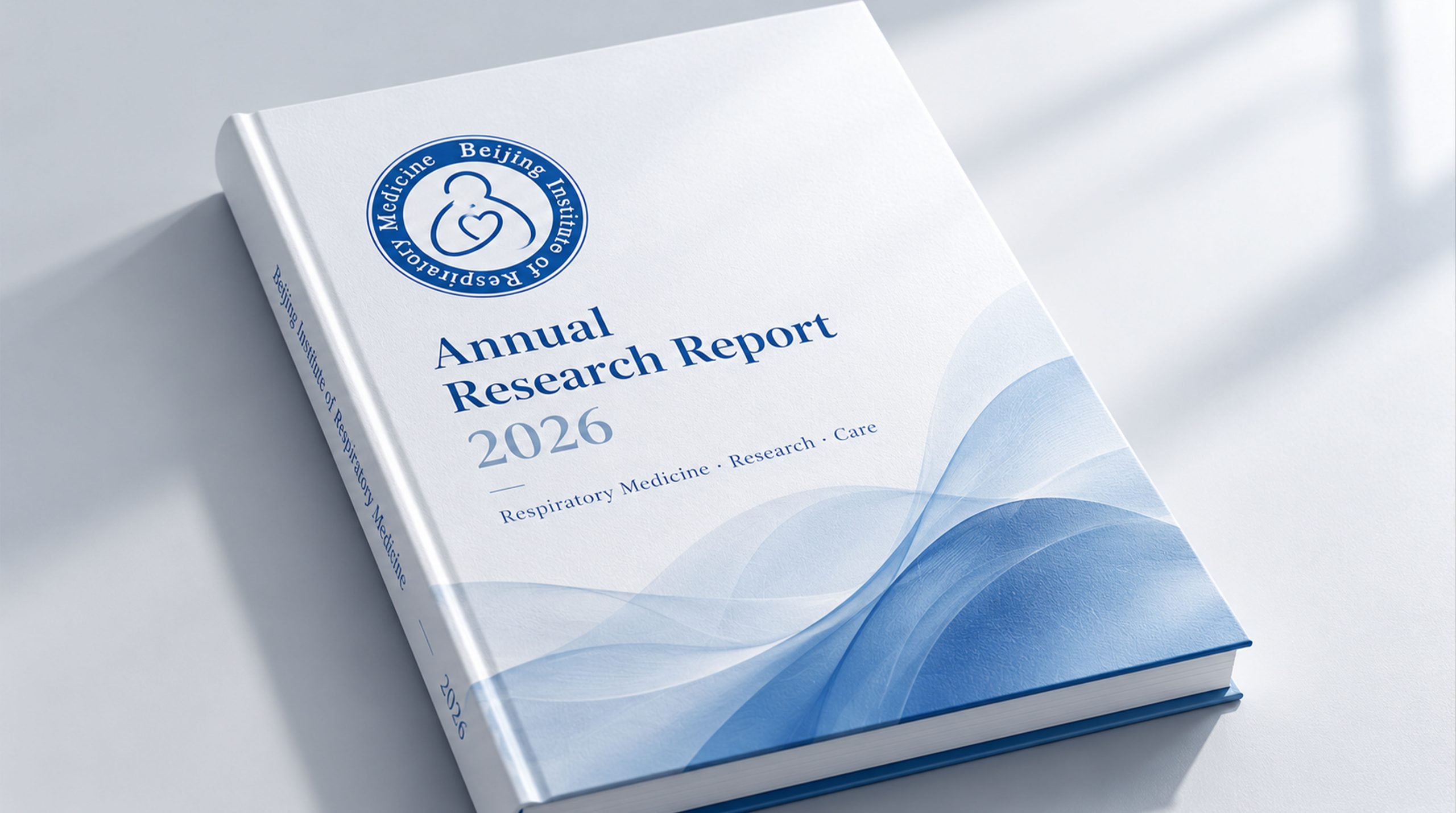
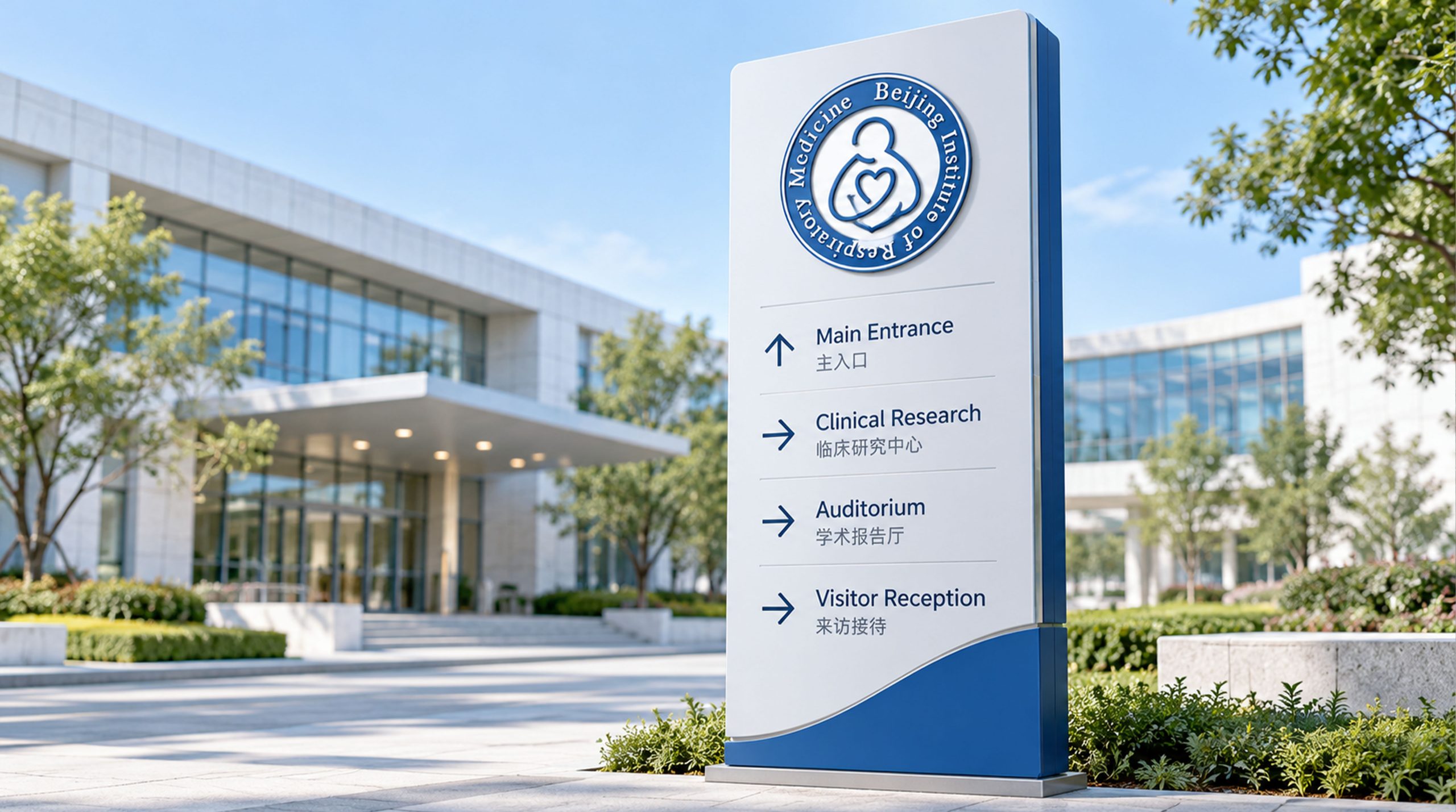
The logo has strong cross-field adaptability: institutional level: applied to academic papers, scientific research reports, international conferences and brand launches; clinical level: suitable for medical equipment, diagnosis and treatment spaces and patient service logos; spatial level: forming a unified visual language in research buildings, guidance systems and academic exhibition halls. In the dynamic version, the heart can be used as a "breathing rhythm" or heartbeat pulsation animation, symbolizing the continued vitality of the rhythm of life.
The logo of the Beijing Institute of Respiratory Medicine embodies the dual values of "scientific rationality × humanistic warmth": round badge → authoritative system logic; heart shape → the core of caring life; blue and white color → symbiosis of professionalism and purity. This is not only an institutional identification symbol, but also a visual expression of a medical philosophy - guarding every breath with the benevolence of a doctor.
design results
After the release of the new visual system, Beijing Institute of Respiratory Medicine has become an iconic academic brand image in the field of respiratory medicine in China. Circular badges and heart and lung graphics are widely used in academic conferences, medical journals, and international cooperation. With the visual expression of "authoritative structure × humanistic language", they have established a new aesthetic standard for medical research institutions. This case represents the mature expression of the brand in the direction of medical health, academic research and system visual language design, achieving the unification from "institutional logo" to "life philosophy".