










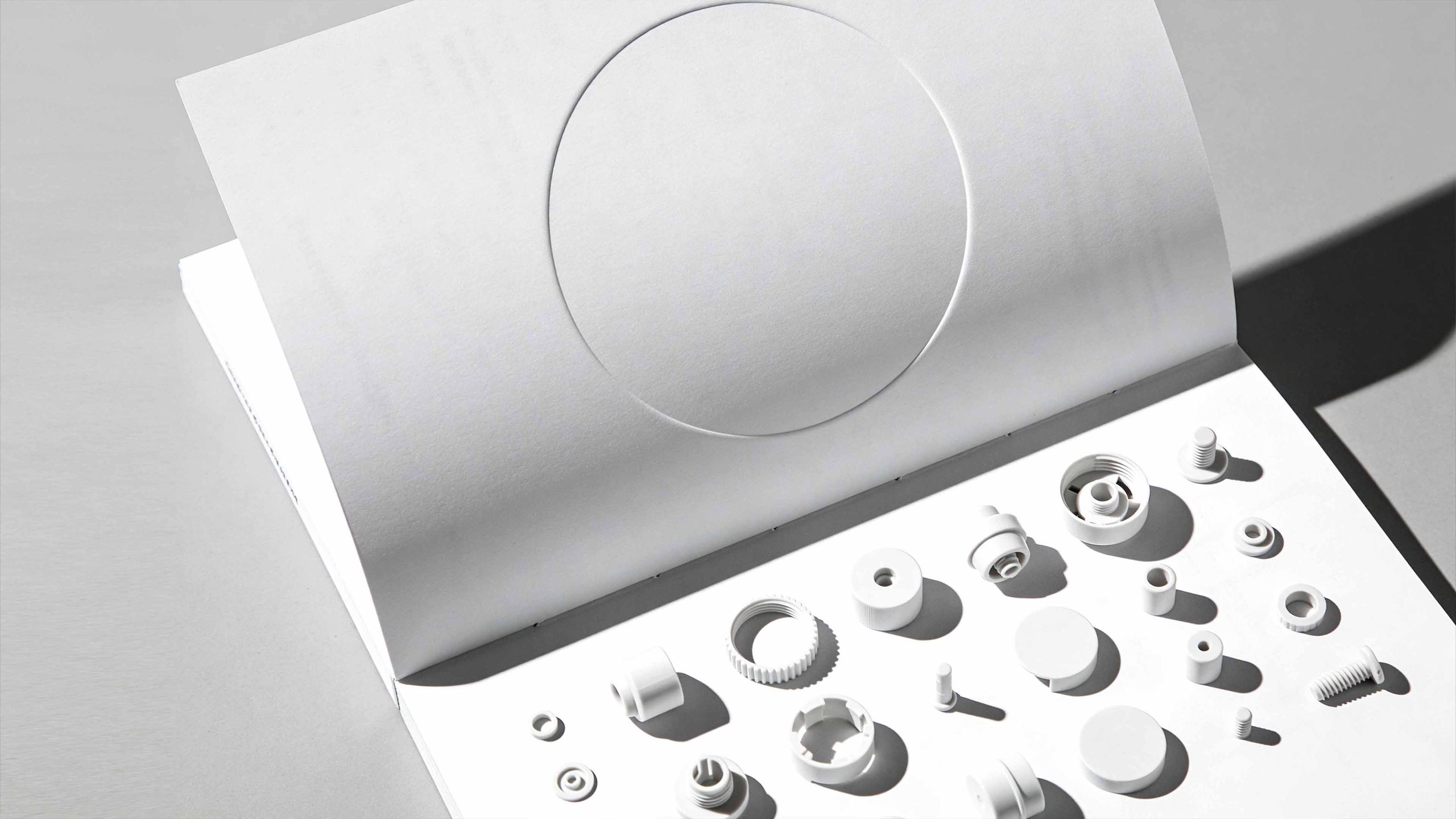
This project is to design a brand album and visual planning system for Xiaomi Technology Co., Ltd. (Xiaomi). It aims to jointly build the brand's design temperament with the pure expression of minimalist aesthetics and the humanistic warmth of technological innovation.
The design goal is to present the brand's brand characteristics of "allowing everyone around the world to enjoy the beautiful life brought by technology" through systematic visual structure and product narrative.
The entire volume is themed "Invisible Design. Less is More", integrating the precision of technology and the purity of aesthetics, showing the minimalist design philosophy of Xiaomi's ecological chain and the global technology landscape.
design challenge
Xiaomi is not only a global innovation leader in consumer electronics, but also a staunch practitioner of minimalist design aesthetics. The design needs to achieve the following balance in the visual language: sense of technology × sense of humanity: it must not only reflect the precision power of hard-core technology, but also convey the warmth and love of "born for fever"; sense of minimalism × sense of richness: it must maintain the restraint and purity of the design language, but also show the diversity and system of ecological chain products; professionalism × affinity: it must not only continue the depth and rigor of industrial design, but also integrate the friendliness and accessibility of mass consumption. The core challenge is - how to combine technological precision and aesthetic purity in design, so that the brand has both professional depth and emotional resonance.
Strategy and philosophy
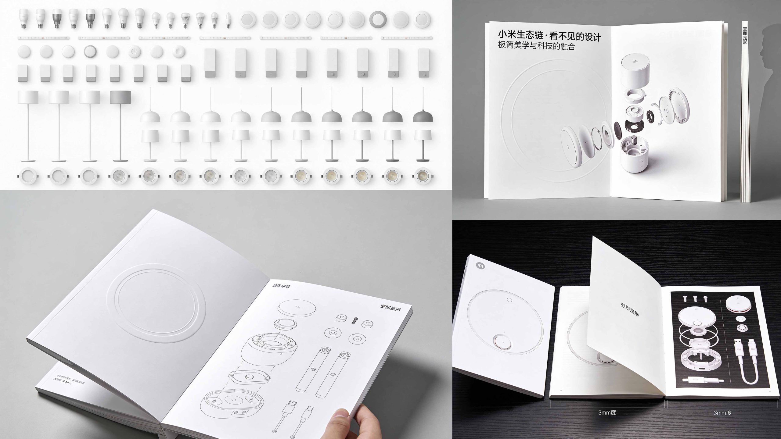
The project takes "Invisible Design·The Power of Minimalism" as its core design concept. Visual philosophy: Based on the dual-line logic of "coexistence of technology and aesthetics" as the visual basis, it embodies the precision of the product and the restraint of the design; Structural logic: adopts an industrial design-level typesetting system to organize the product language in layers to form a multi-dimensional structure of "idea-structure-details-ecology"; color system: pure unbounded white + technological gray + Xiaomi orange is the main color, supplemented by product explosions and engineering lines, symbolizing purity, precision and vitality; graphic language: integrating product exploded views, parts arrays, geometric circles and technical drawings to establish a "visual system under industrial order"; cultural expression: introducing product manuscripts, engineering drawings and ecological matrices to give the album both professionalism and a sense of technological ritual. The core of the concept: presenting the design philosophy with minimalism and continuing the ecological spirit with a system.
Design presentation
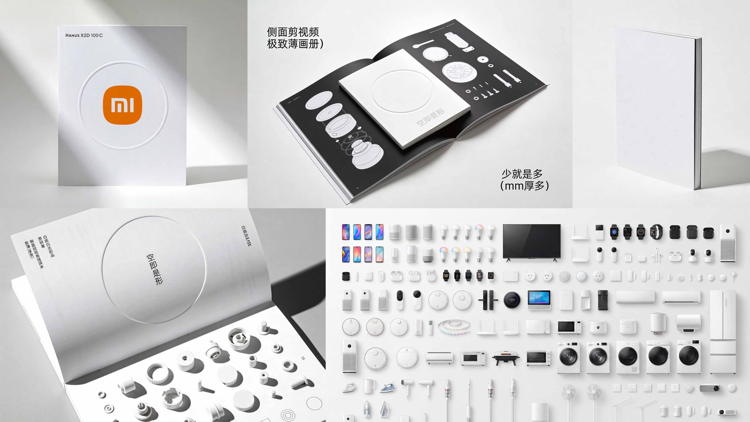
Cover design: The main color is pure white and embossed circles, reflecting minimalism and restraint; the orange logo or product outline of Xiaomi is used as the visual core in the center, supplemented by ultra-thin book craftsmanship and geometric embossing; the title is bilingual in Chinese and English to convey the global technology landscape. Chapter logic: 1. Design philosophy; 2. Invisible design; 3. Space star (product structure); 4. Ecological matrix; 5. Material technology; 6. Future vision.
Internal page design: Modular structure: Product pages and concept pages are alternately presented, forming a "technology × aesthetics" rhythm; Layout design: Pure white background and array of product parts form a visual tension of "less is more", with product exploded views presenting "invisible design"; Image language: Industrial photography using an all-white product matrix, exploded structural diagrams, and close-ups of parts conveys precision and purity; Culture page: Introduces engineering drawings, millimeter-level dimensional annotations, and design manuscripts to express ultimate ingenuity. Craftsmanship and materials: The cover uses tactile matte white card + embossed round shape + hot orange logo; the inner pages are made of high-weight art paper + black and white facing pages design to ensure a high degree of restoration of product details and structural diagrams. The overall style embodies "technological precision × aesthetic purity × ecological system".
Achievements and Impact
As the brand's official design publication, the album is widely used in global press conferences, design exhibitions and partner exchanges. Through the integration of product logic × aesthetic narrative × brand order, the design successfully created Xiaomi's visual image of "both technological depth and minimalist aesthetics". The project is considered by the brand owner to be "one of the brand publications with the most design philosophy and industrial aesthetics" and has become the core blueprint of Xiaomi's global design visual system.