










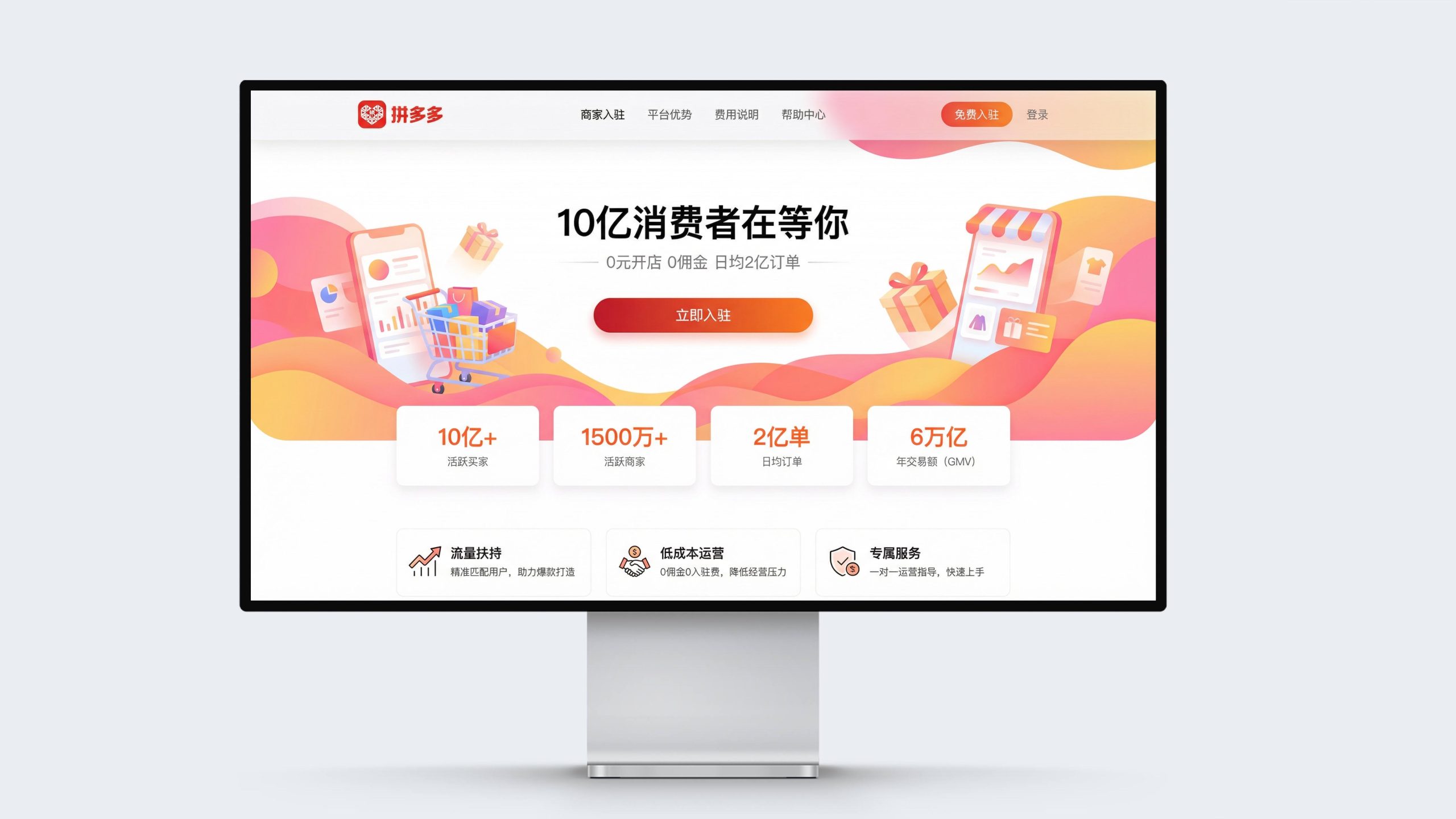
This project is to design the web page and multi-terminal visual system for Pinduoduo, aiming to jointly build the brand temperament of the platform with the affordable concept of inclusive e-commerce and the innovative model of social group buying.
The design goal is to present the platform's brand characteristics of "allowing everyone to enjoy affordable life" through systematic visual structure and commercial narrative.
The overall theme is "Here are your opportunities and the choice of 800 million people", integrating affordable warmth and social vitality, demonstrating the inclusive pattern and business ecology of Pinduoduo as China's leading social e-commerce platform.
design challenge
Pinduoduo is not only China’s largest agricultural product online platform, but also the pioneer of the social e-commerce model. The design needs to achieve the following balance in the visual language: Affordability × Quality: It must not only reflect the core value of ultimate cost-effectiveness, but also convey product quality and shopping trust; Sociality × Efficiency: It must not only maintain the social fun of group interaction, but also show the convenience and efficiency of shopping decisions; Vitality × Affinity: It must not only continue the youthful and energetic brand tonality, but also integrate an inclusive warmth for all people. The core challenge is - how to make the design have both affordable appeal and quality trust, so that the platform has both price advantage and shopping experience.
Strategy and philosophy
The project takes "affordable temperature and group-building fun" as its core design concept. Visual philosophy: Based on the dual-line logic of "coexistence of inclusiveness and quality" as the visual basis, it reflects the sincerity of prices and the authenticity of goods; Structural logic: Adopts a modular responsive architecture to organize product information hierarchically to form a multi-dimensional structure of "focus - classification - recommendation - ordering"; Color system: Pinduoduo orange + pure white + Warm beige is the main color, supplemented by price tags and group buying buttons, symbolizing benefits, vitality and trust; graphic language: integrating product cards, price tags, group buying countdowns and short video entrances to establish a "visual system under the order of e-commerce"; interactive expression: introducing instant ordering, short video planting and merchant entry entrances, making the platform both shopping convenience and business empowerment. The core of the concept: using visual warmth to present the concept of inclusiveness, and using interactive design to continue social e-commerce.
Design presentation
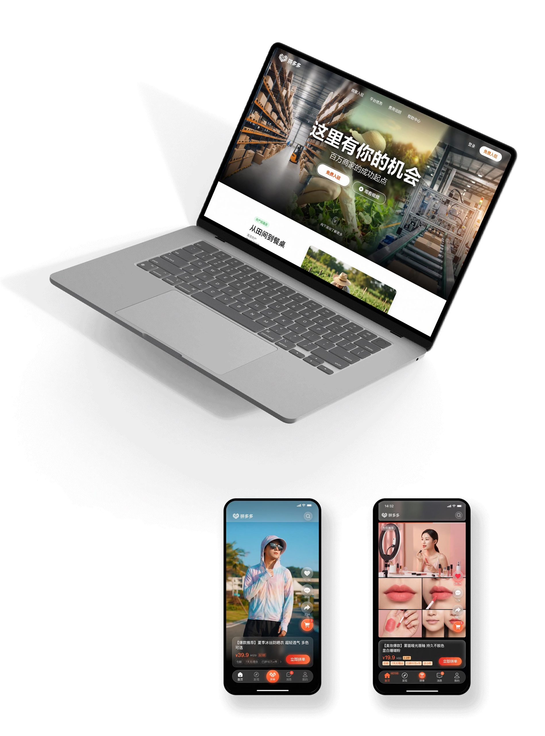
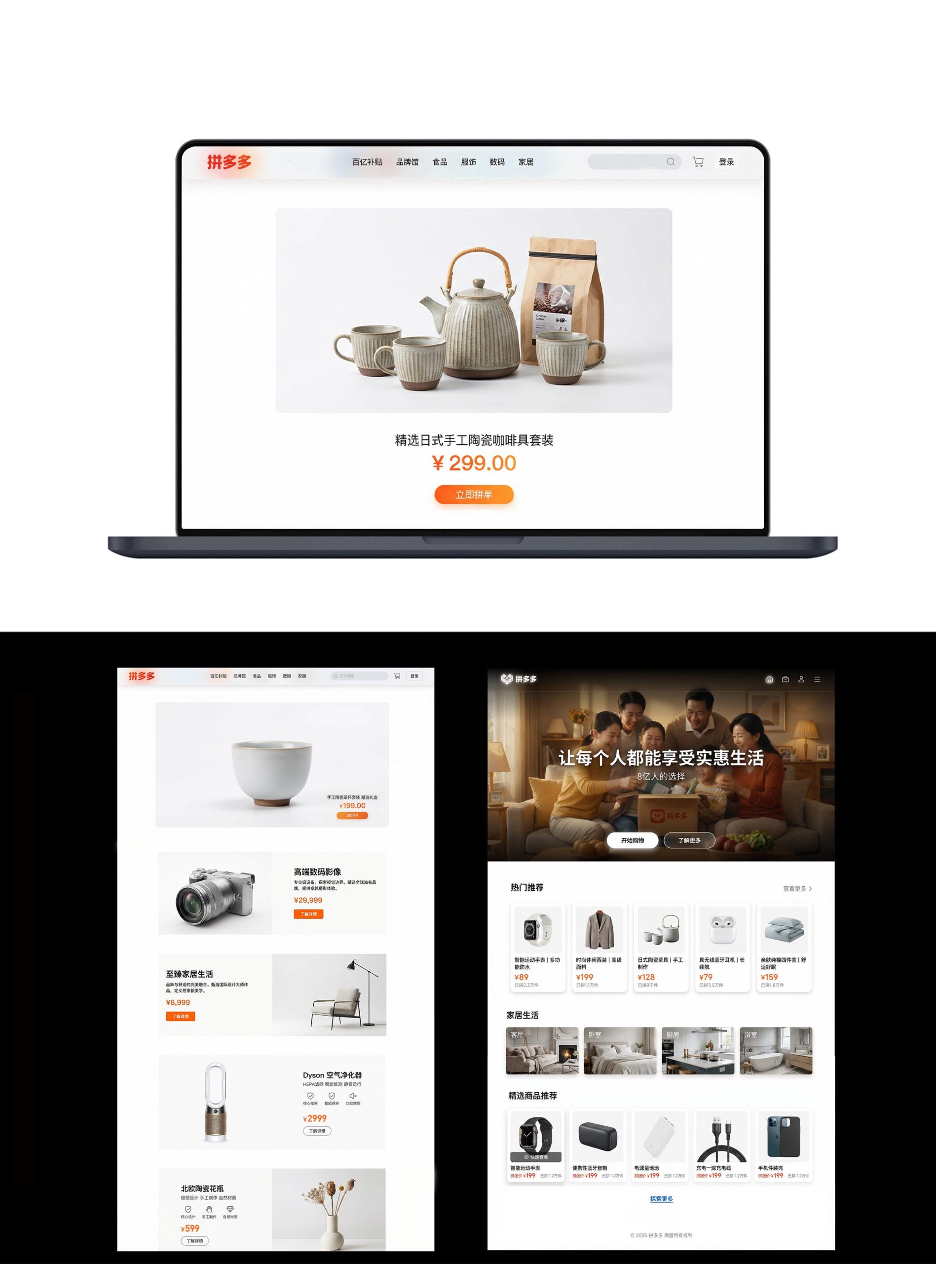
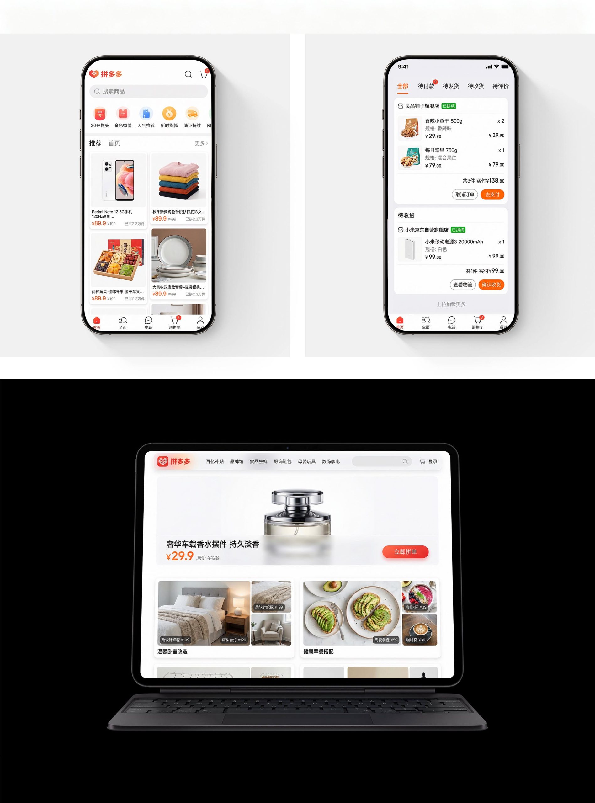
Home page design: The main color is a pure white background and Pinduoduo’s orange-red logo, which reflects refreshingness and brand recognition; the top part uses a large picture of merchants and agricultural products as the visual focus, supplemented by the brand proposition of "Here is your opportunity"; the navigation uses category labels such as tens of billions of subsidies, brand hall, food, clothing, digital, and home furnishings to convey a full-category coverage pattern. Content logic: 1. Popular recommendations; 2. Ten billion subsidies; 3. Home life; 4. Selected products; 5. Short video planting; 6. Merchant center.
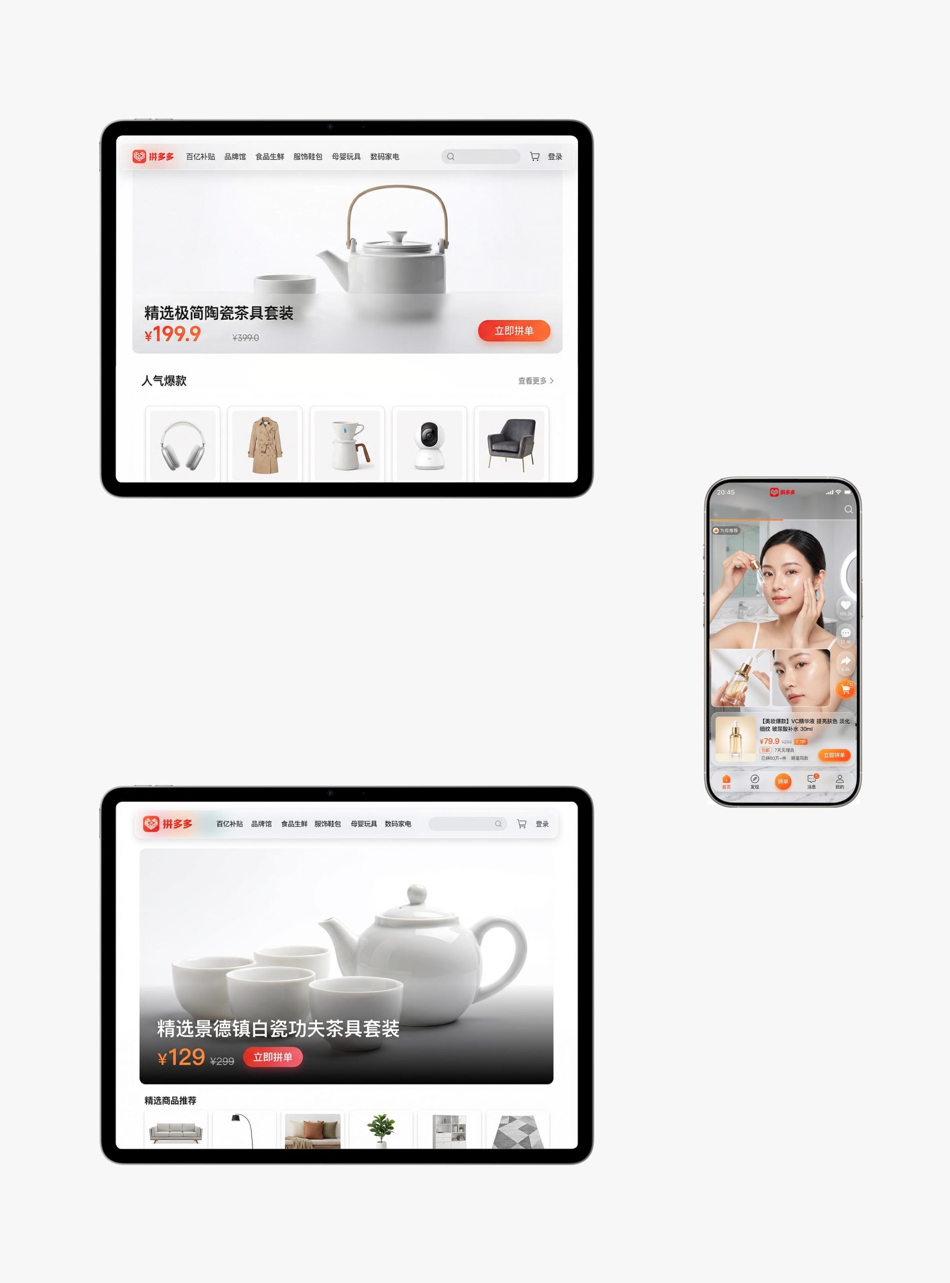
Multi-terminal design: Responsive structure: The desktop mall and the mobile APP are seamlessly connected, forming a "browse × order" rhythm; Product design: Use large picture display, highlighted prices, group purchase buttons and the number of people who have purchased the product to present core shopping information; Image language: Use real shots of the product, short video display, and multi-style content presentation of user scenarios to convey authenticity and trust; Merchant side: Introduce free entry, pre-sales training, help center and merchant success stories to express the platform's empowerment of merchants. Technology and experience: Use intelligent recommendations + short video immersive streaming + one-click ordering; multi-end shopping cart synchronization to ensure seamless cross-device shopping. The overall style embodies "affordable temperature × social vitality × smooth experience".
Achievements and Impact
As the official visual system of the platform, this design is widely used to reach users and merchants on the web, APP and merchant backends. Through the integration of e-commerce logic × social narrative × brand order, the design successfully created Pinduoduo’s visual image of “both inclusive warmth and business efficiency”. The project is considered by the platform to be "one of the most affordable and user-trusted visual systems" and has become the core blueprint for Pinduoduo's multi-terminal experience design.