










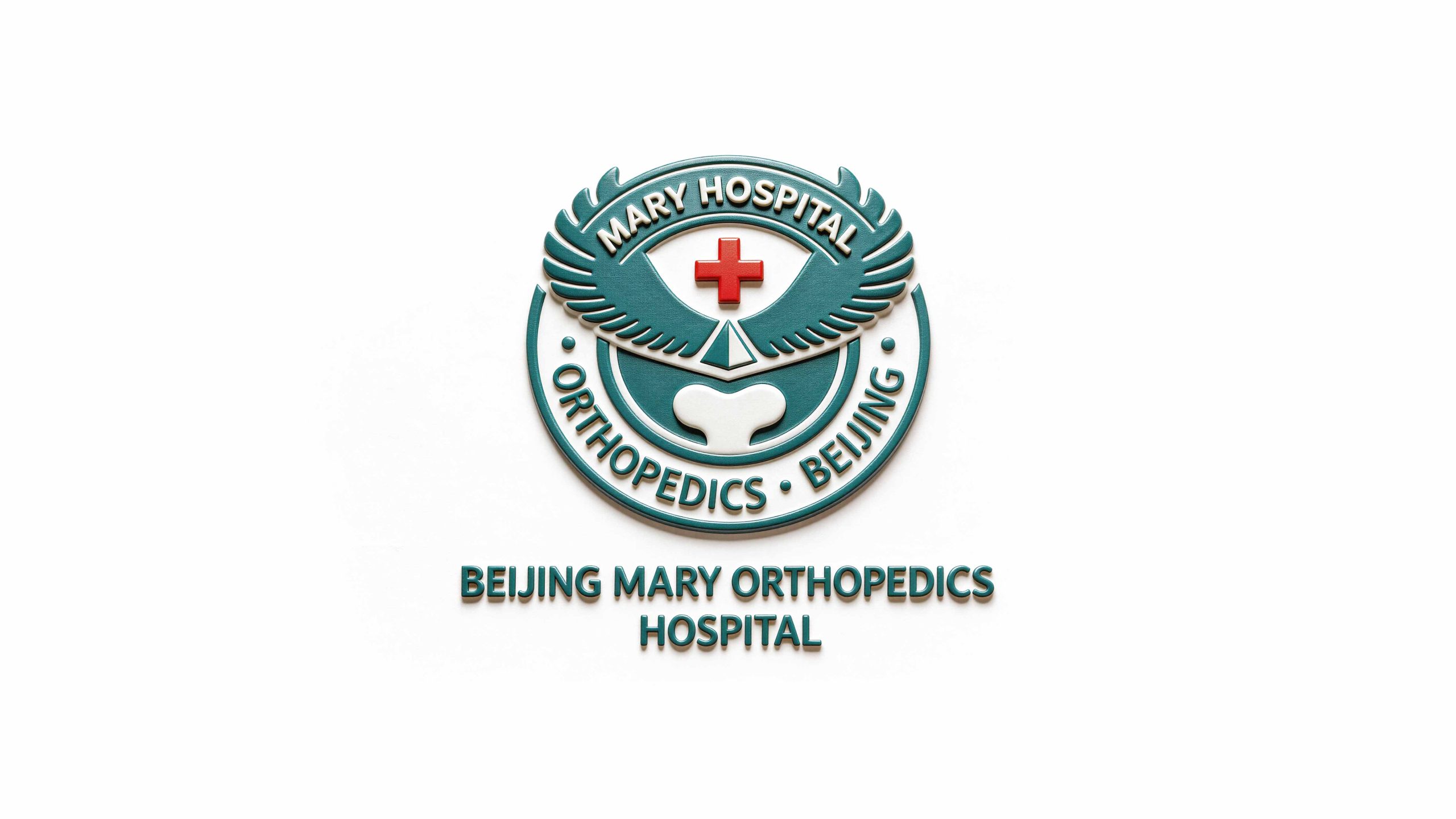
Beijing Mary Orthopedics Hospital is a professional medical institution focusing on the field of orthopedic medical care. With precision diagnosis and treatment, professional technology and meticulous service as its core, it is committed to providing patients with international-level orthopedic medical solutions.
The brand adheres to the service concept of "eagle-eyed precision, professional technology, and meticulous care" and sets a high-quality brand benchmark in the field of orthopedic medical care. Qingmei Future was commissioned to lead the brand identity design.
The design goal of the brand logo is to demonstrate the industry status of Mailui Orthopedic Hospital as a professional orthopedic medical institution through the visual language of medical authority, professional precision and humanistic care, accurately convey its "eagle-eyed, professional and meticulous" brand image, while highlighting industry attributes and making the logo image vivid and memorable.

Design concepts and language graphics
The logo takes "Eagle Emblem" as the core concept, uses an eagle with spread wings as the main pattern, and integrates it into the circular badge structure to build a brand symbol that combines a sense of strength and medical professionalism. The wings of the eagle are powerfully stretched and stacked, symbolizing the precision and power of orthopedic medical treatment. The lower part of the eagle's body naturally gathers into a beautiful heart-shaped outline, which symbolizes the benevolence of doctors and their meticulous care for patients. An eye-catching red cross is embedded in the square shape of the eagle's body, which directly points out the attributes of the medical industry and makes the brand positioning clear at a glance. The overall design integrates the triple images of the sharpness and strength of the eagle, the warmth and tenderness of the heart, and the professionalism and authority of the cross, reflecting the dual attributes of Mairui Orthopedic Hospital between professional medical care and humanistic care.
The main body of the eagle symbolizes the precise vision and diagnosis and treatment capabilities of an eagle eye. The eagle is the creature with the sharpest vision in nature. The eagle is the brand symbol, which is a direct metaphor for the medical pursuit of "accurate diagnosis, accurate to the last detail". The wings are arranged in layers and have a clear structure, just like the precise structure of the skeletal system. It not only shows the disciplinary characteristics of the orthopedics profession, but also conveys the systematic ability of the professional team; the heart-shaped outline below It is formed by the natural transition of the eagle body, with a rounded and soft shape, injecting a warm humanistic feeling between the strong and powerful eagle wings, symbolizing "professionalism and benevolence"; the blank space inside the heart shape presents the abstract shape of bones and joints, subtly referencing the core field of orthopedic medical care; the red cross is at the highest point of the visual center of the badge, establishing the authoritative identity of the brand with the most direct symbol of the medical industry. The words "MARY HOSPITAL · ORTHOPEDICS · BEIJING" are engraved on the outer ring of the circular badge, and the top is closed with an olive branch pattern, giving the logo the solemn ceremony and academic authority of an international medical institution. The overall composition constructs the "Medical Eagle" in a rigorous and symmetrical badge order, conveying the brand's professional depth and benevolence.
Font composition and color system
The English "BEIJING MARY ORTHOPEDICS HOSPITAL" uses a stable uppercase sans-serif font, with straight and even strokes and a generous and open font, conveying the professional authority and international image of the medical institution. The circular text of the badge "MARY HOSPITAL · ORTHOPEDICS · BEIJING" is arranged in equidistant capital letters along an arc. The fonts are regular and the spacing is strict, which strengthens the academic ritual sense and institutional formality of the badge. The overall font system strikes a balance between authority and clarity, ensuring the brand's high recognition and professional trust in medical scenarios, academic exchanges and public communications.
The main color Mairuiqing #00838F is the core color of the logo, representing medical professionalism, cleanliness, safety and vitality. Cyan is between blue and green, combining the rational calmness of blue and the hope of life of green, which is in line with the brand positioning of orthopedic medicine of "equal emphasis on precision science and life care"; cross red #D32F2F The red cross used in the center of the logo is a universal symbol for the medical industry, directly conveying the industry attributes of rescue, medical care and life protection. It forms a strong and orderly visual contrast with the main color of cyan, making the logo eye-catching and distinctive in various application scenarios. The pure white #FFFFFF is used in the eagle shield-shaped area and the heart-shaped skeleton to symbolize cleanliness, purity and the sterile sense of security in the medical environment, while enhancing the level and breathability of the logo. The overall color system uses cyan, red and white to form a classic medical color scheme, reflecting the "professional, clean and trustworthy" medical brand temperament. It is different from the blue and white style of general hospitals, and uses the unique Mai Ruiqing to establish a differentiated brand identity for orthopedic specialty hospitals.
Application extension and brand significance
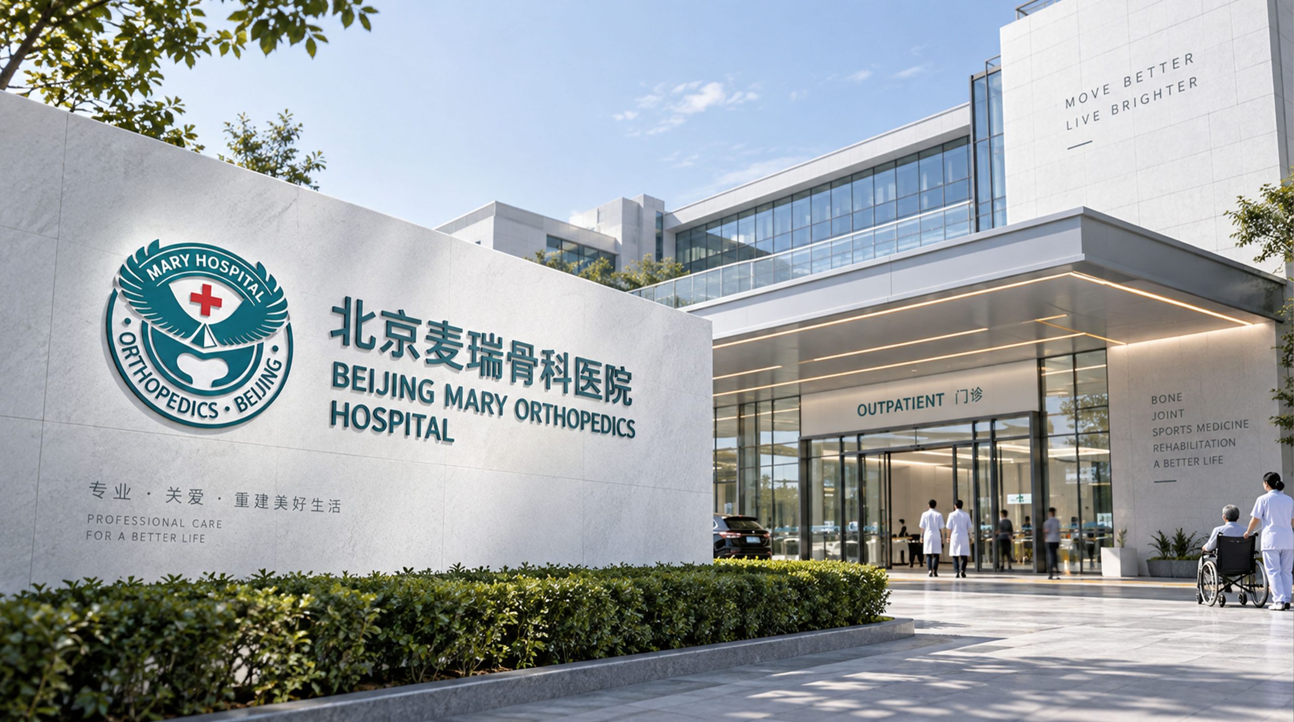
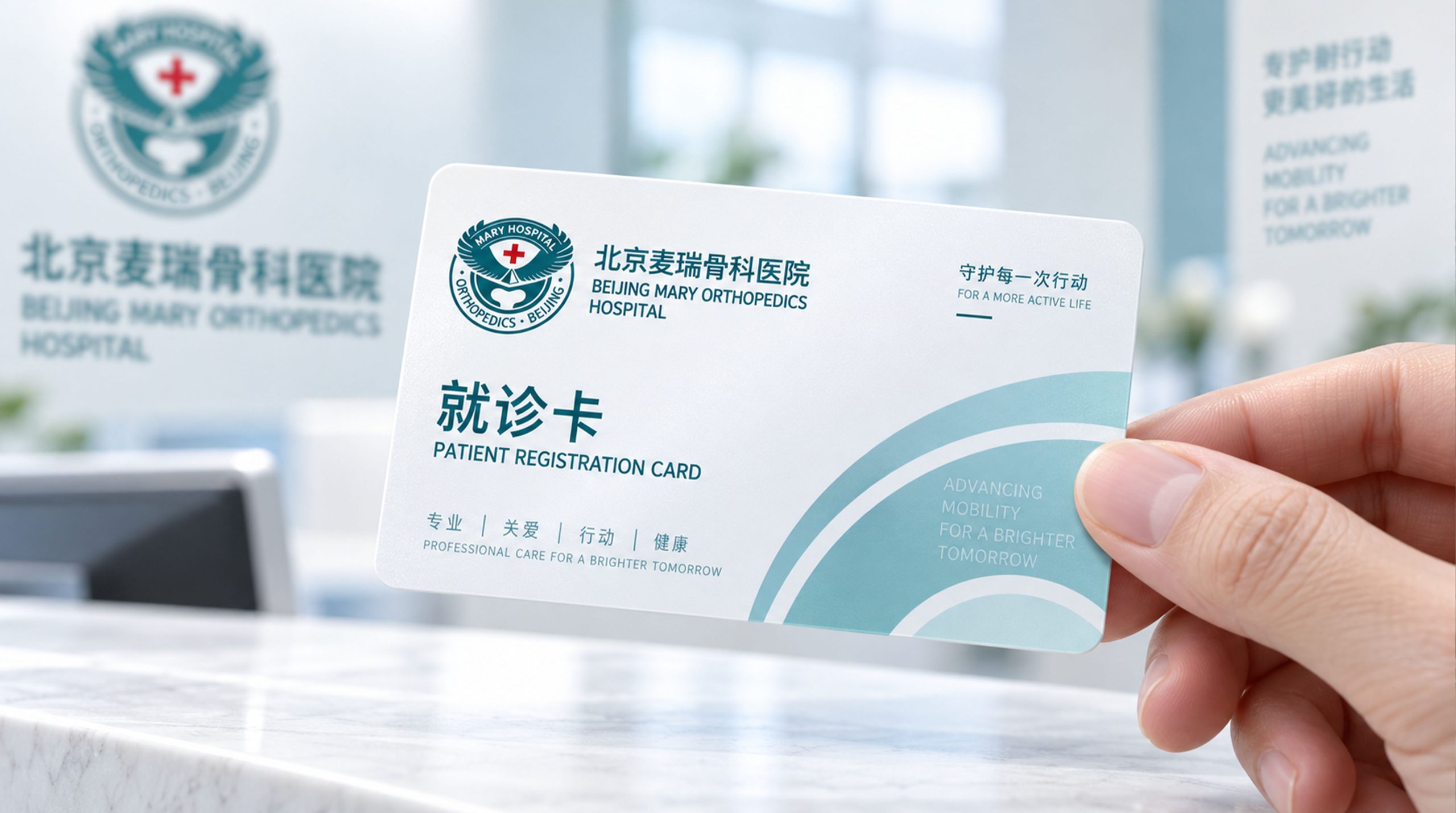
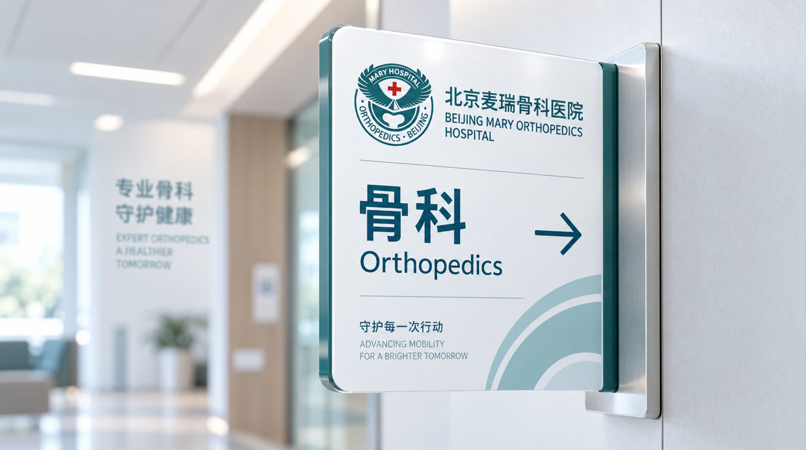
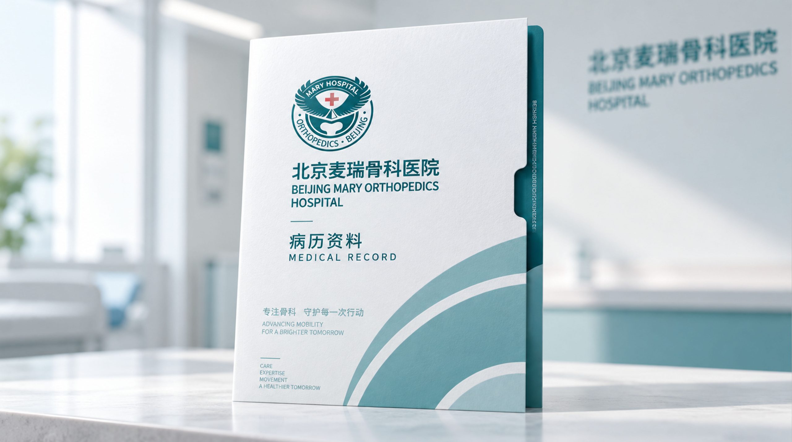
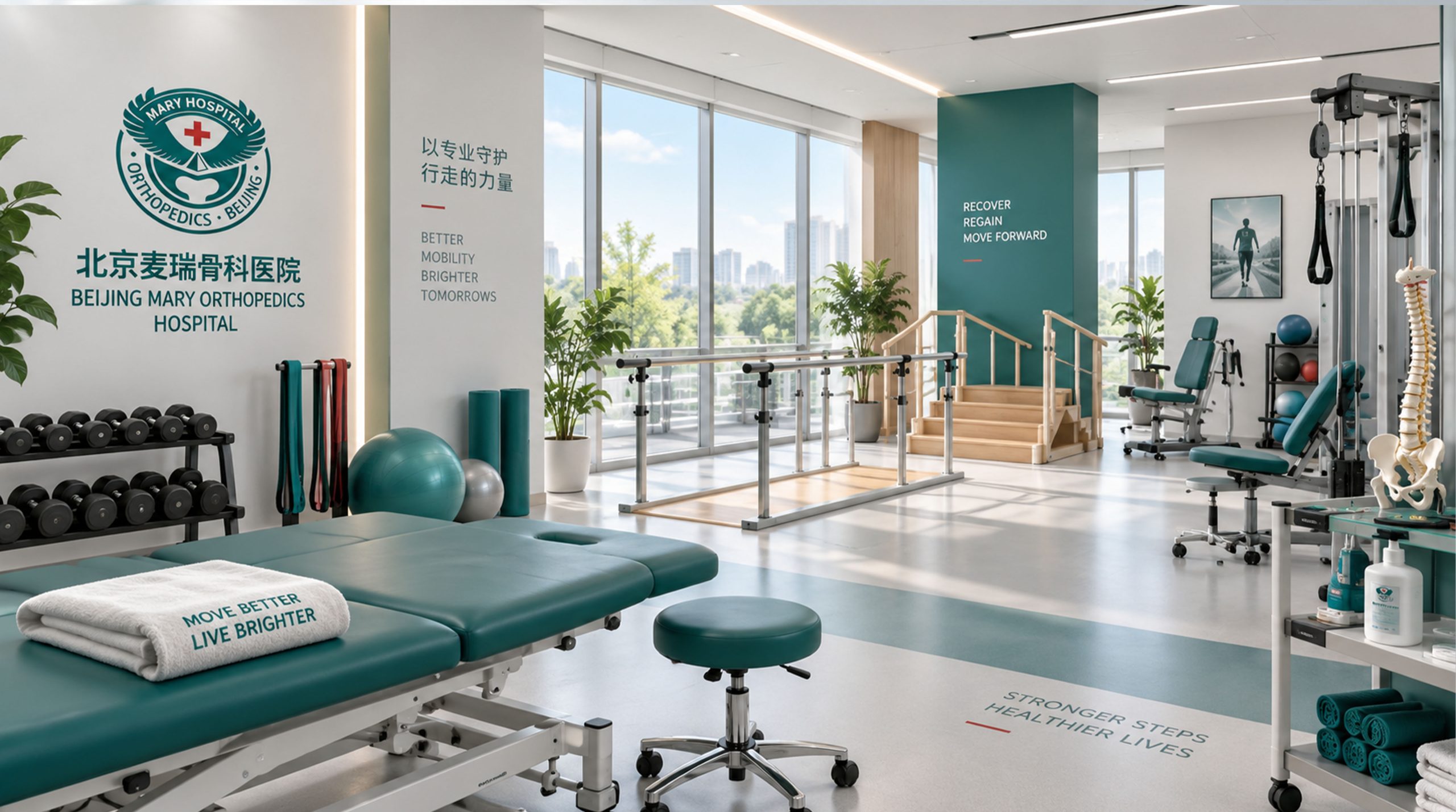
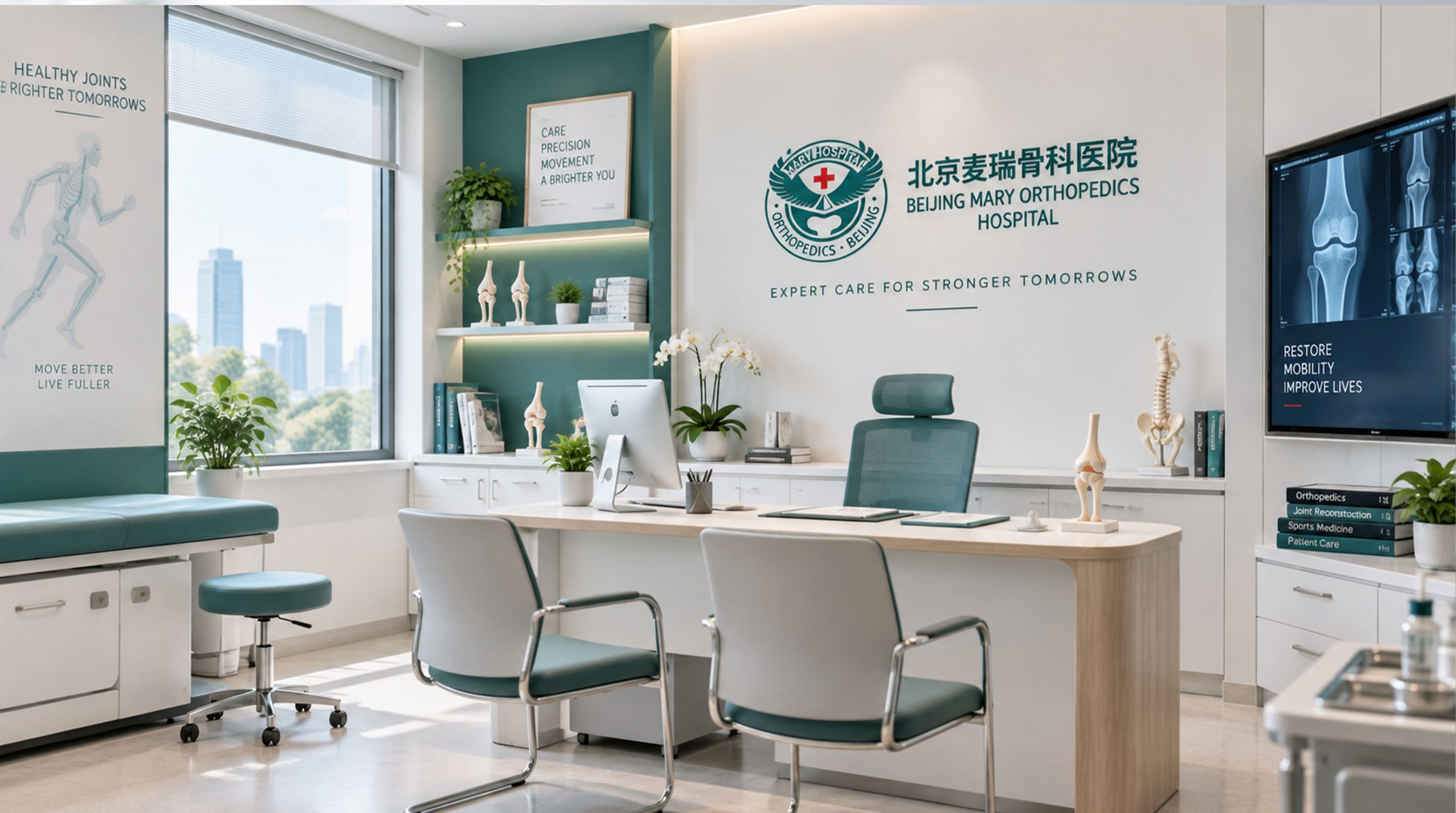
The logo has strong system scalability and can be widely used in hospital building facades, outpatient lobby image walls, department guides and floor signage systems; doctor badges, prescription notes, medical record covers and medical reports; official websites, online registration platforms, patient service applets and social media images; images of academic conferences, orthopedic forums, medical training and international exchange activities; ambulance vehicles, medical device logos, drug packaging and patient rehabilitation manuals. In the dynamic visual, the eagle can spread its wings from the center of the badge, with a red cross shining brightly between the stretched wings, and then the heart-shaped outline gently takes shape, symbolizing the complete medical journey from accurate diagnosis to attentive care. The eagle wing feather texture can be extended into a visual mother element and used in environmental decorative patterns, department zoning color systems, rehabilitation guidance manuals and brand pattern systems.
The logo contains the three core images of the Mairui Orthopedic Hospital brand: Eagle-Eye Precision - the eagle symbolizes the accurate diagnosis ability like an eagle's eye, and can observe every bone detail with a sharp vision; Professional Authority - the badge structure and red cross convey the academic depth and industry authority of the Orthopedic Hospital; and Attentive Care - the heart-shaped outline represents the meticulous care and warm protection of every patient. The overall design conveys the brand vision of Mailui Orthopedic Hospital of "Eagle Eye Precision, Professionalism First, and Meticulousness".
Improper Usage (Protection Specification)
Do not change the angle, wing level or overall outline proportion of the eagle's wings; do not modify the size, position or color of the red cross; do not change the hue, brightness or saturation of the main color of Mai Ruiqing; do not add gradients, strokes, outer glow or texture overlay effects to the logo; do not rotate, tilt or separately extract local elements such as eagle wings, heart shapes and crosses to be used separately from the overall badge; keep the white space around the logo not less than 25% of the diameter of the badge; the minimum display width must not be less than 30mm.
design results
After the release of the logo, Beijing Mailui Orthopedic Hospital's brand recognition and professional trust in the orthopedic medical field have been significantly improved. "Eagle Badge + Heart-Shaped Skeleton + Red Cross" has become the core identification symbol of the Meili Orthopedics brand system with its vivid and memorable visual language. It is widely used in the hospital environment, academic exchanges and patient services, demonstrating the brand vision of "Eagle Eye Precision, Professional and Detailed".